Google AdWords is a very impressive advertising platform. It provides us with numerous tools and features to work with and make our campaigns better. As long as you have the right mindset, resources and strategy, you can make your campaigns rock (and make your Conversion Rate Optimization Agency very happy).
I’ve always said: “you just have to get creative and analytic with the tools you are provided with.”
So with that in mind, I decided to create this guide with twelve ways to advertisers take their campaigns to the next level, especially when focusing on conversions. Please keep in mind that the features and techniques listed below are not sorted in any priority order. You decide which ones to implement first based on your specific case:
1. Start Rotating Ads to Optimize for Conversions
Ad Rotation is a basic feature that you put in place when you’ve already accrued a certain number of conversions (no specific number) and have started converting regularly. This feature gives you the power to rotate through several different ad versions to find out which works best for a given set of keywords.
It only makes sense to have your ads “Optimize for Conversions” when that is your main purpose, but when is it not? If you’re “Optimizing for Clicks”, you’re assuming all clicks turn into customers at the same rate. The ads that serve more and receiving the most clicks are not always the ones driving leads and customers.
2. Ad Scheduling Bid Adjustments
When it comes to e-commerce you may want to have your campaign running 24/7, since customers can complete a purchase online 24/7. However, certain times of day may generate lots of expensive clicks, but few purchases.
Use adwords to report on the hours of the day and days of the week to when your customers are really converting.
It may pay to schedule ads for e-commerce campaigns that exclude early hours of the day (after midnight and before dawn). I call this the “zombie hours” because I rarely see customers taking action during these hours. At these hours, customers just browsing around and this turns out to be a big expense that leads to higher cost per action (CPA) and lower return on ad investment (ROI).
You may see something different. It makes sense to exclude some hours and adjust bids based on the times you are experiencing more conversions.
For example, in the screenshot below you can see that I started doing ad scheduling (4 am – midnight), because in this particular case, there were very little to no conversions between these hours. Hence, I’ve raised bids on Tuesday and Friday to maximize the conversions on these days, since they convert very well, at a lower cost and lower position.
3. Location Target Bid Adjustments
If you’re running a nationwide campaign or one that is targeting multiple locations (states, cities, metro areas, etc.), take some time to figure out where most of your conversions are coming from. You would be surprised on how differently users behave from different locations, and it is sometimes best to target them geographically with targeted tactics.
The Adwords Dimensions tab gives you a good general insight on how each location contributes to your overall campaign’s performance. Use the “User Locations” View.
I guarantee you that if you have been running a campaign for a long time and have not taken the time to look into this, you will find locations that have a ridiculous cost/conversion or no conversions at all, representing an unnecessary expense for your campaign.
In this case, it is the best to exclude these locations from your existing campaign. If these locations are really important to your business and you want to really exploit them, you can target them on a separate campaign with a separate approach. All of these, after building an effective strategy based on that location’s user behavior and data pulled from Google analytics.
4. Bid Strategy: Enable Enhanced CPC
Enhanced CPC tells Google that they can raise your bids on ads that seem to generate more conversions. Use this feature carefully, because it works for some campaigns and not for others. Nevertheless, AdWords is all about testing, optimizing, analyzing results, and making decisions. Don’t be afraid to try new things, use features you have never used before or don’t understand very well. I always encourage everyone I talk to about AdWords to get creative and think out the box and get out of your comfort zone.
One of the best scenarios where I would recommend using this setting is when your campaign is in its early stages. If your campaign is converting regularly and has at least 15 conversions in the past 30 days, then it is probably eligible for Conversion Optimizer (which we will discuss further).
Enhanced CPC is 1 step away from Conversion Optimizer, which is why it is more reasonable to work with this setting if your campaign doesn’t have that much historical conversion data, yet you are looking forward to drive more conversions.
Some advertisers and business owners are skeptical about using the tool, because they are afraid of “giving Google control their bidding strategy”, which is why they take the conservative road and stick to manual bidding (this can also be the case of Enhanced CPC).
In order to have success with Conversion Optimizer, one must have solid knowledge of how it works and be careful how you set your CPA bids in order to obtain your goals.
The Conversion Optimizer is a very powerful tool. There are essentially two bidding types:
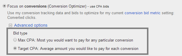
Max CPA:
Use this bidding type when budget is not limited or your CPA (Cost per-acquisition) is not very high. The algorithm will try to maximize the amount of conversions based on the conversion data.
Upon selecting this option, it will suggest a Max CPA bid (the most you are willing to pay for a conversion) based on the historical conversion data.
Target CPA:
Use this bidding type when your CPA is too high and you want to make it more profitable. This option helps you to reduce the CPA while continuing to bring in the same or higher amount of conversions (Google AdWords will also suggest to start Target CPA bid based on your historical data).
Before choosing any of these bidding options, you need to figure out what exactly it is that you want to achieve; whether this is an increase in the amount of conversions while sacrificing a higher CPA, or if you are struggling to reduce your CPA and trying to find a solution on bringing this down.
Something very important is to remember that once you choose your bidding type, the selected CPA bid will be applied to all your ad groups. You would need to review this afterward and adjust it accordingly.
Typically, every ad group has a different CPA and it should not be set to the default CPA bid suggested by the system. Adjust it according to your criteria, based on what CPA is best for each ad group.
6. Focus on Converting Keywords and Ads
On a campaign that is performing very well, there are ad groups, keywords and ads that are the main drivers for these conversions. Sometimes, 1 to 3 ad groups are responsible for 60% of the campaign’s overall results. The other ad groups convert every now and again at a decent CPA, and that is why we decide to keep them running.
- Once you’ve identified which are these keywords and ads, create variations, try to identify other potential keyword variations for your campaign based on the ones that have converted.
- Create keyword variations in different match types to cover more ground.
- Create ad variations based on the best performing ones, whether this is just changing the call to action, headlines or parts of your description lines – even small changes can have an impact.
- Analyze how these elements are performing over time and perform bid adjustments based on what has been the best ad rank to work with.
These are just a few of the creative and analytic adjustments that you can do with your keywords and ads.
7. Implement the Best Converting Ad in Other Ad Groups that Are Applicable
I like to compare ads’ performance across my campaign. There is always one specific ad that is your “killer ad”. It is important that we identify why this ad does better than the others. Whether it is a result of the call to action, description line, or benefits mentioned in the ad.
Once you’ve identified the driving factor, compare this ad with ads in other ad groups. If all ad groups are promoting the same products or services, but with different keywords, it would be beneficial to start using this ad across all other ad groups that are applicable.
8. Pause Non Converting Keywords to Focus Your Budget on Converting Elements
A beneficial practice is to perform a campaign evaluation at the end of every month, every 3 months and every 6 months. This facilitates a better grasp of how the campaign is doing from time to time. Performing a monthly or quarterly assessment is important, because it helps you identify historical trends, spikes and areas of opportunities.
One of these areas of opportunities is reallocating your budget to focus on what is actually being productive. For instance, you might have a campaign with 200+ keywords, but less than 50% of those keywords are productive.
I encourage you to take a look at your campaign at a keyword level, create a customized filter to show only keywords that have not converted in the past 3 months, and another filter for keywords that have converted at a higher CPA than your actual goal (or above ideal CPA).
You will be surprised of how many keywords will show in that filter, and how much money has been wasted on them throughout the duration of your ads.
Once you make a full assessment and decide to pause most of these keywords, you will have space to exploit your budget and focus higher bids on productive keywords.
9. For E-commerce Campaigns: Use Google Analytics E-commerce Transactions
If you’re running a campaign for an e-commerce website, it is crucial that you work with Google Analytics and that the e-commerce transactions tracking is setup properly. Google Analytics will provide you with an abundance of data to assist you in the success of your ad campaign.
With E-commerce Transactions tracking, you have the most granular level data; data for strategic account management, and business driven decision making.
As long as your AdWords account is linked to Google Analytics and reporting accurately, you will be able to determine:
- revenue driven per ad group
- per keyword
- per ad
- bounce rate
- visit duration
- and more.
Analyzing an AdWords e-commerce campaign through Analytics can be eye opening. One can be under the impression that the ad group or keyword that drives the most conversions in AdWords is the most profitable one, but there are times when having more conversions doesn’t necessarily mean more revenue.
The prices for each product differ and that is why an evaluation in Analytics is indispensable. You will be able to determine which ad groups and keywords are producing the most revenue and which ones need improvement.
10. Add Converting Keywords from Analytics that Perform Well in Other Traffic Sources
With goals setup in either Analytics, or “Ecommerce Transactions Tracking”, you are able to analyze and determine which sources are more productive for you; whether this is Google Organic, Direct Channel, Google CPC, etc.
One of the most competitive sources is Google Organic, particularly if your client is doing SEO and has decent ranking in Google Organic SERP. This is something that you should exploit and add the benefits from that source to your AdWords campaign.
One approach is to review Google Organic Source to see what keywords are driving conversions. To do this:
Go to Analytics > Go to All Traffic > Select Google / Organic > as Primary Dimension, choose Keywords.
Select a larger time frame than just the last 30 days, and do a comparison with the keywords in your campaign and other keywords from this source to determine which ones you have not implemented. Add them to your campaign and you will see results if implemented with the best practices.
11. E-commerce: Focus on Top Converting Products
Another way to exploit Google Analytics and E-commerce Tracking is by easily identifying which your best selling products are, how much revenue they represent to your total and work with them accordingly.
In Analytics, under the Ecommerce Overview, you will see: Your top selling products
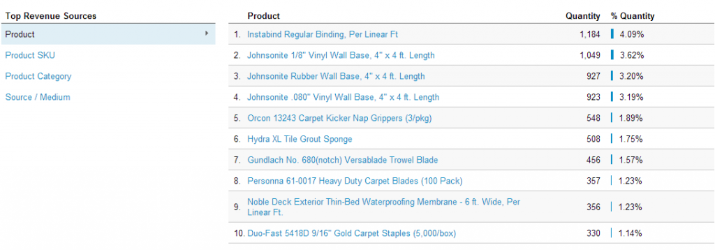
Review this list however you want, within the interface or by doing a csv export, and run with it. Research the life of your campaign and see which of these products you are not advertising directly (as in using targeted keywords with the name of the products), include these in your campaign, tightly themed with some killer ads, you’re all set!
12. Explore Other Campaign Types Such as a Remarketing Campaign
From small to large companies, search campaign is one of the most effective online marketing efforts when your purpose is direct response. However, you can’t disregard the fact that there are other marketing channels to be explored and exploited.
Some marketers and business owners still are hesitant to expand their marketing efforts to other channels once they are doing well with a Search Marketing campaign. It only makes sense to invest more to get more. If you limit yourself with budget, you are limiting the reach of your success.
That is why expanding to other marketing efforts is so important, once you’ve already killed it with one channel.
There are so many other effective campaign types and efforts such as:
- Remarketing – Remarketing lets you show ads to users who’ve previously visited your website as they browse the Web
- Display Campaign -You can reach a wide range of customers with broad interests, choose which sites or pages to appear on, and engage users with appealing ad formats when ads are in the display network.
- Product Listing Ads – A unique ad format that allows you to include rich product information like an image, title, price, promotional message, and your store or business name.
- Shopping Campaigns – Shopping campaigns are a better way to manage and optimize Product Listing Ads to promote your products online using retail-centric tools.
- Dynamic Search Ads – Dynamic Search Ads automatically show your ad based on the content of your website.
Don’t be afraid to expand and explore other marketing efforts, as you can see there are many options available to you.
Be Analytic, Creative and Always Think Out the Box
The Online Marketer that works on AdWords platform and doesn’t use Google Analytics for a better grasp on their user behavior analysis or to track ROI to produce measurable results, should now be expanding their marketing efforts with Google Analytics.
I encourage everyone who is still not working with the combination of these tools to get started – more than likely, you competition is using them already. If you are passionate about AdWords and Google Analytics, your deeper understanding and use of all that Google has to offer, you will stop at nothing short of success in your marketing efforts. Once you have these components in place, you should strongly consider which Conversion Optimization Services you can utilize to get maximum value of of your precious paid traffic.
“Knowledge is only potential power. It becomes power only when, and if, it is organized into definite plans of action, and directed to a definite end.” – Napoleon Hill
Derek Hooker is Chief of Search Marketing at White Shark Media™. He is both Google AdWords Qualified and Bing Ads Accredited. Derek is determined in constantly providing his Clients top results via his a ROI/customer care-driven approach. He specializes in both eCommerce and local search campaigns. You connect with Derek on GooglePlus and LinkedIn.
For further reading on maximizing conversions through Google, please read the following articles:
It’s All About You: The Future of High Quality Link-building
A New Kind of Marketing Battery: Google’s New Smart Lists


Digital Elite Camp 2014 Photo Album
News & EventsDear Mom,
Just came back from a speaking tour of Europe. One of the highlights was Digital Elite Camp 2014 in Tallinn, Estonia. I met some of the smartest people in online marketing. We shared ideas, we danced, and we swam in the freezing Baltic Sea.
Here are some pictures from this adventure.
To new friends,
12 Rules for Maximizing Conversions from AdWords
Conversion OptimizationGoogle AdWords is a very impressive advertising platform. It provides us with numerous tools and features to work with and make our campaigns better. As long as you have the right mindset, resources and strategy, you can make your campaigns rock (and make your Conversion Rate Optimization Agency very happy).
I’ve always said: “you just have to get creative and analytic with the tools you are provided with.”
So with that in mind, I decided to create this guide with twelve ways to advertisers take their campaigns to the next level, especially when focusing on conversions. Please keep in mind that the features and techniques listed below are not sorted in any priority order. You decide which ones to implement first based on your specific case:
1. Start Rotating Ads to Optimize for Conversions
Ad Rotation is a basic feature that you put in place when you’ve already accrued a certain number of conversions (no specific number) and have started converting regularly. This feature gives you the power to rotate through several different ad versions to find out which works best for a given set of keywords.
It only makes sense to have your ads “Optimize for Conversions” when that is your main purpose, but when is it not? If you’re “Optimizing for Clicks”, you’re assuming all clicks turn into customers at the same rate. The ads that serve more and receiving the most clicks are not always the ones driving leads and customers.
2. Ad Scheduling Bid Adjustments
When it comes to e-commerce you may want to have your campaign running 24/7, since customers can complete a purchase online 24/7. However, certain times of day may generate lots of expensive clicks, but few purchases.
Use adwords to report on the hours of the day and days of the week to when your customers are really converting.
It may pay to schedule ads for e-commerce campaigns that exclude early hours of the day (after midnight and before dawn). I call this the “zombie hours” because I rarely see customers taking action during these hours. At these hours, customers just browsing around and this turns out to be a big expense that leads to higher cost per action (CPA) and lower return on ad investment (ROI).
You may see something different. It makes sense to exclude some hours and adjust bids based on the times you are experiencing more conversions.
For example, in the screenshot below you can see that I started doing ad scheduling (4 am – midnight), because in this particular case, there were very little to no conversions between these hours. Hence, I’ve raised bids on Tuesday and Friday to maximize the conversions on these days, since they convert very well, at a lower cost and lower position.
3. Location Target Bid Adjustments
If you’re running a nationwide campaign or one that is targeting multiple locations (states, cities, metro areas, etc.), take some time to figure out where most of your conversions are coming from. You would be surprised on how differently users behave from different locations, and it is sometimes best to target them geographically with targeted tactics.
The Adwords Dimensions tab gives you a good general insight on how each location contributes to your overall campaign’s performance. Use the “User Locations” View.
I guarantee you that if you have been running a campaign for a long time and have not taken the time to look into this, you will find locations that have a ridiculous cost/conversion or no conversions at all, representing an unnecessary expense for your campaign.
In this case, it is the best to exclude these locations from your existing campaign. If these locations are really important to your business and you want to really exploit them, you can target them on a separate campaign with a separate approach. All of these, after building an effective strategy based on that location’s user behavior and data pulled from Google analytics.
4. Bid Strategy: Enable Enhanced CPC
Enhanced CPC tells Google that they can raise your bids on ads that seem to generate more conversions. Use this feature carefully, because it works for some campaigns and not for others. Nevertheless, AdWords is all about testing, optimizing, analyzing results, and making decisions. Don’t be afraid to try new things, use features you have never used before or don’t understand very well. I always encourage everyone I talk to about AdWords to get creative and think out the box and get out of your comfort zone.
One of the best scenarios where I would recommend using this setting is when your campaign is in its early stages. If your campaign is converting regularly and has at least 15 conversions in the past 30 days, then it is probably eligible for Conversion Optimizer (which we will discuss further).
Enhanced CPC is 1 step away from Conversion Optimizer, which is why it is more reasonable to work with this setting if your campaign doesn’t have that much historical conversion data, yet you are looking forward to drive more conversions.
5. Implementing Conversion Optimizer
Some advertisers and business owners are skeptical about using the tool, because they are afraid of “giving Google control their bidding strategy”, which is why they take the conservative road and stick to manual bidding (this can also be the case of Enhanced CPC).
In order to have success with Conversion Optimizer, one must have solid knowledge of how it works and be careful how you set your CPA bids in order to obtain your goals.
The Conversion Optimizer is a very powerful tool. There are essentially two bidding types:

Max CPA:
Use this bidding type when budget is not limited or your CPA (Cost per-acquisition) is not very high. The algorithm will try to maximize the amount of conversions based on the conversion data.
Upon selecting this option, it will suggest a Max CPA bid (the most you are willing to pay for a conversion) based on the historical conversion data.
Target CPA:
Use this bidding type when your CPA is too high and you want to make it more profitable. This option helps you to reduce the CPA while continuing to bring in the same or higher amount of conversions (Google AdWords will also suggest to start Target CPA bid based on your historical data).
Before choosing any of these bidding options, you need to figure out what exactly it is that you want to achieve; whether this is an increase in the amount of conversions while sacrificing a higher CPA, or if you are struggling to reduce your CPA and trying to find a solution on bringing this down.
Something very important is to remember that once you choose your bidding type, the selected CPA bid will be applied to all your ad groups. You would need to review this afterward and adjust it accordingly.
Typically, every ad group has a different CPA and it should not be set to the default CPA bid suggested by the system. Adjust it according to your criteria, based on what CPA is best for each ad group.
6. Focus on Converting Keywords and Ads
On a campaign that is performing very well, there are ad groups, keywords and ads that are the main drivers for these conversions. Sometimes, 1 to 3 ad groups are responsible for 60% of the campaign’s overall results. The other ad groups convert every now and again at a decent CPA, and that is why we decide to keep them running.
These are just a few of the creative and analytic adjustments that you can do with your keywords and ads.
7. Implement the Best Converting Ad in Other Ad Groups that Are Applicable
I like to compare ads’ performance across my campaign. There is always one specific ad that is your “killer ad”. It is important that we identify why this ad does better than the others. Whether it is a result of the call to action, description line, or benefits mentioned in the ad.
Once you’ve identified the driving factor, compare this ad with ads in other ad groups. If all ad groups are promoting the same products or services, but with different keywords, it would be beneficial to start using this ad across all other ad groups that are applicable.
8. Pause Non Converting Keywords to Focus Your Budget on Converting Elements
A beneficial practice is to perform a campaign evaluation at the end of every month, every 3 months and every 6 months. This facilitates a better grasp of how the campaign is doing from time to time. Performing a monthly or quarterly assessment is important, because it helps you identify historical trends, spikes and areas of opportunities.
One of these areas of opportunities is reallocating your budget to focus on what is actually being productive. For instance, you might have a campaign with 200+ keywords, but less than 50% of those keywords are productive.
I encourage you to take a look at your campaign at a keyword level, create a customized filter to show only keywords that have not converted in the past 3 months, and another filter for keywords that have converted at a higher CPA than your actual goal (or above ideal CPA).
You will be surprised of how many keywords will show in that filter, and how much money has been wasted on them throughout the duration of your ads.
Once you make a full assessment and decide to pause most of these keywords, you will have space to exploit your budget and focus higher bids on productive keywords.
9. For E-commerce Campaigns: Use Google Analytics E-commerce Transactions
If you’re running a campaign for an e-commerce website, it is crucial that you work with Google Analytics and that the e-commerce transactions tracking is setup properly. Google Analytics will provide you with an abundance of data to assist you in the success of your ad campaign.
With E-commerce Transactions tracking, you have the most granular level data; data for strategic account management, and business driven decision making.
As long as your AdWords account is linked to Google Analytics and reporting accurately, you will be able to determine:
Analyzing an AdWords e-commerce campaign through Analytics can be eye opening. One can be under the impression that the ad group or keyword that drives the most conversions in AdWords is the most profitable one, but there are times when having more conversions doesn’t necessarily mean more revenue.
The prices for each product differ and that is why an evaluation in Analytics is indispensable. You will be able to determine which ad groups and keywords are producing the most revenue and which ones need improvement.
10. Add Converting Keywords from Analytics that Perform Well in Other Traffic Sources
With goals setup in either Analytics, or “Ecommerce Transactions Tracking”, you are able to analyze and determine which sources are more productive for you; whether this is Google Organic, Direct Channel, Google CPC, etc.
One of the most competitive sources is Google Organic, particularly if your client is doing SEO and has decent ranking in Google Organic SERP. This is something that you should exploit and add the benefits from that source to your AdWords campaign.
One approach is to review Google Organic Source to see what keywords are driving conversions. To do this:
Go to Analytics > Go to All Traffic > Select Google / Organic > as Primary Dimension, choose Keywords.
Select a larger time frame than just the last 30 days, and do a comparison with the keywords in your campaign and other keywords from this source to determine which ones you have not implemented. Add them to your campaign and you will see results if implemented with the best practices.
11. E-commerce: Focus on Top Converting Products
Another way to exploit Google Analytics and E-commerce Tracking is by easily identifying which your best selling products are, how much revenue they represent to your total and work with them accordingly.
In Analytics, under the Ecommerce Overview, you will see: Your top selling products

Review this list however you want, within the interface or by doing a csv export, and run with it. Research the life of your campaign and see which of these products you are not advertising directly (as in using targeted keywords with the name of the products), include these in your campaign, tightly themed with some killer ads, you’re all set!
12. Explore Other Campaign Types Such as a Remarketing Campaign
From small to large companies, search campaign is one of the most effective online marketing efforts when your purpose is direct response. However, you can’t disregard the fact that there are other marketing channels to be explored and exploited.
Some marketers and business owners still are hesitant to expand their marketing efforts to other channels once they are doing well with a Search Marketing campaign. It only makes sense to invest more to get more. If you limit yourself with budget, you are limiting the reach of your success.
That is why expanding to other marketing efforts is so important, once you’ve already killed it with one channel.
There are so many other effective campaign types and efforts such as:
Don’t be afraid to expand and explore other marketing efforts, as you can see there are many options available to you.
Be Analytic, Creative and Always Think Out the Box
The Online Marketer that works on AdWords platform and doesn’t use Google Analytics for a better grasp on their user behavior analysis or to track ROI to produce measurable results, should now be expanding their marketing efforts with Google Analytics.
I encourage everyone who is still not working with the combination of these tools to get started – more than likely, you competition is using them already. If you are passionate about AdWords and Google Analytics, your deeper understanding and use of all that Google has to offer, you will stop at nothing short of success in your marketing efforts. Once you have these components in place, you should strongly consider which Conversion Optimization Services you can utilize to get maximum value of of your precious paid traffic.
Derek Hooker is Chief of Search Marketing at White Shark Media™. He is both Google AdWords Qualified and Bing Ads Accredited. Derek is determined in constantly providing his Clients top results via his a ROI/customer care-driven approach. He specializes in both eCommerce and local search campaigns. You connect with Derek on GooglePlus and LinkedIn.
For further reading on maximizing conversions through Google, please read the following articles:
It’s All About You: The Future of High Quality Link-building
A New Kind of Marketing Battery: Google’s New Smart Lists
The Science of Pricing [INFOGRAPHIC]
Ecommerce CROChoosing the right price for your product can be stressful and confusing: Pick a low price and you’ll earn too little from your sales, pick a high price and you’ll sell only a few products.
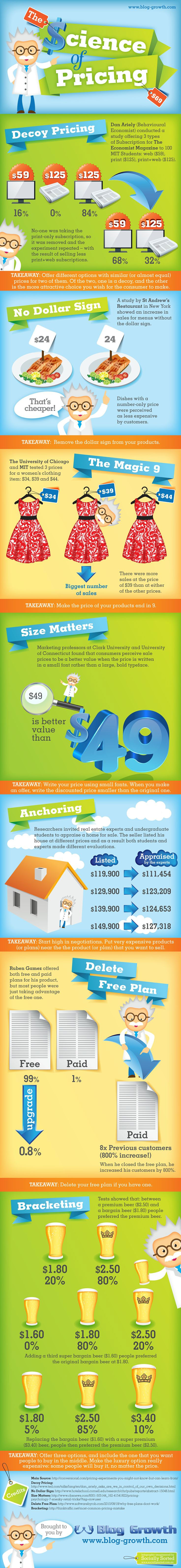
So, what is the best pricing practice for my product?
The following infographic by Blog Growth will show you 7 of the best pricing strategies that will help raise your sales and increase your profit!
The Blue Line that Frustrates Your Visitors
Conversion OptimizationThe Conversion Function is the number of actions taken for an online property divided by the number of visits to that property.
The Conversion Rate Function: Actions over Visitors
Here is where we find the solid blue line in our websites.
It runs through our sites and our landing pages. It slices our prospects’ mobile phones, their tablets and their computers.
We charter the digital vehicles that carry people to our online properties.
We begin by chartering the digital transportation that will bring people in under the line, these confounding and complex people we call visitors. This is not an inexpensive undertaking.
We cajole Google with it’s menagerie of penguins, pandas and hummingbirds. We cast our banners and our ads across the internet, chasing prospects as they surf. We create the content, we share on social, and we send the emails that bring them to us.
We pay their fares promising them a trip to a place meant for them. Our place.
They arrive below our line, looking for that solution, that thing that will make them feel better, that product to adorn themselves, that moment of entertainment when they can let go.
The blue line stands as a ceiling to our visitors and they image how things might be different if they could just get up there.
Above the line.
They are always tempted by the exit, the back button, the next search.
It is this blue line that our visitors struggle with, which means that we as online businesses struggle with it, too.
Those tempted by the line find reason and method to climb.
For some, this might be quite easy. Others will accept the help of friends and strangers.
We create the line. We draw our blue line. Sometimes higher. Sometimes lower.
It is our duty help more of our visitors to rise above this line.
We choose the tools that will elevate them.
Will we let them devise a system of pulleys and knots with which to climb.
Will we provide the clear steps, a little boost in their efforts.
Will we ask them to make a leap of faith and trust in their agility to spring safely above our blue line.
Will we try to make it effortless using the machinery of our websites to transport them to a fixed location, a place above the line? And what will make them take that leap, to step on, to push the button.
The vision we have for our blue line is one in which many make the journey. They come with their money in hand, ready to spend, ready to engage.
We see them coming with ample intuition and a nourishing supply of common sense, all calibrated by the way we see our business, ourselves and our world.
As it turns out what we call sense isn’t that common.
These frustrating people we call visitors aren’t like us. They aren’t even like the people we know.
They come with their own rules, with their own ideas of beauty and their own sense of how things should work.
They are not here to be manipulated. They are here to be understood.
When they are not understood, they seem mesmerized by the exit, transfixed and hypnotized.
We paid to bring them here and they, in their flagrant individuality choose not to stay.
In our hubris, we create the quicksand that will trap them. Did our navigation confuse them, do our words lack clarity, did we call them to act in the way they like to act.
We are opaque to them, and this is scary. Our very visitors fear us like a bad dream on Halloween.
Your visitors have natural fears.
Are we lurking behind our website, ready to pounce, to steal from them or, worse, to make them feel stupid and incompetent?
Do we fear being known for who we really are? For it is the unknown that allows our visitors imaginations to run to places we did not expect them to go.
How are we dealing with this complexity?
For this is a complex problem.
How high will we set our line? What distance must these lost souls cover to find their solution?
What have we provided them? Why should they put their fears aside? How will we transport them above the line?
For it is their journey from below the blue line that tells us who they are and who we should be for them.
I’m pleased to be exploring these questions over three days at Digital Elite Camp in Tallinn, Estonia.
If you aren’t planning to be in Tallinn, you should follow us from right where you are. We’re going to be exploring some fun and helpful stuff.
How Big is the Optimizely "Test Snooping" Problem
CRO Tests | Multivariate | AB TestingHow helpful would it be to know what prices and features your competition was thinking about using?
One of my readers just sent me a very revealing screenshot. It is one of the pricing pages that Optimizely is testing. It was found by “spying” on their test data.
We hid the pricing on this test treatment from Optimizely
We are able to see this because of an “exploit” that allows anyone to see what a site is testing if they are using the Optimizely testing software. Oh, the irony.
Venture Beat recently “
revealed” this in an article. Those of us who use these tools have known about it for some time. It’s quite easy to decipher this test data.Try dragging the following link to your browser bookmark bar.
Optimizely Spy
Now visit Optimizely and click on the bookmark to see what they are testing.
How is this possible?
Whenever we run a split test with Optimizely, the software uploads scripts and data into all of our visitors’ browsers to change the experience and track the results. Along with this is included not just the test our visitor is being entered into, but all of our tests for that account.
So it’s relatively easy to decipher this information and see what we’re testing.
Note that the snooper can’t see any actual results, just what kinds of things you’re testing.
We like this approach because it speeds up the delivery of tests. When we use one file with everything, it changes less frequently, and the file it can be cached on a content delivery network (CDN) specifically designed to deliver files faster.
Faster tests mean more reliable tests.
Convert.com also uses this technique, though they take steps to obsure the test information.
Why Aren’t We More Concerned?
In a worst case scenario, a competitor can see what hypotheses you are testing. They can then test those same ideas and perhaps win more customers.
However, only a small percentage of sites are even testing, let alone stealing your tests. I did a quick survey of sites selling plastic surgery and cosmetic surgery who are spending at least $500 per month on search advertising.
Of 2,958 domains, only 33 had some form of split testing software installed, such as Optimizely. That’s just 1.1% of these domains. Furthermore, we know that some portion of these testing are not actually using the software they have installed.
Plastic and Cosmetic Surgery websites are missing a significant opportunity to get more patients. Source: SpyFu.com
Here’s another surprise. There are ninety-seven (97) domains in this space spending over $50,000 per month on search ads. Only five of them have A/B Testing software installed, only 5%.
If you’re in the plastic surgery space and are testing, you have a major advantage over your competitors. So, the odds of someone stealing your ideas are far outweighed by the gains you will see from testing.
Our Recommendation
We recommend that you continue to test using Optimizely unless your page contains sensitive information, such as price.
If you feel uncomfortable with your test information being publicly available, move to Convert Experiments for some protection. Another popular tool, Visual Website Optimizer, does not use this technique meaning past and future tests are safe from prying eyes. There are also a variety of other highly recommended AB testing tools available.
Whatever you do, don’t let this issue take the steam out of your testing program. As you can see, testers have a significant advantage, snoopers or not.
PS: If you are in the plastic and cosmetic surgery industry, you should contact us.
Agencies are being asked for Conversion Optimization Services
Conversion OptimizationConversion optimization is now a recognized discipline in the digital marketing stack. This stack roughly looks like this:
According to MarketingCharts.com, increasing conversion rates is at the top of business’s digital priorities in 2014.
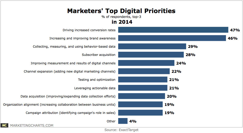
“Testing and Optimization” is in the top three of 21% of respondents to this survey. As it turns out, test data is ideal for “Leveraging actionable data”, which 21% also put in their top three.
For most businesses, the digital marketing stack is delivered by one or more digital agencies.
When is the right time for these agencies to begin offering conversion optimization services? We think it’s now, and we’d like to provide you with this capability. When I talk about conversion optimization, I mean the following process:
In our experience, it is wholly insufficient to stop with step 2. Step 3 provides the measureable revenue increases that these services deliver.
Conversion Optimization Delights Clients
We know you are being asked by your clients to provide conversion optimization services. Instead of saying, “We don’t do that,” you should take this chance to demonstrate your ability to help them find more revenue in measureable ways. Send them to Conversion Sciences.
We have an impressive track record.
We can deliver a complete turnkey optimization solution to your clients today.
Send Us the Business
If your clients are asking about conversion optimization, we say, “Send them our way.”
Call us now and we’ll give you detailed insight into our process and referral agreements.
Conversion Sciences
+1 (888) 961-6604 Toll Free
+1 (512) 961-7159 Direct
bmassey@conversionsciences.com
Thanks to Peep Laja for the pointer to the MarketingCharts.com data.
9 Motivational CRO Lessons You Can Learn from Ghostbusters
Conversion OptimizationGhostbusters was a touchstone for us. Seven years ago, we were launching into a new marketplace – conversion optimization. Like the Ghostbusters, many didn’t understand the value of what we did. Like the ghosts of the movie, the goblins in a website were invisible and ethereal.
So, we turned up the volume, donning lab coats and teaching anyone who would listen. Today, conversion optimization is quickly becoming a must-have discipline in any online business.
We have always taken inspiration from the trio of Venkman, Stantz and Spengler, collectively known as the Ghostbusters.
To celebrate the 30th anniversary of the release of the Ghostbusters movie, we offer nine important lessons that we’ve taken from this classic comedy.
1. Get Yourself Some Cool Toys
“It’s technical. It’s one of our little toys.”
Batman had the Bat Cave. Ghostbusters had ECTO-1. We have CRO-1.
For us, we have to be able to bring our tools of choice to our clients. You probably don’t need the mobility that we do, but should have your own digital lab, stocked with the latest toys.
This modified ambulance carries some cool CRO tools.
For us, we require a solid analytics setup to build on. We further like to add some click tracking tools to see how visitors are interacting with pages. Our split testing software allows us to segment visitors into tests and to inject JavaScript into their experiences.
In the past, we’ve used session recorders and eye-tracking software to get more info on how visitors are using a site.
Yes, we think these are pretty cool toys. You will too when you wield them with a little finesse.
2. Save Your Tests
“Please understand. This is a high-voltage laser containment system.”
The Ghostbusters went on quite a hunting spree in the first movie capturing all manner of ghost, ghoul and specter. What did they do with these? They placed them in a high-voltage laser containment system.
When you complete a test on your website, you need to save the results in a place that ensures you won’t forget what you’ve learned.
Store your tests where they can have the most impact.
We’ve never had a one-size-fits-all approach to documenting test results. We’ve used physical books that we call “Books of Swagger” so that our clients have the answers to questions at their fingertips.
We’ve kept detailed spreadsheets of tests.
Today, we rely most frequently on PowerPoint decks to save our “swagger” along with the details of the tests in our split testing tools.
3. Realize You’re Saving the World
“Fire and brimstone coming down from the sky! Rivers and seas boiling! Forty years of darkness! Earthquakes! Volcanoes! The dead rising from the grave! Human sacrifice, dogs and cats living together — mass hysteria!”
Don’t underestimate the magnitude of the shift you’re bringing to your online business. Adding some science to your marketing is going to bring profound changes to your organization.
Decisions will be made differently. Old beliefs, superstitions and sacred cows will disintegrate.
It will be painful at times and will take some passionate convincing of doubters. In the end, you could be saving the business.
4. Get Some Strange Hobbies
“I collect molds, spores and fungus.”
You’ve got to be interested in some strange topics. Revenue per visit, statistical significance, correlation vs. causation… it’s quite different from product, positioning and pricing.
Yes, the geeks are going to rule the marketing world, so get your geek on.
CRO geeks are interested in the psychology of influence, the structure of the mind and in rudimentary statistics. We study images, copywriting, pricing theory and user experience theory.
The bottom line is that you are going to have to nurture an interest in some unusual topics to be a well-rounded online marketing scientist.
5. Clear Your Mind
“It’s the Stay Puft Marshmallow Man.”
Expectations and attachments will dull your ability to apply science to your marketing. Often, our most cherished creative just won’t win in a split test.
I’m not saying that you shouldn’t have goals for your tests. However, expectations and attachments to outcomes can lead to poor decision-making.
If you’re sure a certain treatment is going to win in a split test, you’re more likely to call it a winner before the confidence level is high enough.
If you expect your results to “make sense”, you are more likely to throw out valid results as “unexplainable.”
We find that it is harder to come up with new hypotheses for a site we’ve been working on for a year or more. It’s harder to clear our minds of the knowledge we already have.
The more you know a thing, the less meaning it has for you. Clear your mind.
6. Don’t Cross the Streams
“Try to imagine all life as you know it ending instantaneously and every molecule in your body exploding at the speed of light.”
Don’t cross your traffic streams when doing multiple tests on a site.
The more tests we can run on a site, the faster we learn. Sites with a large number of visitors and conversions can run several tests, provided the audience can be segmented.
The idea of testing is to understand what is working and what is not. To do this, we need to isolate variables. This is science talk for “only change one thing at a time.” Ideally, only one thing will change for any visitor to your site.
However, if you allow a group of visitors to enter multiple tests, then more than one thing is changing. Imagine that a visitor comes to the home page and is entered into a test in which you remove the sidebar menu. Then they come to a test in your shopping cart in which you remove the discount code field.
When the tests are done, you won’t know which combination of home page sidebar and discount code field resulted in the most sales. The data for both tests have been polluted and cannot be relied on.
So, don’t cross your streams of traffic. If you are running multiple tests on a site, be sure that you segment traffic to only see one or the other.
7. Be Proud to be a Scientist
“Back off man. I’m a scientist.”
You should feel proud to have a data-driven marketing program up and running. Science isn’t perfect, and the fact that we are always trying to prove ourselves wrong means that our self-esteem may suffer.
Most importantly, you should be bringing others in your organization along the science learning curve.
Don’t be afraid to take a moment to explain statistical significance to a coworker. Go ahead and write up a memo on isolating variables or calculating the length of a test.
And when you have a success, be sure to do the money-dance in a very public way.
8. Tell Them About the Twinkie
“That’s a big Twinkie.”
At one point in our heroes’ adventures, Dr. Spengler uses a Twinkie to illustrate the growth of “psychokinetic energy” in the New York area.
“According to this morning’s sample, it would be a Twinkie 35 feet long weighing 600 pounds.”
Spengler uses a Twinkie to illustrate the ghostly trouble brewing in New York.
We really can’t take our graphs, charts and tables out to our organizations and expect others the understand what we’re seeing.
I think this is why we prefer to save our test results in slide decks. It is a system designed to tell an emerging story. These decks includes hypotheses, screen shots, data tables and conclusions. Everyone can open them and they can be as big as they need to be.
Sometimes, a map is better than step-by-step directions. Become a student of explaining and presenting findings. The better you get at this, the more cred you will build within your company.
Companies like Narrative Sciences are focused on turning data into stories.
Use your own Twinkies – analogies and metaphors – to help others understand the context for your discoveries and their relevance to themselves.
Charles Bukowski said, “Genius could be the ability to say a profound thing in a simple way.”
9. Don’t get Slimed
“I feel so funky.”
Don’t let the slime get you down.
It is one of the inevitabilities of the scientist to have her most amazing theories regularly proven wrong. Inconclusive tests, polluted data and external interference make testing disheartening.
Don’t let a series of disappointments bring your momentum and scientific excitement to a standstill. Don’t let yourself get slimed.
If you find yourself in a slump, it’s time to get input from outside of your echo-chamber. Pull in some fresh eyes from elsewhere in the company. Watch a few recorded sessions or collect some user feedback using any of a number of tools.
When you feel your energy ebbing, it’s because you got attached to your outcomes. Be humble. Stay curious. Stay out of the slime.
Thanks to Dan Akroyd, Rick Moranis, Bill Murray and the late Harold Ramis for providing the inspiration we needed to take ourselves a little less seriously than we would have.
Are you troubled by high bounce rates in the middle of the night?
Do you experience feelings of dread in your CFO’s office?
Have you or your family ever seen you twitch, shake or cry?
If the answer is “yes,” then don’t wait another minute. Pick up the phone and call the professionals.
Images taken from Ghostbusters. All copyrights belong to their owners.
7 Social Media Marketing Trends [INFOGRAPHIC]
Conversion-Centered DesignShould I waste my time on Facebook advertising or throw all my eggs into the blogging basket this year? What social media marketing trends do I need to integrate into my marketing?
The 2014 Social Media Marketing Industry Report holds results from over 2,800+ marketers. These experts share their experience with new and rising trends in social media marketing. The following infographic will answer marketers questions concerning where to focus their efforts in social media marketing this year.
Some relevant takeaways from the following infographic and Social Media Examiner article:
Enjoy and share!
Social media marketing trends for 2014 from Social Media Examiner.
Looking to gain more from your library of original content? Breath new life into your webinars and start generating leads today.
3 Must Have Tools for Those Who Depend on Google Analytics [AUDIO]
Lead GenerationThe staff was assembled, the stage was set. Representatives from every department plus some of the big brass were sitting around the long conference table.
I was about to present the data that showed how successful my marketing campaigns had been for the past month. This was important, because it had been like pulling teeth to get a more data-driven process in place.
IT had to be cajoled into setting up Google Analytics.
Sales had to be bullied into keeping good account of leads and sales.
Now, with the first full month of data in hand, I was going to point to some steady growth. My pitch was confident as I showed the increase in leads and correlated it with an increase in sales. I was going to be a star.
Until someone spoke up from sales.
“We didn’t get that many leads last month. Most of my sales came from affiliates.”
All eyes turned to me. What I would say next would either raise stature or destroy my credibility.
Was it my programs, or was it my analytics that caused this disconnect?
The right answer would have been, “I personally QA’d our analytics setup. These numbers are right.”
Could you have given that answer?
In my most recent Marketing Land article Is It The Site, Or Is It The Analytics? Debugging Google Analytics, I show you how to be certain that your Google Analytics setup is working as planned.
Whether you setup your own analytics or have your tech team do it, you need to know that the data you’re using is right.
Listen to the Article, Read by the Author
Podcast: Play in new window | Download
Subscribe
The More I Test the More I Loathe Myself
CRO Tests | Multivariate | AB TestingThere is a point in almost every testing program in which your confidence will be shaken. Even seasoned professionals experience it.
We start off with high confidence having identified opportunities to really improve a site. We’re good at getting that low-hanging fruit early on, but we will inevitably find that many of our great ideas just don’t work.
It’s humbling, the right kind of humbling.
With patience, our picture of the visitors coming to a site become clearer. On-going success is due not to our own brilliance, but to what we learn in the Valley of Death that kills so many testing programs before they’ve matured.
We can take you through the Valley of Death.
Have a conversation with a Conversion Scientist this week to see what our testing team can do for your bottom line.
Inspired by the excellent blog Indexed.