It may not seem intuitive business to business brands to implement live chat for B2B conversion optimization. But live chat is no longer only reserved for B2C brands. While Live Chat hasn’t become popular with B2B decision maker just yet, more organizations are adopting this rich media tool to support their conversion optimation efforts.
Live chat can not only assist with customer service, but it can help with customer acquisition and retention. In fact, studies show that live chat can increase conversions by up to 20%. Source: Bold Software LLC, a live chat software vendor.
Furthermore, customers who live chat are three times more likely to make a purchase. When it comes to customer service, live chat shows higher rates of consumer satisfaction when compared to all other customer service touchpoints.
With the uses of live chat for conversion optimization clearly established, it’s time for a complete how-to guide. Here is all you need to know to make live chat work for you in 2018.
Don’t Skimp on Security
For live chat for B2B conversion optimization to be productive, your audience must be assured that their data will be kept private. A full two-thirds of brands promise security to their live chat customers. Doing the same would be wise, and an overall great move on your part. Source: AMA.
Put Experts at the Helm
Customers using live chat want instant answers to their questions, which means that proper and thorough training, as well as modern communication, are the orders of the day.
Integrate Add-On Solutions
Live chat can be effective all on its own, but you can enhance your efforts by adding click-to-call functionality and screen sharing solutions, for instance. Both of these technologies will make engaging with customers easier.
Add Live Chat Data into the CRM
Your live chat agents should be trained to enter all consumer interactions into the CRM to ensure all data is up-to-date. Better yet, you can integrate live chat with your CRM to ensure data is transferred automatically.
Live Chat integrated with Infusionsoft, for example, allows your agents to recognize your customers instantly, making the interaction more personal and efficient.
Live Chat integrated with Infusionsoft
Use Preset Responses Appropriately
It’s common for your agents to field the same questions day in and day out, and pre-set responses can help to break the monotony. However, ensure that staff is trained to use preset responses so that customers always know they’re talking to a person instead of a robot.
Instead of
“I am going to put you on hold for a moment.”
you can be more relaxed, such as,
“I’m going to place you on a brief hold while I look up this answer. I’ll return in a moment.”
While still canned, it’s a bit more personal and could reasonably have been typed live by your agent before hunting for the customer’s query response.
It is important to note that a preset response used inappropriately or at the wrong time can make the consumer feel ignored and frustrated, which should be avoided at all costs.
It’s Not About You or the Agent
Your live chat representatives should be trained to focus on the person they are interacting with and their needs. All organizational and personal agendas should be kept at bay until the consumer’s problem is resolved.
Pass on Information Quickly
If the person on the other end of live chat needs to open a support ticket or wants a call back from the head of IT, then that information needs to be passed on right then and there and followed up with.
Consumers should be able to feel confident that live chat agents always have their best interests at heart, and will fulfill all promises made.
Test Live Chat Often
Don’t just set live chat on your website and then forget about it.
Every so often, test the functionality of your live chat integration, and determine if anything can be improved upon, such as the colors, language used, training of your staff, preset responses, or the add-ons that can only improve enhance this amazing consumer-facing channel.
Make it Personal
Agents should be trained to ask for a customer’s name straight away. Using the person’s name and other identifiable information, such as their birth order, job title, and even location, can help to build rapport, and that’s always great for business.
Take SnapEngage, for example. The brand tells web visitors precisely which experts they’ll be chatting with, making the interaction helpful and personal.
Tell visitors who they’ll be talking to
Use the Best Software
In 2017, the best rated Live Chat software options included Live Chat, Capterra, and HelpCrunch. Olark, Smartsupp, and GetSiteControl were some other honorable mentions. They were chosen for their ease of use, availability of convenient add-on options, and ultimate reliability.
Arm Agents with the Proper Collateral
Your Live Chat staff should be trained to disseminate marketing materials depending on which stage the consumer happens to be at along the buyer’s journey.
From awareness to the consideration stage, presenting solutions to consumers in the form of marketing collateral helps to build trust, with 77% of chat users reporting that Live Chat helped to improve their perceptions of the companies they interact with.
Training Should Include Consumer Education
While assisting customers, Live Chat agents should be aware of any opportunities to inform and educate. B2B sales cycles are on the longer side, and the more education your agents can provide the better.
All that education will successfully sway the customer in your favor when it comes to deciding between your organization and the other guys.
Collect Data
While not the focus of any Live Chat interaction, there is no hard and fast rule that you can’t mine your customers for relevant and valuable information.
For example, just before the Live Chat session ends, it’s perfectly acceptable to ask the person if the website performed to their needs. Did they find your content to be of the highest quality? Were their pain points addressed? Did they find the navigation to be intuitive or way too difficult to figure out?
Don’t take up too much of the person’s time, but at the same time, you should never let a customer interaction go to waste.
Action-Specific Chat
You don’t always have to use Live Chat to sell a first-time customer or provide customer service. Virgin Airlines, for example, only uses live chat to upsell customers who have already made a purchase. Crazy Egg reports that brands that use live chat for upselling report a 15% higher additional order value.
Go Responsive
40% of respondents said that they would be willing to connect with a brand via live chat on a mobile device if such an option were offered. The lesson is clear. Go responsive or get left behind.
LeadForensics makes Live Chat available on desktop and mobile for ease-of-use no matter which device you’re using.
Make Live Chat available on desktop and mobile
21 Quick and Easy CRO Copywriting Hacks
Keep these proven copywriting hacks in mind to make your copy convert.
43 Pages with Examples
Assumptive Phrasing
"We" vs. "You"
Pattern Interrupts
The Power of Three
"*" indicates required fields
Give a Rundown
If you want to be extra helpful, provide your customers with a copy of the live chat transcript. That will keep your brand and the conversation fresh on their mind, which can contribute to lead generation and brand loyalty.
Don’t Be Intrusive
While it is acceptable to have a LiveChat box pop up after the visitor has remained on a page for a certain duration of time, you should not bombard the visitor with popups, noises, or anything else. Live Chat should be available when needed without harming the user experience.
Take pet insurance brand PetPlan, for instance. The Live Chat tag is out of the way and unassuming until it’s needed. That’s how web visitors prefer it.
Live Chat tag is out of the way and unassuming until it’s needed
Add Chat to Email
Inserting a “Chat with an Agent” in your emails to give your customers instant access to a help agent anywhere they happen to be.
Analyze Customer Behavior
Agents should be aware of how your customer has interacted with your site leading up to visiting live chat. This insight into the actions of your consumer can help your agent further provide targeted assistance, leading to a more satisfying interaction overall.
Use Live Chat for B2B Conversion Optimization on Important Product Pages
Mark Tuchscherer, co-founder, and President of Geeks Chicago recommends using live chat on those pages where you tend to have a lot of drop-offs. Live chat can help to overcome hurdles and objections, and that can sometimes be all it takes to earn the deal.
Live chat can help to overcome hurdles and objections
Conclusion
Live chat for B2B conversion optimization can be used to assist customers, generate leads, qualify leads, entice conversions, and foster loyalty. To accomplish all of this, all of the above points about live chat could be condensed to the simple advice of: Be immediate with your audience, be helpful, be knowledgeable, and always pass of information accurately and on time. That’s a helpful live chat agent, which is precisely what customers should expect from your world-class brand.
It can be dangerous to delay asking for the sale on your website. Optimizing for buyer intent helps you ask at the right time.
You should hire me. I’m good at what I do, have helped some pretty awesome companies achieve killer results, and I reckon I could help you achieve similar levels of success. If you’ve got copywriting or PPC optimization needs, I’m your man. Click here to pay your deposit now and secure my revenue increasing services!
Crappy pitch, right? Even overlooking the dreadfully generic benefit, poor copy, and woeful CTA there’s still something important missing.
An omission which would stop you from reaching out and laying down that deposit I so desperately want.
That something is your complete lack of knowledge and trust in me.
99% of the people who read this will never have heard of me. They’ll have no idea who I am, only a vague idea of what I do, and absolutely no inkling as to whether or not I’m good at it (save for my poorly worded benefit brag).
This is first contact for you and I. And for a first contact, that pitch is far too aggressive.
Unfortunately, this is the exact approach I see countless brands across the globe making day after day. They think all they need is a hard pitch, a well optimised landing page, and some relevant traffic.
But that’s not how sales are made.
No one makes big purchase decisions based on impulse. It might work for low cost items, but for big-ticket products or high end services you’ve got to foster a little trust before a pitch will be effective.
You’ve got to establish yourself as an authority; a provider of the highest quality. Only then will a hard pitch for high-priced products work.
This is the element missing from so many campaigns. It’s the element that not only makes the sale, but keeps your customers coming back to you time and time again.
It’s a shame that more business don’t focus on building relationships. And if I had to hazard a guess why, it’s because very few understand that…
Not all your Leads are Ready to Purchase
In fact, very few are at the point where they’re ready to open their wallet.
If you’ve spent any time in marketing and sales you’ll have heard the statistics. It takes anywhere between 6 and 12 touchpoints with customers to make a sale. You’ve probably also seen countless images like the below.
There’s an element of truth to these beliefs. The view of a wholly linear sales funnel might be outdated, but the principle stands.
People don’t trust you enough to purchase after a single interaction.
Check the modern consumer’s browsing habits and you’ll see what I mean. Modern users jump from site-to-site, they use various devices, abandon, reengage, and complete purchase journeys at completely random times.
It’s honestly a bit of a mess. But figuring out how to make the most of the modern consumers scatterbrained approach to online purchases doesn’t have to be. And it all begins with…
Ignore the Concept of Touchpoints
When you follow the old linear journey and the belief that you must have X touchpoint for the sale it blinkers your focus.
The thought of there being a set number of touchpoints to make users purchase is absolute bullshit. I don’t walk into a store 6 times and on the 7th feel as though I must buy something simply because I’ve hit my touchpoint limit.
The same is true for the online purchase journey. People don’t buy based on the number of touchpoints alone. They purchase based on value.
Let’s put this in real terms, I recently assisted a client in optimising their PPC campaigns. When I took over, all campaigns targeted industry related keywords before directing users to the primary landing page.
If we imagine the client was in the real estate space, that meant searches like the below all directed to the same page:
What are the house sale processes in [area]
the best real estate broker in [area]
what’s in [neighborhood] for [kids/elderly/students]
The client believed that if customers stopped by his site often enough, they were eventually bound to hire him. He thought this repeated hard pitch was guaranteed to wear his customers down until they bent to his will.
It didn’t work well for him because, whilst he had a frequently visited site, it offered no value.
If he had instead offered something of value related to the user’s search, then people would have remembered him. Something like:
An eBook/guide explaining the house sale process
A sales page explaining why he was the best
A neighborhood guide that detailed all relevant areas
Taking this approach gives people what they want. It offers the value they’re searching for and would raise him in their estimation.
You have to shift focus to the customer. You have to examine the reason the user comes to your page/site, understand the problem they’re facing, and optimize to address that problem.
Keep the promise made in the ad, email or link that brings visitors to the page. We call this the Offer.
Get the visitor to take action on the offer.
The offer is what I want to bring attention to here. People at different stages of the customer journey need different things from you.
Your traffic generation makes a promise that attracts them, your pages need to reflect and deliver on that promise.
So the first step is to stop directing users with different needs to a single hard sales page. You first need to optimize each page for buyer intent.
What Do I Mean Buyer Intent?
I’m sure you’re aware of the different stages of awareness and how they impact the length and detail of your landing pages.
If you’re not, I’ll offer a very quick explanation. Basically, the less aware someone is of your brand, the longer your landing page usually is.
Someone who’s having their first contact with your brand will need more information before they take any action.
On the other hand, someone who knows your brand well, understands the products you offer, the benefits, and maybe has bought something from you before won’t need as much information. All they need is the bare essentials of the product and offer.
It’s some killer advice. But, it’s excluded something something the marketing community has generally overlooked.
Buyer Intent
Length of page is great when considering the stages of awareness, but it doesn’t take buyer intent into consideration. Not all people buy products for the same reason.
Some products and services are indeed universal and customers from all walks of life purchase for the same reason. In those cases, you only have to consider the stage of awareness.
The above would resonate with all people suffering from substance abuse. It’s a perfectly optimized page for those seeking help because intent, in this case, wouldn’t deviate between different people.
But in cases where buyer intent will differ, you have to consider what the user’s intent is and optimize accordingly.
I’ve chosen an extremely obvious example to highlight this in Upwork. Upwork is a great place to hire cheap freelance work (and a terrible place to offer freelance services).
The site ranks well for all terms relating to freelancing on both the client and freelancer side.
However, they have two distinct sides to the site. One is optimised for those who are looking to hire a freelancer, the other is for those looking for work.
Upwork optimized each of these pages for different buyer intent.
Both are optimized for different intent. They’re focused on a service which overlaps, but are completely different in their approach because they’re trying to convert two distinct groups of people.
I know this example is something of a copout because, whilst the services overlap, they have very different demographics with different goals.
However, it proves the point that the same service can have different pages targeting different buyer intent. Each one is aimed at providing a high level of value to its respective audience.
Optimizing for buyer intent in this way should be a common practice in every business’s marketing.
For example, eCommerce product pages should be optimised not just for the product, but also for who might be shopping. A woman shopping for jewelry herself will need different information than her partner who’s buying it as a gift.
Unbounce have good examples of this. They’ve built campaigns (from the look of it both PPC and SEO campaigns) that direct users to pages that mirror explicit needs and the search terms users are using.
For example, a search for “consulting landing page builder” directs to the below page which is set up to sell their consulting specific landing page templates.
This page is targeted specifically to consultanta building landing pages
Pop in a similar search for “SaaS landing pages” and you get the below.
This page is similar to the previous, but targeted at SaaS businesses.
Both are specific to the search term and offer the answer the user is looking for.
The service wouldn’t change as the end goal is still to get the user to sign up for an Unbounce account where, if I’m not mistaken, they’d get access to all of the free templates outlined on both pages.
The difference is simply in focusing on the need of the customer. If you want to implement something similar to the above, here’s what you need to do.
Focus on the Immediate Value
I’m a huge proponent of the one page, one purpose rule.
Whatever you’re selling, your landing page should only have one purpose. Anything more and you’ll just end up confusing yourself, and your customers.
However, buyer intent will dictate that immediate conversion goal. Let’s again imagine that my goal is to understand landing pages and that I’m a complete newbie to marketing.
My first search might be “what is a landing page?”, with that search I’d find the below ads.
There is one ad for “What is a landing page?” on the results page.
Thsi page does not tell the reader what a landing page is.
The intent for me was to educate myself on the basics of landing pages. Does this page do that?
No (the dictionary response did a better job)! Again, it’s focused only on the sale and getting people to sign up.
It tells me that I can try a free landing page and create a stunning site, but doesn’t answer the question I asked. If I were truly seeking for information on landing pages, I’d bounce almost immediately and forget Wix within minutes.
What they should have done was provide something that educated me on the basics of landing pages.
That could be a comprehensive beginner’s guide blog post or even an eBook/guide behind an email gate.
The value for people at the highest level of awareness is not being answered here. And there’s a huge gap that could be filled.
What about those later in the purchase journey for landing page services searching “how to create a highly optimised landing page”
Search results for “how to create a highly optimised landing page”
There’s a couple of potentials in here. The WordStream result is the highest relevant result so we’ll use that in this example. If I click though, I find the below.
This page is highly relevant to the search term “how to create a highly optimised landing page”
Does this answer the question I asked and is it targeted at those with an intent to learn more about the perfect landing page?
Hells yeah it is.
It’s exactly what I’d need at this stage. I’m looking for information on what makes a great landing page, and that’s exactly what I’m being offered. If this were a real search, I’d likely stop my search here to see what this guide is all about.
If they’d linked to the main WordStream page and tried to sell me their service I’d leave because I’m not interested in purchasing just yet. But no, they perfectly answered my question and offered the value I need.
Whether you’re running PPC campaigns or are optimising your SEO to bring in relevant traffic, ask yourself about the user’s intent. Ask yourself what’s the most valuable thing you can offer them right then and there. What’s the offer they won’t be able to refuse?
Stop thinking about the sale, and start thinking about the value.
Once you’ve done that, you’ll create more valuable touchpoint that create a longer lasting positive image of your brand. And once that touchpoint is down, you need to focus on the next step.
Build a Solid Follow Up Based on Previous Action
We all know email as the ROI king. As such, much of the follow-up information out there is focused on how to build relevant email sequences.
It’s all great advice and can really help in driving revenue numbers up. However, it’s also something that’s been covered time and time again.
What I want to cover is a tactic I recently stumbled across from Ezra Firestone of Smart Marketer. It’s a relatively simple idea (as all great ideas are) that details how to offer value through some smart retargeting. A strategy which helped Ezra sell 84,000 units in three months.
There’s that hard sell mentality of “well, they looked at the product so shove it down their throats until they buy”.
But with Ezra’s method you’re focusing on providing a more logical user journey packed full of value.
You can see how the initial video ad kicks things off. Ezra explains that he breaks things down by the engagement.
If they watch less than 25% then they’re not retargeted and tagged as a poor lead.
Between 25-75%, he’ll retarget them with more value building content. Something to establish the brand and product in a favorable light.
Over 75% consumed indicates a highly interested user, and so they’re sent to a long form sales page.
Ezra only pushes the sale on those who are most interested and most likely to convert. For those who aren’t ready, he focuses on the value they need to make an informed purchase decision.
This pre-sell engagement tracking and retargeting is an incredible way to build value with your customers and, for Ezra, led to $18,000,000 in sales form a single page.
It’s also not just a viable method for eCommerce. If we look once again at the WordStream example above we can apply the same processes.
They could track all users to that landing page (which I’m sure they are) and track how many make it through to the “thanks for downloading” page. Those who don’t might benefit from a retargeting campaign that either linked back to that page, or one with more information that offers the same download.
For those that download, you could retarget with the next logical step in their customer journey.
After downloading the basics of landing pages, you could retargeted with an eBook or article on the best landing page services for beginner CROs and copywriters through Google Display Network, Facebook Ads, and of course the follow-up email campaign.
You could also see if user’s are ready for the hard sell at that point.
This multi-touch campaign focuses on value. It provides the user with multiple touchpoints but, unlike most campaigns, doesn’t feed everyone you’ve contacted to your sales page.
Instead, it offers them the next logical step ensuring they take it with your brand. You’re still hitting those multiple touchpoints, but you’re packing each one with value which builds more trust in you and your brand.
Multiple Touchpoints Build Trust, But Only if Optimised into a Comprehensive Customer Journey
Each step you optimize needs to be focused on the immediate value the consumer is most looking for. However, you also need to keep your eye on the overall conversion goal.
As a starting point I’d recommend starting as close to the money as possible. Look at how you can optimize the sale and work backwards. Doing so brings more immediate gains, but it also means that with each subsequent optimization you’re simply adding more fuel to the fire.
You’re not optimising a stage for which there is no logical follow up established.
So stop focusing only on grabbing the sale. Look at the immediate value you can offer and build it into your wider conversion funnel. Do that, and you’ll see more people buying from you and becoming long term advocates of your brand.
Etsy.com is good at selling niche products. Here are 10 ideas you can apply to your ecommerce site.
As of November 2017 the Etsy marketplace had 31 million active product listings, created by 1.9 million unique sellers.
At any given time, there are between 20 to 25 million active buyers on the site, and consumers purchased an incredible $2.64 Billion worth of products from the site in 2016.
While Amazon.com’s mastery of commodity products makes it the undisputed king of ecommerce, Etsy.com is any many ways the queen, having established itself as the go-to marketplace for all things niche, boutique, and custom made.
Today, we’ll be looking at 10 profitable lessons on selling niche products, courtesy of Etsy’s astounding success.
Lesson 1. Cart abandonment emails increased sales by $24 Million.
A lot can happen between the moment a customer adds a product to their shopping cart and they moment they hit “confirm purchase”.
A Baymard Institute study identified the following top reasons behind shopping cart abandonment.
High shipping, tax and other charges (61%)
Required account creation (35%)
Complicated checkout (27%)
There’s various things you can try to decrease shopping cart abandonment:
Offer free shipping
Ad trust symbols
Make the checkout process more streamlined
Add social proof throughout the checkout process
Offer a compelling return guarantee
But one of the best strategies for reducing cart abandonment actually comes after the abandonment takes place. This strategy was used by Etsy to increase sales by $24 Million.
Cart abandonment emails.
A report from Salescycle says that around 30% of the clicks generated on cart abandonment emails result in purchases. In this talk, Etsy’s former CEO explains how conversions improved when they started sending cart abandonment emails 5 days after abandonment.
This tactic alone increased Etsy’s total sales by 1%. And while that may not seem like a large number, at $2.4 Billion in sales in 2015, that’s a $24 Million increase in sales.
For most of us, 5 days is a tad too long to wait. Consumers have short memories, and you might benefit from shortening the followup time and sending your emails sooner. Most of the successful case studies I’ve reviewed send their emails in the 1-3 day range.
Furthermore, the more specific and personalized you can be in your email, the higher your conversion rate will be.
For example, include products that were in the cart, like in this email from Jack Wills:
Personalized abandonment emails
You can also create a sense of urgency like in this example from Google. This is very easy to do if you offer a limited time discount as part of your abandonment email.
Google uses cart abandonment emails, tool.
Finally, don’t throw in the towel after sending one email. Sending multiple emails can mean more clicks. Try a 3 email sequence and see how it performs.
2. Continuous A/B testing increased conversions by 457%
“Experimentation at Etsy comes from a desire to make informed decisions, and ensure that when we launch features for our millions of members, they work. Too often, we had features that took a lot of time and had to be maintained without any proof of their success or any popularity among users. A/B testing allow us to tinker with small pieces and measure if those pieces are moving in the right direction. We can say a feature is worth working on as soon as it’s underway, or even before, having measured the impact of small changes on our buyer and seller experiences.”
The team runs tests in an attempt to improve UX across different verticals be it their mobile app, product interface or anything else.
For example, the team changed the way people experienced Etsy on tablets to closely mimic the user-experience on PCs, both being large-sized screens.
Like desktop like tablet
In another instance, after hearing complaints about the mobile checkout process, they optimized the flow to make it simpler. The design and the development teams work hand-in-hand to roll out these changes which are tested on a big segment of the daily traffic before rolling them out sitewide.
While Etsy hasn’t shared any of their specific data, we can pull some hard numbers from another site.
Over a period of 10 months, digital marketplace Fiverr ran approximately 400 A/B tests, resulting in a conversion increased of 457%.
Testing isn’t a guessing game. With the right framework, you can achieve consistent wins, like we do for our clients here at Conversion Sciences. Click here to download our proven conversion framework that results in an average 20% boost for our clients in the first 3 months.
According to multiple studies, placing videos on product pages is a proven way to increase conversions. Home retailer OrganizeIT found that visitors who watched videos were 144% more likely to purchase a product. Adding product videos to your top selling products could be a great place to start.
You can also go in more of a content marketing direction, as Blitsy does well. They have a prominent section on the site called ‘inspiration’ with video tutorials that feature products available for purchase on the site.
The videos aren’t on product pages, but Blitsy leverages videos to educate visitors who may want to skip the hard work and order something from the site or get inspired to purchase craft supplies from the site. Either option is a win-win.
Video is key to Blitsy’s strategy.
B. Test button copy, messaging and size.
There are a lot of little things you can test on a product page. Just look at the below example.
This product page makes the savings obvious.
Savings is displayed in large and clear font followed by a large add to cart button that’s in stark contrast to everything else. I really like how they introduce the old pricing as “was” and strike it out.
The rule for button color is this: Choose a color that is not in the color palette of the page. In this case the add-to-cart button could be almost any color but pink, black or light blue. Red, green or purple would certainly stand out.
Test and see what works for you.
3. Highly visible reviews increase orders by 10-50%.
User reviews are one of the most powerful tools in your eCommerce arsenal.
Since a large majority of people trust online reviews as much as they trust a recommendation from a friend it makes sense to invest in acquiring and promoting reviews. It also helps that reviews can drive a 10 to 50% increase in orders. Just 15 good reviews is enough to make most people trust the review content, and this threshold results in a noticeable spike in sales.
According to a Harvard study, each additional review star on sites like Yelp results in a 5-9% improvement in product revenue.
Purchases on Etsy are fueled by a 5 star rating system that display review counts and dates for individual stores. You can an example for one Etsy store below:
Prominently displayed reviews with plenty of white space
Notice the bright colors, large font, and plentiful white space. These reviews are meant to be read. They aren’t just there to fulfill an item on a checklist.
Meanwhile, in the example below, the review count is small and monochromatic.
Monochromatic review
Telling you to publish reviews is hardly re-inventing the wheel, but take this is a reminder that not all review displays are created equal.
4. Include an estimated or guaranteed ship/arrival date
With custom products, there can be a long time gap from start to finish. Etsy gives an estimate of how long it’d take to create a product and ship it. This lowers cancellation rates and reduces buyer anxiety.
Estimate to build and ship
BHPhotoVideo (quirky name) follows on the same footsteps. The “order now to ship tomorrow”— call to action kills two birds with one stone— playing on urgency and giving a shipping estimate in-tandem.
Order now to ship tomorrow
You can also try a few additional techniques to improve conversions related to shipping.
A. Offer free shipping
The biggest hurdle that 61% people cite to purchasing online is shipping and associated costs. Free shipping makes a large part of the iceberg dissolve.
Probably free shipping is one big reason why Amazon prime members outnumber free members. As of last count there are 63 million people who hold the prime membership.
Blitsy, ensures that free worldwide shipping is the first thing visitors see.
Worldwide shipping is prominent
Throughout the homepage you’ll find instances that highlight free worldwide shipping.
B. Introduce an element of urgency
For instance, here’s what happened when I visited BH again. This time I only had 10 minutes to make the purchase.
A countdown timer that urges the visitor to purchase a product he’s interested in can definitely tilt the scales in your favor.
Another example.
Limited time
5. Utilize geo-targeted messaging.
On Etsy product pages you can always see geo-targeted messaging that mentions the country of the visitor. Example:
Targeted messaging
This is a small example and nowhere near the vast capabilities of geo-targeted messaging on offer today.
Let’s analyze a familiar scenario. Familiar because most of us have experienced the bane of retargeting ads.
For some reason, ads from the site eLabelz have been shadowing me since the past few days.
However, they’re wasting their ad budget.
They don’t ship to where I live. Plus their currency targeting is off.
Missed targeting
Targeting me with some unfamiliar currency, SAR in this case, puts me off as soon as I visit the site.
Changing the currency to match the currency of the country your visitors live in is crucial to get more conversions. It alleviates some of the fears and questions like if they’ll ship to their country or not.
With IP based targeting you can automatically figure in and add shipping costs for the customer to his country and in his currency.
For example, Bed Bath and Beyond targets me with a pop-up as soon as I visit the site that tries to placate most of my fears with international shipping viz— customs duty and shipping costs.
They then proceed to show all products in my currency.
Better targeting
When running geo-targeted campaigns here are few ideas you can use:
Change the language according to the visitor’s country of origin.
Show products on the homepage according to the season in that place. Works really well for clothing stores.
6. Make returns and exchanges easier
Most stores on Etsy outline a return policy which makes buyers confident about their purchase. The freedom to return what they don’t like is a big purchase driver.
Here’s an example.
Returns and exchanges
A Wall Street Journal research reported that a third of all internet transactions are returned.
The trend’s in the upswing because a lot of millennial shoppers now buy stuff to try them out.
And that’s one reason to provide hassle-free returns.
The second reason—despite many shoppers returning purchases, they remain loyal to brands that provide a better experience.
A four-year long study tracked spending habits of buyers at two large online retailers and found that introducing a free return policy increased average spend by $620 on one store and $2500 at the other.
Everything said and done, it won’t be easy to introduce easy returns. You’d have to calculate shipping costs and allocate a part of the marketing spend to factor in for losses. But ultimately easy returns start paying for themselves and the surge in sales would make up for the losses.
Many online craft stores provide easy returns like the example below from Folksy.
Easy return policy
7. Exploit trends as they occur
During early 2000s, indie craft shows mushroomed all over the US— a time when an online marketplace for crafts wasn’t even a distant possibility, but a big need.
Coincidentally, this was a time when to-be Etsy founders were working on a community forum for crafters. Users on the site one after the other were all saying the same thing— they wished for a place where they could sell crafts. The consensus was Ebay “sucked,” and fees were too high.
That was the opportunity.
The founders jumped head-first and created a new avenue for craftsmen. Etsy lists over 30 million items as of today.
You don’t need a crystal ball to identify trends and jump on the bandwagon before anyone else. Google trends, news and forum talk is often enough.
Fugoo capitalized on Bluetooth technology to introduce world’s first waterproof Bluetooth speakers much before stalwarts like Apple or Google could smell the trend. By the time design and product teams get past red tape in corporate, startups like Fugoo can milk on a trend and establish themselves as industry leaders.
It need not always be a trend. It can also be a popular overarching theme.
For instance Nine Line an apparel retailer has a patriotic color to its line of clothing. The site especially espouses veterans.
Exploiting trends
Further down the road, they realized that the patriotic angle was well-received by Americans as a whole and not just veterans.
Patriotism shines through their tees, promotional emails, homepage and product copy and even product packaging.
They also hire only veterans.
With a 3-year growth spurt of 4,402% and $14 million in revenues, anyone can see how solid the strategy is for them.
For custom products, there are a number of avenues for fresh ideas.
For instance, the Craft and Hobby Association runs an annual trade show that packs insights from hundreds of successful craftsmen. That and similar trade-shows can give you a swipe-pack full of ideas enough for a year.
8. Feed personalized suggestions to return customers
Machine learning and customer feedback helps Etsy show personalized listings that make sense to the buyer.
Starting 2013, they began offering personalized recommendations and it immediately improved conversions.
Personalized Suggestions
94% of senior-level executives believe that personalization is the lynchpin of marketing. Online shoppers reflect that sentiment in that 59% of them attribute personalization to the ease of finding relevant products.
Needless to say that a lack of onsite personalization can hamper shopping experience.
Amazon aces on-site personalization on more than one front. Considering how much they upsell and downsell, it’s safe to assume that they generate a lot of sales thanks to their recommendation algos.
Not only is the homepage customized to a shopper’s tastes, showcasing products they’re interested in; there’s also a browsing history they can access to get back to anything they looked at before. On the customer’s shopping cart, price changes and changes in availability are promptly made available.
Consider another example.
The majority of the traffic to Build.com comes from affiliates. People click on the affiliate link and are redirected to Build. But this often left visitors wondering if the coupon had actually been applied. To counter this and improve conversions, Build created personalized CTAs that changed depending on the site that drove the traffic.
Personalized call to action
This step alone helped them lift conversions by 6%.
9. Improving page load speed increased conversions by 27%
There’s more than one reason to come up to speed with regards to your page speed.
If your site doesn’t load fast enough you’re effectively sinking sales. Etsy loads under 1.56s with a low page size of 1.5mb.
Improve load times
AliExpress found that when they reduced load time of their pages by 36%, conversions increased 27%.
Page speed also dents your conversion in other deceptively innocuous ways. A mobile visitor may still scroll the site if takes longer than 4 seconds to load.
But since the elements didn’t load, they’re well likely to miss out on special offers and promos that you’ve on the top. That can hurt.
That’s to say if Michaels (craft deals site) didn’t load their site quick enough, many mobile visitors wouldn’t see their richly done promo deals.
Rich promo deals with fast load time
QuBit’s survey of 60,000 eCommerce consumers found that a slow loading page is a major factor driving them away from the site.
According to their estimates, the number of abandoners who quit due to slow load times alone would result in an annual loss of £1.73 billion GBP.
Using a CDN, optimizing images that you’ve tons of and ensuring you’ve a mobile-friendly version of your store are a few steps in the right direction.
10. Highlight special events, limited time offers, and new arrivals
Be it Black Friday, Cyber Monday, Christmas or any special occasion Etsy includes custom CTAs on the homepage. This boosts sales and something you ought to consider for your store as well.
Highlight events
Hold your horses though.
Etsy isn’t the perfect lead to follow in this case.
Their CTA merges with the color and feel that the rest of the site carries. It doesn’t stand out— which is last thing you want for a CTA.
As such it can be and is easily ignored.
It wouldn’t be an overstatement if I said that they did a piss poor job at crafting CTAs. It feels like since everybody is offering a sale on Cyber Monday they too had to do something.
In contrast, ArtFire’s homepage ticks all conversion optimization boxes.
Example of great conversion optimization
The homepage holiday offer hogs all the spotlight. The messaging is in place and stands in stark contrast to the surrounding dark colored them.
When you click through to the CTA you find an assortment of categories that further leads to products like the ones below.
Click through to categories
And then drop the ball. There’s no attempt to interest me as a potential buyer. Sure, a few items have SALE written next to them but it doesn’t answer how much I am saving.
That’s a potential deal-breaker.
When people click through to the CTA, it would do well to offer discounted set of aggregated deals.
Blitsy does it best. The discount amount is highlighted in bold pink and the sub-headlines call the offers limited time. The font size could be bigger but still that’s an example you can follow.
Blitsy does it best
One more example.
Blitsy does it best
Pay attention to how they highlight the new price by striking out the old price. There are countless occasions, days, and events when you can run special promos.
Or just announce an inventory clearance.
10 Profitable Lessons On Selling Niche Products from Etsy.com Conclusion
As with any technique, it’s important to test and see what works.
Don’t be disappointed if some of your marketing promos fall flat on the face. It’s only when you analyze your failures that you learn.
Try some of the ideas that we have compiled so carefully and let us know how it worked out for you.
Testing isn’t a guessing game. With the right framework, you can achieve consistent wins, like we do for our clients here at Conversion Sciences. Click here to download our proven conversion framework that results in an average 20% boost for our clients in the first 3 months.
Discover the retail conversion lessons we can take from Amazon, and the science behind their success.
With 38.1% of total eCommerce sales in 2016, Amazon.com is the definitive king of online retail. The next closest competitor trails at just 7.8%.
Amazon market share in 2016
What does this mean for us? It means Amazon is where we should be looking for conversion lessons.
With unparalleled traffic and revenue, Amazon is constantly testing, optimizing, and experimenting with new features and services. We can look at anything on there site and know without question that hundreds of thousands if not millions of dollars were invested in optimizing that thing.
As we hit the most lucrative time of the year for retail stores, both online and offline, this is a great opportunity to pull some lessons from the best in the business and boost our own conversion rates in the process.
So here we go: 10 conversion lessons for online retail from Amazon.com.
1. Highlight promotions and clearly display the value.
According to the NRF, holiday sales can account for as much as 30% of total annual sales for some retailers. With consumers fueled by the dopamine driven highs of bargain hunting, online retailers who take full advantage of this surge in shopping benefit handsomely.
This last week on Amazon’s home page, Black Friday & Cyber Monday deals were front and center, and there are a few key things we can learn from just how prominently they featured these holiday specials.
Savings on individual products is highlighted by crossing out original prices at Amazon.
This is the homepage customers saw when they first arrived at Amazon.com. Notice, the original prices are clearly displayed and marked out. For Black Friday, the new discounted prices were even highlighted in red.
Amazon highliights sale prices in red, using color to feed our shopping desire.
The contrasting prices emphasize the value of the deal, which activates pleasure centers in a shopper’s brain. The use of red has also been shown to instill boldness and a sense of urgency in shoppers, increasing conversion rates up to 21% in one study.
As an added reinforcement, ‘limited-time offer’ is displayed, adding to that sense of urgency that taps into shoppers’ innate fear of missing out on an unmissable deal. According to loss aversion theory, the psychological fear of missing out on a deal can often be enough to motivate a purchase.
Other large retailers like BestBuy have adopted this strategy as well. Rather than attempting to highlight individual deals, BestBuy hard pitches the promotion itself, influencing consumers to assume that everything on the website is part of the promotion.
Best Buy makes the promotion the central focus, rather than specific products.
When you click through the category of your choosing, BestBuy follows up with the specifics.
Retail Conversion Lessons: Best Buy makes the best parts of their value proposition obvious.
What do you see?
40% off
WE PRICE MATCH
Limited Time
You know there is a sale the moment you arrive and you don’t have to engage much to get the details. That’s what ecommerce sites should be aiming for.
By comparison, you could visit ecommerce hub Etsy and never even realize a sale is going on.
If you squint, you can see “IT’S CYBER WEEK” above the main headline at Etsy.
“Cyber week” is in tiny font. They popular listings shown are apparently not on sale. And why is it showing me prices in Canadian dollars???
Etsy does a lot of great things, and we’ll probably highlight a few of them down the road, but they are not a good example of leaning into seasonal promotions or large deals.
Don’t be Etsy this holiday season. Be Amazon.
2. Make reorders stupid easy.
Some purchases are relatively insignificant as a single order but massively profitable as a recurring order. If you can get someone to buy something that will require a refill or reorder at some point, those are the types of customers that can make or break a business.
Amazon is one of the best players in the game at making reorders stupidly easy for consumers, and there are quite a few strategies you can steal for your own store.
The first and simplest is the “Buy it again” option that Amazon throws at you at every available opportunity.
Looking at your account? Buy it again.
The “Buy it Again” offer is the left-most column of the orders tab on Amazon.
Opened your cart? Buy it again.
Amazon puts the “Buy it Again” prompt on its order pages.
Checking the status of your orders? Buy it again.
Even when checking the status of your orders, Amazon asks you to buy it. Again.
Amazon’s ‘Buy it again’ algorithm does a great job of identifying items that are typically re-ordered and then suggests them for repeat purchase. It’s an incredibly helpful feature, but wasn’t always available, as one frustrated customer explained in a Reddit post two years ago.
Making reorders easier is really a no-brainer. It improves the user experience, and it acts as an upselling mechanism for existing customers.
Win win.
This particular interaction is so valuable to Amazon that they have created two additional features specifically to encourage reorders.
One is their suite of Dash Buttons that allows one-click reorders of any product available via Amazon Prime.
Amazon lets you “Buy it Again” even when you’re not online.
And another is their new Subscribe&Save option that allows consumers to save an additional 15% buying creating 5-item subscription packages.
Now you don’t have to buy anything again. It will just show up.
If you’re counting along, that is three distinct website features created specifically around reorders. If you take nothing else away from this, you should be seriously re-evaluating how much emphasis you are placing on reorders, retention, and customer lifetime value.
3. Track user behavior and make relevant suggestions.
It is easier and cheaper than ever before to track user behavior onsite and feed relevant purchasing suggestions to users while they browse or when they come back for a return visit.
Targeted product suggestions were one of Amazon’s early distinguishable features, and it’s a feature they continue to perfect to this day.
Amazon isn’t coy about tracking items you’ve viewed on the site.
Consumers can visit your store anywhere, anytime, and at any stage of the buying cycle. It might seem like common sense to feed return visitors suggestions based on their past browsing habits, but even today, very few stores are actually doing this well.
Let’s take a recent example of my own consumer experience.
I was browsing hiking equipment and clothing for a an upcoming multi-day camping trip. After doing some initial research on a few different sites, I returned to one in particular to review a few more items. This would have been a perfect opportunity for the site to pitch me a curated collection of items highly relevant to my past browsing behavior.
Instead, their algorithm simply locked onto the brands I had been browsing and sent me recommendations for out of stock women’s pants (I’m a man btw) and types of jackets that weren’t even that similar to what I was searching for.
That’s a missed opportunity.
This recommendation engine did a poor job. I’m not a woman. It would have been better if they had saved my previous searches.
BestBuy on the other hand, follows this strategy perfectly. Sure, suggesting televisions is pretty simple, but notice that the television suggestions are all in the exact same class of what I’d previously been viewing: 40+ inch screens around the $200 mark.
Best Buy remembers my searches so it’s easy to find them again when I’ve made my decision.
Implementing these types of algorithms in your online store is really a no-brainer, particularly the more niche you go. When people are coming to your site to find something more unique, suggesting the right items is especially powerful.
4. Upsell and cross-sell at every opportunity.
If you aren’t upselling, you are literally throwing away money.
Whenever a customer on your site makes a purchase or is getting ready to make a purchase, they are in prime position to be sold more. Amazon understand this well and attempts to upsell and cross-sell often.
Amazon always asks if you would like “fries” with that.
It all goes back to the question every McDonald asks their customers, “Would you like fries with that?” The reasoning behind this is that fries enhance the dining experience which makes the customer more happy and the company more money.
“Frequently bought together” and “Customers who bought this item also bought” are cross-selling tactics that have increased Amazon’s revenue by 35% since they implemented it in 2006. According to Forrester, that number is only 10-30% for other ecommerce sites.
So, what is Amazon doing differently?
For one, Amazon emphasizes their bundles are separate items that can be bought together for convenience. Notice the ‘+’ sign and the check boxes in the ‘Frequently bought together’ section that clearly show customers that they have the option of purchasing these items individually.
This is an important detail. As Vineet Kumar of Harvard Business School notes in his research, consumers appreciate bundles as long as they feel like they have the option to buy products individually.
For example, when Nintendo released its Game Boy Advance console, revenue for bundles where the bundle was the only option was 20% lower than when the bundle items could be bought separately as well.
Turns out giving consumers options is a great idea in retail.
5. Leverage customer reviews as much as possible.
When Yotpo crunched the data from 200,000 eCommerce stores, they noted a 161% increase in conversions from companies who used social proof compared to those who did not. When you consider that a staggering 97% of consumers rely on product reviews before making a purchase, this comes as no surprise.
Reviews matter.
You know this. In fact, it’s hard to find a company that isn’t using customer reviews these days, so why am I bringing this up?
Having a spot on your product pages where customers can leave reviews is not the same as leveraging your reviews to provide social proof and drives conversions. There is an optimal way to harness review, and there are numerous ineffective ways to use reviews.
So on that note, let’s look at what Amazon is doing and see what we can learn from it.
First, let’s talk about color.
Amazon uses two colors: bright yellow for review stars and review distribution bars and then a distinct blue for the numbers and percentages.
Not only are these colors very visible but they also have notable psychological affects, with yellow triggering feelings of joy and energy while blue triggers feelings of confidence and loyalty. There is also plenty of white space, so reviews can be clearly read.
Amazon uses customer reviews to maximum effect.
Have you seen this color scheme anywhere else?
Oh right, BestBuy again. Seems like they are way ahead of us on the whole emulate Amazon thing.
Color choices aren’t as impactful for Best Buy.
Now look at this example from an outdoor retailer. Notice how the monochromatic color scheme fails to draw the eye or provoke any emotion. It might look “cleaner” from a design perspective, but eCommerce sales isn’t about sexy design. It’s about sales.
This retailer doesn’t use color at all in its reviews.
Another thing worth noticing about Amazon’s reviews is that they are ALWAYS prominently visible no matter where you are on the site. The number and score of reviews is always clearly visible next to the picture and title.
If you can see a product listing, you can also see the review count and review score… always
Finally, Amazon does something really powerful in an age where paid reviews are incredibly common. They indicate which reviews come from actual purchasers of the product. If you buy the product and then review it, you get a “Verified Purchase” tag next to your review. If not… you don’t.
A review’s credibility is immediately visible on Amazon
Have you ever showed up to a product listing and seen fifty 5-star reviews with no negative reviews? That immediately causes you to question all the reviews’ credibility. While there are of course ways to circumvent Amazon’s credibility mechanism, even just its existence immediately encourages consumer trust.
6. Show limited stock availability to create urgency.
If you have limited stock availability, SHOW IT. If you don’t… well… consider your options. Maybe break the product down into categories where you can make it look like their is limited availability. For example, there are only 19 black backpacks available.
Amazon uses in-stock status to create scarcity and urgency.
Only 19 left in stock is much more specific and helpful than simply showing an item as ‘Out of stock’. I was mulling over a purchasing decision for a several days and every time I returned to Amazon’s page, I saw that the number of items left in stock for my Osprey bag was dwindling down from 15 to 13 to 5. I knew I had to make a decision fast and ended up buying.
And this isn’t the only strategy Amazon uses to create urgency.
7. Ship fast and tell them when it’s arriving.
One of the things that can trip you up as an online retailer is delayed gratification. When visitors are browsing your store, they know that anything they purchase won’t immediately be in their hands like it would be at a brick and mortar retailer.
Fortunately, the convenience of home delivery tends to outweigh the downsides of delayed gratification, but what if there was a way to have the best of both worlds?
Well, that’s exactly what Amazon has pulled off with their lighting fast shipping capabilities, and they make sure to leverage that speedy timeline on their product pages.
Tomorrow is basically today
Do you want this in your hands tomorrow? Order now and you will get it.
That’s a pretty compelling offer.
Amazon follows up with this on the checkout page, this time even more prominently.
Tomorrow or two days from now? You are getting it fast either way.
It’s no secret that Amazon’s ability to cut shipping times has had a massive impact on their success. Amazon holds a 2-3 day lead over its competitors on average.
But while you might not be able to cut your shipping time to two days, what you can do is make guarantees to your customers about what they can expect from your shipping process. If you can tell them, “Order in the next 4 hours and receive guaranteed delivery by [date six days from now],” you can create some level of expectation and trust in the minds of your potential customers.
8. Include images that help customers pre-experience the product.
It’s hard to compete with the instore experience of touching, feeling, and seeing a product. The best thing an online retailer can do is simulate that experience.
Amazon considers it so important that they suppress vendors who fail to meet certain listing requirements. Product listings are encouraged to include multiple high-resolution photos that can take advantage of Amazon’s zoom-in image viewing feature.
Can’t see? Zoom in.
But it’s not only Amazon who thinks it’s important. 67% of customers believe product images are more important than product descriptions or customer reviews.
Simply put, customers want to virtually experience the product as much as possible.
A virtual product experience is quickly becoming a complex technological experience, complete with virtual and augmented reality and who knows what next.
For now, however, your main tools are images and video, and multiple images with different angles are going to beat a single image every time.
9. Leverage product popularity to sell more products
Why is social proof so effective?
Because deep down, no matter how stupid we think people are, we are always going to be swayed by a ton of people all being in agreement. For some, it activates FOMO and makes them want to try it out for themselves. For others who like to think disagreeing makes them special, it sways them avoid it.
Either way, popularity is influential.
And when you have popular products on your site, you should be flaunting how popular they are at every opportunity… like Amazon does.
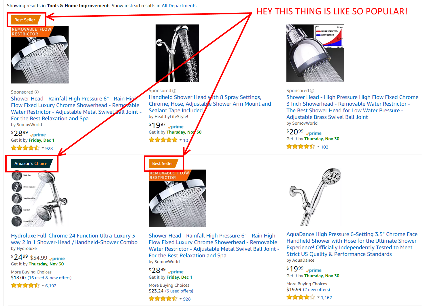
Listing best sellers appeals to those who are looking for suggestions.
You can’t visit a large retailer without seeing a “Best Sellers” or “What’s Trending” section, yet I often see it missing on more niche stores. Many stores will list their products in order of popularity but never get around to actually telling viewers, “Hey! This thing is popular!”
Meanwhile Amazon…
People want to get good stuff, and if everybody else likes it, they probably will to.
10. Keep customers coming back through strategic loyalty programs
We can’t talk about Amazon without talking about Amazon Prime.
Amazon Prime and the two-day shipping that comes with it has redefined what a customer loyalty membership looks like, with an estimated half of all US households having at least one member.
Prime is really just getting started, and I’d expect that in 5 years, the following statement will feel like ancient history, but up to this point, Prime’s massive success has been due to one thing and one thing only.
Amazon Prime solved a gaping consumer need with its two-day shipping.
That’s it. That’s the long and the short of it. People aren’t magically loyal to Amazon. Amazon isn’t necessarily going to have the cheapest option in all scenarios. For a long time, Amazon wasn’t even near the top of the list in terms of customer service.
The simple reality is that people wanted to be able to order online goods and receive them quickly, and Amazon was literally the ONLY place willing to fill that need.
That’s it, and when I look at other eCommerce loyalty programs… nobody seems to get it. Everyone seems to think that loyalty programs are nothing more than discount clubs.
Look at Ebay, for example. This is their “loyalty program”.
eBay offers eBay Bucks, but lacks the incentive that shoppers feel when they pay to play.
Okay, so its a 1% cashback program. Who gives a #$&%?
Sure if I use Ebay already I might signup for it, but it doesn’t make me more inclined to use Ebay. It offers me basically nothing. If I spend $1,000 on your site, I get $10 back. Whoopdeedo.
BestBuy might be worse.
Best Buy offers a loyalty program, but complexity might be working against them.
First of all, its way too complicated. I had to do math in order to figure how little money I’m going to save.
Second of all, there is no compelling offer. Again, it’s basically a cashback program, but where I have to do like 3 equations to figure out I’m going to make barely more than 1% unless I spend $3500 at the store.
Do you want free two-day shipping?
Hell yes.
Done.
Easy.
Amazon Prime: You paid for it. You better use it.
It’s really not that complicated.
What do your customers want? If they are really hyped on discounts, that can be part of it, but discounts and cashback are rarely going to inspire brand or store loyalty by themselves.
It’s also worth noting that paid monthly memberships can encourage use.
Despite having a $99 Prime membership option, Amazon chooses to advertise its $10.99/month plan because monthly payments incentivize Prime members to shop more often than an annual payment plan.
Customers feel more compelled to use products when they are paying for them, especially when they are continuously paying for them. A study on the psychology of consumption conducted by Harvard Business Review showed reminding customers on a monthly basis rather than allowing them to forget a one-time annual payment encourages continual and consistent use of a product, in this case, buying off Amazon.
Clearly, there is an effect that correlates to payment frequency.
Of course, if you are going to make them pay to join, you’ll need to actually meet a need, which takes us back full circle.
Conclusion
Amazon is the king for a reason… for a lot of reasons.
They have focused on the right things time after time after time, and that’s why they continue to expand their lead.
I hope you’ve found this discussion of some of Amazon’s retail conversion strategies helpful. In review, here are the 10 we covered:
Highlight promotions and clearly display the value.
Make reorders stupid easy.
Track user behavior and make relevant suggestions.
Upsell and cross-sell at every opportunity.
Leverage customer reviews as much as possible.
Show limited stock availability to create urgency.
Ship fast and tell them when it’s arriving.
Include images that help customers pre-experience the product.
Leverage product popularity to sell more products
Keep customers coming back through strategic loyalty programs
If you’d like to dive further into optimizing your retail site, grab a free copy of our 110 point optimization checklist.
21 Quick and Easy CRO Copywriting Hacks
Keep these proven copywriting hacks in mind to make your copy convert.
43 Pages with Examples
Assumptive Phrasing
"We" vs. "You"
Pattern Interrupts
The Power of Three
"*" indicates required fields
Co-written by Daniel Ahn and Jacob McMillen
Daniel Ahn is a former technology sales recruiter who works with e-commerce startups to help grow their business. When he’s not writing strategic content pieces, he’s sharing stories about purpose, travel, and growth at readahn.com.
It’s said that a picture is worth a thousand words, but too often, we use them as nothing more than a design element on our sales pages.
When used poorly, images work against us, but when used correctly, they can do things in our customers’ minds that our copywriting cannot. As a Conversion Optimization Agency, we use images all the time for storytelling and persuasion.
In the next 10 minutes, we’re going to look at why images are so important and review 6 case studies that demonstrate how images can make or break our conversion rates.
We’ve also put together a downloadable, best-practice checklist for choosing the right images in 5 key scenarios:
Product images
Hero shot images
Landing page images
Social post images
Content images
These guidelines are compiled from 20 different expert sources. Download the checklist here:
Image Best-Practices Sheet
Guidelines for choosing high-converting images in 5 key scenarios.
Why Images Are Critical To Conversion
As we’ve talked about many times before, direct response copywriting is a key ingredient of breaking down your audience’ mental barriers. But it’s not the only tool in our toolbox.
Images are powerful. VERY powerful. Here’s why:
#1. Our brains process images faster than text
A study by MIT neuroscientists discovered the human brain can identify images seen for as little as 13 milliseconds. In comparison, it takes humans 100 milliseconds to blink.
This means that before you blink once, your brain has processed almost 8 images.
Our brains process images 60,000 times faster than text. What this means practically is that images are actually the first thing people ‘read’ on your landing page.
#2. The brain is predominantly a visual organ
According to the same MIT scientists, 90% of information transmitted to our brain is visual, with the remaining 10% divided between the rest of our senses. Our eyes are our primary way of consuming and understanding information.
By utilizing images correctly in your marketing and sales, you’re playing to the brain’s strength, so to speak. You’ll get your audience to grasp your message faster and in ways you can’t pull off via copy alone.
#3. Most people are visual learners
Research from Pearson Prentice Hall shows that 65% of people are primarily visual learners. They respond more to visual demonstration than auditory explanations or even hands-on, tactile learning.
In practice, this means that failing to visually demonstrate your offer will put you at a disadvantage with 65% of consumers.
Obviously, that’s not ideal. We want every advantage available to us when optimizing our websites and online funnels.
Now that we understand why images and visualization are so important, let’s look at how we can practically make images work for us on our websites.
#1. Using Images To Visualize Benefits Increased Revenue Per Visitor By 17%
One of the best ways to use images in marketing is to help customers visualize the benefits they’ll receive.
What does success look like for them when they choose your product or service? Is there a way to visualize that success with an image?
A great case study of this in action comes from Behave.org. While the original image helped visualized the product, the team wanted to test an image that more clearly visualized the product’s benefit to the consumer.
The decided to test an image of a model before and after adding the brand’s hair extension product.
AB Test in which a before and after approach was tested.
This change was intended to better display the changes (or benefits) the products brings to the wearer, and new image got results.
With a test size of 23,000 visitors, split 50/50 across the old and and new versions, the “before & after” approach increased page click-throughs by 7.93% and more importantly, increased revenue per visitor by 17.61%.
Interestingly, these results only held true for desktop traffic.
On mobile, where the new design was a bit cramped on smaller screens, the simpler original photo performed better, with the new image, decreasing click-throughs by 0.67%, and revenue by 27.69%.
The original image still displays the benefits of the product, and in our analysis, the mobile results suggest that for mobile users, simplicity is superior to other conversion factors.
In other words, take advantage of the added space on desktop and tablet, but prioritize simplicity on smartphones.
#2. A 28% Increase In Product Image Size Resulted In A 63% Conversion Lift
While size and quality aren’t as important as relevance, both qualifications matter when creating images.
Bigger images typically mean greater visibility, deeper emotional connections, and better-looking pages. When it comes to product images specifically, a larger, higher-quality image can provide a significantly superior shopping experience for customers wanting a clearer idea of the product before purchasing.
When Skinner Auctions tested a product image increase of 28%, they boosted page sales by 63%, despite the bigger image pushing the content below the fold as seen below.
Example of AB Test in which larger images increased conversion rate. Source
Of course, bigger isn’t unilaterally bigger. Overly large images can be distracting or harm load speeds. In order to stay on the right side of this equation, follow these recommendations from WordStream:
Resize the image yourself (as opposed to having the browser resize it)
Compress the image in Photoshop, an online compressing tool or even in Paint
Experiment with different image file types (PNG vs. JPG) to optimize quality without sacrificing load times.
Leverage page caching as much as possible.
#3. Adding A Smile Increased Sales By 10%
People are attracted to other smiling people. This law of reality is about as universal as it gets, and it’s been applied to marketing many, many times.
In one simple, five-week split test, Alwin Hoogerdijk of Collectorz.com saw a 1.3% increase in signups and a 9.9% boost in sales when he compared a serious and a smiling face on his landing page.
Version A
Example of an image in which the model is not smiling. Source
Version B
Example of an image in which the model is smiling. Source
Notice his big smile on the winning version?
Neuroscience marketing studies show that smiling makes one look warm, attractive, likeable, and approachable. The same report shows that a smile is a trust booster. People are more likely to trust you and be influenced by you when you’re smiling.
Plus, people are hard wired to follow other people’s gaze as this eye-tracking study shows. Take advantage of this fact and use eyes as visual cues to direct visitor’s eyes to specific areas of your page.
A good illustration of how to use a stare to guide visitors’ eyes comes from this Wordstream optin page.
Example of using eye direction to focus attention in an image. Source
See how she’s focused on the form? This draws the visitors’ eyes to focus on the sign up form as well. You can also use a person’s body as a directional cue not just the eyes.
To boost conversions, give your images a human touch.
#4. Switching From Stock Photos To Real Shots Increased Lead Signups By 45%
Listen, you’ve read this before… undoubtedly. But if you look at your own marketing materials, there is probably a decent chance you are using a few stock photos.
Why?
Because taking quality photos of your team, equipment, business, etc. is somewhat challenging. There are a few hurdles to jump, whereas stock photos are easy, and you probably have a great eye for picking the good ones, right?
The problem is that you are thinking in terms of downside. “This stock photo isn’t THAT bad and surely won’t hurt my conversion rate.”
But when creating a landing page, we shouldn’t be thinking in terms of “not hurting” our conversion rate. We should be thinking in terms of enhancing our conversion rate.
As we discussed earlier, images are incredibly powerful, and your site’s images should be an ASSET to your page, not simply a neutral force. If you are aiming for neutral, you are missing out.
And there’s some good news here.
You don’t need high resolution, professionally produced photos to enhance your page’s conversion rate. Just taking real photos of relevant parts of your business can do wonders.
For example, Harrington Movers improved conversions by 45.45% when they replaced their stock photos with a shot of their crew. They also tested with a shot of their trucks, and saw similar results.
AB test example in which images of real people or a truck worked. Source
Notice that these shots are the type you could take with your smartphone. They key is understanding why these images work. They aren’t design element to enhance your page. They are a way for potential customers to visualize key pieces of your business.
When you are hiring a trucking company, what are the only three points of contact with the business?
The driver
The truck
Customer service in the event of a problem
By choosing images that visualize 2 out of 3 of these contact points, the company was able to help readers visualize the brand’s value.
And while we don’t have the data on this, they’ve since redesigned their site with more real shots of crew and equipment.
This website now uses real pictures, not stock photos.
Images can and should be working FOR your business.
#5. Using The Right Colors Increased Opt-Ins By 132%
Color has a powerful psychological influence on the brain. A journal by Satyendra Singh revealed that people make snap judgements about about both products and people within 90 seconds of their initial interactions, and between 62-90% of that assessment is based on colors alone.
Coca cola knows how to use colors to impact buyers.
Coca Cola knows how to use color to impact buyers. Source
Color has a number of powerful psychological effets.
Alertness, romanticism, vitality… these are central feelings targeted in Coke’s marketing, as further articulate through their taglines, “Open happiness,” “Taste the feeling,” “The Coke side of life.”
The colors are used in conjunction with the copy to create feelings.
And while branding isn’t always directly measurable, we can see evidence of color’s profound impact in more measurable tests.
We sometimes like to make fun of the poorly run tests claiming massive improvements from small changes, but just two years ago, Leadpages saw a green CTA beat a yellow CTA and increase opt-ins by 132.41% when they did the following split test.
The original form with yellow call to action button. Source
This form with a green call to action button performed much better. Source
While colors are powerful, their use is not simplistic. The same color doesn’t have the same emotional effect on every human being every time. A study by Joe Hallock showed different genders favor different colors and even different age groups like different colors!
The central point here is that color matters, and being intentional about the colors you use can have a profound impact on your marketing.
#6. Aligning Images With Copy Boosted Revenue By 108%
Aligning persuasive copy with strategic images makes for the perfect marketing marriage.
Show the benefits. Speak to the pain. Sell the solution.
That’s the strategy SweatBlock took in revamping its homepage and the result was a 108% lift in revenue.
Example of an AB test in which better aligned image and copy improved performance.
While the new version isn’t a massive conceptual departure from the original, it does a better job both in terms of the copy and the image, better aligning the two around the benefits of the product.
Best Practices For 5 Key Scenarios
Now that you understand why images are powerful and how to choose the right ones, it’s time to get one step more practical.
Different scenarios call for different types of images, so we’ve gone through 20 different expert sources to put together a best practice cheat sheet. We cover the following 5 key scenarios:
Product images
Hero shot images
Landing page images
Social post images
Content images
Download the cheat sheet below. Or, want to hand the work off to a team of experts? We have a range of conversion optimization services that can specifically help you optimize images (along with whatever else needs to be optimized!).
Image Best-Practices Sheet
Image Best-Practices Sheet
Guidelines for choosing high-converting images in 5 key scenarios.
Looking for proven ways to optimize your pricing page? I invite you to read these sure-fire 10 tips to increase conversions fast.
“Yes, I’m very interested in purchasing your product, and I just clicked the button taking me to your pricing page.”
What does that mean?
It means the $50 you invested in finding me and getting me to your landing page paid off. It means the $1,500 you invested in creating a high-converting landing page did its job.
Most importantly, it means I’m a very warm prospect evaluating your pricing plans and very likely considering an immediate purchase.
Aaaaaand I’m gone…
Before Diving into the 10 Proven Ways To Immediately Optimize Your Pricing Page
There are a lot of places you can lose someone in your funnel, but the pricing and checkout pages are where it hurts the most. The people who arrive here are the most primed to purchase, and while re-targeting campaigns can help mitigate the damage, ultimately, we want to maximize the rate at which these warm prospects become immediate customers.
In fact, after analyzing 89 successful SaaS startups, one angel investor cited time invested in optimizing the pricing page as the #1 indicator of conversion rate.
Yet unlike checkout pages, the pricing page rarely gets the focus it deserves.
Today, we are going to shine a big fat spotlight on the pricing page and teach you how to optimize your pricing page to create a high-converting edition on the first try.
1. Offer a Money-Back Guarantee or a Free Trial
One of the biggest friction points that prevents prospective buyers from purchasing is trust. This type of doubt can be multifaceted and is often referred to as FUD (fears, uncertainties, and doubts). It can be expressed as questions like:
What if I don’t like it?
What if it’s difficult to learn?
What if it isn’t suitable for my purposes?
What if I pick the wrong pricing plan?
Can I trust this brand to deliver on their promises?
Can I trust that my transaction will be secure?
Can I trust that my investment won’t be a waste?
One of the easiest ways to alleviate these trust-based fears is to offer a money-back guarantee or a free trial. These types of offers make the customer feel like their risk is significantly reduced, and their actions follow suit.
Ways to optimize your pricing page: add a money back guarantee.
Marketer Neil Patel ran a number of different pricing page offers and found that adding a money-back guarantee increased sales by 21% and total revenue by 6.4%. Adding a free trial performed even better, doubling signups and resulting in 15% additional revenue.
Of course, it’s possible that a company could promise a refund and then fail to deliver, but this type of behavior is much more easily sniffed out via due diligence, and most consumers generally tend to trust that if a company promises a refund, they will deliver.
If your brand is not well known in your industry, you will have to break through some trust issues. Trust symbols give your visitors a visual signal that your site is safe and that your business is legitimate.
Some examples of trust symbols are:
2. Display Transaction Security Badges
While money back guarantees and free trials make the customer feel less at risk from the company, that’s not the only point of concern.
The Nilson Report estimated that last year total credit card fraud worldwide topped $24.71 billion and Experian reported that e-commerce alone saw a 33% spike in credit card fraud. This upward trend has buyers extra cautious when it comes to doing business online and has forced sites to put in extra effort to alleviate security concerns.
As a result, displaying security badges can give potential customers confidence that the checkout process will be safe and secure. A study done by Atcore, a Danish digital marketing agency, found that adding trust symbols to their ecommerce site improved conversions 32%.
Not all security badges are create equal, however. A survey performed by the Baymard Institute found that Norton led the pack in customer recognition and feelings of safety when it comes to paying online.
Norton leads the pack.
3. Display Social Proof
In many ways, the same things that enhance your landing pages will optimize your pricing page as well. Just like social proof can help motivate that first click, it can also motivate each subsequent click throughout your conversion funnel.
This continues on that thread of building trust. 88% of consumers trust online reviews as much as a personal recommendation. When you include things like testimonials, reviews, and other forms of social proof, it’s like having a friend sitting next to your prospect and saying stuff like, “Oh yeah, this is what you’re looking for,” and “This is totally going to solve that problem you’ve been having,” at every step of the conversion journey.
Leadpages’s pricing page offers a solid look at this principle in action. Their page displays real customer reviews that highlight different pain points their potential customers might be experiencing such as pricing concerns, product effectiveness, and conversion rates.
Pricing page with social proof from Leadpages.
GetResponse’s pricing page does a great job of weaving in several different forms of social proof, including influencer testimonials, brands of well-known customers, and the total number of users.
10 ways to optimize your pricing page.
Conversion Sciences has already covered social proof thoroughly in their landing page best practices, so I won’t belabor the point, but suffice it to say that what improves conversions on your landing pages will often improve conversions on your pricing page as well, and for many of the same reasons.
A study performed by ConversionXL found that when you place the more expensive options on the left, participants tended to spend more time analyzing the features and benefits of the leftmost plan and less time doing so on the rightmost plan. The results showed a 6% increase in conversions when the most expensive plan was leftmost and a 10% increase when the second most expensive option was placed first.
10% increase when the second most expensive option was placed first.
5. Highlight a “Recommended” Option
Suggesting a price point that satisfies the bulk of your visitors can boost conversions by helping reduce the paradox of choice.
A study performed on pricing preference versus layout designs for the site Surveygizmo concluded that site visitors focus more quickly and longer on a highlighted plan. The research also found that in a scenario where the most expensive plan was ordered first, and the recommended plan was highlighted in the second position that the recommended plan (shown below as the Pro plan) was chosen more often than in any other scenario.
Highlight a Recommended Option
To make the most out of this strategy, make sure that your recommended plan offers a superior value-to-cost ratio over lesser plans. It should entice people who would prefer to pay for the lesser plan to purchase it because it is such an obviously better value.
6. Utilize Charm Pricing
“Charm pricing” is pricing that ends in digits that are non-zero such as 9, 7, or 5.
An analysis of price point and product being sold on Gumroad’s massive creator marketplace discovered that charm pricing resulted in considerably higher conversion rates for the exact same product.
Utilize charm pricing to increase pricing page conversions.
From a psychological point of view, Gumroad’s team theorizes that since we read left to right, we tend to process the first number in a price and tend to block out the rest of the price. They also mention studies that correlate charm pricing with consumers believing they are receiving a discount.
Simply put, charm pricing is a fairly universal practice for a reason, and if you’d decided to buck the trend and just be “straightforward”, you might want to reconsider.
7. Write Strategic Pricing Plan Names
How much time did you spend thinking about the names for your pricing plans?
The main goal of a pricing plan name is to help communicate who its intended for and make the customer who selects it feel like they are making the right choice. You want customers to instantly know which plan is designed for them.
There are upsides and downsides to choosing standard names versus more original and fun names, but one way to have the best of both worlds is to use more standard, descriptive names while incorporating fun illustrations that highlight your business’ personality.
Mailchimp shows us a decent example of this in action below.
Mailchimp pricing plan names.
8. Write less and use more white space
In everything you do online, simplicity and clarity should be your core values. Visually complex websites don’t perform well in most cases. In order to help users process the info on our page, we want LESS clutter. Less text. Less options. Less distracting design features. The only thing we want more of is white space.
The following should be our target in most cases:
Minimal text that is benefit driven
Bullet points to focus attention and allow for scanning
An above-the-fold design highlighting important points and CTA’s
A layout that makes it easy to compare options
Grasshopper offers a great example of our target design aesthetic. It’s simple, clean, clear, and allows readers to quickly process the presented information without feeling confused or overwhelmed.
Pricing page design tips.
Another great example comes from Typeform. Rather than coming off sales-y, their pricing page comes off as helpful with useful one-liners describing their plans such as “Get to know Typeform,” “More power & personalization,” and “Advanced features for brands.” Each plan builds upon the last, the layout makes it easy to compare, and the entire presentation is simple and visually appealing.
Design ideas for pricing pages.
9. Offer fewer options to reduce analysis paralysis
There was a fairly famous study done on the detrimental effect more choices can have. The study was conducted by a pair of Columbia and Stanford University professors on the subject of jam. This research duo concluded that people purchased more jam when fewer options were made available to them. In fact, conversions shot up 10x when choices of jam offered to shoppers were reduced from 26 varieties to only 6.
Offer fewer options to reduce analysis paralysis.
The same dynamic has been seen in a number of pricing page studies, and it’s one of the reasons you rarely see more than 4 options being presented on a pricing page. Some companies have even taken this element to the extreme with great success. MeetEdgar, for example, has offered only one plan on their journey to $4 million ARR.
Test pricing page designs.
The sweet spot for most business seems to be 3 pricing options, but like everything, you’ll need to test in order to know what works best for your unique business.
10. For international audiences, provide automatic currency conversion
The internet has expanded the once limited reach of local business owners to encompass the entire global market. As such, you are likely missing out on some key conversions if you aren’t offering some sort of exchange rate calculator or alternative pricing page design for other countries.
Take this survey performed by Y Combinator into consideration. They asked, “Would you buy a service that bills only in € (euros)?
72 people said “€ is OK”
65 people said “€ is OK but I would really prefer $ if possible”
19 people said “€ is not OK at all”
6 people said “I would not buy in $, but only in €”
Out of 159 possible votes, 84 (roughly 53%) would rather pay in dollars instead of Euros. If your audience deals in more than one currency, adding those options to your pricing page can enhance your conversion rate.
A great example of this in action comes from Australian company Quad Lock which lets users select from 6 different countries/unions and will change the site’s currency to match.
Automatic currency conversion for international websites.
Summary: 10 Proven Ways To Immediately Optimize Your Pricing Page
If you have a pricing page, it’s a core piece of your conversion funnel.
Today, we’ve highlight some ways to immediately optimize this page, but at the end of the day, there no such thing as a perfect pricing page. Some of these tips may work for your business and some may not. The most important thing to remember is to test early and test often.
We would love to get your feedback as well, what changes have you made to boost conversions on your pricing page? Tell us in the comments below.
21 Quick and Easy CRO Copywriting Hacks
Keep these proven copywriting hacks in mind to make your copy convert.
Discover the 7 components of an optimized bio with 7 high-converting author byline examples to show you exactly what to aim for.
Creating quality content is challenging.
You have to find a unique angle on an often well-covered topic. You have to research data to back it up. You have to create a compelling headline. You have to create curiosity in the opening, polish your grammar, get the tone right, yada yada … all this while fitting the piece into your brand’s or client’s overall content marketing strategy.
With all that work, it’s important that you are getting maximum value out of your content, whether it’s published on your website or a 3rd party publication.
One incredibly easy yet often overlooked way to increase the value of your content is to optimize your author bio.
There is actually quite a bit of value you can derive from your bio, and yet most marketers and writers simply throw something together and never think about it again. Such a waste!
Today, I’m going to highlight the 7 components of an optimized bio, with 7 high-converting bio and byline examples to show you exactly what to aim for.
Before we begin, let’s cover the basics.
How To Write An Author Bio and Byline Examples
A byline is a short paragraph that tells readers a little bit about the author and how to contact the author or read additional content by the author.
In most online content, the author bio can be seen at the end of the article.
As a general rule, you want to keep your bio to 2-3 sentences or 40-60 words. This gives you enough room to include the 7 components we’ll talk about today without creating a wall of text that scares off readers.
An author bio is sometimes confused with an author byline which is technically not the same thing.
An author byline is a line at the top of an article that names the author, usually lists the date, and occasionally includes additional information
Author byline example on Fast Company article by Aaron Orendorff.
Author bios and bylines have become much less distinct in the internet age, and on many websites, the two will be merged in some form or other. But in most cases, you will have the ability to create a distinct 2-3 sentence bio for yourself that shows up at the end of any article you write.
So let’s talk optimization. The following 7 components will help turn your author bios into legitimate lead generators for your business.
STEP #1: Say who you are and what you do
People who consume your content have got three big questions:
Who are you?
What do you do?
Why should I care?
Your bio should answer all three.
Nail them and they’ll be keen to find out more about you — and gladly follow you into the kingdom of your products and services. Most bios don’t address these essential queries. Some do but in a dry matter-of-fact-Wikipedia way. Think of your bio as an elevator pitch in two or three sentences.
She sums up who she is, what she does and who she does it for using an engaging style. Crucially, she tells readers the benefits of doing business with her. Because there’s something in it for them, her readers would want to check her out.
STEP #2: Establish your authority in the space
Authority is the tipping point of winning a hesitant prospect over or boosting your trust with clients.
Becoming a trusted voice in your space draws more prospects and causes your clients to stay with you longer. That’s why influencer marketing is the rage right now. Use your byline to underline your authority. Prove you’re worthy of a prospect’s business.
Here’s a great example from Ann Handley.
Author bio Ann Handley, Get Response blog.
Pixel after pixel, Ann proves her authority… Wall Street best seller, CCO, Entrepreneur columnist, keynote speaker. You may not have her star credentials but there’s always something to share.
Your vast experience maybe? An industry award? Or a mention by a notable publication?
Whatever it is, slip it in. Impress clients before you say a word. However, don’t shamelessly brag about everything you’ve ever done as Sammy Blindell points out in this post:
“Brand, don’t brag. It’s easy to compose a list of all your accomplishments — and it’s also a mistake. Use only those achievements that your ideal customers will see as beneficial to them, because this is about THEM. If you recently completed some extensive training in recognizing dog aggression, your financial planning audience isn’t going to care. In fact, they’ll probably turn away from your brand. However, if you were a keynote speaker and advisor for the annual International Financial Advisory Convention, that matters.”
Amen to that Sammy.
STEP #3: Include an image with some personality
I’m amazed how many content marketers miss the importance of a photo on social media profiles. It’s SOCIAL media for goodness sake — how can you socialize behind a silhouette? That’s like showing up at a party in a hood.
The same applies to your content marketing, and yet many marketers use a photo that either looks like a mugshot or a shot where the cameraman said, “Say ‘professionalism'”. Ugh!
Want to boost your brand’s perceived competence, likeability and influence? Use a professional shot with some personality!
A great example comes from John Nemo.
John Nemo’s bio. Author of LinkedIn riches. Source
John’s shot exudes confidence, warmth and authority. Prospects are more likely to connect with him. And, oh, please smile. It makes you more likeable. To improve the quality of your photo use editing tools like Pixlr and Fotor.
And then put your best face forward so people fall in love with you and your brand.
STEP #4: Inject your personality into the bio copy as well
When you really think about it, you and your competitors sell similar products.
The differentiator? Your unique personality. Personality, an aspect of authenticity, leads to higher ROI and appeal. Sadly, when people write business copy, they insist on sounding business like — whatever that means.
As a result, ho-hum bios abound.
People do business with people. So you better sound like a human. You’ll bond better with your audience and win more business. Jorden Roper reveals a glimpse of her personality very well.
Author bio of Jorden Roper from Clearvoice.
Jorden isn’t just a freelancer. She’s a fuschia-haired one that frolics with Chihuahuas. I have an inkling that, like her Chihuahuas, she’s:
Bold. Lively. Devoted.
In one fell swoop she humanizes and brands herself by talking about her pets. Let your hair down. Flee from high sounding nothing aka corporate speak squeak.
Be yourself. Be human. Be relatable.
Then more people will desire to learn more about you and your products.
STEP #5: Include a lead magnet in your byline
Your conversion goal for your piece should extend to your byline. For better conversions, your offer should be related to the subject of your piece or at least relevant to the topic.
Discussed pitching? Offer readers a pitch template.
Enumerated on the benefits of content creation and management software? Offer readers a demo.
Talked about the health benefits of sex? Offer them hands-on private coaching sessions at the nearest hotel. Nah, bad idea. But I’m sure you get the hang of it.
Your bio is a great opportunity to attract direct leads from your reader base.
Here’s a great example from Beth Heyden.
Byline example Beth Hayden from Be a Better Blogger blog.
What the byline doesn’t show is how the offer is an extension of her piece. Here’s a snippet of one of her main points.
Excerpt from Be a Better Blogger post by Beth Hayden. Source
Her offer? A free report entitled ‘The Ultimate Guide to Creating a Warm Welcome Message.’ You’d almost feel dumb not to sign up for it since the report completes the piece. This way, her conversions are likely to soar.
Note the singularity of her offer. Countless content strategists overload their bylines with links which overwhelms readers and tanks conversions. Plus, by making one uncontested offer, eyeballs are instantly drawn to it.
STEP #6: Follow up your bio link with a landing page
Capitalize on the heavy lifting done by your content by linking to a landing page not your homepage.
People who read all the way down your content are potential red-hot prospects or brand loyalists in the making.
Don’t let their enthusiasm go poof — into cyberspace oblivion, without harnessing it. Reward them with something special, on a special page tailor-made for them.
Give them something cool and useful like:
A super-relevant lead magnet
A discount on your latest product
A free beta version of your product
A slot to win a prize in your competition
See how Jacob McMillen does it below. This byline example on a guest post:
Jacob McMillan author bio on the CrazyEgg blog.
Takes you straight to this landing page:
Landing page from Jacob McMillan author byline. Source
Notice how his CTA, the last words on his bio, are the first words on the landing page? This way the byline is perfectly coupled to the landing page thus increasing conversions. When a reader clicks his bio and lands on the landing page, she smoothly continues her conversion journey.
Harmony wins the day.
Step #7: Be very specific in everything you say
Your bio offers you a chance to position your brand favorably.
Be clear about what exactly you do. You’ll generate more interest, attract higher quality leads and close more sales.
Next time I see a byline that reads ‘Andy Awesome is a marketer who resides at…’ I’ll organize an online march against dud bios. Dude, you ain’t saying nothing. They’re 271 bajillion marketers out there. Add a descriptive to specify what you do.
Only then will you stand a fighting chance of being heard above the me-too roar.
Lianna Patch stars in this regard.
Lilanna Patch author bio and byline example from Copyhackers. Source
Need help with email and landing pages? Then Lianna’s your girl. Her copy makes that crystal clear.
Brand yourself precisely. You’ll see an uptick in the number of prospects who approach you.
Finally, use your bio to boost your rankings for your target pages as Jacob McMillen explains:
“Bylines are a great place to link to a primary service page you are hoping to rank in search. It can be really challenging to rank service pages over blog posts, but including a back link to my main service page in every byline is one of the biggest reasons it’s ranking front page for 40+ key phrases.”
Conclusion: Get Every Ounce of Juice From Your Author Byline
Here’s the heart of the matter:
Your bio is an intricate part of your marketing and branding.
It’s a tiny hinge that swings huge marketing doors — a gateway to your world. So value it and craft it with care. Stretch all your investment in PPC and FB ads, SEO, outsourced content, site design and more to its fullest potential.
Returning customers are worth more than you think. So, here are 4 easy to implement ways to increase customer retention and customer retention rates.
If you’ve listened to any of the top conversion experts lately, you’ve likely noticed them distancing themselves from the word “conversion”.
While the goal of “conversion optimizers” is ultimately to increase revenue, the term is often misinterpreted in a market where acquisition receives an unhealthy level of focus.
Today, we want to spend a little time talking about something that is as important to optimization as the rate at which you acquire new customers.
Customer retention.
You probably already know the statistics. Acquiring a new customer is 5 to 25 times more costly than retaining an existing one. A joint study by YotPo and Riskified shows that while returning customers make up only 15% of all the shopping online, they account for a third of all online shopping revenue and spend 3x more than one-time shoppers.
And yet the focus on customer acquisition remains strong.
We get it. We spend the majority of our time talking about acquisition here at Conversion Sciences, but it’s important to remember that converting 50% of our visitors isn’t worth a whole lot if we can’t retain any of them.
4 Ways to Increase Customer Retention and Customer Retention Rates
You can’t have growth without retention, so today, we’re going to be discussing 4 straightforward ways to improve your own customer retention.
#1. Focus on Value over Loyalty to Retain Customers
First things first.
There’s a lot of talk in the retention space about creating “loyal” customers. Everyone wants loyalty, and many businesses mistakenly believe that if customers are members of a loyalty program, they are in fact “retained”. But as Taddy Hall notes, many people participate in loyalty programs simply for the chance of occasional savings and are part of the competitors’ loyalty programs as well. In other words, they are presumably “retained” by “four or five competitors in the same industry”.
Data from COLLOQUY, a provider of loyalty marketing research, shows that although the average American family holds membership in 29 loyalty programs, they are only active in 12 of them. In other words, only one third of the loyalty programs actually translate to customer retention.
If this sounds an alarm in your minds… good. It should!
Creating a membership program and slapping the word “loyalty”on it is in no way an automatic means to increasing customer retention rates. Frankly, loyalty isn’t even what we should be aiming for.
Ultimately, value is what creates loyalty, and by extension, value is what we should focus our efforts on creating. When you offer more value than your competitors, loyalty is a natural byproduct.
So, How do we Define Customer Value?
That’s an insanely cliche word – “value” – so let’s wrap some meat around it. As Katrina Lerman writes for AdAge “we are loyal to the companies and retailers who show us they understand us through the products they offer and the customer experiences they create.”
Let’s say I have an app called Imgur that I use to scroll through interesting images and visual resources and occasionally favorite them. Now let’s say that myself and about 50,000 of my online friends have been clamoring for Imgur to add a particular feature we want – for example, the ability to add folders to our collection of favorites so we can sort them by category for easy reference.
Imgur could do one of two things:
Add value to their app by creating a feature a large segment of the community has been persistently asking for over the last few years
Or redesign the interface for the 3rd time this year.
One adds real, tangible value. One doesn’t.
I put this way to improve customer retention as #1 for a reason. When you approach customer retention through the lens of loyalty, you end up in weird places. But if you approach it through the lens of adding more value, you are targeting a goal that consistently results in increased retention.
(sarah plz)
#2. Show up… with humans.
We are living in the age of automation, and that means that more than ever, there is a premium on human interaction.
The first one, believe it or not is that they answered the phone. ((That’s right, people answering the phone!))
You would think that this would be obvious right? But I think there are so many people, that in their heads they’re already this billion dollar business and, “Hey man, answering the phone doesn’t scale, so we’re trying to make it so that nobody can contact us. You just use our online forms.”
But because of this, at music conferences they would overhear one musician telling another, especially in the early days when not a lot of people had heard of CD Baby yet, “Oh you’re not on CD Baby yet. Dude, CD Baby is awesome. You know what? They answer the phone. You can call them and they answer and you can talk to a real person!”
They’re like, “No way!”
“Yeah way! Amazon won’t do that.”
And they weren’t talking about their cool graphic design, or their fancy CSS Stylesheets on their website. No. None of the other stuff mattered.
They answered the phone. And that was enough to get his friend to sign up.
The other humanizing example, was a geeky little thing they did one day. It only took two lines of computer code to intercept outgoing emails and put the person’s first name into the from header, not just the to header. So, if an email was going to Sarah, for example, it would say the email was from CD Baby loves Sarah.
But people loved it and then they would forward it to friends, and friends would tell friends, and friends would come and buy CDs from them. Just because a humanizing touch.
They had a policy that “changes need pizza.” The reason for this is because every time a new album came into the store, it would take about 45 minutes of work to lay it on the scanner, scan the album art, photoshop it, drop the CD into the bin, rip it fully and then take the little clips, and do all the stuff, and fix their bio.
And every now and then, somebody would contact them two weeks later and say, “Uhhhh, can I change my choice? I want to send you a different album art cover, or I want to change the way my tracks are done.”
And they would say, “Alright no problem, just send us a pizza.”
And they would reply, “What?”
“Yeah. Look we’re happy to do it, but it’s kind of a pain in the ass. We’re going to have to go out to the warehouse and find your CD. If you don’t mind, just send us a pizza and we’re happy to do it.”
And they’d say, “You’re serious.”
“Yeah, serious. Here’s the phone number of the local pizzeria, they know us, just tell them you want to buy CD Baby a pizza. They already know our favourite pizza, so you just call them up with your credit card, say I want to get CD Baby a pizza. The pizza shows up, we’ll do anything you want.”
The real point was, this is humanizing. I think too many of us start businesses and you want it to look big, and you start to say things on your website, like “we” instead of “I”. Even though it is just you. We try to do these things to make it look corporate. But when you do these things to humanize it and remind people that it’s just a real person back here — we’re just real people with a lot of work, so get us a pizza, we’ll do it — People love that.
“Oh my god dude, you have to sign up to CD Baby.”
“Why?”
“Dude, they changed my album because I sent them a pizza.”
“No way.”
“Yeah, way. You gotta sign up.”
On one occasion, a customer asked for a plastic squid. When the customer saw a real plastic squid in the package of his order, he went nuts and posted this video on Youtube.
Showing up for your customers is one of the most powerful ways to build retention.
#3. Take customer service seriously.
Speaking of showing up, customer service is the hallmark of customer retention. This can never be emphasized enough. According to Customers that Stick, 82% of consumers in the US said that they stopped doing business with a company due to poor customer experience.
Many businesses tend to focus on attitude and personality when training for customer service. They think friendliness is the defining factor when it comes to a great customer service experience.
On some level this is true, as can be seen from the above statistics, but there’s another piece you can’t forget. Competence and problem solving skills are often more instrumental to the customer leaving satisfied than simple demeanor.
As Fast Company co-founder Bill Taylor explains, you should focus on hiring people with good attitudes and then focus your training on equipping them to deliver a high level of service to customers.
“Now that’s an effective prescription for innovation! Over the years, as I’ve studied high-impact organizations that are changing the game in their fields, they’ve adopted a range of strategies and business models. But they all agree on one core “people” proposition: They hire for attitude and train for skill. They believe that one of the biggest challenges they face is to fill their ranks with executives and front-line employees whose personal values are in sync with the values that make the organization tick. As a result, they believe that character counts for more than credentials.”
A lot of businesses hire cheerful staff and then just throw them into the ring with only skeleton training. If you want top level customer service, you don’t just need top quality people. You need top quality people who have received top quality training.
#4. Go deeper than explicit complaints and requests.
Providing quality customer service is the baseline rather than the goal. According to “Understanding Customers” by Ruby Newell-Legner (accessed from Helpscout), a typical business hears only from 4% of its dissatisfied customers. If you want to fully understand what your customers want, you’ll need to dive deeper than provided feedback.
As Carmine Gallo discusses, brands that can anticipate a customer’s needs and meet them without needing to be asked are often the ones that garner customer loyalty. To illustrate, he shares a personal anecdote from a family vacation:
I recently brought my family to a 5-Star San Diego resort, The Grand Del Mar, named the #1 hotel in the United States by Trip Advisor. It sits on a beautiful property in the hills, but there are plenty of gorgeous locations in San Diego. It’s the “attentive” service that Trip Advisor featured in its review and has earned my loyalty. But exactly what does the staff do that sets them apart and, more important, what can all businesses learn from their customer service techniques? The Grand Del Mar’s customer service ‘secret’ became very clear to me on this recent visit—the staff finds small ways to unexpectedly delight their customers and they do so by anticipating unexpressed wishes. Here are just a few of many examples I noted:
– My daughters discovered a small sand area near the pool. Within seconds—not minutes—a staff member casually walked by and, without saying a word, dropped off sand toys for the kids. The kids looked up and there they were, seemingly out of nowhere.
– The valet brought up our car and asked where we were heading. “Legoland,” the kids shouted! By the time I had finished loading the trunk, the valet had placed four water bottles in the car. “It’s hot today. You’ll need these,” he said.
– Vanessa and I decided to treat ourselves to a special occasion dinner in the hotel’s premium restaurant. The hotel offered an inviting play area for children, called The Explorers Club. The dinner was running a bit longer than the kids club would remain open and the restaurant’s location was a 5-minute walk back to the main hotel. “I noticed that you had courtesy cars at the lobby. Can we request one to pick us up as soon as we’re finished?” I asked the waiter. “It’s already been done. The car is waiting,” he responded. “And we informed the club that you’re on your way.
At the end of our stay, the hotel desk employee asked if we had our boarding passes and if we needed directions. I asked the person why everyone seems to anticipate the needs of a guest. “It makes us stand out,” he said. The employee was exactly right. The reason why this level of service leaves a positive impression—and why you, as a leader, must coach to it—is because it happens so infrequently that customers will pay a premium for it. I’ve studied the best brands in the area of customer service and all of them train employees to anticipate unexpressed wishes. It’s a key component to an exceptional customer experience.
Conclusion: 4 Straightforward Ways To Increase Customer Retention
Remember that retention isn’t a step. It’s a lens. If you aren’t building your acquisition and optimization strategies through the lens of costumer retention, any retention efforts you make will be superficial at best.
Provide value. Show up with some humanity. Take customer service seriously. And go deeper than initial feedback.
21 Quick and Easy CRO Copywriting Hacks
Keep these proven copywriting hacks in mind to make your copy convert.
Brian Massey, the Conversion Scientist shares what are user personas and how to create them. He also unveils the reason your visitors are ignoring you as illustrated by Brad Pitt.
Your visitors are ignoring you because you are not talking to them.
Do you know who you are selling to?
Do you really know?
Lately, there has been a pretty intense debate over the importance of user personas, with many in the CRO community saying they are misleading or even unimportant.
In my experience, user personas can be incredibly powerful, but only when they are used in the correct manner.
A user persona is a way to summarize and communicate everything you know about a specific customer segment in a way that allows you to make good design and copy decisions.
Personas are built from market research, directly observed data, and behavioral data. A persona will typically be depicted as a fictional individual who is described like a real person in an attempt to communicate the essence of the segment they represent.
Segments, on the other hand, are more frequently defined by their demographics: their age, income, gender, and geographic location. This is of little value when you want to create messages and experiences that persuade and convert.
When we can turn an intangible customer segment into something tangible, like a person, our team will tie our marketing and optimization efforts together to hit the mark.
The writers write for the same person. The design team designs for the same person. Fewer choices are made based on their personal preferences.
User personas are often presented as a one-page document, but it’s important to understand that like the fictional person embodying the persona, the document itself really doesn’t matter. What matters is our understanding of the segment.
User personas help the entire team work toward a similar goal and deliver a uniform user experience.
So why are user personas popular in the first place? What are the benefits?
Help us identify and understand their problem
Help us identify and understand their behavior
Help us use the right messaging
Help us increase customer lifetime value (LTV)
User personas are primarily about understanding them during a visit to your website or mobile app.
We aren’t trying to understand them as a person. We want to understand them in the context of their visit to our site.
If we have a better picture of the challenges our prospects are dealing with and the pain they are experiencing, we can better inform, educate, and direct their attention to your brand’s solutions.
User personas are also about identifying and understanding behavior. As you collect data on your target audience and start segmenting it into groups, you begin to develop a better understanding of how and where each segment spends its time online.
This understanding allows for better targeting of marketing efforts like ads or content, and allows you to run significantly more efficient and effective marketing campaigns.
Speaking to a segment we aren’t a part of is challenging… if not impossible. We see missteps online every week, where “out of touch” agencies create ads that serve to actually alienate the group of users they’re trying to reach.
User personas help us speak the language that will resonate with the segments we are after, or to sometimes, hire copywriters from those segments who can create the right messaging when we can’t.
Finally, personas can hep us set up our expectations of and strategies for LTV. Defining user personas helps us better understand how to increase LTV for certain segments, but it also helps us identify which segments will tend to naturally have a higher LTV.
That all seems pretty great, so where do businesses go wrong with user personas?
The Brad Pitt Shuffle: How User Personas Save Us
The Brad Pitt Shuffle: we’d all like to think that our target market is pretty sexy. It’s good looking, it has money, it has style.
If you’d like to keep up this charade because it makes you feel better, by all means. But if you’re ready to figure out why your marketing campaign isn’t working, it’s time to remove yourself from this little dance and turn yourself into the Digital Dr. Frankenstein you really are.
Use all of the resources you have at your disposal to create the ideal fake customer – those archetypical users. You’ll realize that you can target users with your campaign in a way you didn’t think possible. Listen to Brian’s keynote summary to get an idea of what we mean.
When we design for everyone, we design for nobody. As we craft our copy and our ux design, we start off laser focused with targeted, effective messages. Then, our message becomes less specific, less targeted, less about anyone in particular.
Here’s how it happens.
When a business starts thinking user personas, they have an ideal customer in mind. I like to call this persona their Brad Pitt.
We imagine our visitors as perfect, like Brad Pitt.
Brad is attractive. He’s young. He’s got lots of money. He’s going to come to our website and buy! We love this guy!
So we begin targeting Brad with our messaging.
“Because handsome is a choice.”
We hope our messaging will speak to our ideal customer segment.
“I can choose handsome by buying your clothes!”
But then something happens. The writers ask, “Are we ignoring females?” Based on the persona, the answer is, “Yes.” But the sales manager begins to think about women giving gifts.
Strong positions get watered down when we don’t follow our personas.
Then the designer says, “All of our images are of warm places. Won’t some of our customers live in colder places?” The guidance of our persona says our products won’t appeal to cold weather.
But the Marketing Manager thinks, “People could be going to warmer places. Go ahead and design both for those living in the cold and those living in warm places.”
Our imagery gets diluted.
What if we want to speak specifically to a segment in a warmer climate?
The picture we keep in our heads of our buyers becomes muddled.
Basically, the target persona keeps expanding, and businesses keep attempting to try and speak to everyone at once, resulting in the mess you see above.
This is the big mistake.
Businesses are still trying to find Brad instead of realizing that there is no single Brad. There are multiple Brads.
Segmentation Is The Key To Successful User Personas
Just like the roles Brad plays, user persona Brad isn’t one person. Our job is to break this persona down into segments – aka real user personas – and market to each individually.
Is your website is designed for one mashup customer segment that doesn’t exist at all?
User Personas vs. Buyer Personas
Personas are a common part of most mature web design processes. However, “buyer personas” seek to understand prospects as they are.
User personas seek to understand a visitor to a website. They are personas addressing a specific time in a prospect’s life.
Here’s why this is important. The same person will come to your website with different personalities.
Take Jennifer, for example, a persona for a plumbing company. She is 35 years old and is remodeling her bathroom. She is in a high-income bracket and prefers modern design for her home. She works part time teaching painting at the local community college. She likes wine, live music and art galleries.
When researching plumbers for her remodel, she will be very methodical. She’ll want to understand the plumbing companies past successes, professionalism and their insurance coverage. She’ll want to know if they’ve done work for any of her neighbors. She’ll want to know if they work with the tile she ordered.
Now, take the same woman, Jennifer. She’s 35 years old and her sink is leaking, threatening her new wood floors. When researching plumbers to save her investment, she only needs to know two things: how quick can they come and what is their number.
Same buyer. Two user personas. Two very different design approaches.
Two different scenarios for the same buyer.
In my opinion, buyer personas don’t provide enough information for me to design a persuasive online experience. We all have our own interpretations of them. User personas are designed to limit interpretation.
Here’s a story that illustrates that.
A copywriter is reviewing a buyer persona and reads that this visitor makes $175,000 per year. “Wow,” she thinks. “That is almost three times my salary.” She writes copy for a person that lives in a large house with an immaculate lawn, and drives an expensive car.
The executive who will be reviewing her work also reads the same persona. “Hmmm”, he thinks. “How can anyone own a home if they only make $175,000 per year?”
When the executive got the copywriter’s work, he rewrote it completely because he felt the copy was talking “above” the target buyers. The result did not persuade visitors to convert.
If we focus on some key components of the user persona, we can avoid these mistakes.
The Key Components of a User Persona
The user personas we use at Conversion Sciences are taken from the book Waiting for Your Cat to Bark? and Buyer Legends by Bryan and Jeffrey Eisenberg. These are the personas that will help us design high converting websites.
Here are the components of our user personas.
1. Demographics
Just a little, and only things that will influence messaging and persuasion. We like to include a name and a picture.
2. Description
The basics of what she does and her situation. Save the details for the Customer Commentary.
User Persona Part One: Basic description and demographics.
3. Mode of Persuasion
What mode of research is this user visiting us in? Waiting for Your Cat to Bark? provides four Modes of Persuasion that define how you should message this user persona.
How to layout a webpage for different modes of persuasion.
Methodical: Will make decisions logically and deliberately on her visits. Needs the details, plans, and fine print.
Spontaneous: Will make decisions emotionally and quickly on his visits. Just needs a reason to act.
Competitive: Will make decisions logically and quickly on his visits. Likes to know what’s in it for him.
Humanist: Will make decisions emotionally and deliberately. Wants to know how she will feel if she takes action.
Here’s an example of the Methodical Mode of Persuasion.
Example of the Methodical Mode of Persuasion
4. Customer Commentary
When I write a customer commentary for one of our clients, they often want to put it right on the website. It is written from the perspective of the user persona, and really builds empathy for the segment.
Note that Buyer Legends recommends writing in third-person.
Example Customer Commentary
Our business runs on relationships, and there’s no better time to build relationships than at our annual “Meitex Meetup”. This is when our employees get to build relationships with partners and customers that will influence the business for the remainder of the year.
This is an important event and my company expects perfection. If I don’t have to twist arms and pull teeth to get that perfection, then all the better.
We are planning a conference, but what we want is an experience. We want our customers and partners to remember the experience, but we don’t want an environment that makes it difficult to talk and build relationships. We’re not considering Disneyland. I intend to provide a structured, professional and comfortable meeting environment with a few planned surprises, and NO unexpected surprises.
Here’s what it will look like:
Customer commentary example.
5. Driving Points
This lists the things that made this user persona visit our website today. It can be anything:
A tip from a friend
A ad click
A search
Direct mail
TV Ad
Email
6. Funnel Points
Where will the visitor land on your website. Typically, this will be the home page, a landing page or blog content page.
7. Points of Resolution
This is where your copywriter and designer will spend their time. It lists the things that this user persona must uncover before she will take action. These are the things that must be on the site for you to persuade them.
As you might guess, this list is longer for the deliberate visitors: Methodicals and Humanists.
For our Methodical Penny Planner, it looks like this:
Example points of resolution for our methodical user persona.
8. Conversion Beacons
How will you call this visitor to take action. Your calls to action will often be content that addresses the above points of resolution.
Map your offers and calls to action, which are called Conversion Beacons.
9. Current Baseline Metrics
It’s often helpful to summarize the current performance of your campaigns and website for this user persona. You can use this to measure the progress you make after you begin to optimize based on your work.
Baseline metrics and recommendations can be drawn from this kind of user persona.
10. Get All This in One Document
Are you Methodical or Humanist
If you are reading this as one of our deliberate decision makers, you just might take advantage of our offer below. If you are a quick decision maker (Spontaneous or Competitive) you probably hate all of this work. You want to get started!
That’s OK. This article is for our Methodicals and Humanists. We have plenty for the rest of you.
Find out how entrepreneurs test marketing ideas, product features and more without spending a lot of your capital. Meet the MVNP.
Should I Invest in That?
For any business person, the decision to invest
…in an idea
…in a traffic source
…in a website
…in a campaign
can feel arbitrary. It doesn’t have to. I speak and write about the abundance of inexpensive data available to us to make such decisions.
Here’s how you can use the optimization tools we use to validate a market, campaign or other business investment — whatever your “thing” is.
First, let’s distinguish between Primary and Secondary research.
Two Kinds of Research
Primary Research: What you learn about your target market.
Most of what I’m going to discuss here is primary research. I’m going to show you how to collect data that tells you what your potential prospects want from you.
Primary research is the most valuable relevant and useful research. And until recently, it was difficult to collect.
Interviews
Surveys
Feedback
Focus Groups
Taste Tests
Trials
Analytics
AB Tests
At it’s best, primary research is behavioral, quantitative and follows the rules of behavioral data.
The challenge with primary research is that you generally have to launch something to collect it.
Secondary Research: What others discovered about your market.
Secondary research is simply researching others’ research. It can help you determine the size of the entire market for your thing.
Secondary research can tell you about your total available market.
Sources of secondary research include:
Research about my marketplace.
Competitors who offer alternatives to my thing.
Things that are Complimentary to my thing.
Blogs about my thing.
Secondary research gives you delicious qualitative data.
The Maximum Viable Non-Product (MVNP)
You are probably familiar with the concept of a minimum viable product, or MVP. It is the minimum feature set a product needs to solve the most basic needs of a potential customer. The idea is that, if the MVP fails, the full-featured product may also fail.
I’d like to introduce the maximum viable non-product, or MVNP. The MVNP is the maximum representation of a product you can present without actually creating the product. It is designed to test two things:
The idea or concept of the product or offering
The persuasive words and images that would sell the product or offering
As a secondary effect, an MVNP can build a list of potential buyers if you decide to proceed based on the data.
An MVNP presents a product concept and persuasive components.
Kinds of MVNPs
An MVNP can be produced in any environment that allows you to present the following:
An offer relevant to your target audience.
A measurable conversion, usually a form.
Copy and images that communicate the value of your offer.
Analytics to track results. Consider a free Google Analytics account.
The Landing Page
Your MVNP can be as simple as a landing page that describes the product and persuades visitors to do something measurable. We love Unbounce for creating effective landing pages.
The Microsite
If you feel you need more than a page to express your idea and marketing message, you might consider a multi-page microsite. It’s usually simple to setup a WordPress site for this purpose.
Facebook
Facebook offers and entire ecosystem for bringing targeted traffic to a page. The ability to test a variety of ads and track the results is unmatched.
Facebook is a highly targetable way to launch an MVNP
Crowdfunding Sites
It takes more work to setup a crowdfunding campaign at Kickstarter, Indiegogo or other niche sites. However, you will get very good idea of whether your idea and marketing message will generate revenue. And you could end up with some funding.
Building your MVNP
We call the MVNP the maximum viable non-product because you should bring all you have to bear on it. What kinds of content do you have?
An existing site
Social network page
Prototype
Existing customers
Testimonials
Content: Video, photos, eBooks, reports, blog posts
All of this can be part of your MVNP.
Calls to Action
You want your MVNP to simulate the experience of saying “yes” to your thing as much as possible. If you’ll sell your thing online, you’re MVNP should ask visitors to “Buy Now” or “Add to Cart”. If visitors must sign up for your thing, take them all the way through the process. Yes, you’ll have to apologize on the last page that the thing isn’t yet available, but this is very valuable data.
You should always see an offer that asks the visitor to “pay” something. I recommend that you ask for their email address at a minimum. This creates an audience for future versions, and a list of prospects, if you decide to launch your thing.
Other offers to consider:
“Tell me when the thing launches”
“Send me an invitation to buy the thing”
“Pre-order the thing”
Remember that you can launch multiple MVNPs. This would allow you to try a variety of features, prices and benefits. You are testing both the idea and your ability to market it.
Who Will See Your MVNP?
The best data will be collected from people like your prospects. You can invite people to view your MVNP through a number of sources.
You should first determine if you can get enough people to your MVNP. Your testable market is defined as the number of people who would buy your thing that you can reach for a reasonable budget.
Your test market are the people who can buy your thing that you can afford to reach.
To get an idea of how large your potential market is, I recommend the Google Adwords Keyword Planner. You’ll need to setup an adwords account to use it. You can also use a service like SEMRush or SpyFu to research your target market and your competitors.
Ad Traffic
Advertise your MVNP through Google Adwords or Facebook ads.
Research Websites
Create an MVNP and let a research site bring people to review it. We are fans of inexpensive survey sites like UsabilityHub and Helios.
A Relevant Email List
Do you have access to an email list that contains the kind of people who might want your product?
Relevant Social Networks
Do you have a social network that contains the kind of people that would buy your thing? This is a source of MVNP viewers.
Launch the MVNP
When you launch the MVNP, you’ll want to send only enough traffic to get an idea of how it’s working.
If you send 1000 people and 10 sign up, that’s a 1% conversion rate. But that’s a small sample size. If you can get 100 people to convert, that’s a better sample size. It might take 10,000 visits to get 100, but you will have more confidence in this 1% conversion rate.
Get Creative
As you become more comfortable with these tools and techniques, you will become more creative in your approaches. This is all about reducing risk, and there’s never been a better time to test your ideas before launching a product.
Slides from my presentation at Tech Ranch
21 Quick and Easy CRO Copywriting Hacks
Keep these proven copywriting hacks in mind to make your copy convert.