
A Comprehensive Guide to Landing Page Optimization in 2025

A high-converting landing page looks deceptively simple, but if you’ve made online offers, you know how hard it can be to get the results you’re looking for.
In this guide, we talk about how to optimize a landing page for peak performance, why it matters, landing page best practices, and key strategies for improving your landing page copy, design, and overall performance.
What Is a Landing Page?
A landing page is the page in any campaign — ad, email, social media post, or website link — that “catches” the clicks generated. For a Google Shopping Ad, the product page is the landing page. For a SaaS business, a standalone web page may be developed that promotes the product, service, or offer.
Landing pages are powerful because they are designed to deliver on the promise made and encourage visitors to take a specific action, such as making a purchase, signing up for a newsletter, or downloading a white paper.
The success of a marketing campaign is as dependent on the landing page as it is the ad creative.
A successful landing page serves two purposes:
- To keep the promise made in the ad, email, social post, or link that preceded the page.
- To ask your visitor to do something.
If you don’t know the promise that is being made that brings visitors to the page, you are building some other kind of page.
If you are putting any information on the page that does not make the visitor feel more comfortable and confident in the offer, you are building some other kind of page.
Learn more about landing page optimization in Conversion Sciences’ Landing Page Optimization Course.
What Is Landing Page Optimization?
Landing page optimization is the process of fine-tuning a landing page’s content and design to maximize its ability to convert visitors into leads or customers. Landing page optimization should adhere to five core guidelines:
Keep the promise: The landing page should align with the message and value proposition presented in the ad or link that led the visitor to the page.
Craft a compelling offer: The landing page should clearly communicate the offer or benefit that visitors will receive in exchange for their action.
Design for conversions: The layout, design, and copy on the landing page should be optimized to guide visitors through the content on the page and make it clear that they are being asked to do something. The layout should establish a clear visual hierarchy that pulls a visitor’s eyes through the messaging. This includes using persuasive copywriting, relevant images, and clear call-to-actions while minimizing confusion.
Promote trust and credibility: The landing page should build trust by displaying customer testimonials, reviews, or other forms of social proof. It should also ensure that the page is secure and error-free.
Track and analyze: Using analytics tools, the optimizer will monitor the performance of the landing page and identify areas for improvement. Split testing can be used to test different elements of the landing page and determine what works best for the target audience.
There’s a craft to designing high performing landing pages. Read our top landing page best practices here.
Why Landing Page Optimization Matters Now, More than Ever
It’s more challenging than ever to get your message in front of your best customers. Landing page optimization helps you identify the issues that keep your offers from converting while improving their conversion rate.
These issues in particular are impacting the effectiveness of most landing pages:
- Steady increase in search ad costs
- More noise in social news feeds
- Rising user expectations
- Increasing competition in digital spaces
- Advancements in technology
Rising user expectations
The average conversion rate for landing pages across all industries is 5.89%, according to HubSpot. Wordstream’s estimate is lower, at 2.35%, with only the top 25% of brands hitting 5.31% or more. Meanwhile, 10% is considered a good conversion rate.
Regardless of the true average, there’s a pretty deep disparity between a good conversion rate and the conversion rate most marketers are achieving. From our experience, that boils down to trust.
People buy from brands they know, like and trust. Many landing pages focus almost exclusively on their offer. This “all-about-me” approach kills trust.
That’s why, when optimizing landing pages, marketers need to ensure the page communicates credibility and trust.
Increasing competition in digital spaces
The digital economy has radically increased the competitive landscape for most businesses. Within this landscape, there are some things we can control and some we cannot.
What we can’t control are the things that our competitors influence, such as ad auctions and SEO.
The cost of Google Ads is trending up, pricing out many brands. According to the 2024 Google Ads Benchmark:
- Cost per click increased for 86% of industries.
- Conversion rates decreased for 12 out of 23 industries.
- Cost per lead increased for 19 out of 23 industries.
Social media platforms have designed their algorithms to devalue most commercial posts so that businesses must advertise. And these ads no longer deliver “cheap” clicks.
The #1 result in Google’s search results gets 27.6% of organic search traffic. Competition for this is heavy.
What we can control are the assets we build for our digital businesses.
- Our email lists
- Our SMS lists
- Our landing pages and websites
These assets cannot be taken from you. Investing in them creates a barrier that your competition cannot take away by bidding more.
Improving your conversion rates by 10% has the same effect on your business as reducing cost per ad click by 10%. Both decrease your acquisition costs by 10%, but one of these strategies is in your control and the other is not.
Your competitive edge comes from your ability to provide an effective user experience.
Does investing a portion of your ad spend in your landing experiences make sense?
Research by Forrester found that delivering excellent experiences directly impacts a business’s bottom line:
- 36% higher growth rates
- 1.9 times the return on ad spend
- 1.9 times higher average order value
It’s only through the conversion optimization process that companies are able to improve the user experience and refine their messaging. By providing better data, it helps brands adapt to changing trends and consumer behaviors, raising credibility and trust in the eyes of potential customers.
Advancements in technology
Technological advances like AI and machine learning (ML) are revolutionizing the way landing page optimization is done. They enhance the functionality of CRO tools by providing additional insights, task automation, and optimization opportunities. And they are able to identify opportunities that human analysts might miss, leading to more effective CRO strategies.
Here are a few benefits we’ve seen from AI and ML technology:
Enhancing Personalization: AI-powered tools analyze user behavior, demographics, and preferences to create personalized landing pages that resonate with each individual.
Automating Optimization: Machine learning (ML) algorithms can automatically test and adjust landing page elements, such as content, images, and call-to-actions. They do this in real-time, making optimization efforts more efficient and giving them better outcomes.
Leveraging Predictive Analytics: AI models predict which landing page variations are likely to perform best for specific audience segments, allowing marketers to make data-driven decisions faster.
Delivering Better Customer Experiences: With AI and ML, marketers can create landing pages that are tailored to the individual needs and desires of each visitor, providing a seamless and engaging user experience that increases customer satisfaction and conversion rates.
Key Elements of an Optimized Landing Page

Landing Page Element 1: A clear and compelling offer
Visitors should know at a glance what the offer is and whether it’s right for them. The value proposition should establish two things very quickly:
- That the visitor is in the right place for the problem they are trying to solve.
- That there is a good reason for them to continue exploring the site.
Landing Page Element 2: Relevant and persuasive copy
The landing page should use conversion copywriting techniques to showcase the value proposition, benefits of the offer, and the value of taking action. The copy must:
- Resonate with the target audience (but not everyone else)
- Offer intrinsic value for engaging with the page and extrinsic value for taking action
- Highlight the offer and everything it includes
- Make it a no-brainer to take action
Landing Page Element 3: High-quality visuals
Your message isn’t just conveyed through words. Your text and images work together to convey your message. That being the case, a landing page should use high-quality images and videos to convey additional layers of meaning. These visuals should:
- Support the offer visually
- Make the page more engaging
- Lead the visitor’s eye to important information
Captions are as important as headlines. Write captions below photos and graphics that explain why you chose that image for the reader. If you can’t come up with a good reason, the image shouldn’t be on the page.
Avoid stock photos and lifestyle images. This pandering may not be effective for our ever-smarter audiences.
Landing Page Element 4: A strong call to action (CTA)
The call to action is the reason a landing page exists — it should be easy to understand, easy to see, and easy to respond to.
A web form is the most common way for visitors to take action on a site. This can be the product selector on an ecommerce product page or simply a button to take visitors to the next step. Optimizers know that the call to action — be it a form, button, or calendar — should be very visible to visitors. It should be clear what is being asked of the visitor and what will happen if they take that action.
Calling the visitor to action is best done with active verbs: buy, order, download, call. We’ll talk more about urgency in a moment, but you can add subtle urgency to your CTA simply by adding words like “now.”

A strong CTA includes an action word and subtle urgency
A strong CTA includes an action word and subtle urgency
Calls to action are most effective when they are truthful. Am I actually going to get a quote when I complete this form, or am I going to get a call from a helpful salesperson? “Get an instant quote” is a good choice for the former, and “Request a quote” is appropriate for the latter. For guidance on creating CTAs that work, ask about our lead generation services.
Landing Page Element 5: Social proof
Social proof is a technique that uses the actions of others to influence the behavior of your visitors. It can be created in a variety of ways: number of happy customers, client logos, awards, and trust elements, for instance.
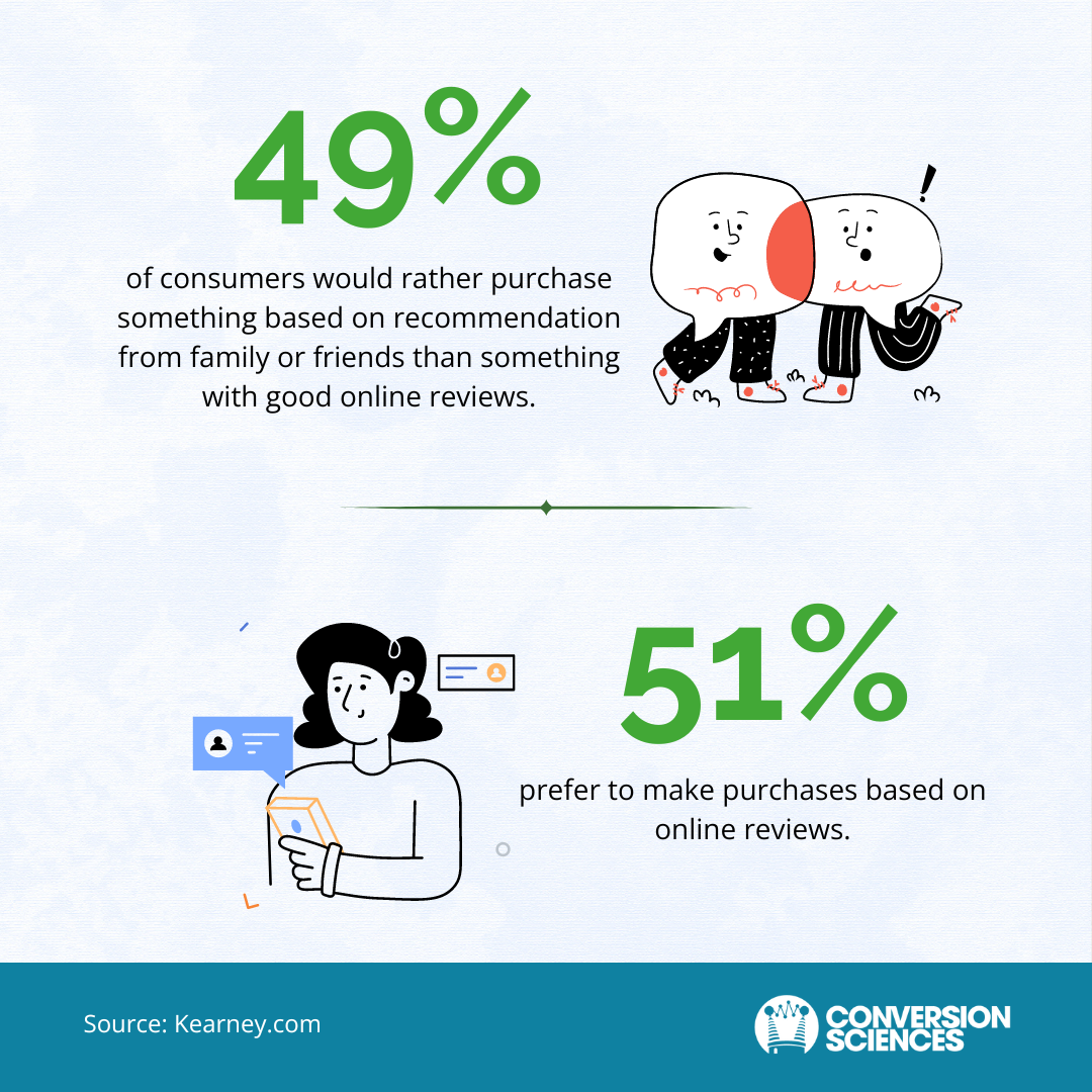
Management consulting firm Kearney reports that consumers typically make purchases based on recommendations from both friends / family and online reviews. That’s why many high-converting landing pages include testimonials or reviews from satisfied customers.
Landing Page Element 6: Urgency and Risk Reversal
The landing page should create a sense of urgency to encourage visitors to take action immediately. At the same time, it can relieve the visitor’s anxiety by taking risk out of the equation.
As we just mentioned, you can add subtle urgency with the word “now” in your call to action. But you can also create urgency with limited-time discounts or fast-action bonuses, or by mentioning the risks of not acting now.
If you are going to provide a money-back guarantee, warranty, or generous return policy, be specific in your description.
For instance, AppSumo drives action by placing a time limit on their offers. Products are steeply discounted and may never be available at the listed price again. They juxtapose this with a 60-day money-back guarantee to reduce perceived risk.

AppSumo uses urgency and a strong guarantee to drive action
Landing Page Element 7: Mobile friendliness
It’s vital that landing pages are easy to read and engage with on a mobile device.
- 92.3% of internet users browse the internet via a mobile phone.
- 61.21% of all website traffic comes from mobile devices.
- The average consumer spends 4 hours and 37 minutes looking at their phone screen every day.
- 82% of online buyers purchased a product they found on social media while using their mobile phone.
Here’s how to ensure your landing pages are mobile-friendly:
- Above-the-fold content should be prioritized.
- Copy and forms should be concise.
- The page should be responsive.
- Page load time should be less than 3 seconds, and ideally less than 1 second.
A word about page design: The design of a page will communicate credibility. A professional design delivers a subconscious message that this company is serious and credible. However, self-serving copy, unclear calls to action, lack of social proof, or broken mobile pages will instantly undo even the most competent of designs. Don’t focus on the design. Focus on the content.
Landing Page Optimization Process
As we’ve discussed, optimizing a landing page is about making incremental improvements in the page’s conversion rate. But it’s important to remember that this isn’t a linear process with a clear beginning and end.
Landing page optimization is an ongoing process of gathering insights, creating hypotheses, experimenting and testing, and evaluating results. For simplicity’s sake, we’ve broken the process into four stages. In reality, these stages may overlap, and you’ll likely be running multiple tests at the same time.

Stage 1: Conduct Research
How is the page currently performing?
- Gather data from analytics, surveys, and user testing to identify areas for improvement.
- Analyze ad campaigns and email offers to understand the promises made to visitors.
- Define the goals and target audience for the landing page.
Stage 2: Identify Areas for Improvement
- Review the landing page design, copy, and overall user experience.
- Use heat maps, click tracking, and scroll tracking to identify areas of high and low engagement.
- Conduct customer research to narrow design choices..
Stage 3: Implement Changes
- Make incremental changes. If you can, design an experiment, such as an A/B test.
- Prioritize changes that address the most critical issues first.
- Collaborate with designers and copywriters to implement the changes effectively.
Stage 4: Evaluate Results
- Track “bottom-line” metrics such as purchase rates, form completion rates, and checkout abandonment rates.
- Use analytics and testing to measure the impact of the changes.
- Make further adjustments based on the evaluation results to continuously improve the landing page performance.
Rinse and Repeat
Good conversion rates require a continuous process of experimentation, monitoring, and analysis that lead to small improvements over time.
Just remember, optimization decisions are data-driven, not opinion-based. By using data to guide optimization efforts, optimizers are able to design tests that continually improve conversion rates.
Best Practices for Well-Optimized Landing Pages
As marketers, we gravitate toward “best practices” for whatever strategy we’re employing. So before we dive too deeply into best practices, let’s be clear: The tactics that work for one brand and audience will differ from what works for another brand and audience, even if they’re in the same industry or serving the same audience.
Most best practices are just a starting point for conversion optimizers. But there are a few landing page optimization best practices that never change. In particular:
- Keeping your pages audience-centric
- Minimizing opportunities for visitors to navigate away from the page
- A/B testing
Audience-Centric Pages
A well-optimized landing page offers is all about your audience — not your brand or product. The language, visuals, and messaging should be tailored to a unique audience and speak to their specific pain points and desires.
Done right, the landing page will make visitors feel seen and understood. Because it expresses their pain points better than they can, they sense that you have expertise in the area. This builds trust, and they begin to trust that your offer will work for them.
This landing page by #samsales speaks directly to the struggling salesperson. It acknowledges that salespeople dread prospecting and explains why it’s such a challenge. It then offers the solution: a playbook with everything the salesperson needs to prospect like a pro.
That’s likely enough to drive sales, but this landing page also answers the biggest objection: Is this product right for me? The answer doesn’t just share some of the specific information available in the guide. It also expresses the relief salespeople feel when they get this information.

An effective landing page keeps the focus on the audience, their desires, and their goals. Make sure your pages:
- Clearly address visitors’ motivations, pains, and interests
- Use their vocabulary, feelings, and knowledge level
- Answer key objections before they become a hindrance to conversion
Focused Navigation
To increase conversions, a landing page should be stripped of any element that could distract visitors from the action they’re being asked to take. That includes navigation options.
Avoid using your website’s standard navigation scheme. Replace it with a navigation that supports the offer on your landing page. In many cases, the landing page doesn’t need navigation. Without unnecessary navigation, the landing page can focus the visitor’s attention on the primary call to action. This reduces confusion about the message and offer. It also encourages your visitors to stay on the page and take the desired action.
Yuppiechef tested two variations of their Wedding Registry landing page, one with navigation and one without. The variation with no navigation delivered twice as many conversions, and the conversion rate jumped from 3% to 6%.

Removing navigation and links reduces the number of choices available to visitors. This lowers the likelihood of them navigating off the page and raises the odds that they’ll take action.
A/B Testing
A/B testing is the process of comparing two versions of a landing page to determine which one performs better. This is a science-based approach to optimization that ensures the page continues to convert well.
It’s important to keep these A/B testing best practices in mind:
Ensure you have enough conversions: A/B testing requires a sufficient flow of conversions if the test is to reach statistical significance before you reach old age. Use a free test calculator to see if you have enough traffic and conversions on a page.
Define relevant metrics: Before you launch the test, establish the specific metrics you’ll use to measure the effectiveness of the landing pages. Compare rates, such as revenue per visitor, purchase rate, or form completion rate.
Establish a testing framework: Choose your preferred method of experimentation — A/B testing or multivariate testing. A/B testing compares two or more versions of a page, while multivariate testing involves varying multiple elements simultaneously. Multivariate testing requires a large amount of traffic.
Implement the changes: Create two (or more) versions of the landing page, each with different elements or content. Ensure that the changes align with your hypotheses or research about what might improve performance.
Drive traffic to the landing pages: To generate insights into user behavior and expectations, optimizers direct a sample of visitors to each version of the landing page. The sample size must be large enough to provide statistically significant results.
Collect and analyze data: Use analytics tools to track the performance of each landing page and gather data on the relevant metrics. Analyze the results to identify which version performs better based on the pre-defined metrics.
Make data-driven decisions: Based on the analysis, determine which version of the landing page has a higher conversion rate or other desired outcome. Consider implementing the more effective version or conducting further testing to refine the results.
Landing Page Optimization Strategies
The best conversion rates are only achieved through ongoing optimization. That’s why optimizers adopt a culture of experimentation and testing. Here are eight landing page optimization strategies they rely on to get maximum results.
1. Keep the Promise
A landing page’s primary purpose is to fulfill the expectations set by the link or advertisement that led visitors to the page. Failing to keep that promise makes people feel cheated, like you’ve broken a promise or bait-and-switched them. This can lead to distrust and high exit rates.
To avoid this, it’s crucial to ensure that the landing page’s offer aligns precisely with the promise made in the ad or link. Use similar language. Highlight the same benefits. Avoid any discrepancies that could confuse or disappoint visitors.
Segment does a good job of keeping its promise in this email-to-landing page sequence. Notice that everything feels consistent, from the color of the button to the way the problem is expressed.

By keeping the promise made in the previous funnel step, landing pages can build trust, enhance the user experience, and increase the likelihood that visitors will take the desired action.
2. Use a Descriptive Call to Action (CTA)
A descriptive call to action is an essential element on any landing page. It guides visitors towards the intended action and explicitly asks them to perform it.
A good example is the Segment landing page above. The CTA is clearly stated in the title of the form: “Register to Watch Recording.” The button, which stands out in green, then repeats the action this landing page is asking for: REGISTER.

Clear CTA on Segment’s landing page
To be effective, the call to action should be prominently displayed on the landing page, using visual cues such as contrasting colors, bold fonts, or eye-catching graphics. It should also be placed strategically to ensure that visitors can easily locate and engage with it. (We’ll talk about your options for CTA placement in a minute.)
For now, just realize that without a strong CTA, the landing page won’t work. And by optimizing the call to action, landing pages can increase conversion rates and drive more profitable outcomes.
3. Optimize Copy and Design
Optimizing landing pages requires a collaboration between copywriters, designers, and optimizers. Designers can provide valuable input on the visual presentation, while copywriters ensure that the messaging is clear, compelling, and aligned with the overall goals of the landing page.
Clear and Persuasive Copy
Well-crafted copy plays a vital role in landing page optimization. It helps to establish credibility, build trust, and address visitors’ concerns. Keep these copywriting tips top of mind:
- Matching the ad: Align the landing page copy with the message and language used in the advertisement or promotion that brought the visitor to the page.
- Addressing objections: Anticipate and address potential objections or questions the visitor may have.
- Using persuasive language: Employ persuasive writing techniques to encourage visitors to take the desired action, such as highlighting the benefits, creating a sense of urgency, or using social proof.
Effective Design
The design of a landing page directly influences its visual appeal, user experience, and overall effectiveness. Key design considerations include:
- Relevance to the offer: Use images, graphics, and layout to visually reinforce the landing page’s offer and value proposition.
- Guiding the eye: Create visual cues, such as contrasting colors, bold fonts, and whitespace, to guide the visitor’s attention towards the most important elements of the page.
- Minimizing distractions: Avoid unnecessary clutter or extraneous elements that can hinder the visitor’s focus and detract from the desired action.
4. Include Social Proof and Credibility
Social proof and credibility help to build trust between the visitor and the brand, and increase the likelihood that visitors will take the desired action. This is why landing pages often include trust symbols, such as logos of well-known brands or security seals.
Squirrly shows social proof on their landing page with this banner just under the fold:

Social proof on Squirrly’s lifetime deal landing page
Social proof on Squirrly’s lifetime deal landing page
It builds trust quickly by telling us that 200,000+ websites are using the tool, which has earned 4- and 5-star ratings on three reputable sites. It also shows a series of awards from G2.
5. Use Different Landing Page Types
Depending on your offer, you might need to adjust the layout of your landing page by moving the call to action. Here are four places to put your calls to action and their purpose:
Top Hat
The top hat places a call-to-action above the page’s content. Its purpose: to grab the reader’s attention and promote the offer even before they read the content.
Here’s how Airbnb does it. You can’t miss this call to action, and to ensure you don’t, it stays visible as you scroll through the page.

Pressure Release
When visitors don’t find what they want on the page, they scroll back to the top of the page to find the information they need: phone numbers, shopping cart links, calls to action, and the search bar. By placing these items in the upper right corner of the page, you make them impossible to miss, and in the process, release the pressure felt by your visitors.
This landing page by Imperial Ghostwriting is a good example. The top of the page has a three-way CTA — button, email, and phone number — for anyone who’s ready to take action.
Because it’s so close to the headline, the brain connects this call to action with the offer. But because it’s in the banner at the top of the page, it doesn’t disrupt the visual impact of the page.

Dripping Pan
The dripping pan is a call-to-action at the bottom of the page, giving visitors one last chance to take action. A visitor that has read the entire page is probably more likely to take action. Make it easy for them.
This landing page by Clifford Ghostwriting is a good example. The yellow box at the bottom of the page gives one final push to take action and includes a phone number to talk with an expert right away.

Coffee Breaks
The coffee break places in-line calls to action throughout the content of the page. This engages the reader and allows them to take action at whatever point they’re ready, without disrupting their reading flow.
This approach works well on a long-form landing page, like this one from DigitalMarketer. The call to action is strategically repeated throughout the page so it’s easy for people to take action, no matter where they are on the page.

Of course, there are other options as well. Here are some other landing page types that suit different purposes:
- Wheelie Popper: A scroll-triggered pop-up that appears when a visitor has scrolled a certain percentage of the page.
- Jilted Lovers: An exit-intent pop-up that appears when a visitor is about to leave the page.
- Inliner: An inline call-to-action that is placed within the content of a landing page.
- Compass: A call-to-action that is placed in the sidebar of a landing page.
6. Ask for Necessary Information Only
People are wary about sharing their personal information online. Even a simple request for the visitor’s email address can create a barrier and discourage them from taking action. It’s critical to keep this in mind when asking for personal information.
To combat this, consider each piece of information being requested in the landing page form, and only include fields that are absolutely necessary for the specific landing page’s purpose.
Learn more about designing effective landing page forms.
7. Optimize for Mobile Devices
According to Google, the majority of mobile sites are still too slow and bloated to meet user’s expectations. Their research shows that:
- As the number of page elements (text, titles, and images) increase, the probability of conversion drops 95%.
- As the page load time increases from 1 second to 10 seconds, the probability of a mobile site visitor bouncing increases 123%.
Adopt a mobile-first design approach to ensure your landing page is accessible, easy to navigate, and visually appealing on smaller screens.
8. Test and Iterate
The ongoing process of experimentation and testing allows you to collect valuable data and insights that improve future optimization efforts. This provides:
Higher Conversion Rates: Iterative testing helps identify areas for improvement, such as headlines, images, call-to-actions, and form designs, leading to increased conversion rates.
Data-Driven Optimization: Accurate data allows optimizers to generate real insights into customers and their expectations. Through experimentation and testing, they gain quantifiable data that support decision-making based on actual results rather than assumptions.
Identification of User Pain Points: By testing different variations, you can identify specific elements or content that create friction or obstacles for users, allowing you to address these pain points and improve the user experience.
Reduced Abandonment: By identifying and addressing potential barriers to conversion, testing helps reduce abandonment rates and increases the likelihood of users completing desired actions.
Increased ROI: Effective landing pages contribute to increased return on investment (ROI) by optimizing conversions and driving more qualified leads or sales.
Accelerate Your Conversion Journey: Key Steps Forward
Landing page optimization is a foundational strategy in digital marketing, unlocking increased conversions, enhanced user experience, and improved return on investment. But it requires a data-driven, scientific approach.
Looking for conversion rate optimization services that pay for themselves? Conversion Sciences is unlike other conversion rate optimization agencies — we use the scientific method to identify and fix underperforming landing pages.
Contact us today to talk with our experienced full-service team of Conversion Scientists.

Expertise: conversion rate optimization, AB testing, marketing strategy, digital marketing, analytics, landing page design, computer programming, entrepreneurship
Speaking: IBM, Inbound, LeadsCon, Content Marketing World, Affiliate Summit, and more
Books and Training: Your Conversion Creation Equation, Video CRO, Marketing Videos that Convert, CRO Best Practices
As Seen On: ClickZ, Search Engine Land, Marketing Land, Conversion Sciences Blog, Intended Consequences podcast
Education: Texas A&M University, BS Computer Science and Management
- A Comprehensive Guide to Landing Page Optimization in 2025 - May 14, 2025
- Statistical Hypothesis Testing: A Simple Guide to Smarter A/B Tests - April 15, 2025
- Four Things You Can Do With an Inconclusive A/B Test - April 14, 2025


