Statistical significance: It’s not just for impressing your date anymore.

Conversion-Scientist-Podcast-Logo-1400x1400


Subscribe to Podcast


If you’re involved with an online business, you draw conclusions from things you’ve learned on a weekly basis.

When you say, “We tried that. It didn’t work,” you are claiming to be able to predict the future based on something you did in the past.

When you say, “We stopped sending email because our list got tired of us,” you are saying that the tea leaves of your email list say you should stop sending email.

Often, such statements stop progress. One way to keep from hitting the “We tried that” wall is the ask a simple question: “Was the data statistically significant?”

In this episode of The Conversion Scientist Podcast, I will tell you exactly what statistical significance means, how to measure it and when to believe the data you’re being shown.

Read the Transcript

Image taken from ABTestGuide.com statistical significance calculator.


21 Quick and Easy CRO Copywriting Hacks to Skyrocket Conversions

21 Quick and Easy CRO Copywriting Hacks

Keep these proven copywriting hacks in mind to make your copy convert.

  • 43 Pages with Examples
  • Assumptive Phrasing
  • "We" vs. "You"
  • Pattern Interrupts
  • The Power of Three

"*" indicates required fields

This field is for validation purposes and should be left unchanged.


How important are images to your landing page? The formula we use in our Chemistry of a Successful Landing Page includes the element “Image” as a necessary component. At the heart of this is the need for the visitor to imagine owning the product or service. That’s right, even services.
For some, it’s difficult to “show the product.” If you’re offering an expensive software solution or consulting service, how do you communicate what it will be like to own that? Screen shots, flow charts and explainer videos are typical go-to solutions.
Lazy designers drop happy, smiling people on the page. Avoid this business porn.
At the other end of the spectrum is the visual product or service. Photographers, artists, decorators and designers have a portfolio of past work to help visitors imagine buying from them.
Vacation Beach Portraits is such a visual business, and they have some test results that offer some insights. I love it when small businesses take up testing.
Vacation Beach Portraits takes family portraits of tourists to the Orange Beach and Gulf Shores areas of Alabama. The beautiful white beaches and sunsets over the Gulf of Mexico offer an ideal setting.
The folks at Vacation Beach Portraits tried testing a landing page against their home page, a blog filled with samples of their work.

Vacation Beach Portraits HomePage-Selections

The Vacation Beach Portraits home page was full of delicious images showing off the work.


familyportraits_vacationbeachportraits_com

Then landing page features a prominent call to action and portfolio video.


Vacation Beach Portraits HomePage thumbThe home page was a long scrolling collection of pictures from recent shoots. Load time can significantly decrease conversion rate on pages like this. However, though lazy-loading of the images allowed me to start viewing images immediately.
The landing page, built using Unbounce, provided an explainer video with samples from their portfolio. It is shorter and features a bulleted list of benefits as part of the copy.

Serial Test

This local business will have few transactions each month. Therefore, Jason Odom of Vacation Beach Portraits did tests in series.
From May 1-15, he sent his search traffic to the landing page.
From May 16-31 he sent his search traffic to the home page.

image

Comparison of visits to inquiries shows a 42.1% increase in conversion rate for the home page. However, this is not statistically valid. Source: ABTestGuide.com


Given the relatively low number of clicks and inquiries, the two pages converted at the same rate statistically. When testing low-traffic sites, we are looking for treatments that beat the control by large margins — 50% or 100%.
In this test, the home page generated 42% more inquiries and 105% more paying clients. Neither of these results was statistically significant, though. The sample sizes were just too low.

Why Didn’t the Landing Page Outperform the Home Page?

Anytime we hear that people are sending “store-bought” traffic to their home page, we roll our eyes. We are almost always able to improve conversions by sending visitors to a landing page.
In this case that didn’t happen. What’s the deal?
Two hypotheses emerged from this test.
1. The long page full of gorgeous pictures found on the home page is what visitors want.
2. The clear call to action found on the landing page kept it in the running.
For their next test, we recommended either adding a bunch of these big gorgeous pictures to the landing page, or adding a call to action button at intervals down the home page.
The quality of the images in the landing page video was lower than the full-width photos found on the home page.
When someone decides they want an amazing family photo like those shown, a button with “Schedule Your Photo Session” is exactly what they will be looking for.

Other Considerations

There were some additional hypotheses we felt would improve the performance of these pages.

This font is pretty, but very hard to read.


We felt that the script font used on the home page was hard to read, recommending a serif print font instead.

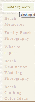
Beach Clothing Color Ideas is at the bottom.


The navigation on the site was not particularly logical. The very helpful navigation item “what to wear” seems to link to anything but topics on what to wear. Every link on a site should keep its promise.
Making the phone number more apparent my close the time it takes to book a client from the web or landing page. We find that adding the phone number to the headline (yes, the headline) will significantly increase calls without depressing form fills.

Advice for Businesses with Visual Offering

If you have a visual product, you should leverage this with high-quality, high-resolution web images. Don’t be afraid of long pages. Visual visitors know how to scroll and will appreciate the wealth of stimulation.
However, don’t forget the calls to action.
You never know when someone has seen enough to buy. Lace a buttons or links among your images. Keep in mind that the buttons or links are going to have to compete visually with the images, so make them pop.
The button or link will go to a more traditional landing page or product page that handles objections, allows selection of size, color or format, and asks them to buy.
In almost every case, use captions. These are the most read copy on most pages and are a great place to include a call to action. Tell them what they are looking at, even if it is obvious to you.

Results From the Follow-up Test

This is the busy season for Vacation Beach Rentals, and their landing pages are already converting very well for them. We won’t know the results another test for some time. Subscribe to the Conversion Scientist by email to find out the rest of this story.

One Republic’s breakout hit in 2007 was “Apologize.” It’s a very sad-yet-beautiful tune.
It’s also one of those songs that our brains like to play with.
“It’s too late to order fries. It’s too laaaaate.”
Every year when September rolls around, my brain hears a different word than “Apologize.”
“It’s too late to optimize. It’s too laaaaaate.”
Do you hear it? Many of the businesses we work with have huge spikes in traffic during the November and December holiday season. Unfortunately, if we hear from them in September, we have to confess that they’ve missed the window to do meaningful conversion optimization before the holiday rush locks everything down.
“It’s too late to optimize…”


It may not be too late to optimize.

Right now, it’s not too late to optimize. We can make meaningful progress on your conversion rate before Black Friday and Cyber Monday hit.
If you would like to ride the holiday season with 10% or 15% more sales, we can help you.
But we have to start soon.
Contact us now and ask about our Conversion Catalyst™, our proven 120-day process for finding improvements quickly and scientifically.
Optimize so you don’t have to apologize.
You tell me that you need me, then you go and cut me down.
You tell me that you’re sorry, didn’t think I’d turn around, and say.
It’s too late to optimize. It’s too laaaaaate.

One of the best reasons to do website optimization is for the wins, when you’ve found a change that delivers real revenue to the bottom line.
But before you celebrate, check out this infographic for Marshall Downy’s sobering presentation at Which Test Won’s The Live Event. The event was held in Austin, Texas, The Conversion Capital of the World.
Marshall is with Build.com and gave several examples of post test analysis that changed the decisions he would make based on the pure test data.
What is post-test analysis? It’s what comes after you’ve completed a split test or multivariate test and have a winning change.
The problem is that we often can’t test the right metric to determine if a winner is actually helping the business. A typical example of this is products with long sales cycles. You can’t really test much if you’re waiting six months to see which leads close. You can increase the lead conversion rate, but you’ll always wonder if the lead quality was the same.
Another example is subscription services. Your test may show you how to get more subscribers, but what if the cancellation rate goes up?
Marshall lists the following types of post-test analysis to help us evaluate the true impact of our test results.
1. Customer Satisfaction Scores – If the customers aren’t as satisfied, it may not matter if you’re selling more.
2. Return Rate – If significantly more people are returning the product, increased sales may not have been good for profits.
3. Profitability – I can increase your conversion rates by slashing your prices, but will that really help the business?
4. Customer Lifetime Value – An important metric for subscription and repeat-purchase businesses.
5. Brand- and Category-specific sales – What if we increase sales of one product line at the cost of another. Also see “Cannibalism.”
6. Signup to Purchase Rate – You may get more triers, but are they turning into buyers?
Marshall didn’t share his slides, but here is my Instagraphic infographic from his presentation.
WTW TLE Post-Test Analysis Instagraph Marshall Downy

CLICK TO ENLARGE


We don’t really know what $10 million in cash looks like, but we do know what $10 million in additional revenue looks like to us: it looks like winning A/B test results.
It’s the graphs and spreadsheets that calculate the impact of often small changes on the fortunes of an online business. Sometimes, we print out some of our favorite winning tests and roll around in them.
Each graph represents a series of steps designed to pull stubborn revenue from online businesses. The well may have looked dry to our clients, but our process is a proven way to get that old well gushing again.
Before we can roll around in the winnings, we have to do a number of very important steps.

Choosing the Right Hypotheses

When we start a project, we don’t know what is going to work. However, we have a lot of good ideas. Our job is to figure out which will raise the conversion rates and revenue for the business.

Designing A/B Tests

We design tests that will tell us exactly what persuades more visitors to act. Is it the copy, the images, the layout or the trust symbols?

Coding and Design

We do the coding and creative work. We’re a turnkey operation for any business.

Execution

You can’t learn anything until you launch the A/B tests. We execute a test and let it run until the statisticians are happy.

Harvesting

When a winner is found, our clients expect to see the results when winning changes are rolled out onto the site. We call this harvesting the revenue found in the tests.

Ask Why

We then have to ask a very difficult question: Why did visitors respond to a winning treatment? In this business there are no answers, only better-informed questions.
Our answers to the question, “Why” are simply the hypotheses that need additional testing. This takes us back to the beginning.
It is the cycle of constant testing that turns online businesses into online leaders.
If you’re site is ready, we will take your site through two test complete cycles. It promises to be quite a ride.
To see if you’re ready, contact Conversion Sciences and schedule a call. Who knows. You could be rolling around in your own million-dollar graphs before long.

Don't stop tests early.

What if this test had been stopped on Thursday?

We encourage every online marketer to begin experimenting with split testing as soon as possible. It is a skillset that empowers marketing to really understand their visitors and generate more revenue from existing traffic.

One of the first hurdles you will have to get through is the “damn lying test” phenomenon. This is when a test has been run and has found a way to significantly increase results. The confidence level reported by the testing tool is 95%. You are going to be a hero.

Then you roll out the change to the site and nothing happens. Conversions don’t go up. Revenue per visit doesn’t move. What’s going on?

It’s the Damn Lying Test. One of the reasons tests lie is that they didn’t take into account the ebb and flow of traffic on your site. Tests must take into account peak and off-peak times. Form most sites, a test must run for a full week and end on seven-day boundaries.

How can you discover the rise and fall of tides in your website?

In Ride The Tides Of Your Website To Make More Money With A/B Split Testing, I discuss the various cycles and how to detect them on your site using analytics.

Listen to me read the column

The Conversion Scientist Podcast


Subscribe to the Podcast
If you enjoyed this, please leave a review on iTunes!

I provide graphs and examples to illustrate a variety of website tides:

  • Intra-day cycles
  • Weekly tides
  • Monthly cycles
  • Yearly seasons
  • Device-dependent cycles
  • Sales cycles
  • Artificial cycles

Understanding the rise and fall of the tides in your website will help you design better tests that deliver results you can take to the bank. Use your knowledge of website tides and some discipline to steadily increase the profitability of your site.

Special thanks to Craig Sullivan for inspiring this column with his Digital Elite Camp presentation 20 Simple Ways to Mess Up Your AB Testing.

A “split” is not usually considered a good thing in the world of prophylactics. However, a condom shop that is “split testing” is going to have happy customers and prosperous owners.
I had the great pleasure of visiting Estonia and the Netherlands on a speaking tour. While in the Netherlands I stayed in a real 19th century windmill, hung out in an 18th century farm house, and walked by a condom shop housed in a 16th century building.
There are a lot of old places in the Netherlands.
I mention the condom shop because I discovered that this shop, called Condomerie® was split testing their store front.
It begs an important question: if a condom shop in the red light district of Amsterdam is split testing, why aren’t you? We can get you started.
While I was impressed that the Condomerie was split testing their products, I was just as excited about the number of condom jokes I could make in a blog post.
Start counting.

The Windows of Condomerie

The store front of the Condomerie was tasteful, consisting of two large windows separated by a door. In each window a selection of condoms were well-hung, having been blown up like a balloon to show off the size and shape.
I found the collection of colorful condom most interesting. As you can see from the photo below, these condoms were animals, vegetables, soccer balls, skeleton heads… there was even a Eiffel Tower condom. You needn’t worry about size when you’re sporting the Eiffel Tower.
And what says “I love you” better than a condom that says “I love you?” See them all in the picture below.

The front window of the Condomerie

Click to “Enlarge” (snicker)


A condom with a QR code on it.

The Qondom


Being a geek, my attention was drawn to an artificial condom made from laminated paper that contained a secret QR code. I call it a QR condom, or Qondom.
Scott Stratten says that every time a QR code is used a kitten dies. However, you have to get creative when designing tests. Use whatever tools are at your disposal.
I scanned it with my phone to see where it would take me. The URL contained a word my Dutch friend understood: “Right”.
We looked to the left window. Sure enough, there was a qondom there too. When I scanned it, the URL that was revealed contained the Dutch word for “Left.”
The Condomerie was split testing its windows! They had placed a Trojan Horse in the window designed to trap sightseers with smartphones.

The Hypothesis

If they were doing a good job of testing, they would be working from a specific hypothesis. At a glance, the hypothesis became pretty clear:
“If we display our funny condoms in the window, we will draw more attention and sharing as measured by QR Code scans and visits to our website.”
Their test placed the colorful cartoon condoms in the right window. I’m going to call this the right-brained window that’s creative, emotional and completely unconcerned that these condoms are far more intricate than necessary.
On the other side were condoms arranged primarily by size. This is the left-brained, “just the facts” side of the store. You can imagine that those interested in this window would be looking for a calibration scale to ensure they got the best fit.

The left window of the Condomerie is about size and fit.

The left window of the Condomerie is about size and fit.

The right Condomerie window features colorful and whimsical condoms.

The right Condomerie window features colorful and whimsical condoms.

Which window would you linger at? The left-brain, functional window? The right-brain imaginative window? Or, the window of the cheese shop next door?
At this point, only the proprietors of the Condomerie know.

An Inflated Sample

A problem with this test is that only tech-savvy condom users with smart phones are going to be part of this sample. Those with feature phones and those who’ve never bothered to load a barcode scanner app will not be able to participate.
This is a real problem, as it probably skews the results, inflating the sample toward early adopters. The sample taken wouldn’t be expected to represent the typical condom-buying public.
There are some fundamental issues with the landing pages that may be suppressing conversions, but we can expect all marketing channels to improve as an organization learns from split testing.
This shop is learning something about their tech-savvy audience, an audience who can often afford the more expensive condoms and profitable condoms. Revenues can be expected to rise when tested changes are rolled onto the shop floor.
What are you learning about your website visitors? How are you testing your assumptions about what people want, like and are persuaded by? Testing is the most effective way to consistently increase your revenue. The Condomerie knows this and so should you.
Let Conversion Sciences get you started on a website split testing program that will get more revenue from the traffic you already have.
Get a free copy of my book if you are the first person to provide a correct count of the double entendre in this post. Put your number in the comments.

How helpful would it be to know what prices and features your competition was thinking about using?
One of my readers just sent me a very revealing screenshot. It is one of the pricing pages that Optimizely is testing. It was found by “spying” on their test data.
 

We hid the pricing on this test treatment from Optimizely

We hid the pricing on this test treatment from Optimizely


We are able to see this because of an “exploit” that allows anyone to see what a site is testing if they are using the Optimizely testing software. Oh, the irony.
Venture Beat recently “revealed” this in an article. Those of us who use these tools have known about it for some time. It’s quite easy to decipher this test data.
Try dragging the following link to your browser bookmark bar.
Optimizely Spy
Now visit Optimizely and click on the bookmark to see what they are testing.

How is this possible?

Whenever we run a split test with Optimizely, the software uploads scripts and data into all of our visitors’ browsers to change the experience and track the results. Along with this is included not just the test our visitor is being entered into, but all of our tests for that account.
So it’s relatively easy to decipher this information and see what we’re testing.
Note that the snooper can’t see any actual results, just what kinds of things you’re testing.
We like this approach because it speeds up the delivery of tests. When we use one file with everything, it changes less frequently, and the file it can be cached on a content delivery network (CDN) specifically designed to deliver files faster.
Faster tests mean more reliable tests.
Convert.com also uses this technique, though they take steps to obsure the test information.

Why Aren’t We More Concerned?

In a worst case scenario, a competitor can see what hypotheses you are testing. They can then test those same ideas and perhaps win more customers.
However, only a small percentage of sites are even testing, let alone stealing your tests. I did a quick survey of sites selling plastic surgery and cosmetic surgery who are spending at least $500 per month on search advertising.
Of 2,958 domains, only 33 had some form of split testing software installed, such as Optimizely. That’s just 1.1% of these domains. Furthermore, we know that some portion of these testing are not actually using the software they have installed.

Plastic and Costmetic Surgery Websites with Testing Software

Plastic and Cosmetic Surgery websites are missing a significant opportunity to get more patients. Source: SpyFu.com


Here’s another surprise. There are ninety-seven (97) domains in this space spending over $50,000 per month on search ads. Only five of them have A/B Testing software installed, only 5%.
If you’re in the plastic surgery space and are testing, you have a major advantage over your competitors. So, the odds of someone stealing your ideas are far outweighed by the gains you will see from testing.

Our Recommendation

We recommend that you continue to test using Optimizely unless your page contains sensitive information, such as price.
If you feel uncomfortable with your test information being publicly available, move to Convert Experiments for some protection. Another popular tool, Visual Website Optimizer, does not use this technique meaning past and future tests are safe from prying eyes. There are also a variety of other highly recommended AB testing tools available.
Whatever you do, don’t let this issue take the steam out of your testing program. As you can see, testers have a significant advantage, snoopers or not.
PS: If you are in the plastic and cosmetic surgery industry, you should contact us.

testing, valley of death
There is a point in almost every testing program in which your confidence will be shaken. Even seasoned professionals experience it.
We start off with high confidence having identified opportunities to really improve a site. We’re good at getting that low-hanging fruit early on, but we will inevitably find that many of our great ideas just don’t work.
It’s humbling, the right kind of humbling.
With patience, our picture of the visitors coming to a site become clearer. On-going success is due not to our own brilliance, but to what we learn in the Valley of Death that kills so many testing programs before they’ve matured.
We can take you through the Valley of Death.
Have a conversation with a Conversion Scientist this week to see what our testing team can do for your bottom line.


Inspired by the excellent blog Indexed.

Those who are successful have a certain way of looking at things. They are committed to the end goal, but focused on the next ten percent.

The Next Ten PercentOur goals are reached one step at a time.

The next ten percent is the next face to scale on the climb, the next set of downs in the game, or the next year of raising a healthy kid.
The next ten percent is more than another step or a rung on the ladder. It’s a complete process that, when repeated results in success. Why ten percent? Because ten percent makes a difference. It’s a reasonable goal, but not necessarily an easy one.
You can get your first ten percent once by luck or fortune. Success comes from getting that ten percent time after time.
It’s invigorating.
For us, the next ten percent is the next cycle of website tests. Ten percent is a reasonable goal. Repeat the process five times and you will see a 50% increase in website performance. If revenue is your goal, that’s 50% more revenue. If leads make your business go, then expect 50% more leads. Grow your revenue per visit by just 7% a month and you’ll double your revenue in one year.
We’d like to introduce you to our ten-percent at a time process. We call it the Conversion Catalyst.
It’s a proven system to get you that next step month after month.
Reply to this email or give us a call at 888-961-6604.

Brian Massey

© Copyright 2007 - 2025 • Conversion Sciences • All Rights Reserved
Conversion Sciences® and Conversion Scientist® are
federally registered trademarks of Conversion Sciences LLC.
Any unauthorized use is expressly prohibited.