video marketing

The long-scrolling flat style landing page is all the rage this year. This style of landing page suffers from some problems, however.

  • Large background images slow load time.
  • Information is presented in small bites. Sometimes more copy is needed.
  • Banded sections often look like the bottom of the page, reducing scrolling.

With the right approach, you can make these pages high-converting landing pages. Here’s how.

In my recent CrazyEgg Webinar How to Reverse-Engineer a High-Conversion Landing Page, I reviewed twelve landing pages using my “backward landing page” framework.

One stood out.

Here’s an excerpt of that presentation featuring the Body Language for Entrepreneurs landing page from Udemy.


21 Quick and Easy CRO Copywriting Hacks to Skyrocket Conversions

21 Quick and Easy CRO Copywriting Hacks

Keep these proven copywriting hacks in mind to make your copy convert.

  • 43 Pages with Examples
  • Assumptive Phrasing
  • "We" vs. "You"
  • Pattern Interrupts
  • The Power of Three

"*" indicates required fields

This field is for validation purposes and should be left unchanged.


Nail the Top of the Landing Page

The purpose of the top of the page is to give the visitor reasons to explore the rest of the page. It’s the headline, the offer and the hook for the page.

Include all Supporting Components

Five components and one contaminant to avoid in a landing page.

Five components and one contaminant to avoid in a landing page.

There are five basic components – Offer, Form, Proof, Trust and Image – and one contaminant to avoid (Abandon) in a landing page, which I outline in the CrazyEgg video.

The Body Language for Entrepreneurs includes all of them at the top, with no opportunities to abandon, such as social media icons, site navigation, or search.

Offer

Your offer is the promise and pricing that this page provides a visitor. A complete offer is perhaps the most critical element of the landing page equation.
image

image

Form

The landing page should quickly make it clear that the visitor can take action to get closer to solving their problem. The form should have a way to act and an effective call to action.

The call to action should answer the question, “What will happen if I complete the form and click the button?”
image

Proof

Support the claims made in your value proposition with proof.
image

Trust

Building trust builds credibility and authority. Your logo plays a role on a landing page: a trust-building role.
Often symbols can be used to borrow trust from other entities. This is what Body Language for Entrepreneurs did.
image
image

Image

A lot of space was dedicated to red buildings in this theme.

A lot of space was dedicated to red buildings in this theme.

If you’re going to slow the load speed of your landing page with a big background image, you better make it count. Designers like to use stylish backgrounds for effect. That’s fine, but not on a landing page.

Images should advance the value proposition. In the Body Language for Entrepreneurs landing page, they show the presenter. That’s relevant. Will I enjoy spending five hours with this person? Do they look credible? It’s all answered with the background image?

Nail the top of the landing page for incredible results.

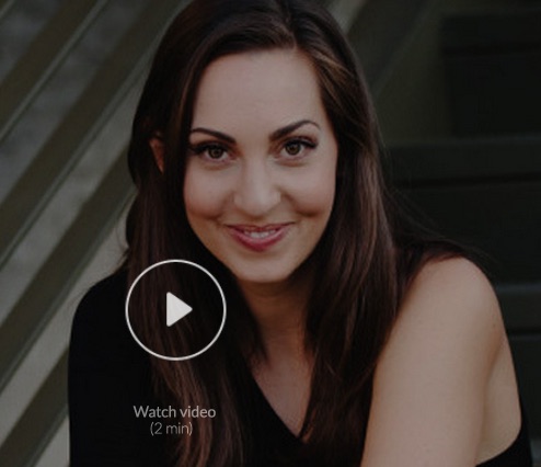
Furthermore, they use video, which is image at 30 frames per second. Consider video if you don’t have an effective image that explains your value proposition.

Abandon

There is only one link in the upper area of the Body Language for Entrepreneurs page. It lets the visitor see all of the 56 reviews in the Proof section.

It actually doesn’t qualify as Abandon because it opens in a popover window. The visitor never leaves the page. Very smart.
The Udemy logo is NOT linked. Very smart.

Keep the visitors you paid good money to acquire. Don’t send them elsewhere or they will be gone forever.

Does This Design Really Work?

I asked Adam Treister, Growth Marketing Manager at Udemy to tell me how he arrived at this design and how this page was performing for him.

It was no accident.

Adam documents the process in his excellent Udemy course User Experience Design: The Accelerated UX Course.

The original page looked like this:

The original Udemy landing page for ad traffic

The original Udemy landing page for ad traffic.

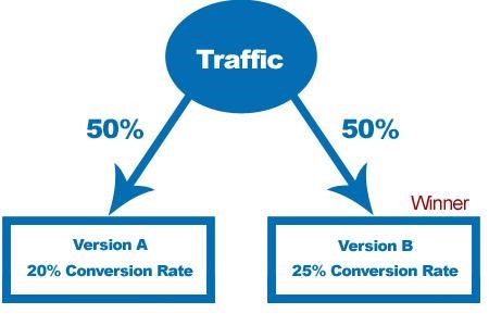
After several iterations using UserTesting.com, VerifyApp.com, Google Consumer Surveys, and CrazyEgg, they tested the profile photo using PickFu.com. Finally, Adam’s team did a split test using Optimizely.

How did this process work for them? They saw a 246% increase in clicks with the new page. That’s not a typo.

Why This Might Not Work on Your Landing Pages

Every audience is different. They have different goals, needs for information, and are coming on a variety of different platforms. Images and words are powerful

The best way to ensure that your landing page works is to test the components: Offer, Form, Proof, Trust, and Image.

If your landing page is generating at least 150 transactions a month, Conversion Sciences will provide the complete testing team to find the highest-converting combination. Get a complete testing team for the price of a part-time employee.

Request a consultation and we’ll let you know how to make your landing pages surprise you.
Brian Massey

Video helps your marketing. It’s not a very controversial statement, but for years now YouTube has been hovering around the number two spot of the most-used search engines, yet somehow video in online marketing still has a feeling of just emerging from its infancy.
Despite that, marketers feel very comfortable using video for their own projects, with close to 80% of marketers polled by eMarketer claiming they’ve leveraged video for their own brand’s marketing. Marketers are starting to see that they can benefit greatly from leveraging video in channels like email marketing.

Email and Video: An Unlikely Marriage?

Email marketers are among many starting to see the benefit of video in their campaigns. Jon Spenceley of Vidyard.com reported that the brand Clear Fit saw a 53% higher click-to-open rate on emails that featured a video call-to-action over their non-video counterparts.
Even mentioning the word “video” can increase open rates by 20% as reported by the Daily Egg blog. In fact, it’s preferred over even more precise terms like “webinar” and “conference”.
A white paper released by The Relevancy Group LLC showed an increase in customer engagement across the board when videos were used in email campaigns. This includes conversions, click-through, social sharing and even average order size!

What are the benefits of using video in your email marketing messages? Source: The Relevancy Group, LLC Executive Survey, n=66 2/13, United States Only

What are the benefits of using video in your email marketing messages? Source: The Relevancy Group, LLC Executive Survey, n=66 2/13, United States Only

Video also has the added benefit of being mobile friendly and this is especially good news since last year mobile finally overtook desktop-fixed internet-access hubs.

Number of global users on desktop versus mobile from Smart Insights

Number of global users on desktop versus mobile from Smart Insights

These numbers are no doubt impressive and there is some psychology behind why video is so effective.

Why Do Customers Prefer Video?

While numbers are definitely indicating a preference for video, we’re interested in exploring why? Let’s start with a simple video-email analogy.
The process of checking email is largely a passive activity. You have information sent directly to you and you review it. Checking your email is a simple process, and it’s precisely the reason marketers find video such an attractive transition within the user’s experience.
Videos can engage customers without requiring them to change their current state which is important because your customers don’t have to do work in order to do business with you.

Video content allows customers to enter into your sales funnel without feeling like they’ve abruptly left another activity behind.
Video content allows customers to enter into your sales funnel without feeling like they’ve abruptly left another activity behind. That’s a hugely beneficial psychological component supporting why video seems to increase the effectiveness of marketing activities.

Carefully Weighing Video in Email Marketing

Videos are great for the user but how much should they be used and where? What should your marketing campaigns look like? A lot of the focus on video and improved conversions in the research cited above touts the benefits of video specifically in email marketing campaigns. But don’t go and blindly add video to every email and marketing document you send out!
Embedding video is great for the user and engaging them with your brand in their current state of mind, but there are also drawbacks. Even well-rounded and optimized email campaigns need to consider what can go wrong before including video.

Thumbnails

Thumbnails, perhaps the most overlooked aspect of video, can actually create several unintended problems for your campaigns. YouTubers have long known that thumbnails matter and email marketers inexperienced with video should take some notes. A good thumbnail needs to be good-quality with a central focus and also be adaptable to changes in sizes. A thumbnail may have to scale from as small as a couple of hundred pixels to over a thousand.  Size considerations also apply to text included in the thumbnail, since it can quickly become unreadable.
The best thumbnails:

  • Evoke emotion
  • Leverage controversy
  • Focus on a human face with an engaging expression
  • Accurately represent the content

These need to be used carefully and in accordance with the brand’s overall messaging and feel.

Embedding

While thumbnails are important, email marketers need also to consider whether to leverage the new video embedding feature that many email clients now support. There’s more support now for this feature than ever, but its current ubiquitousness might have you question whether all your customers are receiving your marketing messages. Since approximately 58% of email users (via Social Mouths) cannot view video embedded in their emails, marketers should be careful about placing all their eggs in that basket.
Even if a customer can open the content, the ability for your customers to engage with your brand in an individual email is limited. Ideally you want your customer to engage with your site more directly.

Leveraging Landing Pages Can be Confusing

Landing pages can support email marketing and help take visitors from the email to the website or to an important conversion in between. You may have a landing page AND an email sporting an embedded video, but that creates a bit of confusion for your customers on how they should share this information. Do they forward the email with the video? Do they email a link to the landing page? If the customer forwards the email, will it create formatting issues with the video?
If you prefer to use a landing page to support your email marketing, you should embed the video in the landing page and use a call-to-action that mimics the look and feel of a video player. The slight disruption is outweighed by side-stepping user confusion of where to share and of course by drastically improving the user’s ability to actually access the video content.

Final Thoughts

There is a lot to consider when working with video in email marketing. It may not be the right move to include video in your email marketing efforts. If it is the right move, you may have a separate set of considerations when it comes to landing pages. Pascale Guay, CEO of Dialog Insight, responds to the limitation of video content in email marketing on her company blog saying the most important strategy for email marketers is to make use of the channels used by their target audience above all else. If your target audience responds to email marketing – use this channel! If your open-rates soar because of video content – use this channel…carefully.
Are you using video in your email campaigns? If not, how come? If so, how is it working for you? Leave a comment below!

About the Author

Jenix Hastings
Jenix is a journalist who specializes in discovering and documenting digital media. She makes a living as a copy writer specializing in web content and recently began writing for her personal blog: www.jenixwrites.com. Jenix is also a proud new mother and when she isn’t writing she’s sharing in the daily discovery of her beautiful daughter. Reach out @JenixHastings.

Online retailer iNature Skincare® sponsored a video that turned into a phenomenon.

Released on October 29, 2014, the Comfortable: 50 People 1 Question video had garnered over 4 million views within two weeks.

iNature Skincare had sponsored a viral hit.

Unfortunately, sales did not rise as much as one would think. Why not? It is not uncommon for viral videos to fail as buy-ral videos.

We took a look at their site and felt that they hadn’t mapped the visitors journey appropriately.

The Visitor’s Journey

In this case the visitor’s journey starts with being moved by the video. It should then move to becoming aware of the brand, to understanding why the brand sponsored this video, to considering their products, and then to purchase.

I feel good. I want to feel good some more.

After viewing the video, we feel pretty good. Or sad. Or nostalgic. These feelings aren’t typical when considering skin care products.

As viewers, our first response is to get more of this feeling. The most common way to extend the feeling is to share with others. This is clearly happening.

However, iNature Skincare should be enabling this next step. I would have liked to know why iNature sponsored this video.

How does my feeling relate to the sponsor?

iNature Skincare’s viral video is benefiting other brands, brands not nearly as closely aligned with it.

For me, PS Print is getting the love from this video because they are advertising here. This is most likely a retargeted ad. I think iNature Skincare should be here.

Other advertisers are getting the benefit of this viral video through advertising.

Other advertisers are getting the benefit of this viral video through advertising.

My recommendation was that iNature Skincare should ask the producer to add an overlay or advertise on the video with a message that says, “Why did iNature Skincare asked 50 people this question? Our story.” This would run before the filmmaker, Jubilee Project had a chance to make their pitch at the end.

This ad would allow visitors to take the next step in the journey. If you were producing such a video, you would want to use the end of the video to bring the viewers to the next step.

The sponsor shares my values.

The ad would need to bring the visitor to a page that answered the question posed.

Every ad should bring the visitor to a page that continues the journey. Home pages are notoriously bad at that.

The page should communicate that there was a reason for the effort, and tie the message to it’s products. We really don’t have to work too hard to do this. The message, in words and pictures would be:

We chose to sponsor this video because one of the people interviewed was clearly impacted as a child by acne and eczema. Our products could have helped. We’re still working on the Mermaid Tail.

If I have skin problems, my next question should be, “Really? How?”

The sponsor can solve a problem I have.

iNature Skincare has strong proof of the effectiveness of its products. It has an award-winning package design that lends it credibility. But we must honor the visitor’s journey.

Now is the time to begin building out the company’s value proposition in words and images.

I felt that the compelling proof found in a study was their most powerful statement of the power of the product. This study was small. Eight babies were treated with their product and the results measured on two scales. The before and after pictures are available on the site.

This page offers compelling evidence of the safety and effectiveness of the products. Click for full image.

This page offers compelling evidence of the safety and effectiveness of the products. Click for full image.

The results on this page are unclear, but the pictures are powerful. The product is effective and save enough for babies.

What product did this? Unfortunately, iNature Skincare leaves the visitor hanging on this page. This is an ideal time to introduce the product that had such an impact and offer more information. This could be done in the right sidebar area of the page.

A mockup of the Consumer Study page with a next step for the visitor.

A mockup of the Consumer Study page with a next step for the visitor.

I would also add products at the bottom of this page.

I can afford the product that solves my problem.

The visitor now needs to do a cost/benefit calculation. It’s time to introduce the product and complete the value building process. For iNature Skincare, the product page does a good job.

I recommended putting a picture of the product used and a link to learn more about the product. The page that featured the product was imperfect, but provided a good deal of information.

The iNature Skincare product page.

The iNature Skincare product page.

This was a good next step because after providing the product information and the price, the presented the next step in the visitor’s journey.

Should I buy now? Can I delay?

The next step in the journey is the choice. So far, the question in the visitor’s mind – “Should I go on?” – has been an easy one to answer. Each click offered more relevant information in the journey.

Visitors that don’t have skin problems have fallen away. Now we are talking to those who need our product.

It’s time to bring them to choice.

This is the job of the call-to-action button. For most ecommerce sites, “Add to Cart” tests well as the call to action. It is presented here in bold read.

This is the traditional next step in the buyer's journey for ecommerce sites.

This is the traditional next step in the buyer’s journey for ecommerce sites.

The button is very wide, and almost doesn’t look like a clickable button. It also lies well down the page. It could be missed. Nonetheless, it offers a natural next step in the visitor’s journey, an important final step.

If, at this point, the visitor does not purchase, then we can assume that

a) they just weren’t ready

b) we didn’t do a good enough job of building value

Price is rarely the issue. When I tell you that your product is too expensive, they mean that you didn’t do a good enough job explaining the value to me.

Could iNature Skincare entice more of these lost visitors to buy?

The Complete Journey

We’ve mapped out a journey from first exposure through to purchase.

  1. A good feeling from branded content
  2. Discovering a brand that shares my values
  3. The realization that the brand solves a problem I have
  4. Understanding the product’s value proposition
  5. The decision to buy
  6. Finalizing the transaction

Each point along the way holds an opportunity for optimization. Here are some opportunities for iNature Skincare to improve these waypoints.

Let Your Visitors Find Their Own Journey

For many visitors, we will not know where their journey started. So, we have to make it easy for them to create their own journey.

iNature Skincare as a non-standard design. The navigation bar is in a sticky band along the bottom, instead of along the top as is expected by most visitors.

This cuts 110 pixels off of the page height, space which could be used to further the value proposition.

The floating navigation bar at the bottom of the takes up precious space.

The floating navigation bar at the bottom of the takes up precious space.

Every page on the site needs to offer a next step toward evaluating the products. There are no next steps on the Our Story, About, Dry Skin or Before and After pages.

Every page should answer a question and continue the journey.

If you are stuck on designing your buyer journey, I recommend you buy Buyer Legends from Bryan and Jeffrey Eisenberg. They outline a process for laying out powerful stories that marketers can actually implement.


21 Quick and Easy CRO Copywriting Hacks to Skyrocket Conversions

21 Quick and Easy CRO Copywriting Hacks

Keep these proven copywriting hacks in mind to make your copy convert.

  • 43 Pages with Examples
  • Assumptive Phrasing
  • "We" vs. "You"
  • Pattern Interrupts
  • The Power of Three

"*" indicates required fields

This field is for validation purposes and should be left unchanged.


This is a guest post by Ivan Serrano.
The phrase “too long; didn’t read” has entered the lexicon of internet users worldwide, highlighting the importance of keeping things brief, so that’s what we’ll do here.

Now more than ever, a quality video can often do a better job at getting clicks to your site and getting sales than any other form of marketing.
Now more than ever, a quality video can often do a better job at getting clicks to your site and getting sales than any other form of marketing. The reasoning is simple: people are less likely to be distracted while watching and listening to a video, compared to text, where there’s no need to pause for fear of missing something, one can just tab over to respond to a message and never tab back.
If you want to keep a customer’s attention and turn idle curiosity into hard sales, social video is the platform to use to get it done. Whether you brave the masses of YouTube or take this advice to the extreme and market your business through Vine, get acquainted with the major social video channels with our graphic below by 1800numbernow.com.

About the Author

Ivan Serrano, a journalist and business enthusiast, enjoys sharing his knowledge within the business communities through his writing. In addition to covering social media marketing, he also likes to discuss globalization, business communications, and developing technology.

This is a guest post by Mike Tyler.

A leader without an audience is just a man yelling things.

There comes a time when every marketer faces the decision of whether to pursue video as part of their marketing strategy. The difficulties in this venture come in several forms. For example, you’ll need to determine what style of video to use, how you’re going to deliver it to your target demographic, and how you’re going to measure the success of the project.
This article is going to talk about a small but critical piece of your campaign’s success.
That is, how to build a better audience for your video.
After all, what’s the point of producing a Grammy worthy production if it sits hidden in the dark depths of YouTube?
Here are a week’s worth of tips that can help you engage more people (assuming you have a video already made).

Day 1

Write good copy. You need to create a headline that is engaging enough for people to open it. Why would people want to open your link? Be specific. If you’re selling baby shoes and people clicking your video don’t have kids, that is a misplaced resource. As cliché as it is, there are reasons why you still see ads that say “Lose 5 pounds today!” or…

New York Post

This also goes for descriptions. Explain the purpose of the video and what people can get if they watch it.
For more on how to do so, check out David Ogivly’s 6 tips on writing copy that sells.

Day 2

Upload your video to YouTube (the second largest search engine behind Google) and Vimeo, This is obviously an obvious step. However, a step that people often miss is using proper SEO formatting, annotations, and hashtags. Remind people to subscribe. If you have other videos, make sure they are in a playlist nearby. The crisper and clearer this is, the higher you will show up on search results.

Day 3

Share your video on social networks such as Facebook and Twitter. If you have a newsletter, add it in. If you have a blog, write a blog on it.
Video Marketing - The War Room
Get some friends to like and share it. This will exponentially increase your exposure.
Forbes states that 59% of executives would rather watch a video than read text. And that 75% of C-level executives watch at least one business video a week.

Day 4

Eliminate text from a page on your site and add your video instead.  Our opinion is that you should also A/B your site with a video and without.
Traffic Split A/B for Video
This will show you the effects a video has on your site. Studies have shown that video attracts 2-times as many monthly visitors, doubles time on your site, and has a 157% increase in organic traffic from search engines.

Day 5

Put aside a budget and use Google AdWords to drive traffic. In a study, Google found YouTube ads increased viewership to websites by 20%.
 

Google AdWords

or
Put aside a budget to use on YouTube Trueview. These are the ads that show up when people play YouTube videos. The way it works, you are only charged when a person watches the entire clip.

Day 6

Find ways to create backlinks to your video. Backlinks are links that bring a clicker to your website & video. The more backlinks there are, the most chances you have that someone will come see your video.
Another advantage of backlinks is that Google uses backlinks as part of their measurements that determine the pagerank of your site/video. The more backlinks you have, the higher your video will show up on keyword searches.

Day 7

See if you can benefit from YouTube Fan Finder. Depending on your video content and how often you create video, YouTube might even promote your channel for free.
You should create video often. A study claims that a YouTube partner who has been regularly uploading videos has increased his earnings by 300% over the course of 8 weeks.
Creating the universe in 7 days is pretty difficult. Finding an audience for your videos shouldn’t be.
Mike TylerAlways pushing his own limits,Mike Tyler, has a track record for success in both business and in the creative worlds. He found his inspiration to battle for what he believes in on a trip around the world. His dedication to perfection, professionalism and focus have helped put Mike on the map as a rising force. Traveling around the world following the surf and living like the locals can do wonderful things to a person. For Mike the people and places rekindled a passion that brought him back to Vancouver. Mike’s focus is people, with a peerlessly sharp eye for detail, Mike Tyler brings a personal touch to his client’s work. You can connect with Mike on LinkedIn or Google+.
 

Don’t toss out those holiday cards you’re getting! There are lessons to be learned in those colorful envelops.
We wanted to pick the right Christmas Card to send to clients and friends, and decided to analyze four different options.
What we learned was often applicable to a successful website.

Website Optimization Lessons from a Christmas Card Video

http://conversionsciences.wistia.com/medias/gcj49vw3jx?embedType=async&videoFoam=true&videoWidth=501
What You Can Learn About Website Optimization from Christmas Cards
We sought to maximize the Open Rate of the card as well as a new metric, Pins (to the office wall) per Recipient, or PPR. Our thinking is that, f the card is effective, it will be displayed for others to enjoy.
Consider it our Christmas card to you.

The big brains in the Conversion Sciences lab have been working around the clock to bring you an interactive ebook about the science behind business video. Business Video Through the Eyes of Your Prospects is a must read for any business looking to invest in video.

business video cover The guys in the lab coats have taken their pile of data on business video and created an ebook that is not only chock full of information, but stocked with over 30 minutes of video examples. Let’s be honest; when it comes to video, seeing is believing. And the best way to show what works (and what doesn’t) is through actual video.

While we can’t promise that this book will tell your future, make your hair thicker, or cure the common cold, we can promise the following:
* An explanation of how video works in the brain
* Results of our split test to maximize conversion
* Results of a post test to measure comprehension
* Over 30 minutes of video so you can see for yourself
* And so much more!

To make a long story short (too late!), you will absolutely want a copy of this book. Before you invest in business video, read this book, watch the videos, and create a video strategy based on what will really work. Get the most out of your video budget by focusing on the video that’s going to have the best ROI.

Download Business Video Through the Eyes of Your Prospects.

Everyone is excited about “whiteboard” video, in which concepts are drawn at super-high speed on a whiteboard to explain or sell what you offer.
business video cover But Whiteboard video is not cheap, and the geek scientists here a Conversion Sciences wanted to learn if whiteboard video was worth the extra price.
First, we used an eye-tracking camera to see how people watch whiteboard video. Watch the incredible video we made that tracks viewers’ eyes as the watch whiteboard video right in the interactive eBook.
But, we didn’t stop there.
We did the same for “talking head” video and for “webinar” or “slide” video. These are the three most common forms of business video.
You’re going to be surprised at what we discovered.
We also did a split test of these kinds of videos to see which would generate the most conversions in a business setting.
Don’t invest in video until you’ve read Business Video Through the Eyes of Your Prospects.
This interactive PDF book includes all of the eye-tracking videos and more.
* An explanation of how video works in the brain
* Results of our split test to maximize conversion
* Results of a post test to measure comprehension
* Over 30 minutes of video so you can see for yourself
This extraordinary ebook will save you from investing $5000, $10,000 or more in the wrong video. Get instant access to the Business Video Through the Eyes of Your Prospects.
Video can significantly improve your conversion rates and revenue. The wrong video can do the opposite. Avoid expensive video pitfalls with this interactive eBook.

The Conversion Sciences team is packing up the coffee cup beakers and the lab coats and heading to downtown Austin for the Which Test Won Live Event happening this Thursday and Friday. We know you have a few questions, so here’s the rundown.

What is Which Test Won Live?

“WhichTestWon’s The Live Event is the most advanced — and practical — show of 2013 for digital marketers who care about conversion rate optimization (CRO). Be inspired by 17 new Case Studies, create a hands-on testing plan for your site at 11 exclusive workshops, and then network (and party) with your peers.”

Sounds cool! What will the Conversion Sciences Team be doing there?

Our usual mix of mayhem and useful information of course! Come by our booth in the exhibit hall for a first crack at our new ebook Business Video Through the Eyes of Your Prospects. Thursday is the official launch, so stop by for specials and maybe a giveaway or two. We’ll also be doing live site critiques at the top of every hour. Step up for a critique or just watch as the Conversion Scientist gives real live businesses the skinny on what’s working (and what’s not) on their site.

I have to be there! How do I get a ticket?

Head over the Which Test Won Live site to get a ticket. We can promise you will not be disappointed. Remember, it’s this Thursday and Friday May 9th and 10th at the Austin Music Hall. We hope to see you there!
business video cover

You can still pre-order a copy of Business Video Through the Eyes of Your Prospects for a special discount. Get yours reserved today!

How does engagement affect conversion rates? Could it impact them positively or negatively? Is it possible to increase conversions by decreasing engagement?

We’ve just finished some very interesting research here at Conversion Sciences labs, and we love it when our deeply held beliefs get blown out of the water.

It’s happened again.

Most of us assume that if our pages are “engaging” to visitors, that they are more likely to convert to leads or sales. If they are engaged, they have more time to take action. If they are engaged, they will truly understand our value and become a lead or a customer.

Look at the following graph of three videos. These three different videos appeared on three otherwise identical landing pages. The graph is “Viewer Attention” as is recorded by YouTube. Basically, these graphs tell us how many visitors were still watching at any point in the video. It tells us how engaging a video is.

YouTube’s Viewer Attention metric would predict that “talking head” video would deliver the lowest conversion rate. In fact, it is the highest converting style of video. In this case, engagement doesn’t predict conversion.

YouTube’s Viewer Attention metric would predict that “talking head” video would deliver the lowest conversion rate. In fact, it is the highest converting style of video. In this case, engagement doesn’t predict conversion.

Clearly, we would expect whiteboard style video to be the highest converting video, since viewers are more engaged for the entire length of the video. We expect slides to be almost as successful. However, we expect plain old talking head videos to perform poorly.

Now take a look at the following graph. This is a graph of the conversion rates of the same videos.

YouTube conversion rates graph. Can You Really Increase Conversions By Decreasing Engagement?

YouTube conversion rates graph.

This graph tells us that plain old talking head video is getting more visitors to click on our call-to-action button. This style of video is almost twice as likely to convert a visitor than the slide-style video found in most webinars.

How Does Engagement Affect Conversion Rates?

Clearly, engagement doesn’t predict conversion in this case. Here, engagement is actually distraction.

Learn more about the relationship between engagement, distraction and conversion in my article Can You Really Increase Conversions By Decreasing Engagement?

I think you’ll be surprised by what you will learn.
[bookpromo]
Brian Massey

© Copyright 2007 - 2024 • Conversion Sciences • All Rights Reserved • Conversion Scientist® is a federally registered trademark owned by Conversion Sciences. Any unauthorized use is expressly prohibited.