No, we aren’t talking about The Blob, or The Mist or even The Thing. We’re talking about “The Thing” that keeps visitors from taking action on your site and converting. Brian has a great post on Search Engine Land talking about The Thing and how do deal with it.
, what can you do to combat that concern and give your visitors the confidence to take action.
Brian walks you through each area and what changes you can make to reduce visitor concern. Think of it as your tools to fight The Thing.
There is an insidious voice speaking to your visitors from the moment they click through to your site. It camps in the back of their minds, setting up a tent and proceeding to talk your visitors out of taking action. While there are many angles this voice can work to fill visitors with doubt, there is likely one that is common to a large number of your visitors.
It’s “the thing.”
If you can discover and address the thing — the major concern shared by a significant number of your visitors — then you can make some major improvements in your conversion rates and revenue per click.
When testing, we have found that this thing will fall into one of five areas: risk reversal, value proposition/messaging, social proof, user interface/user experience, and credibility/authority. All of these nagging questions may be present to some degree, but one of them is more pressing than the others — and addressing it will give you wins early and often.
I recommend that you open a spreadsheet so you can capture the hypotheses that come to mind as you read these gems. Your hypotheses should read like this:
“If I [change something] then more visitors will [do something good or stop doing something bad] as measured by [some metric like revenue per visit or conversion rate].”
Let’s get started.
Risk Reversal
The thought camping at the back of your visitors’ heads may be, “What if I regret this purchase?”
- What if I don’t like it?
- What if it doesn’t fit?
- What if I didn’t consider something before buying?
- What if I feel tricked?
- Will you sell my contact info to a spammer?
- What is the likelihood that you waste my time?
- Will you protect my data?
Risk reversal tests start with the return policy. The most famous return policy of late is the Zappos “return within one year and we’ll pay shipping both ways” policy. It is clearly visible throughout the site, summarized in the header.
If you’re generating leads, the most important way to communicate risk reversal is your privacy policy and privacy statement. You could test link anchor text such as “We respect your privacy,” or “Your privacy is important to us,” or “We will never share or sell your contact information.”
Did you know that free shipping falls into the category of risk reversal? It means that I won’t be surprised by high shipping rates when I get into the shopping cart. Knowing what to expect is often more important than dollars saved — after all, we know shipping is factored into the pricesomehow. Test free or flat-rate shipping.
Value Proposition & Messaging
While munching on a blackened hot dog, the voice camped at the back of your visitors’ mind is whispering, “What’s in it for me?”
- What’s my payoff?
- Will you make me look better, smarter, cooler, more interesting?
- Are you low price, high quality or good service?
- Are you making an offer I can’t refuse?
- What is the one thing I need to know about your offering?
- Why would I put my career on the line by considering your solution?
- What is your story?
- Does that girl with the headset really work for you?
Communicating your value proposition and messaging is the job of the page content — this includes text, images, video, audio and almost any other media.
Headlines and calls-to-action are always important, and testing often starts there. The inevitable hero image should be tested, especially if it is a rotating banner style so prevalent today (and so often a bad idea).
Long-form versus short copy is another way to find out what your visitors prefer.
Test more detailed pictures of your products. Test getting rid of any stock photography you have on the site.
Never underestimate the power of the words on your site. Some of the most transformational tests we’ve seen involve honing in on the right words.
Social Proof
The voice camping at the back of searchers’ mind may start a fire, roast some marshmallows and whisper, “What would others think?”
- Am I being reckless?
- Does the rest of the herd approve of you?
- Has anyone had a really bad experience with your brand?
- Has anyone had a really good experience?
- Do others confirm what you say about yourself?
- What are other businesses in my industry doing?
We are social animals, and the herd mentality never really leaves us.
Ratings and reviews are a powerful addition and should be tested if you can get your customers to chime in with their opinion.
Test testimonials near your calls-to-action and in your shopping cart.
Come up with some big numbers to describe your success. Rather than counting customers served, consider measuring your success in dollars saved, bites eaten, or seconds spent so that readers can relate to what you’ve done.
Test social media in moderation. It can be a distraction. Will your social customers post pictures of your products? Write reviews? Provide testimonials?
User Interface & User Experience
While carving a snake out of a stick with a pocket knife, the voice in the back of your visitors’ head may be saying, “Nice job. You’re lost.”
- Can I explore your offering the way I like to explore?
- I’m new here. Where do I start?
- I’m back again. Where do I go?
- What’s the next step for me?
- How many more steps do I have?
- How do I take action?
- Can I scan your site or do I have to (gasp) read?
- Where’s the discount you promised?
- What if I’m not ready to act?
- Where can I find your risk reversal, your value proposition, your social proof and evidence of your credibility?
How you present information on a page can have surprising effects on your bottom line. In general, your designer should be skilled at the use of white space, position, font, color, and proximity to guide the visitor through a page.
To start with, test making important things stand out, such as calls-to-action. Test the contrast and size of text to see if readability is an issue.
Test completely different layouts for pages to find the right ballpark to do more detailed tests. Simplify or complexify.
Never underestimate the power of ugly to add more dollars to your bottom line. Don’t get attached to your creative. Your opinion doesn’t matter.
Credibility & Authority
The voice at the back of your visitors’ head may be whispering, “Will I get duped?”
- Will I look stupid?
- Will the product be high-quality?
- Have I had a positive experience with you in the past?
- Would a reasonable person buy from you?
- Would a genius buy from you?
- Will you keep your promises to me?
- Are you good people?
- Do you care?
- Will you get me fired if I recommend you?
The first way to communicate credibility and authority is with your company logo. In general putting it in the upper left on your site does the trick. However, it may actually hurt you on targeted landing pages.
Borrowing authority is a favored strategy. Test the addition of client logos to key pages (landing pages, home page, etc.). If you take credit cards online, be sure to include Visa, MasterCard, Amex, and others, even if you take everything.
Test logos for associations you belong to. Test adding shields for certifications you’ve earned. Test the placement of site security logos, such as McAfee secure and VeriSign. Should they be at the bottom? In the header? Near the call to action button?
Test moving blog post titles to the home page to show your thought leadership (but don’t let them get stuck on your blog).
Picking A Direction For Your Testing
Hopefully, you’ve been jotting down hypotheses about your site as you’ve read this article. Now, you need to prioritize them.
Chris Goward offers PIE as prioritization criteria in his new book. Bryan Eisenberg uses a 5x5x5 model.
At Conversion Sciences, we use a Proof/Impact/Effort/Traffic model that doesn’t seem to spell anything clever. Please offer suggestions in the comments.
Those hypotheses that are supported by analytics, are expected to have a high impact, and require the least effort will bubble to the top of the list.
Now, pick one hypothesis from the top of the list that falls into each of our buckets: risk reversal, messaging, social proof, user experience and credibility. Test these first.
If and when one shows a significant win, you’ve got a good idea of what the voice in the back of your visitors’ mind is whispering to them. Try more hypotheses from this bucket.
Following The Rabbit All The Way Down The Hole
If a headline performs well (messaging), then test a hypothesis about copy length next. If a new layout provides a bottom-line boost (user experience), you might then test a hypothesis that says choices should be reordered.
What you’re doing is finding out what the biggest issue is for your visitors, and then diving in to see how far the rabbit hole goes.
When do you stop and look back at the others? When the wins become scarce and small. Switching to a new category can reinvigorate a testing schedule that needs some big news.
Test hypotheses from each of the five “buckets” to find the major concern of your visitors. This gives you the direction to take for early increases in conversion rate and revenue per click.

Content Marketing Traps You Can Avoid
Conversion Marketing StrategyBrittney Stephenson at Powered by Search gives you content marketing traps you can easily avoid.
Content marketing can help your business capture leads and convert them into customers. In fact, after analyzing data from thousands of their software users, HubSpot found that organizations that blog just one or two times a month generate 70% more leads than businesses that don’t blog at all.
It’s therefore no surprise that so many companies have jumped on the content marketing bandwagon, and are churning out blog posts, eBooks, whitepapers, info-graphics, webinars and more, all in the name of lead generation. But there are two common traps that marketers can fall into. The first is focusing exclusively on the content itself. The second is thinking that strong CTAs and landing pages will make up for mediocre content.
If you’re not thinking about a visitor’s overall experience with your content, then you’re not getting the most out of it. A recent Marketing Profs study of B2B marketers revealed that only 36% of respondents believe their organization is using content marketing effectively. This means that there’s a lot of room for improvement, and learning how to hit the right balance between content and conversion will make you stand out as a content marketing champ!
Content Marketing Trap #1 – ‘Content is King!’
Yes, it’s been said a thousand times, content is king. But don’t misinterpret this popular phrase to mean that content is the only thing you need to achieve marketing success. Even top notch content needs a little help if you want it to prompt site visitors to complete a specific action. Otherwise your content marketing strategy will be great for driving site traffic and building industry authority, but not for directly generating leads.
Having a company blog is one of the most popular content marketing tactics, but it’s also one that can easily take up a lot of your energy with little result if you’re not careful. Forgetting to optimize your blog for conversions is a common oversight. Fortunately, there are a number of ways to remedy this.
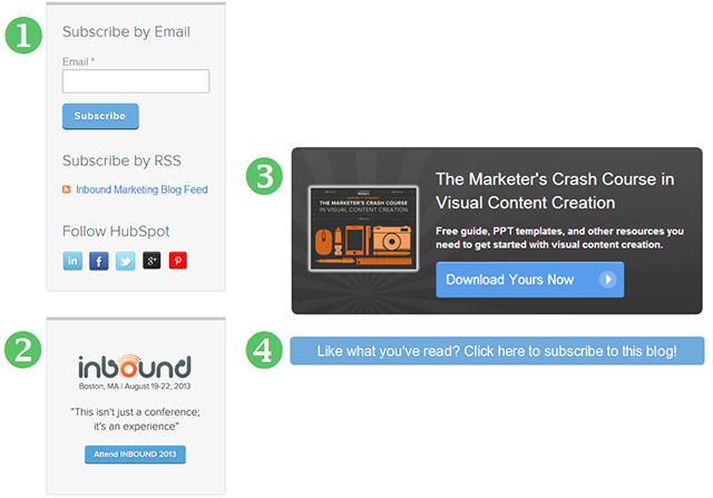
One of the best methods to turn casual blog readers into leads is including calls to action (CTAs) directly on your blog. CTAs make it easy for site visitors to become leads by asking readers to act, and creating a clear path to do so. Marketing software provider HubSpot has done an excellent job of optimizing their blog for conversions in this way. Any given HubSpot blog post will include four CTAs, just like the images below. (Some readers may find this number of CTAs too distracting, so make sure to test what number works best with your own blog audience.)
Calls to action are just one way to optimize your blog for lead conversion. To really maximize conversions, you should also test your overall blog layout and design, use of images and colors, as well as your posting frequency.
Some of these tips may sound obvious, but the 2013 State of Inbound Marketing Report shows the grim reality is that 45% of marketers do not test their marketing efforts, and 21% don’t know whether they test or not.
Just think of all the opportunities to optimize their marketing they’re missing out on!
Does your content marketing strategy include creating high-value content, such as whitepapers or eBooks, that are only accessible after site visitors fill out a form?
If so, these forms may be holding back the conversion potential of your content. A CMO Council study asked consumers what their biggest point of frustration is when it comes to content, and 50% of respondents cited long registrations before accessing content as one of their ‘top three turnoffs.’
If you’re getting lots of clicks on your CTAs, but few conversions, try using progressive profiling on your landing pages. This works by asking consumers only a few questions the first time they fill out a form, and then subsequently asking different questions each time they download a piece of content.
Keeping these CRO tips in mind will help take your content to the next level!
Content Marketing Trap # 2 – Thinking of Your Content as a ‘Lead Generating Machine’
Content marketing isn’t a simple mechanical process — you can’t combine a handful of attractive CTAs and optimized landing pages with low quality content and expect customers to come pouring in. Even if you are able to generate leads in this way, imagine their disappointment after they’ve filled out your form and downloaded your offer, only to find a piece of lackluster content. These leads won’t convert into customers, and will sit indefinitely at the top of your sales funnel.
Not concerned yet? You might be surprised to learn the cost of bad content. An IGD Connect survey found that if buyers perceive your content to be “low value,” your business is 27% less likely to be considered in the decision making process, and 40% less likely to ultimately make the sale!
Think about the last time you downloaded a whitepaper or checked out a company’s blog. How did the quality of the content affect your opinion of that company?
One sure fire way of producing content that people find valuable is by writing with your target audience in mind.
Tailor your content to your ideal buyer persona by brainstorming topics they’d be most interested in, or tips that they’d find beneficial. Don’t spend time and energy creating general content if your goal is to reach a specific audience.
Being more strategic about the type of content you produce will not only raise its value, but it can also help you gain more qualified leads.
Plus, leads that are satisfied with your content are more likely to come back for more. That’s why it’s also important to create different types of content for different stages of the buying process. For instance, a small business owner exploring their marketing options may come to an agency’s site and download a free guide or tip sheet. Once they feel more prepared to make a decision, this lead may return to attend a webinar or read through a case study.
There’s no way around it: if you want to have a successful content marketing strategy, you have to invest in the content itself.
The best way to ensure you end up with qualified leads is to first think about your buyer persona, then start writing. And don’t count on poorly researched articles or typo-riddled guides to convince your leads to convert into customers.
Remember to devote time to both the quality of your content, as well as improving its ability to generate leads — otherwise your work will only be half done!
Image Credit: David Goehring
Do you have any tips for producing engaging content, or optimizing content to generate leads? Share your experience in the comments below!
About the Author: Brittney Stephenson is a Marketing Assistant at Powered by Search, an SEO and inbound marketing agency based in Toronto, Canada. She has a passion for marketing strategy, content marketing, and all things digital. Feel free to connect with Brittney on Google+.
Email Marketing Domination, and Millennials Forge the Future – For Further Study
Conversion Marketing StrategyEmail Is Crushing Twitter, Facebook for Selling Stuff Online | Wired Business | Wired.com
If you’re a frequent reader of our blogs, you won’t be surprised by this report from Custora stating that email is a more effective marketing channel than social networks.
In fact, I say in my book that email is the biggest social network on the planet. Business people plan their days by their inbox. They program audible notifications when new items come into their inbox. It’s not smart, but it’s true.
Of course, this doesn’t mean that you should send self-promotional crap. That won’t work in email, mail or social media. But certainly don’t eliminate email from your marketing mix.
MediaPost Publications Millennials Forge The Future (Depending on Life Stage) 07/01/2013
If you like to study the steady march of the generations, you’ll find this study of Millennials fascinating. Basically, Millennials are here to frustrate the retiring Boomer generation. They are the revenge of GenX. I think you can see from this article that Millennials will baffle Boomers (and GenX) with their attitudes.
Want to get Brian’s For Further Study posts delivered right to your inbox? Click HERE to sign up.
Conversion Conference 2013 Wrap-Up – Better Late Than Never
News & EventsTime flies in Conversion Sciences world. It seems like just a few days ago that Brian was wowing the crowds at Conversion Conference in Chicago, but it was actually a couple of weeks ago! Our brains must be getting old…..
Brian with a presumably young and capable brain.
Brian’s presentation “Everything I Needed to Know about CRO, I Learned From Direct Response Marketers,” was a big draw at this year’s Conversion Conference. He and Dr. Debra Zahey (also known as ‘The Professor’) wow the crowd with their special blend of wit, hard data, case studies, and fashionably professional attire.
I don’t want to give away all of the secrets of this great presentation, so you can check out the slides here, and listen to the audio below. Enjoy!
And maybe just a few more pictures…..
The Professor and The Conversion Scientist.
The One Thing that Keeps Visitors from Converting (Audio)
CRO Tests | Multivariate | AB TestingNo, we aren’t talking about The Blob, or The Mist or even The Thing. We’re talking about “The Thing” that keeps visitors from taking action on your site and converting. Brian has a great post on Search Engine Land talking about The Thing and how do deal with it.
To be fair, The Blob is pretty fearsome as well.
That is this elusive Thing? According to Brian, the thing usually falls in one of five areas; risk reversal, value proposition/messaging, social proof, user interface/user experience, and credibility/authority.
Subscribe to Podcast
Once you identify The Thing, what can you do to combat that concern and give your visitors the confidence to take action.
Brian walks you through each area and what changes you can make to reduce visitor concern. Think of it as your tools to fight The Thing.
Read Brian’s entire post on Search Engine Land or listen to the audio below, and rid your site of The Thing today.
Transcript
There is an insidious voice speaking to your visitors from the moment they click through to your site. It camps in the back of their minds, setting up a tent and proceeding to talk your visitors out of taking action. While there are many angles this voice can work to fill visitors with doubt, there is likely one that is common to a large number of your visitors.
It’s “the thing.”
If you can discover and address the thing — the major concern shared by a significant number of your visitors — then you can make some major improvements in your conversion rates and revenue per click.
When testing, we have found that this thing will fall into one of five areas: risk reversal, value proposition/messaging, social proof, user interface/user experience, and credibility/authority. All of these nagging questions may be present to some degree, but one of them is more pressing than the others — and addressing it will give you wins early and often.
I recommend that you open a spreadsheet so you can capture the hypotheses that come to mind as you read these gems. Your hypotheses should read like this:
Let’s get started.
Risk Reversal
The thought camping at the back of your visitors’ heads may be, “What if I regret this purchase?”
Risk reversal tests start with the return policy. The most famous return policy of late is the Zappos “return within one year and we’ll pay shipping both ways” policy. It is clearly visible throughout the site, summarized in the header.
If you’re generating leads, the most important way to communicate risk reversal is your privacy policy and privacy statement. You could test link anchor text such as “We respect your privacy,” or “Your privacy is important to us,” or “We will never share or sell your contact information.”
Did you know that free shipping falls into the category of risk reversal? It means that I won’t be surprised by high shipping rates when I get into the shopping cart. Knowing what to expect is often more important than dollars saved — after all, we know shipping is factored into the pricesomehow. Test free or flat-rate shipping.
Value Proposition & Messaging
While munching on a blackened hot dog, the voice camped at the back of your visitors’ mind is whispering, “What’s in it for me?”
Communicating your value proposition and messaging is the job of the page content — this includes text, images, video, audio and almost any other media.
Headlines and calls-to-action are always important, and testing often starts there. The inevitable hero image should be tested, especially if it is a rotating banner style so prevalent today (and so often a bad idea).
Long-form versus short copy is another way to find out what your visitors prefer.
Test more detailed pictures of your products. Test getting rid of any stock photography you have on the site.
Never underestimate the power of the words on your site. Some of the most transformational tests we’ve seen involve honing in on the right words.
Social Proof
The voice camping at the back of searchers’ mind may start a fire, roast some marshmallows and whisper, “What would others think?”
We are social animals, and the herd mentality never really leaves us.
Ratings and reviews are a powerful addition and should be tested if you can get your customers to chime in with their opinion.
Test testimonials near your calls-to-action and in your shopping cart.
Come up with some big numbers to describe your success. Rather than counting customers served, consider measuring your success in dollars saved, bites eaten, or seconds spent so that readers can relate to what you’ve done.
Test social media in moderation. It can be a distraction. Will your social customers post pictures of your products? Write reviews? Provide testimonials?
User Interface & User Experience
While carving a snake out of a stick with a pocket knife, the voice in the back of your visitors’ head may be saying, “Nice job. You’re lost.”
How you present information on a page can have surprising effects on your bottom line. In general, your designer should be skilled at the use of white space, position, font, color, and proximity to guide the visitor through a page.
To start with, test making important things stand out, such as calls-to-action. Test the contrast and size of text to see if readability is an issue.
Test completely different layouts for pages to find the right ballpark to do more detailed tests. Simplify or complexify.
Never underestimate the power of ugly to add more dollars to your bottom line. Don’t get attached to your creative. Your opinion doesn’t matter.
Credibility & Authority
The voice at the back of your visitors’ head may be whispering, “Will I get duped?”
The first way to communicate credibility and authority is with your company logo. In general putting it in the upper left on your site does the trick. However, it may actually hurt you on targeted landing pages.
Borrowing authority is a favored strategy. Test the addition of client logos to key pages (landing pages, home page, etc.). If you take credit cards online, be sure to include Visa, MasterCard, Amex, and others, even if you take everything.
Test logos for associations you belong to. Test adding shields for certifications you’ve earned. Test the placement of site security logos, such as McAfee secure and VeriSign. Should they be at the bottom? In the header? Near the call to action button?
Test moving blog post titles to the home page to show your thought leadership (but don’t let them get stuck on your blog).
Picking A Direction For Your Testing
Hopefully, you’ve been jotting down hypotheses about your site as you’ve read this article. Now, you need to prioritize them.
Chris Goward offers PIE as prioritization criteria in his new book. Bryan Eisenberg uses a 5x5x5 model.
At Conversion Sciences, we use a Proof/Impact/Effort/Traffic model that doesn’t seem to spell anything clever. Please offer suggestions in the comments.
Those hypotheses that are supported by analytics, are expected to have a high impact, and require the least effort will bubble to the top of the list.
Now, pick one hypothesis from the top of the list that falls into each of our buckets: risk reversal, messaging, social proof, user experience and credibility. Test these first.
If and when one shows a significant win, you’ve got a good idea of what the voice in the back of your visitors’ mind is whispering to them. Try more hypotheses from this bucket.
Following The Rabbit All The Way Down The Hole
If a headline performs well (messaging), then test a hypothesis about copy length next. If a new layout provides a bottom-line boost (user experience), you might then test a hypothesis that says choices should be reordered.
What you’re doing is finding out what the biggest issue is for your visitors, and then diving in to see how far the rabbit hole goes.
When do you stop and look back at the others? When the wins become scarce and small. Switching to a new category can reinvigorate a testing schedule that needs some big news.
Test hypotheses from each of the five “buckets” to find the major concern of your visitors. This gives you the direction to take for early increases in conversion rate and revenue per click.
21 Quick and Easy CRO Copywriting Hacks
Keep these proven copywriting hacks in mind to make your copy convert.
"*" indicates required fields
Ten Ways to Convert More Customers and More – For Further Study
Conversion Optimization10 Ways to Convert More Customers | Infographic + eBook
If you enjoy studying the psychology of persuasion the way we do here at Conversion Sciences, you’ll love this infographic from the folks at Help Scout.
A Unique Home Page Split Test Experiment on TimeDoctor.com | Biz 3.0
In my book Your Customer Creation Equation I talk about the two conversions that online services have:
I recommend that online services find ways to get the visitor started as soon as possible. Online services have the advantage that we can try the product right there online.
This article is further proof that getting the visitor engaged with questions is a more effective way to find more tryers and buyers than the typical home page.
Want to get Brian’s For Further Study posts delivered right to your inbox? Click HERE to sign up.
Value Propositions: If you have to say it, it probably isn't true.
Persuasion ScienceApple has joined the posers.
“We love our customers!”
“We are the leader!”
“We start by asking, ‘How will it make you feel?'”
Apple was one of those brands that just didn’t have to say how they worked. They created products we didn’t expect and then showed us the products — with the same style that they built them.
This commercial is beautiful, a stylistic way to make an important point.
But it’s all about them. Not me.
I don’t think this bodes well for Apple.
If you can show how you’re different, remarkable or interesting don’t say it. If you have to say it, it probably isn’t true.
[bookpromo]
Last Call for ebook Special – Business Video Through The Eyes of Your Prospects
Conversion-Centered DesignThe big brains in the Conversion Sciences lab have been working around the clock to bring you an interactive ebook about the science behind business video. Business Video Through the Eyes of Your Prospects is a must read for any business looking to invest in video.
While we can’t promise that this book will tell your future, make your hair thicker, or cure the common cold, we can promise the following:
* An explanation of how video works in the brain
* Results of our split test to maximize conversion
* Results of a post test to measure comprehension
* Over 30 minutes of video so you can see for yourself
* And so much more!
To make a long story short (too late!), you will absolutely want a copy of this book. Before you invest in business video, read this book, watch the videos, and create a video strategy based on what will really work. Get the most out of your video budget by focusing on the video that’s going to have the best ROI.
Download Business Video Through the Eyes of Your Prospects.
Conversion Optimization Maturity Model [Infograph]
Conversion OptimizationMaturity Models were all the rage at Conversion Conference Chicago 2013, but they can make you feel like you’re living with your marketing parents — immature.
Don’t feel bad. We didn’t get a perfect score and we do this for a living (see below for how we score).
Maturity models aren’t a way to judge you and your inadequacies. Maturity models are ways to identify your strengths and plan to build on them.
Both Tim Ash of Sitetuners and Michael Parizek of avast! put forward maturity models for us, and I was on hand to capture Michael’s presentation using my innovative Instagraph (instant infograph) technique.
So, how does Conversion Sciences score on the model? Parizek identified seven criteria in his maturity model.
People
This is an area that we feel strongly about at Conversion Sciences. We have an experienced Conversion Scientist doing the work for every business that hires us. We like to say, “You’ll be working with ‘The Guys’.” We would benefit from some more formal methods as we grow our lab staff, both in number and in capabilities.
Score: 4 out of 5
Tools
It is a golden age of conversion tools. There are lots of ways to measure sites, complete tests, and even spy on your competitors. We score highly on this because these tools exist for us to build on.
Score: 4 out of 5
Knowledge
How you manage what you learn from your testing is perhaps the biggest challenge. For most of us, means it stays in the heads of our optimization team. But what happens when there is turnover? Maintaining personas as a living representative of what you know about your customers is a great way to preserve knowledge.
Score: 3 out of 5
Activities
What do you do first? We generate a list of hypotheses based on your analytics, chat transcripts, reviews and interviews with customer-facing employees. Then we rank them in a similar way to Parizek’s model, but with more endices. You may like his simple graph of Impact vs. Feasibility for prioritizing ideas.
Score: 5 out of 5
Processes
Our Conversion Catalyst process that works for businesses in almost any industry. It is a thorough front-end evaluation followed by a fast-test process. Our goal is to find winners on your site within 120 days.
However, this process isn’t effective in slower-moving environments and in situations where wins on the website aren’t closely tied to bottom-line revenue.
Score: 4 out of 5
Testing
We use a test cycle approach. If one of our test hypotheses is a winner, we do another set of tests to see if we can get it even better. If a test is a loser, we can test something else.
This cycle gives us the freedom to find promising rabbit holes and follow them all the way to Wonderland.
Score: 4 out of 5
Sponsors
The key to success is always having a strong internal sponsor at our clients with the authority to get things done. We know how to make this individual a hero. We don’t move forward without this commitment from our clients.
Score: It depends
How do you score on each of these?
Which ones are you working on next?
Let us know in the comments.
[bookpromo]
Business Video Through The Eyes of Your Prospects [New eBook]
Conversion-Centered DesignEveryone is excited about “whiteboard” video, in which concepts are drawn at super-high speed on a whiteboard to explain or sell what you offer.

First, we used an eye-tracking camera to see how people watch whiteboard video. Watch the incredible video we made that tracks viewers’ eyes as the watch whiteboard video right in the interactive eBook.
But, we didn’t stop there.
We did the same for “talking head” video and for “webinar” or “slide” video. These are the three most common forms of business video.
You’re going to be surprised at what we discovered.
We also did a split test of these kinds of videos to see which would generate the most conversions in a business setting.
Don’t invest in video until you’ve read Business Video Through the Eyes of Your Prospects.
This interactive PDF book includes all of the eye-tracking videos and more.
* An explanation of how video works in the brain
* Results of our split test to maximize conversion
* Results of a post test to measure comprehension
* Over 30 minutes of video so you can see for yourself
This extraordinary ebook will save you from investing $5000, $10,000 or more in the wrong video. Get instant access to the Business Video Through the Eyes of Your Prospects.
Video can significantly improve your conversion rates and revenue. The wrong video can do the opposite. Avoid expensive video pitfalls with this interactive eBook.
Big Testing is Better Than Big Data – For Further Study
CRO Tests | Multivariate | AB TestingBig Data is Good—But Big Testing is Better | Chief Marketer
@chiefmartec “out of 12,000 experiments that Google ran in 2009, only about 10% of them resulted in adopted changes.” You are not Google. But you must realize that in every industry, an online leader is going to emerge, and it will be the company that adopts a testing culture.
Intuition is no longer your friend. Your intuition cannot comprehend the variety of ways our visitors are coming at us. Data and testing are your friends, or your online audience will continue to abandon you.
Get excited about testing and taking that leadership role in your marketplace.
Want to get Brian’s For Further Study posts delivered right to your inbox? Click HERE to sign up.