Our LIVE landing page clinic with Unbounce on October 22 was a huge success. Hundreds were on the call as we did an overview of the Chemistry of Landing Pages, and then proceeded to critique the pages of several attendees.
Unfortunately, There were a number of unanswered questions that we wanted to be sure to address.
If you couldn’t attend, you can relive it here.
The Science of Landing Pages & How To Build One Backwards (feat. Live Landing Page Critiques) from Unbounce
Questions we didn’t have time for. Answered.
About Social Media Icons on Landing Pages
There is always heated discussion around the use of social media icons on landing pages. We say, “Save them for the thank-you or receipt page.” One smart attendee asked if these wouldn’t qualify as trust symbols, which they can be, if the cost is not too low.
Teresa wanted to know if placing a Facebook comment widget on the page that didn’t take visitors away was OK. This widget can be a great source of social proof, if you’ve got people commenting. I’ve seen it used effectively on video sales pages for entrepreneurs with big lists. Most of us won’t have that kind of following, and so the widget can simply be a distraction or a resource for trolls.
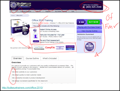
We marked up several pages in our live landing page critiques.
About Generating Calls
Phil asked about his high-priced security product. His call center operates 7 days a week. Shouldn’t he focus on getting calls? We say, “Yes!” My partner on the call and fellow Conversion Scientist Joel Harvey is our “Lord of the Rings.” He makes the phone ring. Find out how to make the phone ring in my MarketingLand column.
Vicky asked what we thought about having a Live Chat button on a lead-generation landing page. We think that your prospects are going to be delighted to get instant access to someone who is knowledgeable. Conversion rates for live chat can be much higher than for completed forms. However, if you don’t have someone manning the live chat during appropriate hours, it may work against you.
About Landing Page Length
Moazzam asked about customers who are known to need more information before taking action. We say, “Put whatever you need on the landing page.” You may need a multi-page landing microsite to satisfy your methodical prospects, but in most cases, you can put all of the objection-handling content on the page. Use tabs, scrolling and even overlays to get the information to the visitor without letting them navigate away from your offer.
Bradley wanted us to speak to the value of brevity. We say that brevity for the sake of brevity isn’t helpful. Write as much as you need to in order to deal with objections and reduce abandonment. If your copy is boring or irrelevant, then brevity is your friend. Hire a copywriter and trust them.
Massimo asked if putting the call to action button below the fold impacted conversion. We often increase conversion rates by moving important elements, such as trust symbols, above the fold. For those who come ready to take action, put the button above the fold. This may not be the right thing to do for longer landing pages.
About Mobile Landing Pages
Kelly asked about having desktop and mobile landing pages. Is a responsive template that resizes dynamically a good idea. Dynamically responsive templates can be difficult to test. Visitors can change the look of the page simply by resizing their desktop. Visitors on tablets can get a desktop template, but have a very different experience from desktop viewers. We say, “Turn off the dynamic nature of the template while testing your landing pages.”
Myrtha asked the common question, “What is a good conversion rate.” The average ecommerce conversion rate is less than 2%, so a conversion rate over 5% is considered good. With the right traffic and a great offer and lots of repeat visitors and a well-known brand, conversion rates over 15% are expected. Myrtha, a better question is, “What is my acquisition cost?” Divide the number of new customers by the cost of generating the traffic, and you can see how your conversion rate is affecting your business.
About Video on Landing Pages
During our discussion of video on a landing page, Mike asked, “How do scribble or text-based videos do?” We actually did an eye-tracking study of landing page video. To learn some of what we learned, watch our mini-course on Business Video.
Ronald asked if a landing page video should ask the viewer to “click here.” The answer is, “Yes.” Landing page video is most effective when it addresses the offer on the page, and includes calls to action. Remember that lighting and audio are always important in video.
Eric wanted to know if videos should start automatically. This is something that changes from page to page. Auto-start video frequently tests best, but we suggest only autoplay video if the ad or link to the landing page promised a video. This is “playing it safe.” Steve asked about on-screen spokes-model video, the kind that seems to walk around on your page. We’ve seen autoplay work here as well in one situation.
About Other Kinds of Landing Pages
Casey asked if the home page could be considered a landing page for a site that sells multiple products. We say, “Nope.” The job of a home page is to get visitors off of the home page (thanks Tim Ash) and into the site. The job of a landing page is to keep people on the page until they take action. Treat your home page as a multiple-choice question and your product pages as landing pages.
Sérgio asked about B2B catalog ecommerce businesses, like restaurant and hotel supplies. If you’ve done your ads and SEO right, the primary landing pages are going to be the category pages and the individual product pages. The product pages in particular should follow our rules for landing pages: Minimize distractions (like navigation), build trust, offer proof, show the product and provide all the information necessary for the visitor to take action. The call to action is almost always “Add to Cart” or “Add to Basket.” These are great offers.
Steve asked about landing pages for our email subscribers. Should landing pages that offer new content ask for contact info, even if we already have it? We say, “Not necessarily.” If your personalized landing pages can track visitors individually, it’s better to learn something new about them.
Dave wanted to know what image we would recommend on a landing page that is offering a newsletter. We say, “Show them a copy of an issue or two, even if the newsletter is strictly electronic. The image at right is for a weekly newsletter that we offer called For Further Study. It’s just a screen grab of one of our emails.
Thomas noticed that our examples used in our critiques didn’t seem to be optimized for search. Landing pages don’t need to be optimized for search traffic. They serve ads, links and emails. They are often not part of a larger corporate site. A landing page is designed to single-mindedly keep the promise made in an ad or email and to get the visitor to take action. SEO isn’t important in this case.
Angie Schottmuller asked about what makes a compelling testimonial on a landing page. She mentions including a photo of the testifier, dates of engagement, location of testifier and targeting testimonials to a certain persona. These are all good ideas. I’d ad this: summarize the most important point in the testimonial quote.
Enjoy the recorded version of the full presentation.
Thanks to the brave souls who submitted their landing pages for review.


Your Landing Page Questions Answered: Unbounce Webinar Extended Edition
Landing Page OptimizationOur LIVE landing page clinic with Unbounce on October 22 was a huge success. Hundreds were on the call as we did an overview of the Chemistry of Landing Pages, and then proceeded to critique the pages of several attendees.
Unfortunately, There were a number of unanswered questions that we wanted to be sure to address.
If you couldn’t attend, you can relive it here.
The Science of Landing Pages & How To Build One Backwards (feat. Live Landing Page Critiques) from Unbounce
Questions we didn’t have time for. Answered.
About Social Media Icons on Landing Pages
There is always heated discussion around the use of social media icons on landing pages. We say, “Save them for the thank-you or receipt page.” One smart attendee asked if these wouldn’t qualify as trust symbols, which they can be, if the cost is not too low.
Teresa wanted to know if placing a Facebook comment widget on the page that didn’t take visitors away was OK. This widget can be a great source of social proof, if you’ve got people commenting. I’ve seen it used effectively on video sales pages for entrepreneurs with big lists. Most of us won’t have that kind of following, and so the widget can simply be a distraction or a resource for trolls.
We marked up several pages in our live landing page critiques.
About Generating Calls
Phil asked about his high-priced security product. His call center operates 7 days a week. Shouldn’t he focus on getting calls? We say, “Yes!” My partner on the call and fellow Conversion Scientist Joel Harvey is our “Lord of the Rings.” He makes the phone ring. Find out how to make the phone ring in my MarketingLand column.
Vicky asked what we thought about having a Live Chat button on a lead-generation landing page. We think that your prospects are going to be delighted to get instant access to someone who is knowledgeable. Conversion rates for live chat can be much higher than for completed forms. However, if you don’t have someone manning the live chat during appropriate hours, it may work against you.
About Landing Page Length
Moazzam asked about customers who are known to need more information before taking action. We say, “Put whatever you need on the landing page.” You may need a multi-page landing microsite to satisfy your methodical prospects, but in most cases, you can put all of the objection-handling content on the page. Use tabs, scrolling and even overlays to get the information to the visitor without letting them navigate away from your offer.
Bradley wanted us to speak to the value of brevity. We say that brevity for the sake of brevity isn’t helpful. Write as much as you need to in order to deal with objections and reduce abandonment. If your copy is boring or irrelevant, then brevity is your friend. Hire a copywriter and trust them.
Massimo asked if putting the call to action button below the fold impacted conversion. We often increase conversion rates by moving important elements, such as trust symbols, above the fold. For those who come ready to take action, put the button above the fold. This may not be the right thing to do for longer landing pages.
About Mobile Landing Pages
Kelly asked about having desktop and mobile landing pages. Is a responsive template that resizes dynamically a good idea. Dynamically responsive templates can be difficult to test. Visitors can change the look of the page simply by resizing their desktop. Visitors on tablets can get a desktop template, but have a very different experience from desktop viewers. We say, “Turn off the dynamic nature of the template while testing your landing pages.”
Myrtha asked the common question, “What is a good conversion rate.” The average ecommerce conversion rate is less than 2%, so a conversion rate over 5% is considered good. With the right traffic and a great offer and lots of repeat visitors and a well-known brand, conversion rates over 15% are expected. Myrtha, a better question is, “What is my acquisition cost?” Divide the number of new customers by the cost of generating the traffic, and you can see how your conversion rate is affecting your business.
About Video on Landing Pages
During our discussion of video on a landing page, Mike asked, “How do scribble or text-based videos do?” We actually did an eye-tracking study of landing page video. To learn some of what we learned, watch our mini-course on Business Video.
Ronald asked if a landing page video should ask the viewer to “click here.” The answer is, “Yes.” Landing page video is most effective when it addresses the offer on the page, and includes calls to action. Remember that lighting and audio are always important in video.
Eric wanted to know if videos should start automatically. This is something that changes from page to page. Auto-start video frequently tests best, but we suggest only autoplay video if the ad or link to the landing page promised a video. This is “playing it safe.” Steve asked about on-screen spokes-model video, the kind that seems to walk around on your page. We’ve seen autoplay work here as well in one situation.
About Other Kinds of Landing Pages
Casey asked if the home page could be considered a landing page for a site that sells multiple products. We say, “Nope.” The job of a home page is to get visitors off of the home page (thanks Tim Ash) and into the site. The job of a landing page is to keep people on the page until they take action. Treat your home page as a multiple-choice question and your product pages as landing pages.
Sérgio asked about B2B catalog ecommerce businesses, like restaurant and hotel supplies. If you’ve done your ads and SEO right, the primary landing pages are going to be the category pages and the individual product pages. The product pages in particular should follow our rules for landing pages: Minimize distractions (like navigation), build trust, offer proof, show the product and provide all the information necessary for the visitor to take action. The call to action is almost always “Add to Cart” or “Add to Basket.” These are great offers.
Steve asked about landing pages for our email subscribers. Should landing pages that offer new content ask for contact info, even if we already have it? We say, “Not necessarily.” If your personalized landing pages can track visitors individually, it’s better to learn something new about them.
Dave wanted to know what image we would recommend on a landing page that is offering a newsletter. We say, “Show them a copy of an issue or two, even if the newsletter is strictly electronic. The image at right is for a weekly newsletter that we offer called For Further Study. It’s just a screen grab of one of our emails.
Thomas noticed that our examples used in our critiques didn’t seem to be optimized for search. Landing pages don’t need to be optimized for search traffic. They serve ads, links and emails. They are often not part of a larger corporate site. A landing page is designed to single-mindedly keep the promise made in an ad or email and to get the visitor to take action. SEO isn’t important in this case.
Angie Schottmuller asked about what makes a compelling testimonial on a landing page. She mentions including a photo of the testifier, dates of engagement, location of testifier and targeting testimonials to a certain persona. These are all good ideas. I’d ad this: summarize the most important point in the testimonial quote.
Enjoy the recorded version of the full presentation.
Thanks to the brave souls who submitted their landing pages for review.
21 Quick and Easy CRO Copywriting Hacks
Keep these proven copywriting hacks in mind to make your copy convert.
"*" indicates required fields
The Indispensable Marketer
Conversion Marketing StrategyLet’s talk about your career as a marketer. Let’s talk about your power in an organization. Let’s talk about your ability to make things happen in a very real and salary-building way.
Marketing is seen as important by CEOs. However, the marketing department is often not seen as important.
We are too often seen as tactical teams working on strategic initiatives, but don’t own the strategy. Our skills are seen as commodities. Everyone with a word processor seems to know how to do marketing.
Marketers move in a valley between powers. They don’t have control of the products. They don’t have control over sales.
We are the soil and water (and fertilizer) that makes the grass grow, but at the end of the day, we’re not given credit for the grass.
The distinctions between a “typical” marketer and an indispensable marketer are subtle and huge.
The table is full of generalizations, of course. My aim is to describe a number of Power Processes that marketers can use to become indispensable.
Power Processes: Visible, Measurable, Repeatable
A power process has the following characteristics:
1. It has visible, demonstrable effects on the bottom line of a company.
Marketing success is too often relegated to graphs in the monthly marketing report. Power Processes are visible to the company, often creating problems in other areas when they work.
2. It is repeatable with consistent results.
Power processes are the things that can be relied on month after month to provide additional revenue and success.
3. It is measureable.
Marketers need to stop doing the things that don’t work. The success or failure of a Power Process should be obvious.
4. It provides a self-regulating learning curve.
A Power Process provides feedback as it is implemented. Learning happens in action. It is a more organic learning curve than can be provided by a campaign.
In my MarketingLand column Marketing Power Processes: The Lord Of The Rings, I talk about making the phone ring. It fits the model of the Power Process.
1. Sales or customer support knows when the website is generating calls. You might create some problems for them!
2. It will deliver month after month.
3. It can be measured and quantified.
4. You will learn over time what calls to action make the phone ring more and more.
Read the article or listen to it here.
Podcast: Play in new window | Download
Why You are Frustrated with Your Landing Pages
Landing Page OptimizationOne of my favorite online videos of all time imagines how Microsoft might have re-designed the original iPod packaging. The comments on YouTube indicate that this was actually made by Microsoft to illustrate the problem with Microsoft’s policies.
MS iPod Parody
Landing Pages go through the same process and end up completely missing their intended purpose.
Done right, they keep the promise made by an ad, email or link.
Done right, they single-mindedly get visitors to take action.
Done right, they make the effective cost of your advertising shrink.
Done right, they focus on an offer and not the company that produced them.
However, many of them don’t deliver. It’s frustrating and maddening.
There is hope.
Our friends at Unbounce, the landing page Kings, have asked me and fellow Conversion Scientist Joel Harvey to explain how to get to “Done right.”
in our presentation The Chemistry of the Landing Page, we show you how to build a landing page backward and are going to critique a number of pages live online.
Several brave souls allowed us to critique their site as a part of the presentation. Watch now as submissions close on Thursday.
There is a recipe for landing pages that will work for you over and over. It involves a finite number of elements.
However, the most important feature of a landing page is a whole lot of nothing – nothing that isn’t supporting the offer, enabling action, building trust, providing proof or showing the offer.
Anything else is creating Abandonment.
We’ll talk about the problem of Abandonment and how your landing pages are giving visitors unnecessary opportunities to flee.
Ample Schadenfreude
We pick a few pages submitted by brave viewers for a live critique, applying the landing page formula.
This is not to be missed.
We have a lot of fun with these critiques and you will too. It’s perhaps the best way to get good at constructing landing pages.
Here’s a freebie just for reading
Here’s an example of how easy it is to apply landing page chemistry to the question, “Should we put social media icons on our landing pages?”
Is the primary page offer to like, friend or follow? Do the icons build trust or credibility? Do they create an opportunity for visitors to delay their action or abandon the page altogether?
For most landing pages, social media icons are a bad idea. They make visitors delay taking action and really don’t support the offer with trust or proof.
Save social media icons for the “Thank you” page.
Watch the complete presentation.
Confessions of an Über Optimizer-Craig Sullivan [INFODOODLE]
Conversion OptimizationIt was a pleasure to spend some time with Craig Sullivan, the pleasant but focused Scotsman now residing in the UK.
He’s not a man to mince words, but he knows his stuff, so he’s earned the right to be cranky when he comes across the websites of companies that just don’t get it.
You don’t have to wait for his wrath, though. He spelled it out in his ConversionSUMMIT keynote, and the Conversion Sciences doodlebot captured his presentation in HD resolution. All for you.
You will find his presentation slides on Slideshare.
September Wrap Up: ConversionSUMMIT and ConversionJAM
News & EventsI’ve got some eye-candy and ear-hums for those of you who hate reading. My tour of Europe (Frankfurt, Germany to Stockholm, Sweden) yielded a variety of media.
Our brains are good at ignoring the typical so that we don’t miss the life-threatening: Wind on the grass vs. the steps of a predator.
Per Axbom
Lab Coats Were All the Rage
My fantastic hosts, André Morys and John Ekman easily earned their Conversion Scences lab coats for exemplary work in progressing the science of conversion. Co-speaker Natalie Nahai (the WebPschologist) found the 1200 thread count thermal weave to be warming on a cool Stockholm night.
An Audio Preview
Live the Full Presentation as if you were THERE
Podcast: Play in new window | Download
Follow along with the slides.
How To Present a Tourist-Friendly Experience To Brand New Site Visitors
Conversion-Centered DesignThere’s comfort in familiarity. Whether it’s an old favorite dish at a neighborhood restaurant, or a sweatshirt you’ve kept in the closet since high school, people like to stick to what they know. The new and unknown is unfamiliar and a little daunting. And it keeps people from branching out to trying new things.
A little familiarity goes a long way when visiting someplace new. (via MarketingLand)
This applies to your website as well. When a first time visitor comes to your site, will they find familiar markers to guide them around? Or will they be confused by the completely new experience?
What can you do to make your site new-user friendly? Brian’s new post on MarketingLand is full of great tips on things you can do to make your site more familiar and comfortable for brand new users. A few suggestions from his post:
Brian pulls some similar (and humorous) examples from his recent travels overseas, and illustrates how frustrating it can be to arrive somewhere new and be unsure of how to perform tasks that should be easy and commonplace.
Check out his entire post here on MarketingLand for an in-depth look at creating a user-friendly and familiar experience for your brand new site visitors.
Tweetable Stats and E-Commerce Customer Acquisition – For Further Study
Ecommerce CRO48 Tweetable Stats To Make You An Online Marketing SmartyPants | Unbounce
So, if you’ve got something you really want people to share, follow this recipe. For article-style content, use pull quotes and put a “Tweet this” link with each.
E-Commerce Customer Acquisition Snapshot | Custora Blog
It is no surprise to see cost-per-click (CPC) search advertising growing over that time. However, it is gratifying to see that email has grown the fastest, far outstripping banner advertising, Facebook and Twitter.
In my book I say that email is the biggest social network on the planet. It appears to be so for e-commerce companies as well.
Want to get Brian’s For Further Study posts delivered right to your inbox? Click HERE to sign up.
Tired of getting Friended, then nothing? Start getting Customered
Conversion Marketing StrategyThey friend you. They fan you. They pin you. We love our social media tribes.
But how often to they customer you? How often do they buy, subscribe, or register?
When you get customered, your business grows, you gain another social influencer, and you get proof that your social media strategy is delivering what your social network wants.
Getting customered is an important part of the social media life cycle, and it’s also one of the trickiest.
I’m going to do a deep dive on getting your business customered at Engage Mexico in beautiful Puerto Vallarta, November 14-17.
You should be there.
The potential in your social networks
Your social networks store potential, like a battery stores voltage.
If you’ve been actively building your social networks, you have stored potential, like a battery has stored voltage. How do you hook up to the juice that turns that potential into leads and revenue.
Tapping this potential requires that you connect your social battery to something of interest to both you and your social denizens.
Use Content for Wires
Ultimately, you discharge your social batteries the same way you charged them. You use relevant content presented in a ways your crowd likes to get it.
Content might be blog post links on Twitter, contests on Facebook, and product pictures on Pinterest. Without the content, no one is going to find their way back. They just stay potential.
Many of us already have content strategies for our social networks, but what gets people to customer us when they visit?
Use social media landing pages to get customered
Connect them to your Landing Pages
Here’s where you need to start thinking like your visitors. Once read, great content is quickly dismissed.
What is the next step for me as a visitor and potential customerer of your business?
(Customerer??)
The golden secret is to treat your content pages as social media landing pages.
A landing page is a single minded page designed to do two things:
A Social Media landing page, then, is a single minded page designed to:
Both pages have content that delivers on a promise and a call to action that entices readers to do something wonderful.
NOTE: If you are building an email list, you get customered when you get subscribered. Think about it: the visitor is paying for content with their contact information.
NOTE 2: “Subscribered” is the last time I will verbify a noun in this article.
Where do Social Media Landing Pages Live?
Social media landing pages live anywhere you are drawing social visitors.
Your blog content pages have the content, but do they have the call to action? Is the call to action where it can be seen?
Add calls to action in or near the content.
Your email signup pages have the call to action, but do they have the content that makes signing up appealing?
Give subscribers a better reason to sign up than “Get on another mailing list.”
Your lead generation pages, offering gated content have the call to action, but do you talk about the content you are offering, or do you talk about our company and your products instead?
Don’t talk about yourself like a socially awkward freak.
Any page to which your friends, fans and followers might come in search of education or entertainment qualified as a social media landing page.
Remember that these are Social Visitors
Product pages on ecommerce sites are another frequent social media landing page. The call to action is invariably there: Add to Cart.
Given that your visitors are coming from a social network, they will be more likely to want to see social content with the product information. You should oblige them.
It’s one thing to get people to friend, fan, follow, and flatulate. It’s quite another to get them to customer you. Use content to connect your social batteries to social media landing pages and get customered.
Tweetables
Tired of getting friended, then nothing? Get customered!
Your social networks store potential, like a battery stores voltage.
The golden secret is to treat your content pages as social media landing pages.
Images by Brian Massey
The Black Hole in your Website
Ecommerce CROThe picture below illustrates all too well the dangers of running a website without some kind of conversion optimization effort.
What you are seeing is the office where an un-optimized website was hosted. The site was designed by an agency that let the charismatic CEO influence the design. Unfortunately, little attention was paid to the shopping cart. It was assumed that visitors would just figure things out.
They were wrong.
The abandonment rate – a measure of the visitors that start the checkout process but don’t finish – rose to alarming levels very quickly.
The abandonment rate of a website housed in this building approached infinity causing a gravity well, or “black hole” to form.
As the abandonment rate approached infinity, a rare singularity was created that threatened the entire building. Left unchecked, the entire business could have been consumed by the black hole that developed from the singularity. The gravitational forces of this website black hole are so strong, not even money can escape.
This is a situation in which a poorly designed website not only loses money, but sucks away all future opportunity. There is nothing worse for a brand than a bad online experience.
By inserting a Conversion Catalyst into the site, the abandonment rate returned to safe levels, saving the business and several surrounding buildings.
A Conversion Scientist was able to avert catastrophe by inserting a Conversion Catalyst into the site and completing some targeted split tests. Problems were isolated and corrected. The abandonment rate returned to safe levels saving the business — and several surrounding buildings.
The moral of the story is that untested websites not only threaten current sales, but can create ripples across the time-space continuum that some businesses never recover from.
Is there a black hole in your website from which money is not escaping?
Ask us about a Conversion Catalyst for your website.
Writing Killer Conversion Copy: Getting Past the Bouncers in Your Brain
Conversion-Centered DesignWhy do we have to work so hard to get our persuasive messages heard? Why is direct response copywriting so difficult? Why don’t people read?
This presentation from ConversionSUMMIT 2013 and ConversionJAM 3 introduces you to two “bouncers” in the human brain that keep marketing messages from penetrating and tells you what to do about them.
Writing Killer Conversion Copy Live
Writing Killer Conversion Copy Slides
Invite Brian to speak and entertain at your next event.