Mobile Call-to-Action Buttons: Best Guidelines for Placement, Copy, and Design
For those mobile visitors that are actually shopping, or trying to solve a problem, there are three broad segments.
- Mobile-yes. These visitors who subscribe or purchase on their phones as if it were a desktop.
- Mobile-maybe. These visitors need to be motivated to complete a transaction. They are hampered by the environment they are in, or a lack of trust or skill with their phones.
- Mobile-nope. These visitors will not buy on mobile.
CST: Can you tell us more about these mobile ecommerce visitor segments?
Mobile-yes visitors may be well-served by the calls to action of your default responsive design. You can estimate this segment by the number of completed mobile transactions you get.
Mobile-maybes may need a call to action that doesn’t require as much effort. You may only be able to get an email address or permission to text them. Offering to save their cart or give them a discount in exchange for permission to contact them may be the best option. This segment is estimated by your abandoners. Those who start filling out your form or press the add to cart buttons, but don’t finish the transaction.
Mobile-nopes may respond to the calls to action of the Mobile-maybes. Some percentage will call. Test click-to-call as a call to action, especially if you are offering a service or product that is complex to buy. When our clients are optimizing for phone calls, they have higher conversion rates on mobile than on desktop. You can estimate this segment as the visitors who spend time on your site, but don’t take any action.
Which segments are the largest on your site? Mobile-yes, mobile-maybe, or mobile-nope. This information will help you decide which calls to action to try first.
If you are good at email, you have more reason to prioritize mobile calls to action that generate email addresses. Here’s a real-life example. Someone is standing in line at the bank and they are shopping at an ecommerce store for fun. You’re not going to get a sale from them. But if your revenue per recipient (email revenue divided by emails sent) on your emails is higher than your mobile revenue per visitor (mobile revenue divided by mobile visitors), then you should have an offer to get a discount or save their work. Let them browse, and capture their email to convert them into sales later.
CST: Now we know which CTAs to optimize for, what is the next step?
Massey: On a mobile site there are many call-to-action buttons. Ultimately, the question we need to answer is, which calls to action are going to stay permanently on the screen.
Which ones are scroll-to, and which ones are permanent. Which ones are on a sticky header or a sticky footer.
Sometimes a top sticky works, sometimes a bottom sticky works. The top sticky is higher in the visual hierarchy. The bottom sticky is closer to the thumb. So really, it’s something you have to test.
Mobile User Behavior Tracking to Identify Possible CTA Button Placements
Let’s dive deeper into how mobile user behavior tracking can help us identify the best possible call-to-action button placement.
CST: How do you define which call to action goes where on a landing page?
Massey: The ones that are most valuable on mobile, should go in a sticky header or footer.
CST: OK. So basically, it’s opposite to everything we’ve read, right?
Massey: What did everybody else say?
CST: Almost every article repeated the same concepts. Make sure the eye flows towards the most important call-to-action. Consider the visitor’s natural scanning pattern.
Massey: Visual hierarchy is an issue on desktop, but not really an issue on mobile. On desktop, it’s important to control the eye. On a mobile site, it’s important to control the thumb.
On desktop the eye is king. On phones, the thumb is queen. On the desktop we use the visual hierarchy to help the visitor look in the right places. On mobile, we are a slave to their thumbs.
According to research done by Stephen Hoober 75% of users touch their screen only with their thumb, even though less than 50% hold the phone with one hand.
The thumb is almighty.
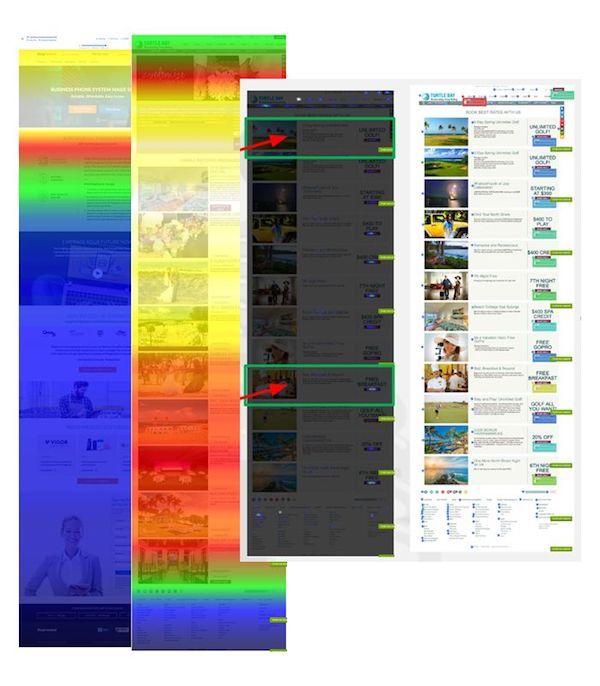
If you look at the heat maps from mobile devices, the scroll goes a lot further than it does on desktop sites.
Mobile phone users are more likely to scroll to the bottom of a page, and bounce. We’ve found a nice 6 percent increase in conversion rates when we place a call-to-action at the bottom of the page, instead of the copyright text in your footer. We call this a “dripping pan”. If they are scrolling your whole page then they are quite engaged. You should always have a call to action at the bottom.
Mobile visitors are much more likely to see the footer of your site. They bounce at the bottom after fast scrolling. For desktop users, the footer is a graveyard, where only the desperate look.
CST: We also read that Gutenberg (top left to bottom right) is the most important pattern on mobile.
Massey: Gutenberg is like reading. It does not apply to mobile web pages as much. The “F-pattern” that you hear about is more relevant to search result pages on the desktop. The pattern in mobile is more top to bottom.
CST: Can you track eye behavior on mobile screens?
Massey: It’s harder to do eye tracking on small-screen mobile devices, because it’s hard to see where the eye is looking. This information is gathered from the camera, and on a small screen, the eyes are not going to move that much.
Therefore, eye tracking is important for desktop and large-screen tablets. Scroll and tap tracking is a better gauge of activity on mobile.
CST: What happens when people take a pause from scrolling?
Massey: Then it’s hotter on the scroll tracking. That portion of the page is hotter. It means they are paying more attention and it could be a great place to add a mobile call-to-action button.
CST: How can we use scroll tracking to improve mobile conversions?
Massey: Let me show you an example. The page on the right has a scroll problem. You can tell because the hot white area is where a lot of people are seeing it, and the dark areas are where few people are seeing it. It could be that they are not scrolling because they are engaged or because this copy is boring them so they’re leaving.
Less than 25% of the visitors are seeing the call to action on this page. Furthermore, there are several calls-to-action on this very long page, and very few people are seeing them. Scroll tracking helps identify these conversion issues.
In order for your call to action (CTA) to work, people have to see it.
We can clearly see how people are consuming the mobile page. Eye tracking is not effective on a mobile device. Scroll tracking is a better guide.
CST: Most articles speak about adopting a specific visual hierarchy of CTA buttons to direct the visitor’s actions. Is this true?
Massey: That is mostly desktop-oriented advice. The visual hierarchy is more important on desktop because we’re looking at a large body of stuff, and we have to understand the priority of things on that page. With mobile, we’ve got people scrolling through and they need to just see what their options are as they’re scrolling down.
Therefore, you may place mobile call-to-action buttons side by side, or make them sticky. Side by side buttons tend to be given equal consideration, and with sticky buttons, visitors get to choose when to take action.
CST: Is placing a sticky View Cart by the hamburger menu always the best option for an e-retailer?
Massey: It’s possible, but that’s not always the best combination.
If you have a site with a large catalog of products, you might put a search icon in the sticky header. If that works, you might try putting a search field there. Discoverability and capturing their email address might be the most important elements to increase mobile conversions.
Most ideas don’t make it to the top of our hypothesis list because they’re low impact. But sticky CTAs are among the first things we test on mobile sites.
We call a sticky header a “headband”, and a sticky footer “sticky shoes”.
Getting your sticky elements right is very important. Test both.
You may be surprised by how much you can include in a headband. We’ve had successful tests with a headband that contained, the company logo, call-to-click phone number, live chat call to action, hamburger menu, and a request information call to action.
If your revenue per visitor is higher on mobile than your revenue per recipient, which is the email revenue, then you would place “View cart” on the sticky menu. On product pages, you might want “Add to cart” to be on your sticky header.
CST: Some studies claim that you should have a clear call-to-action button that takes users 3 seconds or less to see. True or false?
Massey: Well, the page needs to load faster than 3 seconds. This is true for lead generation, but not so much for ecommerce, and it’s very important for content pages.
CST: Can we place more than one CTA per mobile page?
Massey: You must. You must increase the number of calls to action on mobile. You want to avoid having your mobile visitor having to scroll to find the call to action. Especially if you don’t have a sticky header.
And you should always put a dripping pan, which is the call to action at the bottom of the page. If someone reads all the way to the bottom of the page, they are probably pretty interested in the topic.
CST: What are the best top placements for mobile call-to-action buttons?
Massey: There are three things about mobile calls to action that the power of the thumb dictate:
- More frequent calls to down the page. For fast scrollers, you’ll want to have a call to action when their scanning has delivered the answer they were looking for. These can be one call to action repeated or content-relevant calls to action (Like the weak “Learn More”)
- Keeping calls to action on the page. Headbands and sticky shoes should be the first elements you optimize.
- The dripping pan. Have a call to action at the bottom of the page for when the visitor “bounces” off the bottom.
CST: Before we move onto mobile button design, white space and button color, what’s your best advice on mobile call-to-action button placement?
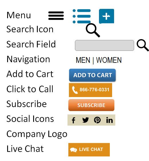
Massey: First, you need to define what goes in the sticky header. Should it be a sticky header or a sticky footer? Then define which of these items should go in that header or footer:
And then you could define how you treat those elements. In other words, it’s about designing the calls to action.
Crafting your Mobile CTA Button Copy
Your mobile CTA button copy needs to be descriptive. The call-to-action button should tell visitors what is going to happen when they click it. It should be relevant, clear, and compelling. For example, “Get instant access” is compelling and clear.
Some studies show that if you say “my” instead of “your” then you’ll have an increase in conversion rates. But this doesn’t always happen.
Test creating a sense of urgency with your audience.
Placing the privacy policy under the mobile call-to-action buttons is called risk reversal, and can help for lead generation. There is a whole science behind risk reversal near the CTA button. Trust symbols, ratings and reviews, stars, testimonials – anything that makes the person feel more comfortable clicking that CTA button.
This section’s advice on call-to-action copy is actually valid for both mobile and desktop buttons.
Mobile CTA Button Design
Button size is really important, especially on small screens. Make sure your responsive design does not reduce the size of your buttons, and follow IOS standards on button size. In the Human Interface Guidelines, Apple recommends a minimum target size that is 44 pixels wide by 44 pixels tall. Try to avoid text buttons, as they are too small to tap and may lack sufficient contrast to be visible.
Adhering to these standards will not only help you with conversion, but with user experience and SEO as well.
The next thing to take into consideration is contrast. Not the color of the button per se, but the contrast in colors.
A button on mobile needs to look like a button, and, if it doesn’t, you may want to add round corners, raised borders, shadows, etc. And if there’s any doubt that this is a button, add an arrow of some sort to point at the button.
Our experience indicates that buttons that look like actual buttons tend to perform better. On the other hand, we have also found that ghost buttons – those whose background is the same as the page – can be invisible. As usual, you have to test to find out.
Vary the boldness of mobile CTAs based on priority if you have several buttons together.
If you are working with a platform like Magento, Shopify or WordPress, you may be limited by the theme’s responsive design. In these cases, you should consider either a theme that allows you to present two different designs, one for large-screen visitors and one for small screens. You may be able to alter the theme’s template to deliver a different experience to small screen devices. There are tools on the market that let you change the site in the visitor’s browser with JavaScript. This is similar to what we use to AB test. The server serves the same page, but as this is a mobile phone, it makes adjustments in the visitor’s browser.
Overall, I think it’s important to realize that your mobile visitors don’t want a shrunk-down version of your desktop site.
They want a mobile experience. If you test the types and designs of your mobile CTAs, you can close the gap between the conversion rate from your desktop visitors and your mobile visitors.
- 7 Simple & Effective Ways to Improve Your Email Open Rates - February 23, 2021
- The 3 Most Effective Marketing Strategies For Ecommerce Businesses - December 26, 2020
- Google Ads not Converting? Try These 4 Optimization Tricks - August 6, 2020


