web forms

We ran an A/B test of a form against a multistep quiz-style form and found that it increased completion rates by 61%. Here’s what we learned.

Sometimes, we collectively overlook some of the most promising ideas to make things better for our visitors.

So many landing page redesigns leave one element largely unchanged:

The stack of fields we call a web form.

The forms may change, but the stack of fields approach seems to be the preferred way to get a visitor’s information.

Over the past few years, we’ve been experimenting with alternatives to what we call Pancake forms, with some incredible results.

We get higher conversion rates, better abandonment data, and more valuable customers.

Traditional Web Forms are rarely questioned.

It’s human nature to keep doing what we and others have done for a long time. This is why the people that Appled called “the crazy ones” seem to find success.

We here at Conversion Sciences are no exception. Here’s a page we completely redesigned. Just about everything on the page changed.

Except one thing.

Two versions of the Ogle Schools homepage, labeled before and after. (Click to enlarge)

Almost everything changed, except one element.

The one thing that changed little was the form, certainly one of the most important components of the page.

Limitations of Web Form Optimization

We have the ability to see how our visitors are using our web forms. A variety of tools will tell us what fields in the stack are causing problems.

But what do we do with the information?

A web form heat map report that shows how many people abandon at each field.

We can instrument forms to see which fields cause people to abondon the form. Click to enlarge.

We can remove a problem field. Sometimes this is an option.

We can adjust the field. We often find that changing a dropdown to an open-text field will increase completions.

We can add some information next to the field. This often makes the form more intimidating to the visitor.

For more, see Designing Landing Page Forms That Convert.

A/B Test of a Form vs. Quiz

Here is a pretty typical lead generation form. It’s a stack of fields — a pancake form.

GPS Fleet Tracking form with fields name, email, phone, company name, and number of devices.

This looks like a simple pancake form. Certainly most visitors are getting through it, right?

How could we change this experience? How can we make it

  • more personal?
  • more mobile friendly?
  • better at collecting data about our users’ behaviors?

This is the solution we came up with. It’s a multi-step form, or a quiz.

Multi-step or Quiz-style web forms

This is the solution we came up with. It’s a multi-step form.

This version generated 61% more quote requests when we did an A/B test of the quiz.

Images of the five steps of the multi-step form for Blue Rhino.

This mulit-step version of the form asks more questions, yet has a much higher completion rate than the Pancake form.

Why do quiz-style forms often outperform standard web forms?

While we don’t expect this type of approach to work for all websites, it is curious that it works at all. The common belief among digital marketers has been that, if you require more clicks in a process, you give visitors more opportunities to abandon the site.

Clearly, quiz-style forms multiply the number of clicks required. Yet, despite the increased opportunities to jump out, quiz-style forms can significantly improve completion rates.

Heres what we think is going on.

  • When you have more room to explain why you need data, reasonable people give it to you.
  • When you start off asking about the visitor and their problem, you build trust.
  • Once your visitor is a few steps in, they figure they should just go ahead and finish (sunk-cost fallacy).
  • Each step fits neatly onto a mobile screen, meaning no scrollling around.

Things to try with Quiz-style Web Forms

Measure visits to each step of a web form.

Send an event to your analytics package at each step of the process. You’ll be able to create detailed funnel reports that tell you where your visitors are getting into trouble.

Bar graph with each bar being a step of the quiz. The legend says

We can diagnose which steps cause more visitors to abandon the quiz. Click to enlarge.

This data allows you to A/B test different versions of the quiz to find the most effective.

Redesign steps that have high abandonment.

Once you know where the problem steps are, you should consider adding information.

Three versions of a quiz step. On labeled

Three variations of a step that had high abandonment rates. Click to enlarge.

Change the order of a web form’s steps.

We have found that asking for personal information at the end of the process is a good place to start. However, it is sometimes helpful to ask for this up-front.

A/B test the order of the steps on your quiz style form to see what works best.

Remove steps from a web form.

While we have found little correlation between the number of steps and completion rates, some steps will be more relevant to your visitors than others.

A/B test removing steps that provide information only important to you.

Add steps to the web form.

It may seem counterintuitive, but adding steps may actually improve completion rates. This is most often the case if you are adding questions that ask about the visitor’s problem, as opposed to questions that collect data for you.

A dropdown form field labeled

This single field was replaced by two quiz steps. Click to enlarge.

Add steps after the conversion.

The power of this approach is that you will see the process of collecting information from your visitors as an experience, or a flow. This experience extends beyond the purchase.

The thank you page or receipt page is a great time to ask for more from your visitor. Try adding some of these:

  • Ask for feedback
  • Ask for social sharing
  • Let them schedule their demo or consultation
  • Upsell them on accessories
  • Invite them to subscribe to regular deliveries
  • Invite them to join your loyalty program
  • Ask them to create an account

Should you consider quiz-style web forms?

This approach has worked in numerous other A/B tests on a variety of websites.

We think you should add this to your own idea list.

You can also let us A/B test a form on your site.

Seven risk reversal tactics to increase B2B lead generation and the quality of your prospect list you can steal.

Even in B2B lead generation, you can “reverse” the perceived risk of completing a form. Risk reversal tactics are an important part of conversion rate optimization.

There are lots of reasons that someone wouldn’t fill out your lead form, even if your white paper, podcast or webinar are free.

  • “I’m going to get a sales call”
  • “I’m going to get a bunch of spam”
  • “I may not be able to join the Webinar”
  • “They’re asking for too much information”
  • “I don’t really know this company”

Well, even in business-to-business lead generation, you can “reverse” the perceived risk of completing a form.

“Hey, you. Yes, you. Come here. You wanna white paper? Well, I have a deal for you. All you gotta do is give me your contact info. Hey, you got nothin’ to worry about. I’ll take real good care of the information. Honest.”

I’ve been studying the landing page techniques of what I call “The Bad Boys of Conversion.” These marketers, often called “affiliate marketers” or “infopreneurs” get high conversion rates for everything from get-rich-quick systems to health supplements.

My goal is to understand how the well-tested tactics they use could be applied to more conservative business sites.

One of the most important techniques used by these marketers is “risk reversal.” Money-back guarantees are perhaps the most common form of risk reversal. Are these tactics useful for business-to-business lead generation?

Absolutely, but a different kind of risk reversal is in order.

Risk Reversal Tactics do work on Business professionals

Business professionals respond to the same incentives that consumers do. However, consumers are risking their money, while businesspeople may be risking their reputation, and their decisions could affect their jobs. This makes business prospects more risk averse.

Thus, using risk reversal strategies becomes even more important in a B2B transaction.

You can significantly increase both your conversion rates and the quality of your prospect list by using some of these risk reversal tactics on your lead generation pages.

7 Risk Reversal Tactics For B2B Lead Generation

7 Risk Reversal Tactics For B2B Lead Generation

Remove the risk up front

Make your white paper, webinar, or video free. Before you say, “Lead generation content is always free,” keep in mind that your prospect is “paying” for the content with their contact information. To them, it isn’t exactly free, and the decision to give you their contact information is similar to the decision to spend money.

Here are some ways to remove risk up front.

1.Don’t ask for contact information.

If you have a piece of content that really nails your value and generates qualified calls give the content away. There is no risk to the prospect, and broader readership can be expected.

Removing risky fields can also lower the “cost.” Fields that increase the cost of lead generation content include address, phone and many qualifying fields. Do you need their address? Do you need to know their marketing budget, really? These risky fields can decrease your conversion rates.

Ask for only the information that you need to qualify and contact them, and eliminate all the rest.

2.Make your forms optional

This allows the prospect to select the level of risk they are willing to accept.

Completed forms will indicate better qualified prospects, prospects that already have a level of trust with your brand. Partially completed forms, less so. Empty form submissions indicate prospects that you may not want to waste time on anyway.

3.Emphasize respect of privacy

On your landing page, best place to put risk reversal is near the submit button (but it shouldn’t ever say “submit”).

The simple phrase, “We respect your privacy” communicates two things: first, that you have a privacy policy, and second, that privacy is important, and you’re not likely to abuse this information, or give it to inbox-clogging spammers.

It is common to make the word “privacy” a link to your privacy policy, but that may not be wise. In his excellent book “Always Be Testing: The Complete Guide to Google website Optimizer”, Bryan Eisenberg recommends testing this. The link takes an interested visitor away from the landing page, and this may decrease conversion rates.

4.Ask for opt-in, not opt-out

If you’re asking a prospect to sign up for email communication, you should explicitly ask for permission. You may feel that this is implied when someone provides their information to you, but any uncertainty increases risk.

Tell the prospect can they can expect and let them opt-in by checking a box. This is an opportunity to sell your email communication.

“Check this box for occasional tips and best practices by email on widget use.”

or

“Subscribe to “Widget News,” the authoritative email newsletter on widgets and their application.”

Allow opt-out at any time. Let prospects who are signing up for email communication know that you will be offering opportunities to opt-out of the email with each communication.

“You can unsubscribe at any time.”

You can use any specifics from your privacy policy, such as “we do not tolerate spam,” and “Your information is digitally encrypted.”

5.Spell it out

Transparency is a great risk reverser. Tell them on the page what will happen when they click the “Get your report” button.

“You will be taken to a page that contains a link to the report. You will also receive an email asking you to confirm your email address. We don’t tolerate spam. Based on your input, a respectful sales person may call, and this is your opportunity to ask any questions about widget use in your organization.”

This risk reversal tactic will lower your conversion rates, but should result in a better-qualified list.

You should also tell them what they won’t get. “No one will call” is a common risk reversal phrase. Of course, this limits what you can do with your house list, and you should be sure to adhere to any limitations you promise.

6.Add risk and then remove it

On the scales of a decision you have risk balanced against value. If your landing page does a good job of building the value of your offer, you will find prospects more willing to take risk, and complete the form.

One great way to communicate value is by setting a price. Consider charging for your content. Then offer a money-back guarantee to reverse risk. No questions asked.

Does this sound like raising the prices in a store just so the owner can run a sale? Yes it does. But our goal is to communicate value—not to boost our profit.

This strategy will reduce conversion rates, but it will deliver highly-qualified prospects.

For example, charging for a product trial—a common lead generation offer—will often ultimately deliver more paying customers than a free trial, even though it reduces the number of people who try the product. Since we’re not really trying to make money on the offer, we won’t be concerned about those who request a refund just to get free content. We should all have content worth stealing.

7.Always deliver on your promises

These risk reversal tactics have two edges. If you fail to deliver on your risk reversal promises, you are damaging your brand and losing potential customers.

You must be able to support your risk reversal claims. You must enforce your privacy policy internally. Don’t email prospects if they opt-out, and don’t let a salesperson call someone on your list if you promised you wouldn’t.

Above all, deliver the content that they “bought” with their contact info and their attention.

I use a unique email address for every site I provide personal information. When I get spam, I check the address to which the email was sent, and that tells me who’s been stealing my contact information. With services such as OtherInBox, more professionals are using this technique. It’s more and more likely that you will get caught, and your brand will suffer.

You don’t want to join the “bad boy” marketers, do you?

In general, you can reverse risk by

  • Telling prospect how you will treat their data
  • Telling prospects what to expect if they complete the form

This article was first published in my Search Engine Land column.

Discover how to create top converting registration forms for your website or landing pages. Don’t let the design of your form hurt your conversion rate.

Are your forms stopping your visitors from converting on your site? Follow these guide and create the highest converting registration forms ever. Of course, this will not preclude you from testing what works and what doesn’t work on your site and with your audience. Read on!

Steps for Creating Top Converting Registration Forms

I recently went to a website to buy a new keyboard for a laptop. I found the site with the right price and delivery and put the keyboard in my cart.

When I went to checkout, the first question on the billing form was Gender.

Gender?

Why does an electronics part manufacturer need to know if I’m a man or woman?

It introduced enough doubt in my process that I left — I abandoned my order.

The unfortunate statistic is that 86% of visitors abandon forms of all kinds.

It’s doubly heartbreaking when they do so in their cart, because that costs you ready buyers.

How to Create the Highest Converting Registration Forms: 13 Key Tips

The thirteen recommendations made here will set you on a path to reduce your abandonment rates. My favorites are:

  • What am I signing up for? Use a title that explains why the user needs to sign up. Keep this intro short, sweet and simple. Make sure your call to action matches the title. Be more creative than a “Submit” button.
  • Show them their password (who said invisible passwords was a good idea?) Let them pick if they want to see it or not.
  • Put errors in an obvious place and make them visible. Make sure to read the last section on how to use error messages as a conversion opportunity.
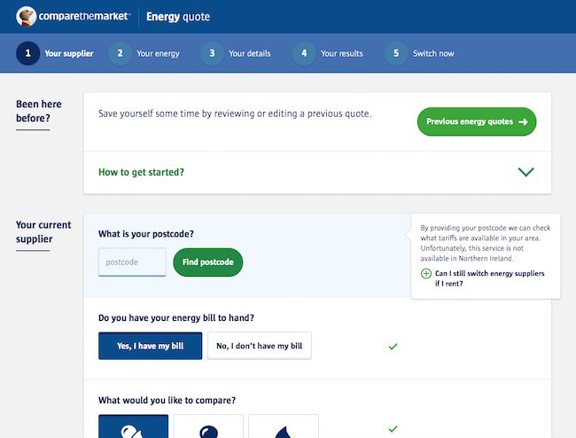
How to create top converting registration forms: informational messages make for a smoother conversion path when they are located close to the corresponding field. Easy to notice and to understand.

How to create top converting registration forms: informational messages make for a smoother conversion path when they are located close to the corresponding field. Easy to notice and to understand.

Here’s the rest of the recommendations for creating top converting registration forms.

  • A social signup option can speed up the form filling process and help you create the best conversion registrations forms.
  • Leverage Autofill whenever possible or offer preset options. This is especially true on mobile devices. Nothing more annoying than fumbling around with a form.
  • Make the most of mobile devices. Enable only relevant keypads as required on the field. Make it easy for your visitors. Don’t make them switch to a numeric keypad or keyboard to enter the zip code or phone. Use specific HTML input types. They’ll appreciate it and you’ll avoid friction in this crucial conversion moment.
  • Explain why you need the information and what you expect them to enter. Just because it’s evident to you, does not mean it’s clear to everybody. The same applies to mandatory fields.
  • Limit the number of fields in your form. Don’t drive your prospects away at the mere sight of the longest form ever.
  • Billing address same as shipping address? One checkmark will take care of filling up the fields – internally, of course.
  • Multi-step forms. Split. Split. Split. Research shows that multi-step forms outperform their single-step registration forms. Especially when asking for sensitive information (such as phone) or when the form is too long. Adding a progress bar will entice your prospects to keep going as they are almost done.
  • Google’s UX researchers found that aligning labels top-left of the fields increased form completion time. This is because it requires fewer ‘visual fixations’. Basically, your eyes scan downwards faster. You are forced to scan in a zig-zag motion when the labels are placed to the left of the fields. The exception is when you are using always visible inline form field labels.
  • Did I mention speed? You can make your website as fast as possible, but slowing down like molasses at the time of filling out a form is unacceptable. Make sure your forms load fast and don’t slow down your page speed to increase conversions.
  • Make sure you are GDPR compliant. You have to ask permission for each and every opt-in.

Ready to AB Test? Read on!

UX Design Guide for Form Validation to Lift your Conversion Rates

Forms are a key component of Landing Pages (in addition to Offer, Image, Trust and Proof). When a visitor considers completing a form — for lead gen, to subscribe or to purchase — it is the moment of truth.

So, it is sad that so many forms work to chase these ready customers and prospects away. Forms are meant to have a conversation with the user. One that guides them all the way to the conversion with the best UX possible.

Form validation used to be a “developer” thing and we need to make it a marketing thing. Forms are placed at your sales funnel’s most crucial moment, the conversion. Therefore, it is only logical that improving the UX would help lift conversion rates.

Here are four elements to consider as you guide development of your website forms in these areas to avoid confusion:

1. When to Show Validation Errors: The right time to inform  the user about problems or success

Consider the two main types of form validation: Inline validation and Post-Submit validation.

Inline validation checks field entries as the information is entered.

Post-submit validation validates entries after submitting the entire form. The visitor doesn’t know if the username they chose was already taken or if their email address was entered incorrectly until after they click the button.

If mistakes were made and the form re-loads, the visitor must manually search for the incomplete fields, and correct them. This adds friction to a shopping cart checkout process or a newsletter signup. This hurts completion rates.

Post-submit validation also suffers from scroll confusion. When the page reloads, the error messages often appear off-screen. The visitor may not know that there’s even a problem with their entry until they scroll around. This is a bigger problem on mobile devices where screens are smaller.

Our recommendation is to use inline validation so users can adjust, learn, and correct as they move from field to field. Inline validation is especially effective for the username and password fields, or any field with strict input requirements.

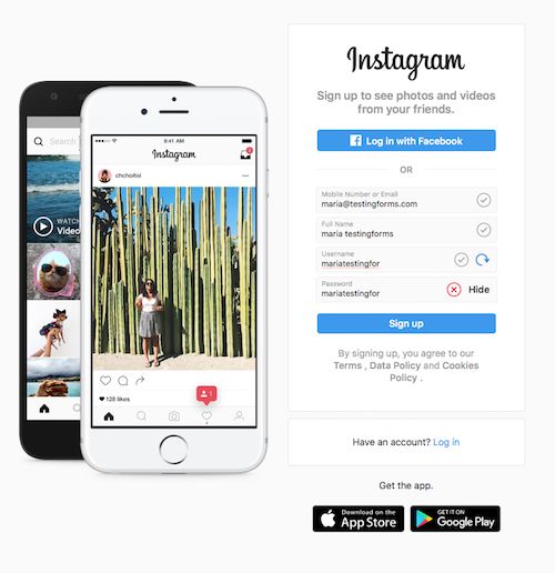
Instagram makes good use of

Instagram makes good use of “always visible inline field labels.”

Don’t limit messages to errors. Success validation messages are always helpful and encouraging. For example, a simple check mark by the field can let the user know their username was accepted and it’s unique.

2. Where to Display Validation Errors: Right place for validation messages

When messages are located close to the corresponding “failing” field, they lead to a smoother path for conversion. They become easier to notice and to understand.

You may be tempted to add the error messages by the Submit button. But there are only two occasions where you can display the error or validation message next to the Submit button.

The first is  when you perform an post-submit validation and there was no page reload.

The second is when the error affects the whole form, as may happen with a dropped mobile connection, and the page was not reloaded.

In any case, if there was a reload of the page, display the validation errors at the top of the page.

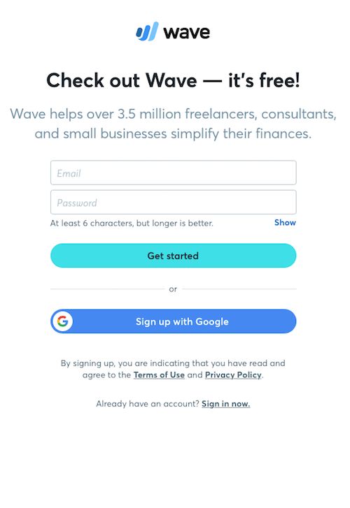
Wave accounting software registration form. Great location for the informational password field. Their social proof is very persuasive.

Wave accounting software registration form. Great location for the informational password field. Their social proof is very persuasive.

3. Right color or Right Graphic Representation

Did you know that 1 in 12 men have some degree of color blindness? Source: Color Blindness

Color blindness is more prevalent among males than females, because the most common form of color vision deficiency is encoded on the X sex chromosome. Source.

In spite of this, if you follow the rules (blue is informational, green is success, red is an error and yellow as a warning) even color-blind visitors will understand the meaning.

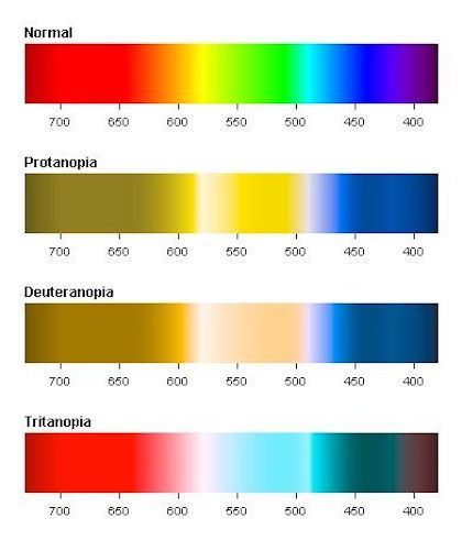
If red-green color blindness is the most prevalent - one in twelve men are color blind - should you rely solely on color to get your message across in your registration forms? Image source: Pinterest.

If red-green color blindness is the most prevalent – one in twelve men are color blind – should you rely solely on color to get your message across in your registration forms? Image source: Pinterest.

I recall asking a friend of mine – yes, he was color-blind – how could he tell the traffic signals apart. His answer was, “I know where they are placed.”

We don’t have specific placements on forms, but we can take advantage of icons. And these have rules as well: X for error, checkmark for success, exclamation point for warning and “i” for informational messages.

4. Clear and persuasive language for error messages

A red symbol notifying you that there is an error and no explanation of what it is or how to fix it can lead to form abandonment. It becomes extremely frustrating for users that may be trying to register for your demo or buy from your online store when they don’t know what they did wrong.

Instagram's sign up form error messages are not helpful to the user. There is no clear explanation on how to fix them.

Instagram’s sign up form error messages are not helpful to the user. There is no clear explanation on how to fix them.

If all problems are opportunities, then error messages and error pages are generally missed opportunities. Marketing should be policing the errors reported on their website, messages that have traditionally been written by a techie in IT.

Clear and persuasive language for error messages can actually work in your favor, improving the user experience and increasing conversions.

I’ll give you an example. A few months ago I had to make a doctor’s appointment. The receptionist scheduled me for the following day with the nurse practitioner. I asked if I could see the doctor – best dermatologist in this neck of the woods – and her answer was “No, you will have to wait until she comes back from vacation.” Which happened to be 3 days later.

What do you think would have happened if she would have said, “Of course. She will be back from vacation on this date. But we can get you in tomorrow if you’d like to see her nurse practitioner”. She could have probably have persuaded me to see the NP.

Wayfair's newsletter sign up form has a confusing call to action button text. What will happen after I press continue?

Wayfair’s newsletter sign up form has a confusing call to action button text. What will happen after I press continue?

Related Reading: Why is my Conversion Rate Dropping? 8 Common Reasons

How to Write Great Error Messages

Follow these guidelines to write error message that won’t have your visitor feel like an idiot.

  1. Get rid of IT jargon. Say goodbye to “Submit”, “Send” or “Error”, not only do they have different meanings in English language, they have a negative connotation putting the blame on the user.
  2. Clearly and simply identify the error and give the user a solution.
  3. Never blame the user. Rephrase your error messages or better yet, provide your website visitors with informational messages so they know what to enter in the first place.
  4. Provide a way to contact you, be it chat, email or a customer service number, in case the user needs your help to solve the issue.

imageThese are the stories that caught my eye last week. If you are a curious marketer looking to learn more about conversion, please subscribe my weekly recommended reading list, For Further Study.

The Product Page 2012: 7 Must-Test Elements

Feb 27, 2012 08:22 am

@TheGrok  says “Test your product headline to be benefit oriented as opposed to just product name.” I hadn’t considered that. Good lists always tell you something you hadn’t thought of and Bryan has such a list for Online Stores and Publication sites who feature their offerings on Product Pages. Product pages are the money pages on your site, and are one of the first places to look for optimization opportunities.

read more

The Shocking Truth About How Web Graphics Affect Conversions

Feb 27, 2012 01:14 am

@KISSMetrics – David Ogilvy is experiencing something of a renaissance these days as his experience and research in offline marketing are proving true in online marketing. And we need him. Images are an abused medium on the Web, and this article points out mistakes that you are probably making.

There are some real nuggets here, such as “Captions under images are read on average 300% more than the body copy itself” Ask your designer what research he has for his decisions.

This is an important article, and you should read it before you blindly follow the advice of lazy designers.

read more

When we don’t consider what visitors expect when we offer them our content, we set a series of events in motion that results in our visitors feeling… dumb. Don’t let your content break promises to your readers.

These four ways set a series of events in motion that result in our visitors feeling… dumb. Make sure to keep your content promises to increase conversions.

Treat your content as a product

“Have you seen my sunglasses?’’ I yelled out to my wife as I was heading out the door.

“In our room on the night stand,” she yelled back.

Little did she know that she was setting in motion a series of events destined to ruin a fine Saturday.

You see, she unwittingly set an expectation in my mind, an expectation that my sunglasses would be there on the night stand beside the lamp and the book I read before bed.

But when I got to the bedroom, they weren’t there.

The series of events that unfolded next are classic human reactions, reactions that you may be creating in the way you present your content.

I entered stage one: I got angry. Not “throwing things” angry, but “disappointed because I just want to get out and do some errands but I’m attached to wearing my sunglasses when I’m out” angry.

Stage two: I got self conscious, so I looked all around the nightstand. Nothing.

Stage three: I got self righteous. I climbed down the stairs down to my wife, building my self-righteousness with every step.

“They’re not there,” I said, my voice dripping with thinly-masked disdain.

She looked at me with a face and stance that would have made our teenager proud.

“Did you look on my nightstand, too?”

Stage four: I questioned my very ability to function in the world. I slinked back up the stairs, retrieved the sunglasses and snuck out the door.

It was no fault of hers that I assumed the sunglasses would be on my night stand, but website visitors are coming with expectations.

When we don’t consider what visitors expect when we offer them our content, we set the exact same series of events in motion. This isn’t good for our business.

Keep Your Content Promises: What is the Psychological Price for Your Content

When you invite someone to read your content, you are making a promise. Your promise is that you will help them solve a problem or entertain them.

Our invitations, be they found in an email, a status update or a blog post must promise something or there would be no clicks.

Visitors may be finding and consuming our content just fine, but we can extract a severe price by making things unintuitive. Just because someone finds your content, doesn’t mean they’re happy about it.

Here are some of the innocent things we do to make our visitors feel frustrated.

1. The Drill Down

If your content link is sending your visitors to your home page or to a “resources” page, you’re setting them up for stage one anger.

Most people expect a click to take them to the very place that content exists. Don’t let them down.

Sure, you may have a logical navigation strategy.

“All they have to do is click on the White Papers menu item then select Case Studies, then pick the one they want,” you might say.

Visitors are saying, “All you had to do was put a link to it on the page you sent me to.”

My wife assumed I would look on both night stands. I assumed she’d have specified the “other” one if that was where it was.

2. The Scroll

For many many visitors, if the content headline isn’t above the “fold” on your page, then it doesn’t exist. Period.

What would push the headline down? Usually, it’s a BAH (big-ass header). The BAH is usually some large stock photo plastered across the top of the page. This is a common feature of websites and is found on both home pages and interior pages.

Bosses love this kind of thing, but it foils visitors.

Your headline and first paragraph should start as close to the top of the page as is politically possible.

3. The Unending Preview

Too often, one BAH isn’t enough, so designers have invented the “flash scroller” also called a “rotator box.” If you are employing one of these to present content choices, you are WAY over-estimating the patience of even the most interested visitor.

Don’t make us sit through a series of cross-fading options.

An image fades in, then we wait.

Another image fades in, then we wait.

Another fade, then we wait.

We won’t last long. I probably lost dozens of readers just writing those three sentences.

4. The Wall of Questions

One of the best ways to generate leads is to promise great content in exchange for contact information. However, you must look at this as a purchase, not a gratuitous grab for their email address. Don’t present them with a wall of form fields and ask them to fill out the form.

Keep your content promises and increase conversions. This page asks a lot, but doesn't promise much.

This page asks a lot, but doesn’t promise much.

You have to sell them.

To this end, a proper lead generation page will have the following components:

  1. A headline that is as identical to the promise of the ad or link as possible.
  2. A picture of the product. Even an eBook can be formatted to look like a publication, and visitors get it.
  3. Tell them very specifically what they will get when they complete the form. Don’t be afraid to lay some text on the page.
  4. Your form should only ask for information you absolutely need. Your content may not be “worth” their phone number and address in their eyes.NOTE: If you must ask for qualifying information, explain how it will be used and why it is needed.
  5. The text on the button should tell the visitor what is next. “Get Your Report” or “Subscribe” is much more clickable than “Submit”, especially if we aren’t sure to what we’re submitting ourselves.

This is what is expected when someone clicks on an invitation to read or view content.

Deviate from this basic formula only if you must. Otherwise, visitors may leave your site questioning their very ability to function in a digital world.

Brian Massey frustrated drawing.

Brian Massey


21 Quick and Easy CRO Copywriting Hacks to Skyrocket Conversions

21 Quick and Easy CRO Copywriting Hacks

Keep these proven copywriting hacks in mind to make your copy convert.

  • 43 Pages with Examples
  • Assumptive Phrasing
  • "We" vs. "You"
  • Pattern Interrupts
  • The Power of Three

"*" indicates required fields

This field is for validation purposes and should be left unchanged.


© Copyright 2007 - 2024 • Conversion Sciences • All Rights Reserved