web design

My partner Joel Harvey is fond of saying, “My favorite part of a design is the money.” He’s been part of many a web design project. His perspective comes in response to the number of times he’s heard things like:

“I want the design to pop!”

“I want my site’s design to be groundbreaking like nothing else out there!”

“Let’s turn it up a notch on the design.”

“I want the site’s design to reflect the high value of our product.”

In and of themselves, none of the above statements are unworthy pursuits. But if your goal is to increase online sales conversion and fill your coffers to the brim, you will fall woefully short if you believe that web design alone can do the heavy lifting of convincing your visitors to take action. If increasing sales is your goal, the most important person on your split testing team is the accountant.

Designers Don’t Design for the Accountant

A while back, a client sent us a couple of different mocks of some new designs they were entertaining. They ask which one I liked. The first thing I said is I like the one that makes you the most money. Up until that time their team was arguing over color palettes, white space,and rounded edges.
When I reminded them about the bigger goal, their conversation evolved. In a clock tick, we were all discussing the quality of content on the pages rather than the design elements. When their offer and call to action were right, everyone seemed to forget about the trivia of the actual design.

Designing For Your Ego

Another client brought to us a new landing page campaign they had just launched and were baffled and disappointed by the early results. They went on to explain that they thought this was the best designed landing page they had ever done. They had just hired a new graphic designer that ‘got it’, and even the CEO was impressed with his work. One problem, their paying customers didn’t seem to agree. No doubt, the design was gorgeous. Rich colors, curvy rectangles, sexy images, even the header and body fonts were crisp and clean.
So why wasn’t this campaign working? We had them show us their most recent successful campaign. The design was a tad dated, and compared to the new landing page it looked like a high school hobbyist in the company basement eating Cheetos and suckling energy drinks.
Still, by comparing we immediately saw the problem with the new landing page. The copy on the old page was much better. The headers screamed the product’s value proposition and benefits. The body copy answered relevant questions, and helped the reader imagine themselves buying the product. The call to action button was big, bold, and in your face. The new page looked stunningly attractive but said very little.
To add insult, the hot shot designer was a minimalist and had an aversion to big gawky buttons, so his primary call to action was tiny button that blended in with the hero image, and , by design, was easy to ignore. We instructed them to use the old page copy on the new design (they had to make a few adjustments to make it all fit), and we asked the designer to create a bigger and bolder call to action button. They obliged us and that new design finally beat the old landing page.

How Much Time Are You Spending With Your Designer vs. Your Banker?

So my lesson is this. Beautiful, eye-popping design and effective, profitable web design are two different things. And it always seems easier to mistake those eye-popping designs for profitable ones. Split testing will always lead you in the right direction.
Some companies spend more on design than they do on organic SEO, and almost all companies spend more on design than on Conversion Rate Optimization. Search engine spiders don’t evaluate site design, only content and links. And I have yet to see a company design their way into a better conversion rate and better RO.
Some companies spend way more time going back and forth about a design element than they do actually testing it. Makes you wonder how far ahead of your competitors you could get if you spent more time and resources on conversion optimization and testing.
So when considering a redesign of your entire site, of a successful landing page, or even a banner ad, do the following:

  • List the things about the page experience (not just he design) work. Keep those in the new design.
  • What about the experience doesn’t work?
  • Why do we want to change this (especially if it is working)?
  • Before you launch a radically new design, test what you believe is NOT working about the current design.

Above all, use web designers that deeply understand the web and principles of conversion. Otherwise they are just an artist, and the value of an artists works usually increases only after their demise. Can you wait that long?

Today, let’s rejoice in a persuasive gift that brightens any landing page, and has started so many new relationships between a visitor and a business. The big red button.

Ode to the Big Red Button.

Ode to the Big Red Button. Image Courtesy: www.sxc.hu/profile/Ambrozjo

Valentine’s Day is an emotional time, even for a Conversion Scientist. It is a time in which we, like so many people in love, celebrate beautiful relationships. It’s a time to stop seeing our visitors as “traffic,” “visits,” “bounces,” or “conversions.” We dispense with talk of hypotheses and statistical significance and turn instead to those things we share as cohabitants of a website.

You may feel that I’m fickle, but I grow teary-eyed just thinking about the person visiting my website, whoever they are at this moment. I love you.

I also feel my heart race when the shoe is on the other foot and you help me solve a problem on your website. It makes me feel like the prettiest girl at the ball.

You Convert Me. Ode to the Big Red Button.

So I’ve written you a poem, my fleeting visitor or humble host. With it I hope to celebrate something we can share, something we both will love: the big red button.

Technically, it is “a high-contrast element containing a compelling call to action that draws a visitor’s eye and clearly communicates how a visitor can complete the next step in their conversion process.”

But you and I know it is so much more.

It is seductive, calling like a siren. It is even a bit sensual to click on such a thing. For this Valentine’s Day, let’s put aside our arguments about headlines, copy, images, and offers. Today, let’s rejoice in a persuasive gift that brightens any landing page, and has started so many new relationships between a visitor and a business.

Ode to the Big Red Button

It is a gift both wise and sage

The big red button on my page

It calls, it beckons without retort

“Join,” “Add to cart,” “Get that free report”

Yes, I think a link is fine

So blue and bright and underlined

It’s not for me, your clicks will sink!

That’s why it’s called an “anchor” link

But when my eyes grace a page

And I desire to spend my wage

I want to buy! I am a glutton!

So serve me up a big red button

Designers cry, “There is a catch!”

“The site and button have to match!”

But if they do, then I do fear

Your call to action will disappear

And what of rainbow’s other gifts?

Of blue and green and amethyst

Try them, test them, this is smart

But big and red is where I’d start

It won’t be hard to understand

What I should do when I land

The button tells me everything

It doesn’t have to dance or sing

I will not suffer a gray “Submit”

Big and red is where I click

It will not let me hesitate

‘Cause if I bounce it’ll be too late

A happy couple, it’s the norm

To wed the button with a form

And though my fields are all complete

There still remains that final feat

If you will charge my credit card

That final click can seem so hard

The big red button makes it fun

Isn’t that true for everyone?

So tell me this my brillig friend,

What do you want in the end?

To abandon you before I’m done?

Or click big red with abandon?

Won’t you be my Valentine?

I think you’ll find the terms sublime

I’ll convert, there’ll be no friction

If you feed my big red addiction

By Brian Massey, The Love Scientist

How to Design Kickass Long Form Sales Pages-ConversionXL

@peeplaja “People have an infinite attention span if you are entertaining them.”

I get a lot of questions about sales letter styled landing pages. Do they work? Do I need to write that much?

My stock answer is that they do work, but that your copywriter needs to know what they are doing. These kind of landing pages typically work with visitors that already know and follow your business.

Peep says it best: “Buyers are readers.” There is more wisdom in this entertaining post. 

Want to get Brian’s For Further Study posts delivered right to your inbox? Click HERE to sign up.

Google Analytics Tips: 10 Data Analysis Strategies That Pay Off Big!

Jan 02, 2013 11:43 pm

Comments:

@Avinash Kaushik has a unique ability to make analytics human. I don’t share many analytics posts with you, as I don’t want to scare you off. But I fear I may be underestimating you.

Here are ten very good ways to get to know your visitors through Google Analytics. I believe you will be energized and excited if you open these reports in your own Google Analytics account.
This is a great way to start appreciating your visitors in ways that will make your site more successful.

by: Brian Massey

Karon Thackston: Phrasing Discount Offers for Maximum Results by Getentrepreneurial.com

Dec 29, 2012 01:47 pm

Comments:

How you phrase a discount is a powerful way to increase conversions. Some visitors do not like to do math, or will do it wrong. Therefore, offering 20% off is less effective than save $18. However, high discounts (50%, 90%) may draw buyers more powerfully than the dollar value.

You have to find out for yourself.
Karon offers a nice list of alternatives and some links to research for your enjoyment.

by: Brian Massey

The Top 5 Website UX Trends of 2012 | UX Magazine

Dec 29, 2012 01:40 pm

Comments:
While good UX (User eXperience) does not always translate into higher conversion rates or revenue per visit (RPV), these trends point to excellent hypotheses for what MIGHT increase the performance of your site.

  1. Single Page Sites: Simplicity is often a great way to increase conversion rates
  2. Infinite scrolling: Consider this for category pages. I haven’t tested this yet.
  3. Persistent top nav: I am very curious to see if this increases CR and RPV. Let me know if you’ve tested it.
  4. Web 2.0 Aesthetics: I hope this includes the rotating banners at the top of so many sites.
  5. Typography Returns: Your message is the most important part of your conversion optimization plan. Typography can help… or hurt

by: Brian Massey

Website design is only great if it’s making you money. It’s not about the colors, the shapes, the sliders and flashy bits, though that’s the fun part many businesses sadly get hung up on. People don’t come to your site for entertainment or art—unless you sell art.

They come to you for a solution.
The purpose of your website is to help them find you, connect with you and pay you money to solve their problems. That’s conversion. That’s why you built the site in the first place. Your site’s main job is to make this very easy for them to do. So the best design isn’t the one that makes your company look cool and edgy and sophisticated. It’s the design that supports conversion, has room for good copy and powerful calls to action that make people click the big orange button. Want to know more?
Read more in my column on Search Engine Lan
d

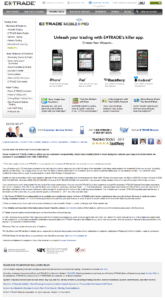
Which of the following pages will get more people to download an E*Trade mobile application for their smartphone?
The answer is, I don’t know, but I have  pretty good idea which will convert better.

Version A

Version B

Landing pages often start out with lots of corporate baggage
Click to Enlarge

Click to Enlarge

Matthew Roche currently of Bo.lt created page B in “about 30 seconds” from the original E*Trade landing page. He wrote in response to my announcement that I would be speaking about landing pages at the DFWSEM group.
Matt would know something about landing pages as he is the co-founder of Offermatica, now Adobe Test and Target.
Most landing pages look like Version A: complex, leaky, distracting, confusing. What does it take to make a page that is focused like Version B?
I say you have to design it backwards.
I take you through the steps to develop a backwards landing page in my new ClickZ column The Backward Landing Page.

Elements of Successful Business Web Sites and the reactions they create for your business.

Can something as complex as online sales conversion be boiled down to some like a chemical reaction? The answer is yes, and these basic marketing reactions make it easy to create interesting new combinations.

Do you recognize this chemical equation?

Marketing Chemical Reaction: The Components of a Landing Page

Basic formula for developing a landing page.

It is the basic formula for developing a Landing Page:

  • Some Content, preferably persuasive in nature
  • An Offer
  • A Form to entice the visitor to action, which can be a simple button or even a link.

This shouldn’t be a revelation to any regular reader of The Conversion Scientist. However, you will see many pages that lack content, an explicit offer or both.

Of course, a landing page will not generate any leads or sales without something more.

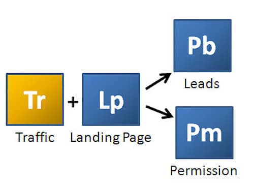
Here’s the formula for a lead generation landing page:

Marketing Chemical Reaction: Converting Traffic to Leads

Converting Traffic to Leads

This formula is important in that it highlights the fact that your landing page must generate equal parts Leads and Permission in order to continue the conversation with prospects.

Why? Because, we need Permission to satisfy this little equation:

Components for generating effective email

The Email Conversion Reaction.

Combining Content with Leads for which you have Permission to communicate provides the components for generating effective Email.

Given an amount of Email, what reaction would you create to turn your email into Web Traffic? Find out in my post The Chemistry of Content at The Content Marketing Institute.

Hint: Consider what mixing an Offer with your Email would do.

Stay tuned to The Conversion Scientist as we explore the Elements of Successful Business Web Sites and the reactions they create for your business.

Here’s a preview:

Youranium: Elements of Successful Business Web Sites

Youranium: Elements of Successful Business Web Sites

Youranium is a powerful radioactive element derived form your knowledge of your visitors.

Sales: The Elements of Successful Business Web Sites

Sales: The Elements of Successful Business Web Sites

Sales is gold to a business.

You should subscribe to the The Conversion Scientist by email to find the reactions that create gold for your business.

Brian Massey is a veteran online marketing strategist, writer and national speaker. His practice, Conversion Sciences is conducting experiments to determine how business Web sites can turn visitors into leads and sales. Follow our blog and put some science into your online marketing.

Tom had two sites targeting the same audience, and getting about the same traffic. Both had analytics installed. This was a rare opportunity to see how two very different approaches to website design affected online sales conversion out in the real world.

Read this before changing your website.

It’s time-consuming to offer 45 minutes of my time to anyone who wants to improve their online sales conversion rates. I just can’t think of any better way to introduce businesses to conversion concepts.

And the people I meet on the phone are priceless.

One such person is Tom Jackson of Heliski.com. His is a rare and instructive look at the power of the written word and the ineffectiveness of standard design strategies when it comes to conversion.

Tom had two sites targeting the same audience, and getting about the same traffic. Both had analytics installed.

According to him, one was “dated, awkward, wordy, but it’s working.” The other, he said, was “newer, looks better, better organized but WAY underperforming in lead gen.”

This was a rare opportunity to see how two very different approaches to website design performed out in the real world.

Which would you pick as the conversion winner?

Take a look at Tom’s two sites. Which would you pick as the hands-down winner? Which would you image would have cratered his income had he relied exclusively on it?

How analytics (and a session with the Conversion Scientist) saved one business's online sales.

How analytics (and a session with the Conversion Scientist) saved one business’s online sales.

I did a complete evaluation of these two pages in my Search Engine Land column, and you might be surprised at my conclusions: strong copy beat slick new design.

Two very different sites: one “dated, awkward, wordy;” the other “newer, looks better, better organized.” So why was the “dated, awkward, wordy” winning the conversion game so handily?

From a distance the two home pages couldn’t look more different. HeliskiingReview.com uses non-standard layout. Text is knockout white on blue, usually considered more difficult to read than Heliski.com’s black on grey.

The newer site uses a more “image- or brand-oriented play, establishing its value proposition as “the ultimate heliskiing destination.” Unfortunately, you can’t heliski on the site, so this is an empty promise.

The body copy couldn’t be more different in approach. HeliskiingReview.com uses plain language with specific, value- and benefit-oriented points in easy-to-scan bulleted format. Specifics are almost always important for conversion.

A designer might say that the big star with “send me info” was “too TV.” However, it certainly does draw the eye to an important call to action.

and the conversion champ is…

HeliskiingReview.com had a conversion rate of 2.27% vs. Heliski.com at 1.99%. That’s 14% better. However, HeliskiingReview.com delivered much more qualified prospects. Tom was able to book trips for 15.29% of the HeliskiingReview.com leads. Heliski.com had a close ratio of only 1.33%.

That’s 1146% more bookings and tens of thousands of dollars in sales.

What we can Learn from Tom (or How Analytics Saved One Business’s Online Sales)

The moral of the tale is that Tom measured his sites’ performance. He had the analytics in place, and was smart enough not to make changes to his site without being able to measure their effect. By leaving both sites up, he was able to rollback the changes.

Do you know how changes to your site affect your business? You should.

I’m offering a two hour short course on June 11 in Austin entitled Web Analytics: Tools and Best Practices. This is an Austin Entrepreneur Network short course, which means that it’s only $25. We love our entrepreneurs.

Join me and find out how you can avoid huge mistakes – mistakes that rob you of leads and steal your sales. This is the second time I’ve done this presentation.

Or you can book your own session!

Read my full report on Search Engine Land, and I hope to see you on June 11.

Design your website around the strategies that drive leads and sales and avoid the marketing strategies that don’t convert.

I had one of those meetings this week; a meeting with a company that has really come to understand the significance of online conversion in their business. I predict good things for them.

They’d taken advantage of a Conversion Sciences home page review, and had attended my workshops. It’s a good feeling to know that I’m making a difference.

They wanted to be sure spent their Web budget on the things that were going to help their business grow faster.

This is going to sound obvious, but take a good look at your own site before you dismiss this statement: They decided that focusing on strategies that would generate leads would alleviate the need to invest in things that didn’t. They would save money and sell more.

That makes sense, doesn’t it?

So what should you be investing in?

Find out which conversion strategies you should be building your web marketing programs around and avoid marketing strategies that don’t convert.

Design your website around the strategies that drive leads and sales and avoid the marketing strategies that don't convert.

Design your website around the strategies that drive leads and sales and avoid the marketing strategies that don’t convert.

The Five Core Patterns Of Conversion Marketing

How many basic web patterns are there? If you were to boil every web site down to a set of core species, how many would you list? Would there be 500 basic types? 100? 50? How about five?

Conversion scientists require some categorization and classification to do their job well. This allows us to simplify rather complex concepts, easing communication with each other and with you. It gives us a common vocabulary with which to work.

For example, if you can tell me which of five patterns your web site fits into, I can tell you with some accuracy which three strategies you should implement first to maximize your conversion rates. From one word springs an entire online marketing plan. That is the power of classification.

Over my next five posts for Conversion Sciences, I’m going to help you identify your core web site pattern and tell you what disciplines you can’t get wrong if you want to turn visitors into leads and sales.

The ground rules

Before I define the five web site patterns, let’s lay some ground rules for the ensuing debate.

  • We are focused on business-oriented web sites designed to increase sales for a business, no matter how indirect the effect.
  • A web site pattern is distinct from its implementation. A blog is not a web site pattern, since many patterns could be implemented using a blog structure.
  • A new pattern is defined as a type of web site that requires a set of online strategies substantially different from the existing patterns to be successful.

I welcome your input on new web species that may exist in the wild. Here is the first of the five basic patterns which I look for when advising a client.

The Brochure pattern

Also known as the “sales support” pattern, the brochure web site is modeled after the glossy print publications that have been created by businesses for decades, and ignored by 99.99% of those who have received them.

Often presented in tri-fold fashion, the brochure is the appetizer of marketing. Its sole purpose is to provide enough information to whet the desire of a prospective customer and tell them how to get more information.

Likewise, its online counterpart is designed to provide little truly valuable information, but to make the sponsoring company look like it has its act together. In this sense, the primary quality of a brochure site is safety.

You have, or desire a brochure site if you answer yes to the following statements:

  • When you decided to create or refresh your web site, you called a web designer first.
  • You spent a great deal of time huddled over a tree-like map of your future web site. This is called an “information architecture.”
  • The copy for the site was reviewed and edited by several people, most of whom were not professional writers. This copy inevitably declares you as the “leader” in something or espouses the ethereal “difference” you offer.
  • Your site contains at least one stock photo of a very happy or very serious person, whom your designer thinks your visitors will admire.
  • Your site avoids the words “you” or “your,” but talks incessantly about what your company and products do. This feature culminates in the ever-popular “News” section of the home page with more information about you.
  • You get your sales leads from anyplace but the web and you have no need to change this.

Don’t be fooled by my snootiness. The Brochure pattern is an important pattern for many businesses. Just because everyone uses the web doesn’t mean that every business should be trying to generate leads and sales there.

The Brochure site has only to make the visitor feel comfortable sharing the site with their boss and with others who are a part of the any purchase decision. No controversy should ever enter into a brochure site. It has to look good. It has to present benefits and features. It has to provide contact information. That’s about it.

The primary goal of the brochure site is to make sure the prospect can find you when they are ready to make a decision. A “conversion” is a phone call or an email.

The three “must get right” conversion strategies for a Brochure business are:

  • The design must be what the visitors want to see. Your design must be professional for people who ware suits to work. It must be fun for creative businesses. It must look unprofessional if you sell hand-crafted products. It must be exciting for adventure-oriented businesses. This is why you call the designer first.
  • It should feature logical tree-like navigation. Since your visitors aren’t really trying to solve a pressing problem, and since they really don’t care that much about what they’re reading, you should organize the content in as logical a manner as possible, so you don’t look sloppy. Those irritating menus that “fly-out” when your cursor accidentally rolls over them are also fine on a brochure site.
  • The contact information must be easy to find. The primary role of a brochure site is to support a sale after the salesperson has been contacted. Think of it as a “leave behind.” Put your phone number on each page and have a simple, clear “Contact Us” page.

The Brochure site is the primary pattern found among business web sites. This is unfortunate, because too many businesses put up brochure sites when they really are counting on the web for sales leads. The result is a site that isn’t a good brochure site, and isn’t a good lead-generation site either.

For example, marketers will optimize their brochure site for search, but see little positive effect because a brochure site is a terrible tool for cold visitors. What these marketers want is a site built on the considered purchase pattern, which we will discuss in part four of this series.

Brochure sites are efficient. Marketers only need to update them when their product lines change, when new news is published, or when they get a new VP of Marketing, who will inevitably want to refresh the site to show how quickly they’re making progress.

The four remaining web site patterns

I’ll next venture into the Portal pattern, a site in which the content takes center stage, and then explore the key conversion strategies for the eCommerce Pattern, the Considered Purchase Pattern and the Site as a Service Pattern. Read on in The Portal Pattern: Core Conversion Marketing Strategies.

I’ll be posting to the Conversion Science column every four weeks, so you should subscribe to the Conversion Science email.

Many of you are going to be surprised at which pattern you end up choosing for your business.

Summarizing

The first pattern is “The Brochure.” Most of the business sites on the Web are like an online brochure. But “The Brochure” is not designed to convert. It’s purpose is to support sales, often after the visitor has already spoken with a salesperson.

If you have a brochure site, you may discover that you really need a site based on one of the other four patterns: a Portal, an eCommerce site, a Considered Purchase site, or a Site as a Service.

Over the next four months, I’ll be digging into each, helping you choose the right pattern for your business, and highlighting the conversion strategies that you must get right for each.

The next installment is coming next week. I’ll send you an email when each of these go live if you subscribe to The Conversion Optimization Blog.

Originally Published: Five Core Patterns of Conversion Marketing for Search Engine Land’s new Conversion Science column.

© Copyright 2007 - 2024 • Conversion Sciences • All Rights Reserved