Building Great Landing Pages Means Starting at the End
Which of the following pages will get more people to download an E*Trade mobile application for their smartphone?
The answer is, I don’t know, but I have pretty good idea which will convert better.
| Version A | Version B |
| Click to Enlarge |
Matthew Roche currently of Bo.lt created page B in “about 30 seconds” from the original E*Trade landing page. He wrote in response to my announcement that I would be speaking about landing pages at the DFWSEM group.
Matt would know something about landing pages as he is the co-founder of Offermatica, now Adobe Test and Target.
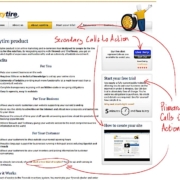
Most landing pages look like Version A: complex, leaky, distracting, confusing. What does it take to make a page that is focused like Version B?
I say you have to design it backwards.
I take you through the steps to develop a backwards landing page in my new ClickZ column The Backward Landing Page.


![Wasp-Redesign-Process_thumb[1] The Waspbarcode.com redesign process.](https://conversionsciences.com/wp-content/uploads/2015/05/Wasp-Redesign-Process_thumb1-180x180.gif)


I completely agree with you as well as I have a debate with my friends that why should many people are targeting home page for a specific product or services? B is great landing page what he is looking for that is being severed to the user. I totally agree with you.
Thanks Nitesh.