ux

How a B2B eCommerce company used a stepwise strategy for their website redesign and got 250% more leads before they were done.

We recently began the split-testing process for a B2B eCommerce company. This is only remarkable because we signed this deal over a year ago. What happened to delay testing so long?

A website redesign.

The four-month redesign turned into a six month redesign and then into a 14-month redesign. This is not unusual in our experience. The new design has launched and, after all this time, the conversion rate and revenue per visit remained about the same.

We see this as good news. Too often, redesigns actually decrease site performance for a period after launch. There are storied website redesign disasters, such as FinishLine and Marks&Spencer.

Nonetheless, the conversion optimization testing was delayed. They can never recover the revenue or the lost testing time. Let’s see then how this website redesign got 250% more leads before it was finished. Step by step.

How to Make More Money During Your Website Redesign

Conversion Scientists look at websites quite differently. You may see a valuable online revenue engine. We see a laboratory for growing sales in petri dishes, and then scaling that to business-changing proportions.

When Wasp Barcode came to us, our vision fell on the ears of a brave and daring team. The approach allowed them to grow the number of live demos by more than 200% in just a few months.

We started with our Conversion Catalyst, a six-month process designed to grow revenue quickly and permanently. We started by getting Wasp setup for website optimization. This included setting up the digital lab, a set of tools that includes analytics, click-tracking, session recording and split testing.

Download and Read the entire case study: This Website Redesign Got 250% More Leads Before it Was Finished-Wasp Barcode

Then, we went to work in a very unusual way.

Wasp Barcode sells inventory and asset tracking solutions. Their most profitable offering is a complete inventory- or asset-management system that may include software, scanners, and labelers for the things businesses need to track. The most effective way to help their prospects choose the right system is with a live demo. During this demo, a sales person will walk the visitor through their software and answer any questions they have.

Our main goal was to increase the number of visitors filling out a form to request a live demo.

We did a stepwise redesign, in which all of the assumptions about the new design were tested to ensure that they had a positive or at least neutral impact on demos. Our approach was this:

Step One: Test Things that Can Be Used in the Website Redesign

Our first step was to find the calls to action that would move more visitors to request a demo. This was a series of tests to find out what language should be placed on buttons. For example, we learned that language offering “Free Live Demo” or “Free Consultation” generated more clicks to the demo landing page and more completed demos.

Step Two: Test the New Page Design on a Portion of the Site

Their design team integrated what we learned into a redesign for one of the site’s product category pages. We tested this new design against the existing category page, the control.

Our tests showed that the new design did a great job of getting more visitors to the Demo Request page. By driving more visitors to this page, we had more resources to test lower in the funnel.

Step Three: Optimize the Demo Landing Page

We then went to work on the Demo Request Page, a page on which the prospect can complete a form requesting a Live Demo.

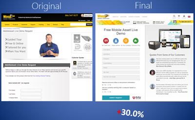
Our tests here revealed that removing video and adding a product shot increased form completions significantly.

This key landing page went through several tested iterations to reach a high-converting design.

This key landing page went through several tested iterations to reach a high-converting design.

The redesign was just getting started, and we had already begun generating significantly more demo requests for the business.

Step Four: Move to Another Section of the Site and Repeat

The Wasp design team designed another category page for the next section of the site. They integrated elements that visitors were clicking on frequently, such as feature lists.

While the visitors in this section of the site behaved somewhat differently, we saw a positive lift in visits to the Demo Request page. This page was optimized, and delivered more demo requests to the sales team.

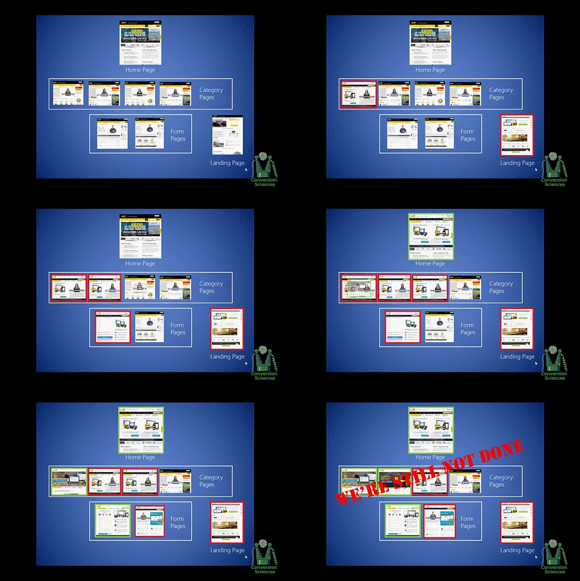
The step-by-step Wasp Barcode website redesign sped up.

The step-by-step Wasp Barcode website redesign sped up.

The Wasp design team then took what we had learned and redesigned the home page. This drove a significant increase in visits to the high-converting Demo Request page.

250% Increase in Demos over Six Months

Most website redesigns would still be sitting on a staging server. Wasp has enjoyed significant increases in demos during their first six months. Together, we rolled their redesign out step by step, testing along the way to ensure each change had a positive or neutral impact.


Breaking the Rules of Website Redesign

Designers and UX people may be rolling their eyes. It is an old truism that a visitor should have a consistent experience across a site, or they will feel lost.

During our stepwise rollout, we violated this rule. But when we have completed the process, providing this consistent experience, we can expect another increase in demos.

This approach also allowed us to change the design for different sections of the site. Those visitors looking for Inventory Management solutions are fundamentally different from those looking at Asset Management tools. One design would not have worked well for both.

Not everything we tried increased the conversion rate, and the Wasp team made adjustments accordingly.

Let Us Guide Your Site Redesign

Your website redesign doesn’t need to be an “all in” gamble. Find out if your website would benefit from a stepwise redesign with a free consultation.

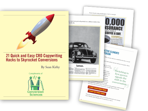
21 Quick and Easy CRO Copywriting Hacks to Skyrocket Conversions

21 Quick and Easy CRO Copywriting Hacks

Keep these proven copywriting hacks in mind to make your copy convert.

  • 43 Pages with Examples
  • Assumptive Phrasing
  • "We" vs. "You"
  • Pattern Interrupts
  • The Power of Three

"*" indicates required fields

This field is for validation purposes and should be left unchanged.


If you live in Chicago, we’re bringing one of our most important presentations right to you.
If you don’t live in Chicago, may I suggest you get that Ford Fairlane lubed and tuned up for a road trip. You’ll want to be there on June 2.
We’re going mobile to spread the results of our testing on the mobile web. It’s one of the most important presentations we’ve done because the mobile web is changing fast.

CRO-1 with Labels ghostbusters ambulance

Conversion Sciences is Road Tripping to Chicago June 2.


We know a thing or two about your mobile marketing. Your Mobile traffic is probably one of your fastest growing segments. It converts at depressingly low rates. You have probably decided to focus your efforts on the desktop for now.
We were there once, too.
Come see the most interesting and lucrative things we’ve learned about mobile conversions from tests across industries. You’ll learn you how to avoid common conversion-killing “mobile best practices”, write CTAs that get mobile visitors to take action and employ simple UX tricks that will keep those CTAs constant without distracting or irritating visitors.
You’ll also get tips for bridging the 1st screen to 2nd screen gap, maximizing phone leads from mobile visitors and building forms that mobile visitors will actually complete.
You’ll leave this sessions equipped to make smarter decisions about your mobile experience.

We Get a Special Discount

We get a special discount since we’ve got the awesome wheels. Don’t tell our hosts at Unbounce that we’re sharing this code with you.

conversionsciencessentme

You better sign up before they get wise. This code lets you in the door for $149.50. That’s 50% off the already ridiculous price. You can use it here. Yes, it’s a damn long discount code. Copy it to your clipboard.

Did I Mention the Other Seven Awesome Speakers?

No? Well you can’t beat them. You should check them out after you’ve registered to see us.
Speaker Image

We’re worth the $149.50 admission, but you also get these bright people.

Come see us in Chicago, or wait to see these great speakers at one of the overblown and expensive conferences in some far away city. Your choice.

We’ve all seen the numbers. Visual content outperforms text-only content by a landslide.
Need a refresher?

  • Content generates up to 94% more views if combined with compelling visual elements and graphics. (MDG Advertising)
  • 40% of people will respond better to visual information than to plain text. (Zabisco)
  • High quality infographics are 30 times more likely to be read than text articles. (Ansonalex)

While I’ve known these stats for some time, I didn’t feel like there was much I could do about it until recently. I would make sure to break my articles up with nice subheadings and insert quality stock photos or original photography when I had it, but that was about as visual as I got. “After all,” I thought, “I’m a writer—not a designer.”

How I Became More Visual

Things changed when I started writing a weekly column for a client whose company designs and builds custom homes. The column was to appear as sponsored content on a well-known luxury living blog. My goal was to conduct interviews and research on the latest trends in home design and present my findings in 500+ word articles along with some beautiful photography of the client’s work.
My logic was simple: The photography was already performing extremely well on social media. The pictures would be the hook, and people would stay for the insightful article.

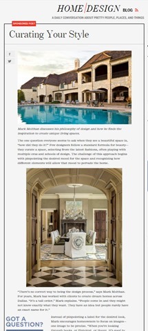
The first article of the campaign. It goes on for over 600 words.

The first article of the campaign. It goes on for over 600 words.

While this approach already seemed to be working on the client’s on-site blog, it didn’t have the effect I wanted it to on the sponsored column.
In fact, my first article performed pretty badly, despite all the effort I had put into conducting interviews, despite the great quotes and useful information I used—even despite the photos that had been shared thousands of times on social media. The first article—a piece that used anecdotes and advice from the client about finding inspiration for your home—received 84 views upon publication and continues to be one of the lowest performing posts of the campaign, with a total of 220 views.

The tiny blip made by my first article. We used tracking pixels to watch traffic on Google analytics. As you can see, traffic did not pick up after posting.

The tiny blip made by my first article. We used tracking pixels to watch traffic on Google analytics. As you can see, traffic did not pick up after posting.

Then I started using Illustrator

I had been fumbling around with the program for several months, but never felt like I had time to use it properly. My approach had always been to write the best copy I could and to let a designer help out if they had time. But this time I was determined to do something—anything—different so that the column would prove worthwhile.
So I went ahead and designed some images for my next two posts—just some simple, vector-based elements to use as featured images and between subheadings. They weren’t great, but they were presentable, and the articles performed slightly better than the last.
I wasn’t sure if the slight increase in views warranted the extra time it took to create new visuals, but I decided to give it one more shot.
I’m glad I did.
Taking a cue from fashion magazine style collages, I cobbled together a collage using pieces of our original photography and used it as the central element of the next post. The post received 524 views on the first day of publication—over six times more views than my initial post. Even better, the post continues to rack up views, with 1,626 views to date.

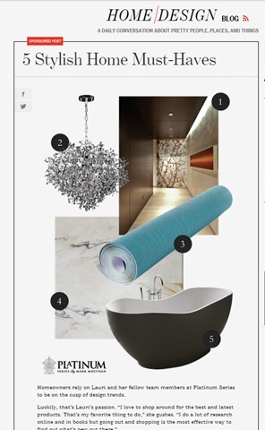
My first post on the site to be primarily visual.

My first post on the site to be primarily visual.

Since posting that article, I have continued to create similar content for this campaign (and others) that have performed just as well.
My next post also used a collage. It received 504 views on the first day of publication. Interestingly enough, this article was on the same topic as my initial failed article—how to find home design inspiration. The difference was all in how the information was presented.

Spikes in traffic from my first two collage posts done in Illustrator.

Spikes in traffic from my first two collage posts done in Illustrator.

A few months later, new posts continue to create spikes in traffic, and we begin to gain a consistent viewership between postings.

A few months later, new posts continue to create spikes in traffic, and we begin to gain a consistent viewership between postings.

While I don’t have all the answers to this change in performance, I attribute the success of the collage articles to two things: 1. their overall presentation, and 2. their particular appeal to my audience.

Overall Presentation

  • They stand out from surrounding posts in the blog roll.
  • In a sea of photographs, a small piece of graphic design can really stand out.
  • They look original.
  • Readers who are already engaged with the client’s brand may have already seen our best photography. These images made them brand new.
  • They look useful and cohesive.
  • A simple collage with numbered items promises practical, bite-sized content. Plus, people want to be shown how information relates. Sometimes, placing a great photo next to text isn’t enough.

Appeal to the Audience

  • They mimic the look of luxury magazine and blog articles.
  • In researching our audience, I checked out several sites that our demographic enjoys. (Facebook’s recent expansion of its search function is great for this task.) They gave me examples of the kind of short-form blog posts that our target audience typically reads.
  • They account for the audience’s browsing behavior.
  • If your prospective customers are visually inclined, too much text is a nuisance. By creating visual content, I was able to provide the kind of bite-sized articles that that my audience expected in that context.

Growing your capabilities will make you more perceptive.

There are probably several lessons to be learned from this incident, including one about knowing your audience. But the one I want to stress is this: learning how to design will make you a better writer.
How do I know? I’m not just basing this claim on the spike in traffic that came after I started creating visuals. I’m also basing it on the fact that now, when I set out to create content, I don’t ask myself, “How can I best express this idea through copy?” I ask, “What is the best way to express this idea? Period.”
I am also better able to take into account the browsing behavior of my audience. I wouldn’t be writing this out as a 1,000+ word article if I didn’t think that the audience of The Conversion Scientist was willing to read longer articles. Similarly, the content you create should cohere with the browsing behavior of the people you want to reach. No matter how great your writing is, you will never convince a non-reader to read—at least, not through a piece of content marketing.
Because I can now create a broader variety of content I also think much more about the behavior of my audience. That’s why learning Illustrator has not only made me more versatile—it has also made me more perceptive. If copy is only a small part of the equation, I can combine my strengths as a writer with my (developing) ability to design to create content that is cohesive, concise, and valuable.
Colleen Ahern, The Conversion ScientistColleen Ahern is a copywriter and content marketing strategist at Page Agency. She created the Page Agency Blog, where she writes about the rapidly evolving world of content marketing and social media. Follow her on Twitter @ColleenAhern.
High shopping cart abandonment rates are frustrating. So, we rounded up 10 eCommerce checkout usability techniques to charm your visitors into shopping on your site again and again!

There are many good reasons for shopping online rather than in person. But, even for those who regularly navigate the pitfalls of the Internet rather than the crowds at the malls, there are some frustrations that send customers screaming into another room, vowing to never again push the “Proceed to Checkout” button.

Well, maybe not really, but there are frustrations for online buyers that are better avoided if your intent is to maintain a healthy conversion rate. Statistics show that online shopping carts are often abandoned. Frequently cited complaints from regular shoppers include the following:

  • Unexpected add-on charges during checkout
  • High shipping charges
  • Complicated checkout procedures
  • Inefficient or time-consuming processing
  • Excessive security checks or, conversely, concerns about security
  • Unacceptable delivery options

If you suspect that your conversion rate should be higher, but you are unsure how to boost your sales figures, there are some relatively simple strategies you can try.

A usability study of the top 100 e-commerce sites produced the following statistics: There were an average of 5.08 steps required for checking out, and 24% of the sites required previous account registration.

Logical and not surprising, right? Other findings, however, were a bit surprising. Two-fifths of the sites asked for validation of addresses, half requested the same information twice or more, and even the top 100 sites violate eCommerce checkout usability techniques and guidelines about one-third of the time.

So, what’s a customer to do? Mutter a few angry words and flee the site seem to be common reactions.

“Keep It Simple” tops all eCommerce Checkout Usability Techniques

The KISS principle was a catchword for all sorts of business advice back in pre-Internet days, but it applies very well to online checkout. Your customers are busy people, and they want to run into your virtual store and be on to other pursuits in a minimum amount of time. It’s your merchant responsibility to help them do that. Your return? Their money and their eternal gratitude. And, likely, return visits!

Consider the following improvements to your site and your checkout procedures if your conversion rate is slipping. Monitor the results, and see what works for you. Think like your busy customers, and seek to make checkout as simple, as user-friendly, and as efficient as it should be.

The Effect of Language

A key skill most face-to-face salespeople have to master is “asking for the sale.” The way you direct your customers through your checkout process can make a difference.

Make it clear: Rather than a “Submit” or a “Next” button, consider a “Payment Options” icon or a “Pay Now” button. Having clear calls to action gives the user no reason to think and also gives them clear instruction on what to do next and also what to expect.

Consider a Single-Page Checkout for your eCommerce Site

A single page checkout may seem more complicated than breaking it down into several steps and pages. However, this simple move into a single page checkout may improve purchases greatly. UX Magazine reported that a French e-commerce site changed from a multi-page checkout to a single page checkout and conversions increased by 67%!

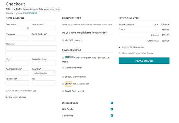
An example of a one page eCommerce checkout.

An example of a one page checkout.

Editor’s Note: We find that your audience may have a different preference when it comes to single-step checkout. Try both on your visitors before committing to one or the other.

Provide Several Payment Options

The kinds of payment available will depend on the price of your product line and your buyer profile. But offering choices is good and is likely to increase your customer base. So consider them carefully. Having options for credit cards and services similar to PayPal, for example offer the user more diverse payment options.

The key here is to let your visitors pay in the way they trust most= by offering payment choices. eCommerce checkout usability techniques.

The key here is to let your visitors pay in the way they trust most= by offering payment choices. eCommerce checkout usability techniques.

Make it Easy for First-time Buyers and for One-time Buyers

While requiring an account in order to purchase makes sense from your side of the fence, it can be an unnecessary bother for the customer who simply wants to order an item and move on. If you require a lengthy account set-up, you may lose a quick sale, whereas from a quick sale there is a good possibility that you might gain a repeat customer.

After issuing the sales confirmation, ask if the customer would like to open an account, you will be surprised how often the answer is yes at that point. After all, they are already invested into your company if they feel that the level of service that they have received is good and timely, this increases dramatically.

Keep buyers on your site, and be consistent with your branding

If you direct customers away from your site in order to register check out or complete the payment procedure, you may lose them. Just don’t do it!

Third-party shopping carts can make a visitor feel like they’re getting scammed. They often suffer from limited customizability as well.

Only Request Essential Information

Don’t raise suspicions by asking for anything that is unrelated to this specific sale. You can collect background information at another time, in another place — or not. But, the business at hand is completing a transaction, and anything that distracts from that goal has no place on the checkout page.

Instill Trust

Gain your customer’s confidence by having an SSL Certificate; reassure your buyers that you do not share any personal information, and comply with the standards of the PCI Security Standards Council. Display your security badges proudly on your site.

Improve Site speed

Make sure your site is up to date, that the loading speed is fast and that operation is efficient. A savvy online buyer with money to spend will not tolerate wait time.

Even boutique sellers should have state-of-the-art Internet connectivity and be lightning-fast (as much as possible) around the world. It is a shrinking globe after all, and e-commerce is global.

The checkout page should be as attractive and as well-designed as the rest of your website.

Ask for Needed Information only Once

If your site requires a second set of address details for ‘Billing Address’ on your checkout form for example, auto-fill the form to save the customer time and effort.

You will gain a loyal fan base by making the procedure so unexpectedly efficient.

Try Free Shipping

Try free shipping to lower shopping cart abandonment.

Try free shipping to lower shopping cart abandonment.

This seems to be the best catalyst for increasing sales. It is, from all reports, more of an incentive to a buyer than special offers, price reductions or “bundling” offers. If you can’t offer free shipping to everyone all the time, try it on a limited basis. And always be upfront about your shipping charges: Don’t spring those charges only on the checkout page.

Finally, take a lesson from the old-timers: Ask for the sale. Issue a clear call to action on your website in the product descriptions or on an appropriate page. Take a lesson from sites like Amazon. Be unambiguous with buttons such as “Add to Basket,” “Continue Shopping,” or “Checkout Now.” For the success of your business, learn how to simplify your checkouts.

Author Bio: Owen Sondergaard is an avid blogger and data enthusiast. Owen writes for CAMO Software who provides multivariate analysis software solutions.

Well-heeled travelers will enjoy a private guided tour of the world’s various wine-making regions. Colin Simpson of Into the Vineyard arranges these advantures for them. Into the Vineyard tours are tailored and personalized to the individual, setting themself apart from other packaged, run-of-the-mill wine vacations.

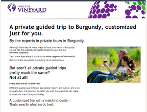
The Into the Vineyard luxury landing page

The Into the Vineyard luxury landing page


Colin came to us with a landing page built on Unbounce.
They have had fairly good success with these landing pages, boasting conversion rates of over 5% and more. Colin had a number of questions for Conversion Sciences about how to optimize his landing page to see a lift in conversion rate while maintaining high lead quality.
Many of our suggestions are included in the annotated infographic image included in this post. However, one of his questions was one that we are asked all the time. Its answer is important for you to understand when you create your own landing pages.

Is the placement of the form too far down the page?

The short answer is “No.” This may be contrary to the above-the-fold or very-close-to-the-fold rule many of you follow, but there are good reasons to place your form towards the bottom of your landing page.
Into the Vineyard offers a luxury item and appropriately uses a value-building approach. Furthermore, part of the value of their offer is the ability to customization the product. Bombarding visitors with a form too early not only gives them no time to appreciate the luxury of the offer but also may elicit feelings of impersonality.
This is something to consider if you are in the luxury market. Even if a form placed “below the fold” produces a lower volume of leads than would one above the fold, you may find these leads to be better qualified. They have not only read your content to the bottom but they also know what they are going to receive in exchange for their information.

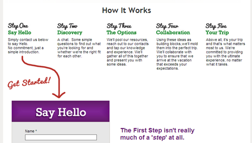
Landing pages should show the steps of the process

Laying out the steps of the process puts many visitors at ease. The use of the red arrow draws the visitor to take action.


We saw this strategy work very well in split testing for a similar company, a company that sells golf tours to Scotland and England.
A landing page that added the steps of the process after filling out the form generated a 300% increase in leads.
A landing page that added the steps of the process after filling out the form generated a 300% increase in leads. Note that this was not the only change to the page.
The bottom line is that the content of your landing page must make a clear offer, regardless of form placement, and your copy must support the offer, not just your product or company. Into the Vineyard does an excellent job of explaining what will happen if a person fills out the form.
The long answer to Colin’s question is “I’m not sure, let’s test it.” One of the awesome perks of using the Unbounce tool to create landing pages is its A/B testing feature.
For most online websites, A/B testing is the most reliable way to know where to place a form on your page to maximize leads and sales.
When you create your own landing pages, consider your market. Are you in the luxury market where your visitors may need a little more information to get excited and convert? Or, are you using this landing page to give the visitor a freebie in exchange for their information?
These two situations will lend themselves to different form placement. If you have the traffic, test the difference because no two business are the same and what works may not work for all.

More recommendations


I’ve got some eye-candy and ear-hums for those of you who hate reading. My tour of Europe (Frankfurt, Germany to Stockholm, Sweden) yielded a variety of media.

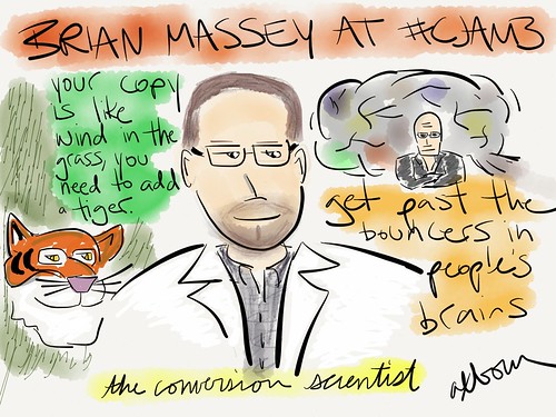
Sketch of conversion scientist Brian Massey @bmassey at #cjam3
Our brains are good at ignoring the typical so that we don’t miss the life-threatening: Wind on the grass vs. the steps of a predator.
Per Axbom

Lab Coats Were All the Rage

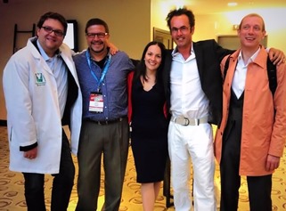
My fantastic hosts, André Morys and John Ekman easily earned their Conversion Scences lab coats for exemplary work in progressing the science of conversion. Co-speaker Natalie Nahai (the WebPschologist) found the 1200 thread count thermal weave to be warming on a cool Stockholm night.

Natalie Craig Ton Andre Brian Lab Coat ConversionJAM Brian Massey John Ekman lab coat Natalie Nahai Lab Coat

An Audio Preview

brian massey cjam3 podcast interview uxpodcastThe James Royal-Lawson and Per Axbom recorded a short (14:36 min) interview. You should listen to it, and if you want to learn more, check out the complete audio of my presentation.

Live the Full Presentation as if you were THERE

Follow along with the slides.

Google Analytics Tips: 10 Data Analysis Strategies That Pay Off Big!

Jan 02, 2013 11:43 pm

Comments:

@Avinash Kaushik has a unique ability to make analytics human. I don’t share many analytics posts with you, as I don’t want to scare you off. But I fear I may be underestimating you.

Here are ten very good ways to get to know your visitors through Google Analytics. I believe you will be energized and excited if you open these reports in your own Google Analytics account.
This is a great way to start appreciating your visitors in ways that will make your site more successful.

by: Brian Massey

Karon Thackston: Phrasing Discount Offers for Maximum Results by Getentrepreneurial.com

Dec 29, 2012 01:47 pm

Comments:

How you phrase a discount is a powerful way to increase conversions. Some visitors do not like to do math, or will do it wrong. Therefore, offering 20% off is less effective than save $18. However, high discounts (50%, 90%) may draw buyers more powerfully than the dollar value.

You have to find out for yourself.
Karon offers a nice list of alternatives and some links to research for your enjoyment.

by: Brian Massey

The Top 5 Website UX Trends of 2012 | UX Magazine

Dec 29, 2012 01:40 pm

Comments:
While good UX (User eXperience) does not always translate into higher conversion rates or revenue per visit (RPV), these trends point to excellent hypotheses for what MIGHT increase the performance of your site.

  1. Single Page Sites: Simplicity is often a great way to increase conversion rates
  2. Infinite scrolling: Consider this for category pages. I haven’t tested this yet.
  3. Persistent top nav: I am very curious to see if this increases CR and RPV. Let me know if you’ve tested it.
  4. Web 2.0 Aesthetics: I hope this includes the rotating banners at the top of so many sites.
  5. Typography Returns: Your message is the most important part of your conversion optimization plan. Typography can help… or hurt

by: Brian Massey

imageThese are the stories that caught my eye last week. If you are a curious marketer looking to learn more about conversion, please subscribe my weekly recommended reading list, For Further Study.

The Product Page 2012: 7 Must-Test Elements

Feb 27, 2012 08:22 am

@TheGrok  says “Test your product headline to be benefit oriented as opposed to just product name.” I hadn’t considered that. Good lists always tell you something you hadn’t thought of and Bryan has such a list for Online Stores and Publication sites who feature their offerings on Product Pages. Product pages are the money pages on your site, and are one of the first places to look for optimization opportunities.

read more

The Shocking Truth About How Web Graphics Affect Conversions

Feb 27, 2012 01:14 am

@KISSMetrics – David Ogilvy is experiencing something of a renaissance these days as his experience and research in offline marketing are proving true in online marketing. And we need him. Images are an abused medium on the Web, and this article points out mistakes that you are probably making.

There are some real nuggets here, such as “Captions under images are read on average 300% more than the body copy itself” Ask your designer what research he has for his decisions.

This is an important article, and you should read it before you blindly follow the advice of lazy designers.

read more

© Copyright 2007 - 2024 • Conversion Sciences • All Rights Reserved • Conversion Scientist® is a federally registered trademark owned by Conversion Sciences. Any unauthorized use is expressly prohibited.