Sales and marketing have changed dramatically over the last few decades. Gone are the days when you need to go door to door to sell your products or services. Most startups these days don’t even have a phone sales team. With the Internet, it has all moved online.
However, just because the methods have changed, it doesn’t mean the underlying principles have. Penned in 1884, Influence: The Psychology of Persuasion by Robert Cialdini talks about persuasion as related to face-to-face sales.
The book has stood the test of time and is still one of the most accepted marketing documents ever produced. Even if you aren’t familiar with the book as a whole, you’ve likely seen or tested one or more Cialdini’s six principles in the past: scarcity, reciprocity, liking, authority, social proof, and commitment and consistency.
While I fully recommend reading the book in its entirety, this post will serve as a brief update on how each of these principles are used now and what you can expect from trying one yourself.
1. Scarcity
We always want what we can’t have.
Scarcity is the idea that there is a limited number of items left to buy or time left in which to complete the conversion. When something is scarce, we tend to want it more, if only just to possess something that’s not readily available.
Scarcity works best on customers who already have a need for your product or service as opposed to those just browsing. If you find that customers are sitting on the fence and not converting, a little indication that your product is scarce might get them to buy sooner rather than later.
There are multiple ways to create scarcity on a site. Let’s take a look at three.
Stock Scarcity
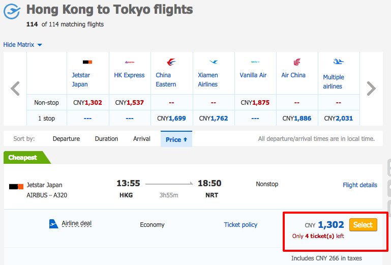
With a bit of red text, Ctrip calls out the number of remaining tickets right next to the CTA.
The Chinese travel site
Ctrip is constantly updating the number of tickets they have at a specific price point. Apart from making the text stand out against the blue and white theme, it also implies a sense of urgency.
As customers look at flights, the text immediately captures their attention, letting them know that if they don’t purchase it now they won’t get that flight at all.
It works great for booking sites like flights and hotels, and it can be used to good effect on regular commerce sites, too. By letting customers know that a certain product is low in stock without mentioning when you’ll restock, you can get them off the fence.
Monsoon, an online clothing and accessories retailer, used to have a regular product page that didn’t indicate if stocks for a product were low. They hypothesized that adding a message when stocks were low might urge their customers to buy faster.
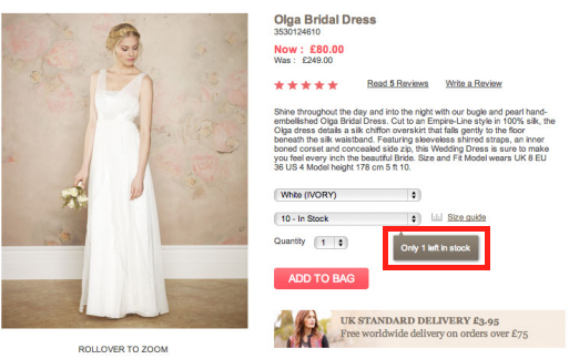
Knowing that there’s only one dress left increases our sense of urgency.
By adding a pointer if a certain item had 5 or fewer units left in stock, they were able to increase conversion rates by 10%!
Shipping Scarcity
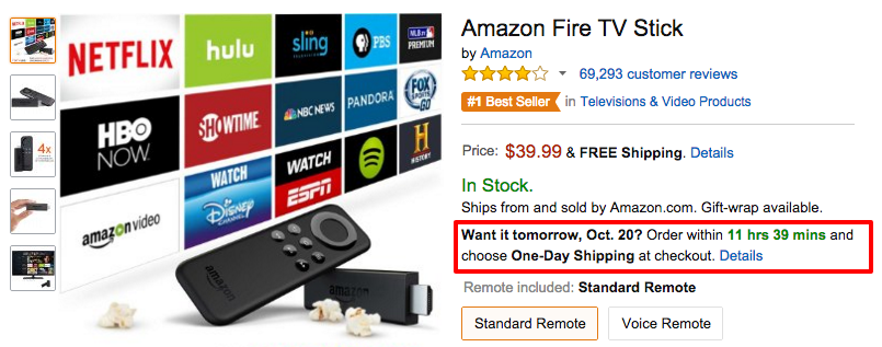
Amazon’s shipping countdown clock
Oh
Amazon, is there any conversion tactic you don’t use on your site? We’ve all seen the little shipping countdown they have for next-day delivery. It looks like a bit of innocent text, but to shoppers it means the difference between getting their product as soon as possible, versus waiting a few days. In this age of instant gratification, it’s enough to convince some people to buy right away.
Running a shipping countdown is a great idea for targeting impatient shoppers, and Which Test Won showed a
9% increase in conversions thanks to the introduction of a similar timer. Even if your shoppers aren’t impatient in general, you can take advantage of holiday shopping to offer priority shipping so they get their gifts in time.
Sale/Discount Scarcity

It’s hard to miss this weekend sale on Threadless
Urban clothing retailer
Threadless is always putting their sales front and center on their homepage. Doing so not only increases visibility, but also plays on the concept of Fear Of Missing Out where shoppers can’t stand to miss a deal since the sales are short-lived.
Again, we see red text playing a part as Threadless brings attention to their limited time sale. By saying it runs “this weekend only” it implies that customers will never see this kind of deal again. Deep down, we know that there will be more deals like this later, but the uncertainty coupled with the immediacy of this deal make us buy.
Be sure to mention the discount even on your product page. Corkscrew Wine had discounted one of their wines but initially they didn’t highlight that on the product page.
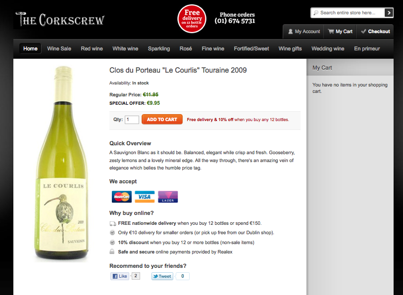
It’s easy to miss that this wine is discounted.
To emphasize the discount, they added a big 15% off sticker and mentioned the discount in the title too.
Calling attention to the fact that the wine was on sale, even though the price was the same in both cases, gave them a massive 150% increase in conversion rates!
2. Reciprocity
You scratch my back and I’ll scratch yours.
The idea plays on the notion that humans are naturally inclined to pay back a favor, typically manifested on a website in two ways.
Free Offers
Conversion Sciences offers a free short course in exchange for your email address.
You’ve probably already got pop-ups and email subscription forms offering your visitors a free resource in exchange for their email address. This is content marketing 101 and draws in leads that may later convert to customers.
But those email addresses would be useless if it weren’t for the principle of reciprocity. By getting something for free your visitors are now inclined to pay you back in some way, by either buying your product or telling their friends about you.
The more valuable the free offer, the stronger this effect is. In the example above, Conversion Sciences offers nine free articles on increasing website sales. On its own, it’s a pretty valuable offer.
But they take it a step further and offer a website review on top of that! Getting an expert to point out where you’re going wrong on your site is the kind of immense value that makes visitors want to pay for more.
If you think your one page report is enough to bring in sales, think again. While it may get you email addresses, it’s probably not valuable enough to get you more. Go big with your free offer and watch sales roll in.
Loyalty Programs
Gamification is a new term in the conversion world and a concept that I find really cool. Completing actions like purchases or filling out a form allows you to earn points that can be redeemed later for discounts and other perks.
Credit card companies have been doing this for a while, but other industries are just catching on that it’s a great way to promote loyalty and engagement.
The concept is simple. You reward your customers for actions that they take. The rewards reinforce repeated behavior and entice them to take more actions. The result is a cycle of loyal, repeat customers doing things you want them to do because they know they’ll be rewarded for it.
Starbucks is a great example of this. They
boosted revenue by 11% by implementing a reward points program. For every dollar spent using a Starbucks Card, you get rewards. In fact, new card activations and reloads went up by 32% just because of that!
Gamifying your site doesn’t have to be as complicated as the Starbucks system. Even simple action-reward sequences, like getting a 10% discount for tweeting a product, work.
3. Liking
Users are more inclined to buy if they like the person selling or marketing the product.
Have you ever wondered why advertisements always have movie actors or sports stars in them? It’s because they are playing on the popularity and likeability of the celebrity.
It goes beyond just sticking a smiling face on every page of your site. You need to take both your ideal customer and product into consideration.
Testimonials
Testimonials can help your site create the trust you need to win over new visitors. Everything from the written praise on your homepage to the retweets by industry influencers can help you stand out to users who might be on the fence about converting.
In the example above from Buzzsumo, a content marketing tool, we see three testimonials from popular marketers. You probably recognize these faces yourself and you may have come across Noah’s blog or Rand’s whiteboard videos. Those testimonials are perfectly targeted at the software’s customer base, and their likeability plays a huge part in conversions.
In fact, testimonials are so powerful that they can increase conversions even without the name-dropping. WikiJobs, a graduate jobs website in the UK, wanted more people to sign up for their practice tests. Initially, their page had no testimonials.
For the test, all they did was add three testimonials in, without names or faces.
Boom! Those three lines, which could very well have been made up, increased their conversions by a whopping 34%!
4. Authority
Just like with using celebrities, many advertisers also use authority figures like doctors. This is especially common when it comes to health and hygiene products like toothpaste or soap. The doctors are probably just actors, but the fact that they are wearing a white lab coat is enough to influence many people.
Introducing the principle of authority into your site means coming across as an industry expert and therefore increasing the trust a user has for your brand.
For example, Kaya Skin Clinic, a retailer of complex skin products, wanted to increase the consultations made through their site. Their initial page mentioned their expert dermatologists, but the call to action was booking a consultation.
To further emphasize their authority and expertise, they tested asking visitors to sign up for an expert opinion instead.
That small change outperformed the control by 138% and increased sales by 22%! By simply implying authority their visitors were more likely to convert.
I personally think there is a bit of overlap when it comes to authority, liking, and social proof, but here are a few examples of sites taking their authority to the next level:
It doesn’t get much more obvious than this. This legal site did almost the same thing as Kaya and added the word ‘expert’ wherever it fit. For businesses in industries like Law, Medicine, Healthcare and so on, it’s important to establish expertise even if it means adding the word ‘expert’ to your site.
Of course, there are more ways to display authority and expertise on your site. USAA does a great job of using images to convey a sense of professionalism and knowledge regarding investments. Both the stock ticker and app screenshots imply that they know what they are doing when it comes to managing your money, especially if you don’t know the first thing about it.
When it comes to your site, a combination of professional design, authoritative copy and images of experts can go a long way in building trust and increasing conversions.
5. Social Proof
Monkey see, monkey do.
If there was any doubt that we evolved from apes, this principle should clear it.
Social proof is all about leveraging the fact that we are more comfortable performing a certain action, like buying your product, if we see that others have done it before. It’s a great way to reassure nervous users that your company is legitimate and others have purchased your product or service.
Most people know the impact that adding reviews can have on your conversion rate, but there are a few other ways to leverage social proof.
Social Stats
Got a big following on social media? Try including it in your header like Sneakerwatch to increase your credibility. They have almost a million followers if you add all those numbers up. That’s like saying there are a million people who love the company so much they want to stay connected on social media.
Going back to the Kaya case study, they tried to go one step further with their CTA and added their Facebook follower count.
Again, the act of adding social proof helped even more and increased conversion rates by a further 70%.
Beware though, if you have really low social media numbers, this might backfire on you. Taloon.com, an ecommerce store that sells plumbing, electrical and gardening suppliers, used to have social media buttons on every product page. However, their share numbers weren’t very flattering and it actually lead to negative social proof that lowered their conversions by 12%.
Show Off Your Accomplishments
Have you won an award or been recognized somewhere? Sing it from the (figurative) rafters by putting it on your homepage to help reinforce your offers in the eyes of your users.
This example from World Nomads combines social proof, authority and liking by adding logos of well-liked and trustworthy brands that use their insurance. The implied question is, if these brands can trust World Nomads, why shouldn’t you?
6. Commitment and Consistency
When I started playing poker, I’d make a very common mistake. If I had bet money pre-flop, I’d continue to bet even if the flop was terrible. After all, I’d already made a commitment, so I might as well continue staying in the hand. Needless to say, I lost a lot of money!
You see, people like to stay consistent. If they make a commitment, they try to keep it. So instead of going for the big sale right away, try starting with a smaller commitment and then increasing the ask later.
For example, if you’ve ever applied for a loan, financed a car, or mortgaged a home, you know that the process of actually getting approved can be daunting. You are often faced with pages of forms that seem to drag on forever. In order to make this easier to manage, sites like to begin with a small commitment that is followed by small and consistent steps.
Take this booking form for an airport parking service in Edinburgh. Just looking at the page makes me want to run away. There are so many form fields!
Thankfully they realized this and split it into a multi-step form. Sure, it’s the same number of fields eventually, but by breaking it up, it doesn’t look so daunting.
This resulted in a 35% increase in form completions. By making the user enters some personal information, they are ensuring the user is committed to the process of providing more information and completing the application. These initial steps help weed out users who aren’t serious and provide higher quality leads.
When customers hit the ‘Continue’ button, they are taken to the next step. Since they’ve already made a bit of a time commitment, they’re more likely to stay consistent and continue filling the form.
Many software companies use this concept when they offer free trials. By entering an email address, you can get started using the product immediately, and each step in the onboarding sequence builds your commitment.
Ecommerce companies, on the other hand, tap into this concept when they up-sell customers. They start off with an expensive base product, like a phone or computer, and then upsell customers on accessories. Having already paid a big sum for the main product, customers are likely to pay a comparatively insignificant amount to further enhance it.
Finally, info-marketers flip the script and sell customers cheap products first before upselling to higher priced courses. Again, the commitment principle is at work here, taking advantage of people’s tendency to stay consistent.
Harness the Power of Persuasion
With the exception of adding social stats to your home page, all of these tips are going to be more complicated than changing the color or copy of your CTA. Consequently, make sure you take the time to plan out each change while considering your audience and goals.
Be warned, though! It would be easy to misuse one of these tactics and do more harm than good. If you go back to the WikiJob case study, you’ll see that the testimonials were just plain-text quotes with no attribution. Of course, those were real quotes, but it’s not hard to ‘cheat’ a bit and make up your own.
Similarly, it’s easy to fake social proof numbers or mislead customers into thinking that your stock is running out. The problem with this is, apart from being entirely unethical if you get caught it could be disastrous for your business.
Recently, JC Penney had to settle a class-action lawsuit for creating fake sales and discounts. In many cases they would double a product’s price and then put it on ‘sale’ for 50% for a limited time. As we’ve already seen, a discount scarcity tactic like this can increase sales, as it did for JC Penney, but when the truth came out it hurt them financially and eroded customer trust.
So if you’re going to try any of this out, make sure you do it the right way. Don’t create scarcity if there isn’t any, don’t manufacture testimonials, and don’t artificially inflate your social proof. Harness the power of persuasion while maintaining your customers’ trust.


Why We Need CRO and Personality Traits of CRO Experts
Conversion OptimizationWhat are the Conversion Scientists reading these days?
Forbes: Why CRO Is Absolutely Essential in 2015
Forbes doesn’t mince words when talking about CRO. Author Niel Patel has built several online businesses, including CrazyEgg and KISSMetrics. He would know.
The article starts off with a great insignt: “Conversion optimizaiton works.”
So, how did you do this year?
Read more.
Conversion Conference: 8 Qualities of Successful Conversion Rate Optimizers
Lance Loveday’s keynote presentation at Conversion Conference this year shared eight traits that gifted CRO experts share. Wouldn’t you know it that Conversion Science’s own Brian Massey and Joel Harvey both ranked in Conversion Conference’s top 25 conversion experts in 2015, so they’ve definitely hit all of Lance’s high points.
Which of these qualities most helps you excel at CRO?
Read more.
“Quick and Easy” is not a Value Proposition [PODCAST]
Landing Page OptimizationAt the outset, your form may seem quick and easy. Everyone should know the answers to easy questions like name, email address, and birthdate. Furthermore, these are questions that everyone asks online. People should expect to answer these questions.
Yes, we know the answers. Yes, we’ve given this information up before. But, don’t call it quick and easy. It takes effort to decide if you’re trustworthy. It takes effort to decide if you’re safe. And it takes more effort than watching TV.
Subscribe to Podcast
So, we just say, “It’s easy.” Sometimes it works. In my Marketing Land column To Buy Or Not To Buy: When “Quick And Simple” Is Just A Lie, I propose that you will enjoy more success if you take the time to build value in your offering, rather than assuming your visitors are lazy and can’t be bothered to work for or spend on something valuable.
Quick And Simple Is Not A Metric. It Is A Perception.
Too often “Quick and Simple” is a lie.
Quick And Simple Is Not A Metric. It Is A Perception. I offer the following flowchart in the article:
Quick and easy is probably different for your visitors.
Mobile experiences are getting more and more sophisticated, which means we are doing less and less work. You’re definition of “easy” is getting eroded. I recommend you build value.
Why Our Website Redesign Wasn’t a Disaster [WEBINAR]
Conversion-Centered DesignOn Monday, Conversion Sciences launched a revamped website. As you will learn in our Lab Coat Lessons Webinar, a website redesign can be a very dangerous undertaking.
Sixty percent of our business comes through our website (the remainder being referrals). Any significant drop in traffic or conversion rate will hit our bottom line hard.
It’s still early for us, but we will share five client redesigns we’ve been involved with and why they were or were not successful. Watch the webinar replay.
Subscribe to Podcast
What Not to Do in a Website Redesign
There is a lot that can change in a redesign. The sentiment seems to be that, since everything is changing anyway, what can it hurt to add a few more modifications, updates and rewrites? It can hurt a lot, as it turns out.
A redesign is a collection of changes, all based on assumptions about what visitors want. Some of those assumptions will be right on. Some will be sadly misdirected. The more you add, the more likely you are to introduce some random poison pill feature into the mix.
Any website redesign is a mix of good and bad assumptions.
With our redesign, we did the opposite. Our primary goal was to improve the search engine performance of our amazing content (like this). We were tempted to rewrite dated pages, redesign elements we’ve grown tired of and photoshop our pictures to make us look more fit.
21 Quick and Easy CRO Copywriting Hacks
Keep these proven copywriting hacks in mind to make your copy convert.
"*" indicates required fields
The heartbreak comes when more of your changes decrease conversions than increase them.
Things can get ugly when more of your redesign ideas hurt than they help.
If you didn’t roll out changes step-by-step, you just don’t know which changes hurt you and which helped.
An even more insidious result is when more of your changes increased performance. In this situation, the marketing department pats itself on the back and goes on about its business.
When the good decisions outweigh the bad, the bad decisions are hidden.
But how much better could business be if the bad decisions were tested away? Usually, much better. The positive decisions overshadow the mistakes that still linger on the site sucking the revenue out of the business.
JJ Abrams has shown that he can revitalize a beloved film franchise, turning it into a blockbuster. Isn’t this what you want for your website? Find out how he did it in our webinar, The JJ Abrams School of Website Redesign.
We’ll show you five different approaches to data-driven redesign. One should fit your situation.
Responsive, Adaptive, & Mobile Optimized Websites: The Make or Break Differences
Conversion-Centered DesignSo you just read an article on how your website needs to be mobile responsive. That makes sense. More people are using their phones these days than ever before. It would be wise to have a site that adjusts to a mobile user’s needs.
But then you stumble across a new headline, this one talking about the need for a separate “mobile optimized” website. Is that the same thing as responsive?
Now there’s a new article talking about “adaptive” sites, and another one demanding you use “dynamic” web design to reach mobile users.
SO. MANY. TERMS.
Why web-design people? Why?
Each of these terms describes a method for delivering your website content to mobile users. Today, we are going to break down the differences between each one, so you can finally understand what’s going on the next time you talk with your website designer.
Before we begin, if you aren’t convinced that mobile design matters, check out this article on Why You Can’t Ignore Mobile Traffic.
The Different Types Of Mobile Website Development
While mobile web development is an ever-expanding field, there are three common classifications you are likely to come across.
Each of these are different, but it’s likely you will hear them being used interchangeably at times, which can add to the confusion.
To simplify things and provide a visual baseline, I’ve created the following spectrum:
This spectrum helps us understand the method we’re using to deliver website content to users.
Each end of the spectrum represents an extreme. On the far left, we have the exact same site delivered to users on every device. In other words, there is no mobile site developed at all.
On the far right, we have a completely different site being delivered to mobile users with no crossover.
Each of the web development methods we’ll discuss fall within this spectrum.
1. Responsive Web Design
Responsive web design delivers a comparatively similar experience to a desktop experience.
Responsive web design delivers the exact same website across every device, with the ONLY difference being layout.
Responsive design uses “fluid grids” to adjust site content to any possible screen size, allowing for an optimal viewing experience regardless of the device been used. This is particularly useful in a world where new devices with new screen sizes are created every other day.
Whether the site is being viewed on a tablet, smartphone, or desktop, all the elements are the same with responsive web design.
Responsive web design keeps all the elements of your site the same on every device.
The only difference is that the layout adjusts for easier mobile consumption, typically arranging everything for quick, up-and-down scroll navigation. So instead of users having to scroll from left to right to see an image or repeatedly zoom in and out, the site images and elements automatically resize and rearrange to intuitively fit the screen being used.
Responsive design rearranges the exact same website for optimal viewing on any device.
On the plus side, responsive sites are cheap to build, easy to maintain and work for any screen size. You make one website and it works for every device. They are also great for SEO as there is no content overlap.
On the downside, responsive sites do not offer a fully mobile-optimized experience, as you are still offering essentially the same content to mobile users. When over half of your web traffic is probably coming via mobile device, this can mean you are leaving tons of mobile conversions on the table.
2. Adaptive Web Design (aka Dynamic Serving)
Adaptive web design does not necessarily deliver the exact same content to desktop and mobile users
While responsive web design delivers essentially the same website to all users, adaptive design, also know as “Dynamic serving”, delivers separate content to users based on their device.
For example, an adaptive designer might create three different designs, each with customized HTML & CSS, for desktop, tablet, and smartphone users. If a desktop user, smartphone user and tablet user were to browse the website, they would all see something fundamentally different while being on the same URL.
These separate designs can be 100% different or simply 10% different. The point is that separate HTML & CSS are being “served” to each device, allowing you to deliver a customized experience.
As you can see in the above image, the desktop, tablet, and smartphone displays all have fundamentally different content. Since they all have the same URL, we say this is an adaptive design.
Unlike responsive design, adaptive doesn’t use fluid grids to deliver flexible content across any device. Instead, it manually creates separate layouts for predefined screen sizes and displays the appropriate selection.
If the three categories of devices had standard sizes, this would be great, but as you can see…
Designing for every device is very difficult.
There are more devices out there than you could ever design for, and this can put adaptive designers at a disadvantage. For devices you don’t design for, the experience won’t be optimal.
Here’s a fantastic gif from CSS-Tricks that illustrates the difference between experiencing a responsive vs adaptive design as you change screen sizes. Responsive is on top and adaptive on the bottom.
Responsive design is demonstrated first, adaptive web design second.
Adaptive design delivers a separate experience to predefined devices via the same URL.
On the plus side, adaptive design keeps everyone on the same URL while allowing you to provide a targeted, optimized experience to mobile users.
On the downside, dynamic design is technically complex and can be more expensive, as you are essentially designing a separate site for each device.
3. Designing a Separate, Mobile-Optimized Site
Mobile optimized sites deliver a very different experience than desktop.
While the term “mobile optimized” can mean a variety of things, when it’s time to design your mobile website, creating a mobile optimized site implies creating a separate, distinct website for your mobile users.
Unlike dynamic serving, this won’t take place via the same URL. Instead, it is most frequently accomplished via a subdomain, such as m.rootdomain.com or something similar.
By rerouting mobile users to a separate website, you can completely control their mobile experience. And as we’ve learned from past discussions on mobile CRO, if you aren’t creating a mobile-centric experience, you won’t reach mobile viewers effectively.
Mobile users, and particularly smartphone users, behave very differently than desktop users.
Having a separate, mobile-optimized site can allow you to better reach a mobile audience.
Mobile optimized design delivers a separate experience to mobile users via a different URL.
As an additional upside, Google recognizes mobile-specific subdomains as being mobile-friendly and factors that favorably into its search results. In other words, it can have a positive impact on your SEO results.
You’ll want to be careful. If you forget to add the appropriate “canonical” tags, you can actually hurt your SEO results, as the search engines will penalize the mobile site as duplicate content. Many designers don’t think about marketing or SEO in their designs (this is exactly why I began offering design to my copywriting clients), so be sure to inquire about this while vetting a potential designer.
Conclusion
I hope this has helped you gain a better understanding of web design and better equipped you to work with designers in the future.
Before we finish, it’s important to understand that many people use the terms we’ve mentioned here incorrectly.
Google treats “adaptive” and “responsive” interchangeably in its search results and many non-designers or sudo-designers with a cursory understanding will often use “adaptive” when they are discussing a responsive design. I myself mixed these terms up regularly until I got fed up with the poor-converting designs my copywriting clients were dealing with, and invested in creating a design solution for them.
“Mobile optimized” is not a term limited to the design world, so be sure to clarify that you are meaning a separate, URL-distinct mobile website when working with a designer.
Photo Credits
6 Persuasion Tactics to Increase Conversions
Conversion-Centered DesignSales and marketing have changed dramatically over the last few decades. Gone are the days when you need to go door to door to sell your products or services. Most startups these days don’t even have a phone sales team. With the Internet, it has all moved online.
However, just because the methods have changed, it doesn’t mean the underlying principles have. Penned in 1884, Influence: The Psychology of Persuasion by Robert Cialdini talks about persuasion as related to face-to-face sales.
The book has stood the test of time and is still one of the most accepted marketing documents ever produced. Even if you aren’t familiar with the book as a whole, you’ve likely seen or tested one or more Cialdini’s six principles in the past: scarcity, reciprocity, liking, authority, social proof, and commitment and consistency.
While I fully recommend reading the book in its entirety, this post will serve as a brief update on how each of these principles are used now and what you can expect from trying one yourself.
1. Scarcity
We always want what we can’t have.
Scarcity is the idea that there is a limited number of items left to buy or time left in which to complete the conversion. When something is scarce, we tend to want it more, if only just to possess something that’s not readily available.
Scarcity works best on customers who already have a need for your product or service as opposed to those just browsing. If you find that customers are sitting on the fence and not converting, a little indication that your product is scarce might get them to buy sooner rather than later.
There are multiple ways to create scarcity on a site. Let’s take a look at three.
Stock Scarcity
With a bit of red text, Ctrip calls out the number of remaining tickets right next to the CTA.
The Chinese travel site Ctrip is constantly updating the number of tickets they have at a specific price point. Apart from making the text stand out against the blue and white theme, it also implies a sense of urgency.
As customers look at flights, the text immediately captures their attention, letting them know that if they don’t purchase it now they won’t get that flight at all.
It works great for booking sites like flights and hotels, and it can be used to good effect on regular commerce sites, too. By letting customers know that a certain product is low in stock without mentioning when you’ll restock, you can get them off the fence.
Monsoon, an online clothing and accessories retailer, used to have a regular product page that didn’t indicate if stocks for a product were low. They hypothesized that adding a message when stocks were low might urge their customers to buy faster.
Knowing that there’s only one dress left increases our sense of urgency.
By adding a pointer if a certain item had 5 or fewer units left in stock, they were able to increase conversion rates by 10%!
Shipping Scarcity
Amazon’s shipping countdown clock
Oh Amazon, is there any conversion tactic you don’t use on your site? We’ve all seen the little shipping countdown they have for next-day delivery. It looks like a bit of innocent text, but to shoppers it means the difference between getting their product as soon as possible, versus waiting a few days. In this age of instant gratification, it’s enough to convince some people to buy right away.
Running a shipping countdown is a great idea for targeting impatient shoppers, and Which Test Won showed a 9% increase in conversions thanks to the introduction of a similar timer. Even if your shoppers aren’t impatient in general, you can take advantage of holiday shopping to offer priority shipping so they get their gifts in time.
Sale/Discount Scarcity
It’s hard to miss this weekend sale on Threadless
Urban clothing retailer Threadless is always putting their sales front and center on their homepage. Doing so not only increases visibility, but also plays on the concept of Fear Of Missing Out where shoppers can’t stand to miss a deal since the sales are short-lived.
Again, we see red text playing a part as Threadless brings attention to their limited time sale. By saying it runs “this weekend only” it implies that customers will never see this kind of deal again. Deep down, we know that there will be more deals like this later, but the uncertainty coupled with the immediacy of this deal make us buy.
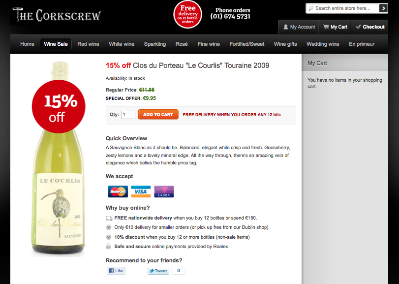
Be sure to mention the discount even on your product page. Corkscrew Wine had discounted one of their wines but initially they didn’t highlight that on the product page.
It’s easy to miss that this wine is discounted.
To emphasize the discount, they added a big 15% off sticker and mentioned the discount in the title too.
Calling attention to the fact that the wine was on sale, even though the price was the same in both cases, gave them a massive 150% increase in conversion rates!
2. Reciprocity
You scratch my back and I’ll scratch yours.
The idea plays on the notion that humans are naturally inclined to pay back a favor, typically manifested on a website in two ways.
Free Offers
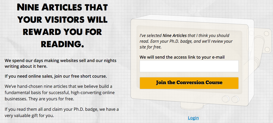
Conversion Sciences offers a free short course in exchange for your email address.
You’ve probably already got pop-ups and email subscription forms offering your visitors a free resource in exchange for their email address. This is content marketing 101 and draws in leads that may later convert to customers.
But those email addresses would be useless if it weren’t for the principle of reciprocity. By getting something for free your visitors are now inclined to pay you back in some way, by either buying your product or telling their friends about you.
The more valuable the free offer, the stronger this effect is. In the example above, Conversion Sciences offers nine free articles on increasing website sales. On its own, it’s a pretty valuable offer.
But they take it a step further and offer a website review on top of that! Getting an expert to point out where you’re going wrong on your site is the kind of immense value that makes visitors want to pay for more.
If you think your one page report is enough to bring in sales, think again. While it may get you email addresses, it’s probably not valuable enough to get you more. Go big with your free offer and watch sales roll in.
Loyalty Programs
Gamification is a new term in the conversion world and a concept that I find really cool. Completing actions like purchases or filling out a form allows you to earn points that can be redeemed later for discounts and other perks.
Credit card companies have been doing this for a while, but other industries are just catching on that it’s a great way to promote loyalty and engagement.
The concept is simple. You reward your customers for actions that they take. The rewards reinforce repeated behavior and entice them to take more actions. The result is a cycle of loyal, repeat customers doing things you want them to do because they know they’ll be rewarded for it.
Starbucks is a great example of this. They boosted revenue by 11% by implementing a reward points program. For every dollar spent using a Starbucks Card, you get rewards. In fact, new card activations and reloads went up by 32% just because of that!
Gamifying your site doesn’t have to be as complicated as the Starbucks system. Even simple action-reward sequences, like getting a 10% discount for tweeting a product, work.
3. Liking
Users are more inclined to buy if they like the person selling or marketing the product.
Have you ever wondered why advertisements always have movie actors or sports stars in them? It’s because they are playing on the popularity and likeability of the celebrity.
It goes beyond just sticking a smiling face on every page of your site. You need to take both your ideal customer and product into consideration.
Testimonials
Testimonials can help your site create the trust you need to win over new visitors. Everything from the written praise on your homepage to the retweets by industry influencers can help you stand out to users who might be on the fence about converting.
In the example above from Buzzsumo, a content marketing tool, we see three testimonials from popular marketers. You probably recognize these faces yourself and you may have come across Noah’s blog or Rand’s whiteboard videos. Those testimonials are perfectly targeted at the software’s customer base, and their likeability plays a huge part in conversions.
In fact, testimonials are so powerful that they can increase conversions even without the name-dropping. WikiJobs, a graduate jobs website in the UK, wanted more people to sign up for their practice tests. Initially, their page had no testimonials.
For the test, all they did was add three testimonials in, without names or faces.
Boom! Those three lines, which could very well have been made up, increased their conversions by a whopping 34%!
4. Authority
Just like with using celebrities, many advertisers also use authority figures like doctors. This is especially common when it comes to health and hygiene products like toothpaste or soap. The doctors are probably just actors, but the fact that they are wearing a white lab coat is enough to influence many people.
Introducing the principle of authority into your site means coming across as an industry expert and therefore increasing the trust a user has for your brand.
For example, Kaya Skin Clinic, a retailer of complex skin products, wanted to increase the consultations made through their site. Their initial page mentioned their expert dermatologists, but the call to action was booking a consultation.
To further emphasize their authority and expertise, they tested asking visitors to sign up for an expert opinion instead.
That small change outperformed the control by 138% and increased sales by 22%! By simply implying authority their visitors were more likely to convert.
I personally think there is a bit of overlap when it comes to authority, liking, and social proof, but here are a few examples of sites taking their authority to the next level:
It doesn’t get much more obvious than this. This legal site did almost the same thing as Kaya and added the word ‘expert’ wherever it fit. For businesses in industries like Law, Medicine, Healthcare and so on, it’s important to establish expertise even if it means adding the word ‘expert’ to your site.
Of course, there are more ways to display authority and expertise on your site. USAA does a great job of using images to convey a sense of professionalism and knowledge regarding investments. Both the stock ticker and app screenshots imply that they know what they are doing when it comes to managing your money, especially if you don’t know the first thing about it.
When it comes to your site, a combination of professional design, authoritative copy and images of experts can go a long way in building trust and increasing conversions.
5. Social Proof
Monkey see, monkey do.
If there was any doubt that we evolved from apes, this principle should clear it.
Social proof is all about leveraging the fact that we are more comfortable performing a certain action, like buying your product, if we see that others have done it before. It’s a great way to reassure nervous users that your company is legitimate and others have purchased your product or service.
Most people know the impact that adding reviews can have on your conversion rate, but there are a few other ways to leverage social proof.
Social Stats
Got a big following on social media? Try including it in your header like Sneakerwatch to increase your credibility. They have almost a million followers if you add all those numbers up. That’s like saying there are a million people who love the company so much they want to stay connected on social media.
Going back to the Kaya case study, they tried to go one step further with their CTA and added their Facebook follower count.
Again, the act of adding social proof helped even more and increased conversion rates by a further 70%.
Beware though, if you have really low social media numbers, this might backfire on you. Taloon.com, an ecommerce store that sells plumbing, electrical and gardening suppliers, used to have social media buttons on every product page. However, their share numbers weren’t very flattering and it actually lead to negative social proof that lowered their conversions by 12%.
Show Off Your Accomplishments
Have you won an award or been recognized somewhere? Sing it from the (figurative) rafters by putting it on your homepage to help reinforce your offers in the eyes of your users.
This example from World Nomads combines social proof, authority and liking by adding logos of well-liked and trustworthy brands that use their insurance. The implied question is, if these brands can trust World Nomads, why shouldn’t you?
6. Commitment and Consistency
When I started playing poker, I’d make a very common mistake. If I had bet money pre-flop, I’d continue to bet even if the flop was terrible. After all, I’d already made a commitment, so I might as well continue staying in the hand. Needless to say, I lost a lot of money!
You see, people like to stay consistent. If they make a commitment, they try to keep it. So instead of going for the big sale right away, try starting with a smaller commitment and then increasing the ask later.
For example, if you’ve ever applied for a loan, financed a car, or mortgaged a home, you know that the process of actually getting approved can be daunting. You are often faced with pages of forms that seem to drag on forever. In order to make this easier to manage, sites like to begin with a small commitment that is followed by small and consistent steps.
Take this booking form for an airport parking service in Edinburgh. Just looking at the page makes me want to run away. There are so many form fields!
Thankfully they realized this and split it into a multi-step form. Sure, it’s the same number of fields eventually, but by breaking it up, it doesn’t look so daunting.
This resulted in a 35% increase in form completions. By making the user enters some personal information, they are ensuring the user is committed to the process of providing more information and completing the application. These initial steps help weed out users who aren’t serious and provide higher quality leads.
When customers hit the ‘Continue’ button, they are taken to the next step. Since they’ve already made a bit of a time commitment, they’re more likely to stay consistent and continue filling the form.
Many software companies use this concept when they offer free trials. By entering an email address, you can get started using the product immediately, and each step in the onboarding sequence builds your commitment.
Ecommerce companies, on the other hand, tap into this concept when they up-sell customers. They start off with an expensive base product, like a phone or computer, and then upsell customers on accessories. Having already paid a big sum for the main product, customers are likely to pay a comparatively insignificant amount to further enhance it.
Finally, info-marketers flip the script and sell customers cheap products first before upselling to higher priced courses. Again, the commitment principle is at work here, taking advantage of people’s tendency to stay consistent.
Harness the Power of Persuasion
With the exception of adding social stats to your home page, all of these tips are going to be more complicated than changing the color or copy of your CTA. Consequently, make sure you take the time to plan out each change while considering your audience and goals.
Be warned, though! It would be easy to misuse one of these tactics and do more harm than good. If you go back to the WikiJob case study, you’ll see that the testimonials were just plain-text quotes with no attribution. Of course, those were real quotes, but it’s not hard to ‘cheat’ a bit and make up your own.
Similarly, it’s easy to fake social proof numbers or mislead customers into thinking that your stock is running out. The problem with this is, apart from being entirely unethical if you get caught it could be disastrous for your business.
Recently, JC Penney had to settle a class-action lawsuit for creating fake sales and discounts. In many cases they would double a product’s price and then put it on ‘sale’ for 50% for a limited time. As we’ve already seen, a discount scarcity tactic like this can increase sales, as it did for JC Penney, but when the truth came out it hurt them financially and eroded customer trust.
So if you’re going to try any of this out, make sure you do it the right way. Don’t create scarcity if there isn’t any, don’t manufacture testimonials, and don’t artificially inflate your social proof. Harness the power of persuasion while maintaining your customers’ trust.
Do Website Redesign Like JJ Abrams
Conversion-Centered DesignA website redesign is like a Hollywood movie reboot. It really is.
There have been two attempts to reboot the cultural phenomenon that is Star Wars. George Lucas gave us three prequels that, while generating some $2.5 billion in box office worldwide, were largely reviled for their lack of magic and stunted acting. Now JJ Abrams is rebooting with a sequel to the series called Star Wars: The Force Awakens.
Redesigning your website should be seen as a reboot of your online properties as well. Watch The JJ Abrams School of Website Redesign, and learn how to avoid creating a Phantom Menace when the Force Awakens for your website.
This is not the first reboot that JJ Abrams has helmed as visionary and director. We’ve got his incredibly successful treatments of the Star Trek franchise to consider as well.
Don’t Just Blow Things Up
The problem we have with the popular Responsive Web Design strategies is that you must change everything in order to create a “mobile-friendly” website. Responsive designs are programmed to make decisions about page content when smaller screens are encountered.
Many of these decisions are wrong, and we’ll cover them in our webinar.
Your responsive design may be creating the equivalent of Jar-Jar Binks, a figure hated perhaps more than Darth Vader himself. In the webinar, we’ll show you how what happens when redesigns go bad.
Bring Back Beloved Characters
Your website redesign isn’t about changing things. It’s about building on what currently works, adding to the experience.
George Lucas managed to work merchandisable characters R2-D2 and C-3PO into the prequels, as well as beloved Obi-Wan Kenobi. But these characters didn’t create the esprit décor that the original ensemble did. In Star Trek, Abrams brought back young versions of the entire ensemble: Kirk, Bones, Scotty, and even two Spocks. Chekov, Sulu and Uhura were thrown in for good measure.
Your website is an ensemble cast of pages and experiences. Your landing pages need to prime buyers to get through the subscription process. Your category pages have to drive visits to product pages that entice visitors to add to cart.
Huge amounts of data is available very cheaply. Use it to know what to keep or suffer the consequences.
Don’t Create Any Jar-Jars
You don’t want to create any Jar-Jar Binks features during your redesign.
I’m sure George Lucas was certain that the Jar-Jar Binks character introduced in the Phantom Menace would be a beloved, merchandisable character. He was wrong. Abrams introduced Keenser, a (thankfully) silent alien who was Scotty’s sidekick in the first Star Trek reboot. However, he didn’t rely on this character for comedic relief nearly as much as Lucas did with Jar-Jar.
The cost to create the all-CGI Jar-Jar was huge, and probably took resources that could have been used elsewhere in the movie.
Unless you’re testing your way into your redesign, you are going to create some Jar-Jars in your redesign. These are features that you believe in, but that are rejected by your visitors. Don’t over-invest in these new experiences without testing them first.
Have A Reason for Radical Changes
Every website has return visitors. Your website, no matter how ugly you believe it to be, has visitors who feel at home there, enjoying a comfortable familiarity. They’ve invested the time to understand your site, to make it theirs. When you change it, they’ll be pissed.
These visitors need some rationale for your removal of familiar features and the addition of new ones. Avoid the pro-innovation bias, which is a tendency to change things because they are cool. Your returning visitors won’t think they are cool.
Even simple parallax animations are dangerous. It’s a technical error waiting for the wrong browser.
Don’t let your design firm add any “alien” features to your site. For example, parallax design causes animates to occur as your visitors scroll through the site. It’s the web equivalent of Jar-Jar.
Parallax design elements are like the blinking text of 1990s era websites. Or the Jar-Jar Binks of the Web.
In the Webinar, we’ll show you how to find out what is and isn’t necessary in your particular redesign.
Add Segments
This ain’t your father’s Star Trek.
JJ Abrams brought whole new segments into the Star Trek and Star Wars franchises. For Star Trek, he cast young heartthrobs Zak Quinto, Chris Pine, and Zoe Saldana in key roles. This brought a younger, hipper audience to the Star Trek universe. Star Wars: The Force Awakens features females in key hero and villain roles.
Your website redesign should be about two things:
1. Keeping your existing visitor segments happy.
2. Engaging new segments that need what you offer.
There is no such thing as an “average visitor” to your site. Design should specifically target key segments. These segments should not just be demographic as much as needs based. Segment by device type, by geography, by whether they are at work or play, or by the kinds of search terms they are using. Target segments at different stages of your funnel.
The death of a redesign is guaranteed if you design for the “average” visitor or design for yourself. See below.
Avoid Executive Influence
After several significant successes, J.J. Abrams has considerable freedom to do what he wants. He ignored all of George Lucas’s ideas for the new Star Wars movie and took it in his own direction.
The executives that you report to will want to have a say in the redesign. Statements like, “I would never respond to that!” are poisonous to the process, unless you site is targeted at them.
Abrams didn’t get such freedom until he had a win under his belt. Your ace in the whole is research and data. If your redesign is questioned, you better have the studies, heatmaps, split test, and analytics you need to make your case.
If you don’t have this information, you’re not likely to have a success anyway. You may want your executives to attend our webinar.
Lens Flair Comes Last
Only after you’ve considered all of these key issues can you put your own unique stamp on the site design. Abrams has a thing for lens flair in his movies.
But none of this means anything unless you have beloved features in your new site, avoid adding Jar-Jar Binks experiences and address your visitors segment by segment.
Attend our free Webinar The JJ Abrams School of Website Redesign and make sure your next redesign isn’t a Star Wars prequel.
How Conversion Optimization is a Brand-Building Investment
Conversion Marketing StrategyIt can often seem that conversion optimization conflicts with brand and image marketing. In some cases, this is true. A recent infographic from the New Jersey Institute of Technology’s Online Master in Business Administration program (NJIT) got us to thinking about the importance of branding to any conversion optimization effort.
How a Conversion Scientist Thinks of Brand-Building
For the purposes of conversion optimization, brand is critically important. If we’re talking about a landing page, a website, an email or an ad, brand can communicate some important information in the blink of an eye.
For us, brand is a container for trust, credibility and authority. Brand marketers will tell you to put the company logo and tag line on every communication. A Conversion Scientist uses brand symbols primarily to communicate authority and credibility.A brand symbol is a hook on which brand experiences are hung. Conversion Sciences has benefited from its brand symbol — the lab coat — and we work diligently to hang positive brand experiences on this symbol when we write, teach, and speak. We give lab coats to our clients so they can associate our business-changing results with this important brand symbol.
Companies who have invested in brand recognition over decades and have protected their brand symbols have a significant advantage over less-known brands. These brand symbols communicate a complex set of impressions quickly.
From a budgeting standpoint, building brand is very expensive. It requires paying for millions of impressions with little expectation of short-term increases of revenue. It also takes time.
We believe that conversion optimization is a brand-building activity. Conversion-based brand building works on the assumption that there is no better brand experience than finding what you are looking for. As you improve the conversion rate and revenue per visit of your website, you are, by definition, giving your visitors better experiences. These experiences are associated with your brand symbols and build brand quickly and powerfully.
Brand Building in Digital Environments
Because conversion optimization relies on data, and since digital environments are data-rich, these digital environments are ideal for conversion-based brand building. Your investment in optimizing online properties is an investment in brand.
The infographic acknowledges that there are three moments in the buying process when companies come into contact with new and existing clients.
There are potential touchpoints with new and existing clients before, during, and after a purchase.
Each of these can be optimized to increase conversions and sales.
Be Careful with Consistency
The infographic tells us that “Consumers Expect Consistency” across channels and devices. This is a lie.
90% of customers expect their experience with a brand to be the same across every marketing channel
Consumers expect consistent quality of experiences and consistent use of brand symbols. However, our testing shows that they want very different experiences when they are in different contexts. Desktop visitors want a more intense experience with more choice and deeper information. Smartphone visitors want immediate access to solutions.
Quality experiences across devices become a consistent builder of brand value.
Optimizing Touchpoints
There are different kinds of people coming to each of your touchpoints. They are often the same person coming in different modes.
Search Engine Watch tells us that certain types of searches are more common on Bing than on Google – finance and automotive for instance. You probably already know that mobile iOS users behave differently than Android ones, but have you made the connection about how their searches differ?
Ninety-seven percent of Millennials touch at least two devices every 24 hours, and many of them interact with even more devices.
Millenials are multi-device creatures.
That’s a lot of opportunity for touchpoints just from search.
Social media platforms prime visitors in different ways meaning online experiences must be tailored to each. For example, Instagram is poised to be a better organic marketing option than Facebook for many companies.
Customers expect to find you on all of the major social media platforms, but how much effort should you use in maintaining your presence? Our answer is to be only on those platforms for which you have the resources to optimize the experience. The default social experience may negatively impact your brand.
Each platform has a distinct purpose that should dictate how much time and money you must invest in it. Your most important task when you invest in new digital marketing is to go back to the original concept of branding, no matter how complicated contemporary marketing may seem. Your new and existing customers will know what to expect from you based on past experience, and today’s experience is tomorrow’s past experience.
Thanks to NJIT’s MBA program for sharing.
Feature image by Hanna_Elise via Compfight cc and adapted for this post.
Low Sales on Mobile, Conversion Tools, Flat Design [For Further Study]
Ecommerce CROWhat has the Conversion Scientist been reading lately?
AdExchanger: Why Do Mobile Users Not Buy On Mobile?
We believe that mobile traffic is every bit as important as desktop traffic. Many businesses walk away from their mobile traffic because it doesn’t convert well. This is a mistake.
Two points found in this article drive the point home:
Spend some time on your mobile site. Don’t just create a responsive version of your desktop website.
Read more.
Marketizator: 25+ Tools That Conversion Rate Optimization Pros Can’t Ignore
I often say we’re living in a golden age of marketing, in which we can find data to answer almost any question we have. And these tools aren’t expensive. Every marketer can benefit from these tools with a little curiosity and patience.
Nielsen Norman Group: Long-Term Exposure to Flat Design: How the Trend Slowly Decreases User Efficiency
I reviewed 47 wordpress templates for a competition earlier this year. 98% of them used a “flat” design approach. Of course, we’re seeing this style of design pervade websites.
Is this a good thing? Nielsen Norman Group says we can use flat designs if we follow some smart guidelines.
Read more.
Got suggestions for what we should be reading? Share them with us!
Is Instagram More Powerful Than Facebook for eCommerce? [Infographic]
Ecommerce CROYou can find the most inane demographic information about Facebook users, the amount of time they waste on the site, how many of them are grandmothers, where to find a browser extension that will make all of those pictures of your friends’ kids turn into pictures of cats, and lots of other quasi-useful information that make for great click-bait.
Millions of people visit Facebook every single day without fail, and many of them are money-spending Millennials. Conventional wisdom says that, if you run a business, you probably should be on Facebook because that’s where the customers are.
Facebook has become an object beyond criticism. Or has it?
There’s also a lot of other data out there about how Facebook isn’t doing all that much for businesses. If you consider all of the time needed to build a following and curating content, it becomes too expensive to reach your Facebook members. There are alternatives, apparently.
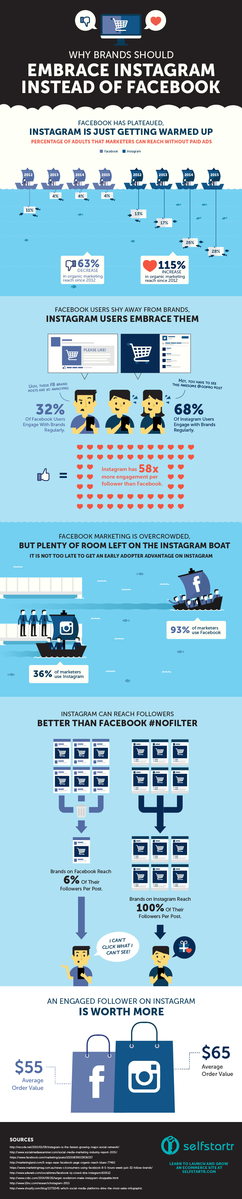
An infographic from selfstartr makes the argument that Instagram is where you should be placing your bets on organic marketing instead of expending all your effort with Facebook. When a business posts on social media and doesn’t pay for it, that’s what we mean by organic marketing.
Facebook Organic Marketing is Dead or Dying
According to an article on Clickz, even people who defend marketing on Facebook aren’t saying organic marketing on social media helps increase conversion rates because “Most organic social media posts aren’t directly selling, because selling is rarely interesting enough to drive engagements.” This article lumps all social media sites together, including both Facebook and Instagram, but treating them the same way ignores a lot of data.
People actually really like interacting with brands on Instagram.
Instagrammers engage at a much higher rate than Facebookers. Not only that, there’s a very strong chance that your followers aren’t even seeing what you post on Facebook since only 6% of your followers see each one.
Facebook’s algorithm for the newsfeed means that no matter how far someone scrolls, they may never see what you posted.
Companies using Instagram have the potential to reach 100% of their followers. If your customers scroll far enough down on their feed, they’ll see what you shared. Keep in mind that when we say that engagement with brands is lower on Facebook, it’s not necessarily because people don’t see posts from brands. Millions of companies are creating content on both social media sites, but a much smaller group of people bother interacting with brands on Facebook.
Interactions on Instagram are more passive than on Facebook. Instagram has more barriers to content going viral, and you can’t see whether seven of your friends have double-tapped the same image (on Facebook, your newsfeed tells you what your friends Like). In other words, interacting with brands on Instagram isn’t as visibly social as it is on Facebook. Turns out, this model isn’t bad for business.
Engaged users are worth more on Instagram.
To sum up: Instagram users engage at higher rates and spend more money than their Facebook counterparts. How much time are you putting into creating content for your Facebook followers when only a handful of them see it and even fewer care?
There’s Still Time to Be An Early Adopter
How many of your competitors are on Instagram? The market on Facebook is pretty saturated, so your eCommerce company is probably one of many. That might not be the case on Instagram.
What’s keeping you from using Instagram?
Don’t dismiss Instagram because whatever you’re selling doesn’t photograph well. Kissmetrics makes a pretty persuasive argument that it doesn’t matter: you can find a creative way to get around that problem. It also addresses some other misunderstandings that might be keeping you from creating a business account.
Is Instagram the Way to Millennials’ Hearts?
Facebook began with exclusivity. Only students at certain colleges could join, and no one else was welcome. No parents, certainly no grandparents, and absolutely no businesses. People caught marketing their business ventures weren’t welcome and would be immediately reported.
If that’s Facebook’s origin story, maybe it’s not surprising that people react with derision when it feels like their newsfeed is bloated with paid and unpaid ads. It’s inauthentic when someone tries to sell you something in a setting that’s supposed to be just your friends. Facebook’s original model didn’t have a place for that kind of interaction.
Instagram, however, was born into a world where businesses were already an integral part of social media. By the time Instagram launched in 2010, Facebook was already trying to be an everything-to-everyone social media site. Instagram’s focus was more narrow. Just photos.
Facebook is so broad that you can post your Instagram photos to Facebook. People use Facebook as a catch-all, so when they need something more focused, they go elsewhere.
People tend to use Instagram to follow interests instead of friends. They can see what their friends are doing on Facebook. Remember that you can potentially reach 100% of your followers on Instagram since it’s just chronological instead of using an algorithm. That doesn’t work well when you’re trying to keep up with other people’s lives, especially if they don’t post often.
Keeping up with an interest is easier because someone can follow lots of similar users. That’s a real advantage for businesses because data exists on the best times to post. It’s more acceptable to re-post similar images because followers may not see both and get annoyed.
Instagram is fertile ground for attracting Millennial consumers. This generation loves transparency, engaging with people and organizations with similar interests, and creative marketing. This group is huge. More than half of US adults age 18-29 are already on Instagram.
My takeaway from this study is that people think Facebook is kind of a drag. It’s necessary, but not all that fun. Two thirds of users engage with brands on Instagram compared to less than a third of the users on Facebook. Stats like that make me think about the quality of engagement on Facebook versus Instagram.
There are countless articles about customer service and customer complaints on social media, but it’s tough to find any information about using Instagram as a platform for complaints. Maybe Instagram will bring you higher-valued conversions and make social media enjoyable again.
Thanks to selfstartr for sharing.
Developing a Maximum Viable Non-Product (MVNP)
Conversion Marketing StrategyThe inventors of Lean Product Development graced us with the concept of the MVP — the Minimum Viable Product. The idea is that you identify the absolute minimum feature set necessary to test the validity of a product, and then you launch it.
When it comes to validating ideas, conversion optimization tools make you leaner than Lean. You’re ultra lean. You’re 45-days-in-a-lifeboat lean. You’re hide-behind-a-flagpole lean.
Instead of building an MVP, we prefer to build an MVNP: the Maximum Viable Non-Product.
The idea is that you identify the absolute maximum feature set without actually building anything, then you launch it.
While we’re not in the business of validating markets per se, we do spend a great deal of time building facades, fronts, simulations and prototypes to see what will make a website more productive before we invest.
This is why the entrepreneur creation company Tech Ranch asked me to present to their Venture Forth entreprenuers on the topic of market validation.
I summarized my presentation in a column for Marketing Land entitled Using Conversion Optimization Tools to See if That Product Will Fly. Listen here.
Subscribe to Podcast
The testable market is defined by your ability to reach your addressible market.I think it’s more important to figure out if you can market an idea to an audience cost-effectively than to find out if people will use it.
In my column, I talk about:
Listen now and go to the article to see the visual aids.
Feature image by Hans Gotun via Compfight cc