As internet marketers, our goal is to convert as many customers as possible with the lowest spend on advertising. Converting Customers in the fashion niche is one thing but understanding how to properly convert your customers varies from niche to niche. Knowing how to analyze data and find the best solutions is something that applies to every market and it is a skill on its own to be able to find the ways of increasing your overall conversions.
Look at it like this: If you were able to change your conversion rate from 1% to 2%, you could halve your advertising budget or double your results. Increasing your rate of conversion by the smallest of amounts can make a huge impact on your online business.
The ideas in this article are strategies that we use on a day-to-day basis at Top Tier Style to analyze how our customers interact on our website. The goal should always be about trying to figure out how to build the best customer experience, the sales will roll in from there…
Visitor Heatmaps
Heatmaps are a great way of easily understanding on a behavioral level how your customers interact with your page. Heatmaps will generally track where your customers click on on a page-by-page basis, and it will show you the average distance that a customer will scroll to when visiting your pages.
This data can be useful because you can pick up and see areas in which you can improve your website. Maybe 60% of your customers are clicking on an image that doesn’t actually link to anything, you could update this and take them to a relevant place.
Or maybe only 20% of your customers are scrolling down a certain amount of your blog post page. From this, you can gather that the content, or part of the content, is low quality and needs to be updated in order to engage your customers at a higher level.
This one is kinda creepy, but absolutely gold if you are willing to spend a good deal of time looking into how your customers are interacting with your website. Recordings on most services can be tracked for all visitors or visitors that are visiting certain pages. It may be less time consuming and more valuable to spend time recording visitors on pages that are getting a low conversion rate with a high amount of traffic.
So, visitor recordings work much as it says in the name, you’ll get access to a screen recording of exactly what your customer does when they are visiting and browsing your website. You’ll get to see where they scroll, where their mouse moves, where they click and even what pages they visit.
This data is amazing because you get to put yourself, as a marketer, in your customer’s shoes and understand what it is that the customer is thinking while they are browsing your site. From this, you can understand a wide range of improvements and you can see exactly what influenced your customer to complete a certain action, or what caused them to drop off and leave your website.
A Data-Driven Approach
Once you have spent time analyzing all of this data and building a website that converts at a much higher level, you can look into implementing tracking with a service like Google Tag manager to analyze the percentage that a user completes a certain action on average within a certain time frame.
For example, you may be running a commerce store and you may want to track the percentage of people that add that product to their cart and what percentage add it to their Wishlist.
If you notice on a particular product that people are adding it to their Wishlist a lot instead of checking out straight away, then you could look into ideas such as running a promotion on that product or allowing a discount if they add it to their cart and check out today.
Summing Up – KNOW YOUR FUNNELS!
Every business has a funnel. Even if you are a local digital marketing agency, you have a funnel. Some funnels are more complex than others, here’s an example of a funnel for an average Plumbing website as compared to lets say an E-Commerce store.
A 2 Stage Funnel for a Local Plumber
Visitor Lands on Landing Page -> Visitor Gets in Touch
A 4 Stage Funnel for an E-Commerce Brand
Visitor lands on Product Page or Category Page -> Visitor Adds Product to Cart -> Visitor gets to Checkout Page -> Visitor Completes their Purchase
Either way, knowing your funnel is important because you can look at the areas in which customers begin to fall off. In the example of the plumber, it’s very simple because the plumber only has their landing page to optimize properly before they get their result, which is for someone to get in touch.
However, in the example of an E-Commerce brand – a visitor needs to follow a number of steps before completing the goal which is to purchase a product. If you are properly tracking the drop-off of your funnels, you may notice that 90% of people fall off at your cart page. By knowing this data, you can narrow in and know exactly what areas to look at the heatmaps or visitor recordings for so that you can begin to repair that section of the funnel and increase the overall conversion rate of your online business.
About the Author
Gary Wilson works as part of the marketing team for Top Tier Style, a fashion brand specializing in clothing and accessories. He works closely to market the website to new customers and analyzes customer data to increase conversions and customer experience through the website.
Don’t kid yourself into thinking that your viewers believe your testimonials are real and genuine. Any website that hosts its own testimonials has the opportunity to molest and curate its own testimonials and every viewer knows it. There are three rules to make testimonials more persuasive that you can start using today.
If everybody knows you can alter and curate your testimonials, is there any point in having them in the first place? Probably not, but if you are dead set on having testimonials on your website, then you need to make testimonials more persuasive.
Before you hire a bunch of writers to create a set of positive testimonials for your website, take a look at these three unusual tactics for making testimonials more persuasive.
Use A Long-Form Testimonial That Goes Into Intimate Detail
Long testimonials make testimonials persuasive
The very idea that a long testimonial is more persuasive than a shorter one seems silly because most people would assume that a longer testimonial is more likely to have been written by the company’s marketing department rather than a genuine customer. However, there is a form of cognitive dissonance that occurs when people read larger testimonials.
Despite the fact that the user probably believes the longer testimonial was written by a member of the website’s own staff, the fact is that the user is still more likely to read the longer review than any of the shorter reviews. This is especially true if the testimonial has headings, and things such as lists, alternative purchases, and pros & cons sections.
Look at Amazon book reviews. The longest reviews are almost always the ones with the most “This was helpful” votes. Even if the review looks like it was written by the author’s friends, it is still more readable and attractive than the hundreds of smaller reviews/testimonials on Amazon.
It is better to have a semi-convincing review that is long and read by the user, rather than a series of smaller very-convincing reviews that are not read by the user.
Name All The Bad Stuff And Convert Them Into Selling Points
Convert bad stuff into selling points make testimonials persuasive
When most people shop online, they do not read the hundreds of positive reviews. They search out the negative reviews. People do this because most people are aware that reviews and testimonials can be bought.
We have all seen the list of positive reviews on Amazon that were written by a marketing department, and then the several recent ones that are negative because they are real. You can use the fact that people search out negative reviews by using negative reviews/testimonials to sell your product or service.
There are two ways you can do this, you may do it by giving negative points and making them illogical, or you may answer negative reviews with selling points. Let’s start with a few examples of negative testimonials that you have added to your website that are actually illogical.
This book on “Sixteen Ways To Cook Beef” was full of tasty ideas, but I was very disappointed that they didn’t offer vegetarian alternatives.
The plumber turned up on time and had the problem fixed in ten minutes, which means there was very little wrong. I should have taken a look at it myself before calling.
Do not use this taxi service. Why is this taxi firm charging per mile? They should charge for the time it takes to get places. I am paying for a taxi’s time and not for how far it takes me.
Alternatively, you can allow negative reviews and then offer replies that create selling points. If done correctly, this can be a very powerful way to sell your product.
Do not make the mistake of asking the reviewer to contact your company via the replies because that is what all of the worst companies say.
Here are a few examples of negative testimonials and their replies that turn negatives into positives.
Testimonial – I received the second-hand DVD and it is scratched. It only works on my PC and not on my DVD player.
Reply – Thank you for letting us know, we will issue a refund right away. Also, we have invested in DVD cleaning machines. Every second-hand DVD we sell will now be cleared of scratches prior to being sent out.
Testimonial – Your writing service doesn’t cover formatting and setting styles. I hate having to set out my essays and I always get it wrong. You should at least offer a paid service so that people like me don’t have to suffer.
Reply – Quite right! We have instituted a new policy. All student customers will now have their essays set out and formatted free of charge whenever an essay is bought or an essay is proofread. Please return your essay and we will format it for free within 24 hours.
Allow Anybody To Leave A Testimonial And A Reply And Have It Post Immediately
A big part of making a testimonial believable is less about what is written and more about how the testimonial came to life. If you can prove to people that what regular people are writing is what is coming up on your testimonial page, then you may be able to convince people that your testimonials are real.
That is why it is important for you to make the testimonial process very easy. Any visitor should be able to leave a testimonial without having to sign in and without having to buy something. It should be clearly obvious to the user that he or she may start writing a testimonial right away, and that the user doesn’t need to have an account.
What is just as important is what happens after the user clicks to submit the review. If the system says that the testimonial is awaiting moderation, then the user will give up on the website and probably continue to believe that the testimonials on the website are curated. However, if the testimonial appears right away on the web page, then the user will have a hard time denying that genuine testimonials must exist on your website.
Many webmasters will not allow people to post directly to their web pages for a number of reasons. The most common reason is that it allows spammers to add content right away, but you can use spam catching software to stop that.
The second most common reason is that it allows users to add troll messages or negative messages into an area where potential customers may see them, but this doesn’t matter.
If your product or your service is a good one, then the troll messages or the negative messages will be dwarfed by the many positive messages. Plus, every Monday there is nothing stopping you from going through your testimonials and deleting a few of the most damning ones. After all, it is not as if your users are going to return every week to see if their testimonial is still there.
People are willing to pay more websites they trust. Establish credibility online to boost your online conversion rate.
When selling anything online people almost always prefer to buy from people and companies that they trust. In fact, many times people are willing to pay more to buy from websites they trust. It’s one of those key components that can boost your online conversion rate in multiples if done right so you need to instantly establish credibility online.
I’ve been working in the field of conversion optimization for 9 years. About 6 years ago, I made the decision to focus my agency primarily on optimizing websites that were specifically in the health field/vertical, mostly dietary supplements.
We niched down to optimizing for the health industry because we started seeing patterns among multiple dietary supplement clients. Those patterns lead us down a path of researching how people buy health supplements differently than they buy any other type of product.
The health field, especially natural health supplements, can be a pretty tough field to sell products directly online. There are a lot of FDA compliant and legal issues to watch out for if you don’t want to be shut down. Although there are certainly more than the fair share of claims out there on the internet that cross the line. That combined with so much misinformation and it’s no wonder that so many people tend to feel a little bit leery about trusting holistic health and supplement products.
The sad thing is, a lot of these products are actually really, really good for you and really beneficial. They’re often derived from natural products that have incredible benefits with minimal side effects.
But how do you get that across? Especially when you can’t afford to do a double-blind scientific test?.
I’ve developed some strong strategies for developing trust and establish credibility online between my clients and their website visitors.
Here are a few ways that you might be able to accomplish the same goals in your specific industry…
To Establish Credibility Online: Be Completely Transparent With Your Audience
One way I do that is by making sure that the website is as transparent as possible. Putting it all out there may show some vulnerability, but it also conveys honesty.
Reveal the ingredients that are in your products by showing the full supplement facts label. Don’t hide behind a “proprietary blend”.
Transparency is key
Also, let them know where those ingredients are sourced from.
What’s the potency, purity, and integrity of the ingredients?
Where are your ingredients sourced from? Where is your dietary supplement manufactured and bottled? Was it made in a GMP facility?
What is your return policy? And provided them with a top-notch FAQ section.
Make Reasonable Claims and Back Them Up With Proof
Some holistic herbs and supplements claim that they can solve every problem under the sun in one little pill – from helping you to lose weight to providing a cure for cancer. (Even though the word “cure” is not allowed by the FDA.)
We all know it’s probably not likely that one pill can solve all these problems. Even if it’s true, trust breakdown with multiple claims or condition solutions. It’s better to focus on the power of one. One story, one problem, one solution. So don’t make broad outrageous claims. And when you do make claims, be sure that you are backing them up with proof.
If you really concentrate your focus on the things your product can do and go into great detail with facts that support that – then it’s more likely that you’ll be believed.
I’m sure you’ve probably heard a million weight loss remedies that will help you lose weight quickly. But when you’re bombarded with so many messages, how do you even begin to know which ones might actually work?
There’s not enough time in the day to try them all out. And who wants to spend the money on each one?
But if you do your research and look closely, some of the suggestions are backed up by actual science.
For example, did you know that grapefruit stimulates the production of a hormone called adiponectin, which is involved in the breakdown of body fat?
Ok, now that’s something to go on, right? Actual science. I’m in.
This is the same kind of confirmation that your visitors need and want. They don’t want to have blind faith and just believe what you say or try a million products to see which really works. Most people don’t have that kind of money or time to spend.
So give them proof. Establish credibility online. It may already be there and you just don’t know it.
Another Example that Fails to Establish Credibility Online
The cookie claimed to be healthy – but the nutrition label that they displayed on their website really wasn’t all that impressive.
It listed some protein and some calcium – but other than that it was hard to justify spending the money.
They went on to list the healthy ingredients – flaxseed and chia seeds which are rich in antioxidants and omega 3’s. And coconut oil that boosts the immune system and helps you lose weight.
But they didn’t bridge the gap so that it made sense. They didn’t tell their visitors why these ingredients were so healthy. In fact, they’re so healthy that they’re often referenced as “superfoods”.
If prospects weren’t aware of these benefits, listing the ingredients meant absolutely nothing. So don’t assume. Don’t assume that they know why something is good for them. Just because you know, doesn’t mean that they do.
To Instantly Establish Credibility Online, Be Vulnerable
This is why you need to make sure that you tell them everything.
And if there’s something that your product or service can’t do. Don’t be afraid or too proud to admit it. By being honest about what you can offer, it really comes off more as trustworthy than incompetent actually. By honestly admitting that you can’t do a particular thing – your visitors will now believe you when you say that you can do other things really well.
Don’t Unintentionally Plant Seeds Of Doubt
This is something that I see often.
Websites try to establish trust by making statements such as “No gimmicks” or “Those other products are scams. We can be trusted.”
While you may actually be very trustworthy, you’ve just reminded your visitors that some of these products are a complete hoax. Possibly even a sugar placebo.
So now that you’ve mentioned “gimmick”… now they’re not so sure about you .
Here’s what happens. Your visitors are going about their business gathering information so they can make an informed decision about your product or service.
When they see words like “gimmick” or “scam” red flags may start to go up. Those thoughts might not have been in their minds in the first place. But since you’ve now put them out their boldly in print… now they are.
Planting these types of thoughts in your visitor’s heads could be very risky. Your very attempt to gain trust in this way may backfire big time.
So those are some of the areas in the health vertical where trust needs to be established in a very specific way. Hopefully, these techniques might help you in your vertical as well.
But be sure that you are also implementing these other critical trust indicators as well.
Social Proof Establishes Credibility Online
Consumers are still looking for the social proof of a third party to help convince them that your products and services are the right choices.
Add testimonials and reviews.
Another way to add social proof is by adding social media count boxes. The boxes that display the number of people that have liked you. Those can’t be faked.
LinkedIn testimonials also can’t be faked. Members are the ones who write the actual recommendation and they are then displayed on your profile.
And if you can get an expert endorsement. You’re golden.
In fact, tout yourself as an expert too. Make the effort to write blog articles that will highlight you as someone who knows what they’re talking about.
If your product or service has an average success rate – boldly highlight that. It’s amazing how often I see businesses forget to include this information.
I once worked with an insurance agency that required prospects to apply for approval to receive a special discount. People are often worried when they’re credit is going to be checked. It adds an additional layer of anxiety that they just don’t want to deal with. So they don’t.
But this agency had a 97% approval rate. But they failed to mention that.
Adding such information makes the reader feel a little bit more secure that they just might be approved. So they take the risk.
Share Details About Yourself
Make sure you are providing an About Us page where you can highlight your team and their credentials.
There are always going to be a percentage of your audience that wants to know more about the people behind your business before they move forward with a transaction.
When I’m analyzing heat maps, it always amazes me just how many people are clicking on About Us links to find out more.
And don’t forget to include real-world data such as a physical address and contact information when you can. Hiding this information can not only be frustrating, but it can also make your visitors question whether or not you are a legitimate business.
How to Instantly Establish Credibility Online: Security
I’m sure you know by now how important it is to create a secure environment if you’re selling online.
To ensure that your website is secure – your website address will start with “https” rather than just “http”. The “s” at the end means “secure”.
Nowadays, it’s also highlighted in the address bar with green text and the actual word “Secure”. So make sure your website’s address looks like this in the address bar.
Security starts at the address bar
Because sometimes you’d be surprised to see what’s displayed here. I was surprised to see this in the address bar for cnn.com.
Unsecured websites hurt credibility
Perhaps they are not selling anything online. But it’s always a good measure to make this read as secured.
Also, make sure that you are are displaying trust seals that verify that you are a legitimate business and also verify that your site is secure.
Visual indicators such as padlocks also help to create a sense of security. Both of these can be really important at the point of checkout where visitors feel most vulnerable.
We Only Buy A Second Time From Those We Trust
Now you see why gaining trust and establishing credibility is an all-encompassing task. A task that’s going to pay off in the end.
So make sure you’re providing all the information you can to help your visitors make an informed decision. Don’t make outrageous claims. And when you do make claims, try to back them up with proof.
Don’t scare visitors away by unintentionally planting seeds of doubt. And don’t forget to include standard trust indicators such as real-world data and security seals and security indicators.
21 Quick and Easy CRO Copywriting Hacks
Keep these proven copywriting hacks in mind to make your copy convert.
Here are 3 conversion optimization examples of how to kill the “slider”.
This is not a post about how carousels kill conversions. They can, but it’s not about that.
This post is about doing what’s best for the people who want to buy from you on your site.
Every CRO and savvy eCommerce manager I have ever met hates carousels. In fact, we’ve never actually blogged about it because EVERYONE ELSE already did. Bringing up carousel flaws would be akin to bringing up the Hindenburg’s.
What we at Inflow will do, however, is document the death of the carousel. But before we do, let’s talk about its birth.
Blame Yahoo! if you want
It seems like the carousel has been around forever, at least in Internet terms. Broad adoption started in the summer of 2009 after Yahoo introduced it on its homepage.
If your site still has a rotating carousel, perhaps you still have a Nokia phone? You can check your email on it, you know!
From that point on, every website felt free to:
Whisk away copy while it was still being read
Randomly change calls to actions
Remove control from the user actions
Create “banner-blindness”
Periodically attract attention no matter how irrelevant to the viewer.
Slow page load time with multiple big images
So, for some, it might not be a surprise that there is a better way to structure an eCommerce homepage.
The death of the (unnecessary) carousel
In our 2018 Best in Class Comparative Matrix for eCommerce, we saw only 6 out of 10 sites still used the homepage hero carousel. That number is less than half of what it was 2 years earlier.
The reason why is simple: it was never the best option for most of the sites that did it, and that statement is still pretty much true.
Optimization Away from Carousels
So, how does a site transform its homepage from having a carousel? Here are three conversion optimization examples for removing carousels.
Zappos.com
Before
A year ago, Zappos was sporting a left category nav, hero carousel and a couple of static promo areas to the right. That made it jam-packed with options.
After
Zappos simplified things by ditching the carousel, the left nav on the homepage and instead focusing the homepage on the things customers want most. They are still testing this bad boy with over 5 major variants identified, so check back in February to see the winning combination. ;)
So apparently, Zappos.com never needed a slider. Note that they kept the slides, but moved 2 of them to the bottom of the site in favor of stuff users most want (a lot of which was not even on the homepage of this eCommerce behemoth just a year ago).
There’s a big lesson here for those willing to learn it and kill their carousel.
UnderArmour.com
Before
Under Armour had a carousel last year, alternating between two and three slides.
After
Over the past year, they have MADE ONLY ONE CHANGE on their homepage. That was to ditch the carousel.
Williams Sonoma
Before
Williams Sonoma made some minor navigation changes over the past year and added lazy-load to the homepage, which widened it a bit.
After
For the most part, the only significant change to the homepage was REMOVING THE CAROUSEL.
Take-Away
If you were to take the lead from these 3 best in class sites, you would blindly get rid of your eCommerce site’s carousel. But wait!!!
You can see below that there are still 6 out of 20 Best-in-Class eCommerce sites that are standing by their carousel. You bet they have tested their homepage over the past year.
So Why?
The answer is that the carousel, as they have it, is right for them and their audience. For now, at least, until something tests better.
About the author: Keith Hagan is an award-winning conversion optimization expert and Director of Conversion Services at Inflow. Keith’s insights have been featured in well-known publications, such as Moz, HuffPo, Forbes and more.
Lead generation is the lifeblood of online business and most lead generation is done via email collection.
If you grow a list of prospects who’re interested in your promotions, your business grows too. However, before you make money from your list you’ve got to get people on it. Whether you want people to download your lead magnet, sign up for your latest webinar or volunteer to test your product, you first need to persuade them to part with their highly guarded personal details – that’s no small feat.
No wonder the average opt-in rate across industries is hovering around a mere 2%. After investing a fortune in Facebook advertising, PPC ads, outsourced content, content management software, site design, and more, you only net two leads per 100 visitors. Two leads… NOT customers mind you.
Surely, your business deserves better.
Today, we’re going to cover the eight elements of a high converting opt-in page so you can boost your opt-in conversion rates and get a better return on your content marketing investment.
Ready to dive in?
Element #1: A short pre-headline to draw them in
When your prospect arrives on your opt-in page she wants to know if she’s in the right place. If she feels lost, she’ll click away. Use the apex of your page to make her stick around.
And, depending on who you ask, you have five seconds or less to do that. But how do you do it? Here’s three ways to instantly attract your reader when she lands on your page so she stays on.
#1. Name the target audience
For example, Attention dog owners, Attention Content Marketers etc.
When you name your audience you get a nod from the prospect, “Yep that’s me.” Handled correctly, this small first yes will ultimately lead to the big yes of a signup later on.
#2. Name the type of lead magnet
For example, Free Special Report, Free Training Webinar etc.
The specificity of your offer increases desire and the likelihood of the prospect staying on so as to get it.
#3. Name the referral site
Naming the referral site on your page makes your prospect feel like a diva and warm up to you and your offer.
Amy Harrison rolls out a red carpet for her Copyblogger readers. She makes them feel the love by welcoming them: specifically, heartily, personally.
#1. To help your prospects understand your offer…fast.
#2. To alienate those who are not a good fit for your offer.
#3. To attract those who are perfectly suited to your offer.
#4. To build rapport with your audience in an instant.
A great pre-head will keep readers on your signup page.
Element #2: A benefit-rich headline to make them want to read more
Once your prospect hangs around, use your headline to show her how your offer will benefit her and improve her life. Promptly address her concerns so she lingers on the page or you’ll lose her by the door. Quickly address her pain, paint the desired future for her, or pique her curiosity so she can’t help herself but read on.
In short, tell your prospect what’s in it for her.
Jacob McMillen’s headline is ultra-specific and has a solution that’s tailor-made for cash-strapped businesses – that’s a big benefit that’ll keep his target audience glued to the page.
Source
Not only that. Your headline must also tie in nicely to the traffic source. That way the prospect’s conversion journey becomes smoother thus generating better results for your business. Jacob McMillen does this superbly as the source page to the above landing page shows:
Notice how his CTA, the last words in his bio, are the first words on the landing page? This way the byline is perfectly coupled to the landing page thus increasing conversions. When a reader clicks his bio and lands on the landing page she smoothly continues her conversion journey – because of harmony between the two pages, conversions are likely to be higher.
On the flip side, a copy mismatch between the source page and the signup page tanks conversions.
Element #3: A few lines of crisp copy to pull them further down the page
You’ve done well if your prospect is still on your page thus far.
Your next few lines should give specific points about your offer. Show her how your offer will scratch her itch or push her towards her dream. Do that and she’s more likely to give you her details.
Use bullet points or short paragraphs. Your bullets should be:
Clear- use simple direct language so the prospect easily grasps your offer.
Crisp- keep your points brief and to the point to keep the prospect engaged.
Catchy- use attention-getting words to give details about your offer.
Smartblogger nails their bullet copy on this sign-up page for an upcoming webinar.
The three bullets tell you exactly what you’ll get on the webinar in a simple engaging way without laboring the point. If you’re going for the minimalist approach even a single line will do. The amount of copy on the body of your opt-in page depends on three key factors.
#1. How aware is your prospect about you and your offer? The more aware she is about you and what you do the less copy you need and vice versa.
#2. What works best for your niche? Study the most successful signup pages in your niche and do likewise.
#3. How complex is the problem you’re trying to solve for the prospect? The more complex the problem, the more copy required to convince prospects to sign up.
Element #4: A pro-looking image to help them visualize what they’ll get
Our brains process images up to 60,000 times faster than text.
To woo your prospect so she says yes to your proposal (offer), show her what she’ll get. Use a picture of the product or of people expressing the feeling you’re targeting. Pictures of animals work well too if your context allows it.
John Nemo’s book shot dominates his opt-in page on purpose. You can almost smell the LinkedIn cash splashed on the cover.
A word of warning about pics: don’t just include a picture because you like it…that won’t help your cause. Only include a picture if it’s relevant to your offer.
Element #5: A signup field(s) to capture their personal details
You’re almost there now… your prospects cursor is hovering over the signup field. Now comes the big question…how much info do you want from her?
Numerous tests show that, in most cases, the fewer the signup fields, the higher the conversion rates. That’s why most sites simply ask for an email address and/or name only as shown in the Marketing Sherpa lead generation graphic below.
Of course, you can ask for more than that if you want a more targeted list. Although your conversions may dip, the quality of your list will improve. Ask for what you need and no more. This makes filling the fields more desirable. You can always ask for more details later.
But, as with everything digital, conduct split tests to see what works for you and your audience instead of blindingly jumping on the bandwagon. In many cases, tests have shown that increasing the number of fields actually raised conversions.
Element #6: A bit of social proof to earn their trust
It’s natural. No one wants to go first. People do what they see other people do. That’s why social proof is a vital ingredient to the success of your page. Here are some three quick-and-easy ways of incorporating social proof into your signup page:
#1. Display your list numbers if they’re substantial
To nudge people over the sign-up line, you can use big numbers associated with your following. However, be careful as numbers can be a double-edged sword. If your numbers are small, social proof will still work, but against you! No-one wants to be a part of something small and insignificant.
Social Media Examiner uses their massive list to good effect to inspire people to join their list.
Surely, on seeing the 620 000+ social media marketing peers on Social Media Examiner’s list, a prospect will be enticed to sign up.
#2. Splash customer testimonials generously on the page
Testimonials multiply your clout score thus making it easy for people to take up your offer. Henneke Duistermaat, of Enchanting Marketing, does a neat job.
Not only does she head the page with a rich list of big sites she’s been featured on, she sandwiches her offer between two testimonials from heavyweights in her niche. Prospects are more likely to trust her word and gobble up her course.
#3. Point to influencer endorsements and press mentions
To get prospects to sign-up for a free trial, Get Response leads with an imposing figure of their current users and then they underline their authority in their space by quoting two influencers.
This is likely to cause more people to take their software for a spin.
Element #7: A privacy statement to assure them their info is safe
Because cyber-crime is rampant, your prospect is uneasy. Hardly a day goes by without someone being scammed or spammed online. Allay her fears…wrap your arm around her and let her know you’re not one of the bad guys. Tell her you won’t peddle her email address nor send the alien stuff she didn’t ask for.
A brief statement such as ‘We respect your privacy and will never share your info’ is enough as Neil Patel does.
Feel free to get creative with the phrasing. Or, if you’re not feeling inspired, simply write ‘privacy policy’ and link to your full-blown privacy policy. And, oh, a privacy statement also serves a more personal and practical purpose: failure to include one might land you in trouble with the law.
Basically, your privacy statement should assure your visitors that their info is safe. Only when they feel you’re trustworthy will they be swayed to give you their personal information.
Element #8: A strong call to action (CTA) to compel them to click
Your call to action marks the finishing line of the sign-up race. Give it some thought.
Your button copy should be specific, simple and reader-focused. Tell the prospect exactly what she’ll get if she signs up. Don’t try to be cute, clever, or cryptic, or you’ll lose out. And please, don’t make the rookie mistake made by many content marketers – using the dismal default CTA copy e.g. signup, subscribe, or download.
Don’t leave your visitors wondering what they are clicking the button for.
Sign up. For what?
Subscribe. To what?
Download. What?
A simple formula, coined by Joanna Wiebe, will help you ace your button copy. Just fill in the blank: I want my reader to __________________.
Your answer becomes your CTA. For example:
I want my reader to:
Book a free call…becomes…Book my free call.
Get a free quote…becomes…Get my free quote.
Reserve a spot on webinar…becomes…Reserve my webinar spot.
Here’s a great example of powerful button copy pulled from this very site’s homepage:
Book a Consultaion Now is a proper Call to Action, or CTA
The CTA is clear, simple, direct, benefit-focused, and urgent – all the hallmarks of a powerful call to action that converts.
Make the desired action simple and easy smoothly guiding the prospect towards your goal without much work or resistance. Use energetic verbs and the first or second person to make the CTA personal and bump up your conversions. Once your reader clicks on your button, you’ve won and now have a precious lead in your funnel.
Opt-in pages are crucial to the overall success of your business that you should seriously consider outsourcing the task if you don’t have the time or the expertise to craft them yourself.
Conclusion
Getting signups is an essential bridge in your inbound digital marketing efforts. It’s the magic link that turns browsers into subscribers, subscribers into buyers, and buyers into brand evangelists. In short, it’s the gateway into your funnel. As a serious growth-focused business owner, take time to work all these elements into your page so you increase the likelihood of success. Then you’ll hear the sound of clicks not crickets for a change.
With the use of social media and web access at all-time highs, it’s more important than ever to create powerful content that converts and makes sure that you engage with your customers. With the 2018 marketing trends in mind, leads and potential customers are looking for a personal touch. They want an account of how your product or service works, what people are happy with and what challenges they face in using it. They do not want a marketing funnel.
This is where using your customer’s voice comes in. When used right, your current customers’ voices can be used to create powerful content that actually converts leads!
For the purpose of this post, you can all but forget fancy terms and processes. Conversion funnels, influencer marketing, engagement – these all have a place in business, but it’s not necessarily here. Instead, this post is all about why interacting with current customers is so important and how you can use this interaction to create authentic content. This is the kind of content customers are looking for – and it just so happens to be the kind of content that converts.
The Importance of Leveraging Honest & Authentic Reviews
At the base of using your customer’s voice to create powerful content is a preliminary step; encouraging and gathering honest and authentic user reviews. Without customer reviews, you won’t have much to go off of when it comes to incorporating customers’ perspectives into your content planning!
Thankfully, there is no shortage of review sites available to B2B and software companies. Do your research. Take the time find one or two that fit your business and your customer profile. Then take the time to invite (and maybe even incentivize?) your customers to submit reviews about your software, your service, your product. This will have more than a few benefits for your company, including:
It gives credibility: Content plan or not, opening up your service or product to authentic reviews is just a good idea – full stop. Instead of having to convincing leads with marketing language, you can rely on informative and positive feedback from current customers to help potential customers make their decision.
More leads: More customer reviews means more exposure and a better ranking, which means more leads. It’s as simple as that.
A pool of content: Of course, this is the focus of the post. Encouraging reviews gives you a pool of customer feedback to incorporate into your marketing content! Positive reviews can be translated into featured website content, blog posts, social media content, and more.
Using Your Customer’s Voice to Create Content That Converts
Of course, it’s not enough to simply open up your company to authentic customer reviews and leave it at that. You can take the time to translate your customer’s voice into marketing content! There are a few ways to go about this.
#1: Manage Your Potential Customer’s Expectations
You can use reviews to help potential customers understand what your service, product or software looks like in practice. Instead of imagining everything they could do with the features, customer reviews give leads the chance to explore how your product will truly work for them.
For example, sharing customer reviews that highlight specific features of your service or product will speak more specifically to a smaller target audience.
#2: Customer Experience Speaks Louder Than Marketing Language
This is absolutely the main benefit of customer reviews; you can use all of the positive quotes you want in developing a content strategy! You can incorporate reviews (especially specific and helpful reviews) into blog posts, landing pages, social media content, and even demos!
For example, try replacing the headline copy on one of your landing pages with a quote from an authentic user review. Run an A/B test and see how that page compares to others.
#3: Listen to What’s Important
If your current customers are focusing on technical support and price in their reviews, then you shouldn’t really be spending that much time on something else. Look at what features customers focus on in their feedback, and spend time developing content around those features.
For example, if most reviews focus on the quality for the price, you can use that in your marketing language for paids. Similarly, if customers are highlighting your customer service, home in on that for attracting new customers.
This should get you started on using your customer’s voice to create content that converts going into 2018!
About the Author
Brooklin Nash writes about the latest tools and small business trends for TrustRadius. When he’s not writing, you can find him reading YA dystopian fiction (with guilty pleasure) and cooking.
Do online reviews really matter, and do they make a difference to your business? The answer is yes, they absolutely do.
Consumers increasingly use reviews left by other consumers as part of their pre-purchase research efforts, and a bad review can have serious effects on your sales.
Herd shopping psychology plays an ever effect on consumers’ behavior online. Groupon is a wonderful example of that, with deals kicking in only if a certain amount of people pay for them. Research shows that the more people have already opted in on a deal, the likelier it is new visitors will commit to it.
User reviews are not so far removed from this phenomenon.
Over 80% of people said that positive reviews would encourage them to purchase a product. The same number of people changed their minds about purchasing after reading as little as one or two negative reviews.
Fake & Negative Reviews
Unfortunately, fake reviews exist, and they exist in a massive abundance. Competitors have been known to leave bad reviews on products posing as disgruntled customers, That is why more needs to be done to help consumers identify a fake review.
You are bound to get a negative review at some point during your business career. That’s simply the reality and nature of the world. It can be devastating for a business, but most people recognize that everyone makes mistakes. A couple of bad reviews aren’t going to put the nail in your coffin and close your business down.
Here are just some of the facts why online reviews are not to be ignored:
68% of millennials trust online reviews, with positive ones producing an 18% average uplift in sales
Consumer reviews are more trusted than descriptions that come from other manufacturers, nearly 12 times more.
90% of consumers read less than 10 reviews before forming an opinion about a business which means these decisions being made are made quickly, without much hesitation.
The top five industries to be affected negatively by online reviews are restaurants, hotels, doctor’s offices, hospitals and hair salons.
Negative reviews aren’t all bad; these have been known to create a buzz around your business and increase its exposure, unlike fake reviews that have been so outlandishly obviously fake and ridiculous that they go viral.
Want to learn more about how online reviews can make or break your business? Check out our infographic.
User Reviews are the King
About the Author
Josh Wardini, Editorial Contributor and Community Manager at websitebuilder.org. With a preliminary background in communication and expertise in community development, Josh works day-to-day to reshape the human resource management of digitally based companies.
When you think of the machine that is your online business, what do you picture? Do you see something organic? Something mechanical?
I think it’s helpful to pick a vision. The marketing and sales functions are too complex. The tools and channels are changing faster today than at any time in history. Thanks, internet.
Vizualize your marketing machine to make good decisions about where to invest.
Visualizing the process helps us focus on the pieces one at a time, instead of being overwhelmed by the mass of moving parts that feed our pipes, funnels and drips. When we work with clients, we tend to talk about knobs.
Here’s what I mean.
Our Marketing Machine Looks Like A Scientific Instrument
The most powerful metric for an online marketing ecosystem is acquisition cost.
The lower your acquisition cost, the higher your profit.
The lower your acquisition cost, the cheaper all of your advertising becomes.
The lower your acquisition cost, the more places you can afford to advertise.
But acquisition cost isn’t a dial you set. It’s the product of several dials.
The Acquisition Cost Spectrophotometer
We control acquisition costs using a device called the “Acquisition Cost Spectrophotometer” (ACS). This powerful device has two dials.
1. Traffic cost
2. Conversions — Typically leads or online transactions
We plug the ACS into any incoming channel — search engines, email, referrals, social media and so on. Then we begin to play with the knobs.
If we increase the traffic costs, but the conversions stay the same, we increase our acquisition cost, and the little red warning light turns on. If we dial down the traffic costs and keep the conversions the same, acquisition costs go down, and the red warning light goes off.
So, if we can increase conversions without increasing traffic costs, we get all the benefits of a lower acquisition cost. And for the paid search channel, we can actually lower the traffic costs by raising the conversion rate because Google rewards ads with effective landing pages by placing them higher on the search results pages.
Mathematically, the acquisition cost is calculated as:
Total Traffic Cost/Conversions
OR
Total Traffic Cost * Conversion Rate
If we put our metaphor down for a moment, we know that each of these “knobs” actually involves an entire process. Our “Traffic Cost” knob is controlled by an advertising and media team focused on getting the highest quality clicks for the fewest dollars.
Our “Conversions” knob is a metaphor for a team of data scientists, developers, designers and test techs focused on delivering the right experience to entice action.
All the marketer needs to do is determine if they should be investing in traffic or conversions, then fund the teams accordingly.
Vectron Conversion Analyzer
These are the primary knobs you turn when optimizing for conversion.
The Vectron Conversion Analyzer doesn’t actually exist, but we can visualize ourselve adjusting the knobs as we optimize our site.
When focused on optimizing a website for a given traffic channel, there are a number of knobs we control. I visualize a “Vectron Conversion Analyzer” as a metaphor for our process.
This amazing device allows us to control a number of “ingredients” that can lead to more conversions for any given traffic source. If you read this column, you’ll be familiar with most of the knobs on this little gem.
Value Proposition
The headlines, text, and images that spell out the value being offered by your company and products. Answers the question, “What’s in it for me?”
Layout and User Experience
The way the design draws a visitor’s eye to the important parts of each page and the cues that move them step-by-step along their exploratory journey.
Should important information be moved above the fold? Is there a visual hierarchy that tells the visitor what is important?
Credibility And Authority
A site design’s first job is to make the site seem credible. It should communicate that the company and products represent an authority in the solution space that it occupies.
Trust And Security
The visual cues that tell a visitor that the site will treat any information exchanged with care and veracity.
Social Proof
What do others like me think about this company, site and products?
Splitting The Signal
The Vectron machine splits the traffic up, allowing us to test different settings at one time. This is how we determine two very important things:
1. What is lacking from the site that visitors expect.
2. By how much each change increases the site’s performance.
AB Testing gives you the feedback on your conversion optimization work.
Visualizations That Help You Prioritize
We rarely have the budgets to invest in every part of our marketing machine. Having a metaphor by which you can visualize the pieces working together offers a powerful way to decide how to invest over time.
Using the visualization at the top of this page, you may not have any luck seeding your brand clouds with advertising until you’ve built brand awareness. When it rains, you should invest in the downspouts that drive leads into the soil of marketing.
If your sales close ratios aren’t flowering, you may need to look at the quality delivered by ads and conversion together. Once you have a low acquisition cost, you can again invest in more expensive advertising channels to seed your brand’s rain clouds and bring the rain.
A poor conversion rate will pick your pocket day after day. That’s why you’ll love these 7 conversion copywriting hacks. They’re quick and easy. And you can start using them today.
REPEAT YOUR CUSTOMERS/PROSPECTS
You may have heard that you should write like your customers speak. It builds rapport and credibility. Readers are more likely to think to themselves, “This company gets me and my issue.”
But rather than just guess what your target audience would say, use their actual words.
That’s what Sarah Peterson did when promoting her Etsy course.
The highlighted phrase stood out among responses to a survey she sent to prospects.
A key phrase from survey response
She used that exact phrase to resonate with prospects in her sales email.
The key phrase inserted into marketing email
There are several ways you can do this same thing.
Speak with your customers and prospects. Pick up the phone and have a quick chat. Do more listening than speaking, and write down what they say. Or, if the person gives you permission, record it so you can transcribe it later.
Survey your audience. This could even be as simple as a one question survey that you put on your website. Make sure that it’s open-ended.
Search reviews and forums. See what people are saying not just about your offering, but your competitors as well. This can be a great way to uncover pain points.
SWAP YOUR HEADLINE AND SUBHEAD
It’s amazing how many times I see a landing page where the subhead is stronger than the headline. Maybe the writer is trying to be clever or creative. Perhaps they think the headline shouldn’t be more than a few words long.
Whatever the reason, it’s killing conversions. If it’s not immediately clear what you’re offering me, why should I read on?
Fortunately, the subheads usually have this information. So an easy fix is to just make the subhead your headline.
Here’s a good example:
The subheading is the value proposition
A stronger converting headline
See how much clearer this page is when the subhead and headline are switched?
CUT YOUR FIRST PARAGRAPH
This is a hack that goes back to the heyday of direct mail. It’s designed to help you get right to the point.
Getting to the point quickly sounds pretty obvious. But you’d be surprised how many marketing pieces waste words trying to introduce themselves or state the obvious.
People don’t care about that. They care about themselves. What is it your offer is going to do for them? Tell them right away why they should care.
If your first paragraph doesn’t do this, scrap it and start with the next one.
ADD ASSUMPTIVE PHRASING
Here’s a nifty little psychological hack.
Write your copy as if the conversion is a foregone conclusion.
Simply look through your copy and add phasing like this to some of your statements:
“When you start your trial…”
“You’ll love how…”
“As you’ll see…”
The power of this hack lies with the endowment effect, a phenomenon where we value what we already own more than something we never had. By writing as if your prospect already owns what you’re selling, he or she imagines that situation.
Presuppositions are another type of assumptive phrasing you can use to add persuasive power to your copy. These statements infer something else is true. For instance, if I ask, “Which of these copywriting hacks are you going to use first?” that infers that you are indeed going to use them.
You must accept the inference to be true in order to avoid incongruence within the sentence. We’re wired to avoid incongruence because it requires more brain power.
Use this to your advantage by creating presuppositions with words such as:
Finally. “You can finally get in shape without spending hours in the gym.” (Presupposes that you had to spend hours in the gym to get in shape.)
Start. “Start earning the income you deserve.” (Presupposes that you aren’t currently earning what you deserve.)
Stop. “Stop wasting time on diets that don’t work.” (Presupposes that you are wasting your time.)
Again. “This car makes driving fun again.” (Presupposes that you once enjoyed driving but now find it to be a chore.)
Anymore. “Getting your kids to do their homework won’t be a battle anymore.” (Presupposes that getting your kids to do their homework is a battle.)
How will you use assumptive language in your marketing? (See what I did there?)
USE THE WORD “BECAUSE”
We like to think that we’re rational. That’s why we like to have a reason for doing things people ask of us. But here’s the interesting part. Simply having a reason is often more important than the reason itself.
Consider this famous social experiment:
In 1978, researchers approached people in line for the copier machine and asked to cut in front. They tested the effectiveness of three different phrases.
“Excuse me, I have 5 pages. May I use the Xerox machine?” was successful 60% of the time
“Excuse me, I have 5 pages. May I use the Xerox machine, because I’m in a rush?” was successful 94% of the time
“Excuse me, I have 5 pages. May I use the Xerox machine, because I have to make copies?” was successful 93% of the time
It’s not surprising that people let the researchers cut in line more often when a reason was given. What is surprising is that whether that reason was valid or bogus had no significant impact.
Look at that third phrasing again. Of course, they had to make copies. So did everyone else in line. That’s what a copier is for.
So why did that excuse work?
Often with small requests, we take a mental shortcut. Instead of processing the actual request and reason, we recognize that a reason was given, and we comply.
It’s important to note that the reason for the request becomes more important as the request gets larger.
When the researchers repeated the experiment with 20 pages instead of 5, giving a bogus reason had the same effect as giving no reason. Both were successful only 24% of the time compared to 42% when a valid reason was given.
To use this in your marketing, look for areas where you want the reader to do something and add a “because.”
“Act now because this offer expires in 10 days.”
“Because you’re the type of person who…”
“We’re giving away free samples because we want you to see for yourself.”
USE PATTERN INTERRUPTS
Attention spans are short these days. Even if your copy is great, most readers will start to lose interest if you don’t shake things up a bit. Pattern Interrupts are a great way to do just that.
Pattern Interrupts are a neuro-linguistic programming technique designed to break the expected pattern of thoughts or behaviors. There are a couple of ways to use it in your marketing.
The first is to keep readers engaged. In a long-form piece of marketing, the reader expects paragraphs to follow paragraphs and on. This familiar pattern allows the brain to go on autopilot. You don’t want this. You want readers’ attention.
Break the pattern by adding testimonials, sidebars, callouts and other devices that temporarily interrupt the narrative of your text. Take a look at these examples.
Interrupting the pattern and flow
Interrupting the pattern and flow
You can also use a Pattern Interrupt to disarm readers or refocus their attention. People don’t like to be sold to. As a result, they reflexively put their guards up when they expect a sales pitch.
But what if your copy doesn’t start off as expected?
Use a Pattern Interrupt to disarm readers or refocus their attention.
Readers expecting a typical sales pitch will probably have a different mindset when they read something like this:
Shift the mindset
REMIND READERS OF THEIR FREE WILL
A team in France first proved how effective the “But You Are Free (BYOF)” technique is with this social experiment.
One of the experimenters would stop people in a mall and ask for change to ride the bus. In half of the instances, he or she added the phrase, “But you are free to accept or to refuse.”
Significantly more people gave money when the BYOF technique was used. Not only that, but the amount they gave was twice as much.
Follow-up studies have proved BYOF effective in requests for donations to a tsunami relief fund, participation in a survey, and many other situations.
It works by combating something called psychological reactance. Wikipedia describes it this way:
“Reactance occurs when a person feels that someone or something is taking away his or her choices or limiting the range of alternatives.
Reactances can occur when someone is heavily pressured to accept a certain view or attitude. Reactance can cause the person to adopt or strengthen a view or attitude that is contrary to what was intended, and also increases resistance to persuasion.
With this one simple phrase, you remove reactance and open your prospect’s mind to your persuasion. “
Note: The specific wording doesn’t matter as much as the sentiment. You can also use variations such as:
The choice is yours
It’s completely up to you
You may do as you wish
But obviously do not feel obliged
When you see how well these techniques work you’ll wish you started using them sooner.
Download the full ebook for all 21 copywriting hacks.
21 Quick and Easy CRO Copywriting Hacks
Keep these proven copywriting hacks in mind to make your copy convert.
How do you decide which elements of your site to test? This question is at the heart of website optimization.
A better question is, “How do you determine what NOT to test?”
It’s relatively easy to come up with ideas that might increase your conversion rate. We typically come up with 50, 75, 100 or more ideas for each of our client sites. Filtering through this list is the hard part.
Here’s the approach we take at Conversion Sciences (my employer).
Step One: Look For Evidence
You should never test anything if you don’t have some evidence that it is a problem. These ideas are called hypotheses for a reason. A hypothesis is an educated guess, an informed fabrication, a data-based brain fart.
So you need to educate, inform and find data on your ideas, or they don’t qualify as hypotheses. They’re just happy thoughts.
The first benefit of looking for evidence is that you might be able to eliminate a hypothesis. You might find evidence that it’s NOT a problem.
Here’s an example hypothesis for the product page of an e-commerce site: “If we put an ‘Add to Cart’ button at the bottom of the page, more visitors will add an item to their cart.”
Sounds reasonable. Yet, if few people are scrolling down the page, this hypothesis won’t hold water.
We can look at attention data, or “heat map” data generated by click-tracking and scroll-tracking software such as CrazyEgg. This will tell us how far visitors are scrolling on the product pages of the site.
If they aren’t scrolling far, then we may save this hypothesis for another time.
When we’re identifying what to test, we give each hypothesis a rating from 1 to 5 for how much evidence there is.
A rating of “1” means there’s no evidence, that the hypothesis is just an idea. A rating of “5” tells us that there is overwhelming evidence that there is a problem this hypothesis could address.
I’ve written and talked about the sources of data that are available to help you with this.
Step Two: Rate The Traffic
We want to avoid optimizing the wrong parts of the site. Our hypothesis list should have ideas for site-wide improvement, as well as page-specific enhancements.
Changing the order of the site’s navigation, for example, is a site-wide change. Adding trust symbols to the checkout page is page-specific. If we were to rate the value of the traffic on a scale of 1 to 5 again, what would we give these two scenarios? They both might get a 5.
A site-wide change, such as adjusting the navigation, has an impact on 100% of the visitors. That’s a 5 in my book. Accordingly, changing a page that is only seen by 20% of visitors or less gets a 1.
Visitors to the checkout page often account for a small percentage of viewers. Why give them a 5? Because what this traffic lacks in volume it makes up for in opportunity.
Visitors who are checking out have demonstrated significant buying intent. These visitors are very valuable to us.
Other pages may not get much attention. The “About Us” and “FAQ” pages may not be so interesting to us. They might get a 2 or 3.
Favor hypotheses that have an impact on the most, or most interesting, visitors.
Step Three: How Hard Is It To Test?
For each of our hypotheses, we want to understand what the level of effort might be. It’s easy to change the text of a guarantee or offer. It’s much more difficult to add live chat to a site.
If we use our 1-to-5 scale again, we might give the change in the copy a 1 or a 2. Adding live chat requires hiring a live chat vendor, doing integration and staffing for our chatty visitors. This is a 5 in my book.
You don’t want to favor simple tests for simplicity’s sake. Don’t rush off and test button color just because it’s a 1 on your level-of-effort scale.
Likewise, hold off on swinging for the fences until the low-hanging fruit has been found. Leave your 5s for another time.
Step Four: What Does Experience Tell You?
Finally, gauge the impact you think this hypothesis will have. This is based on your knowledge of your prospects. It is based on what you’ve learned from previous tests you’ve done.
It is based on your experience as an online marketing team. It is based on research you’ve done, such as reading this column.
How about a scale from 1 to 5 again? If you rate a hypothesis as a 1, you’re saying that this is an arbitrary idea. If it has a big impact, that will be a surprise.
If you rate your hypothesis as a 5, you’re saying you believe this change will have a significant impact on the visitors and the site. You’re expecting a big win.
Our intuition can often lead us astray. You will find yourself rating hypotheses higher on this impact scale, not because of your experience, but because you want to try them. Or you might favor one because you like the idea.
These kinds of sentiments don’t belong in a scientific environment like the one we create. However, we cannot ignore the intuition of experienced business people.
This is only one of the four factors we weigh, the others being proof, traffic value, and level of effort. A high impact score may tip a hypothesis into the top 10, but only if it has good ratings in other categories.
Once a hypothesis has been proven or disproved, there is no more role for intuition. When the data is there, we favor the data. However, when deciding what to test, we like to mix in a little gut.
Step Five: Bucket The Winners
Once we have ratings for each of the five areas, we can weight a hypothesis. We simply add together the values for Proof, Impact and Visits/Buyer Affected. Then subtract the level of effort (LOE). Here’s what part of a hypothesis list may look like:
The top 10 hypotheses reveal an interesting pattern when you bucket them.
We take one more step and put each of our top hypotheses into one of five buckets:
User Experience: For hypotheses that would alter the layout, design or other user interface and user experience issues.
Credibility and Authority: For hypotheses that address trust and credibility issues of the business and the site.
Social Proof: For hypotheses that build trust by showing others’ experiences.
Value Proposition: For hypotheses that address the overall messaging and value proposition. Quality, availability, pricing, shipping, business experience, etc.
Risk Reversal: For hypotheses involving warranties, guarantees and other assurances of safety.
It’s important to have these buckets because when we look at the top ten hypotheses shown in the figure, we see that six out of the ten are “User Experience” issues. This gives us a hint about the overall challenge with the site. It’s not well-designed for conversion.
We may spend our initial efforts finding out what kind of user experience these visitors want since our analysis says that the site doesn’t seem to be giving them what they want.
This is a simplified version of our process. If you’d like a copy of the “ROI Prioritized Hypothesis List” spreadsheet we use daily, send me an email at TheLab@ConversionSciences.com.
ABOUT THE AUTHOR
Brian Massey is the Conversion Scientist at Conversion Sciences and author of Your Customer Creation Equation: Unexpected Website Formulas of The Conversion Scientist. Conversion Sciences specializes in A/B Testing of websites. Follow Brian on Twitter @bmassey


Converting Customers in the Fashion Niche
Conversion Optimization, Ecommerce CRO, Web AnalyticsStraight facts from an Online Fashion Brand
As internet marketers, our goal is to convert as many customers as possible with the lowest spend on advertising. Converting Customers in the fashion niche is one thing but understanding how to properly convert your customers varies from niche to niche. Knowing how to analyze data and find the best solutions is something that applies to every market and it is a skill on its own to be able to find the ways of increasing your overall conversions.
Look at it like this: If you were able to change your conversion rate from 1% to 2%, you could halve your advertising budget or double your results. Increasing your rate of conversion by the smallest of amounts can make a huge impact on your online business.
The ideas in this article are strategies that we use on a day-to-day basis at Top Tier Style to analyze how our customers interact on our website. The goal should always be about trying to figure out how to build the best customer experience, the sales will roll in from there…
Visitor Heatmaps
Heatmaps are a great way of easily understanding on a behavioral level how your customers interact with your page. Heatmaps will generally track where your customers click on on a page-by-page basis, and it will show you the average distance that a customer will scroll to when visiting your pages.
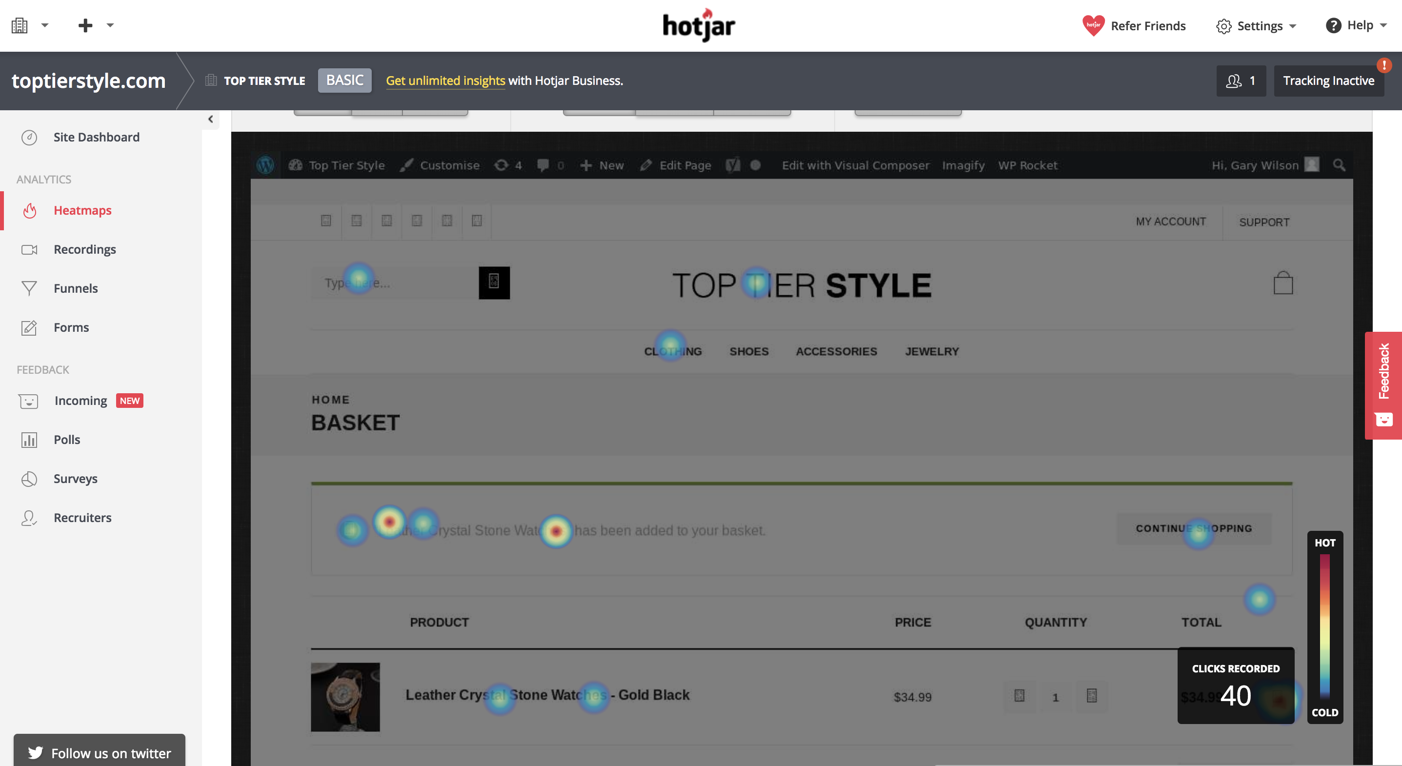
This data can be useful because you can pick up and see areas in which you can improve your website. Maybe 60% of your customers are clicking on an image that doesn’t actually link to anything, you could update this and take them to a relevant place.
Or maybe only 20% of your customers are scrolling down a certain amount of your blog post page. From this, you can gather that the content, or part of the content, is low quality and needs to be updated in order to engage your customers at a higher level.
Heatmaps can be tracked on your website using services such as HotJar, Lucky Orange or CrazyEgg.
Visitor Recordings
This one is kinda creepy, but absolutely gold if you are willing to spend a good deal of time looking into how your customers are interacting with your website. Recordings on most services can be tracked for all visitors or visitors that are visiting certain pages. It may be less time consuming and more valuable to spend time recording visitors on pages that are getting a low conversion rate with a high amount of traffic.
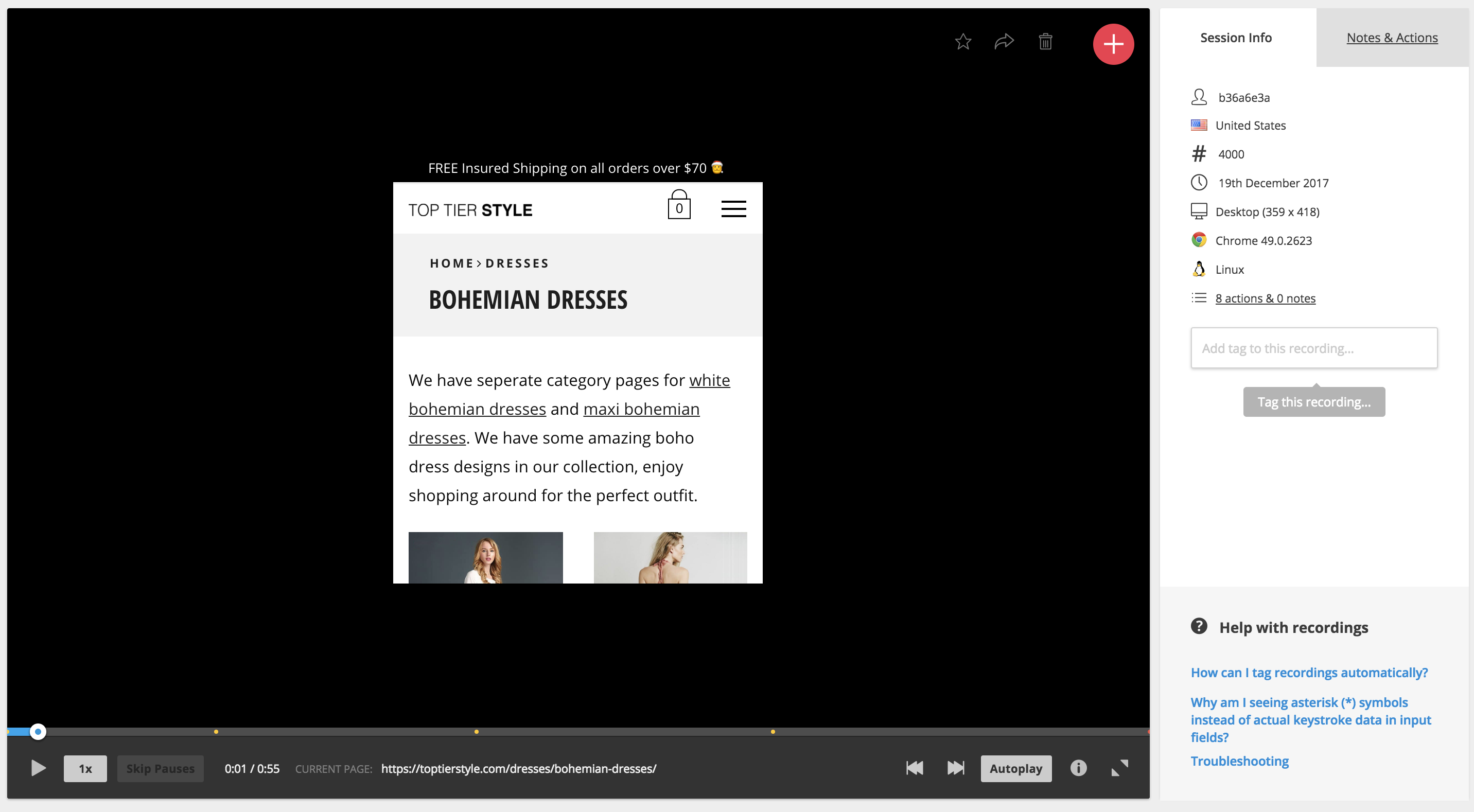
So, visitor recordings work much as it says in the name, you’ll get access to a screen recording of exactly what your customer does when they are visiting and browsing your website. You’ll get to see where they scroll, where their mouse moves, where they click and even what pages they visit.
This data is amazing because you get to put yourself, as a marketer, in your customer’s shoes and understand what it is that the customer is thinking while they are browsing your site. From this, you can understand a wide range of improvements and you can see exactly what influenced your customer to complete a certain action, or what caused them to drop off and leave your website.
A Data-Driven Approach
Once you have spent time analyzing all of this data and building a website that converts at a much higher level, you can look into implementing tracking with a service like Google Tag manager to analyze the percentage that a user completes a certain action on average within a certain time frame.
For example, you may be running a commerce store and you may want to track the percentage of people that add that product to their cart and what percentage add it to their Wishlist.
If you notice on a particular product that people are adding it to their Wishlist a lot instead of checking out straight away, then you could look into ideas such as running a promotion on that product or allowing a discount if they add it to their cart and check out today.
Summing Up – KNOW YOUR FUNNELS!
Every business has a funnel. Even if you are a local digital marketing agency, you have a funnel. Some funnels are more complex than others, here’s an example of a funnel for an average Plumbing website as compared to lets say an E-Commerce store.
A 2 Stage Funnel for a Local Plumber
Visitor Lands on Landing Page -> Visitor Gets in Touch
A 4 Stage Funnel for an E-Commerce Brand
Visitor lands on Product Page or Category Page -> Visitor Adds Product to Cart -> Visitor gets to Checkout Page -> Visitor Completes their Purchase
Either way, knowing your funnel is important because you can look at the areas in which customers begin to fall off. In the example of the plumber, it’s very simple because the plumber only has their landing page to optimize properly before they get their result, which is for someone to get in touch.
However, in the example of an E-Commerce brand – a visitor needs to follow a number of steps before completing the goal which is to purchase a product. If you are properly tracking the drop-off of your funnels, you may notice that 90% of people fall off at your cart page. By knowing this data, you can narrow in and know exactly what areas to look at the heatmaps or visitor recordings for so that you can begin to repair that section of the funnel and increase the overall conversion rate of your online business.
About the Author
Make Testimonials More Persuasive
Conversion Optimization, Persuasion ScienceDon’t kid yourself into thinking that your viewers believe your testimonials are real and genuine. Any website that hosts its own testimonials has the opportunity to molest and curate its own testimonials and every viewer knows it. There are three rules to make testimonials more persuasive that you can start using today.
If everybody knows you can alter and curate your testimonials, is there any point in having them in the first place? Probably not, but if you are dead set on having testimonials on your website, then you need to make testimonials more persuasive.
Before you hire a bunch of writers to create a set of positive testimonials for your website, take a look at these three unusual tactics for making testimonials more persuasive.
Use A Long-Form Testimonial That Goes Into Intimate Detail
Long testimonials make testimonials persuasive
The very idea that a long testimonial is more persuasive than a shorter one seems silly because most people would assume that a longer testimonial is more likely to have been written by the company’s marketing department rather than a genuine customer. However, there is a form of cognitive dissonance that occurs when people read larger testimonials.
Despite the fact that the user probably believes the longer testimonial was written by a member of the website’s own staff, the fact is that the user is still more likely to read the longer review than any of the shorter reviews. This is especially true if the testimonial has headings, and things such as lists, alternative purchases, and pros & cons sections.
Look at Amazon book reviews. The longest reviews are almost always the ones with the most “This was helpful” votes. Even if the review looks like it was written by the author’s friends, it is still more readable and attractive than the hundreds of smaller reviews/testimonials on Amazon.
It is better to have a semi-convincing review that is long and read by the user, rather than a series of smaller very-convincing reviews that are not read by the user.
Name All The Bad Stuff And Convert Them Into Selling Points
Convert bad stuff into selling points make testimonials persuasive
When most people shop online, they do not read the hundreds of positive reviews. They search out the negative reviews. People do this because most people are aware that reviews and testimonials can be bought.
We have all seen the list of positive reviews on Amazon that were written by a marketing department, and then the several recent ones that are negative because they are real. You can use the fact that people search out negative reviews by using negative reviews/testimonials to sell your product or service.
There are two ways you can do this, you may do it by giving negative points and making them illogical, or you may answer negative reviews with selling points. Let’s start with a few examples of negative testimonials that you have added to your website that are actually illogical.
Alternatively, you can allow negative reviews and then offer replies that create selling points. If done correctly, this can be a very powerful way to sell your product.
Do not make the mistake of asking the reviewer to contact your company via the replies because that is what all of the worst companies say.
Here are a few examples of negative testimonials and their replies that turn negatives into positives.
Allow Anybody To Leave A Testimonial And A Reply And Have It Post Immediately
A big part of making a testimonial believable is less about what is written and more about how the testimonial came to life. If you can prove to people that what regular people are writing is what is coming up on your testimonial page, then you may be able to convince people that your testimonials are real.
That is why it is important for you to make the testimonial process very easy. Any visitor should be able to leave a testimonial without having to sign in and without having to buy something. It should be clearly obvious to the user that he or she may start writing a testimonial right away, and that the user doesn’t need to have an account.
What is just as important is what happens after the user clicks to submit the review. If the system says that the testimonial is awaiting moderation, then the user will give up on the website and probably continue to believe that the testimonials on the website are curated. However, if the testimonial appears right away on the web page, then the user will have a hard time denying that genuine testimonials must exist on your website.
Many webmasters will not allow people to post directly to their web pages for a number of reasons. The most common reason is that it allows spammers to add content right away, but you can use spam catching software to stop that.
The second most common reason is that it allows users to add troll messages or negative messages into an area where potential customers may see them, but this doesn’t matter.
If your product or your service is a good one, then the troll messages or the negative messages will be dwarfed by the many positive messages. Plus, every Monday there is nothing stopping you from going through your testimonials and deleting a few of the most damning ones. After all, it is not as if your users are going to return every week to see if their testimonial is still there.
How to Instantly Establish Credibility Online
Conversion OptimizationWhen selling anything online people almost always prefer to buy from people and companies that they trust. In fact, many times people are willing to pay more to buy from websites they trust. It’s one of those key components that can boost your online conversion rate in multiples if done right so you need to instantly establish credibility online.
I’ve been working in the field of conversion optimization for 9 years. About 6 years ago, I made the decision to focus my agency primarily on optimizing websites that were specifically in the health field/vertical, mostly dietary supplements.
We niched down to optimizing for the health industry because we started seeing patterns among multiple dietary supplement clients. Those patterns lead us down a path of researching how people buy health supplements differently than they buy any other type of product.
The health field, especially natural health supplements, can be a pretty tough field to sell products directly online. There are a lot of FDA compliant and legal issues to watch out for if you don’t want to be shut down. Although there are certainly more than the fair share of claims out there on the internet that cross the line. That combined with so much misinformation and it’s no wonder that so many people tend to feel a little bit leery about trusting holistic health and supplement products.
The sad thing is, a lot of these products are actually really, really good for you and really beneficial. They’re often derived from natural products that have incredible benefits with minimal side effects.
But how do you get that across? Especially when you can’t afford to do a double-blind scientific test?.
Here are a few ways that you might be able to accomplish the same goals in your specific industry…
To Establish Credibility Online: Be Completely Transparent With Your Audience
One way I do that is by making sure that the website is as transparent as possible. Putting it all out there may show some vulnerability, but it also conveys honesty.
Reveal the ingredients that are in your products by showing the full supplement facts label. Don’t hide behind a “proprietary blend”.
Transparency is key
Also, let them know where those ingredients are sourced from.
Make Reasonable Claims and Back Them Up With Proof
We all know it’s probably not likely that one pill can solve all these problems. Even if it’s true, trust breakdown with multiple claims or condition solutions. It’s better to focus on the power of one. One story, one problem, one solution. So don’t make broad outrageous claims. And when you do make claims, be sure that you are backing them up with proof.
If you really concentrate your focus on the things your product can do and go into great detail with facts that support that – then it’s more likely that you’ll be believed.
I’m sure you’ve probably heard a million weight loss remedies that will help you lose weight quickly. But when you’re bombarded with so many messages, how do you even begin to know which ones might actually work?
There’s not enough time in the day to try them all out. And who wants to spend the money on each one?
But if you do your research and look closely, some of the suggestions are backed up by actual science.
For example, did you know that grapefruit stimulates the production of a hormone called adiponectin, which is involved in the breakdown of body fat?
Ok, now that’s something to go on, right? Actual science. I’m in.
This is the same kind of confirmation that your visitors need and want. They don’t want to have blind faith and just believe what you say or try a million products to see which really works. Most people don’t have that kind of money or time to spend.
So give them proof. Establish credibility online. It may already be there and you just don’t know it.
Another Example that Fails to Establish Credibility Online
For example, we were recently analyzing a landing page for a healthy chocolate chip cookie.
The cookie claimed to be healthy – but the nutrition label that they displayed on their website really wasn’t all that impressive.
It listed some protein and some calcium – but other than that it was hard to justify spending the money.
They went on to list the healthy ingredients – flaxseed and chia seeds which are rich in antioxidants and omega 3’s. And coconut oil that boosts the immune system and helps you lose weight.
But they didn’t bridge the gap so that it made sense. They didn’t tell their visitors why these ingredients were so healthy. In fact, they’re so healthy that they’re often referenced as “superfoods”.
If prospects weren’t aware of these benefits, listing the ingredients meant absolutely nothing. So don’t assume. Don’t assume that they know why something is good for them. Just because you know, doesn’t mean that they do.
To Instantly Establish Credibility Online, Be Vulnerable
And if there’s something that your product or service can’t do. Don’t be afraid or too proud to admit it. By being honest about what you can offer, it really comes off more as trustworthy than incompetent actually. By honestly admitting that you can’t do a particular thing – your visitors will now believe you when you say that you can do other things really well.
Don’t Unintentionally Plant Seeds Of Doubt
This is something that I see often.
While you may actually be very trustworthy, you’ve just reminded your visitors that some of these products are a complete hoax. Possibly even a sugar placebo.
So now that you’ve mentioned “gimmick”… now they’re not so sure about you .
Here’s what happens. Your visitors are going about their business gathering information so they can make an informed decision about your product or service.
When they see words like “gimmick” or “scam” red flags may start to go up. Those thoughts might not have been in their minds in the first place. But since you’ve now put them out their boldly in print… now they are.
Planting these types of thoughts in your visitor’s heads could be very risky. Your very attempt to gain trust in this way may backfire big time.
Other Standard Ways To Establish Trust
So those are some of the areas in the health vertical where trust needs to be established in a very specific way. Hopefully, these techniques might help you in your vertical as well.
But be sure that you are also implementing these other critical trust indicators as well.
Social Proof Establishes Credibility Online
Add testimonials and reviews.
Another way to add social proof is by adding social media count boxes. The boxes that display the number of people that have liked you. Those can’t be faked.
LinkedIn testimonials also can’t be faked. Members are the ones who write the actual recommendation and they are then displayed on your profile.
And if you can get an expert endorsement. You’re golden.
In fact, tout yourself as an expert too. Make the effort to write blog articles that will highlight you as someone who knows what they’re talking about.
If your product or service has an average success rate – boldly highlight that. It’s amazing how often I see businesses forget to include this information.
I once worked with an insurance agency that required prospects to apply for approval to receive a special discount. People are often worried when they’re credit is going to be checked. It adds an additional layer of anxiety that they just don’t want to deal with. So they don’t.
But this agency had a 97% approval rate. But they failed to mention that.
Adding such information makes the reader feel a little bit more secure that they just might be approved. So they take the risk.
Share Details About Yourself
There are always going to be a percentage of your audience that wants to know more about the people behind your business before they move forward with a transaction.
When I’m analyzing heat maps, it always amazes me just how many people are clicking on About Us links to find out more.
And don’t forget to include real-world data such as a physical address and contact information when you can. Hiding this information can not only be frustrating, but it can also make your visitors question whether or not you are a legitimate business.
How to Instantly Establish Credibility Online: Security
I’m sure you know by now how important it is to create a secure environment if you’re selling online.
To ensure that your website is secure – your website address will start with “https” rather than just “http”. The “s” at the end means “secure”.
Nowadays, it’s also highlighted in the address bar with green text and the actual word “Secure”. So make sure your website’s address looks like this in the address bar.
Security starts at the address bar
Because sometimes you’d be surprised to see what’s displayed here. I was surprised to see this in the address bar for cnn.com.
Unsecured websites hurt credibility
Perhaps they are not selling anything online. But it’s always a good measure to make this read as secured.
Also, make sure that you are are displaying trust seals that verify that you are a legitimate business and also verify that your site is secure.
Visual indicators such as padlocks also help to create a sense of security. Both of these can be really important at the point of checkout where visitors feel most vulnerable.
We Only Buy A Second Time From Those We Trust
So make sure you’re providing all the information you can to help your visitors make an informed decision. Don’t make outrageous claims. And when you do make claims, try to back them up with proof.
Don’t scare visitors away by unintentionally planting seeds of doubt. And don’t forget to include standard trust indicators such as real-world data and security seals and security indicators.
21 Quick and Easy CRO Copywriting Hacks
Keep these proven copywriting hacks in mind to make your copy convert.
"*" indicates required fields
Conversion Optimization Examples: Homepage Carousel vs None
Conversion Optimization, Ecommerce CROHere are 3 conversion optimization examples of how to kill the “slider”.
This is not a post about how carousels kill conversions. They can, but it’s not about that.
This post is about doing what’s best for the people who want to buy from you on your site.
Every CRO and savvy eCommerce manager I have ever met hates carousels. In fact, we’ve never actually blogged about it because EVERYONE ELSE already did. Bringing up carousel flaws would be akin to bringing up the Hindenburg’s.
What we at Inflow will do, however, is document the death of the carousel. But before we do, let’s talk about its birth.
Blame Yahoo! if you want
It seems like the carousel has been around forever, at least in Internet terms. Broad adoption started in the summer of 2009 after Yahoo introduced it on its homepage.
If your site still has a rotating carousel, perhaps you still have a Nokia phone? You can check your email on it, you know!
From that point on, every website felt free to:
So, for some, it might not be a surprise that there is a better way to structure an eCommerce homepage.
The death of the (unnecessary) carousel
In our 2018 Best in Class Comparative Matrix for eCommerce, we saw only 6 out of 10 sites still used the homepage hero carousel. That number is less than half of what it was 2 years earlier.
The reason why is simple: it was never the best option for most of the sites that did it, and that statement is still pretty much true.
Optimization Away from Carousels
So, how does a site transform its homepage from having a carousel? Here are three conversion optimization examples for removing carousels.
Zappos.com
Before
A year ago, Zappos was sporting a left category nav, hero carousel and a couple of static promo areas to the right. That made it jam-packed with options.
After
Zappos simplified things by ditching the carousel, the left nav on the homepage and instead focusing the homepage on the things customers want most. They are still testing this bad boy with over 5 major variants identified, so check back in February to see the winning combination. ;)
So apparently, Zappos.com never needed a slider. Note that they kept the slides, but moved 2 of them to the bottom of the site in favor of stuff users most want (a lot of which was not even on the homepage of this eCommerce behemoth just a year ago).
There’s a big lesson here for those willing to learn it and kill their carousel.
UnderArmour.com
Before
Under Armour had a carousel last year, alternating between two and three slides.
After
Over the past year, they have MADE ONLY ONE CHANGE on their homepage. That was to ditch the carousel.
Williams Sonoma
Before
Williams Sonoma made some minor navigation changes over the past year and added lazy-load to the homepage, which widened it a bit.
After
For the most part, the only significant change to the homepage was REMOVING THE CAROUSEL.
Take-Away
If you were to take the lead from these 3 best in class sites, you would blindly get rid of your eCommerce site’s carousel. But wait!!!
You can see below that there are still 6 out of 20 Best-in-Class eCommerce sites that are standing by their carousel. You bet they have tested their homepage over the past year.
So Why?
The answer is that the carousel, as they have it, is right for them and their audience. For now, at least, until something tests better.
This is why we test.
8 Elements of a High Converting Squeeze Page
Conversion Optimization, Conversion-Centered DesignLead generation is the lifeblood of online business and most lead generation is done via email collection.
If you grow a list of prospects who’re interested in your promotions, your business grows too. However, before you make money from your list you’ve got to get people on it. Whether you want people to download your lead magnet, sign up for your latest webinar or volunteer to test your product, you first need to persuade them to part with their highly guarded personal details – that’s no small feat.
No wonder the average opt-in rate across industries is hovering around a mere 2%. After investing a fortune in Facebook advertising, PPC ads, outsourced content, content management software, site design, and more, you only net two leads per 100 visitors. Two leads… NOT customers mind you.
Surely, your business deserves better.
Today, we’re going to cover the eight elements of a high converting opt-in page so you can boost your opt-in conversion rates and get a better return on your content marketing investment.
Ready to dive in?
Element #1: A short pre-headline to draw them in
When your prospect arrives on your opt-in page she wants to know if she’s in the right place. If she feels lost, she’ll click away. Use the apex of your page to make her stick around.
And, depending on who you ask, you have five seconds or less to do that. But how do you do it? Here’s three ways to instantly attract your reader when she lands on your page so she stays on.
#1. Name the target audience
For example, Attention dog owners, Attention Content Marketers etc.
When you name your audience you get a nod from the prospect, “Yep that’s me.” Handled correctly, this small first yes will ultimately lead to the big yes of a signup later on.
#2. Name the type of lead magnet
For example, Free Special Report, Free Training Webinar etc.
The specificity of your offer increases desire and the likelihood of the prospect staying on so as to get it.
#3. Name the referral site
Naming the referral site on your page makes your prospect feel like a diva and warm up to you and your offer.
Amy Harrison rolls out a red carpet for her Copyblogger readers. She makes them feel the love by welcoming them: specifically, heartily, personally.
Source
Your pre-headline has four main purposes:
#1. To help your prospects understand your offer…fast.
#2. To alienate those who are not a good fit for your offer.
#3. To attract those who are perfectly suited to your offer.
#4. To build rapport with your audience in an instant.
A great pre-head will keep readers on your signup page.
Element #2: A benefit-rich headline to make them want to read more
Once your prospect hangs around, use your headline to show her how your offer will benefit her and improve her life. Promptly address her concerns so she lingers on the page or you’ll lose her by the door. Quickly address her pain, paint the desired future for her, or pique her curiosity so she can’t help herself but read on.
In short, tell your prospect what’s in it for her.
Jacob McMillen’s headline is ultra-specific and has a solution that’s tailor-made for cash-strapped businesses – that’s a big benefit that’ll keep his target audience glued to the page.
Source
Not only that. Your headline must also tie in nicely to the traffic source. That way the prospect’s conversion journey becomes smoother thus generating better results for your business. Jacob McMillen does this superbly as the source page to the above landing page shows:
Notice how his CTA, the last words in his bio, are the first words on the landing page? This way the byline is perfectly coupled to the landing page thus increasing conversions. When a reader clicks his bio and lands on the landing page she smoothly continues her conversion journey – because of harmony between the two pages, conversions are likely to be higher.
On the flip side, a copy mismatch between the source page and the signup page tanks conversions.
Element #3: A few lines of crisp copy to pull them further down the page
You’ve done well if your prospect is still on your page thus far.
Your next few lines should give specific points about your offer. Show her how your offer will scratch her itch or push her towards her dream. Do that and she’s more likely to give you her details.
Use bullet points or short paragraphs. Your bullets should be:
Smartblogger nails their bullet copy on this sign-up page for an upcoming webinar.
Source
The three bullets tell you exactly what you’ll get on the webinar in a simple engaging way without laboring the point. If you’re going for the minimalist approach even a single line will do. The amount of copy on the body of your opt-in page depends on three key factors.
#1. How aware is your prospect about you and your offer? The more aware she is about you and what you do the less copy you need and vice versa.
#2. What works best for your niche? Study the most successful signup pages in your niche and do likewise.
#3. How complex is the problem you’re trying to solve for the prospect? The more complex the problem, the more copy required to convince prospects to sign up.
Element #4: A pro-looking image to help them visualize what they’ll get
Our brains process images up to 60,000 times faster than text.
To woo your prospect so she says yes to your proposal (offer), show her what she’ll get. Use a picture of the product or of people expressing the feeling you’re targeting. Pictures of animals work well too if your context allows it.
John Nemo’s book shot dominates his opt-in page on purpose. You can almost smell the LinkedIn cash splashed on the cover.
Source
A word of warning about pics: don’t just include a picture because you like it…that won’t help your cause. Only include a picture if it’s relevant to your offer.
Element #5: A signup field(s) to capture their personal details
You’re almost there now… your prospects cursor is hovering over the signup field. Now comes the big question…how much info do you want from her?
Numerous tests show that, in most cases, the fewer the signup fields, the higher the conversion rates. That’s why most sites simply ask for an email address and/or name only as shown in the Marketing Sherpa lead generation graphic below.
Source
Of course, you can ask for more than that if you want a more targeted list. Although your conversions may dip, the quality of your list will improve. Ask for what you need and no more. This makes filling the fields more desirable. You can always ask for more details later.
But, as with everything digital, conduct split tests to see what works for you and your audience instead of blindingly jumping on the bandwagon. In many cases, tests have shown that increasing the number of fields actually raised conversions.
Element #6: A bit of social proof to earn their trust
It’s natural. No one wants to go first. People do what they see other people do. That’s why social proof is a vital ingredient to the success of your page. Here are some three quick-and-easy ways of incorporating social proof into your signup page:
#1. Display your list numbers if they’re substantial
To nudge people over the sign-up line, you can use big numbers associated with your following. However, be careful as numbers can be a double-edged sword. If your numbers are small, social proof will still work, but against you! No-one wants to be a part of something small and insignificant.
Social Media Examiner uses their massive list to good effect to inspire people to join their list.
Source
Surely, on seeing the 620 000+ social media marketing peers on Social Media Examiner’s list, a prospect will be enticed to sign up.
#2. Splash customer testimonials generously on the page
Testimonials multiply your clout score thus making it easy for people to take up your offer. Henneke Duistermaat, of Enchanting Marketing, does a neat job.
Source
Not only does she head the page with a rich list of big sites she’s been featured on, she sandwiches her offer between two testimonials from heavyweights in her niche. Prospects are more likely to trust her word and gobble up her course.
#3. Point to influencer endorsements and press mentions
To get prospects to sign-up for a free trial, Get Response leads with an imposing figure of their current users and then they underline their authority in their space by quoting two influencers.
Source
This is likely to cause more people to take their software for a spin.
Element #7: A privacy statement to assure them their info is safe
Because cyber-crime is rampant, your prospect is uneasy. Hardly a day goes by without someone being scammed or spammed online. Allay her fears…wrap your arm around her and let her know you’re not one of the bad guys. Tell her you won’t peddle her email address nor send the alien stuff she didn’t ask for.
A brief statement such as ‘We respect your privacy and will never share your info’ is enough as Neil Patel does.
Source
Feel free to get creative with the phrasing. Or, if you’re not feeling inspired, simply write ‘privacy policy’ and link to your full-blown privacy policy. And, oh, a privacy statement also serves a more personal and practical purpose: failure to include one might land you in trouble with the law.
Basically, your privacy statement should assure your visitors that their info is safe. Only when they feel you’re trustworthy will they be swayed to give you their personal information.
Element #8: A strong call to action (CTA) to compel them to click
Your call to action marks the finishing line of the sign-up race. Give it some thought.
Your button copy should be specific, simple and reader-focused. Tell the prospect exactly what she’ll get if she signs up. Don’t try to be cute, clever, or cryptic, or you’ll lose out. And please, don’t make the rookie mistake made by many content marketers – using the dismal default CTA copy e.g. signup, subscribe, or download.
Don’t leave your visitors wondering what they are clicking the button for.
Sign up. For what?
Subscribe. To what?
Download. What?
A simple formula, coined by Joanna Wiebe, will help you ace your button copy. Just fill in the blank: I want my reader to __________________.
Your answer becomes your CTA. For example:
I want my reader to:
Here’s a great example of powerful button copy pulled from this very site’s homepage:
Book a Consultaion Now is a proper Call to Action, or CTA
The CTA is clear, simple, direct, benefit-focused, and urgent – all the hallmarks of a powerful call to action that converts.
Make the desired action simple and easy smoothly guiding the prospect towards your goal without much work or resistance. Use energetic verbs and the first or second person to make the CTA personal and bump up your conversions. Once your reader clicks on your button, you’ve won and now have a precious lead in your funnel.
Opt-in pages are crucial to the overall success of your business that you should seriously consider outsourcing the task if you don’t have the time or the expertise to craft them yourself.
Conclusion
Getting signups is an essential bridge in your inbound digital marketing efforts. It’s the magic link that turns browsers into subscribers, subscribers into buyers, and buyers into brand evangelists. In short, it’s the gateway into your funnel. As a serious growth-focused business owner, take time to work all these elements into your page so you increase the likelihood of success. Then you’ll hear the sound of clicks not crickets for a change.
Use Your Customer’s Voice to Create Powerful Content that Converts
Conversion Optimization, Persuasion ScienceWith the use of social media and web access at all-time highs, it’s more important than ever to create powerful content that converts and makes sure that you engage with your customers. With the 2018 marketing trends in mind, leads and potential customers are looking for a personal touch. They want an account of how your product or service works, what people are happy with and what challenges they face in using it. They do not want a marketing funnel.
This is where using your customer’s voice comes in. When used right, your current customers’ voices can be used to create powerful content that actually converts leads!
For the purpose of this post, you can all but forget fancy terms and processes. Conversion funnels, influencer marketing, engagement – these all have a place in business, but it’s not necessarily here. Instead, this post is all about why interacting with current customers is so important and how you can use this interaction to create authentic content. This is the kind of content customers are looking for – and it just so happens to be the kind of content that converts.
The Importance of Leveraging Honest & Authentic Reviews
At the base of using your customer’s voice to create powerful content is a preliminary step; encouraging and gathering honest and authentic user reviews. Without customer reviews, you won’t have much to go off of when it comes to incorporating customers’ perspectives into your content planning!
Thankfully, there is no shortage of review sites available to B2B and software companies. Do your research. Take the time find one or two that fit your business and your customer profile. Then take the time to invite (and maybe even incentivize?) your customers to submit reviews about your software, your service, your product. This will have more than a few benefits for your company, including:
Using Your Customer’s Voice to Create Content That Converts
Of course, it’s not enough to simply open up your company to authentic customer reviews and leave it at that. You can take the time to translate your customer’s voice into marketing content! There are a few ways to go about this.
#1: Manage Your Potential Customer’s Expectations
You can use reviews to help potential customers understand what your service, product or software looks like in practice. Instead of imagining everything they could do with the features, customer reviews give leads the chance to explore how your product will truly work for them.
For example, sharing customer reviews that highlight specific features of your service or product will speak more specifically to a smaller target audience.
#2: Customer Experience Speaks Louder Than Marketing Language
This is absolutely the main benefit of customer reviews; you can use all of the positive quotes you want in developing a content strategy! You can incorporate reviews (especially specific and helpful reviews) into blog posts, landing pages, social media content, and even demos!
For example, try replacing the headline copy on one of your landing pages with a quote from an authentic user review. Run an A/B test and see how that page compares to others.
#3: Listen to What’s Important
If your current customers are focusing on technical support and price in their reviews, then you shouldn’t really be spending that much time on something else. Look at what features customers focus on in their feedback, and spend time developing content around those features.
For example, if most reviews focus on the quality for the price, you can use that in your marketing language for paids. Similarly, if customers are highlighting your customer service, home in on that for attracting new customers.
This should get you started on using your customer’s voice to create content that converts going into 2018!
About the Author
Do Online Reviews Really Matter?
Conversion Marketing Strategy, Conversion Optimization, Ecommerce CRODo online reviews really matter, and do they make a difference to your business? The answer is yes, they absolutely do.
Consumers increasingly use reviews left by other consumers as part of their pre-purchase research efforts, and a bad review can have serious effects on your sales.
Herd shopping psychology plays an ever effect on consumers’ behavior online. Groupon is a wonderful example of that, with deals kicking in only if a certain amount of people pay for them. Research shows that the more people have already opted in on a deal, the likelier it is new visitors will commit to it.
User reviews are not so far removed from this phenomenon.
Fake & Negative Reviews
Unfortunately, fake reviews exist, and they exist in a massive abundance. Competitors have been known to leave bad reviews on products posing as disgruntled customers, That is why more needs to be done to help consumers identify a fake review.
Here are just some of the facts why online reviews are not to be ignored:
Negative reviews aren’t all bad; these have been known to create a buzz around your business and increase its exposure, unlike fake reviews that have been so outlandishly obviously fake and ridiculous that they go viral.
Want to learn more about how online reviews can make or break your business? Check out our infographic.
User Reviews are the King
Josh Wardini, Editorial Contributor and Community Manager at websitebuilder.org. With a preliminary background in communication and expertise in community development, Josh works day-to-day to reshape the human resource management of digitally based companies.
Visualizing Your Marketing And Sales Process
Conversion Marketing Strategy, Conversion OptimizationWhen you think of the machine that is your online business, what do you picture? Do you see something organic? Something mechanical?
I think it’s helpful to pick a vision. The marketing and sales functions are too complex. The tools and channels are changing faster today than at any time in history. Thanks, internet.
Vizualize your marketing machine to make good decisions about where to invest.
Visualizing the process helps us focus on the pieces one at a time, instead of being overwhelmed by the mass of moving parts that feed our pipes, funnels and drips. When we work with clients, we tend to talk about knobs.
Here’s what I mean.
Our Marketing Machine Looks Like A Scientific Instrument
The most powerful metric for an online marketing ecosystem is acquisition cost.
The lower your acquisition cost, the higher your profit.
The lower your acquisition cost, the cheaper all of your advertising becomes.
The lower your acquisition cost, the more places you can afford to advertise.
But acquisition cost isn’t a dial you set. It’s the product of several dials.
The Acquisition Cost Spectrophotometer
We control acquisition costs using a device called the “Acquisition Cost Spectrophotometer” (ACS). This powerful device has two dials.
1. Traffic cost
2. Conversions — Typically leads or online transactions
We plug the ACS into any incoming channel — search engines, email, referrals, social media and so on. Then we begin to play with the knobs.
If we increase the traffic costs, but the conversions stay the same, we increase our acquisition cost, and the little red warning light turns on. If we dial down the traffic costs and keep the conversions the same, acquisition costs go down, and the red warning light goes off.
So, if we can increase conversions without increasing traffic costs, we get all the benefits of a lower acquisition cost. And for the paid search channel, we can actually lower the traffic costs by raising the conversion rate because Google rewards ads with effective landing pages by placing them higher on the search results pages.
Mathematically, the acquisition cost is calculated as:
Total Traffic Cost/Conversions
OR
Total Traffic Cost * Conversion Rate
If we put our metaphor down for a moment, we know that each of these “knobs” actually involves an entire process. Our “Traffic Cost” knob is controlled by an advertising and media team focused on getting the highest quality clicks for the fewest dollars.
Our “Conversions” knob is a metaphor for a team of data scientists, developers, designers and test techs focused on delivering the right experience to entice action.
All the marketer needs to do is determine if they should be investing in traffic or conversions, then fund the teams accordingly.
Vectron Conversion Analyzer
These are the primary knobs you turn when optimizing for conversion.
The Vectron Conversion Analyzer doesn’t actually exist, but we can visualize ourselve adjusting the knobs as we optimize our site.
When focused on optimizing a website for a given traffic channel, there are a number of knobs we control. I visualize a “Vectron Conversion Analyzer” as a metaphor for our process.
This amazing device allows us to control a number of “ingredients” that can lead to more conversions for any given traffic source. If you read this column, you’ll be familiar with most of the knobs on this little gem.
Value Proposition
The headlines, text, and images that spell out the value being offered by your company and products. Answers the question, “What’s in it for me?”
Layout and User Experience
The way the design draws a visitor’s eye to the important parts of each page and the cues that move them step-by-step along their exploratory journey.
Should important information be moved above the fold? Is there a visual hierarchy that tells the visitor what is important?
Credibility And Authority
A site design’s first job is to make the site seem credible. It should communicate that the company and products represent an authority in the solution space that it occupies.
Trust And Security
The visual cues that tell a visitor that the site will treat any information exchanged with care and veracity.
Social Proof
What do others like me think about this company, site and products?
Splitting The Signal
The Vectron machine splits the traffic up, allowing us to test different settings at one time. This is how we determine two very important things:
1. What is lacking from the site that visitors expect.
2. By how much each change increases the site’s performance.
AB Testing gives you the feedback on your conversion optimization work.
Visualizations That Help You Prioritize
We rarely have the budgets to invest in every part of our marketing machine. Having a metaphor by which you can visualize the pieces working together offers a powerful way to decide how to invest over time.
Using the visualization at the top of this page, you may not have any luck seeding your brand clouds with advertising until you’ve built brand awareness. When it rains, you should invest in the downspouts that drive leads into the soil of marketing.
If your sales close ratios aren’t flowering, you may need to look at the quality delivered by ads and conversion together. Once you have a low acquisition cost, you can again invest in more expensive advertising channels to seed your brand’s rain clouds and bring the rain.
7 Conversion Copywriting Hacks You’ll Wish You Knew About Sooner
Conversion Optimization, Conversion-Centered Design, Persuasion Science21 Quick and Easy CRO Copywriting Hacks to Skyrocket Conversions
Note: The following conversion copywriting tricks are reprinted from the ebook 21 Quick and Easy CRO Copywriting Hacks to Skyrocket Conversions.
You just lost some potential revenue.
There goes some more.
A poor conversion rate will pick your pocket day after day. That’s why you’ll love these 7 conversion copywriting hacks. They’re quick and easy. And you can start using them today.
REPEAT YOUR CUSTOMERS/PROSPECTS
You may have heard that you should write like your customers speak. It builds rapport and credibility. Readers are more likely to think to themselves, “This company gets me and my issue.”
But rather than just guess what your target audience would say, use their actual words.
That’s what Sarah Peterson did when promoting her Etsy course.
The highlighted phrase stood out among responses to a survey she sent to prospects.
A key phrase from survey response
She used that exact phrase to resonate with prospects in her sales email.
The key phrase inserted into marketing email
There are several ways you can do this same thing.
SWAP YOUR HEADLINE AND SUBHEAD
It’s amazing how many times I see a landing page where the subhead is stronger than the headline. Maybe the writer is trying to be clever or creative. Perhaps they think the headline shouldn’t be more than a few words long.
Whatever the reason, it’s killing conversions. If it’s not immediately clear what you’re offering me, why should I read on?
Fortunately, the subheads usually have this information. So an easy fix is to just make the subhead your headline.
Here’s a good example:
The subheading is the value proposition
A stronger converting headline
See how much clearer this page is when the subhead and headline are switched?
CUT YOUR FIRST PARAGRAPH
This is a hack that goes back to the heyday of direct mail. It’s designed to help you get right to the point.
Getting to the point quickly sounds pretty obvious. But you’d be surprised how many marketing pieces waste words trying to introduce themselves or state the obvious.
People don’t care about that. They care about themselves. What is it your offer is going to do for them? Tell them right away why they should care.
If your first paragraph doesn’t do this, scrap it and start with the next one.
ADD ASSUMPTIVE PHRASING
Here’s a nifty little psychological hack.
Write your copy as if the conversion is a foregone conclusion.
Simply look through your copy and add phasing like this to some of your statements:
“When you start your trial…”
“You’ll love how…”
“As you’ll see…”
The power of this hack lies with the endowment effect, a phenomenon where we value what we already own more than something we never had. By writing as if your prospect already owns what you’re selling, he or she imagines that situation.
Presuppositions are another type of assumptive phrasing you can use to add persuasive power to your copy. These statements infer something else is true. For instance, if I ask, “Which of these copywriting hacks are you going to use first?” that infers that you are indeed going to use them.
You must accept the inference to be true in order to avoid incongruence within the sentence. We’re wired to avoid incongruence because it requires more brain power.
Use this to your advantage by creating presuppositions with words such as:
Finally. “You can finally get in shape without spending hours in the gym.” (Presupposes that you had to spend hours in the gym to get in shape.)
Start. “Start earning the income you deserve.” (Presupposes that you aren’t currently earning what you deserve.)
Stop. “Stop wasting time on diets that don’t work.” (Presupposes that you are wasting your time.)
Again. “This car makes driving fun again.” (Presupposes that you once enjoyed driving but now find it to be a chore.)
Anymore. “Getting your kids to do their homework won’t be a battle anymore.” (Presupposes that getting your kids to do their homework is a battle.)
How will you use assumptive language in your marketing? (See what I did there?)
USE THE WORD “BECAUSE”
We like to think that we’re rational. That’s why we like to have a reason for doing things people ask of us. But here’s the interesting part. Simply having a reason is often more important than the reason itself.
Consider this famous social experiment:
In 1978, researchers approached people in line for the copier machine and asked to cut in front. They tested the effectiveness of three different phrases.
It’s not surprising that people let the researchers cut in line more often when a reason was given. What is surprising is that whether that reason was valid or bogus had no significant impact.
Look at that third phrasing again. Of course, they had to make copies. So did everyone else in line. That’s what a copier is for.
So why did that excuse work?
Often with small requests, we take a mental shortcut. Instead of processing the actual request and reason, we recognize that a reason was given, and we comply.
It’s important to note that the reason for the request becomes more important as the request gets larger.
When the researchers repeated the experiment with 20 pages instead of 5, giving a bogus reason had the same effect as giving no reason. Both were successful only 24% of the time compared to 42% when a valid reason was given.
To use this in your marketing, look for areas where you want the reader to do something and add a “because.”
“Act now because this offer expires in 10 days.”
“Because you’re the type of person who…”
“We’re giving away free samples because we want you to see for yourself.”
USE PATTERN INTERRUPTS
Attention spans are short these days. Even if your copy is great, most readers will start to lose interest if you don’t shake things up a bit. Pattern Interrupts are a great way to do just that.
Pattern Interrupts are a neuro-linguistic programming technique designed to break the expected pattern of thoughts or behaviors. There are a couple of ways to use it in your marketing.
The first is to keep readers engaged. In a long-form piece of marketing, the reader expects paragraphs to follow paragraphs and on. This familiar pattern allows the brain to go on autopilot. You don’t want this. You want readers’ attention.
Break the pattern by adding testimonials, sidebars, callouts and other devices that temporarily interrupt the narrative of your text. Take a look at these examples.
Interrupting the pattern and flow
Interrupting the pattern and flow
You can also use a Pattern Interrupt to disarm readers or refocus their attention. People don’t like to be sold to. As a result, they reflexively put their guards up when they expect a sales pitch.
But what if your copy doesn’t start off as expected?
Use a Pattern Interrupt to disarm readers or refocus their attention.
Readers expecting a typical sales pitch will probably have a different mindset when they read something like this:
Shift the mindset
REMIND READERS OF THEIR FREE WILL
A team in France first proved how effective the “But You Are Free (BYOF)” technique is with this social experiment.
One of the experimenters would stop people in a mall and ask for change to ride the bus. In half of the instances, he or she added the phrase, “But you are free to accept or to refuse.”
Significantly more people gave money when the BYOF technique was used. Not only that, but the amount they gave was twice as much.
Follow-up studies have proved BYOF effective in requests for donations to a tsunami relief fund, participation in a survey, and many other situations.
It works by combating something called psychological reactance. Wikipedia describes it this way:
“Reactance occurs when a person feels that someone or something is taking away his or her choices or limiting the range of alternatives.
Reactances can occur when someone is heavily pressured to accept a certain view or attitude. Reactance can cause the person to adopt or strengthen a view or attitude that is contrary to what was intended, and also increases resistance to persuasion.
With this one simple phrase, you remove reactance and open your prospect’s mind to your persuasion. “
Note: The specific wording doesn’t matter as much as the sentiment. You can also use variations such as:
When you see how well these techniques work you’ll wish you started using them sooner.
Download the full ebook for all 21 copywriting hacks.
21 Quick and Easy CRO Copywriting Hacks
Keep these proven copywriting hacks in mind to make your copy convert.
"*" indicates required fields
Finding Website Optimization Gems
Conversion Optimization, Conversion-Centered DesignHow do you decide which elements of your site to test? This question is at the heart of website optimization.
A better question is, “How do you determine what NOT to test?”
It’s relatively easy to come up with ideas that might increase your conversion rate. We typically come up with 50, 75, 100 or more ideas for each of our client sites. Filtering through this list is the hard part.
Here’s the approach we take at Conversion Sciences (my employer).
Step One: Look For Evidence
You should never test anything if you don’t have some evidence that it is a problem. These ideas are called hypotheses for a reason. A hypothesis is an educated guess, an informed fabrication, a data-based brain fart.
So you need to educate, inform and find data on your ideas, or they don’t qualify as hypotheses. They’re just happy thoughts.
The first benefit of looking for evidence is that you might be able to eliminate a hypothesis. You might find evidence that it’s NOT a problem.
Here’s an example hypothesis for the product page of an e-commerce site: “If we put an ‘Add to Cart’ button at the bottom of the page, more visitors will add an item to their cart.”
Sounds reasonable. Yet, if few people are scrolling down the page, this hypothesis won’t hold water.
We can look at attention data, or “heat map” data generated by click-tracking and scroll-tracking software such as CrazyEgg. This will tell us how far visitors are scrolling on the product pages of the site.
If they aren’t scrolling far, then we may save this hypothesis for another time.
When we’re identifying what to test, we give each hypothesis a rating from 1 to 5 for how much evidence there is.
A rating of “1” means there’s no evidence, that the hypothesis is just an idea. A rating of “5” tells us that there is overwhelming evidence that there is a problem this hypothesis could address.
I’ve written and talked about the sources of data that are available to help you with this.
Step Two: Rate The Traffic
We want to avoid optimizing the wrong parts of the site. Our hypothesis list should have ideas for site-wide improvement, as well as page-specific enhancements.
Changing the order of the site’s navigation, for example, is a site-wide change. Adding trust symbols to the checkout page is page-specific. If we were to rate the value of the traffic on a scale of 1 to 5 again, what would we give these two scenarios? They both might get a 5.
A site-wide change, such as adjusting the navigation, has an impact on 100% of the visitors. That’s a 5 in my book. Accordingly, changing a page that is only seen by 20% of visitors or less gets a 1.
Visitors to the checkout page often account for a small percentage of viewers. Why give them a 5? Because what this traffic lacks in volume it makes up for in opportunity.
Visitors who are checking out have demonstrated significant buying intent. These visitors are very valuable to us.
Other pages may not get much attention. The “About Us” and “FAQ” pages may not be so interesting to us. They might get a 2 or 3.
Favor hypotheses that have an impact on the most, or most interesting, visitors.
Step Three: How Hard Is It To Test?
For each of our hypotheses, we want to understand what the level of effort might be. It’s easy to change the text of a guarantee or offer. It’s much more difficult to add live chat to a site.
If we use our 1-to-5 scale again, we might give the change in the copy a 1 or a 2. Adding live chat requires hiring a live chat vendor, doing integration and staffing for our chatty visitors. This is a 5 in my book.
You don’t want to favor simple tests for simplicity’s sake. Don’t rush off and test button color just because it’s a 1 on your level-of-effort scale.
Likewise, hold off on swinging for the fences until the low-hanging fruit has been found. Leave your 5s for another time.
Step Four: What Does Experience Tell You?
Finally, gauge the impact you think this hypothesis will have. This is based on your knowledge of your prospects. It is based on what you’ve learned from previous tests you’ve done.
It is based on your experience as an online marketing team. It is based on research you’ve done, such as reading this column.
How about a scale from 1 to 5 again? If you rate a hypothesis as a 1, you’re saying that this is an arbitrary idea. If it has a big impact, that will be a surprise.
If you rate your hypothesis as a 5, you’re saying you believe this change will have a significant impact on the visitors and the site. You’re expecting a big win.
Our intuition can often lead us astray. You will find yourself rating hypotheses higher on this impact scale, not because of your experience, but because you want to try them. Or you might favor one because you like the idea.
These kinds of sentiments don’t belong in a scientific environment like the one we create. However, we cannot ignore the intuition of experienced business people.
This is only one of the four factors we weigh, the others being proof, traffic value, and level of effort. A high impact score may tip a hypothesis into the top 10, but only if it has good ratings in other categories.
Once a hypothesis has been proven or disproved, there is no more role for intuition. When the data is there, we favor the data. However, when deciding what to test, we like to mix in a little gut.
Step Five: Bucket The Winners
Once we have ratings for each of the five areas, we can weight a hypothesis. We simply add together the values for Proof, Impact and Visits/Buyer Affected. Then subtract the level of effort (LOE). Here’s what part of a hypothesis list may look like:
The top 10 hypotheses reveal an interesting pattern when you bucket them.
We take one more step and put each of our top hypotheses into one of five buckets:
It’s important to have these buckets because when we look at the top ten hypotheses shown in the figure, we see that six out of the ten are “User Experience” issues. This gives us a hint about the overall challenge with the site. It’s not well-designed for conversion.
We may spend our initial efforts finding out what kind of user experience these visitors want since our analysis says that the site doesn’t seem to be giving them what they want.
This is a simplified version of our process. If you’d like a copy of the “ROI Prioritized Hypothesis List” spreadsheet we use daily, send me an email at TheLab@ConversionSciences.com.
Brian Massey is the Conversion Scientist at Conversion Sciences and author of Your Customer Creation Equation: Unexpected Website Formulas of The Conversion Scientist. Conversion Sciences specializes in A/B Testing of websites. Follow Brian on Twitter @bmassey