Let’s dive into a brand new online marketing concept: Contextualization. Thanks to AI and ML, we have come a long way from creating customer segments. To improve conversions, we also need to understand context. Read on.
I predicted years ago that my business would be using machine learning for much of what we do manually today.
When I talk to people like Olcan Sercinoglu, I know that day is coming. Olcan is the CEO at a company called Scale Inference. He studied and worked under Peter Norton from Google – the guys who wrote the book on Machine Learning – and has spent the last 25 years as a developer engineer. Scaled Inference focuses on applying machine learning to online user interactions, and to personalize their experiences in ways we could never do by ourselves..
If we can understand how machine learning is different, we can understand how our digital marketing will be changed in the near future.
And so my interest was, “OK, this is great, but how do we how do we build a platform that is useful to others?”
From Segmentation to Contextualization: The New Way to Look at Marketing Key Takeaways
Moore’s Law. Back in 1965, Gordon Moore predicted that we’d be able to fit twice as many transistors on a microchip every year. We are experiencing a golden age of tools – the tools are getting better, less expensive and getting easier to use.
The future of AI marketing. Is it all about personalization? Are the metrics you’re optimizing for clear? And if not, can AI even work for you? Or how do we take all this data and make it matter?
Contextualization. We are taking this idea of personalization and introducing you to a new term – contextualization. Everything you do as a marketer should flow from optimization. By understanding the metric first, then you can ideate and create based on the context that’s being emerged from the data.
How do we use AI to make us better marketers?
AI Optimization-Why context matters with Olcan Sercinoglu
But at the end of the day or what companies actually want out of that saying there hasn’t been much progress. I think a lot of progress is going to happen as machine learning shifts towards metrics and these easier modes of integration.
Moore’s Law: As Valid Today as it was a Few Decades Ago
In 1965, a man named Gordon Moore made a bold prediction, a prediction that was expected to fail almost every year since. It is a prediction that helps to explain the dizzying speed with which our lives are being upended by new tech..
What Moore said in 1965 is that we’d be able to fit two times more transistors on a microchip every year, year after year. What this meant for the semiconductor industry is that microchips would get twice as fast and cost half as much to produce every single year.
This, they thought, was crazy talk.
A Grain of Rice and a Chessboard
Take a typical chess board. On the first square place a grain of rice. On the next square put two grains of rice. On the next square, four. And double the number of grains of rice on each subsequent square.
By the time you reach the final square, number 64, the amount of rice you would need would require the entire surface of the earth and its oceans to grow, 210 billion tons.
That’s the power of compounding.
Every few years, the skeptics declared that we had reached the end of our ability to shrink these tiny transistors any more. “It’s just not physically possible,” they said.
And every time, Moore’s prediction was proven more or less true.
Even today, as the wires that run across microchips approach the width of an atom, engineers find ways to make things half the size.
Why should you care? As microchips shrink and drop in cost, so do the things we build with them. For example, the camera that is found in any laptop has a HD resolution and costs the manufacturer a few dollars. The cost of servers and storage space has plummeted as well. Hence, most of our computing and storage is done in the proverbial cloud.
All of this has created a golden age of technology — for consumers, for businesses, and especially for marketers. Entrepreneurs are using the cloud and cheap computing power to make digital marketing cheaper easier, and more predictable.
It is now more expensive to ignore the amazing data we can collect than it is to buckle down and put it to use.
While we’re sitting around wondering what to do with all of this data, entrepreneurs and engineers are using it teach machines to learn.
The Era of Neural Networks: Is the Future of AI marketing all about Personalization?
Neural networks are computer programs that work like human neurons. Like the human brain, they are designed to learn. Neural nets have been around for decades, but only in recent years have we had enough data to teach them anything useful.
Machine learning is lumped together with Artificial Intelligence, or AI, but it’s really much simpler than building an intelligent machine. If you have enough data, it’s relatively easy to teach a machine how to learn and to get insights from it.
In fact, machine learning is being used all around you and you probably don’t even know it.
In this episode, I am going to change the fundamental question you ask as a marketer. You will no longer ask, “Will this creative work for my audience?” You will ask, “Which people in my audience will this creative work for?”
And we’ll ask some more tactical questions.
How do we pull meaningful things out of our data in a reasonable amount of time.
So how do we understand the information that the machine pulls for us?
Are you optimizing for the right things? And if not, can machine learning even work for you?
How do we take all this data and make it matter?
How do we as marketers, become better at using the tools and resources available to us in the age of Moore’s law?
I start the conversation, asking Olcan, “Is the future of AI marketing all about personalization?”
From Segmentation to Contextualization: Focus on the Context that Your Visitors Arrive In
My favorite take away from my conversation with Oljan Sercinoglu is that context matters.
There is one big context that you don’t need machine learning to address: It is the context of your mobile visitors.
You may say that your website is responsive, and that you’ve already addressed the smartphone context. But, you haven’t.
Do you want proof? Check your analytics. You’re smartphone conversion rates are probably a half or a quarter of your desktop sites, even with that responsive design. I know this without looking at your analytics.
Mobile visitors are coming in a completely different context than desktop visitors. They don’t need a shrunk down version of your website. They need a different website.
Fortunately, you don’t need a machine learning program to identify these visitors. You can start personalizing your mobile site to deal with this new context.
Try this as a contextualization exercise: Reduce the number of fields on the mobile forms, or eliminate the forms altogether. Replace them with click-to-call. If you have an eCommerce site, make “Add to Cart” secondary and build your mobile subscriber list. Email is the life’s blood of eCommerce.
If your website is generating millions of visits, you may want to consider putting that data to work for you. Not every business is ready for machine learning, but you don’t want to be the last business in your market to start using it.
When You Get Back to the Office
When you get back to the office, I recommend that you share this episode of Intended Consequences with someone else in your company. It’ll make you look smart and forward thinking.
If not I have a challenge for you.
Here’s my challenge to you this week – start to really think about how you define success. Answer the question, “I’ve done a great job because…” and fill in the blank. Answer this questions three ways. everything you do as marketer should flow from optimization.
Then ask, how do I measure each of those with data I’m collecting today. Once you’re clear that it’s the idea that by understanding the metrics, first then you can begin to prioritize your data gathering and create based on the context that’s being emerged from the data.
This post is excerpted from Designing from the Mobile Web 2.0 by Joel Harvey. Joel discusses what he’s been learning through the tests that Conversion Sciences has done for the mobile web. You can begin to take these as new hypotheses in your business so that your mobile devices and your mobile traffic is converting at higher and higher levels.
I’m sure mobile’s on the top of your mind.
We have tested hundreds of mobile hypotheses over the last couple of years and we’ve learned a lot. There’s still a lot that we don’t know.
We’re going to share some of the key things that we’ve learned along the way with you and show you what you need to be focusing on to start driving wins in your mobile traffic.
[mobile-web-20]
What Mobile AB Tests Can You Try Right Now?
What are some of the things you can AB test right now to start driving higher mobile conversions?
Here are the hypotheses we’ve tested and things that we’ve seen give us increases across dozens of mobile websites. Some of them are very site specific like the offer link and the copy. This is one thing that yields big results in any business and there’s no one rule of thumb that we can share.
However, there are some things you can do with layout and with execution that, with the right words and the right elements, work across almost many mobile sites.
Sticky Headers and Footers
Persistent Calls to Action
Footer Content
Optimizing for the Right Goals
1. Sticky Headers and Footers
For anybody that doesn’t know, what we mean by a “sticky” header or footer, we mean a “bar” of content that persists at the top of the screen. It sticks even when the visitor scrolls.
By locking this on the screen as people scroll we always keep in their view. Just making the existing header sticky, we saw a 9% increase in phone calls for this site. We’ve seen this on ecommerce sites, increasing form fill completion and purchases.
For a follow-up test, we simply added a call to action. The text delivered a relatively large increase in phone calls on top of the increase from adding the sticky header.
There are a number of things you can put into a header.
Calls to action
Search boxes
Add-to-cart button
A menu icon
The company logo
Shipping policy
Over time this has continued to evolve and conversions have increased.
In our experience, sticky footers, or bars that persist across the bottom of the screen, may work better for your audience. We recommend that you try them both.
2. Persistent Calls to Action
Persistent calls to action or parachutes are offers that remain on the screen as the visitor scrolls. These are usually found as the footer.
It’s very similar to a sticky header.
The site at left enjoyed a 20% increase in registrations from a sticky header. The site at right saw a 45% from top and bottom stickies.
Since we found that these parachutes work well as top “stickies” and bottom “stickies, we wondered if we could do both. Our original thought was that it took up too much screen real estate, that it was too much to keep in front of the visitor. However, we found that in most cases you can have both and they’re very complimentary to one another.
We recommend testing to find the right call to action first, and then testing a persistent, or “sticky” call to action.
So why do we call it a parachute?
We call it a parachute because we know that mobile visitors will scroll much farther down a page and much faster than desktop visitors. This is an interesting fact: Mobile visitors are more likely to see all of the content on your page than a desktop user, especially if you have a lot of content and it’s a long page. You can see this in your own scroll maps and in session recordings.
The problem is that they do it fast and they sometimes get lost. Having a parachute someplace for the them to parachute out of this purgatory they’ve gotten themselves into is proving to be very helpful.
Check Your Tel-Links
The Safari mobile browser doesn’t necessarily do a fantastic job of identifying phone numbers and turning them into click-to-call, or tel-links.
Anywhere where you have a phone number on your site, make sure you’ve explicitly written the tel-link around that phone number.
In the example above, we found this site didn’t have click-to-call. We tested adding the tel-link functionality explicitly, and we saw a 20% increase just in clicks to call. It makes sense. You’re on your mobile device. You don’t have to put it down, write the number down, and then type it in.
There are phones built into these mobile devices, aren’t there?
3. Footer Content
This issue dovetails in with what we were just saying about how far a mobile visitor will scroll.
Mobile visitors are much more likely to see the footer of your site. They bounce on the bottom after fast scrolling. On the desktop the footer of the site is this graveyard of crap that we throw into the bottom. It’s the detritus of the site. It usually includes the privacy policy and some legalese, things that are not really going to compel anybody to take action.
Yet, the visitors that scroll to the bottom of your page may be very interested. What are you telling them? “Copyright 2015?” This is not really a deal closer.
We saw on our scroll map reports that about 50% of mobile visitors reach the bottom of these pages. Page footer are rarely inspiring.
“You’re here. Desktop version. Back to top. Copyright.”
Why not do something a little bit more compelling? We changed this to reiterate the value proposition. Why should someone call, and how we can this company help?
We saw about an 8% increase in calls with this very simple change.
The Footer on Mobile is not a Graveyard
We’ll take 8% lifts all day and night.
Mobile will make up between 40% and 60% of almost anybody’s traffic at this point in time. We see some outliers, but more or less that’s the range. So let’s just say it’s 50%.
An 8% increase on mobile is a 4% increase on your entire business. There’s not many things that you can do to magically get a 4% increase for your entire business. This is an example of one of those things you can do.
It’s the beauty of conversion optimization. It’s a huge lever to grow your business. Something as simple as making an offer in the footer to reiterate your value proposition can have a meaningful impact on your business.
Get people to take action once they get to the bottom of that page.
[mobile-web-20]
4. Optimize for the Right Goals
What mobile goals are you optimizing for? Are they the right ones?
Conversion for your mobile visitors should look different than conversion for your desktop visitors. One of the ways to really leverage the growth in mobile is to understand and accept that.
One of our clients, eSigns.com, allows visitors to design vinyl banners and other signs for their event, yard, etc. It’s a phenomenal tool and a great site. Unfortunately, it is Flash-based tool, and it doesn’t work on iOS or Android devices. Even if it did work, visitors are less likely to design a banner or a sign on their small-screen mobile device.
Essentially we had this mobile dead end. Mobile traffic simply could not convert. eSigns had become resigned to ignoring their mobile traffic.
But we said, “What could we do with this traffic?” We chose to focus on getting email addresses instead.
We shifted our objective.
This mobile entrance overlay enticed mobile visitors to give us their email address.
Instead of saying, “We need to get more conversions and more immediate revenue out of mobile visitors,” we said, “Let’s just focus on getting your email address”. We could tell from upstream indicators that these people are really just kicking tires.
Remember, we’re addressing a consideration set. We decided to do something to remain in their consideration set. Ask them to give us their name and email address. In return, we offered to email them a link to this page so they can come back to it later, on their desktop, when they are ready to do the design.
The results are that 5.3% of the visitors gave us their name and email address. Not bad, especially for an unoptimized experience. Each person who completed this form received an email with a link to that page, and the link was specially coded so we could track it and track those visitors.
Of those who got our email, we found that 26% of the recipients of this email clicked back to the site. Now this didn’t really result in an immediate boost in revenue from those clicks, but it lit a fire under their email list growth rate. They gathered almost 1,400 new email addresses in the first month of this test.
This is a business like many of your businesses that ultimately live and die by their email list. Building your email list gives you control over your own destiny. The marginal cost of delivery is almost zero. Not just for every single recipient of your email, but for every email. It’s so cheap to create new customers and satisfy repeat customers.
To get an idea of just how valuable these new email addresses were, we calculated the value of every recipient of eSign’s emails. We’re fond of a metric whenever we’re evaluating an email called revenue per recipient (RPR).
Collecting emails from the mobile deadend delivered an estimated $200,000 in additional annual revenue.
For eSigns, we calculated that the average annual revenue per recipient to be $11. With an average of 1,400 new email addresses per month, we’re generating almost $200,000 in additional annual income. Instead of ignoring mobile traffic, we took a longer-term approach by getting their email address, and using email to convert them.
Take a hard look at what your mobile visitors will be willing to do to begin a conversation with you.
Do This Now
These are our main premises. We hope you agree.
That mobile is a one of the fastest growing channels for your online business.
That mobile doesn’t have to convert at levels lower than desktop.
That mobile visitors want and need a unique mobile experience.
That there are no best practices and that you should test.
If you buy into our beliefs, these are the things you should try right now on your mobile traffic.
Optimize your header and determine if a sticky or non-sticky header works better.
Start testing those persistent calls to action – those parachutes. Test placement, test color, test language, and test the page you’re sending them to.
Take a hard look at the footer content on your mobile device right now and ask yourself, “If this is the last thing that someone sees on this page, am I compelling them to take action?” If the answer is no, the next question is, “What could we do here to compel them to take action?”
Ask yourself, “Are we optimizing for the right goals on mobile? Do we really believe that doing X and Y is what we want people to do on our desktop site. Is the best use of our optimization efforts on mobile?” Then test some alternative goals.
Once you’ve nailed your mobile experience, you can start having fun with your mobile site, like this add-to-cart animation.
You can have fun when you’ve delivered the mobile experience your visitors want.
So you just read an article on how your website needs to be mobile responsive. That makes sense. More people are using their phones these days than ever before. It would be wise to have a site that adjusts to a mobile user’s needs.
But then you stumble across a new headline, this one talking about the need for a separate “mobile optimized” website. Is that the same thing as responsive?
Now there’s a new article talking about “adaptive” sites, and another one demanding you use “dynamic” web design to reach mobile users.
SO. MANY. TERMS.
Why web-design people? Why?
Each of these terms describes a method for delivering your website content to mobile users. Today, we are going to break down the differences between each one, so you can finally understand what’s going on the next time you talk with your website designer.
While mobile web development is an ever-expanding field, there are three common classifications you are likely to come across.
Responsive Design
Adaptive Design (aka Dynamic Serving)
Separate, Mobile-Optimized Design
Each of these are different, but it’s likely you will hear them being used interchangeably at times, which can add to the confusion.
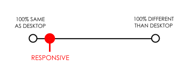
To simplify things and provide a visual baseline, I’ve created the following spectrum:
This spectrum helps us understand the method we’re using to deliver website content to users.
Each end of the spectrum represents an extreme. On the far left, we have the exact same site delivered to users on every device. In other words, there is no mobile site developed at all.
On the far right, we have a completely different site being delivered to mobile users with no crossover.
Each of the web development methods we’ll discuss fall within this spectrum.
1. Responsive Web Design
Responsive web design delivers a comparatively similar experience to a desktop experience.
Responsive web design delivers the exact same website across every device, with the ONLY difference being layout.
Responsive design uses “fluid grids” to adjust site content to any possible screen size, allowing for an optimal viewing experience regardless of the device been used. This is particularly useful in a world where new devices with new screen sizes are created every other day.
Whether the site is being viewed on a tablet, smartphone, or desktop, all the elements are the same with responsive web design.
Responsive web design keeps all the elements of your site the same on every device.
Same headlines
Same copywriting
Same CTAs
Same everything
The only difference is that the layout adjusts for easier mobile consumption, typically arranging everything for quick, up-and-down scroll navigation. So instead of users having to scroll from left to right to see an image or repeatedly zoom in and out, the site images and elements automatically resize and rearrange to intuitively fit the screen being used.
Responsive design rearranges the exact same website for optimal viewing on any device.
On the plus side, responsive sites are cheap to build, easy to maintain and work for any screen size. You make one website and it works for every device. They are also great for SEO as there is no content overlap.
On the downside, responsive sites do not offer a fully mobile-optimized experience, as you are still offering essentially the same content to mobile users. When over half of your web traffic is probably coming via mobile device, this can mean you are leaving tons of mobile conversions on the table.
2. Adaptive Web Design (aka Dynamic Serving)
Adaptive web design does not necessarily deliver the exact same content to desktop and mobile users
While responsive web design delivers essentially the same website to all users, adaptive design, also know as “Dynamic serving”, delivers separate content to users based on their device.
For example, an adaptive designer might create three different designs, each with customized HTML & CSS, for desktop, tablet, and smartphone users. If a desktop user, smartphone user and tablet user were to browse the website, they would all see something fundamentally different while being on the same URL.
These separate designs can be 100% different or simply 10% different. The point is that separate HTML & CSS are being “served” to each device, allowing you to deliver a customized experience.
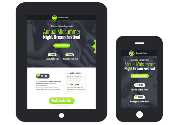
As you can see in the above image, the desktop, tablet, and smartphone displays all have fundamentally different content. Since they all have the same URL, we say this is an adaptive design.
Unlike responsive design, adaptive doesn’t use fluid grids to deliver flexible content across any device. Instead, it manually creates separate layouts for predefined screen sizes and displays the appropriate selection.
If the three categories of devices had standard sizes, this would be great, but as you can see…
Designing for every device is very difficult.
There are more devices out there than you could ever design for, and this can put adaptive designers at a disadvantage. For devices you don’t design for, the experience won’t be optimal.
Here’s a fantastic gif from CSS-Tricks that illustrates the difference between experiencing a responsive vs adaptive design as you change screen sizes. Responsive is on top and adaptive on the bottom.
Responsive design is demonstrated first, adaptive web design second.
Adaptive design delivers a separate experience to predefined devices via the same URL.
On the plus side, adaptive design keeps everyone on the same URL while allowing you to provide a targeted, optimized experience to mobile users.
On the downside, dynamic design is technically complex and can be more expensive, as you are essentially designing a separate site for each device.
3. Designing a Separate, Mobile-Optimized Site
Mobile optimized sites deliver a very different experience than desktop.
While the term “mobile optimized” can mean a variety of things, when it’s time to design your mobile website, creating a mobile optimized site implies creating a separate, distinct website for your mobile users.
Unlike dynamic serving, this won’t take place via the same URL. Instead, it is most frequently accomplished via a subdomain, such as m.rootdomain.com or something similar.
By rerouting mobile users to a separate website, you can completely control their mobile experience. And as we’ve learned from past discussions on mobile CRO, if you aren’t creating a mobile-centric experience, you won’t reach mobile viewers effectively.
Mobile users, and particularly smartphone users, behave very differently than desktop users.
Having a separate, mobile-optimized site can allow you to better reach a mobile audience.
Mobile optimized design delivers a separate experience to mobile users via a different URL.
As an additional upside, Google recognizes mobile-specific subdomains as being mobile-friendly and factors that favorably into its search results. In other words, it can have a positive impact on your SEO results.
You’ll want to be careful. If you forget to add the appropriate “canonical” tags, you can actually hurt your SEO results, as the search engines will penalize the mobile site as duplicate content. Many designers don’t think about marketing or SEO in their designs (this is exactly why I began offering design to my copywriting clients), so be sure to inquire about this while vetting a potential designer.
Conclusion
I hope this has helped you gain a better understanding of web design and better equipped you to work with designers in the future.
Before we finish, it’s important to understand that many people use the terms we’ve mentioned here incorrectly.
Google treats “adaptive” and “responsive” interchangeably in its search results and many non-designers or sudo-designers with a cursory understanding will often use “adaptive” when they are discussing a responsive design. I myself mixed these terms up regularly until I got fed up with the poor-converting designs my copywriting clients were dealing with, and invested in creating a design solution for them.
“Mobile optimized” is not a term limited to the design world, so be sure to clarify that you are meaning a separate, URL-distinct mobile website when working with a designer.
Commercial or professional procedures that are accepted or prescribed as being the most effective.
It’s something that works much of the time in similar situations.
What is a conversion insight?
Conversion optimization is finding the unique things on your unique site that drive your unique visitors to do more of what you want them to do.
A conversion insight is something that works for one audience in one situation.
Sometimes a best practice will work in a unique situation. But the two efforts are fundamentally different. Many best practices are informed by a long history of conversion insight.
We don’t have that luxury in mobile. It hasn’t been around long enough for us to identify best practices that are informed by conversion insights. There’s no such thing as a mobile best practice. There. We said it [again].
Why do we keep asking about mobile best practices?
There are this many ways to potentially increase the UXO of a mobile website.
How many ways can you increase conversions for your website? This many.
For someone setting up a mobile website, these look like the eyes of a monster.
The “Infinite Solutions Monster” scares us into looking for best practices.
It’s terrifying.
So naturally we reach for some guidance when designing our mobile sites. We reach for a swig of best practices. We go looking for a unicorn.
We want to find the Best Practices Unicorns as a shortcut to optimizing.
Don’t Be That Marketer
We have tested several approaches that have improved the performance of mobile websites. They have put more money into the pockets of our customers. They have increased call volumes to incredible levels. They have generated new life-giving subscribers.
Some of them might work for you. You should find out for yourself.
Conversion Sciences Reveals Its Secrets
You have three opportunities around the world to hear what we’ve learned about the mobile web this fall.
Conversion Scientist Joel Harvey can be seen in London, UK on October 28th at Hero Conference.
On November 5th Joel will be back stateside in Chicago, IL, USA for Content Jam.
On November 24th, company founder Brian Massey will present at GPeC in Bucharest, Romania.
Our opinions are definitely controversial, but that’s fine with us. When you hear what we have to say, we know you’re going to change the way you treat your mobile visitors. We have the data to back it up.
You’ll walk away knowing:
Joel aged a bit while waiting for a mobile site to load
Why responsive web design is losing you customers
How Apple and Android users behave differently
Why you might need an alternative conversion goal on mobile
Where to start A/B testing your mobile site
How to make sure your customers don’t look like this guy by the time your site loads…
“We’ve got mCommerce covered. Sincerely, the rest of the world.”
What if I told you that there was an under-served segment of your marketplace, a segment that is growing three times faster than your current visitors? What if I told you this segment was using mobile apps at an alarming rate?
Would you be interested in knowing more about this segment? Worldwide venture capital firms are investing in this segment, more than any other right now.
Yes, it’s the mobile commerce segment, that portion of your visitors that will purchase from their phones, install apps for your marketplace and fuel the growth of all of our industries. Mobile commerce is exploding in the US, but this growth pales in comparison to other countries.
If you think mCommerce is important outside the US because they have more mobile users to begin with, you may be missing the point. All countries have a lot of mobile users, and that portion willing to buy on their phone or tablet is growing. While the rest of the world would like to see us resting on our desktop laurels, you can’t afford to oblige them, according to this infographic.
The global trend in online shopping favors mCommerce over desktop eCommerce. That’s not to say that eCommerce isn’t also growing – both mobile and desktop online shopping are steadily increasing, but mobile growth eclipses desktop with a projected growth that’s 300% greater than traditional eCommerce over the next few years.
mCommerce is expected to grow at 300% the rate of traditional eCommerce
mCommerce is such an international trend that you might be surprised to see that several of the top mobile retailers of 2014 are companies that would be unfamiliar to the average American shopper. (Though the number one retailer is hardly shocking.)
The top 10 mobile retailers of 2014
It’s true that this mobile trend is all over the world – some Scandinavian countries will see growth of over 50% – but there’s one part of the world that is seeing increases at an especially aggressive rate.
China has the highest number of mobile shoppers
With China’s ever increasing role in our international economy, its number of mobile shoppers compared to other countries is to be expected, and the rest of Asia isn’t far behind.
Asian users are dominating the mobile marketplace
We’ve spent a lot of time talking about why we likeadaptive web design (AWD) better than responsive web design (RWD) for mobile websites, and one trend we are seeing is the tendency for successful mobile websites to look and behave like apps, so the popularity of apps over browser could signal a change in approach for some companies.
The Threat: Mobilegeddon, Google’s search algorithm change that would penalize mobile websites that weren’t “mobile friendly”.
There is little as scary to an online business as having your source of traffic threatened. However, Google put some resources in place and is making recommendations to businesses to help them become mobile-friendly.
The recommendations will not help you become mobile-friendly. They will make you Google-friendly. Google calls something “mobile-friendly” if a website fits into a small screen, if the fonts are large and if the content remains largely in tact. We call a site “mobile-friendly” if it entices more visitors to buy, call or fill out a form.
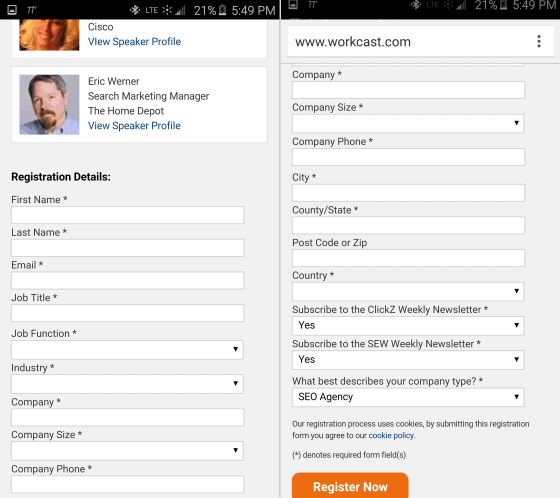
Here’s a simple example. I was invited to attend a webinar. It had a great slate of speakers and a topic I was keenly interested in. I got the email on my cell phone, as many of us do. The registration page was responsive. It morphed to fit my mobile screen, resizing images, stacking sections… and then this.
This form required two screen shots to capture all of the sixteen fields.
It’s hard to fill out forms on a mobile device. Despite my excitement about the topic, “Advanced Conversion Strategies for Mobile Search,” I didn’t register. I intended to go back and register from my laptop, but had forgotten all about it within 30 seconds.
The punchline is that a webinar discussing great mobile experiences essentially asks mobile visitors to go away, and a LOT of desktop visitors, too. Workcast.com, the host of this monstrous form, thinks their job is to host webinars. Those of us that do webinars know that their job is to generate leads.
I would have offered an autofill via linked into get the form started. I would have removed the address fields on mobile. I would have removed Industry, Company Size and a description of the company. Make the sales people do a little research for crying out loud.
The point is this: Mobile visitors expect a mobile experience. Responsive design delivers a smaller desktop experience. No thanks, Google.
The increasing popularity of a variety of devices to access the internet—ranging from small handheld phones to tablets and laptops—have led web designers and marketers to work on approaches to make the devices more compatible with Internet usage. They are studying ease of scrolling and navigation, visual appeal, support of different screen sizes, richer experiences and faster page loads.
Adaptive Web Design (AWD) and Responsive Web Design (RWD) are different methods that arrive at the same solution. RWD is the hotter and more popular approach now, but before you decide to jump on the bandwagon, take a look at AWD. It may prove to be a better and more far-sighted approach for mobile web design.
At the heart of it, both AWD and RWD are two different ways of approaching the same goal: to create effective and impactful, functional and customized web design which can be easily visualized on any device. But as you read on, you will find that it may be the more complex and resource intensive AWD which may be a better option for designers in the long run.
The Difference Between RWD and AWD
Responsive Web Design
RWD is the popular design choice right now. It is a dynamic rendering of a web page based on fluid changes in layout according to the screen size and resolution. Thus, the design is responds to the screen size dynamically and instantly.
The images are flexible in size and the use of fluid grids is necessary. There are changes in the width of the elements in response to changing window sizes. This kind of web design makes use of queries to detect devices, so it is useful for advanced phones with certain operating systems versions. Ethan Marcotte introduced this strategy. The basis behind it was the permanent state of impermanence in the web design world —the web design has to keep evolving and shaping itself in response to changes. Thus, the advantage of this design is this: the same design can be used for viewing the website on different devices. This change in design is made possible by changes in the width and number of columns for storing text (container fields) in the code for the web page. RWD is a real-time, dynamic, changing web design.
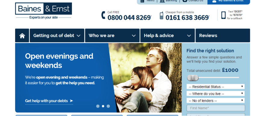
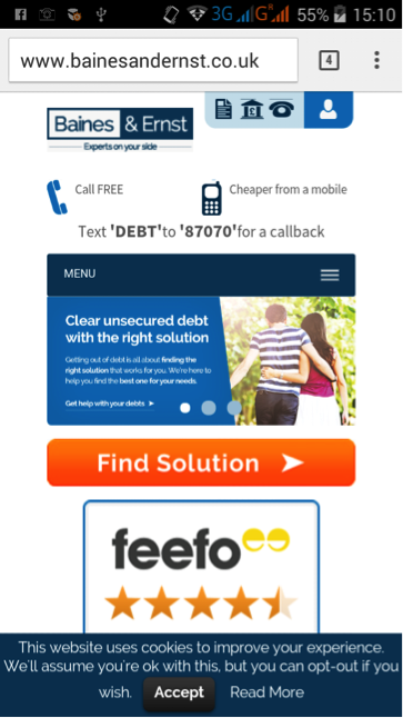
An example of RWD is that used by Barnes and Ernst, debt management experts in the UK. As you can see [need figure reference, or move images closer], the content is configured keeping in mind the interests of desktop and mobile users. Because of the increase in mobile users who were accessing their website through their smart phones, the company introduced mobile-specific search advertising and subsequently mobile-optimized websites.
Their aim was to deliver the required information to customers in a speedy way, without pushing down too much information. Based on their long-term goals and requirements, they went with the RWD one-size-fits-all approach: a single platform for all devices. Through this approach, they were able to optimize their site experience without the hassle of creating multiple websites. The site makes use of the smart-phone technology (touch/swipe), JavaScript, fluid queries, and flexible queries.
Baines and Ernst responsive web design on a desktop
Baines and Ernst responsive web design on mobile
Adaptive Web Design
AWD requires several different formats of the website — often different templates — to be made and kept ready for different devices, unlike RWD. The version of the website displayed to the viewer is based on several factors such as the location, kind of device and OS. AWD requires more up-front effort and development, but it offers a customized experience for mobile audiences. AWD is the better option for marketers who are into content-rich marketing and who need to deliver content of all kinds to their audience.
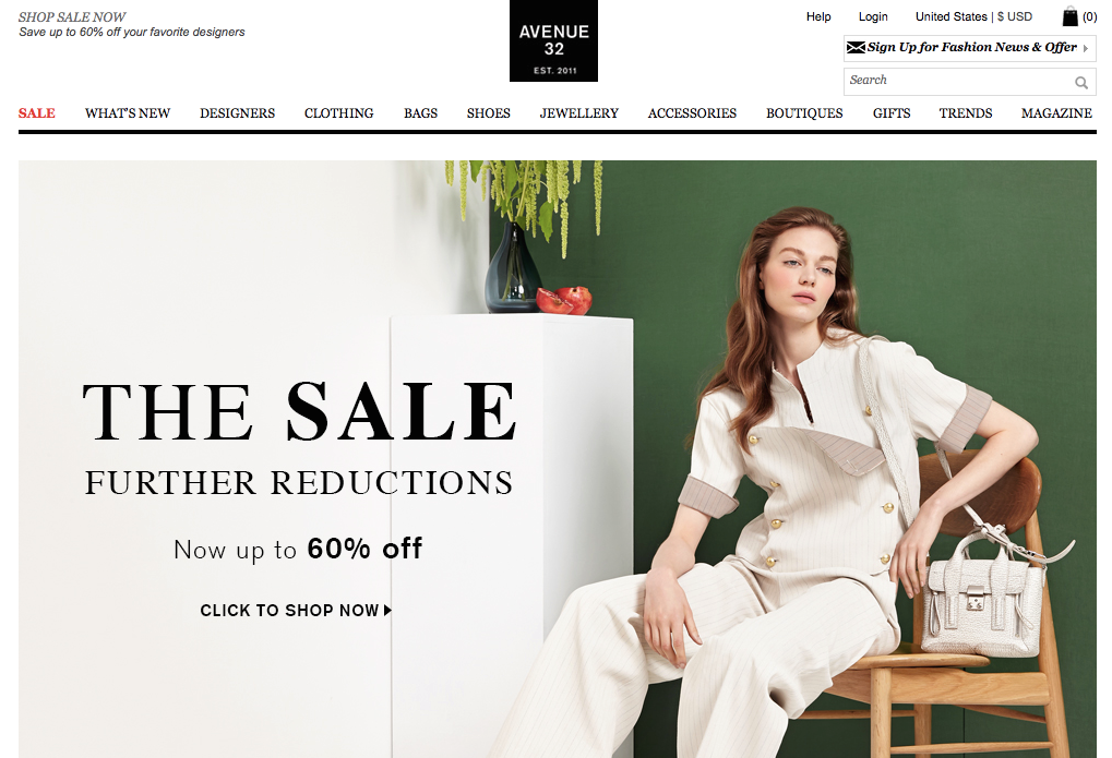
Avenue 32’s adaptive web design on a desktop
Avenue 32, a top-notch luxury retail brand, has made use of AWD to design its websites suitable for smart phone and tablet. The use of AWD has helped the brand create a visually and functionally engaging and rich experience, which matches its desktop website, which is content-rich and engaging.
This creates an equally rich mobile experience, in which customers experience content from wherever they may be. When you compare the desktop and mobile versions of the website, you can see that the content is more or less the same, but has been arranged in a way best seen on a desktop or mobile screen.
Avenue 32’s adaptive web design on mobile
The URLs for both websites can be the same (dynamic serving) or through use of different URLs (mobile specific and desktop specific, for instance), so the website visitors see is determined by the kind of device and operating system being used. Use of predesigned and customized landing pages may save time and glitches, which may otherwise happen in a dynamic RWD system.
Why is AWD the Design Choice with the Advantage?
Use of AWD makes accessing Internet pages more efficient. Pages load much more quickly with AWD, which improves the user experience and has been proven to increase conversion rates. This is because only those files which are required are transferred from server to mobile device. Optimum media files can be chosen that are suitable for the device and browser. This is how AWD delivers specific user experiences. Unlike AWD, RWD is more limited in generating optimized user experiences. Adaptive web design can be used for older mobile phones unlike responsive web design which needs the latest technology and recent phones plus use of CSS queries. The reason AWD doesn’t need the latest technology is because it makes use of client or server side code to detect the devices. This is good for the lower-end phones and older generation mobile phones which are not CSS optimized and thus do not have the ability to understand media queries and translate them.
Why is it important for a website to be accessible on many generations of mobile technology? Even if a company is located in an affluent part of the world where there is a rapid turnover in technology, huge parts of the global population – in Africa and Asia, for instance – do not have the financial means to have the newest smart phone. You would be putting your company at risk of missing out on new markets that may want what you’re selling but can’t access it easily.
You can easily deliver content to low-end mobile phone users in these countries who have much lesser bandwidth, poorer batteries and possess less power by using AWD. Adaptive means your marketing efforts lead to maximum inclusiveness.
Another advantage of AWD over RWD is that responsive web design may not be able to integrate all advertisements into every possible screen resolution as it dynamically adjusts itself. This problem is less of an issue with AWD since advertisements of all kinds can be tailored into it.
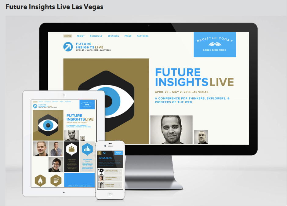
One example of the power of AWD is in the way Future Insights website generates pages. As you can see, the best customized webpage shows up for each device.
Future Insights’ set of webpages
All you need to do is to make one master version of the website, which can be tailored to make many minor versions of it. Thus, AWD offers many advantages without the drawbacks of RWD. AWD’s emphasis is on the overall functionality of the device rather than just the design. Sites using AWD can be more user-focused for mobile devices.
If you dream of achieving wider mobile Internet reach, don’t jump on the responsive bandwagon with out taking a hard look at adaptive mobile design.
About the Author
Jacey Johnson has been an administrator in higher education for over 10 years and currently works with http://aussieessays.com/essay-writers/ as a academic counselor guiding students. Most of her experiences have been in the online teaching, curriculum development and academic counseling.
Elliott asked the question, “Isn’t mobile-friendly like being pregnant?” during my SEMRush webinarMobile Test Results: What Mobile Web 2.0 Will Look Like. His point was that Google, with its Mobilegeddon update, will grade you as mobile friends or not.
I would turn that question around. “Is your mobile website Google-friendly and is it visitor-friendly?” The two are different. Basically, Elliott, your mobile website needs to be pregnant with twins.
The primary metric for a Google-friendly site is rank in search and ad placement. The primary metric for a visitor-friendly mobile site is how much money your business is making from mobile visitors.
Following are some additional questions that we didn’t have time to answer during the webinar. You can watch the webinar in its entirety right here on this page.
More Questions
You keep mentioning responsive design. I’m looking at adaptive: how will adaptive fair in the Mobile Web 2.0 world?
Shelle, we believe that it doesn’t matter as long as you can customize the mobile experience – and specifically the small-screen experience. For example, this site is built on a responsive design. It is easy for us, however, to add and remove content based on the screen size: desktop, phone or tablet.
What is the difference between “responsive” design and “adaptive” design?
We call a website “adaptive” if it changes based on the form-factor of the device viewing it. Websites that offer separate “m.domain.com” sites are adaptive. While the domain doesn’t have to change, the template that the site displays does. The desktop website and mobile website are separate sites, though they read from the same content database.
We call a website “responsive” when the mobile site is a version of the desktop site that morphs to fit smaller screens. Typically, page elements are resized, removed and restacked using CSS and JavaScript.
The litmus test for us is this: Was the mobile site designed by humans to optimize the mobile experience, or is the template making the decisions about how to present page elements? The former is adaptive, the latter is responsive.
With some work, a responsive site can be customized to be as effective as a dedicated adaptive mobile site. It’s not about the technology. It’s about the fundamental differences between the mobile offering and desktop offering.
In the following graphic, we see a desktop site and a mobile site. Forms work well on the desktop, but not as well on mobile. Here click-to-call buttons have replaced the form for the mobile site.
Mobile users will more often be looking for directional information. Maps should be integrated into mobile sites where appropriate.
Mobile sites need mobile-specific calls to action and mobile-specific content.
Is Google treating [adaptive] mobile websites the same as responsive ones?
Guy’s question is difficult to answer definitively, but it appears that both approaches meet its requirement. Google’s Webmaster’s Mobile Guide actually recommends responsive designs.
One of the benefits of RWD is that you’ll only need to maintain one version of your site instead of two (i.e., you won’t need to maintain the desktop site at www.example.com and the mobile version at m.example.com
We believe that if you’re serious about mobile business, you’ll put the resources behind maintaining two experiences. It appears that Google is looking at font size, button target size, and similar clues to mobile-friendliness.
Will banner ads survive on mobile?
Jan asks a good question. Only the future will tell. Banner ads, however, have followed us across all media, from print, to billboard, to web pages and now to mobile devices. How effective they will be is yet to be seen. Jan commented, “Can we nuke that stupid ‘Game of War’ pop-up?”
Mobile devices offer many more opportunities to present offers. Notifications, map interfaces and text messages come first to mind. We’ll have to see where banner ads stand against these other forms of advertising.
What about the Google Mobile Site Test? Is that the same?
Wasim, I recommend that we all do some research with Google’s Mobile-Friendly Test. Both of our responsive sites have passed this test. Try some of your competitors adaptive and responsive sites to see how they fair in Google’s eyes.
We’re Still Figuring out What Mobile Web 2.0 Will Look Like
The conclusions we’re coming to are based on tests we’ve done so far. We all have more to learn, and every website will be different. Subscribe to The Conversion Scientist Blog to learn what we’re discovering with our tests.
I love the bubbles, but I doubt they are helping conversion rates. I haven’t seen animations like this since the 1990s. The background image slows load time and confuses the eye. The graduated fill on the buttons makes them all but unreadable.
Don’t laugh at my friends design. Here is a WordPress theme I recently reviewed. Check out the stars.
These stars don’t move the value proposition forward. Maybe it works for NASA.
Then there’s this:
Animation for animations sake is not helpful for scanners. Note the slow loading of the background image.
My friend needed a new theme for his WordPress site.
Fortunately, I had been asked to be a judge in the ThemeForest PageWiz template contest. More specifically, my task was to pick the themes that would make the best landing page templates.
I’ll tell you how I ranked these themes based on my experience, based on tests we’ve conducted here at Conversion Sciences, and based on my work as an online marketer who uses WordPress in my business.
47 Landing Page Templates, One Winner
The typical “Banded Sales Page” delivers the value proposition for a page in separate sections, or bands.
I reviewed 47 different PageWiz landing page templates created by designers. I was tasked with picking one I felt embodied the best practices in conversion-centric landing page design.
The goal of a landing page is to:
1) Keep the promise of an ad, email or link.
2) Get the visitor to take some action, to convert.
Most of the themes I reviewed followed a common pattern, one I call a “banded sales page.”
These are designed to unfold like a sales letter: Big promise at the top, and an unfolding story, or value proposition, as you scroll. Key parts of the story are separated into sections, often with bands of color or images to identify them.
The support for the value proposition is like that found in an old-style sales letter: claims, features and proof. Trust builders, such as testimonials and client logos are also an important part of the this style.
Most themes chose big images for background filler. This is an unfortunate choice, because slow load times mean lower conversion rates. It looks cool, but you know what’s cooler? More sales.
This style of page templates doesn’t provide a significant amount of space for copy, and this may be to their detriment. Instead, they provide bite-sized information to build the value proposition, perfect for scanning the page. These bite-sized sections are most commonly presented in bands of different background colors.
For example, the Landing Page Elements Theme wastes a lot of valuable space for a rather irrelevant image.
Large images take a long time to load and often don’t move the value proposition forward.
Some of the themes used parallax scrolling features, which we have not tested, but which may actually add friction to the experience, reducing conversions.
The Theme Should Serve Your Market
The landing page really needs to serve it’s audience. I found the highest scoring templates to be those that were for specific kinds of businesses: fitness, real estate, conferences, travel.
My pick is the Avira Homes template because of its creative calls to action and excellent mobile experience. It suffers from big images and almost fell out of the running.
Mobile Friendly is a Must
I’ll get this out of the way now. No responsive design made my list of top templates. I know it’s an easy way to get a mobile site, but mobile is different than desktop. Design a separate template for mobile.
Look for a landing page template that supports a separate mobile experience.
The Knights Theme offers a mobile theme separate from their desktop implementation.
Mobile Visitors Want Different Content
I made mobile support an important part of the criteria, because it is a growing traffic source for almost any industry. Most themes relied on responsive designs. Others had dedicated mobile templates. Many themes actually break when displayed on phone-sized screens.
We favor designs with dedicated mobile designs, as responsive designs have myriad problems for landing pages. Responsive designs often don’t make sense as desktop content is stacked in non-intuitive ways. These mobile sites also tend to load slower than their dedicated mobile cousins.
Most desktop themes won’t offer a map on their home page or landing pages. For mobile visitors, where we are is important. Maps are a great addition to your mobile experience.
Mobile-oriented content like maps are often lost in responsive designs.
Mobile visitors also want bigger buttons, click-to-call functionality and mobile-focused calls to action. Notice how the Avira site (my winner) offers click to call as the first-screen call to action in their mobile theme. Their desktop site offers a form and the “Contact Me” button.
Avira’s separate mobile app is designed for a uniquely mobile experience.
The Avira Real Estate Theme was my choice for overall winner.
The Page Should Load Fast
I was happy to see that none of these pages had scrolling hero images, called sliders. These slow load times and can distract readers from the information on the page.
The slow load time of the VPropos theme left us with nothing to watch.
The slow load time of this theme left us with nothing to watch.
The Theme Should Make Good Use of the First Screen
It is important that a landing page communicate that the visitor can take action on the page. It should be done early. There is a segment of your visitors that are looking to take action. They don’t want to read, they want to put things in motion.
The FlatVault theme makes good use of the top of the page using calls to action.
In contrast to the landing page templates with large images, I felt that FlatVaulth did a good job of utilizing the top portion of the page, with not one but two calls to action.
The Copy Should Be Easy to Read
I favor designs with dark text on light backgrounds for readability. Knockout text is hard for eyes over 40 to read. Pages that are mostly dark cause our pupils to widen. This larger aperture makes focusing more difficult. That’s why we squint when we are trying to read small text. It makes our aperture smaller.
Light text on a dark background is more difficult for older eyes that have trouble focusing.
The App Cast Theme may be best for young eyes.
A good designer uses color to guide the eye. The use of the same color makes it harder to locate the information that is important. For example, pricing tables job is to help us choose. In this pricing table, it’s clear that the center offering is more important, but the color choices make it hard to compare across offerings.
The poor color choices make it hard to compare options.
The Landing Elements Vol 2 Theme make poor color choices.
Contrast is your friend, especially when your presenting headlines and calls to action.
The headline and call to action are difficult to read here because of a low contrast between background and text.
The green and red backgrounds offer a low contrast background for the headline and form’s call to action in the Brom theme.
Make Good Use of Images and Video
If a theme didn’t explicitly support video, I didn’t hold it against theme. Several did. Video is all over the map in terms of whether it works or not. It is a powerful medium that can work for you or against you.
Images are powerful ways to move the value proposition of the site forward. Unfortunately, designers often punt, using filler stock images instead of well-thought out pictures. Unfortunately, theme builders really can’t offer one image that communicates well for all of the possible sites their theme may ride on.
The Cube Consulting Theme makes good use of image placement here.
This image is in the right place, but is clearly a stock image. The human eye knows when it sees what we call business porn.
The man in this theme is what we call “business porn.” It is a stock image, not someone who works at the company or is a customer. The placement of this image is smart. It anchors the call to action form visually which partly covers the image.
A better image would have been looking down at the form, or to the value proposition at the left. We tend to linger on faces, especially when they are looking right at us. If we’re looking at a face, we’re not reading the offer text or the calls to action.
Be careful of images that work against you.
The dot-matrix background and gratuitous keyboard image only work to make the text hard to read in this image.
The Expo Theme uses a dot-matrix background that messes with the eyes and makes the text harder to read. Why is there a keyboard in the background?
This background image conflicts with the call to action, confusing the eye.
One problem of our winning theme, Avira, is the poor choice of a background image. This image conflicts with the call to action form.
Shapes
The shape of your images can have impact as well. After viewing over 40 different themes with the banded designs, I found these curved images refreshing.
The shape of your images can draw the eye to important page components.
The Dyxalot Theme curved hero image draws the eye to the center where the key messages are.
Avoid Useless Images
If I have to find a large, high-resloution image that’s relevant to my visitor and figure out how to not screen it back, that’s a theme that is too much work.
This design is typical of the designs that waste precious real estate at the top of the page with nothing relevant.
A lot of space was dedicated to red buildings in this theme. What’s the message?
The Mobis Theme wastes a lot of space with a background picture of buildings. Unecessarily large images push your value proposition and calls to action down on the page, where they are less likely to be seen.
Make Images Clickable
Make images clickable, even if there’s a button below. These are not.
Clicking on the buttons works, but the images are not clickable. Don’t get in your visitors’ way.
The MyCourse Theme should make their images clickable.
Calls to Action
Calls to action should be the most visually prominent items on the page.
The use of arrows and button colors that clash with the other colors on the page signal that the call to action should be addressed by the visitor.
High contrast buttons and arrows signal to the visitor that they should address the call to action.
The My Earth Non-profit Theme enhances the visibility of the call to action.
More Calls to Action
For long banded pages, they should be frequent. You never know when your visitor is seeing the content that pushes them to take action in a long-scrolling landing page.
Our winning theme, Avira, offered a variety of calls to action, from the ability to inquire about specific properties to general inquiries. It invited visitors to call and offered lead generation forms at the top and bottom of the page.
You never know when copy or an image is going to incite a visitor to act. Use frequent calls to action.
Your Forms Should Behave
Form behavior should make completion intuitive and natural. When someone hits tab in your form, they should be taken to the next field, not another part of the page.
The form for the Urane Theme looks like this:
Be careful if you use the tab button here (and most of us do).
When I type my name and click Tab, it jumps to a random part of the page.
Surprise behaviors will kill your conversion rates.
Use a Dripping Pan
If someone reads your page to the bottom, this is a pretty good sign that they are interested. Themes should repeate the call to action at the bottom of the page. We call this a dripping pan because it catches the juices to make gravy.
This form appears at the bottom of the page. It’s a dripping pan.
The dripping pan for the MyPro Affiliate Theme offers a complete form and call to action.
App Store Buttons
If you’re doing a theme for an app download, the call to action is to visit an app store. I recommend that you not redesign these buttons. They should be recognizable as clicks to the Google Play store and iTunes app store.
The most recognizable app store button designs are used across the Web.
The Dyxalot Theme makes this call to action almost invisible.
These download calls to action are almost invisible
The App Cast Mobile Theme offers company logos, not app store logos.
Are these company logos or app store download buttons?
The Volax Theme offers more clues that this is an app download, but this is not a fimiliar image for the app stores.
The addition of download counts adds social proof, but what am I downloading exactly?
Plan for Proof and Trust
Presenting proof is very important, and several themes offered interesting ways to present proof. Claims made in your copy must be supported by a benefit and proof.
The Expo theme presents a place for proof points
The Expo theme presents a place for proof points.
Websites can “borrow” trust from other brands by showing logos, seals and badges. Client logos, partner logos, and even the logos of credit cards all conspire to build trust with visitors. Themes that support this were ranked higher in my judging.
Websites can “borrow” trust from clients, partners and media outlets by displaying their logos
Unfortunately, the MyPro Theme made a poor choice for the background of these trust building logos.
Induce Scrolling
One of the concerns with banded pages like those in this competition is that every scroll can look like the bottom of the page. Visitors may never scroll further to see the persuasive content lower on the page.
Themes that induced scrolling were ranked higher on my list.
The Upfold Theme provides several scrolling queues. The v-shaped header image invites visitors to scroll down.
A simple arrow-shaped image can induce scrolling, making your copy more effective.
Connective lines between sections signal visitors that there is more to see. This keeps people scrolling.
Subtle connective lines signal that there is more information to follow as the visitor scrolls.
Consider Introducing Scarcity
If your offer has a deadline, you can use countdown timers to introduce “scarcity.” This communicates that an offer is about to expire and that the visitor should take action immediately.
Countdown timers are effective, and several themes incorporated them into their pages.
Count down timers can introduce scarcity into the visitor’s decision making process.
The Pagewiz Event Conference Meetup Theme places a countdown timer in the body of the page.
Scarcity is a natural fit for events.
Elect! Political Charity Conference Theme places a countdown timer right below the hero image.
Social Distraction
The most common distraction I see on landing pages is social media icons. Traffic is never free. Even search traffic requires you to optimize and develop content. If you’ve paid for a visitor to come to your site, why send them off to Mark Zuckerberg? He’s god enough traffic.
The social icons are muted, but shouldn’t be at the top of the page competing with the call to action.
The social icons are muted here, but save them for the thank you page.
The social icons on the FlatBox Theme are the most visible (and thus the most important) items above the fold.
The social media icons really pop on this dark background. The message is that these are the most important things on the page.
Only use if social media is a great source of visitors for your site. Instead of a dripping pan at the bottom of the page, FlatBox offers a smorgasbord of distractions.
Most businesses aren’t good at turning likes and follows into business. Save these buttons for the thank you page.
The best use of social media I saw was the RealGym Theme, my runner up. This use of social media turns gym trainers into social sales people
Here the social icons support the business model directly by turning trainers into social salespeople.
Help Me Choose a Plan
If you offer multiple levels of service or product tiers, the job of your pricing matrix is to, Help Me Choose. Your landing page template should highlight one price package to help my visitors choose.
The Mobis Multipurpose Landing Page Theme offers three colors, none of which is more prominent than any other.
Which of these is most popular? Which should I choose? It’s hard to tell.
The Urane Theme offers a highlighted choice.
This design says,”I should pay attention to the middle one, and not just choose the cheapest.”
Pricing tables that make it easy to compare features will improve conversion rates.
The Landing Elements Vol 1 Theme offers banding to help guide the eye across features.
Alternating colors help guide the eye and aid in comparing features.
Pricing tables should not attempt to sell features. You should only select a few criteria–three or four–to be placed in the pricing table. Let the copy do the rest of the selling.
Use helpful names as well.
Choose the descriptive names for your feature levels.
The Flat Vault Theme suggests “Basic”, “Pro” and “Elite” levels. These generic names are translated as “Cheap”, “Expensive” and “Only for big companies”. Be more clear in your naming. Choose names that convey relevant value.
No Template is Going to Have It All
This is a lot to consider when picking a theme. None of the landing page templates I reviewed scored perfect on all counts.
Your business may have special needs. If building trust is important, focus on themes that support trust and proof. If you serve mobile visitors, be sure to use a separate theme for your mobile site.
For almost any site, Readability, Calls to action, and Load Time are going to be critical.
Any theme you produce will need to be optimized for your unique visitors. Contact Conversion Sciences for a free consultation on your site.
Now I can ride my new bike and know that I selected the best template for my carpet-cleaning friend.
Here’s the dripping pan.
21 Quick and Easy CRO Copywriting Hacks
Keep these proven copywriting hacks in mind to make your copy convert.
We may request cookies to be set on your device. We use cookies to let us know when you visit our websites, how you interact with us, to enrich your user experience, and to customize your relationship with our website.
Click on the different category headings to find out more. You can also change some of your preferences. Note that blocking some types of cookies may impact your experience on our websites and the services we are able to offer.
Essential Website Cookies
These cookies are strictly necessary to provide you with services available through our website and to use some of its features.
Because these cookies are strictly necessary to deliver the website, refusing them will have impact how our site functions. You always can block or delete cookies by changing your browser settings and force blocking all cookies on this website. But this will always prompt you to accept/refuse cookies when revisiting our site.
We fully respect if you want to refuse cookies but to avoid asking you again and again kindly allow us to store a cookie for that. You are free to opt out any time or opt in for other cookies to get a better experience. If you refuse cookies we will remove all set cookies in our domain.
We provide you with a list of stored cookies on your computer in our domain so you can check what we stored. Due to security reasons we are not able to show or modify cookies from other domains. You can check these in your browser security settings.
Other external services
We also use different external services like Google Webfonts, Google Maps, and external Video providers. Since these providers may collect personal data like your IP address we allow you to block them here. Please be aware that this might heavily reduce the functionality and appearance of our site. Changes will take effect once you reload the page.
Google Webfont Settings:
Google Map Settings:
Google reCaptcha Settings:
Vimeo and Youtube video embeds:
Privacy Policy
You can read about our cookies and privacy settings in detail on our Privacy Policy Page.


 Jacey Johnson has been an administrator in higher education for over 10 years and currently works with


.")


