We came across this infographic from ecommerce-platforms.com, The History of Commerce from Cattle to Bitcoin, and realized that conversion optimization has been around as long as commerce. Conversion optimization is the art and science of making more money from what you have. It is about getting more currency from the investments you’ve already made. Today we tend to associate optimization with websites and traffic, but making more from what you have goes back as far as 9000 BC.
Take for example, cattle trading.
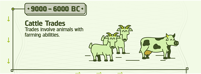
Farmers and shepherds optimized their herds by encouraging procreation. This made more “currency” from the stock they had. To this end, they were known to play romantic music and light candles to encourage an amorous atmosphere. In extreme situations, the shepherds were known to get the animals drunk, hoping for a hookup or two.
Unfortunately, this didn’t work with cowry shells. It was never clear what would make mollusks feel more amorous toward each other. So, optimizers invested in snorkeling gear hoping to find more of the rare shells. While it was centuries before the technology was perfected, this is considered the origin of SCUBA diving.
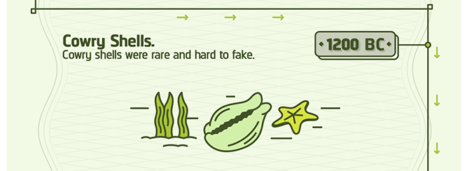
This is also most likely the origin of the phrase “For just a few clams.”
When leather money was invented, conversion optimization consisted of stretching the skins, hoping to get more from each leather bill.
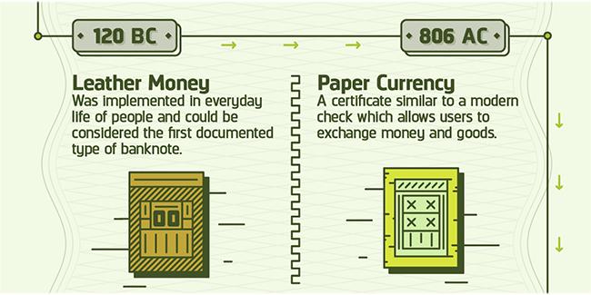
We refer to this kind of optimization when we talk about “Stretching your dollar.”
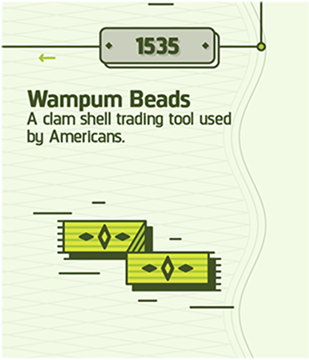
As early as the 1500s, native Americans used VWO (Visual Wampum Optimizer) to get more from their money. This is an early forerunner of the Visual Website Optimizer tool we use today.
With the invention of Travelers Cheques, the slogan, “Don’t leave home without them” entered the American vernacular.
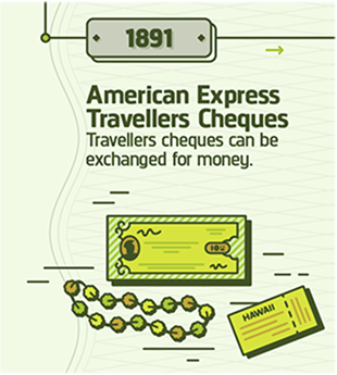
Savvy optimizers knew the way to hang on to more of their money was to not spend it. They adopted a new version of the slogan, “Don’t leave home.” Unfortunately, a whole generation of young adults seems to have adopted this motto, much to the chagrin of their parents.
The banks got into the optimization game with the invention of ATMs. They were able to charge us for the privilege of giving us our own money. Optimization revealed that banks can charge higher ATM fees when the machines were placed in strategic locations.
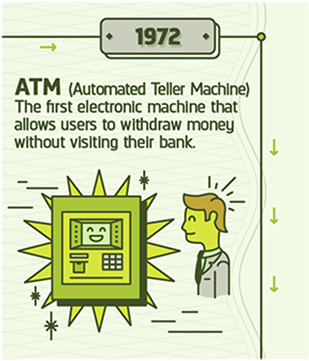
For example, banks learned that they could charge as much as $10 in fees for machines placed near car impoundment lots and in Las Vegas casinos.
With the advent of Bitcoin, optimization has come full circle. In 9000 BC, optimization was all about farming. Bitcoin is created from “farms” of computers doing near impossible calculations.
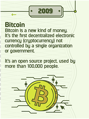
And, based on the unpredictable behavior of Bitcoin entrepreneurs, alcohol would almost certainly have to be involved.
Today, the best way to get the most from your investment in traffic and web properties is to call a Conversion Scientist. During our href=”/contact-conversion-sciences/”>free consultation, we’ll tell you exactly how to optimize your online business and get an “unfair” advantage over your competition.
How would you have optimized the currency from the other eras in the infographic? Tell us in the comments.

History of Commerce: From Cattle to Bitcoin, infographic created by Ecommerce Platforms.
What are online shoppers looking for? No matter what you’re selling, knowing the answer to this question is the first step to figuring out how to give them what they want.
The Conversion Scientists here spend their time testing ecommerce sites, and they know that the recommendations in this infographic can work for your online store. But not always.
For example, you should be careful about offering more shipping options.
Though 50% of the people in a survey said they wanted more shipping options, our tests have shown that too many choices reduces sales.Though 50% of the people in a survey said they wanted more shipping options, our tests have shown that too many choices reduces sales.
Online shopping is constantly growing, and now over two thirds of consumers shop online at least once a month. A whopping 0% never shop online, that is, 0% of people who respond to shopping surveys. Don’t you love statistics?
Numbers like that are pretty solid motivation to figure out exactly what’s going to make a person press the buy button, and an illuminating infographic sharing tips and trends for eStores is a great place to start.
It probably comes as no surprise that offering free shipping helps nudge people into spending money, but it may be surprising just how much it matters. For 80% of online shoppers, free shipping makes them more likely to buy something. More than three fourths of online shoppers will add items to their shopping cart if it means not paying for shipping.
With the US spending billions of dollars in ecommerce, how much money are you losing by not offering free shipping?
Customers are also much more likely to convert if they know they can easily return an item they no longer want.
This is another factoid with a catch. You must state your “shipping both ways” return policy such that the visitors see and understand it. This usually takes some testing of language and placement.
Too many ecommerce sites have an amazing return policy that is invisible to their shoppers.Too many ecommerce sites have an amazing return policy that is invisible to their shoppers.
Of online shoppers, at least half of them will use their smartphone or tablet to make purchases over the course of three months. Having a mobile strategy is crucial to serving those potential customers, especially since many of them won’t do any comparison shopping if they’re using an app to shop.
Will any of these ideas work on your ecommerce site?
They had tried everything, and if you looked at their site, you would find a competent site from an optimization standpoint.
Products were presented in a clear way. Navigation made sense. Product pages handled most desires for information. Still, they struggled with a low conversion rate.
This company was not a customer of ours, but I gave the owner a few ideas and some Google Analytics reports to look at. In one of those reports, he found a culprit. But the news isn’t as good as it sounds.
Having a Team with Time to Investigate
Before I reveal the secret, I’d like to highlight the value of giving your business time to digest what it knows. This means that someone is given the mandate to pull out of the day-to-day rush, and begin answering important questions about your website.
Is something broken on one of the many browsers visitors use to buy? This is the source of many of our “wins.”
When we make a change to the site, does it impact our bottom line? This is the purpose of improving your site, is it not?
Is there some suspect traffic? This turned out to be key to our story.
Even if you have dedicated optimization people, do they have this important time to be rigorously curious?
Rent a Conversion Scientist
It’s expensive to hire. That’s why we’ve configured Conversion Sciences to provide conversion optimization services that are completely turnkey at a fraction of the employee rate.
You can have someone experienced, curious, and very good with data analysis finding undiscovered gold on your website. Our value proposition is simple.
We will find the money to pay for our conversion optimization services, and a whole lot more.
With Conversion Sciences, you get a team for less than the cost of an employee. And our fixed monthly fee covers everything:
- Analytics setup
- Testing
- Design
- Development
- Administration
We’ve been so successful that 97% of our clients have continued with us after our initial engagement.
For Established Businesses
You don’t have to be an enterprise to take advantage of our talents. You only need have an established online business with around five hundred monthly transactions.
To be sure that we can keep your business from leaking dollars, schedule a free call with a Conversion Scientist.
The End of the Story
With some free advice, the owner of this ecommerce business found that his conversion rate had been artificially suppressed by visits from a robot called Halebot, like Halibut. This was very fishy (sorry).
So, while his website changes did improve his conversion rate, Halebot made it look like his conversion rate was going down. Had we been working with him, we would have discovered this early on and would have removed this invalid traffic from the equation.
We didn’t put any more money in his pocket, but, with just a few minutes of thought, we showed him that he was on the right path.
Let us put you on a path to growth with the traffic you are already getting. Schedule the call now.
This infographic from Ecommerce Platforms gives us some insight state of eCommerce in 2015. It’s looking like online sales are going to increase to well over a quarter of a billion dollars (yep, you read that right: billion!), and even though retail sales online are still a relatively small percentage of total sales, brick-and-mortar shops are still feeling the pinch.
What piece of the ecommerce pie will your business get? It depends where you are. Note how much European shopping behaviors vary by region.
The 10% increase in ecommerce revenue is up for grabs. Your ability to capitalize will be based in large part on the conversion rate, or revenue per visit that you get from your site.
A 10% increase in buyers plus a 10% increase in conversion rate could deliver you 21% growth in topline revenue in 2015.A 10% increase in buyers plus a 10% increase in conversion rate could deliver you 21% growth in topline revenue in 2015..
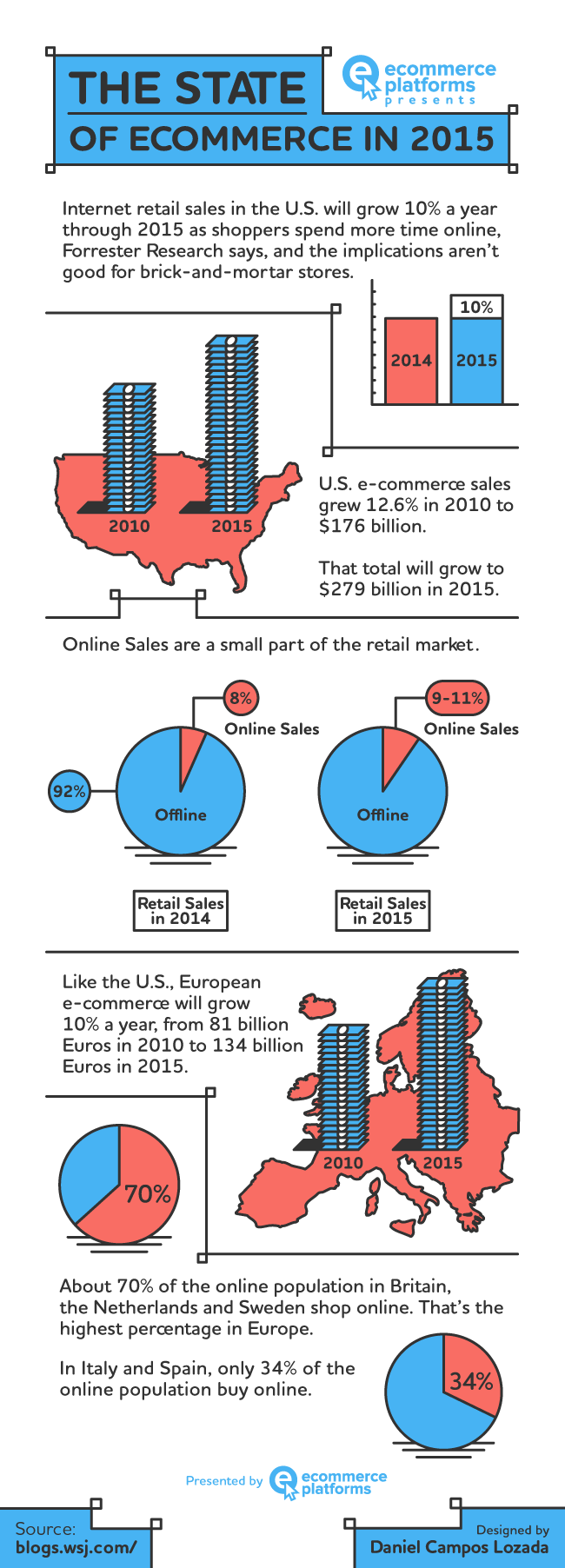
Thanks to ecommerce platforms for creating this.
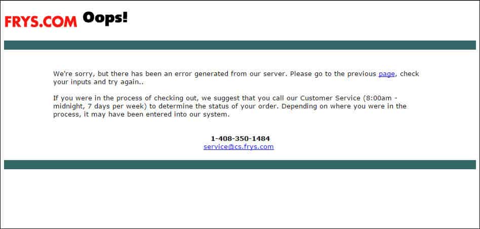
What is the last thing you want your visitors to see when checking out?Ecommerce website decisions are often made without thinking about the impact on sales. In this article, we show you an unfortunate example of this and offer four lessons your ecommerce website can learn from them.
This, maybe?
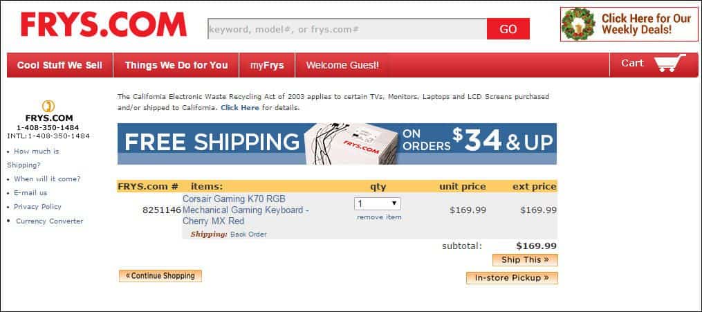
This is the page we found when we clicked a button that is very important to a Fry’s Electronics, named “In-store Pickup”. It is the button visitors use to check out if they want to pick something up at one of Fry’s stores.
This is one of the most important buttons on the site, doubly so near Christmas when shipping gifts becomes an iffy proposition.
Fry’s has gone to in the hopes of getting visitors to click this. It’s a shame it doesn’t work all the time.
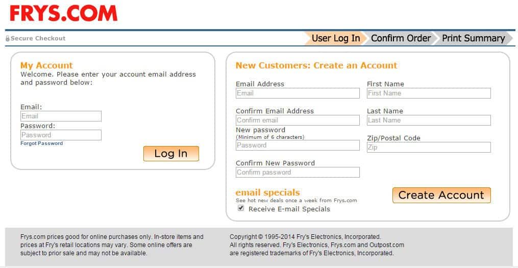
We were able to get past it by starting over. Then, they did this:
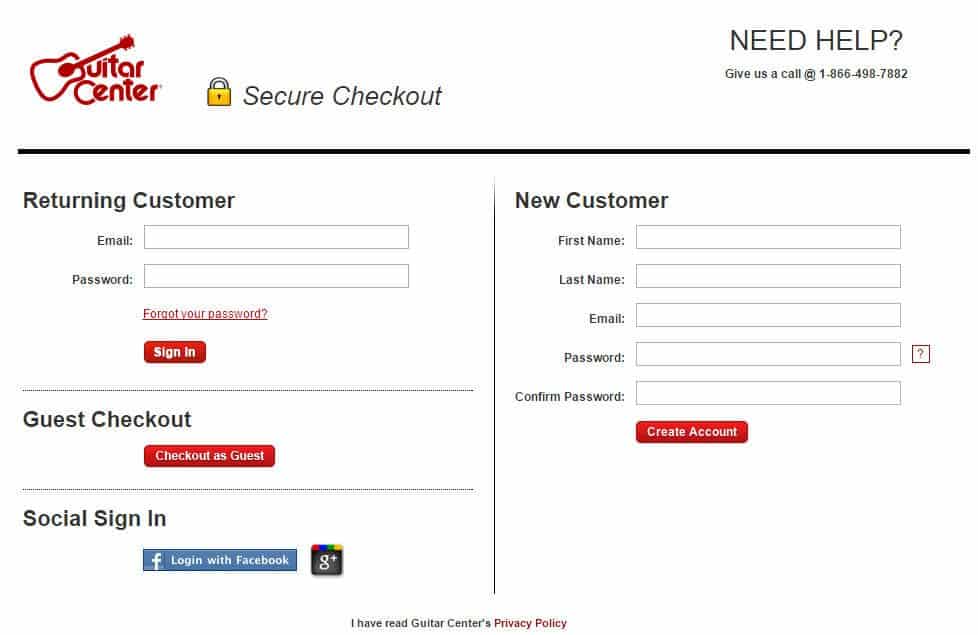
If I’m picking up in the store, why do I have to create an account?
Creating often results in higher abandonment rates. It seems that something as innocuous as picking a password can generate enough friction to scare off ready buyers.
The highest converting sites offer a guest account, and still ask for a name and email address.
For Fry’s, the value of creating an account is gaining the contact information of a person who might become a repeat customer.
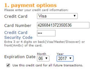
However, the visitor doesn’t see the value of creating an account until the step asking for a credit card. Fry’s will save my credit card for me. Unfortunately, many buyers won’t ever see this.
I let them bully me into this because I was buying a product that was hard to find. Otherwise, I may have chosen another retailer.
Our advice to Fry’s is to call Conversion Sciences and then consider some rules for shopping cart success.
Never, ever, ever have errors in your Shopping Cart.
It’s just crazy. We make hundreds of changes to websites each year, and we don’t break the site (knock on wood).
Fry’s will never see this error. Yes, it’s eleven days before Christmas. Yes, I can tell them exactly how to recreate it over and over and over.
For us, QA takes a room full of devices of every (popular) make and model. Old iPads. New iPhones. Old Windows XP machines. Internet Explorer versions. Android versions. Safari versions.
Part of our job is knowing which ones to test.
I’m running a garden variety version of Windows 8 and a Chrome browser. I shouldn’t get this error.
If you require that your visitors create an account, sell them on why.
Explain that you’ll keep their information on file, that you’ll be able to contact them if something goes wrong with the order, that they will be able to track their order. Hell, offer them a discount for creating an account.
Otherwise, you’re asking too much.
Offer in-store pickup.
I wouldn’t have gone with Fry’s if my son’s keyboard was available elsewhere, but now that I know I can pick products up, I’m checking Fry’s first.
If you have a retail presence, invest in the store pickup model. Sears does a great job with the in-store pickup service.
Tell me the shipping cost before I checkout.
Many buyers will add something to the cart and enter checkout just to find out the cost of shipping. In Fry’s case, this behavior cause the error.
I went to check-out and to see if it could be shipped before Christmas. When I saw that they wanted me to create an account, I went back and decided to pick it up. When I clicked the in-store pickup button, KABOOM! I got an error.
So, not only is their site broken, but the requirement to create an account drives visitors to the broken path. More people seeing this error because they have to create an account before seeing the shipping costs. This means more will go back and click the deadly “in-store pickup” button. Worse, many will just say, “No thanks.”
This is why free shipping and flat-rate shipping is so powerful. It removes this variable from the visitor’s equation. It’s done; taken care of; not an issue; put to bed; signed off on.
That’s what we want for our visitors.
The most determined visitors will get through just about any poorly designed checkout process. The rest? It’s a coin toss, one that ecommerce sites will lose more often they want to.
High shopping cart abandonment rates are frustrating. So, we rounded up 10 eCommerce checkout usability techniques to charm your visitors into shopping on your site again and again!
There are many good reasons for shopping online rather than in person. But, even for those who regularly navigate the pitfalls of the Internet rather than the crowds at the malls, there are some frustrations that send customers screaming into another room, vowing to never again push the “Proceed to Checkout” button.
Well, maybe not really, but there are frustrations for online buyers that are better avoided if your intent is to maintain a healthy conversion rate. Statistics show that online shopping carts are often abandoned. Frequently cited complaints from regular shoppers include the following:
- Unexpected add-on charges during checkout
- High shipping charges
- Complicated checkout procedures
- Inefficient or time-consuming processing
- Excessive security checks or, conversely, concerns about security
- Unacceptable delivery options
If you suspect that your conversion rate should be higher, but you are unsure how to boost your sales figures, there are some relatively simple strategies you can try.
A usability study of the top 100 e-commerce sites produced the following statistics: There were an average of 5.08 steps required for checking out, and 24% of the sites required previous account registration.
Logical and not surprising, right? Other findings, however, were a bit surprising. Two-fifths of the sites asked for validation of addresses, half requested the same information twice or more, and even the top 100 sites violate eCommerce checkout usability techniques and guidelines about one-third of the time.
So, what’s a customer to do? Mutter a few angry words and flee the site seem to be common reactions.
“Keep It Simple” tops all eCommerce Checkout Usability Techniques
The KISS principle was a catchword for all sorts of business advice back in pre-Internet days, but it applies very well to online checkout. Your customers are busy people, and they want to run into your virtual store and be on to other pursuits in a minimum amount of time. It’s your merchant responsibility to help them do that. Your return? Their money and their eternal gratitude. And, likely, return visits!
Consider the following improvements to your site and your checkout procedures if your conversion rate is slipping. Monitor the results, and see what works for you. Think like your busy customers, and seek to make checkout as simple, as user-friendly, and as efficient as it should be.
The Effect of Language
A key skill most face-to-face salespeople have to master is “asking for the sale.” The way you direct your customers through your checkout process can make a difference.
Make it clear: Rather than a “Submit” or a “Next” button, consider a “Payment Options” icon or a “Pay Now” button. Having clear calls to action gives the user no reason to think and also gives them clear instruction on what to do next and also what to expect.
Consider a Single-Page Checkout for your eCommerce Site
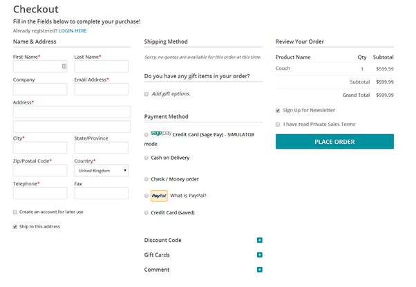
A single page checkout may seem more complicated than breaking it down into several steps and pages. However, this simple move into a single page checkout may improve purchases greatly. UX Magazine reported that a French e-commerce site changed from a multi-page checkout to a single page checkout and conversions increased by 67%!
Editor’s Note: We find that your audience may have a different preference when it comes to single-step checkout. Try both on your visitors before committing to one or the other.
Provide Several Payment Options
The kinds of payment available will depend on the price of your product line and your buyer profile. But offering choices is good and is likely to increase your customer base. So consider them carefully. Having options for credit cards and services similar to PayPal, for example offer the user more diverse payment options.

The key here is to let your visitors pay in the way they trust most= by offering payment choices. eCommerce checkout usability techniques.
Make it Easy for First-time Buyers and for One-time Buyers
While requiring an account in order to purchase makes sense from your side of the fence, it can be an unnecessary bother for the customer who simply wants to order an item and move on. If you require a lengthy account set-up, you may lose a quick sale, whereas from a quick sale there is a good possibility that you might gain a repeat customer.
After issuing the sales confirmation, ask if the customer would like to open an account, you will be surprised how often the answer is yes at that point. After all, they are already invested into your company if they feel that the level of service that they have received is good and timely, this increases dramatically.
Keep buyers on your site, and be consistent with your branding
If you direct customers away from your site in order to register check out or complete the payment procedure, you may lose them. Just don’t do it!
Third-party shopping carts can make a visitor feel like they’re getting scammed. They often suffer from limited customizability as well.
Only Request Essential Information
Don’t raise suspicions by asking for anything that is unrelated to this specific sale. You can collect background information at another time, in another place — or not. But, the business at hand is completing a transaction, and anything that distracts from that goal has no place on the checkout page.
Instill Trust
Gain your customer’s confidence by having an SSL Certificate; reassure your buyers that you do not share any personal information, and comply with the standards of the PCI Security Standards Council. Display your security badges proudly on your site.
Improve Site speed
Make sure your site is up to date, that the loading speed is fast and that operation is efficient. A savvy online buyer with money to spend will not tolerate wait time.
Even boutique sellers should have state-of-the-art Internet connectivity and be lightning-fast (as much as possible) around the world. It is a shrinking globe after all, and e-commerce is global.
The checkout page should be as attractive and as well-designed as the rest of your website.
Ask for Needed Information only Once
If your site requires a second set of address details for ‘Billing Address’ on your checkout form for example, auto-fill the form to save the customer time and effort.
You will gain a loyal fan base by making the procedure so unexpectedly efficient.
Try Free Shipping
This seems to be the best catalyst for increasing sales. It is, from all reports, more of an incentive to a buyer than special offers, price reductions or “bundling” offers. If you can’t offer free shipping to everyone all the time, try it on a limited basis. And always be upfront about your shipping charges: Don’t spring those charges only on the checkout page.
Finally, take a lesson from the old-timers: Ask for the sale. Issue a clear call to action on your website in the product descriptions or on an appropriate page. Take a lesson from sites like Amazon. Be unambiguous with buttons such as “Add to Basket,” “Continue Shopping,” or “Checkout Now.” For the success of your business, learn how to simplify your checkouts.
Author Bio: Owen Sondergaard is an avid blogger and data enthusiast. Owen writes for CAMO Software who provides multivariate analysis software solutions.
There’s an old (and probably sexist) saying that I often apply to many online marketing decisions.
If you’ve got it, flaunt it. If you don’t, flaunt it more.
The online store Magic Of Fire has “it.”
-
- A great product or service.
- A bona fide value proposition.
- Top people working behind the scenes.
- Customers who will tell your story.
- A great guarantee, warranty or return policy.
We have a scientific name for guarantees, warranties and generous return policies: Risk Reversal.
Magic of Fire offered an amazing guarantee. It goes something like this:
“Shipping is free. If you trust us enough to buy from us, we promise that, if you have any issues with your product or our service, we’ll pay to ship your item back at our expense and refund your purchase price.”
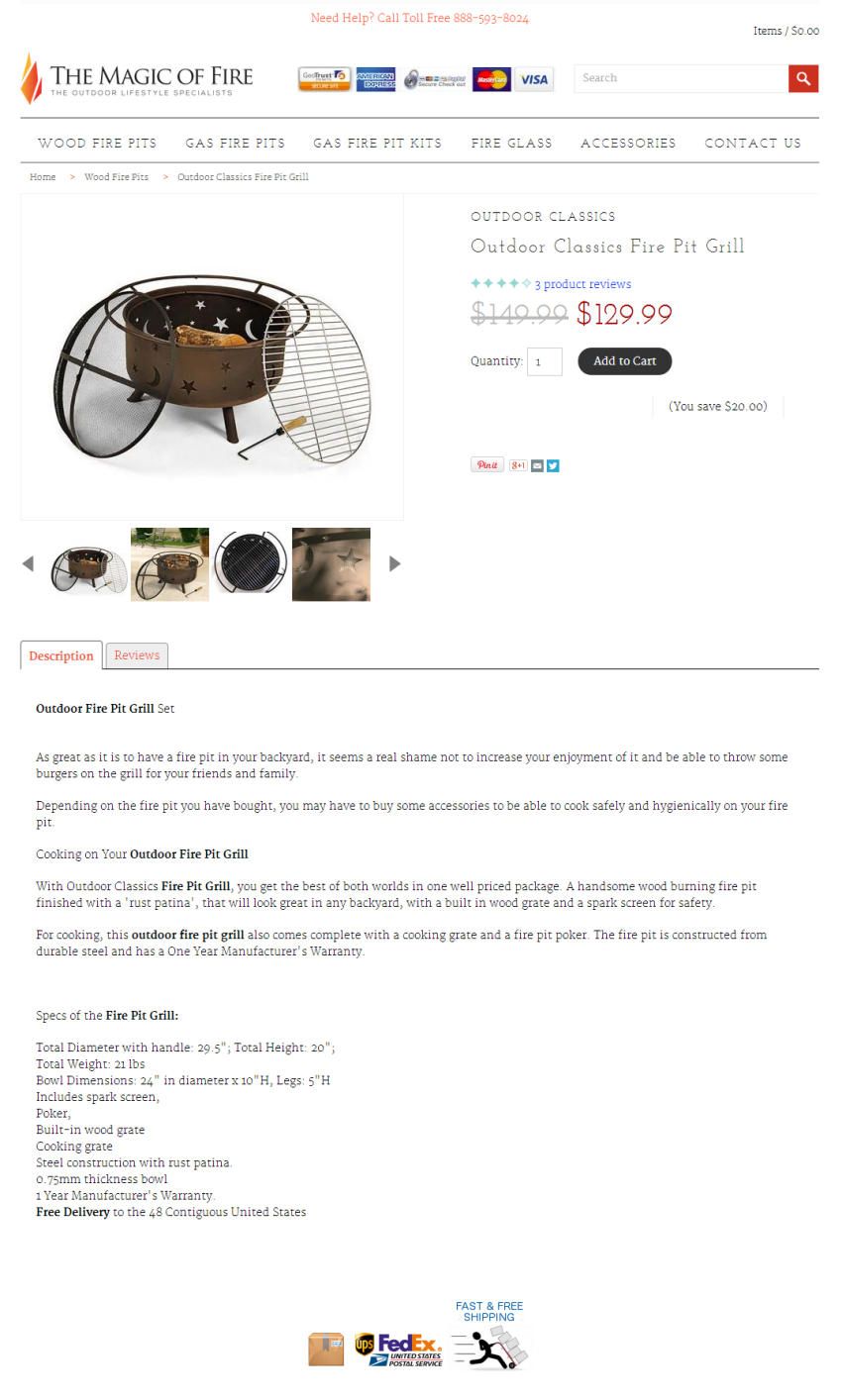
Now, can you find this promise on their product page?
I put it through our Scanning Electron Microscope and eventually found a “Free Shipping” logo near the bottom of the page. I eventually found a link to their return policy, with the text “100% Satisfaction.”
Cliche is not flaunting. Avoid language like “Satisfaction Guaranteed” and “No Risk” and “No obligation.” These no longer mean anything.
If you’ve got it flaunt it.
Risk Reversal Means Never Having to Say Goodbye
When you purchase from a glass and cement store (nothing is brick and mortar anymore), you know that you have an easy out if you don’t like what you bought. You’ll march right in there, slam it down on the customer service desk and demand your money.
Not so much online.
This makes buyers delay hitting that checkout button. They procrastinate, surf other parts of your site and wait for circumstance to save them from making the final decision.
This is especially true if you’ve done a poor job building trust and credibility with your site. The fear is that they will get a lump of coal deposited on their doorstep when they expected a snuggly with a heart-shaped pattern. And they will have no store to storm into.
It sounds “risky.”
Relational buyers will fear getting stuck with the wrong product.
Transactional buyers fear that shipping fees will ruin their great deal, especially if they want to return it (and they will return anything they don’t like).
“Risk reversal” turns “risky” into “safe.”
I recommended that Magic of Fire bring their fantastic return policy right up next to the Add to Cart button on their all-important product pages. I also recommended that they make their free shipping available all over the site, especially in the checkout process.
These two changes alone should deliver a significant boost in conversion rates and revenue per visit.
Does Risk Reversal Really Work?
Magic of Fire’s Mark Oakley called me for a free consultation. After meeting Mark over Skype and hearing his shipping and return policies, I bought a beautiful “star and moon” fire pit for my house.
Zappos has the most famous risk reversal story in the online world. Their 365 day return policy with shipping both ways is one reason their sales reached $1 billion in ten years. That’s amazing growth for a commodity apparel store.
Are you flaunting it?
This is just one mistake that businesses make when selling online.
Businesses who have great products or services with amazing value propositions and great reputations continue to struggle online.
We’re the people who change that.
Jump on a call with us at (888) 961-6604. It’s free, and we’ll show you how much money you could be making with our 120-day Conversion Catalyst™ program.
Update
Mark has apparently taken my advice to heart, placing his free shipping offer all over the site and adding risk reversal near his “Add to Cart” button.
The feature free shipping in a visible place on the product pages as well.
Want to find out how this turns out? Subscribe to The Conversion Scientist.
Let me put a finer point on the concept of “flaunting.” This is flaunting:
This 20 second design may not match your brand, but you should strive to find something that pops for something as important as your risk reversal.
I’ll give a free signed book to anyone who can tell me in the comments where I heard “If you’ve got it flaunt it. If you don’t flaunt it more.”
SwellNoMore is one business that changed its cart for technical reasons, and ended up changing their visitors behavior in the process.
How many steps should your checkout process have? There are conflicting theories.
Some believe that every click, every step offers visitors another chance to abandon the process. They believe that the checkout process should have as few steps as possible.
Others believe that the long forms found on single-step checkouts intimidate visitors, driving them to abandon the process.
Unfortunately, most businesses let their shopping cart software decide for them.
Abandonment rate measures percentage of visitors that begin the checkout process, but never make it through to complete the purchase. A high abandonment rate is very undesirable.
The Battle for Higher Conversion Rates
SwellNoMore.com offers a natural supplement designed to reduce swelling in the face, abdomen and feet. It’s about reducing water retention. The folks behind Swell No More contacted us because they needed to increase visitor retention, however.
They had done what many of you have done to increase sales on their site.
They had hired designers to come in and revamp their landing page. Twice. In both cases, the redesigned pages decreased the conversion rate.
Here you can see the original, current control and the redesigned page that cut conversion rate to about 1/3. Click the images to enlarge them.
  |
|
| The redesigned landing page on the right did not generate as many sales as the original on the right. | |
They did the smart thing and went back to the original.
They tried an editorial approach to educate their visitors. This reaches a more methodical audience, but doesn’t perform well.
While they were waging this battle, they got blind-sided by a change that they had to make for technical reasons.
Having a Change of Cart?
See what I did there?
Swell No More has a traditional online store, and their landing page used the same cart as this store.
Until they changed it.
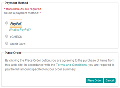
The old cart offers a two-step checkout process that hid fields until needed. For instance the fields to input shipping address were hidden unless the “Shipping information same as billing information” checkbox was unchecked. Likewise, the fields for credit card information were hidden unless the radio button for Credit Card was selected.
 |
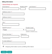 |
| Unnecessary fields are hidden in the original cart (right) making the process seem simpler. Click images to enlarge. | |
This seems to have made the checkout process seem faster and simpler.
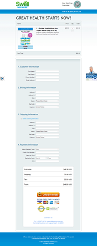
Compare this to the new cart featuring a one-step checkout process and no hidden fields.
This checkout page follows many of the best practices for online checkout:
- The order is shown, including the product images.
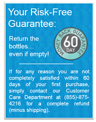
- The “Risk-free Guarantee” at the top and “Doctor Trusted” bug on the right reinforces the purchase.
- Trust symbols are placed near the call-to action button.
- All costs have been addressed, including shipping and taxes.
Nonetheless, this cart had a significantly higher abandonment rate then the multi-step cart, but it is not sufficient to blame the steps alone. Fewer visitors were getting through to complete their purchase.
Things That Can Impact Checkout Abandonment
Every time we change something and collect results, we gain information we can put to use on our site. Keep in mind that we are not finding answers, only hypotheses.
Conversion Sciences will run the controlled split tests needed to turn a hypotheses into a reliable, revenue-building result. Start optimizing.
Here are some hypotheses that might explain the difference.
- The form on the single-step checkout was too intimidating. Hide fields or return to a two-step process. Or do both.
- The more explicit risk reversal message on the old cart was more trustworthy.
- The trust symbols placed above the fold made buyers feel more comfortable.
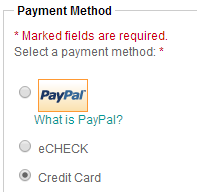
- The PayPal logo, missing from the new checkout page, made buyers feel more comfortable.
- Placing the shipping and tax information above the fold was more clear.
Look Beyond the Technical Aspects of Your Cart
Too many shopping carts have been built by engineers and not by professionals experienced in human interfaces. These carts may meet the technical requirements you need, but may chase away the very customers you serve.
No checkout process fits all.
Look for flexibility in your cart vendor so that you can test and tweak to your cart’s desire. Ask them if they have tested their cart in businesses like yours. Ask them what research they have that shows their abandonment rates are low.
Take control of your abandonment rates to increase sales of your products and services.
Choosing the right price for your product can be stressful and confusing: Pick a low price and you’ll earn too little from your sales, pick a high price and you’ll sell only a few products.
So, what is the best pricing practice for my product?
The following infographic by Blog Growth will show you 7 of the best pricing strategies that will help raise your sales and increase your profit!

Checkout abandonment rates stand at an average of 67.4%.
This eye opening statistic reveals that a significant amount of online businesses are letting valuable sales slip through their fingers due to errors within the checkout stage itself. The modern day consumer is spoiled by choice, they can easily compare prices, they judge a website and brand within seconds and they will make quick judgments on whether to make a purchase or not with any slight site error or cause for doubt leading to a loss of interest, and lost sales.
Online brands must work increasingly harder to encourage their consumers to make a purchase. Brands must understand how their consumers respond to their website design and layout as well as offering top customer service, quality products and competitive prices – not an easy challenge.
Vouchercloud has developed this infographic to help online businesses gain an understanding of what puts consumers off from making a purchase – leading to checkout abandonment. It gives an insight into the mind of the ever demanding online consumer in a bid to help businesses improve their sales.

About the Author:
Emma works for vouchercloud. She works with brands to plan and develop effective coupon marketing campaigns which will boost profits and increase brand exposure. She enjoys all aspects of marketing and the challenges of producing a successful campaign which will be well received by consumers. Her key responsibilities are to develop and launch these campaigns with her team. You can reach vouchercloud on Twitter & Facebook.


