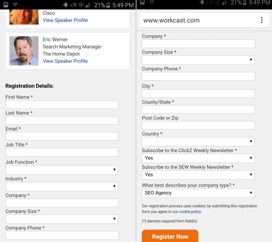
Companies will typically spend $92 to bring customers to their site, but only $1 to convert them. Traffic is only half the solution to a successful online business.
If you’re putting 90% of your effort into driving traffic to your site, and minimal effort into optimizing your site for conversions then you may as well throw off the lab coat right now.
Like any great scientific experiment, you need to include the right elements to create a winning formula. And when it comes to a winning conversion formula, nothing screams “Sale!” more than a good call-to-action (CTA).
On paper the equation looks easy. Create a clear CTA for a product that delivers, and you’ll achieve sales.
So why is it that 47% of websites don’t have a CTA that can be found within 3 seconds or less?
So why is it that
47% of websites don’t have a CTA that can be found within 3 seconds or less? You shouldn’t expect a customer to take action if you haven’t made it abundantly, painfully, overwhelmingly clear what you want them to do. This is one reason many sites are losing the precious visitors they’ve struggle to bring to the site.
Take a look at these smart calls-to-action with tips on how to use them effectively – from the homepage – right through to the sale.
#1. How to get people to sign up for an account: Basecamp
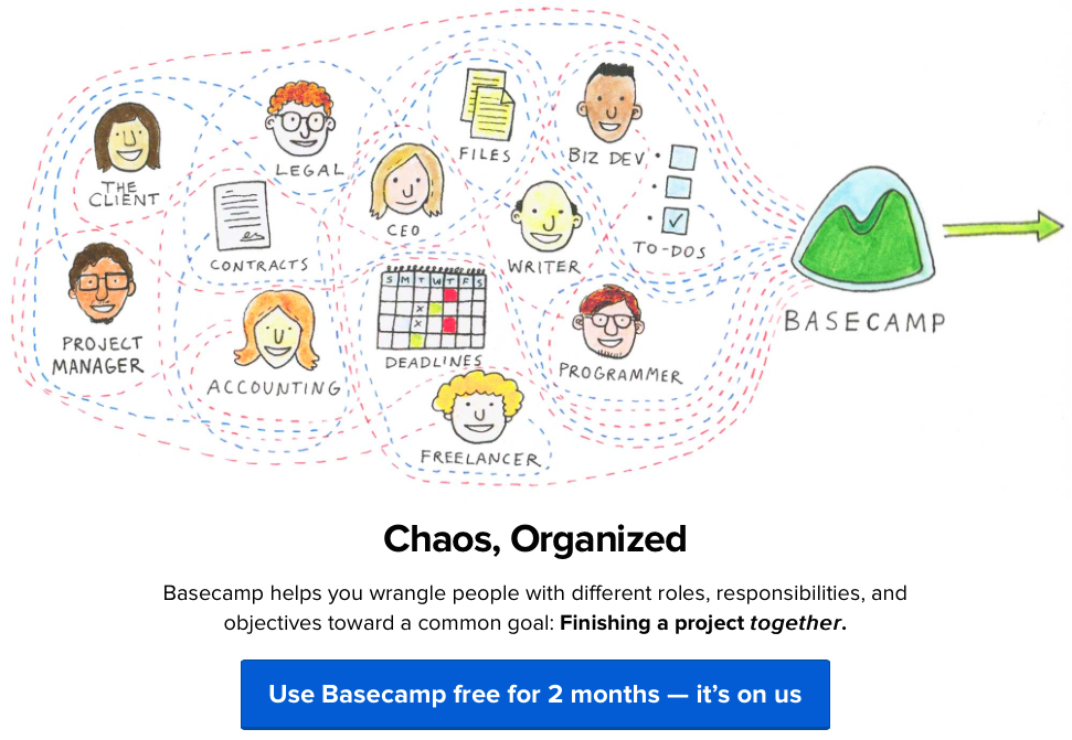
Basecamp’s CTA
Basecamp is a product that has enjoyed amazing online success year after year. Look at the Basecamp homepage and notice where your eyes are drawn first. Yup, it’s the call-to-action. It stands out like a sore thumb.
The minimalist design of the page really makes the sign up button pop. It’s a huge block of color, surrounded by white space. The key here is that the dark color of blue isn’t used anywhere else on the page, so it is the most visually “important” thing on the page.
Your pages should make it visually clear what path the visitor should take in order to move to the next step in their journey to conversion.
#2. How to get people interested in your product: MyOwnBike
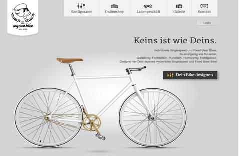
CTA to design your bike on MyOwnBike
Smart CTAs even transcend language barriers. You don’t have to speak Germany to understand what it wants you to do.
As soon as you jump on the MyOwnBike homepage, you are invited to start designing your own bike via some persuasive writing techniques.
Again, a minimalist design is centered around the product image with a prominent call-to-action begging the visitor to click. And once clicked, the visitor gets to design their own bike and watch it transform in front of their very eyes – making it fun and engaging.
It’s a no-nonsense approach that relies solely on design to show the visitor what they should do next.
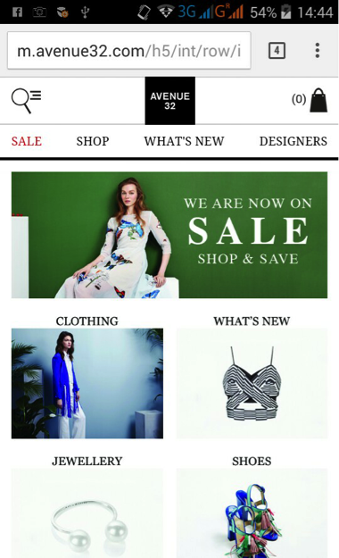
#3. How to push people to the product page: Asos
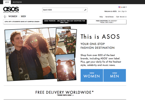
Shopping option CTAs on Asos
Sometimes, the CTA need only put the visitor on the right path. The CTA on the homepage of Asos does an excellent job of getting the visitor into the right part of the site. Visitors are split into two, males and females. To tackle this problem, Asos features two huge CTAs that lets the visitor pick which gender they would like to shop for.
This is a smart and simple way to move shoppers through to the category pages, where they’ll hopefully refine their search further and find exactly what they’re looking for.
The usual principles of a strong call-to-action apply, of course. The page uses liberal amounts of white space. Branding and navigation elements are black. This ensures the ‘View Women/View Men’ buttons clearly stand out in a vibrant blue color.
#4. How to push people to the checkout: Amazon
Your CTAs shouldn’t compete. One CTA should is ideal, but you often need to add more than one CTA. This is where it becomes a little trickier to refine your CTAs. Competing CTAs cause confusion and friction. A secondary offer on the page may cannibalize conversions from the primary, more desirable offer.
The Amazon product page uses color and position to achieve this on its product pages.

Two examples of Amazon’s primary and secondary CTAs
When a shopper is debating whether to buy they have two options:
- Add to bag/basket – the primary CTA
- Add to wishlist – the secondary
The clear option is for the shopper to add the product to their basket so they can checkout. But if the visitor is hesitating, the ‘add to wish list’ button gives the visitor a back up option. Rather than losing that visitor to a competitor, Amazon chooses to provide a lower-commitment option.
The color and button size of the primary CTA sends powerful signals about what a visitor should do. And if you look at the contrast between the primary and secondary calls-to-action, you can see how much more attractive the primary option is.
The key here is to use a clear visual hierarchy with your primary and secondary CTAs, to push them towards the sale.
#5. How to make the sale: BarkBox
Once you click ‘get started’ on the BarkBox homepage, the journey from the product to the checkout page is simple, clear and most importantly, engaging.
First, using fun illustrations you select the size of your dog.

Barkbox’s visual tactic leading you to the sale
The call to action here is “Select Dog Size.” It is not presented on a button or link.
The next step asks visitors to select a monthly plan. Notice how the most expensive plan is highlighted as the best value.

Barkbox’s monthly plans
You’re then given the option to treat your dog to a toy. Notice how the ‘Yes Please’ option is highlighted automatically.

Barkbox’s upgrade option offers both a positive and negative call to action.
In general humans are reluctant to say “No,” so the negative call to action, “No, thank you.” may actually reinforce the primary call to action, “Yes, please!”
The site then asks for an email address.

The call to action is “Create Your Account”
By clicking on, “Next,” you’ll be taken to the shipping and payment page. This page is crucial to closing the sale, and as you can see from BarkBox, they really hit the nail on the head. They don’t ask for more details than necessary, and they don’t include any hidden charges – a reason why 70% of shoppers on most sites abandon their carts.
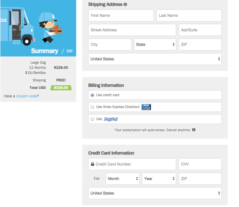
The form asks for minimal information to complete the sale
The key takeaway here is that calls to action rarely stand alone. The process of purchasing is a series of calls to action, each of which may or may not be a button or link.
Top tip for your checkout page: If you need to use a multi-step process then use a visual progress indicator like a progress bar so customers can manage their expectations regarding how long it will take.
Closing Thoughts
As you can see from these powerful examples, the CTA is clear, each standing out clearly on the page, and each having an intended purpose. By using contrasting colors, on a clean and simple web page, you’ll make your CTAs stand out and guide your visitors to the sale.
Looking for more awesome ways to supercharge your website? Download this eBook for 10 ways to convert shoppers into buyers.
About the Author
Bryan Robinson is a Digital Business Analyst in charge of Marketing for the Commerce division at Spark Pay. He specializes in Lead Generation, PPC and SEM, while also overseeing content production for Spark Pay online store. He has also started and flipped his own eCommerce websites for over 10 years.


 to Images (I) gives us Video (V).")


, YouTube can turn Video content into Attention (Att) a semi-precious metal.")


 Jacey Johnson has been an administrator in higher education for over 10 years and currently works with


