The fight for online leads and sales has traditionally been fought at the search engine. That is changing.
Web analytics, bid management, competitive intelligence, ad testing and ad management tools are all common staples of any serious paid search effort. Return on ad spend (ROAS) is being tracked all the way through the sign up or purchase process and ad strategies are being adjusted accordingly.
Quietly, the battle for online leads is moving to a new front. This new front is measured by revenue per visit, and it’s kissing cousin, conversion rate. Like the tide that floats all boats, website optimization is being seen as the way to reduce all marketing costs by dropping the acquisition cost of new prospects and customers.
Why do we say this is happening quietly? That is the conclusion we came to when examining an unusual data set from SpyFu.com. We were able to determine which businesses had conversion optimization tools installed on their website. This, we reasoned, gave us a pretty good idea of which businesses would dominate in the world of online marketing — assuming they were actually using the tools.
In one report, 73% of businesses are spending between $500 and $5000 per month on paid search ads. Almost a quarter are spending between $5000 and $50,000 per month. Yet, only 14% of businesses have at least one website optimization tool installed.
Who are going to be the winners in this new front? Where does your business fit in this statistic?
Split tests are a favored tool of economists, direct response mailers and website optimizers. The primary challenge when creating a split test is being sure that you’re measuring exactly what you think you’re measuring.
As my grandmother used to say, “The road to bad conclusions is paved with uncontrolled variables.” Yes, we are a geeky family.
When your variables get out of hand, all hell breaks lose, and you end up testing something you didn’t intend to test.
When comparing humans, nothing beats twins for experimenting. I feel sorry for twins because of the number of medical and economic studies that tap them for “controlled” experiments. It must be like living on the Island of Dr. Moreau.
The following YouTube video uses twins to perform an experiment that tests the social axiom that, “Chewing gum isn’t attractive.” Watch the following video and see if you can name some of the uncontrolled variables that may be putting this experiment on the statistical road to invalidity.
This is an art exhibit, not a controlled experiment. However, many who watch it may believe that it provides scientific evidence that we should all go out and pick up a few sticks of Wrigley’s if we want to be more charming. In fact, that is what the makers of Beldent want you to believe.
Is this test really telling us to put our jaws in motion if we’re to be more likable?
Controlling Variables
The artist who created this experimart controlled for appearance quite effectively. Genetically identical twins are used as the control and the variation. They are dressed identically. They wear identical makeup. They are sitting in a neutral position on identical chairs. They have identical facial expressions. The lighting is the same on both participants.
The only apparent difference is that one of them is chewing delicious Beldent gum (Beldent is the South American brand from Trident).
Test subjects sit in front of these two doppelgangers and listen to questions piped in through a headset.
“Which one seems like he has more friends?”
“Which one has more imaginary friends?”
“Which one gets invited to more parties?”
“Which one gets invited to more bridge tournaments?”
“Which of these bosses would give you a raise?”
Participants chose the left or the right by pressing one of two buttons vaguely reminiscent of The Family Feud.
It looks like all variables have been controlled, and that the results can be considered valid.
The Unsuspecting Twists that Ruin Experiments
One thing experienced testers learn quickly is that little things will influence your tests more than you would have imagined.
For instance, this experiment could be testing if people favor pressing the left button when they are unsure of their answer. In every situation, the gum chewer is sitting on the left. To control for this, the gum chewer should have been on the left sometimes and on the right sometimes.
This experiment could be comparing gum chewers to people who look like total bummers. In every situation, the control twin is sitting with a neutral expression. In any situation, they would look boring. To control for this, they could have asked the twins to be smiling sometimes.
The handlers who setup the test, a test paid for by Beldent, may have unconsciously chosen the more attractive twin of each pair to be the gum-chewer. Certainly, the artists wanted Beldent to win. This creates a bias. To control for this, the twins should have taken turns as the gum chewer.
The designers of the test attempt to control for age and gender biases. A mix of twins is used: men, women, older, younger.
The people pressing the buttons may represent a skewed sample set, however. The experiment was done in a museum. Only a portion of the total population enjoys museums. Thus, the test subjects are probably not representative of the population as a whole.
Basically,
Beldent can only conclude that chewing gum makes you more attractive to museum-goers when you’re sitting to the left of your boring twin.
Beldent can only conclude that chewing gum makes you more attractive to museum-goers when you’re sitting to the left of your boring twin.
A More Rigorous Experiment
To really get a handle on the social benefits of constant mastication, you would design a test that controlled for even more variables.
Participants should be shown only one twin. This, of course, means you don’t need twins. Just one person from each set, chewing, not chewing; smiling and not smiling.
Questions would have to be reworded.
“Does this person make friends easily?”
“Does this person get invited to parties frequently?”
I would scratch the “bridge tournament” question. You’ve got to be smart to play bridge well. Smart people are likable, right?
This new design would require a larger sample size than the 481 participants in the Beldent artsperiment. You now have sixteen different treatments (four chewing, four not cheweing; four chewing and smiling; four not chewing and smiling). You would need 1600 participants or more to get close to statistical significance.
Unfortunately, this new experiment wouldn’t deliver such dramatic video footage. But without this rigor, Beldent may be lying to themselves — and to us — about the value of chewing gum.
Imagine Your Web Pages as Twins
Our job at Conversion Sciences is to design website tests for companies, tests that tell us exactly what we want to know about a web page and nothing more. We agonize over the subtle things that introduce bias into our test. We always want to test the right thing.
We create two or more versions of a page that are like identical twins, with only one thing changed. We make sure that the visitors in our tests are representative of the site’s visitors at large.
And we must control our natural human biases. Like the artists who setup the experiment, we want to get wins for our clients. If we give in to this desire, we can find ourselves calling tests too soon, or running with statistically insignificant results that favor our treatment. Even when our testing tools tell us we’ve got a winner, we are skeptical.
It isn’t hard to tell if we make a bad call. If our tests didn’t increase the fortunes of our clients, our reputation isn’t worth a p-value. The accounting department’s numbers don’t lie.
Let us test some pages for you. If you have five-hundred transactions a month or more, you have the sample size to test your way to more sales, more leads and more subscribers. And we’ll throw in some chewing gum.
Welcome email tests that will help begin the onboarding process that turns tryers into buyers and buyers into long-term subscribers.
Email is still the most effective strategy for onboarding visitors. By “onboarding” we mean:
Getting tryers to use the product so they can become buyers
Getting buyers to use the product so they become long-term subscribers
Getting repeat buyers to share their appreciation of the product
Yes, email is important to your business. It can’t be done through Facebook or Twitter. It can’t be done through SMS. Maybe it can be done through direct mail. Maybe.
The first step in these processes is the ubiquitous Welcome Email. It gives customers a first impression of your business. Guides them through your product. And demonstrates the value that you can bring them. It’s what takes them from trial to paying user to a repeat user to a evangelist.
In fact marketers who utilize welcome emails find that they have a substantial effect on their conversions with some even experiencing up to a 50% conversion rate when implementing them into their onboarding marketing strategy. Impressive, huh?
Welcome emails aren’t as straightforward as you would think, however. They need to be tested. From timing to subject line, rigorously A/B testing the different aspects of your emails is a sure fire way to build the most effectual onboarding strategy for your business.
Today, we are going to focus on one aspect of welcome email A/B testing – Content.
Content is what entices your user to click-through and act. You need to get it right.
Welcome Email Tests to Engage Customers
Here are five A/B tests you should be doing on your content to optimize your onboarding emails and get users converting from trial to lifetime customers.
1. Test Simple vs. Hyper-Stylized Design
Let’s begin with design.
No matter how well-written your emails are, if it the look isn’t right the effectiveness will be hampered. Emails can be as simple or flamboyant as you wish. Generally they are divided into three types:
The first type is E-zine style. It’s flashy, hyper-stylized with images and bold font taking centre stage.
Next is SaaS style. It’s cleaner and simpler yet still professional.
And finally Personal. This has no branding, no design. Just a straightforward email.
It’s up to you to test what works best for your business.
Will your visitors prefer a stylized email or a simple “personal” email?
An interesting design case study comes from SitePoint, a specialist in content for web developers. After sending out over 40 newsletters, their campaign started to look a little lackluster.
Their initial emails were uncluttered and pared back in design. And they wanted to continue with this look but update it and get more clicks.
So they ran an A/B test.
The first thing they tested was the template, and the results were positive with an initial 16% rise in click through rates.
Next they tested images – should they include them or keep it plain text? SitePoint already had a hunch that their customers didn’t care for them and wanted a text only email. This assumption proved to be inconclusive as the results were 118 vs. 114 clicks in favor of no images.
This inconclusive test demonstrated that readers didn’t prefer nor mind images in their welcome email.
These welcome email tests were just the first round of experimenting for SitePoint. They went back to the drawing board and tested everything again. They experimented with images and templates until they found what worked best.
The winning email was simple, but a little design can go a long way.
The winning email retained the simple look of their original email. It was just updated, more attractive to readers and most importantly, increased their click-through rate.
Contrasted to this is Wishpond. After extensive testing of their own emails, they discovered images were just what their audience wanted. Using images produced a 60% higher click-through rate versus just using text alone.
These two contrasting examples are just to illustrate the fact that there is no single best design for all businesses.
There is no one template fits all.
You need to test to discover what your customers like and what drives results.
2. Test A Single Call to Action
When you send out your welcome emails we are betting you have one goal in mind – getting customers to use your product.
All too often we see businesses sending emails with multiple links and requesting customers do numerous actions. It’s confusing and will distract your user from your goal.
So here’s a challenge – try restricting your welcome emails to have only one call-to-action,
In 2014 they began rigorously testing all aspects of their emails. One of the tests had a goal of increasing click-throughs on the call to action.
To do this they sent out two emails. The first having only one CTA, while the second had multiple.
Optimizely tested emails with a single call to action against their one with several.
There was one clear winner. The email with only one CTA produced substantially more click-throughs with a 13.3% increase.
Narrowing down your email to one call to action can be a tough task. You have a limited amount of onboarding emails to send. Yet you have so much to say.
Try removing any unnecessary call to actions you have in your emails and just focus on what you believe is most important.
Ask yourself what is the most important thing you want your customer to do after receiving this email and make this your call to action.
Then test.
3. Test Urgency Inducing Copy
When sending welcome emails to onboard your users there are some tactics you can use to convert those trial users into paying customers.
One method is urgency. Using a sense of immediacy in your email to get your customer to act now.
MarketingExperiments tested the effects of urgency in their email campaigns.
They planned a Web Clinic Invite and sent out two emails. One was just the simple invite. The other however, had three extra urgency inducing words – Limit 1000 Attendees.
Urgency may induce more of your email recipients to act.
The email containing the urgency had a 15.4% increase in click-throughs. Pretty impressive figures considering the only difference was 3 words!
When sending welcome emails, urgency can be incredibly valuable.
Here is another example of urgency from Sprout Social.
To get trials to convert to paying customers they use copy to imply urgency and encourage users to act now.
Urgency can be communicated in may ways.
They use phrases such as “Only 2 days left” and “Time Flies – your trial period is over in just 2 days”. It shouts “act now or you’ll miss out!”
It’s a clever way to optimize your emails and get more customers converting.
4. Testing Email Length (How Long Should a Welcome Email Be?)
When a customer signs up you want to tell them everything about your business.
Explaining every feature and what you offer in a long winded email is going to show them the value of your business, right? Well probably not.
Conversely, saying too little can be problematic also. Customers might feel under informed and might not act at all.
Research has shown that the average open time for an email is only 15-20 seconds.
With such a small window of time, you need to test how long your emails should be to have the maximum impact.
iMedia Connection decided to carry out tests, with two versions of an email promoting an upcoming conference.
One email was verbose, containing all of the information about the conference within it as well as links to the website.
The other was half the length, with only a short description and a link to a website containing the information.
A bigger open rate doesn’t mean a higher click-through rate.
The shorter email proved to be more appealing. iMedia Connection reported that not only was the open rate on the shorter higher at 30% vs. 20% but the click-through rate was also higher at 11% vs. 5%.
Short, brief content was the winner here but that might not always be the case. Getting your emails length right must be tested.
Good ab testing will help you find the perfect balance between being informative while also being concise.
5. Welcome Email Tests: Test Personalization
Personalization is one of the most effective techniques to increase conversions from emails. Using a customer’s data to appeal to their interests has been proven to work time and time again. And it isn’t as complicated as you may think.
They recognized that Rottweiler owners wouldn’t want the same emails as Chihuahua owners. So they began to segment in the simplest way possible.
They began collection “doggie data” by asking owners one simple question – is their dog small, medium or large?
Based on this data, they created three email segments based on dog size. Each segment received an email that had products that were suited to their dogs.
DoggyLoot sent different emails to owners with different sized dogs.
The results were impressive to say the least. The personalized emails that were targeted at large dog owners had a click through rate that was 410% higher than the average.
Personalization doesn’t have to be complicated. Just find whatever works for your business.
Doggyloot just asked the right questions on signup, enabling them to segment their audience with relative ease.
Whether you just add a user’s name or build comprehensive buyer personas, testing personalization can be a real asset to your welcome emails.
5 Welcome Email Tests To Turn Tryers into Buyers: Summary
These 5 A/B tests and case studies are guidelines. Some may work for your business while others might make no impact at all.
It is important to focus on how customers are reacting to your email content. Measuring click-throughs and conversions is essential. See what makes statistical significance, gets users converting and becoming lifelong customers. For more advanced A/B tests read our Ebook “Welcome Your First Million Users: The Ultimate Guide to A/B Testing Your Welcome Emails”.
You’ve read the blog posts and you’ve heard from the vendors. A/B testing is a lot more difficult than you can imagine, and you can unintentionally wreak havoc on your online business if you aren’t careful.
Fortunately, you can learn how to avoid these awful A/B testing mistakes from 10 CRO experts. Here’s a quick look at some of their greatest pitfalls:
Joel Harvey, Conversion Sciences Worst A/B Testing Mistake
“Because of a QA breakdown we didn’t notice that the last 4-digits of one of the variation phone numbers displayed to visitors was 3576 when it should have been 3567. In the short time that the offending variation was live, we lost at least 100 phone calls.”
Peep Laja, ConversionXL Worst A/B Testing Mistake
“Ending tests too early is the #1 mistake I see. You can’t “spot a trend”, that’s total bullshit.”
Craig Sullivan, Optimise or Die Worst A/B Testing Mistake
“When it comes to split testing, the most dangerous mistakes are the ones you don’t realise you’re making.”
“I had been allocated a designer and developer to get the job done, with the expectation of delivering at least a 20% increase in leads. Alas, the test went terribly and I was left with few insights.”
Andre Morys, WebArts.de Worst A/B Testing Mistake
“I recommend everybody to do a cohort analysis after you test things in ecommerce with high contrast – there could be some differences…”
Ton Wesseling, Online Dialogue Worst A/B Testing Mistake
“People tend to say: I’ve tested that idea – and it had no effect. YOU CAN NOT SAY THAT! You can only say – we were not able to tell if the variation was better. BUT in reality it can still be better!”
John Ekman, Conversionista Worst A/B Testing Mistake
“AB-testing is not a game for nervous business people, (maybe that’s why so few people do it?!). You will come up with bad hypotheses that reduce conversions!! And you will mess up the testing software and tracking.”
Paul Rouke, PRWD Worst A/B Testing Mistake
“One of the biggest lessons I have learnt is making sure we fully engage, and build relationships with the people responsible for the technical delivery of a website, right from the start of any project.”
Matt Gershoff, Conductrics Worst A/B Testing Mistake
“One of the traps of testing is that if you aren’t careful, you can get hung up on just seeing what you DID in the past, but not finding out anything useful about what you can DO in the future.”
Michael Aagaard, ContentVerve.com Worst A/B Testing Mistakes
“After years of trial and error, it finally dawned on me that that the most successful tests were the ones based on data, insight and solid hypotheses – not impulse, personal preference or pure guesswork.”
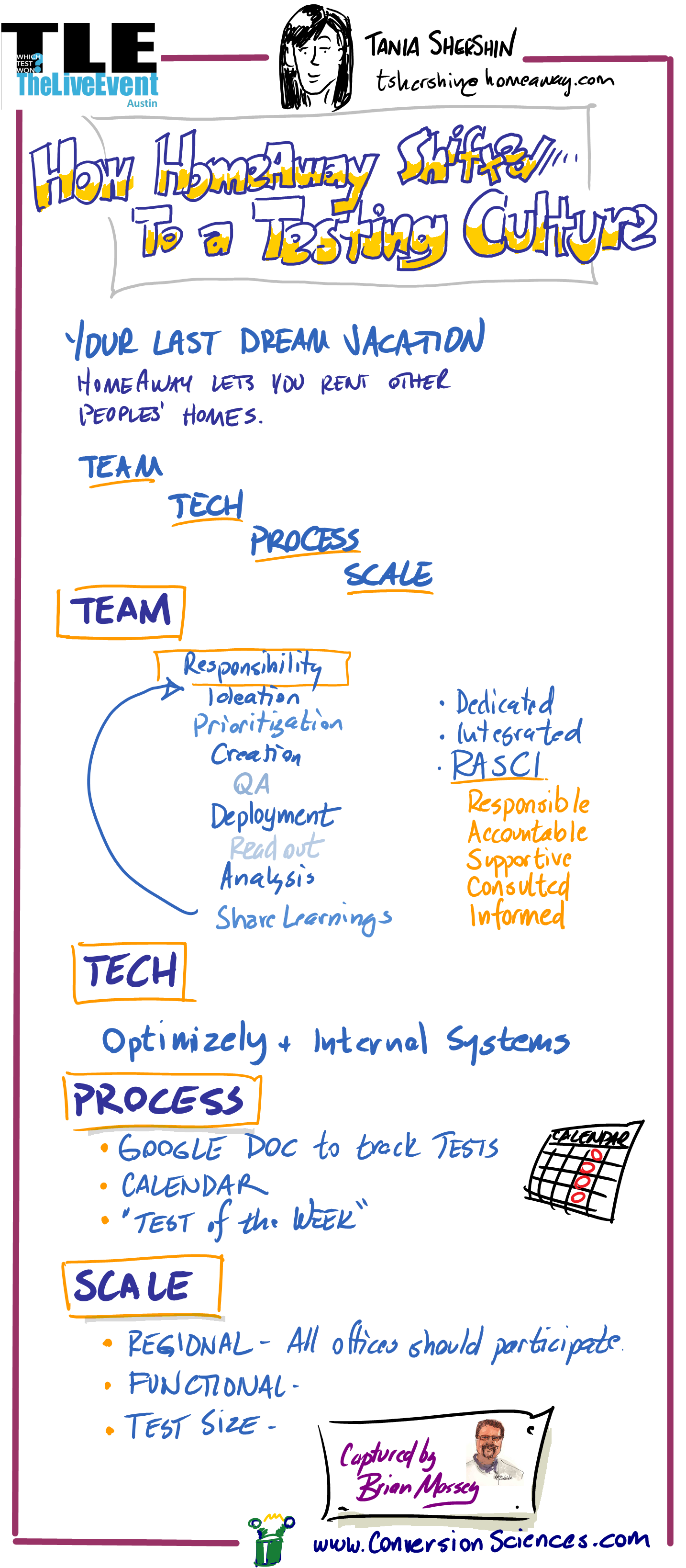
Team, tech, process and scale: these are the primary components shared by Tania Shershin of Homeaway at the Which Test Won Live Event in Austin, Texas.
We captured the high-points of her presentation live in this instagraph infographic.
If you want to create a culture of testing in your organization, here is a roadmap to success.
Questions can be powerful things, if the questions are good and are leading us in the right direction (normally this means toward better results). When the questions are about the statistical significance of your marketing results, you’ve got a winning combination that will really take you places.
Subscribe to Podcast
So, what are a couple of good questions that you can use to help you become statistically significant as a digital marketer? Brian introduces a couple of doozies in How to be a Statistically Significant Marketer (Part 2) on Marketing Land:
Question 1: Are the results I’m seeing from my online marketing telling me what really happened?
Question 2: Are these results “good” enough to predict what will happen in the future?
Brian tackles these challenging questions by introducing us to three characters involved in life-like scenarios that will seem all too familiar to some of us.
Finally, he ends with the question that every marketer has to continually ask at every step along the way: What do I do next based on the results I am seeing?
Here’s another solid question you can ask yourself: “Self, is it worth 15 minutes of my time to find out how to begin asking the right questions in my marketing efforts?” We’re going to help you out here and encourage you to go with a resounding “YES” on that one.
21 Quick and Easy CRO Copywriting Hacks
Keep these proven copywriting hacks in mind to make your copy convert.
My partner Joel Harvey is fond of saying, “My favorite part of a design is the money.” He’s been part of many a web design project. His perspective comes in response to the number of times he’s heard things like:
“I want the design to pop!”
“I want my site’s design to be groundbreaking like nothing else out there!”
“Let’s turn it up a notch on the design.”
“I want the site’s design to reflect the high value of our product.”
In and of themselves, none of the above statements are unworthy pursuits. But if your goal is to increase online sales conversion and fill your coffers to the brim, you will fall woefully short if you believe that web design alone can do the heavy lifting of convincing your visitors to take action. If increasing sales is your goal, the most important person on your split testing team is the accountant.
Designers Don’t Design for the Accountant
A while back, a client sent us a couple of different mocks of some new designs they were entertaining. They ask which one I liked. The first thing I said is I like the one that makes you the most money. Up until that time their team was arguing over color palettes, white space,and rounded edges.
When I reminded them about the bigger goal, their conversation evolved. In a clock tick, we were all discussing the quality of content on the pages rather than the design elements. When their offer and call to action were right, everyone seemed to forget about the trivia of the actual design.
Designing For Your Ego
Another client brought to us a new landing page campaign they had just launched and were baffled and disappointed by the early results. They went on to explain that they thought this was the best designed landing page they had ever done. They had just hired a new graphic designer that ‘got it’, and even the CEO was impressed with his work. One problem, their paying customers didn’t seem to agree. No doubt, the design was gorgeous. Rich colors, curvy rectangles, sexy images, even the header and body fonts were crisp and clean.
So why wasn’t this campaign working? We had them show us their most recent successful campaign. The design was a tad dated, and compared to the new landing page it looked like a high school hobbyist in the company basement eating Cheetos and suckling energy drinks.
Still, by comparing we immediately saw the problem with the new landing page. The copy on the old page was much better. The headers screamed the product’s value proposition and benefits. The body copy answered relevant questions, and helped the reader imagine themselves buying the product. The call to action button was big, bold, and in your face. The new page looked stunningly attractive but said very little.
To add insult, the hot shot designer was a minimalist and had an aversion to big gawky buttons, so his primary call to action was tiny button that blended in with the hero image, and , by design, was easy to ignore. We instructed them to use the old page copy on the new design (they had to make a few adjustments to make it all fit), and we asked the designer to create a bigger and bolder call to action button. They obliged us and that new design finally beat the old landing page.
How Much Time Are You Spending With Your Designer vs. Your Banker?
So my lesson is this. Beautiful, eye-popping design and effective, profitable web design are two different things. And it always seems easier to mistake those eye-popping designs for profitable ones. Split testing will always lead you in the right direction.
Some companies spend more on design than they do on organic SEO, and almost all companies spend more on design than on Conversion Rate Optimization. Search engine spiders don’t evaluate site design, only content and links. And I have yet to see a company design their way into a better conversion rate and better RO.
Some companies spend way more time going back and forth about a design element than they do actually testing it. Makes you wonder how far ahead of your competitors you could get if you spent more time and resources on conversion optimization and testing.
So when considering a redesign of your entire site, of a successful landing page, or even a banner ad, do the following:
List the things about the page experience (not just he design) work. Keep those in the new design.
What about the experience doesn’t work?
Why do we want to change this (especially if it is working)?
Before you launch a radically new design, test what you believe is NOT working about the current design.
Above all, use web designers that deeply understand the web and principles of conversion. Otherwise they are just an artist, and the value of an artists works usually increases only after their demise. Can you wait that long?
Statistical significance: It’s not just for impressing your date anymore.
Subscribe to Podcast
If you’re involved with an online business, you draw conclusions from things you’ve learned on a weekly basis.
When you say, “We tried that. It didn’t work,” you are claiming to be able to predict the future based on something you did in the past.
When you say, “We stopped sending email because our list got tired of us,” you are saying that the tea leaves of your email list say you should stop sending email.
Often, such statements stop progress. One way to keep from hitting the “We tried that” wall is the ask a simple question: “Was the data statistically significant?”
In this episode of The Conversion Scientist Podcast, I will tell you exactly what statistical significance means, how to measure it and when to believe the data you’re being shown.
How important are images to your landing page? The formula we use in our Chemistry of a Successful Landing Page includes the element “Image” as a necessary component. At the heart of this is the need for the visitor to imagine owning the product or service. That’s right, even services.
For some, it’s difficult to “show the product.” If you’re offering an expensive software solution or consulting service, how do you communicate what it will be like to own that? Screen shots, flow charts and explainer videos are typical go-to solutions.
Lazy designers drop happy, smiling people on the page. Avoid this business porn.
At the other end of the spectrum is the visual product or service. Photographers, artists, decorators and designers have a portfolio of past work to help visitors imagine buying from them.
Vacation Beach Portraits is such a visual business, and they have some test results that offer some insights. I love it when small businesses take up testing.
Vacation Beach Portraits takes family portraits of tourists to the Orange Beach and Gulf Shores areas of Alabama. The beautiful white beaches and sunsets over the Gulf of Mexico offer an ideal setting.
The folks at Vacation Beach Portraits tried testing a landing page against their home page, a blog filled with samples of their work.
The Vacation Beach Portraits home page was full of delicious images showing off the work.
Then landing page features a prominent call to action and portfolio video.
The home page was a long scrolling collection of pictures from recent shoots. Load time can significantly decrease conversion rate on pages like this. However, though lazy-loading of the images allowed me to start viewing images immediately.
The landing page, built using Unbounce, provided an explainer video with samples from their portfolio. It is shorter and features a bulleted list of benefits as part of the copy.
Serial Test
This local business will have few transactions each month. Therefore, Jason Odom of Vacation Beach Portraits did tests in series.
From May 1-15, he sent his search traffic to the landing page.
From May 16-31 he sent his search traffic to the home page.
Comparison of visits to inquiries shows a 42.1% increase in conversion rate for the home page. However, this is not statistically valid. Source: ABTestGuide.com
Given the relatively low number of clicks and inquiries, the two pages converted at the same rate statistically. When testing low-traffic sites, we are looking for treatments that beat the control by large margins — 50% or 100%.
In this test, the home page generated 42% more inquiries and 105% more paying clients. Neither of these results was statistically significant, though. The sample sizes were just too low.
Why Didn’t the Landing Page Outperform the Home Page?
Anytime we hear that people are sending “store-bought” traffic to their home page, we roll our eyes. We are almost always able to improve conversions by sending visitors to a landing page.
In this case that didn’t happen. What’s the deal?
Two hypotheses emerged from this test.
1. The long page full of gorgeous pictures found on the home page is what visitors want.
2. The clear call to action found on the landing page kept it in the running.
For their next test, we recommended either adding a bunch of these big gorgeous pictures to the landing page, or adding a call to action button at intervals down the home page.
The quality of the images in the landing page video was lower than the full-width photos found on the home page.
When someone decides they want an amazing family photo like those shown, a button with “Schedule Your Photo Session” is exactly what they will be looking for.
Other Considerations
There were some additional hypotheses we felt would improve the performance of these pages.
This font is pretty, but very hard to read.
We felt that the script font used on the home page was hard to read, recommending a serif print font instead.
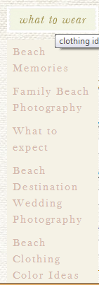
Beach Clothing Color Ideas is at the bottom.
The navigation on the site was not particularly logical. The very helpful navigation item “what to wear” seems to link to anything but topics on what to wear. Every link on a site should keep its promise.
Making the phone number more apparent my close the time it takes to book a client from the web or landing page. We find that adding the phone number to the headline (yes, the headline) will significantly increase calls without depressing form fills.
Advice for Businesses with Visual Offering
If you have a visual product, you should leverage this with high-quality, high-resolution web images. Don’t be afraid of long pages. Visual visitors know how to scroll and will appreciate the wealth of stimulation.
However, don’t forget the calls to action.
You never know when someone has seen enough to buy. Lace a buttons or links among your images. Keep in mind that the buttons or links are going to have to compete visually with the images, so make them pop.
The button or link will go to a more traditional landing page or product page that handles objections, allows selection of size, color or format, and asks them to buy.
In almost every case, use captions. These are the most read copy on most pages and are a great place to include a call to action. Tell them what they are looking at, even if it is obvious to you.
Results From the Follow-up Test
This is the busy season for Vacation Beach Rentals, and their landing pages are already converting very well for them. We won’t know the results another test for some time. Subscribe to the Conversion Scientist by email to find out the rest of this story.
One Republic’s breakout hit in 2007 was “Apologize.” It’s a very sad-yet-beautiful tune.
It’s also one of those songs that our brains like to play with.
“It’s too late to order fries. It’s too laaaaate.”
Every year when September rolls around, my brain hears a different word than “Apologize.”
“It’s too late to optimize. It’s too laaaaaate.”
Do you hear it? Many of the businesses we work with have huge spikes in traffic during the November and December holiday season. Unfortunately, if we hear from them in September, we have to confess that they’ve missed the window to do meaningful conversion optimization before the holiday rush locks everything down.
“It’s too late to optimize…”
It may not be too late to optimize.
Right now, it’s not too late to optimize. We can make meaningful progress on your conversion rate before Black Friday and Cyber Monday hit.
If you would like to ride the holiday season with 10% or 15% more sales, we can help you.
But we have to start soon. Contact us now and ask about our Conversion Catalyst™, our proven 120-day process for finding improvements quickly and scientifically.
Optimize so you don’t have to apologize. You tell me that you need me, then you go and cut me down.
You tell me that you’re sorry, didn’t think I’d turn around, and say.
It’s too late to optimize. It’s too laaaaaate.
We may request cookies to be set on your device. We use cookies to let us know when you visit our websites, how you interact with us, to enrich your user experience, and to customize your relationship with our website.
Click on the different category headings to find out more. You can also change some of your preferences. Note that blocking some types of cookies may impact your experience on our websites and the services we are able to offer.
Essential Website Cookies
These cookies are strictly necessary to provide you with services available through our website and to use some of its features.
Because these cookies are strictly necessary to deliver the website, refusing them will have impact how our site functions. You always can block or delete cookies by changing your browser settings and force blocking all cookies on this website. But this will always prompt you to accept/refuse cookies when revisiting our site.
We fully respect if you want to refuse cookies but to avoid asking you again and again kindly allow us to store a cookie for that. You are free to opt out any time or opt in for other cookies to get a better experience. If you refuse cookies we will remove all set cookies in our domain.
We provide you with a list of stored cookies on your computer in our domain so you can check what we stored. Due to security reasons we are not able to show or modify cookies from other domains. You can check these in your browser security settings.
Other external services
We also use different external services like Google Webfonts, Google Maps, and external Video providers. Since these providers may collect personal data like your IP address we allow you to block them here. Please be aware that this might heavily reduce the functionality and appearance of our site. Changes will take effect once you reload the page.
Google Webfont Settings:
Google Map Settings:
Google reCaptcha Settings:
Vimeo and Youtube video embeds:
Privacy Policy
You can read about our cookies and privacy settings in detail on our Privacy Policy Page.