stock photos

Everybody wants to be the llmpany that came up with the brilliantly clever video or ad or Tweet that got shared by millions. The one where, if you dare to admit you haven’t seen it, everyone else at the party will jump on you demanding, “You haven’t SEEN it?” But here’s the thing: While there are many companies that have made such ads that quickly translated into rapid sales, other companies with viral videos and other funny content never increased their sales at all, despite millions of shares. The bottom line is humor can create sales, but it has to be done right.
Unfortunately, it’s so easy to do it wrong.

Inc. published case studies on two products. One, the Orabrush, was designed to remove the tongue bacteria that cause bad breath. Inventor Dr. Robert Wagner was only pulling in about $30 a month, selling 10 Orabrushes, until he created a funny video. Within six weeks, Orabrush sold about 10,000 tongue cleaners (and gave many away free). Within two years, the company sold more than a million Orabrushes online and the video was viewed more than 15 million times. You can now buy the tongue cleaner at stores like Walmart. What was so great about the video was that, in addition to being funny, it clearly explained what causes bad breath and why the Orabrush is the best solution. It also had a call to action and a free Orabrush for responding.

In the same article, though, the reporter talked about EZ Grill which made a video in which it grilled various smart phones to see which would last longest. The video quickly got over a million views but didn’t translate into sales. There might have been a lot of reasons for this.

  • The focus was more on the phones than on the grill.
  • There was no explanation about why one would buy a portable grill or what made EZ Grill a better option.
  • The video revealed the little aluminum grill’s occasional inferno-like action.
  • There was no connection to the company’s website or any other outlet, so consumers had to figure out where to get one on their own: friction.
  • There was cognitive dissonance between something high tech, like smart phones, and the music, which sounded like something from a Charlie Chaplin movie. Cognitive dissonance can be good or bad. In this case, it was difficult to tell who the audience was or what they should do.

The truth is, humor is complicated. Consider that most comedians will work a joke over and over before they bring it to audiences. Nielsen reports that, in the U.S. and Europe at least, 50 percent of people surveyed rank humorous ads as most effective. But myriad studies have failed to find a direct correlation between a funny ad and widgets flying out the door. A study on funny Superbowl ads showed that sales didn’t immediately go up on the products with the funniest ads. And yet we all know about the ones that worked. The Dollar Shave Club, which got 12,000 people to sign up for the service in the first 48 hours after they first aired their comic video, for example. So what makes the difference?

The first rule of humor probably should be:

1. Don’t Forget to Sell Your Product

A great example of this is Poo Purri, a company that makes a spray with essential oils that traps the odor of poop in the bowl. Really, hard to imagine how to sell this product without humor. But here’s a company that uses cognitive dissonance perfectly. It’s a visually attractive video of a gentile, British, girl-next-door, in elegant clothes, sitting on a toilet talking about the basest human functions.

But this video tells you exactly how Poo Pourri works, where to find it, what its Amazon rating is, has a “click here” call to action and a money back guarantee. The result was a 13,000 percent increase in visits to the site and more than double the company’s revenue.

One reason humor works is that it engages the brain in such a way that people kind of forget they’re being sold to. They might share the video over and over, watch it over and over, never realizing that they’re cheerfully and voluntarily propagandizing themselves and spreading your message. That’s because, from a scientific standpoint, humor provides all kinds of payoffs for the brain.

According to a paper published by the Harvard Mahoney Neuroscience Institute, the beginning of a joke triggers your frontal cortex—the executive part of the brain—to look for pattern recognition. The minute we sense a joke is coming, we perk up. We pay attention, look for the payoff. And if the payoff is good, we’re flooded with good feeling neurotransmitters: dopamine, serotonin and endorphins. These are the neurotransmitters that flood us when we’re in love or we accomplish a challenging goal. At the same time, laughter decreases stress hormones like serum cortisol or epinephrine. So just by the act of being funny, your blog, email, video and other content can reach through the screen and make customers feel good. That’s power.

A study on How Humor Breaks Resistance to Influence, conducted at a university in the Netherlands, show how humor distracts audiences from the fact they’re being sold to. Especially if the humor doesn’t tackle the sales goal head on. So it prevents the target audience from throwing up walls against being influenced.

Normally, any content that might cause us to spend money or make a decision triggers all kinds of defense mechanisms: skepticism, criticism, refusal to be moved. That’s especially true if we already have resistance to the brand. Humor has the effect of distracting us from resistance. And, the study said, even if consumers don’t consciously remember the association between the brand and the thing that made them laugh, it will positively impact brand perception and influence buying.

2. Distract Your Audience From the Hard Sell

One company that uses humor to distract is Yesware, which sends out the email below to customers who haven’t responded to sales pitches. The humor in it, of course, softens the fact that the email is essentially saying “What gives?” Typically, Yesware reports, replies to follow up emails are around 21 percent. But not this one:

This humorous email had a 46 percent response rate

This humorous email had a 46 percent response rate

But to make people laugh, you have to know your audience.

3. Be Relevant to Your Audience

Ikea wanted to boost its sales in Singapore and Malaysia. The trouble is, Singapore and Malaysia are crazy about technology and Ikea is a very low-tech company with furniture you build yourself. Its primary marketing tool is a paper catalog, which is about as low tech as they come. So, just before the release of the iPhone 6, Ikea posted a video that spoofed its own catalog.

Its commercial video used an Apple-like asthetic to show the simple navigation of its paper catalog

Its commercial video used an Apple-like asthetic to show the simple navigation of its paper catalog, touting catalog’s “eternal battery life” and “tactile touch technology you can actually feel.”

With The Ikea “bookbook”, the ad said “each crystal clear image loads instantaneously….”
It was the only commercial video that made it to Time Magazine’s top 10 viral videos of 2014, with 12 million views as of the end of 2014. The video—which was created BBH Asia Pacific marketing company—increased sales .8 percent in Singapore and 13 percent in Malaysia. A case study by London branding and marketing firm, Cream Global, showed the video also garnered articles in Time, WSJ, Buzzfeed, The Daily Mail, Mashable and more. It got nearly 500,000 share on Facebook. More than 6,000 people uploaded photos of themselves with their bookbooks on Instagram. Ikea’s revenues have climbed every year but global sales in 2014 were up nearly six percent from the previous year.

By contrast Ranker has a votable list of brands that try too hard to connect with the millennial generation, including Welch’s “Pour ‘em a glass of LOLs” and a myriad of brands who ultimately killed the expression “bae.”
Ikea’s ad did something else that is crucial to humor in content, it was self-deprecating. Making fun of others in ads just communicates that you’re mean-spirited. Take political ads, for example. But making fun of yourself engenders affection.

4. Be Self-Deprecating

Dissolve makes stock footage. Just showing how pretty their stock footage was would only serve to keep them in competition with every other stock footage company. But Dissolve decided to spoof itself on the fact that stock footage is designed to create mental associations that may or may not have anything to do with the actual product. The blatant honesty was surprising and funny. During the Generic Brand Video launch week, visits to the site increased by 9x and signups and sales revenue both increased by 6X.

Dissolve's self-deprecating humor about stock photos being generic worked well

Dissolve’s self-deprecating humor about stock photos being generic worked well.

Sam Elliott, in his gravelly, dead-pan voice nails the intention of the pictures of happy, beautiful people and scenery to influence viewers’ perception about the product being sold: “Lest you think we’re a faceless entity, look at all these attractive people. Here’s some of them talking and laughing and closeups of hands passing canned goods to each other….” As the saying goes: “It’s funny because it’s true.” It also communicates a sense of transparency and humility on Dissolve’s part.
The video generated articles in Fast Company, Ad Age, Adweek, Mashable, Gizmodo, Mediaite and TIME, according to the Shorty Awards where it won Best of B2B.

One of the brilliant things about the Dissolve video was that, while it was making fun of itself, it was also making the case that its beautiful footage sells powerfully. And it included a link to the company’s website.

Humor is difficult. Just listen to a lineup of comedians and it’s clear that some people know how to do it and others don’t. Poo Pourri founder Suzi Batiz said in several interviews that some of the writing for that first viral ad made her cringe. But it worked. So find someone who knows how to do it right, and don’t forget that the whole point is to get people to buy your product or service.

About the Author

Susan Lahey headshotSusan Lahey is a journalist, copywriter, author and all around multipotentialite wordsmith who loves to write about brave people doing cool things.

Feature image by S.Hart Photography, licensed through Creative Commons and adapted for this post.

A shocking graph; The power of compound interest; What 7% a month growth gets you.

I had to study the graphic two or three times before my brain registered what it was saying. We recently enacted a new retirement plan here at Conversion Sciences — a Safe Harbor 401(k) for you odd ducks that find this sort of thing interesting.
I thought I understood the value of saving at an early age, especially since I have acquired the wisdom that is lacking among early-agers. Yet, a little graphic buried in the heavy pages of our retirement plan manual made me wish I could jump on George Orwell’s time machine.

Look closely at this graph, and celebrate if you're under 30.

Look closely at this graph, and celebrate if you’re under 30.


Any young whippersnapper who can scrounge up $2,400 a year for ten years will have more party money at retirement than I will if I put away $2,400 every year until I am 80.
It’s just not fair.
I hope this next sentence will help my retirement problems, because it will make everyone want to call Conversion Sciences.
Any business who can scrounge up $10,000 or $15,000 a month for website optimization will have far more revenue in thirty months than a business who waits ten months before they start.
Conversion optimization is like compounding interest. New increases in revenue per visit or conversion rate are built on top of last month’s wins.
An increase in conversion rate of just 7% each month will double your revenue in one year.

Time is your Friend

Time is not the enemy. It is your friend. Every business is a whippersnapper in the optimization game. The tools we use have been around for less than ten years.
If this makes you feel better about waiting, then I have bad news for you. Ten months will pass faster than you think.
Like proto-retirees, there are a number of rationalizations working against you when considering conversion optimization.

Juicy Rationalizations

The rationalizations that keep us from investing for retirement are the same as those that keep us from investing in website optimization.

I have time.

If you don’t have competitors, you have time. A higher conversion rate means a lower cost of acquisition. A competitor who has optimized, will spend less in advertising and still generate more leads and sales than you. As more time passes the odds of you catching up to them are, well, look at the graph.

I don’t have the money this month.

If your son or daughter was telling you this, you’d have a long list of “discretionary” expenditures that they could cut out to find $200 a month for retirement. The same is probably true for your business.
Budget for conversion optimization. Borrow from your advertising spend (gasp). Ask your rich Grandmother for a business loan. The money is there.

I’m investing. We have tools.

This is like signing up for your company’s 401(k) but not putting any money in. It makes you feel better, but not for long.
I was recently asked what my favorite Conversion Rate Optimization tools were. I listed “The human brain” as my number one tool. “Train it. Feed it. Let it run wild,” were my substantiating thoughts. Cheeky, yes, but oh so appropos.
Get the right people in place and they’ll grab the right tools for the job. It doesn’t work the other way around.

I don’t have the traffic.

This actually increases the imperative of starting early. Low traffic sites require longer to optimize. You may have to think in terms of quarters instead of months. The rules are the same: start now. Collect the right data and get someone to help you evaluate what you’re learning.

The Fine Print

Like the stock market, conversion optimization doesn’t give you a steady increase month after month. Your efforts will see agonizing plateaus as well as some jaw-dropping wins.
But, if you invest in reputable resources with a track record of success you can expect to see unfair gains over the long term.
Now, you should ask us for a free conversion strategy session. We’ll go over your current situation and help you decide how to get started, whether we’re involved or not.
Someone once said, “The best time to plant a tree is 20 years ago. The second best time to plant a tree is now.”
It’s now.

Retirement image provided by ADP.

If you are anything like me, you’ve made your fair share impulsive purchases online.

Unlike trekking into brick-and-mortar, I never get on the Internet with the intent of pulling out my credit card. Yet, inevitably, I’ve got two food delivery subscriptions and a blouse from the JCrew factory store shipping out tomorrow.

Are your visitors like me? How much of your business comes from impulsive behavior?  Most importantly, are you converting your impulse visitors before their craving to buy passes?

In this post, I will show you how to quantify the number of impulse buyers on your site using Google Analytics, and I will also share strategies on how to get them to convert.

The Impulsive Buyer

We define an impulsive buyer as someone who is poised to take action. These are our spontaneous buyers, more likely to be relational than transactional. They may not be impulsive in life, but are behaving in their spontaneous mode on your site right now.
What makes an impulsive buyer impulsive?

  • They perceive the risk of taking action as low.
  • They perceive the value of taking action as high.
  • They perceive the cost of shopping as high.
  • FOMO: Fear of missing out may drive their behavior.
  • Familiarity with your products makes a purchase decision easy.
  • Repeat buyers simply restocking will act as if they are impulsive.

For these visitors, leaving a browsing session without having pulled the financial trigger is like leaving the confessional before they’ve received their prescription of penitential prayers. It’s a complete waste of time and fundamentally misses the point of the exercise.
For these buyers, you should dedicate a portion of your site to mitigating risk, building value, pointing the way to purchase, creating scarcity, and spelling out the facts.

Impulse buyers aren’t the crazed shoppers that can be found assaulting each other in the Walmart on Black Friday.
Impulse buyers aren’t the crazed shoppers that can be found assaulting each other in the Walmart on Black Friday. These buyers may be thoughtful and methodical in their approach. However, they will buy from someone today, unless no alternatives present themselves.

If they don’t buy from you now, they will most likely not return.

Finding Impulse Buyers in the Data

Impulse buyers don’t announce themselves upon arrival at your website, but they leave footprints in your digital sand. To start, we’re looking for those one-hit wonders, the drive-by shoppers. Google Analytics tracks this behavior for us with the “Time to Purchase” report.

Where to find time to purchase in Google Analytics

Where to find time to purchase in Google Analytics

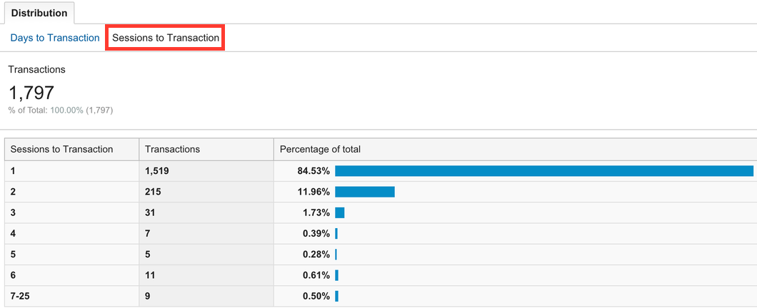
Impluse buyers are, by definition, those visitors who purchase within their first visit. Thus, we want to know which transactions are completed on our site within a single session.

The number of sessions it takes to convert

The number of sessions it takes to convert

For an ecommerce website, a single-session percentage of more than 80% indicates that quick buying behavior is contributing to your overall conversion rate. You’re probably serving your impulse buyers well.

If single-session conversions make up less than 60% of your total transactions, one of two things is happening.

  1. You are selling something that methodical customers are going to purchase, such as appliances or a college education.

OR

  1. You are not satisfying the impulse-buyers’ craving before it passes.

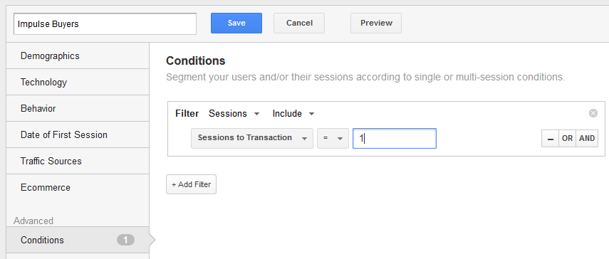
Google Analytics makes it easy to track impulse buyers on your site. Create an advanced segment for those visitors who purchase in one session.

When you look at your Google Analytics reports through the lens of this segment you will see how impulse buyers are impacting your business.

Impulse Buyers (blue line) are a significant portion of all revenue (orange line) for this ecommerce business.

Impulse Buyers (blue line) are a significant portion of all revenue (orange line) for this ecommerce business.

Use this segment to answer other questions as well. In the graph below, it is clear how an email promotion to existing buyers affects the impulse buyer segment.

Email campaigns appeal to return and repeat buyers and less so to first-time impulse buyers

Email campaigns appeal to return and repeat buyers (orange line) and less so to first-time impulse buyers (blue line).

How did these visitors get to your site? Where did they land? Did they use site search or navigation to get to a product page? What items did these quick buyers purchase?

Search is clearly not important to most impulse buyers for this site.

Sessions with Searches: Search is clearly not important to most impulse buyers for this site.

Answering these questions will help to develop a map of impulse behavior on your site.

With this blueprint, you’ll be able to pinpoint the areas of your site that attract impulse buyers and begin to test conversion optimization efforts that focus on them.

Reducing Risk

When customers are poised to buy, they do a risk assessment. Impulse buyers love low-risk transactions. This is the job of what we call risk reversal tactics.

A risk reversal tactic is anything that takes the risk out of a transaction. Risk reversal comes in many forms.

  • Money-back guarantees
  • Warranties
  • Trust symbols, such as the BBB logo
  • Ratings and reviews
  • Free shipping offers
  • Low-price guaratees

Often sites signal that they can’t be trusted without even realizing it. They hide their return policies, or make them so complex that they become meaningless. They don’t display free shipping offers in a prominent place.

Impulse buyers have a quiet voice in their head asking “Is this a good idea?”.  What can you do to make sure the answer to that question is always “Yes”?

Case Study: JetPens

The vaguest, most theoretical thing you should be doing is making people feel good about giving you their personal information.  Trust symbols must be obvious but subtle enough to avoid that “Trust me!  Trust me!  Trust me!” vibe that we get from used car salesmen, so incorporate them as naturally as possible.

Take Jetpens.com, an online store selling Japanese pens and stationery.

JetPens naturally decreases risk reversal with the trust symbols on their checkout screen.

JetPens naturally decreases risk reversal with the trust symbols on their checkout screen.

This store is somewhat specialized, so it doesn’t have the same degree of trusted name recognition as an office supplies store like Staples or Office Depot.  One way it resolves the issue is having the Google Trusted Store symbol in the lower right corner.  It sticks to every page, not just the checkout screen.

This is called “borrowing trust.” Sites can borrow trust from current clients, credit card companies, and certification organizations like Google and Buyer Safe.

Increasing Order Size

While you may see free shipping as a pricing issue, it really acts to reduce risk. It reduces anxiety about spending money on a website. It is can also increase the average order of impulse buyers.

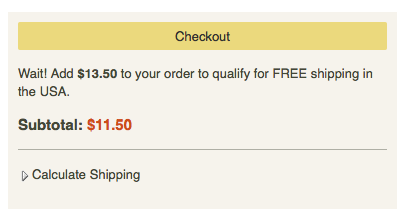
JetPens offers free shipping for orders over $25, and they make it really easy for you to hit that mark.

You know exactly how much you need to spend to get free shipping.

You know exactly how much you need to spend to get free shipping.

There’s no need for their impulse buyers to do any math.

In lieu of free shipping, it pays for your site to be up-front about what shipping will cost. This takes the surprise out of the transaction, reducing cart abandonment.

JetPens uses a Calculate Shipping button for just this purpose.

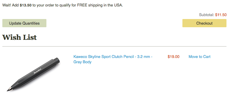
You don't even have to leave the checkout page to fill your cart to the $25 mark.

You don’t even have to leave the checkout page to fill your cart to hit the $25 mark.

Getting to the $25 mark that signals free shipping is pretty good motivation for most people to spend more money, but once someone is in the checkout screen, do you really want them to leave it?  By placing a few items from account holders’ wish list at the bottom of the page, JetPens makes it easy for impulse buyers to double-down. Customers see how much more they need to spend and a great suggestion for how to get there.

If the visitor hasn’t added anything to their wish list, why not add a few inexpensive suggestions of your own?

Case Study: ModCloth

With online retail, shipping information needs to be easy to find.  Free shipping isn’t the only reason people convert: they’ll also be more likely to buy if they think it will be easy to return what they bought.  Someone doing lots of research on a product may be willing to hunt around for money-back guarantees, but impulse buyers need trust symbols to be much more in-their-face.

ModCloth, an online women’s clothing store, uses the top of its website to embed lots of different trust symbols.

The top of ModCloth's website is covers lots of trust-building bases.

The top of ModCloth’s website covers lots of trust-building bases.

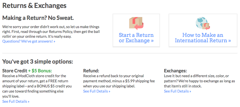
Customer care and shipping information is at the top of every page, and when you visit the page on returns and exchanges, it’s also pretty easy to understand.

ModCloth's return policy

ModCloth’s return policy

Someone in a hurry to spend money may not make it all the way to this page, but she’ll know it’s there, and she’ll know that exchanges are free without even clicking.  Why wouldn’t she spend her money if it’s that easy to get rid of something that didn’t work out?

Introducing Scarcity

Scarcity is a term that includes limitied supplies, limited-time engagements, exclusivity and qualifications to buy. It imparts a sense of urgency to a shopping session, and impulse buyers are just looking for excuses to act. Give your impulse buyers excuses to act by making it clear that she will be missing out if she doesn’t buy right now.  Remember, impulse buyers see the shopping process as expensive and don’t want to waste their time.

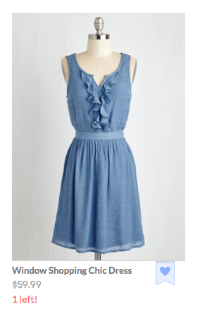
Dwindling stock makes this item much more attractive.

Dwindling stock makes this item much more attractive.

Only one Window Shopping Chic Dress left?!  What am I going to wear when I go window shopping this weekend if that dress doesn’t end up in my closet!

Many impulse buyers like feeling like they’re part of an exclusive group. It feeds their egos and justifies the elitist tone they use when they brag about how the rest of us weren’t able to wear the right window shopping dress.

Increasing the Perceived Value of an Impulse Purchase

Free gifts and bonuses add value to a perceived purchase. The gift doesn’t have to be an extraordinary offer. It provides another excuse to act, often increasing urgency.

SheIn hits that impulse buying nail on the head not once, but twice.  First, a popover tells you that there’s an opportunity for a free gift.

Free gift offer from SheIn

Free gift offer from SheIn

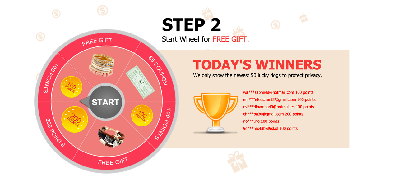
But here’s the fun part.  You have to start a wheel for a free gift.  So it’s a game!

Shoppers play a game to get a free gift.

Shoppers play a game to get a free gift.

This strategy works for pretty much any kind of business, not just retail.  SheIn asks you to join a mailing list order to have the chance at spinning the wheel to get a free gift, so it’s a lead-generating strategy.

The Gift of Game

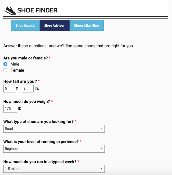
Gamification is much beloved by millennials, a group renowned for their impulsive buying behavior.  Quizzes and games make even the most mundane tasks so much more interesting.  Let’s say I’m looking for new running shoes, so I search “What kind of shoes should I buy?”

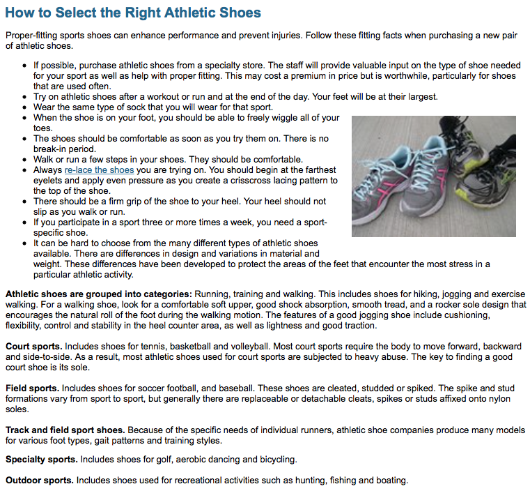
One result is from the American Orthopaedic Foot and Ankle Society.  The name alone seems pretty trustworthy. What do they have to say about what shoes I should buy?

Running shoe buying guide

Running shoe buying guide

Yikes. This isn’t even half of the article! Luckily, I have another option to help me find the answer to my question.

Runner's World shoe quiz

Runner’s World shoe quiz

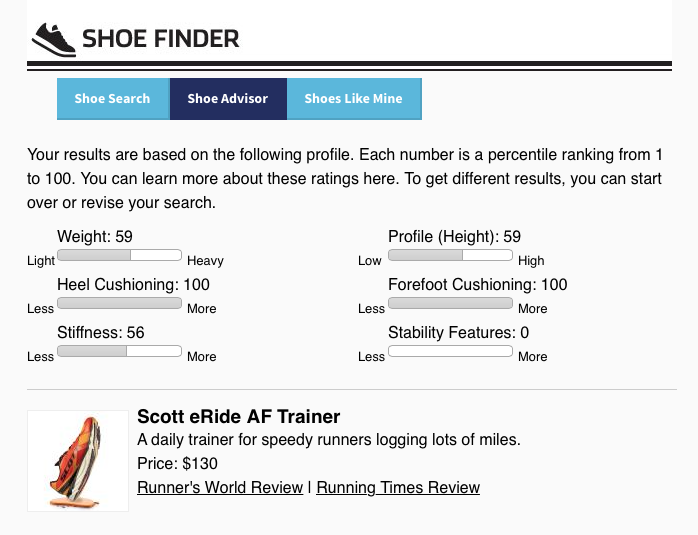
Runner’s World magazine makes things so much easier!  First I take a short quiz, then it spits out a shoe suggestion for me.

Running shoe suggestion

Running shoe suggestion

Runner’s World doesn’t want to sell me a shoe, but if I were on a retail site selling running shoes, how awesome would it be to be able to click “Add to Cart” from this page?

Go Mobile or Go Home

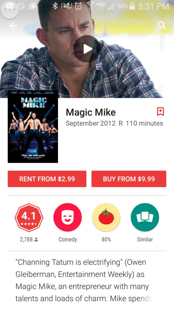
This weekend I had a movie night with some friends at my house because we urgently needed to watch the first Magic Mike movie.  We didn’t want to miss any major plot points when we watched the soon-to-be-released sequel.

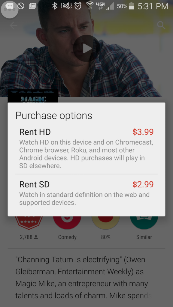
I rented the movie on my phone using the Google Play Movies & TV app.  I tapped the purchase button, and openly lamented to my friends how easy it was to throw my money away.  I mean disgustingly easy.  Three taps and four bucks of my hard-earned money was gone, replaced by the privilege of having two days of access to a movie I hope my mom never finds out I watched.

Magic Mike to rent

First tap

Renting options

2nd tap…and 3rd tap my money is gone

Voila, I made a purchase I kind-of-but-not-really regret.  Your website could have that purchase!

On mobile, fewer people are doing research.  They’re either buying, or they’re leaving.  I wanted that Magic Mike movie, and I wanted it right then.  More obstacles would have meant using a different app or just watching a different movie I already own.

Buying something from you should be as easy as renting a movie on my phone.

Park the things you know about your desktop users. Think about the needs of your mobile visitors as if they were a different animal. They’re not unicorns or dragons or anything, but you wouldn’t put a leash on a cat. They just won’t stand for it.

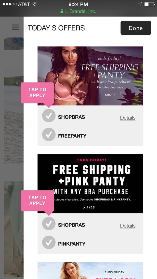
As an example, Victoria’s Secret realized that promo codes are to mobile users what pull cords are to blow dryers. They’re not the right tool for the job.

Victorias secret doesn't ask mobile visitors to enter a promo code.

Victoria’s Secret doesn’t ask mobile visitors to enter a promo code.

Impulse Abandoners

Impulse buyers become impulse abandoners when your site doesn’t serve their need to take action. The moment they perceive that a transaction is low value, that the effort is too high, that a purchase is risky or that there is no urgency to take action, they become less impulsive.

It is not manipulative to feed their need for speed. Giving impulse buyers the rationale to act is exactly what they want from you. Why deny them?

Feature image licensed under Creative Commons and adapted for this post.

We came across this infographic from ecommerce-platforms.com, The History of Commerce from Cattle to Bitcoin, and realized that conversion optimization has been around as long as commerce. Conversion optimization is the art and science of making more money from what you have. It is about getting more currency from the investments you’ve already made. Today we tend to associate optimization with websites and traffic, but making more from what you have goes back as far as 9000 BC.
Take for example, cattle trading.
image
Farmers and shepherds optimized their herds by encouraging procreation. This made more “currency” from the stock they had. To this end, they were known to play romantic music and light candles to encourage an amorous atmosphere. In extreme situations, the shepherds were known to get the animals drunk, hoping for a hookup or two.
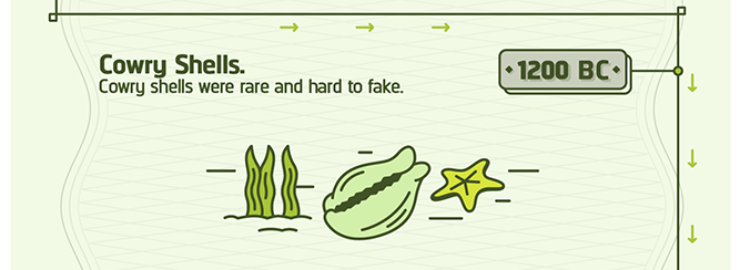
Unfortunately, this didn’t work with cowry shells. It was never clear what would make mollusks feel more amorous toward each other. So, optimizers invested in snorkeling gear hoping to find more of the rare shells. While it was centuries before the technology was perfected, this is considered the origin of SCUBA diving.
image
This is also most likely the origin of the phrase “For just a few clams.”
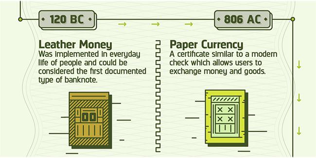
When leather money was invented, conversion optimization consisted of stretching the skins, hoping to get more from each leather bill.
image
We refer to this kind of optimization when we talk about “Stretching your dollar.”
image
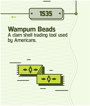
As early as the 1500s, native Americans used VWO (Visual Wampum Optimizer) to get more from their money. This is an early forerunner of the Visual Website Optimizer tool we use today.

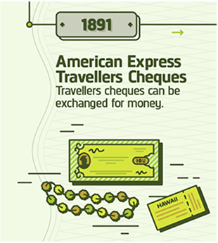
With the invention of Travelers Cheques, the slogan, “Don’t leave home without them” entered the American vernacular.
image
Savvy optimizers knew the way to hang on to more of their money was to not spend it. They adopted a new version of the slogan, “Don’t leave home.” Unfortunately, a whole generation of young adults seems to have adopted this motto, much to the chagrin of their parents.
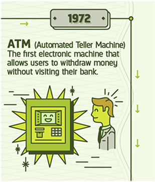
The banks got into the optimization game with the invention of ATMs. They were able to charge us for the privilege of giving us our own money. Optimization revealed that banks can charge higher ATM fees when the machines were placed in strategic locations.
image
For example, banks learned that they could charge as much as $10 in fees for machines placed near car impoundment lots and in Las Vegas casinos.
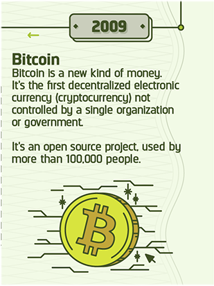
With the advent of Bitcoin, optimization has come full circle. In 9000 BC, optimization was all about farming. Bitcoin is created from “farms” of computers doing near impossible calculations.
Bitcoin currency
And, based on the unpredictable behavior of Bitcoin entrepreneurs, alcohol would almost certainly have to be involved.
Today, the best way to get the most from your investment in traffic and web properties is to call a Conversion Scientist. During our href=”/contact-conversion-sciences/”>free consultation, we’ll tell you exactly how to optimize your online business and get an “unfair” advantage over your competition.
How would you have optimized the currency from the other eras in the infographic? Tell us in the comments.
History
History of Commerce: From Cattle to Bitcoin, infographic created by Ecommerce Platforms.

Oli Gardner will make you blush when he rips your landing page copy from its safe HTML home and shows you what it says as a plain text file.
I got to thinking, what if we just pulled the images from your website? Would they be able to tell the story of your value proposition?

The Role of Images on a Web Page

Too many designers see images as a way to break up the copy on a web page. They use filler images, stock photos and silly graphs that have no meaning.
Images are a powerful way to convey your value proposition – the reason that a visitor should consider your offer. This is true for landing pages as well as your home page.
The impact on a landing page can be extreme.
Images draw the eye. When your visitors first arrive, these are the elements that get seen first as they scan the page. Images can immediately ask the first question your prospects have, “Am I in the right place to get what I’m looking for?”
Images should compliment, support and enhance the copy on the page. Any image that doesn’t move the value prop forward is hindering it.
Pull the images from your page and take a look.

The Image-only Version of Your Landing Page

If you were to pull just the images from your site, would they tell your story? Here are the images from a site offering information on annuities.

What does your landing page say in pictures?

What does your landing page say in pictures?


It starts off great. The main image has a stock model representing the target audience.
Adding text to an image makes it relevant to your message.

Adding text to an image makes it relevant to your message.


Adding text to an image is a simple way to give it power.
Adding text to an image is a simple way to give it power. Furthermore, the model is looking at the information you want them to read. If a model is staring at the visitor, the visitor tends to focus more on the face, and less on the messages on the page.
This is essentially an in-image caption.

Captions Get Read

One of the most read portions of your landing pages is the caption. Unfortunately, most pages don’t use captions. Captions explain the image in more detail, moving the value proposition forward for the reader.

Captions are a great place to repeat the offer on the page.

The Caption Test

The best way to test to see if your captions are helpful is to ask a stranger to write a caption for it. How would our annuity page fare?

Graphics without meaningful information don't move your value proposition forward for the reader.

Graphics without meaningful information don’t move your value proposition forward for the reader.


Caption Test: “Get complex information about something.”
The heading for the copy next to this is, “What are the fees associated with an annuity?” This should be repeated as the caption.
The remaining images don’t do so well.
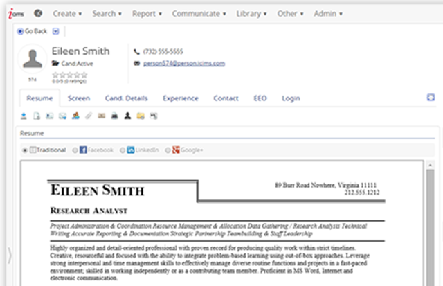
Is this a happy customer? An employee? We can tell the difference between a model and a real person.

Is this a happy customer? An employee? We can tell the difference between a model and a real person.


Caption Test: “I will meet attractive older men. Sooo handsome.”
The copy headline next to this image reads, “What if I need access to the principal in my annuity?” The answer may have made this handsome man smile, but the image really doesn’t support the point. This would not work as a caption.
Another lost opportunity to communicate something valuable.

Another lost opportunity to communicate something valuable.


Caption Test: “Time is running out for you and your little dog too!”
What are your images bringing to mind in your reader's mind?

What are your images bringing to mind in your reader’s mind?


The copy next to this image reads, “How long will I be able to receive income from my annuity?” This would work as a caption. But with the power that an image has for conveying a message, I think this page could do much better.

Images that Work

In general, your images should strive for the following characteristics.

Use real people when possible: employees, clients and spokespeople are great choices.

Use real employees, customers or spokespeople in your images.

Use real employees, customers or spokespeople in your images. This one needs a caption.

Use text on the image and as a caption to advance your value proposition.

Don’t be afraid to repeat offers in captions and on-image text.

This image makes great use of in-image text and an offer in the caption.

This image makes great use of in-image text and an offer in the caption.

Design images that support the copy on the page.

This image uses in-image messaging that supports the copy on the page.

This image uses in-image messaging that supports the copy on the page.

Direct the gaze of people in images to offers, forms or other important parts of the page.

This model is looking at the form, the most important part of this landing page.

This model is looking at the form, the most important part of this landing page.

For software products, choose screen shots that don’t make your product look intimidating.

Screen shots should focus on key features of your software offering.

Screen shots should focus on key features of your software offering.

Spend as Much Time on Your Images as Your Copy

Utlimately, if you spend as much time on your images as you do your copy, you will find creative ways to power conversions on your landing pages, home pages… all pages.

Images courtesy ICIMS, Expert Market and TheStreet.com.

In January a large property listing website announced they’d increased conversions by 300%. They’d significantly changed the site’s design and the way they searched for properties, delivering results by travel time rather than miles radius.
In March a second property website announced a boost of 300% but this time no design change whatsoever. They started delivering results by travel time, and that was the only change they made. Timing was everything.

Why does providing travel time boost conversions?

As with any conversion boost, it’s down to optimizing consumer experience. The search results were more relevant, but why?

Personalization: the key to transforming conversion rates

We already know that personalization is key whether you’re composing an email campaign or doing post-sales follow-ups. Where’s the personalization in location? Personalization is nothing without people, which is the downfall of a distance search. A mile “as the crow flies” isn’t relevant if the crow is on a bus or in a car.
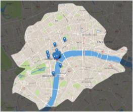
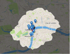
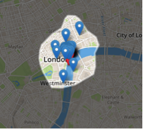
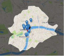
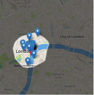
Acknowledging infrastructure networks transforms a circle into a polygon. This polygon changes shape depending on the surrounding location’s network. Local search results that use a polygon model will eliminate all the erroneous results that would have been delivered in a miles radius search.

Search result with radius model

Search result with radius model


Map acknowledging transportation networks

Map acknowledging transportation networks


Search result with polygon model

Search result with polygon model

Sorry, I’m running 5 miles late

A mile is not a human metric: we do everything by time. We need to arrive at locations on time, leave on time, spend time at locations or visit several places in an allotted time. The problem is that one mile can take five minutes or one hour depending on congestion, infrastructure and other factors.
Tell a hungry person their favorite restaurant is ten minutes away, and they know exactly what you mean. Tell them it’s a mile away, and they will need to know a lot more. Using time in local searching makes the results relevant and understandable. When the amount of consumer leg-work is reduced, they’re more likely to decide there and then.

Time to personalize

People search for location-specific results because they need to get there. Websites that use minutes instead of miles can ask two simple questions that will personalize each search so that no one will ever need to work out “will this work for me?”


  • What time of day are they planning on traveling?
  •     

  • What mode of transportation will they use?

Give it the time of day

This information alters the relevant results for three reasons.


  1. Transportation timetables and open/close times will limit where a consumer can go.
  2.     

  3. The results they seek will also differ – restaurants open at 3:00 am are different from those at 6:00 pm.
  4.     

  5. Road congestion will most likely reduce in the early hours of the morning.

Some locations will always operate at the same time of day. Lunch reservations will always be in the same time window. Property searches may always use 9:00 am because the majority of people commute from home to work at that time.
Other sites may choose to automate the time function so that the visitor sees what is possible at the time of their search. This is useful if the site visitor wants to get there immediately, giving accurate results quickly.

Timely transport

The four polygons show different results for different transportation modes within 30 minutes. You can see that walkers can’t cover as much distance as drivers (obviously!). Adjusting for the exact mode of transportation ensures that every location result is reachable and removes any errors covered in distance searching.

Polygon search result for cycling

Cycling


Polygon search result for public transport

Public transportation


Polygon search result for driving

Driving


Polygon search result for walking

Walking

Case Studies:

Restaurant listing site OpenTable lets customers book tables so that they can reach their restaurant reservation within minutes.

The distance to a restaurant changes by mode of transportation.

The travel time to a restaurant changes by mode of transportation.


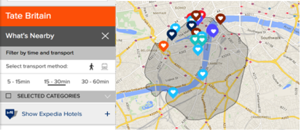
UK national tourism agency VisitBritain lets tourists plan their day based on what’s near their attraction of choice.
Planning your day by travel times.

Planning your day by travel times.


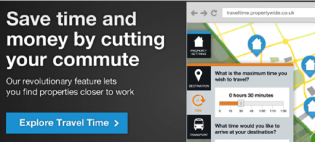
The UK’s largest real estate agency group Countrywide lets property seekers pick how long they want their commute to be when listing new homes.
Coutrywide let's visitors shop for homes by commute time.

Coutrywide lets visitors shop for homes by commute time.

Time is mobile

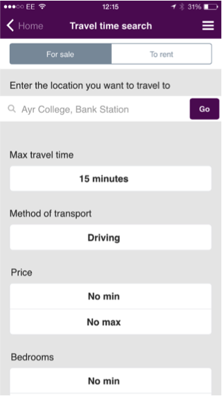
With four out of five local searches on mobile devices ending with a purchase, marketers need to leverage their apps to ensure that they’re catering to the ever-moving consumer. Consumers can pick their search point or use mobile location searches to search by minutes from their current point.

Travel time search results on mobile device

Travel time search results on mobile device

Whose marketing efforts will benefit most from travel time search results?


  • Local businesses and listing sites can deliver local results within minutes rather than miles e.g. property, restaurants, bars, jobs.
  •     

  • Retailers providing click and collect services can navigate customers to the best pick up point and direct customers to access-friendly locations when products are out of stock.
  •     

  • Delivery services (food, laundry, furniture etc.) can create marketing campaigns around the minutes it takes to reach each individual customer.
  •     

  • Companies with location-specific geo-targeting campaigns can deliver location-based information in minutes rather than miles radius.
  •     

  • Classified listing sites eBay and Gumtree can supply product searches using travel time when users prefer to pick up locally.

It’s about time…I wrapped things up

Searching for locations by time delivers more accurate results. Consumers like it and convert.
        

  • Consumers convert when they are delivered more relevant results
  •     

  • As the crow flies isn’t accurate because we can’t fly!
  •     

  • Consumers need a human metric for location searching. Don’t reinvent the wheel, get a clock.
  •     

  • Ask site visitors more to deliver more accurate results

About the Author

Louisa is head of marketing at iGeolise.com. The company is the creator of the TravelTime Platform, an API that allows websites to search, rank, sort and display location results by minutes rather than miles. She’s cuckoo for conversions – particularly if they have to do with local search. To find out more follow them on Twitter @iGeolise or go to  www.gettraveltime.com.

Would you be brave enough to let a bunch of conversion experts tell you what is wrong with your website?  Flex Fitness’s Ryan Ehler did just that when he won the privilege of having five website optimization experts evaluate a landing page for one of his ads. Digital Marketer published all of the recommendations.
The critiques may seem a little rough, but in the end Ryan was the recipient of some really solid advice (estimated to be worth $25,000).
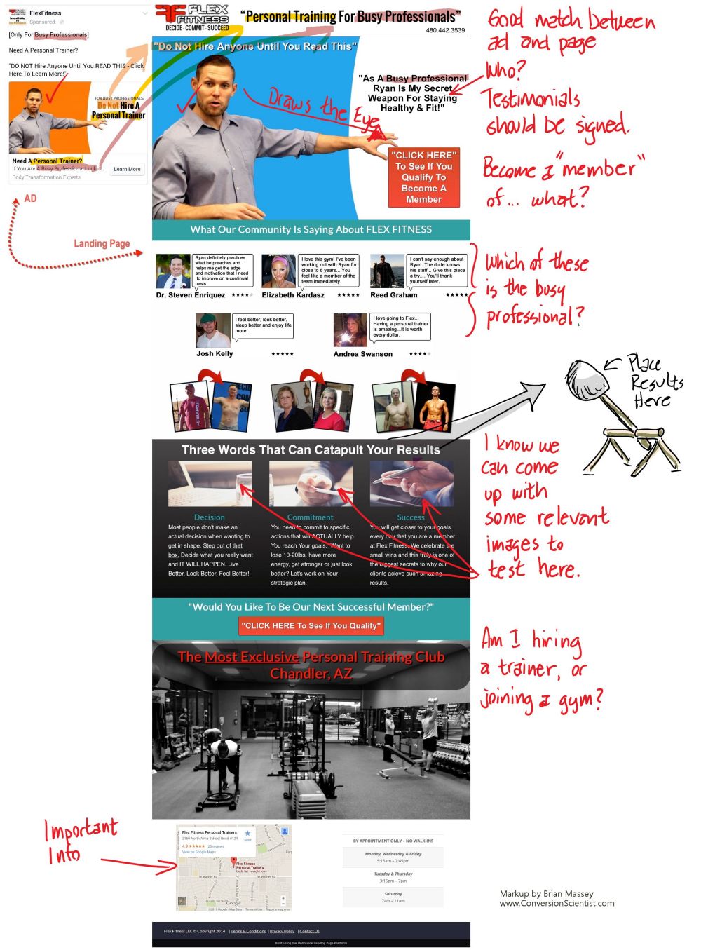
Our own Brian Massey pointed out some problems that needed to be addressed. Here are the note from which his full critique was created.

Notes from Brian Massey's review of Flex Fitness landing page.

Notes from Brian Massey’s review of Flex Fitness landing page.


What can you take away from this?
1. Make your landing page match the promises in your ad. Ryan does a good job here, matching copy and images.
2. Don’t try to be too cute with your copy.
Why do we want to catapult our results?? We want to keep them, don’t we?
3. Use images that support your value proposition. The image of the gym are supportive. The stock photos in the “Three Words…” section is not.
4. Make your calls to action clear. What will happen if your visitor submits a form or clicks on a button.
Read the full critiques from Brian and website optimization experts Chris Goward, Tim Ash, Justin RondeauPeep Laja.
Learn more about landing pages on The Conversion Scientist Blog.

Guest Post By Russel Cooke
Facebook has a new advertising network that has some people worried about their personal data online.
The new network, Atlas, uses data it collects from users on Facebook to serve ads on other websites based on what Facebook knows about its users. Facebook already uses personal data to serve up contextual and targeted ads within Facebook, but now Atlas gives them the ability to use this data on behalf of third-party websites and apps.

Atlas allows advertisers to follow users across devices and across the Internet.

Atlas allows advertisers to follow users across devices and across the Internet. Image Courtesy of Shutterstock


Facebook bought Atlas in 2013 for approximately $100 million and has entirely rebuilt it. The former Microsoft property will now serve as Facebook’s alternative to Google AdWords, allowing advertisers to follow users across devices and across the Internet.
For example, a beer company utilizing Atlas can use the platform to serve ads on sports websites or game apps that aren’t related to Facebook.

Cookies Aren’t Working

In a blog post, the head of Atlas, Erik Johnson, addressed the limitation of cookies, which had been the industry’s instrument for serving ads on desktop and tracking users.
He noted that cookies are becoming less accurate when it comes to demographic targeting and don’t work on mobile. Cookies also have trouble accurately measuring the customer purchase funnel across devices, browsers, and in the real world. He wrote that Atlas’ focus is on “people-based marketing.”
This type of advertising may make some users uncomfortable in relation to how their personal data is used. Yet, it presents a new opportunity for advertisers and offers up an alternative to Google AdWords management.
The platform will also help marketers and advertisers understand how their efforts across different networks and channels intersect and how they can bolster each other. Atlas eliminates the need for silos in advertising campaigns, which results in a more consistent advertising experience for the end-user.
Facebook’s existing advertising solution previously only used cookies to track the websites that users visited and targeted ads based on that data. As mentioned, Atlas does not rely on cookies to gather consumer information.
In the past if a user browsed the prices of a car on a dealer’s website they would probably see car ads in their News Feed. However, because cookies do not work on mobile, it would have been difficult for advertisers to fully and comprehensively track the behaviors and interests of users.
Atlas is not dependent on cookies and can track the third-party websites that people visit. This more robust information better allows advertisers to target ads around the interests and “likes” of Facebook users.

Tracking Sales Across Screens

The benefits of Atlas don’t end with tracking users and more efficiently targeting campaigns. It also has the ability to determine if a user purchased a product on a desktop after viewing an ad on a mobile device. It tracks the relationships between offline sales and the online advertising that spurred them on.
For example, if a person makes a purchase and gives their email address during the process Facebook would be able to let the store know that the person had viewed an ad online.
These connections will be invaluable to marketers and advertisers, as they will now be able to fully understand the relationship between their campaigns and real life sales activity. As the tracking grows and evolves, advertisers will create more compelling and powerfully targeted campaigns.
Atlas is making the advertising process more people-focused and the most successful advertisers will follow their lead.
Russel Cooke is a business consultant and writer from Baltimore, Maryland. He graduated from the University of Louisville, and worked in the Louisville area for over ten years before become an independent consultant and business writer. He recently relocated to Los Angeles, CA. You can follow Russel on Twitter @RusselCooke2.
 

Ghostbusters was a touchstone for us. Seven years ago, we were launching into a new marketplace – conversion optimization. Like the Ghostbusters, many didn’t understand the value of what we did. Like the ghosts of the movie, the goblins in a website were invisible and ethereal.

So, we turned up the volume, donning lab coats and teaching anyone who would listen. Today, conversion optimization is quickly becoming a must-have discipline in any online business.

Four Ghostbusters
We have always taken inspiration from the trio of Venkman, Stantz and Spengler, collectively known as the Ghostbusters.

To celebrate the 30th anniversary of the release of the Ghostbusters movie, we offer nine important lessons that we’ve taken from this classic comedy.

1. Get Yourself Some Cool Toys

“It’s technical. It’s one of our little toys.”
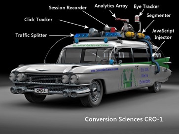
Batman had the Bat Cave. Ghostbusters had ECTO-1. We have CRO-1.

For us, we have to be able to bring our tools of choice to our clients. You probably don’t need the mobility that we do, but should have your own digital lab, stocked with the latest toys.

This modified ambulance carries some cool CRO tools.

This modified ambulance carries some cool CRO tools.

For us, we require a solid analytics setup to build on. We further like to add some click tracking tools to see how visitors are interacting with pages. Our split testing software allows us to segment visitors into tests and to inject JavaScript into their experiences.

In the past, we’ve used session recorders and eye-tracking software to get more info on how visitors are using a site.

Yes, we think these are pretty cool toys. You will too when you wield them with a little finesse.

2. Save Your Tests

“Please understand. This is a high-voltage laser containment system.”
The Ghostbusters went on quite a hunting spree in the first movie capturing all manner of ghost, ghoul and specter. What did they do with these? They placed them in a high-voltage laser containment system.

When you complete a test on your website, you need to save the results in a place that ensures you won’t forget what you’ve learned.

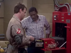
Ghostbusters store a ghost.

Store your tests where they can have the most impact.

We’ve never had a one-size-fits-all approach to documenting test results. We’ve used physical books that we call “Books of Swagger” so that our clients have the answers to questions at their fingertips.

We’ve kept detailed spreadsheets of tests.

Today, we rely most frequently on PowerPoint decks to save our “swagger” along with the details of the tests in our split testing tools.

3. Realize You’re Saving the World

“Fire and brimstone coming down from the sky! Rivers and seas boiling! Forty years of darkness! Earthquakes! Volcanoes! The dead rising from the grave! Human sacrifice, dogs and cats living together — mass hysteria!”
Don’t underestimate the magnitude of the shift you’re bringing to your online business. Adding some science to your marketing is going to bring profound changes to your organization.

Decisions will be made differently. Old beliefs, superstitions and sacred cows will disintegrate.

It will be painful at times and will take some passionate convincing of doubters. In the end, you could be saving the business.

4. Get Some Strange Hobbies

“I collect molds, spores and fungus.”
You’ve got to be interested in some strange topics. Revenue per visit, statistical significance, correlation vs. causation… it’s quite different from product, positioning and pricing.

Yes, the geeks are going to rule the marketing world, so get your geek on.

CRO geeks are interested in the psychology of influence, the structure of the mind and in rudimentary statistics. We study images, copywriting, pricing theory and user experience theory.

The bottom line is that you are going to have to nurture an interest in some unusual topics to be a well-rounded online marketing scientist.

5. Clear Your Mind

“It’s the Stay Puft Marshmallow Man.”
Expectations and attachments will dull your ability to apply science to your marketing. Often, our most cherished creative just won’t win in a split test.

I’m not saying that you shouldn’t have goals for your tests. However, expectations and attachments to outcomes can lead to poor decision-making.

If you’re sure a certain treatment is going to win in a split test, you’re more likely to call it a winner before the confidence level is high enough.

If you expect your results to “make sense”, you are more likely to throw out valid results as “unexplainable.”
We find that it is harder to come up with new hypotheses for a site we’ve been working on for a year or more. It’s harder to clear our minds of the knowledge we already have.

The more you know a thing, the less meaning it has for you. Clear your mind.

6. Don’t Cross the Streams

“Try to imagine all life as you know it ending instantaneously and every molecule in your body exploding at the speed of light.”

Ghostbusters capture a ghost.

Don’t cross your traffic streams when doing multiple tests on a site.

The more tests we can run on a site, the faster we learn. Sites with a large number of visitors and conversions can run several tests, provided the audience can be segmented.

The idea of testing is to understand what is working and what is not. To do this, we need to isolate variables. This is science talk for “only change one thing at a time.” Ideally, only one thing will change for any visitor to your site.

However, if you allow a group of visitors to enter multiple tests, then more than one thing is changing. Imagine that a visitor comes to the home page and is entered into a test in which you remove the sidebar menu. Then they come to a test in your shopping cart in which you remove the discount code field.

When the tests are done, you won’t know which combination of home page sidebar and discount code field resulted in the most sales. The data for both tests have been polluted and cannot be relied on.

So, don’t cross your streams of traffic. If you are running multiple tests on a site, be sure that you segment traffic to only see one or the other.

7. Be Proud to be a Scientist

“Back off man. I’m a scientist.”

You should feel proud to have a data-driven marketing program up and running. Science isn’t perfect, and the fact that we are always trying to prove ourselves wrong means that our self-esteem may suffer.

Most importantly, you should be bringing others in your organization along the science learning curve.

Don’t be afraid to take a moment to explain statistical significance to a coworker. Go ahead and write up a memo on isolating variables or calculating the length of a test.

And when you have a success, be sure to do the money-dance in a very public way.

8. Tell Them About the Twinkie

“That’s a big Twinkie.”

At one point in our heroes’ adventures, Dr. Spengler uses a Twinkie to illustrate the growth of “psychokinetic energy” in the New York area.

“According to this morning’s sample, it would be a Twinkie 35 feet long weighing 600 pounds.”

Ghostbuster holding a Twinkie

Spengler uses a Twinkie to illustrate the ghostly trouble brewing in New York.

We really can’t take our graphs, charts and tables out to our organizations and expect others the understand what we’re seeing.

I think this is why we prefer to save our test results in slide decks. It is a system designed to tell an emerging story. These decks includes hypotheses, screen shots, data tables and conclusions. Everyone can open them and they can be as big as they need to be.

Sometimes, a map is better than step-by-step directions. Become a student of explaining and presenting findings. The better you get at this, the more cred you will build within your company.

Companies like Narrative Sciences are focused on turning data into stories.

Use your own Twinkies – analogies and metaphors – to help others understand the context for your discoveries and their relevance to themselves.

Charles Bukowski said, “Genius could be the ability to say a profound thing in a simple way.”

9. Don’t get Slimed

“I feel so funky.”

Ghostbuster got slimed.

Don’t let the slime get you down.

It is one of the inevitabilities of the scientist to have her most amazing theories regularly proven wrong. Inconclusive tests, polluted data and external interference make testing disheartening.

Don’t let a series of disappointments bring your momentum and scientific excitement to a standstill. Don’t let yourself get slimed.

If you find yourself in a slump, it’s time to get input from outside of your echo-chamber. Pull in some fresh eyes from elsewhere in the company. Watch a few recorded sessions or collect some user feedback using any of a number of tools.

When you feel your energy ebbing, it’s because you got attached to your outcomes. Be humble. Stay curious. Stay out of the slime.

Thanks to Dan Akroyd, Rick Moranis, Bill Murray and the late Harold Ramis for providing the inspiration we needed to take ourselves a little less seriously than we would have.

Are you troubled by high bounce rates in the middle of the night?
Do you experience feelings of dread in your CFO’s office?
Have you or your family ever seen you twitch, shake or cry?
If the answer is “yes,” then don’t wait another minute. Pick up the phone and call the professionals.

Images taken from Ghostbusters. All copyrights belong to their owners.

As scientists, we like to break things down to their essence, to understand the things that make them work. This works well when we’re optimizing websites.
Now it’s St. Patrick’s Day. What are the components of this rowdy holiday?

We decided to create our own website optimization holiday modeled on St. Patty’s Day. Our analysis indicates that we need two things:

  1. A Patron Saint
  2. Beer

Here’s what we did for today’s celebration.

Select a Patron Saint

How CRO is Like St. Patrick's Day: Tell us who your patron saint will be.

Tell us who your patron saint will be. Image Credit: iconsatoare.

In selecting a patron saint for our holiday, we considered a number of the saints of the Web.

St. Phatty is the the patron saint of online apparel stores. St. Maverick is the patron saint of industry changing online services like Amazon. St. Splatrick is the patron saint of online paintball vendors. St. Hattrick is the patron saint of magician websites. Can you guess the what St. Latte is the patron saint of? You pick your own patron saint and get ready to celebrate.

We decided that St. Buyschtuff would be the patron saint of online business. We created a mythology for St. Buyschtuff.

St. Buyschtuff: The Patron Saint of Marketers and Advertisers

St. Buyschtuff is a mythical figure frequently credited with influencing important purchases. For example, St. Buyschtuff is credited with selling both the watch fob and brush set detailed in the classic story “The Gift of the Magi”. When the three wise men were debating what to get the future king of the Christian faith, who did they consult? St. Buyschtuff is often credited with recommending the Frankincense and Myrrh, but thought the gold a bit garish.

St. Buyschtuff’s name is invoked whenever transactions are made. He is rumored to have been the original Easter Bunny and to have worked under the pseudonym “St. Valentine.” Saint Nicholas (aka Santa Claus) is said to have consulted with him about how to best use flying reindeer. Historian Herman Sellers said, “History is rife with bad deals and ill-advised transactions. However, whenever there is a purchase or transaction that results in great good for both buyer and seller, St. Buyschtuff’s name is frequently invoked.”

Tell us who your patron saint is in the comments.

Before we can have a party, we have some work to do. The second step is to “make beer.” For this article, “make beer” is a euphemism, like “make bank”, “print money”, “rev the revenue”, or “buy papa a new pair of shoes.”

If you’re St. Patrick and just had a long day of driving snakes out of Ireland, you want a cold brew with a little kick.

If you’re St. Buyschtuff and just had a long day driving abandoners out of websites, you want cold hard cash with a big kick.

St. Buyschtuff’s Day Brew or How CRO is Like St. Patrick’s Day

St. Patty’s brew is created in a boiler with hops and malted barley. Heat is applied at key points and carefully monitored to bring out the starches. Then yeast is introduced as a catalyst that turns the starch into buzz-inducing ethyl alcohol.

The St. Buyschtuff brew, in similar fashion, is created on a website rather than a boiler. It is filled with content and offers instead of hops and barley. The heat comes from traffic. Trust and proof are the catalysts that convert visits into buzz-inducing conversions.

Content and Offers

Before you begin brewing your content and offers, you need to go through a process of cleansing the content of self-serving, posing and irrelevant messages. You want a pure value proposition, enticing offers and nothing more. We’ll add some of your company information into the mix near the end of the process.

Don’t neglect images and video. Avoid filler images and stock photography, what we call “business porn”. Instead use images to better communicate your value proposition.

Turn on the heat (more how CRO is like St. Patrick’s Day)

Our mix is heated in the fire of live traffic. Traffic may come from search engines, paid ads, email or social networks. Each of these kinds of traffic burns at different intensity levels.

Our beer-brewing brothers and sisters must maintain the temperature of the flame in a tight range. We try to control our traffic quality as well. We may get less traffic than we could, but bringing qualified visitors is key to keeping the right temperature.

StumbleUpon traffic is the wrong traffic for most businesses. Social media networks deliver visitors who were doing something else, and work mostly for spontaneous purchases. Where are your qualified visitors. Yes, this is the question we are always asking. We never stop asking this.

Add some Catalysts

To drive fermentation, beer brewers introduce a bacteria called yeast. It processes the sugars extracted from the barley and convers them into CO2 and ethyl alcohol. The CO2 is vented off. The alcohol is kept.

Likewise, we need to add a catalyst to our website. We choose trust and proof. If your brand, company and products demonstrates proof or builds trust, now is the time to introduce this to the site.

Proof and trust process the content on the site and convert it into abandonment and conversion. Abandonment is, by definition, vented off. It is an inevitable part of the process.

Conversion is kept and will give us a nice “checkbook buzz” on the celebratory day of our patron saint.

Experiment (yes, CRO is like St. Patrick’s Day)

Brewmasters experiment with their mix, and they can’t just test one stage. They change the process, the temperature, the length of each stage and even add unexpected elements like fruit to the process.

But they always complete the beer before judging their changes. They can’t sample the “wort” or the “trub” and predict how the final beer will taste.

Likewise, we must test our website to the dollars. We like metrics like Revenue per Visit and Revenue per Click when testing. Testing to “engagement” or email “click-through rate” doesn’t let us test the right result.

We always measure to the dollars.

Happy St. Buyschtuff Day!

We celebrate our wins like the Irish celebrate the St. Patrick’s driving away of the snakes. We summarize the results, take the credit, and slap high fives.

Then we start working on the next conversion rate increasing brew.

Tell us what you’re brewing up for your day of celebration in the comments.

Brian Massey

© Copyright 2007 - 2024 • Conversion Sciences • All Rights Reserved • Conversion Scientist® is a federally registered trademark owned by Conversion Sciences. Any unauthorized use is expressly prohibited.