When we stand up a website, perhaps the most valuable question we can ask about our visitors is, “What triggered them come to our website? What problem are they trying to solve?”
The question is different when someone comes on their smartphone.
The question is, “What triggered them to come to our website from where they are? What problem are they trying to solve right now?”
When you add the “where” and “right now” components, it is clear that your mobile site has to answer a very different question.
I was inspired to talk about this when I was looking for a Chinese Restaurant near my office.
How to define a Mobile User
How do you define a mobile user?
Is it the operating system they use (Android or iOS)?
Is it the size of their screen?
Is it the device they visit with?
I would argue that the best definition of a mobile user is if they need an answer where they are or right now.
When I was looking for a Chinese Restaurant near my office, I picked up my smartphone even though I had a full-powered PC right in front of me.
Why did I do this?
Because my phone is my “where” device. It can tell Google exactly where I am as a reference.
It is also my “right now” device. When someone asks a question that I don’t know the answer to, I Google it on my phone. Not my laptop.
Old habits die hard.
So, what did I get from my where and now search?
A mobile site that doesn’t quite get me
For the person who is searching for a Chinese Restaurant from their mobile device, there are a few predictable questions. Your business has a similar set of predictable questions as well.
Here are the key questions for desktop and mobile devices:
|
Desktop/Tablet Questions
|
Mobile Questions
|
| Where are you? |
How far are you from where I am now? |
| What are your business hours? |
Are you open now? |
| Do you deliver? |
Do you deliver to where I am now? |
| What is on your menu? |
Does your menu meet the requirements of the people with me now? |
| Do you have a nice environment? |
Will I be embarrassed when we all show up? |
| What is your phone number? |
What do I do if I don’t find an answer to my above questions? |
So, how does the Chinese Restaurant Shu Shu’s mobile website fare in meeting my needs?
Shu Shu’s wins with a nice big click to call button. I may not need this now, but this is the way to display a phone number for a device that is a phone. Dialing is so last decade.
The two other big buttons on the first screen are both helpful and baffling. The map icon shows a map of the store location. “Where” is a natural mobile question. But, “Where is your Google Plus profile” is not a natural first question. So why is that the second most important item on the top screen?

The value proposition, “Fresh Ingredients, Clean Environment, Healthy Eating!” is not a common mobile question. In fact, this value prop introduces the concept of a not-clean restaurant. If it wasn’t a problem, why bring up “clean?”
The menu button answers an important question and one of the early ones. But why send people off to Yelp!? It seems that this would encourage comparison shopping.
And then came the text. Do I need to know that “Shu Shu’s Asian Cuisine offers the mouth-watering tastes you’re craving at our Chinese restaurant in Austin, TX?”
No, I don’t. This is SEO copy, and it has no place in a mobile experience. This is a downside of the responsive design.
Unfortunately, it just keeps going.
Finally, I get to something that speaks in the language of smartphones: images.
Well, one image.
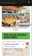
Let’s have some more pictures, please.
And we finally get to the map, with a link to “View on Google Maps.” This is how we can answer the question, “How far are you from where I am now?”

Adding a coupon-like sweetener is smart. However, the responsive design changed the aspect ratio of the image, making the site look cheap.
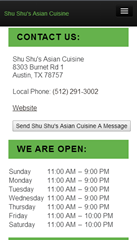
Next are the facts about address and hours of operation, complete with a link to “Website.” I thought we were already there?
Design for the Bottom Bounce
Finally, we hit bottom. Smartphone users have busy thumbs that generate lots of scrolling. Scroll tracking shows that many mobile visitors will “hit bottom.” This part of the page can be as critical as the first screen.

Choose wisely what you put at the bottom. I wouldn’t recommend sending bouncers off to social media. In fact, I would repeat the click-to-call phone number, place a clickable address, and maybe a way to take action here. A “Place an Takeout Order” button or “Email this to Friends” button would be good considerations.
I would also consider placing ratings and reviews here if possible.
All in all, this mobile site eventually delivers answers to most of the mobile user’s questions. The effectiveness is hampered by the responsive design that
- Inserts unnecessary elements.
- Slows the load time significantly.
- Mutilates some images.
In this case, a responsive design is probably not the right choice from a purely functional standpoint. However, it is easy to maintain, and restaurants don’t usually have the staff to manage multiple sites.
You don’t have to run a restaurant
The questions are the same, even if you don’t run a restaurant. However, there are differences for sites that have “considered” purchases, such as high-ticket products or business services.
What can you teach the mobile designer right now, where they are? Are they in a meeting being asked about solutions like the ones you provide?
We think that cross-device calls to action can be a big help.


The Most Important Person on Your Split Testing Team
CRO Tests | Multivariate | AB TestingMy partner Joel Harvey is fond of saying, “My favorite part of a design is the money.” He’s been part of many a web design project. His perspective comes in response to the number of times he’s heard things like:
In and of themselves, none of the above statements are unworthy pursuits. But if your goal is to increase online sales conversion and fill your coffers to the brim, you will fall woefully short if you believe that web design alone can do the heavy lifting of convincing your visitors to take action. If increasing sales is your goal, the most important person on your split testing team is the accountant.
Designers Don’t Design for the Accountant
A while back, a client sent us a couple of different mocks of some new designs they were entertaining. They ask which one I liked. The first thing I said is I like the one that makes you the most money. Up until that time their team was arguing over color palettes, white space,and rounded edges.
When I reminded them about the bigger goal, their conversation evolved. In a clock tick, we were all discussing the quality of content on the pages rather than the design elements. When their offer and call to action were right, everyone seemed to forget about the trivia of the actual design.
Designing For Your Ego
Another client brought to us a new landing page campaign they had just launched and were baffled and disappointed by the early results. They went on to explain that they thought this was the best designed landing page they had ever done. They had just hired a new graphic designer that ‘got it’, and even the CEO was impressed with his work. One problem, their paying customers didn’t seem to agree. No doubt, the design was gorgeous. Rich colors, curvy rectangles, sexy images, even the header and body fonts were crisp and clean.
So why wasn’t this campaign working? We had them show us their most recent successful campaign. The design was a tad dated, and compared to the new landing page it looked like a high school hobbyist in the company basement eating Cheetos and suckling energy drinks.
Still, by comparing we immediately saw the problem with the new landing page. The copy on the old page was much better. The headers screamed the product’s value proposition and benefits. The body copy answered relevant questions, and helped the reader imagine themselves buying the product. The call to action button was big, bold, and in your face. The new page looked stunningly attractive but said very little.
To add insult, the hot shot designer was a minimalist and had an aversion to big gawky buttons, so his primary call to action was tiny button that blended in with the hero image, and , by design, was easy to ignore. We instructed them to use the old page copy on the new design (they had to make a few adjustments to make it all fit), and we asked the designer to create a bigger and bolder call to action button. They obliged us and that new design finally beat the old landing page.
How Much Time Are You Spending With Your Designer vs. Your Banker?
So my lesson is this. Beautiful, eye-popping design and effective, profitable web design are two different things. And it always seems easier to mistake those eye-popping designs for profitable ones. Split testing will always lead you in the right direction.
Some companies spend more on design than they do on organic SEO, and almost all companies spend more on design than on Conversion Rate Optimization. Search engine spiders don’t evaluate site design, only content and links. And I have yet to see a company design their way into a better conversion rate and better RO.
Some companies spend way more time going back and forth about a design element than they do actually testing it. Makes you wonder how far ahead of your competitors you could get if you spent more time and resources on conversion optimization and testing.
So when considering a redesign of your entire site, of a successful landing page, or even a banner ad, do the following:
Above all, use web designers that deeply understand the web and principles of conversion. Otherwise they are just an artist, and the value of an artists works usually increases only after their demise. Can you wait that long?
Using Risk Reversal to Increase Ecommerce Sales: If You’ve Got it Flaunt It
Ecommerce CROThere’s an old (and probably sexist) saying that I often apply to many online marketing decisions.
The online store Magic Of Fire has “it.”
We have a scientific name for guarantees, warranties and generous return policies: Risk Reversal.
Magic of Fire offered an amazing guarantee. It goes something like this:
“Shipping is free. If you trust us enough to buy from us, we promise that, if you have any issues with your product or our service, we’ll pay to ship your item back at our expense and refund your purchase price.”
Now, can you find this promise on their product page?
Magic of Fire Ecommerce Product Page
I put it through our Scanning Electron Microscope and eventually found a “Free Shipping” logo near the bottom of the page. I eventually found a link to their return policy, with the text “100% Satisfaction.”
Cliche is not flaunting. Avoid language like “Satisfaction Guaranteed” and “No Risk” and “No obligation.” These no longer mean anything.
If you’ve got it flaunt it.
Risk Reversal Means Never Having to Say Goodbye
When you purchase from a glass and cement store (nothing is brick and mortar anymore), you know that you have an easy out if you don’t like what you bought. You’ll march right in there, slam it down on the customer service desk and demand your money.
Not so much online.
This makes buyers delay hitting that checkout button. They procrastinate, surf other parts of your site and wait for circumstance to save them from making the final decision.
This is especially true if you’ve done a poor job building trust and credibility with your site. The fear is that they will get a lump of coal deposited on their doorstep when they expected a snuggly with a heart-shaped pattern. And they will have no store to storm into.
It sounds “risky.”
Relational buyers will fear getting stuck with the wrong product.
Transactional buyers fear that shipping fees will ruin their great deal, especially if they want to return it (and they will return anything they don’t like).
“Risk reversal” turns “risky” into “safe.”
I recommended that Magic of Fire bring their fantastic return policy right up next to the Add to Cart button on their all-important product pages. I also recommended that they make their free shipping available all over the site, especially in the checkout process.
These two changes alone should deliver a significant boost in conversion rates and revenue per visit.
Does Risk Reversal Really Work?
Magic of Fire’s Mark Oakley called me for a free consultation. After meeting Mark over Skype and hearing his shipping and return policies, I bought a beautiful “star and moon” fire pit for my house.
Zappos has the most famous risk reversal story in the online world. Their 365 day return policy with shipping both ways is one reason their sales reached $1 billion in ten years. That’s amazing growth for a commodity apparel store.
Are you flaunting it?
This is just one mistake that businesses make when selling online.
Businesses who have great products or services with amazing value propositions and great reputations continue to struggle online.
We’re the people who change that.
Jump on a call with us at (888) 961-6604. It’s free, and we’ll show you how much money you could be making with our 120-day Conversion Catalyst™ program.
Update
Mark has apparently taken my advice to heart, placing his free shipping offer all over the site and adding risk reversal near his “Add to Cart” button.
Magic of Fire sitewide free shipping offer.
The feature free shipping in a visible place on the product pages as well.
Magic of Fire free shipping offer on the Product Page.
Want to find out how this turns out? Subscribe to The Conversion Scientist.
Let me put a finer point on the concept of “flaunting.” This is flaunting:
Make your best risk reversal offers pop on your pages.
This 20 second design may not match your brand, but you should strive to find something that pops for something as important as your risk reversal.
I’ll give a free signed book to anyone who can tell me in the comments where I heard “If you’ve got it flaunt it. If you don’t flaunt it more.”
The Most Important Questions to Ask About Your Mobile Visitors
Conversion Marketing StrategyWhen we stand up a website, perhaps the most valuable question we can ask about our visitors is, “What triggered them come to our website? What problem are they trying to solve?”
The question is different when someone comes on their smartphone.
The question is, “What triggered them to come to our website from where they are? What problem are they trying to solve right now?”
When you add the “where” and “right now” components, it is clear that your mobile site has to answer a very different question.
I was inspired to talk about this when I was looking for a Chinese Restaurant near my office.
How to define a Mobile User
How do you define a mobile user?
Is it the operating system they use (Android or iOS)?
Is it the size of their screen?
Is it the device they visit with?
I would argue that the best definition of a mobile user is if they need an answer where they are or right now.
When I was looking for a Chinese Restaurant near my office, I picked up my smartphone even though I had a full-powered PC right in front of me.
Why did I do this?
Because my phone is my “where” device. It can tell Google exactly where I am as a reference.
It is also my “right now” device. When someone asks a question that I don’t know the answer to, I Google it on my phone. Not my laptop.
Old habits die hard.
So, what did I get from my where and now search?
A mobile site that doesn’t quite get me
For the person who is searching for a Chinese Restaurant from their mobile device, there are a few predictable questions. Your business has a similar set of predictable questions as well.
Here are the key questions for desktop and mobile devices:
Desktop/Tablet Questions
Mobile Questions
So, how does the Chinese Restaurant Shu Shu’s mobile website fare in meeting my needs?

Shu Shu’s wins with a nice big click to call button. I may not need this now, but this is the way to display a phone number for a device that is a phone. Dialing is so last decade.
The two other big buttons on the first screen are both helpful and baffling. The map icon shows a map of the store location. “Where” is a natural mobile question. But, “Where is your Google Plus profile” is not a natural first question. So why is that the second most important item on the top screen?

The value proposition, “Fresh Ingredients, Clean Environment, Healthy Eating!” is not a common mobile question. In fact, this value prop introduces the concept of a not-clean restaurant. If it wasn’t a problem, why bring up “clean?”
The menu button answers an important question and one of the early ones. But why send people off to Yelp!? It seems that this would encourage comparison shopping.
And then came the text. Do I need to know that “Shu Shu’s Asian Cuisine offers the mouth-watering tastes you’re craving at our Chinese restaurant in Austin, TX?”
No, I don’t. This is SEO copy, and it has no place in a mobile experience. This is a downside of the responsive design.
Unfortunately, it just keeps going.
Finally, I get to something that speaks in the language of smartphones: images.
Well, one image.
Let’s have some more pictures, please.
And we finally get to the map, with a link to “View on Google Maps.” This is how we can answer the question, “How far are you from where I am now?”

Adding a coupon-like sweetener is smart. However, the responsive design changed the aspect ratio of the image, making the site look cheap.
Next are the facts about address and hours of operation, complete with a link to “Website.” I thought we were already there?

Design for the Bottom Bounce
Finally, we hit bottom. Smartphone users have busy thumbs that generate lots of scrolling. Scroll tracking shows that many mobile visitors will “hit bottom.” This part of the page can be as critical as the first screen.
Choose wisely what you put at the bottom. I wouldn’t recommend sending bouncers off to social media. In fact, I would repeat the click-to-call phone number, place a clickable address, and maybe a way to take action here. A “Place an Takeout Order” button or “Email this to Friends” button would be good considerations.
I would also consider placing ratings and reviews here if possible.
All in all, this mobile site eventually delivers answers to most of the mobile user’s questions. The effectiveness is hampered by the responsive design that
In this case, a responsive design is probably not the right choice from a purely functional standpoint. However, it is easy to maintain, and restaurants don’t usually have the staff to manage multiple sites.
You don’t have to run a restaurant
The questions are the same, even if you don’t run a restaurant. However, there are differences for sites that have “considered” purchases, such as high-ticket products or business services.
What can you teach the mobile designer right now, where they are? Are they in a meeting being asked about solutions like the ones you provide?
We think that cross-device calls to action can be a big help.
How Many Steps Should Your Online Checkout Have? [CASE STUDY]
Ecommerce CROSwellNoMore is one business that changed its cart for technical reasons, and ended up changing their visitors behavior in the process.
How many steps should your checkout process have? There are conflicting theories.
Some believe that every click, every step offers visitors another chance to abandon the process. They believe that the checkout process should have as few steps as possible.
Others believe that the long forms found on single-step checkouts intimidate visitors, driving them to abandon the process.
Unfortunately, most businesses let their shopping cart software decide for them.
Abandonment rate measures percentage of visitors that begin the checkout process, but never make it through to complete the purchase. A high abandonment rate is very undesirable.
The Battle for Higher Conversion Rates
SwellNoMore.com offers a natural supplement designed to reduce swelling in the face, abdomen and feet. It’s about reducing water retention. The folks behind Swell No More contacted us because they needed to increase visitor retention, however.
They had done what many of you have done to increase sales on their site.
They had hired designers to come in and revamp their landing page. Twice. In both cases, the redesigned pages decreased the conversion rate.
Here you can see the original, current control and the redesigned page that cut conversion rate to about 1/3. Click the images to enlarge them.
They did the smart thing and went back to the original.
They tried an editorial approach to educate their visitors. This reaches a more methodical audience, but doesn’t perform well.
Click to Enlarge: The editorial style landing page.
While they were waging this battle, they got blind-sided by a change that they had to make for technical reasons.
Having a Change of Cart?
See what I did there?
Swell No More has a traditional online store, and their landing page used the same cart as this store.
Until they changed it.
The old cart offers a two-step checkout process that hid fields until needed. For instance the fields to input shipping address were hidden unless the “Shipping information same as billing information” checkbox was unchecked. Likewise, the fields for credit card information were hidden unless the radio button for Credit Card was selected.
This seems to have made the checkout process seem faster and simpler.
Compare this to the new cart featuring a one-step checkout process and no hidden fields.
The one-step online checkout presented an intimidating page.
This checkout page follows many of the best practices for online checkout:
Nonetheless, this cart had a significantly higher abandonment rate then the multi-step cart, but it is not sufficient to blame the steps alone. Fewer visitors were getting through to complete their purchase.
Things That Can Impact Checkout Abandonment
Every time we change something and collect results, we gain information we can put to use on our site. Keep in mind that we are not finding answers, only hypotheses.
Conversion Sciences will run the controlled split tests needed to turn a hypotheses into a reliable, revenue-building result. Start optimizing.
Here are some hypotheses that might explain the difference.
A detailed return policy can increase conversion rates in your checkout process.
Trust symbols lend your page legitimacy, increasing many buyers’ comfort.
Third-party financial logos allow your page to “borrow” trustworthiness from known brands.
One of the biggest reasons buyers abandon checkout is that they don’t know the final cost of their purchase.
Look Beyond the Technical Aspects of Your Cart
Too many shopping carts have been built by engineers and not by professionals experienced in human interfaces. These carts may meet the technical requirements you need, but may chase away the very customers you serve.
No checkout process fits all.
Look for flexibility in your cart vendor so that you can test and tweak to your cart’s desire. Ask them if they have tested their cart in businesses like yours. Ask them what research they have that shows their abandonment rates are low.
Take control of your abandonment rates to increase sales of your products and services.
Become a Statistically Significant Marketer [AUDIO]
CRO Tests | Multivariate | AB TestingStatistical significance: It’s not just for impressing your date anymore.
Subscribe to Podcast
If you’re involved with an online business, you draw conclusions from things you’ve learned on a weekly basis.
When you say, “We tried that. It didn’t work,” you are claiming to be able to predict the future based on something you did in the past.
When you say, “We stopped sending email because our list got tired of us,” you are saying that the tea leaves of your email list say you should stop sending email.
Often, such statements stop progress. One way to keep from hitting the “We tried that” wall is the ask a simple question: “Was the data statistically significant?”
In this episode of The Conversion Scientist Podcast, I will tell you exactly what statistical significance means, how to measure it and when to believe the data you’re being shown.
Read the Transcript
Image taken from ABTestGuide.com statistical significance calculator.
21 Quick and Easy CRO Copywriting Hacks
Keep these proven copywriting hacks in mind to make your copy convert.
"*" indicates required fields
Conversion Copywriting Guide: Transactional vs. Relational Buyers
Persuasion ScienceThere are two broad categories of visitors to your site. Understanding them will make you a better at conversion copywriting. You’ll deliver copy, offers and landing pages that perform.
By “better” I mean “money generating” or “lead generating.” Interested?
We recently completed a test for one of our clients that generated a 42% lift in leads for them simply by analyzing the kind of buyer that was coming.
We can find these kinds of wins for your business. Do you want our help?
Roy H. Williams of the Wizard Academy introduced these two buyers to me: Transactional and Relational.
Transactional buyers are those whose greatest fear is paying one dollar too much for something. They are the competitive shoppers. They love the shopping experience and will visit many stores and sites in search of bargains.
They want to be the expert.
They aren’t loyal to any brand or outlet, but seek the best price du jour.
On a landing page, these buyers are enticed by offering coupons, deals and discounts.
Relational Buyers’ greatest fear is buying the wrong thing. They see shopping as part of the cost of the purchase.
They seek out expert help, and will pay a premium for trusted guidance.
They rely on brands to help them make choices.
These buyers are drawn to assurances of quality, ratings and reviews, and information to help them choose.
Does Your Audience Lean Transactional or Relational?
Like Republicans and Democrats in the US, your visitors may naturally lean to one side or the other. You may even have an extreme “Tea Party” transactional audience or a “Bleeding Heart” relational audience. Testing is one way to find out.
Here’s an example. Laithwaites sells wine online. They did a test that took the exact same offer and presented it in relational and transactional ways.
This split test shows that more wine buyers prefer a good wine to a good deal on wine. They are relational buyers.
In their case, they found that the transactional message, leading with “Save $100 on 12 World-Class Reds” didn’t perform as well as the relational message that started with “Enjoy 12 World-Class Reds…”.
Laithwaites apparently has a relational audience, or the ad that drove traffic here made an offer with relational appeal.
Roy Williams makes another important point. Transactional shoppers are the least profitable of them all. They hunt relentlessly for your lowest price and don’t come back if they find something cheaper. We prefer not to optimize for these “LMLLV,” or “Low Margin, Low Lifetime Value” visitors.
If most of your advertising offers discounts, deals and coupons, you may be leaving your most profitable buyers behind.
Simple Copy Changes Can Make All the Difference
Our client sells home furnishings, and the offer was an on-site visit and consultation.
The best performing search ads for this client offered discounts, like “Now 20% Off – Save up to $100 on Advanced.”
However, the landing pages featured reasons to buy the product and benefits of the brand. This is a relational approach. The highest performing ads, however, are clearly transactional, offering discounts and savings.
Our hypothesis was that the landing page copy wasn’t appealing to the transactional shoppers the ad was drawing. The page didn’t keep the visitor on the scent.
To test our hypothesis, we created a “Transactional” landing page that emphasized the savings, and reinforced that the consultant would be able to offer even more savings.
The headline was changed from
FREE Design Consultation and Installation
Take the stress out of shopping
to
In Home Manufacturer Discounts
Our Certified Designers can offer you $100 off each unit you purchase.
This shifted the headline from a relational consultation to inviting someone into your home who can dole out the savings – very transactional.
We also added some additional copy touches that appeal to transactional shoppers. “Combine Discounts,” proclaimed one bullet. “Limited time only,” chirped another.
These changes gave us a 42% jump in conversions.
Let us design some tests for your business and draw more revenue from your existing traffic. We offer a free strategy session to help you map out our own optimization roadmap.
Selling Visual Products Online: Case Study
CRO Tests | Multivariate | AB TestingHow important are images to your landing page? The formula we use in our Chemistry of a Successful Landing Page includes the element “Image” as a necessary component. At the heart of this is the need for the visitor to imagine owning the product or service. That’s right, even services.
For some, it’s difficult to “show the product.” If you’re offering an expensive software solution or consulting service, how do you communicate what it will be like to own that? Screen shots, flow charts and explainer videos are typical go-to solutions.
Lazy designers drop happy, smiling people on the page. Avoid this business porn.
At the other end of the spectrum is the visual product or service. Photographers, artists, decorators and designers have a portfolio of past work to help visitors imagine buying from them.
Vacation Beach Portraits is such a visual business, and they have some test results that offer some insights. I love it when small businesses take up testing.
Vacation Beach Portraits takes family portraits of tourists to the Orange Beach and Gulf Shores areas of Alabama. The beautiful white beaches and sunsets over the Gulf of Mexico offer an ideal setting.
The folks at Vacation Beach Portraits tried testing a landing page against their home page, a blog filled with samples of their work.
The Vacation Beach Portraits home page was full of delicious images showing off the work.
Then landing page features a prominent call to action and portfolio video.
The landing page, built using Unbounce, provided an explainer video with samples from their portfolio. It is shorter and features a bulleted list of benefits as part of the copy.
Serial Test
This local business will have few transactions each month. Therefore, Jason Odom of Vacation Beach Portraits did tests in series.
From May 1-15, he sent his search traffic to the landing page.
From May 16-31 he sent his search traffic to the home page.
Comparison of visits to inquiries shows a 42.1% increase in conversion rate for the home page. However, this is not statistically valid. Source: ABTestGuide.com
Given the relatively low number of clicks and inquiries, the two pages converted at the same rate statistically. When testing low-traffic sites, we are looking for treatments that beat the control by large margins — 50% or 100%.
In this test, the home page generated 42% more inquiries and 105% more paying clients. Neither of these results was statistically significant, though. The sample sizes were just too low.
Why Didn’t the Landing Page Outperform the Home Page?
Anytime we hear that people are sending “store-bought” traffic to their home page, we roll our eyes. We are almost always able to improve conversions by sending visitors to a landing page.
In this case that didn’t happen. What’s the deal?
Two hypotheses emerged from this test.
1. The long page full of gorgeous pictures found on the home page is what visitors want.
2. The clear call to action found on the landing page kept it in the running.
For their next test, we recommended either adding a bunch of these big gorgeous pictures to the landing page, or adding a call to action button at intervals down the home page.
The quality of the images in the landing page video was lower than the full-width photos found on the home page.
When someone decides they want an amazing family photo like those shown, a button with “Schedule Your Photo Session” is exactly what they will be looking for.
Other Considerations
There were some additional hypotheses we felt would improve the performance of these pages.
This font is pretty, but very hard to read.
We felt that the script font used on the home page was hard to read, recommending a serif print font instead.
Beach Clothing Color Ideas is at the bottom.
The navigation on the site was not particularly logical. The very helpful navigation item “what to wear” seems to link to anything but topics on what to wear. Every link on a site should keep its promise.
Making the phone number more apparent my close the time it takes to book a client from the web or landing page. We find that adding the phone number to the headline (yes, the headline) will significantly increase calls without depressing form fills.
Advice for Businesses with Visual Offering
If you have a visual product, you should leverage this with high-quality, high-resolution web images. Don’t be afraid of long pages. Visual visitors know how to scroll and will appreciate the wealth of stimulation.
However, don’t forget the calls to action.
You never know when someone has seen enough to buy. Lace a buttons or links among your images. Keep in mind that the buttons or links are going to have to compete visually with the images, so make them pop.
The button or link will go to a more traditional landing page or product page that handles objections, allows selection of size, color or format, and asks them to buy.
In almost every case, use captions. These are the most read copy on most pages and are a great place to include a call to action. Tell them what they are looking at, even if it is obvious to you.
Results From the Follow-up Test
This is the busy season for Vacation Beach Rentals, and their landing pages are already converting very well for them. We won’t know the results another test for some time. Subscribe to the Conversion Scientist by email to find out the rest of this story.
You Are What You Wear: Why Conversion Scientists Wear a Lab Coat
News & EventsWhy do superheroes wear costumes when a simple mask would suffice? What is behind the legend of the “Power Tie?”
Why do Conversion Scientists wear a lab coat?
This is one of the questions I answer in my interview with Roger Dooley for the Brainfluence Podcast. Roger is one smart cookie, and our conversation flows to a number of interesting topics.
You should certainly give this a listen, or pop over the the Brainfluence Blog to read the transcript.
Subscribe to Podcast
This interview originally appeared on Roger Dooley’s Brainfluence Podcast.
21 Quick and Easy CRO Copywriting Hacks
Keep these proven copywriting hacks in mind to make your copy convert.
"*" indicates required fields
Use These Surprising Web Tactics to Get More Phone Leads
Lead GenerationFor many of our clients, phone calls are far more valuable to the business than a completed form. You should prioritize phone calls when:
You get two scientists for the price of one.
Brian Massey and Joel Harvey – The Conversion Scientists – talk about the tactics that they used on a website to make the phone ring without compromising form fills.
Getting the Phone to Ring: How the Conversion Scientists Enticed New Clients to Call with One Simple Change
Subscribe to Podcast
This originally appeared on the LeadPages ConversionCast.
21 Quick and Easy CRO Copywriting Hacks
Keep these proven copywriting hacks in mind to make your copy convert.
"*" indicates required fields
It's Too Late to Optimize. It's Too Laaaaaate.
CRO Tests | Multivariate | AB TestingOne Republic’s breakout hit in 2007 was “Apologize.” It’s a very sad-yet-beautiful tune.
It’s also one of those songs that our brains like to play with.
“It’s too late to order fries. It’s too laaaaate.”
Every year when September rolls around, my brain hears a different word than “Apologize.”
“It’s too late to optimize. It’s too laaaaaate.”
Do you hear it? Many of the businesses we work with have huge spikes in traffic during the November and December holiday season. Unfortunately, if we hear from them in September, we have to confess that they’ve missed the window to do meaningful conversion optimization before the holiday rush locks everything down.
“It’s too late to optimize…”
It may not be too late to optimize.
Right now, it’s not too late to optimize. We can make meaningful progress on your conversion rate before Black Friday and Cyber Monday hit.
If you would like to ride the holiday season with 10% or 15% more sales, we can help you.
But we have to start soon.
Contact us now and ask about our Conversion Catalyst™, our proven 120-day process for finding improvements quickly and scientifically.
Optimize so you don’t have to apologize.
You tell me that you need me, then you go and cut me down.
You tell me that you’re sorry, didn’t think I’d turn around, and say.
It’s too late to optimize. It’s too laaaaaate.