The most important part of your website is your value proposition. Find out how to communicate it in words and images.
Too often, we confuse our tag line with our value proposition.
For a website, the value proposition is the critical message that asks a visitor to explore further and to purchase.
Famous value propositions include Zappos’ “365 day return policy and we pay shipping both ways.” Warby Parker offers “Order up to 5 of our vintage-style sunglasses. Keep the ones you like and send the others back at our expense.” These sound like expensive value propositions.
Yours doesn’t have to be.
No matter how simple or complex, your value proposition should be communicated clearly in the words and images on your website. Most value propositions can’t be communicated in a sentence or two.
Let’s see how one company communicates its value proposition in words and images.
iMagnetMount Value Proposition
I’m not going to tell you what iMagnetMount does. Let’s discover it from their home page, which acts as a landing page.
The value proposition for iMagnetMount is simple:

The “Hero Shot” should tell visitors that they are in the right place.
“We make a phone mount for your car.”
If I didn’t read the text, I wouldn’t really know what this is. The headline tries to be cute, but has the magic words, “Phone Mount.”
If we scroll we get the next part of the value prop pretty easily from an auto-play hero video.

If your product is easily demonstrated, consider using video.
BAM! I get it. Viscerally. Nothing fancy. No catchy music. I don’t even have to read the text.
It’s solid. It’s easy. It works on the dash or on the windshield.
This is the value of having a demonstrable product. If you have a demonstrable product, use video. To demonstrate.
If anything, I would have put this at the top of the page.
Objections: What’s missing from your Value Proposition
As potential customers, what we haven’t been told will quickly gel into objections. Objection questions begin with “What if I…?” and “Will it…?” and “How can it…?”
However, these questions aren’t asked on a web page. They must be anticipated.
It’s apparent that iMagnetMount believes to be the first objection to be, “Can I trust you?” Trust symbols are seen in two places on the page.

Logos can increase “borrow” trust from better-known brands.

Be careful introducing objections with little proof to overcome them.
Objections are funny things, though. If you address the right concern, you move the prospect closer to buying. If you raise the wrong one, you create a new objection.
Here, iMagnetMount introduces an objection, “Magnets might hurt my phone” by stating that there is “No Magnetic Disruption To Their Phone.” The objection is addressed with some social proof, so the objection is raised and addressed.
If you raise an objection, handle it quickly.
What is the next thing we should learn about this “phone-destroying” product?
More Demonstration
Next is a video with a marquee frame showing the phone turned horizontally, like a GPS. Awesome!
The copy next to it says, “Life is too short to fumble with your phone.” iMagnetMount’s copywriter thought cute was the way to go.
The goal of this particular headline is to get the visitor to play the video. Instead, they introduce a new objection: “Will I fumble the phone? Will it fall off?”

Headlines should tell the visitor what to focus on.
In your copy, avoid cliché phrases like “Life is too short”. Instead, be more direct.
Watch this short video to see how flexible this magnetic mount is.
Managing the Big Objections
When speaking with iMagnetMount, they confirmed that a big objection is that the magnetic mount would damage or interfere with the phone.
Will it hurt my battery?
Will it fry my electronics?
Will it burn my screen?
Will it affect reception?
iMagnetMount addresses the issue in small text under an unrelated headline.

The answer to the big objection is buried in hard-to-read copy under a cutesy headline.
Here, the copy asks the visitor to “Turn smartphone mounting on its head.” Another throw-away headline. As above, tell them to watch the video and see the advantage.
The video demonstrates the strong suction as well as the grip of the magnet on the phone. Demonstration rocks value propositions.
These two messages – that the magnet is safe and that the suction is awesome – address two of the biggest parts of the value proposition. They should be separated and proven.
Marry Messages and Copy

Your headlines should support the image.
In this part of the page, I felt that the background image used was pretty effective for making a statement about suction. It shows a suction cup sticking to a rough dashboard surface. In this case, the overlaid text supports the message of the image. Words like, “Finally” and “hassle-free” are not as powerful. Chuck these words to advance the value proposition.
Phrases like “patented” and “secure for months” are going to be more successful.
Managing Risk
Buying anything is perceived as risky, especially online. Managing the risk is a key part of the value proposition.

Risk management is a key part of your value proposition.
There are several messages at the bottom of the page that address risk.
- You won’t have to buy a new mount if you think you’ll change phones.
- Our mount is safe for your phone (with a link to a FAQ page)
- Our product is built from strong stuff (in South Korea)
- We offer a one-year warranty.
- Over 100,000 drivers have bought your product.
The cornerstone of risk management is risk reversal. The use of a familiar gold seal tests well in many industries. The use of plain-English text describing the warranty and return is done well here.
A link to a FAQ page offers up many more objections, but also handles them well. Methodical buyers will appreciate the detail on this page.
Repeat the Offer at the Bottom
Anyone who has read through your page to the end is probably pretty interested. Always repeat the call to action at the bottom, as iMagnetMount does here.
Bringing it Home
Copy is more than words. Copy is words and the images that support them.
If there is one issue with the copy on this page, it is that copy is trying to be cute and isn’t supporting the very strong images and video on the page.
After our conversation, iMagnetMount modified the page to address some of these issues.

Proof is important when handling value objections.
Here they’ve added copy to handle the objection, “Will the magnets hurt my phone?” Unfortunately, the image and copy no longer collaborate.
I don’t think they expend enough effort in managing this objection. Proof is key, and they have it. However it is buried, even in this treatment. They should state that it’s SAFE.
Safe for your phone. Safe for your battery. Safe for your screen. Proven with over 10,000 hours of road testing over 2 years.
Are we introducing some objections here? Yes, but if the proof is there, we can consider it handled.
With one change, iMagnetMount significantly improved the image-headline relationship in another part of the page.

When text and image work together, value propositions get wings.
What a powerful headline that begs me to watch the video to see the proof.
The Complete Value Proposition
The keys to a communicating a strong value proposition are:
- Demonstrate your value with images and video.
- Support your images with headlines.
- Provide proof whenever possible.
- Manage risk with proof and a straight-forward return policy.
- Repeat the offer at the bottom of the page.
There are other aspects of this page that may be hindering conversion rates, and those are discussions for another day.
However, with a well-crafted value proposition, buyers will find their way through many obstacles on their way to purchase.


Google Analytics Setup Basics [Audio]
Web AnalyticsWe have a recipe for setting up Google Analytics when we take on a new client. A few simple things can make all the difference.
Like naming your Views so that you can find the right one easily.
Or adding a RAW data view so that you can effectively “backup” your Google Analytics information.
I address these and a few more setup issues in my most recent Marketing Land Column, A Google Analytics Setup Checklist.
Listen on The Conversion Scientist Podcast
Subscribe to Podcast
The other lower-case filters are defined as follows:
Lower case campaign
The lower case campaign filter in Google Analytics.
Lower case Referrals
The Google Analytics filter to make the referral field lowercase.
Related Marketing Land Columns by Brian Massey
21 Quick and Easy CRO Copywriting Hacks
Keep these proven copywriting hacks in mind to make your copy convert.
"*" indicates required fields
5 Fastest Ways to Generate Leads Using Leadpages [Review]
Lead GenerationMany Conversion Science clients are focused on generating leads. So, we are always exploring tools that we could use to accelerate our process — and to generate leads for our business.
We’ve spent some time evaluating Leadpages on our own site. Leadpages promises to reduce the time it takes to build traditional landing pages, and offers a variety of simple procedures that can maximize your lead capture strategy.
Our tests were run using our new report on search marketing, How 20 Search Experts Beat Rising Costs.
1. Easy integration with WordPress
The first thing you should notice is that this Leadpages page is integrated with the Conversion Sciences WordPress blog. Having a landing page on your main domain can increase trust for visitors, and thus increase conversion rates.
Here are 5 more tips to get leads fast using Leadpages.
2. Webinar Hosting
Webinars continue to deliver well-qualified leads, and Leadpages offers a variety of templates to use for webinar registration. Some of the features include a countdown clocks (urgency), social sharing and commenting (social proof), and integrates seamlessly with Google+ Hangouts, & GoToWebinar.
This takes us to #2.
3. Increasing Webinar Registration Numbers With Leadlinks
What if you could increase webinar registration numbers without an external page or funnel? LeadLinks makes this possible by incorporating a 1 click opt-in feature.
If you’re sending an email to your list, all you have to do is add a snippet of code to your template that says “Click here to automatically register for the webinar.”
Once clicked the visitor will be added to a segmented list and will be registered without having to enter an email. It’s truly a zero step optin process.
Unfortunately, you cannot use this feature if your list is hosted on Aweber or 1ShoppingCart due to their terms of service.
4. You Can Give Away Pretty Much Anything.
We all like free stuff. It’s a simple way to drive traffic, and depending on how your traffic behaves you’ll want to offer a variety of lead magnets to get them through your funnel.
But let’s say you want to offer an MP3 on the first landing page, a free report on the second page, and a video on the third. Normally, you would need to break this into three separate email lists, create three separate forms, and write three follow up emails.
Leadpages simplifies this by allowing you to send a variety of lead magnets on one single list. What’s impressive is you can also send a variety of automated emails per lead magnet when someone opts in. There are several types of files you can upload. Check them out below.
5. Lead Capture With LeadBoxes
Let’s talk about content strategy, shall we? When a business publishes a blog, each post should aim at pulling traffic into the website. Driving traffic isn’t enough, though. Your content should be getting people to join your list.
This means placing forms on your blog to entice people to give you their email address. Leadpages has come up with an easier way.
LeadBoxes eliminates the process of creating a form or landing page to capture leads. A lead box opens as an overlay, or a popover, with the click of a single button. This means that the visitor MUST deal with the overlay: either join or dismiss the offer.
Data from Leadpages indicates that this will increase subscription rates.
It can be added easily to your blog posts by embedding a piece of code right in your text.
Bonus: Social Media Integration
Leadpages integrates easily with Facebook. Visitors opt-in to your list via Facebook without having to enter their email.
Add a LeadPage to a customizable Facebook tab. This opens up a window of lead generating opportunities especially advertising for Facebook ‘Likes.’ Simply use this tab as a landing page for your Facebook Ad traffic. Not only will you get new Facebook ‘likes,’ but you’ll increase your subscriber list at the same time.
That being said, here are some big problems I have with Leadpages.
1. Let’s start with the price. You’re going to be a little conflicted when paying for the service.
You can pay monthly, annually, or for two years up front. Each package has its perks, some more subtle than others. The year’s subscription will save you roughly 40% in the long run. However, if you’re adamant about testing the software for yourself, go with the monthly plan.
2. Customer service is important. If you’ve got the Standard Package, you’re screwed. It can take up to a week for any type of response when submitting a ticket. Even then, customer service may not have a solution to your problem.
Time is money, so get the assistance along the way, and pay for a Pro or Enterprise account. You’ll be able to chat with or call for help instantaneously. Dish out the money.
3. As customizable as Leadpages is, it’s not that customizable. Perhaps in the near future they might enhance their platform to let you select what type of elements you want (video, images, social media widgets, etc) to include on the page and where you want to place them.
As of now, you’re only given a select number of templates to work from, with features that you can turn and off, and custom colors.
4. If you’re like me, managing multiple clients is important. However, if they use the same email service like MailChimp, The free Leadpages accounts can only have one MailChimp account. However, the Pro version lets you create subaccounts, and each subaccount can have its own MailChimp account. Again, you’ll want to go with a paid account.
5. Finally, it’s still very new. This means there are some undetected bugs and glitches that Leadpages hasn’t solved yet. You will run into a few of those.
Don’t spend 5 hours trying to figure out an issue yourself. Upgrade a paid account and let customer service help.
LeadPages offers features that we are finding very valuable for generating leads, especially for an inbound, content-driven program like ours. However, the free account is probably not going to offer the support and features that you need. In my evaluation, LeadPages is worth the cost of a paid account.
How to Present a High-Converting Value Proposition [CASE STUDY]
Landing Page OptimizationThe most important part of your website is your value proposition. Find out how to communicate it in words and images.
Too often, we confuse our tag line with our value proposition.
For a website, the value proposition is the critical message that asks a visitor to explore further and to purchase.
Famous value propositions include Zappos’ “365 day return policy and we pay shipping both ways.” Warby Parker offers “Order up to 5 of our vintage-style sunglasses. Keep the ones you like and send the others back at our expense.” These sound like expensive value propositions.
Yours doesn’t have to be.
No matter how simple or complex, your value proposition should be communicated clearly in the words and images on your website. Most value propositions can’t be communicated in a sentence or two.
Let’s see how one company communicates its value proposition in words and images.
iMagnetMount Value Proposition
I’m not going to tell you what iMagnetMount does. Let’s discover it from their home page, which acts as a landing page.
The value proposition for iMagnetMount is simple:
The “Hero Shot” should tell visitors that they are in the right place.
“We make a phone mount for your car.”
If I didn’t read the text, I wouldn’t really know what this is. The headline tries to be cute, but has the magic words, “Phone Mount.”
If we scroll we get the next part of the value prop pretty easily from an auto-play hero video.
If your product is easily demonstrated, consider using video.
BAM! I get it. Viscerally. Nothing fancy. No catchy music. I don’t even have to read the text.
It’s solid. It’s easy. It works on the dash or on the windshield.
This is the value of having a demonstrable product. If you have a demonstrable product, use video. To demonstrate.
If anything, I would have put this at the top of the page.
Objections: What’s missing from your Value Proposition
As potential customers, what we haven’t been told will quickly gel into objections. Objection questions begin with “What if I…?” and “Will it…?” and “How can it…?”
However, these questions aren’t asked on a web page. They must be anticipated.
It’s apparent that iMagnetMount believes to be the first objection to be, “Can I trust you?” Trust symbols are seen in two places on the page.
Logos can increase “borrow” trust from better-known brands.
Be careful introducing objections with little proof to overcome them.
Objections are funny things, though. If you address the right concern, you move the prospect closer to buying. If you raise the wrong one, you create a new objection.
Here, iMagnetMount introduces an objection, “Magnets might hurt my phone” by stating that there is “No Magnetic Disruption To Their Phone.” The objection is addressed with some social proof, so the objection is raised and addressed.
If you raise an objection, handle it quickly.
What is the next thing we should learn about this “phone-destroying” product?
More Demonstration
Next is a video with a marquee frame showing the phone turned horizontally, like a GPS. Awesome!
The copy next to it says, “Life is too short to fumble with your phone.” iMagnetMount’s copywriter thought cute was the way to go.
The goal of this particular headline is to get the visitor to play the video. Instead, they introduce a new objection: “Will I fumble the phone? Will it fall off?”
Headlines should tell the visitor what to focus on.
In your copy, avoid cliché phrases like “Life is too short”. Instead, be more direct.
Managing the Big Objections
When speaking with iMagnetMount, they confirmed that a big objection is that the magnetic mount would damage or interfere with the phone.
iMagnetMount addresses the issue in small text under an unrelated headline.
The answer to the big objection is buried in hard-to-read copy under a cutesy headline.
Here, the copy asks the visitor to “Turn smartphone mounting on its head.” Another throw-away headline. As above, tell them to watch the video and see the advantage.
The video demonstrates the strong suction as well as the grip of the magnet on the phone. Demonstration rocks value propositions.
These two messages – that the magnet is safe and that the suction is awesome – address two of the biggest parts of the value proposition. They should be separated and proven.
Marry Messages and Copy
Your headlines should support the image.
In this part of the page, I felt that the background image used was pretty effective for making a statement about suction. It shows a suction cup sticking to a rough dashboard surface. In this case, the overlaid text supports the message of the image. Words like, “Finally” and “hassle-free” are not as powerful. Chuck these words to advance the value proposition.
Phrases like “patented” and “secure for months” are going to be more successful.
Managing Risk
Buying anything is perceived as risky, especially online. Managing the risk is a key part of the value proposition.
Risk management is a key part of your value proposition.
There are several messages at the bottom of the page that address risk.
The cornerstone of risk management is risk reversal. The use of a familiar gold seal tests well in many industries. The use of plain-English text describing the warranty and return is done well here.
A link to a FAQ page offers up many more objections, but also handles them well. Methodical buyers will appreciate the detail on this page.
Repeat the Offer at the Bottom
Anyone who has read through your page to the end is probably pretty interested. Always repeat the call to action at the bottom, as iMagnetMount does here.
Bringing it Home
Copy is more than words. Copy is words and the images that support them.
If there is one issue with the copy on this page, it is that copy is trying to be cute and isn’t supporting the very strong images and video on the page.
After our conversation, iMagnetMount modified the page to address some of these issues.
Proof is important when handling value objections.
Here they’ve added copy to handle the objection, “Will the magnets hurt my phone?” Unfortunately, the image and copy no longer collaborate.
I don’t think they expend enough effort in managing this objection. Proof is key, and they have it. However it is buried, even in this treatment. They should state that it’s SAFE.
Are we introducing some objections here? Yes, but if the proof is there, we can consider it handled.
With one change, iMagnetMount significantly improved the image-headline relationship in another part of the page.
When text and image work together, value propositions get wings.
What a powerful headline that begs me to watch the video to see the proof.
The Complete Value Proposition
The keys to a communicating a strong value proposition are:
There are other aspects of this page that may be hindering conversion rates, and those are discussions for another day.
However, with a well-crafted value proposition, buyers will find their way through many obstacles on their way to purchase.
Mobile Advertising [INFOGRAPHIC]
Conversion OptimizationThe folks at WhoIsHostingThis.com have put together a very complete infographic on mobile advertising.
We like articles and infographics that support their findings with research and case studies.
One thing we’d like to put a fine point on is this:
Responsive vs. Dedicated Mobile Site
We are seeing in the literature more evidence that responsive designs suppress mobile conversion rates. The primary culprit is load times. We are currently recommending the Native Mobile Website approach for phone-sized screens.
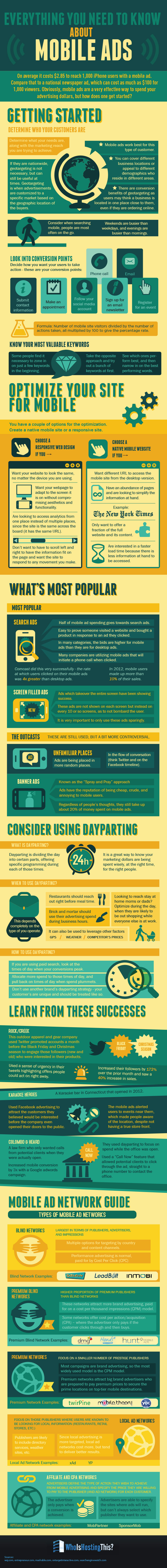
Furthermore, many sites are displaying mobile sites on tablets and phablets that have the resolution to show more. This may be suppressing conversion rates as well.
Source: WhoIsHostingThis.com
What are You Really Selling on Your Landing Page? [CASE STUDY]
Landing Page OptimizationWhat is your landing page selling?
You can answer this question in one of three ways:
The right answer is number one.
Number two is an About Us page. Number three is a typical home page.
If this was a poll, we’d see heavy voting for two and three. Why the disconnect?
I spent some time on the phone with John Colasante of ManhattanTechSupport.com to understand why his landing pages were under-delivering. It was pretty clear that he had chosen door number two.
Take a look at one of their test landing pages built on the Unbounce platform.
One ManhattanTechSupport.com Landing Page. Click for a larger image.
This page served PPC ads promising to help mid-sized businesses choose a managed IT provider. What is the promise found on the landing page?
“Transform your IT Experience!”
Few if any CTOs have woken in the middle of the night in a pool of sweat thinking, “I need to transform my IT experience!”
The sub-headline takes a bold step. “Outsource your IT Department to ManhattanTechSupport.com.”
This is the sort of suggestion you make to someone who is hypnotized, maybe.
We would expect a high bounce rate because this landing page doesn’t keep the promise of the ads, and hasn’t addressed the fundamental question of qualified visitors, “How do I choose the right managed IT provider?”
This landing page sounds like their home page.
The promise of a home page is “We’ll tell you about our company.” Not so for a landing page.
What is this landing page really selling?
A landing page has two very focused jobs:
The promise here is to help visitors choose an IT provider. The offer, however, is “Fill out this form.” Not particularly compelling.
Reading on, the offer is for ManhattanTechSupport.com to “get back to you same day during business hours.”
Is this a consultation? A sales call? A chance to hear about the CEO’s vacation?
Can filling out a form really transform my IT experience?
John clarified this for me. It is a consultation with someone who knows the space.
Now that’s an offer.
Retargeting Your Landing Pages
How would we turn this page into a true landing page?
It’s usually the job of the headline to keep the promise of the ad. This is also why landing pages are powerful: we know what the visitor is interested in, so get to design a very targeted page.
ManhattanTechSupport.com may want to change this to “Let an experienced IT consultant answer your questions on managed IT services.” Another might be “Free Managing IT Services Consultation.”
Now we need to tell them about the offer, not the company. Our sub-headline is designed to get them to read the next paragraph.
“In thirty minutes, you will discover the key to cutting the time you spend on IT by 85%.”
I gotta find out more about this!
Unfortunately, the paragraph starts we-weing all over itself: “ManhattanTechSupport.com is your premier…”.
We want to know about the offer.
How long will the consultation be? What qualifications will the consultant have? What key questions will be answered? Will I get the hard sell? Do you have a proprietary evaluation process? Will I get a freebie just for speaking with them?
When to Talk About Your Company, Products or Services
There is often another question on the visitors’ minds: “Who are you?”
It’s OK to talk about yourself to support the offer, to build trust. But you must provide proof.
Don’t tell me that you are the “leader” or the “premier” provider in your space. What awards have you won? What famous media outlets have declared you to be top of the heap? Have you been seen partying with Justin Bieber?
The ManhattanTechSupport.com page provides some trust-builders by using logos of well-known partners below the form.
There are many proof points and trust builders you can use.
ManhattanTechSupport.com lists four differentiators on their page: No contracts, Everything is included, We are proactive, and We are 24/7.
Once the value of the offer is established – the value of the consultation – this is fair game to make the visitor feel comfortable taking action.
Bring it Home
The form and call to action button bring the offer home.
The form and button text must bring the offer home. We really don’t need to tell anyone to fill out a form. If we had to, then how good of an IT customer would the really be?
We could start the form with a call to action like, “Request your free consultation now.”
Copyhackers Joanna Wiebe has tested button text and recommends that it match the headline. So, we might rewrite the button to say, “Have a Consultant Contact Me.”
The form fields you choose will affect the number of conversions as well as the quality of your requests.
ManhattanTechSupport.com asks for “Company Size.” Why are they asking this? If it’s a qualifying question then are there some companies that won’t get called? Will I get an email that says, “Sorry, you’re too small for us”?
On the flip side, small companies may be reluctant to answer this question and may decide not to take the offer. This could mean higher quality prospects. It could also chase away visitors who aren’t really committed.
Your Landing Page in a Paragraph
The story of our landing page should be straight forward. For ManhattanTechSupport.com, it could read:
That’s a pretty compelling offer, if I do say so myself.
A Few Bonus Tips
Here are a few bonus tips for this page.
I recommend that you limit the “knock-out” text, or light text on a dark background. Those of us over 40 with failing eyes will have more trouble focusing on and reading this text.
If you want people to pick up the phone and call, give them the number in the headline and at the top of the form. For ManhattanTechSupport.com, we’d use a headline like, “Call to speak to an experienced managed IT consultant. 646-762-7649.” The form headline would read, “For immediate answers, call 646-762-7649, or we’ll use this form to request a call within one business day.”
To solicit calls, don’t put the number off to the side.
Use steps and bullets. Don’t be afraid to let visitors know they are going to get a sales pitch.
The ManhattanTechSupport.com page may offer this guidance:
Focused Landing Pages are Easier to Write
I hope that this column has taken some of the burden out creating landing pages for you. When you focus on the promise, the page gets much easier to write. With a reasonable design and the right traffic, you should have a high-converting landing page.
Share your landing page with us here and let us know what your questions are.
Communicate More Creatively with Analytics
Conversion Marketing StrategyPeople sometimes confuse us with robot-like scientists, being lead by data and caring little for the creative side of marketing.
Nothing could be further from the truth.
Subscribe to Podcast
I like to think that we can be more creative because we add a rigor to our creativity that allows us to try riskier things. If we have some data that says risky might work, we have a methodology through which we can confirm it’s effectiveness with a high level of confidence.
We backstop our creative with data, and this gives us a freedom that few designers and writers have.
In my new column Enhance Your Creativity Through Analytics I show you how we find data to backup or disavow our creative efforts.
Listen here or read it online.
21 Quick and Easy CRO Copywriting Hacks
Keep these proven copywriting hacks in mind to make your copy convert.
"*" indicates required fields
Rand Fishkin Cracks the SEO Code in 2015
Conversion OptimizationAs former head of Moz.com, Rand Fishkin is a guy who knows his stuff when it comes to SEO and search marketing in general. I had the pleasure of meeting and hearing him speak at Business of Software USA in Boston.
And I took notes.
I captured a live instagraph infographic for you since you couldn’t make it. You can download Rand’s slides.
Key Takeaways
“Google doesn’t want to count links that you can build.”
“Build relationships, not links.”
“Aim for resource pages and blog rolls.”
“Buy exposure that leads to links-Tabula, Outbrain, etc.”
“Do PR”
Share Socially
Tweets do affect rankings, but cause and effect are not clear.
Google+ your content. It will rank higher for your G+ network.
Content Marketing
If you’re in the bottom 15% of publishers, focus on quality over quantity.
CLICK TO ENLARGE
The Formula That Makes LeadPages A Lead Generation Force
Lead GenerationIn this webinar Brian Massey sits with Tim Page, Conversion Educator At LeadPages who discusses the success of LeadPages and how the company processes over 3 million email optins each month.
It’s no surprise that after 12 years testing and implementing sales marketing psychology, Tim’s team created one of the most effective, lead generation tools available that grew their company from zero to 15 thousand paying customers in a year.
After watching this webinar you’ll learn:
Click here to watch this Free Webinar with Brian Massey and Tim Paige.
Grow Your Email List With These Recommended Tools
Lead GenerationHow do you grow your email list quickly and effectively? Do you advertise on social media, use special list building software, or do you pray to the lead generation gods for better, quality leads?
How many tools do you really need to list build? Maybe a dozen?
60 online marketing experts were asked a simple question: “If you could only choose 3 tools to grow your email list, which 3 would you choose?”
At Conversion Sciences, we like to break down our list building strategy into three parts: content, destination, and calls to action.
We use the Content Cascade for transcribing webinars for a month’s worth of quality content. Hootsuite helps us share that content over time on social media. WordPress plugins help funnel the type of traffic we get from social media. We also recommend building a separate site for phone visitors. Finally, we’ve built a conversion mini course on our website and use CommerceScience.com to significantly grow our subscribers.
Here are just a few of the top tools recommended by 60 Marketing Experts in a poll by RobbieRichards.com
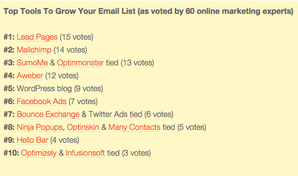
Read the Robbie Richards Blog for more of the best tools for list building.
How Homeaway Shifted to a Testing Culture [INFOGRAPHIC]
CRO Tests | Multivariate | AB TestingTeam, tech, process and scale: these are the primary components shared by Tania Shershin of Homeaway at the Which Test Won Live Event in Austin, Texas.
We captured the high-points of her presentation live in this instagraph infographic.
If you want to create a culture of testing in your organization, here is a roadmap to success.
Click to Enlarge
21 Quick and Easy CRO Copywriting Hacks
Keep these proven copywriting hacks in mind to make your copy convert.
"*" indicates required fields