I’m fond of saying that AB testing, or split testing, is the “Supreme Court” of data collection. An AB test gives us the most reliable information about a change to our site. It controls for a number of variables that can taint our data.
Things change over time. You might make a change to your site at the same time that a competitor runs a sale. Was it your change or the sale that was responsible for a drop in transactions on your site? AB tests eliminate such issues by serving variations over the same period of time.
Things change among visitors. Generally, visitors coming to your site from an email campaign are more likely to buy than visitors from search ads. For most businesses, mobile visitors convert worse than desktop visitors. An AB test can make sure that the “mix” of visitors is the same for the each change that is tested.
Plus, the AB test gathers data from real visitors and customers who are “voting” on our changes using their dollars, their contact information and their commitment to our offerings.
And our AB tests can lead us astray.
Testing Email: Open Rates & Click-Through Rates
When testing email, open rates and click-through rates don’t give you the true performance of your emails. They also don’t let your team take credit for keeping the accountants busy.
We recently did an analysis of one of our e-commerce client’s email campaigns. They had been testing how the “disclaimer” line in their emails was affecting purchase behavior.
The “disclaimer” is the first line in an email. It typically says something like “Having trouble viewing this email? Click here.” The reason this line is important is that most email clients now show the subject line and the beginning of an email in the inbox view. Here’s an example from my Gmail promotions folder.

The first line of your email is as important as the subject line.
One assumes that, if these messages are working, they will be reflected in a better open rate. It turns out not to be true.
So, we tested different versions of this text over the course of 23 emails. The Open Rate predicted which would generate the most revenue in less than half of them.
As a predictor of revenue, click-through rate didn’t fare much better, calling the revenue winner in thirteen of the tests.
Revenue-Per-Recipient Puts Marketing In The Money
When we talk about monetizing a list, the metric we like is Revenue-per-Recipient.
It is calculated as:

It tells us how much spendable revenue we’re getting from each member of our list. To look at it another way, it’s an estimate of the value of each person on our list.
With proper analytics, we can measure this for the whole list, particular segments of the list (customers vs. new subscribers for instance), or for different treatments in a split test.
Measuring it requires some discipline and a bit of analytics work.
Getting To Revenue-Per-Recipient
The key to getting the Revenue-per-Recipient (RPR) number is tying email clicks to transactions. This may require some help from your friendly IT department.
Configure Your Analytics Package
Most e-commerce companies will be pumping the results of each transaction into their analytics software. If you’re generating leads for your business, your analytics system can track new prospects for you as well.
We talked last time about tracking phone calls generated by your site. Done right, you can track the number of calls made by email clickers.
Do the work necessary to get reliable reporting of sales or leads into your analytics package. Once this is done, you have what you need to calculate the impact of email on the bottom line.
Mark Your Email Traffic
This is where the discipline comes in. We need to be able to identify the traffic generated from each email drop. This is done typically by adding special parameters to the links in the emails that come back to our site.
What you add to you add to your URLs depends on your analytics package. Google Analytics has a set of standard parameters. An email link, properly tagged might change from:
http://buyschtuff.com/halloween
to
http://buyschtuff.com/halloween?utm_campaign=halloween-special&utm_source=subscriber-list&utm_medium=email
When someone clicks on this link, Google Analytics will know that it was from the email talking about the Halloween Special, that it was sent to the Subscriber List, and that it was clicked from an email.
I have found that it’s important to add the date of the email drop as well, and this can be added to the campaign description. Here’s the format I use.
http://buyschtuff.com/halloween?utm_campaign=halloween-special-20131029&utm_source=subscriber-list&utm_medium=email
Many email service providers offer integrations with popular analytics packages, such as Google Analytics. They will add these tags automatically for you. The only down side is that the campaign names they choose may not be as easy to read. Mailchimp sends Google Analytics campaign names like “934f31ce51-Webinar_Follow_up_Email_10_31_2013.”
Readability is important.
We will want to be able to identify performance of individual emails when we’re testing or sending to specific segments. We will soon want to be able to marry our email service provider reports with our analytics reports. Readability will be key.
Power Reports
This process gives us the ability to see the revenue each email produces directly. Here’s a report taken from Google Analytics.

Track your emails to the dollars.
For any of the emails in this kind of report, we can pull the number of recipients from our email service provider. This gives us our Revenue per Recipient for each drop and an overall number.

Revenue per Recipient accounts for list size and revenue generated.
In this example, we got 37 cents for each member of our list. However, we can see that this number is skewed by the first one, delivering a whopping $1.20 per recipient.
Don’t be concerned that 37 cents sounds so small. RPR numbers are rarely exciting in their magnitude.
A Word For B2B Lead Generators
It may not seem that this will work for lead generators, especially those with long sales cycles. Nonsense.
As lead generators, we should know the value of a lead to our business. For our purposes, how we calculate it is less important than being consistent. Lead value is calculated by New Customer Revenue/New Leads.
We could calculate it once based on last year’s numbers and use it for all emails until you calculate it again.
We could calculate it every month by dividing the past month’s new revenue with all new leads from the past three months.
You should choose the method that you can justify, and that delivers a consistent RPR month over month.
Power Process Tip: If you can calculate the true value of a lead for your organization, you can calculate your value as a lead generator in terms everyone understands: dollars.
Optimizing Revenue-Per-Recipient
There are two ways to increase your Revenue per Recipient, both of which are best practices in email marketing.
- Increase the revenue your list is generating. Duh.
- Decrease the number of recipients. What?
Like trees in the winter, it’s important to prune and shape your list. Those who have never opened a single one of your emails should be dropped. In fact, many email marketers drop non-openers every 90 days or less.
It’s scary, but it’s good business.
Of course, we all want our lists to deliver steady revenue growth. This comes from understanding the offers, subject lines, email copy and landing pages that make the most money for the business.
It’s relatively easy to test emails. Just remember to test to the dollars using RPR.
A Final Word About Accuracy
This method doesn’t take into account the revenue generated when your emails create non-click demand. You don’t get credit when recipients see your email, but call, come to your store, or visit your site through other means. Nonetheless, RPR this is a valid measure of the dollar impact we are having on our businesses.
It’s time to stop boring people with how good your open rates and click-through rates are. Tell them what each and every person on your list is worth in dollars. When you track the results of your emails down to the dollar, you track your own value down to the dollar.
Portions of this article first appeared on Marketing Land.


Testing Email Can Be Misleading (How to Avoid Bad Decisions)
Conversion Marketing StrategyI’m fond of saying that AB testing, or split testing, is the “Supreme Court” of data collection. An AB test gives us the most reliable information about a change to our site. It controls for a number of variables that can taint our data.
Things change over time. You might make a change to your site at the same time that a competitor runs a sale. Was it your change or the sale that was responsible for a drop in transactions on your site? AB tests eliminate such issues by serving variations over the same period of time.
Things change among visitors. Generally, visitors coming to your site from an email campaign are more likely to buy than visitors from search ads. For most businesses, mobile visitors convert worse than desktop visitors. An AB test can make sure that the “mix” of visitors is the same for the each change that is tested.
Plus, the AB test gathers data from real visitors and customers who are “voting” on our changes using their dollars, their contact information and their commitment to our offerings.
And our AB tests can lead us astray.
Testing Email: Open Rates & Click-Through Rates
When testing email, open rates and click-through rates don’t give you the true performance of your emails. They also don’t let your team take credit for keeping the accountants busy.
We recently did an analysis of one of our e-commerce client’s email campaigns. They had been testing how the “disclaimer” line in their emails was affecting purchase behavior.
The “disclaimer” is the first line in an email. It typically says something like “Having trouble viewing this email? Click here.” The reason this line is important is that most email clients now show the subject line and the beginning of an email in the inbox view. Here’s an example from my Gmail promotions folder.
The first line of your email is as important as the subject line.
One assumes that, if these messages are working, they will be reflected in a better open rate. It turns out not to be true.
So, we tested different versions of this text over the course of 23 emails. The Open Rate predicted which would generate the most revenue in less than half of them.
As a predictor of revenue, click-through rate didn’t fare much better, calling the revenue winner in thirteen of the tests.
Revenue-Per-Recipient Puts Marketing In The Money
When we talk about monetizing a list, the metric we like is Revenue-per-Recipient.
It is calculated as:
It tells us how much spendable revenue we’re getting from each member of our list. To look at it another way, it’s an estimate of the value of each person on our list.
With proper analytics, we can measure this for the whole list, particular segments of the list (customers vs. new subscribers for instance), or for different treatments in a split test.
Measuring it requires some discipline and a bit of analytics work.
Getting To Revenue-Per-Recipient
The key to getting the Revenue-per-Recipient (RPR) number is tying email clicks to transactions. This may require some help from your friendly IT department.
Configure Your Analytics Package
Most e-commerce companies will be pumping the results of each transaction into their analytics software. If you’re generating leads for your business, your analytics system can track new prospects for you as well.
We talked last time about tracking phone calls generated by your site. Done right, you can track the number of calls made by email clickers.
Do the work necessary to get reliable reporting of sales or leads into your analytics package. Once this is done, you have what you need to calculate the impact of email on the bottom line.
Mark Your Email Traffic
This is where the discipline comes in. We need to be able to identify the traffic generated from each email drop. This is done typically by adding special parameters to the links in the emails that come back to our site.
What you add to you add to your URLs depends on your analytics package. Google Analytics has a set of standard parameters. An email link, properly tagged might change from:
http://buyschtuff.com/halloween
to
When someone clicks on this link, Google Analytics will know that it was from the email talking about the Halloween Special, that it was sent to the Subscriber List, and that it was clicked from an email.
I have found that it’s important to add the date of the email drop as well, and this can be added to the campaign description. Here’s the format I use.
Many email service providers offer integrations with popular analytics packages, such as Google Analytics. They will add these tags automatically for you. The only down side is that the campaign names they choose may not be as easy to read. Mailchimp sends Google Analytics campaign names like “934f31ce51-Webinar_Follow_up_Email_10_31_2013.”
Readability is important.
We will want to be able to identify performance of individual emails when we’re testing or sending to specific segments. We will soon want to be able to marry our email service provider reports with our analytics reports. Readability will be key.
Power Reports
This process gives us the ability to see the revenue each email produces directly. Here’s a report taken from Google Analytics.
Track your emails to the dollars.
For any of the emails in this kind of report, we can pull the number of recipients from our email service provider. This gives us our Revenue per Recipient for each drop and an overall number.
Revenue per Recipient accounts for list size and revenue generated.
In this example, we got 37 cents for each member of our list. However, we can see that this number is skewed by the first one, delivering a whopping $1.20 per recipient.
Don’t be concerned that 37 cents sounds so small. RPR numbers are rarely exciting in their magnitude.
A Word For B2B Lead Generators
It may not seem that this will work for lead generators, especially those with long sales cycles. Nonsense.
As lead generators, we should know the value of a lead to our business. For our purposes, how we calculate it is less important than being consistent. Lead value is calculated by New Customer Revenue/New Leads.
We could calculate it once based on last year’s numbers and use it for all emails until you calculate it again.
We could calculate it every month by dividing the past month’s new revenue with all new leads from the past three months.
You should choose the method that you can justify, and that delivers a consistent RPR month over month.
Power Process Tip: If you can calculate the true value of a lead for your organization, you can calculate your value as a lead generator in terms everyone understands: dollars.
Optimizing Revenue-Per-Recipient
There are two ways to increase your Revenue per Recipient, both of which are best practices in email marketing.
Like trees in the winter, it’s important to prune and shape your list. Those who have never opened a single one of your emails should be dropped. In fact, many email marketers drop non-openers every 90 days or less.
It’s scary, but it’s good business.
Of course, we all want our lists to deliver steady revenue growth. This comes from understanding the offers, subject lines, email copy and landing pages that make the most money for the business.
It’s relatively easy to test emails. Just remember to test to the dollars using RPR.
A Final Word About Accuracy
This method doesn’t take into account the revenue generated when your emails create non-click demand. You don’t get credit when recipients see your email, but call, come to your store, or visit your site through other means. Nonetheless, RPR this is a valid measure of the dollar impact we are having on our businesses.
It’s time to stop boring people with how good your open rates and click-through rates are. Tell them what each and every person on your list is worth in dollars. When you track the results of your emails down to the dollar, you track your own value down to the dollar.
Portions of this article first appeared on Marketing Land.
21 Quick and Easy CRO Copywriting Hacks
Keep these proven copywriting hacks in mind to make your copy convert.
"*" indicates required fields
Generating Phone Leads from the Web
Lead GenerationFor many of our clients, a phone call is worth seven to ten times more than a form fill. This means that we want to maximize the number of calls, but don’t want to completely shut down the forms on these sites.
Why Phone Calls are So Valuable
Phone calls are typically most valuable to businesses selling high-dollar and high-consideration products.
The term “high-dollar” is subjective. It can mean anything from plastic surgery to mortgage loan applications.
“High-consideration” products and services are those for which the stakes are high, and the buyer will generally do more research before buying. Cars, appliances, and vacations are some examples of considered purchases.
Phone calls are also valuable in markets in which doing nothing is a real option. For example, addiction treatment centers will want to get a prospect on the phone knowing that they will want to delay treatment for their addiction.
For these businesses, a human being will often have more success moving a prospect to a close than the website alone.
Please Add Me To Your CRM
When someone completes a form on the site, you know where the information goes. Someone gets an email. A record is added to the customer relationship management (CRM) system. Lead counts are tallied for your weekly marketing report. Some get contacted. Some don’t. Some get the autoresponder they had hoped for. Most don’t.
a phone call is worth between 500% and 1,000% (that’s five to ten times) more in revenue than a completed form will generate.Form leads too often wither in the CRM freezer. How can we thaw out our lead funnel and give sales what they need to generate revenue?
Phone Calls. Because phone calls don’t get cold.
Phone calls are answered and voice mails are returned. There is no CRM icebox where your contacts can be sent to chill while everyone updates their lead reports.
Even if you have highly sophisticated marketing automation campaigns that move people through the sales funnel, none of them is as efficient and successful as a human being — listening, answering questions, and handling objections.
In our experience,
The business wants more calls. Your sales team wants more calls. However, marketing is rewarded for leads. This is the problem.
Making the Phone Ring
There are three kinds of people coming to your website who need to talk to someone. They won’t be satisfied by completing a form or reading a report.
There is a group of those who just don’t want to talk to another human under any circumstances. We want these folks to complete the form.
When you say, “Let’s put a phone number on our site because someone might actually call,” you are thinking of the first group, those who will call. This is not going to be effective for the second group, those who might call.
Embrace the phone, or they will go someplace else.
Evaluate the location of phone numbers on your site the same way you would evaluate call to action buttons. The phone number needs to be prominent, frequent, but not too pushy. Below we talk about where to place phone numbers.
You Can’t Take Credit For What You Don’t Measure
In order for this to work, dear marketer, you first need to get credit for these calls. Instead of slapping the company sales number on the website, you need to be able to measure calls sent from the site. Inexpensive services will give you a unique number. We use Grasshopper for our 800 number service. Google Voice is a source of local phone numbers. Counting calls will be largely done by hand.
To tie calls back into an analytics package, we’ve worked with a number of services, including Dialogtech, FiveNines, Five9, Convirza, and Invoca. This allows you to calculate a conversion rate with more accuracy.
Watch our phone leads webinar with Convirza.
The ways these packages work are different and beyond the scope of this column. Nonetheless, they let you take credit for real activity in sales.
Nail The Offer
We too often think that those who would prefer a call will think of calling. It ain’t true. Someone predisposed to call still needs to understand why they should call and what to expect. The only number that doesn’t need a call-to-action is 9-1-1.
Those who bother to write an invitation alongside their phone numbers resort to engaging messages such as, “Call,” “Call us,” “Call us today,” or the daring “Contact us.” None of these offers a why or tells you what to expect. Adding an exclamation point doesn’t help.
Home Instead Senior Care is really working hard to get visitors to pick up the phone.
There are four things that you can use to make your phone number more enticing to those who would call:
In the example above, “Struggling with caring for a parent” would be aligned, but not emotional.
“Feeling guilty about caring for a parent?” definitely carries emotion. If you think that this kind of message is too bold, think again. We had a 43% increase in calls for an invitation that read, “Ready to stop lying to yourself? We can help. Call …”
Emotion is a powerful tool.
These four components — Alignment, Emotion, Clarity and Value — make for effective calls-to-call, and are great for other calls-to-action as well.
Put Things In The Right Place
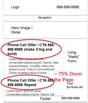
Just sticking the number in the upper right corner isn’t going to get you those calls that make you powerful. The number should be there, as this is where callers look. But the other two places that make the phones ring are:
The following image shows a wireframe of a typical content page with proper placement of calls-to-call. We’ve tested them all over the page.
Smartphones Have Phones
On your small-screen mobile site — as opposed to your tablet-formatted website — click to call is an intuitive way to get more calls.
For our call-oriented customers, their mobile sites now out-convert their desktop sites. How do we do it? Here are some steps.Make the phone numbers click-to-call
Click to call is crucial for mobile conversion rates.
Sometimes, that’s all it takes. Write “Tel” links explicitly.
Keep Calls to Action Available in Sticky Header or Footer
This sticky header offers several ways to take action.
You never know when the visitor will have the information they need to take action. Plus, they may find it’s their turn in line and need to take action quickly. These are mobile devices, you know.
Reduce Forms
Completing forms on a mobile device is grueling, frustrating and could scare the children. Look for ways to take action that don’t require long forms to fill.
Ironically, this two-screen form is for a Webinar on mobile marketing.
Consider using auto-fill from a social network, like LinkedIn or Facebook.
Filling in forms on mobile is hard. Consider social login auto-fill.
Bonus: The Power Of A Long, “Nasty” Form
If you’ve read this far, I have a bonus for you. You may have noticed an item on the wireframe image above: “Long, ‘Nasty’ Form.”
To maximize the number of calls you get and cast fewer of your visitors into the frigid desert of the CRM, make your forms long, and ask for some personal info. Yes, this is the opposite of what we tell you to do when you want visitors to fill out a form.
This will cook your noodle. When trying to maximize the number of calls we get, a long, nasty form works better than no form at all. That’s right. No form generates fewer calls.
I think this highlights the way our visitors assign a price to their time and attention. On its own, a phone call may seem “expensive”. However, when a long, nasty form is on the page, it makes the cost of taking action by form more “expensive”. The call looks cheap by comparison.
This is a pricing exercise, but the cost isn’t money. It’s time and attention.
The power of a ringing phone gets noticed. If visitors to your site start calling your sales team, it will be noticed. You need to be able to measure the calls and toot your own horn as well. Unlike leads, calls have a power beyond a graph in a PowerPoint presentation. To become an indispensable marketer, make the phone ring.
This article first appeared on Marketing Land.
Conversion-Centered Redesign: Slash the Risk and Guarantee Results
Conversion-Centered DesignBrian Massey presents five design case studies and how to use conversion-centered redesign to reduce risk and deliver revenue growth quickly.
What You’ll Learn
What JJ Knows
JJ Abrams has successfully rebooted three marquee movie franchises in his career: Mission Impossible, Star Trek and now Star Wars.
He seems to know something that we need to understand when we redesign our websites: what to keep in his reboots and what create from scratch.
Watch the Webinar Now
Highlights
Why Redesigns Fail
Typical (Bad) Reasons to Redesign
Good Reasons to Redesign
There are only two good reasons for a website redesign:
Five Redesign Strategies to Choose From
Read the full conversion–centered redesign case study.
Place Your Bets
These are the areas in which you make assumptions when you “go all in”. Many of your choices can increase performance. Many will not.
The Kinds of Information We Use to Make Design Decisions
When making these decisions, too many of us rely on information from categories 1 through 3 of this list. The least reliable sources are listed first.
I give examples of each of these and explain why they are or are not reliable.
21 Quick and Easy CRO Copywriting Hacks
Keep these proven copywriting hacks in mind to make your copy convert.
"*" indicates required fields
Metrics We Watch
When you launch your redesign, these metrics will tell you if your redesign was successful or not.
Compare these metrics before and after the launch. You should also compare the year-over-year results to eliminate seasonal effects.
Things to Test on Current Site
If you are going to test things on your existing site to inform your redesign, consider these “portable” solutions:
Be Ready to Go Back
If possible, always be ready to roll back to your old site if the new one craters sales.
Summary
We often redesign for the wrong reasons.
Without data, redesigns are risky. The “Going All In” is the most risky and most common. Collecting analytics data on the current site mitigates the risk. Testing assumptions on the current site further reduces risk. A side-by-side launch approach allows you to back out poor performing features. A stepwise approach eliminates risk while increasing performance immediately.Do you need a conversion-centered redesign or an optimization program?
Conversion Sciences Redesign Lab™ delivers the data and test results for…
Contact us to schedule a call. We’ll discuss your goals and strategies for your site.

Photo Credit: https://www.flickr.com/photos/39804614253@N01/1761955352/ (cc)
Ecommerce: Applying Conversion Science Q&A
Ecommerce CROHere are several questions about applying conversion science to ecommerce sites. These questions came from the sponsors of the GP Ecommerce Summit in Bucharest, Romania.
Can we consider Conversion Rate Optimization a real science?
What defines a science? The Scientific Method.
I’ve just described our six month Conversion Catalyst process to you. We “science the sh*t” out of websites. Without the science, we make bad decisions, emotional decisions, decisions based on superstition and myth.
There is also a component of sport in conversion optimization. We are in this to win. While we must be objective, we like to find revenue and hate when our tests are inconclusive.
What are the first steps you have to take if you wish to increase your conversion rate on your e-commerce website?
My recommendation is that ecommerce sites focus on the value proposition their offering. This is a combination of your categories (what you sell), your shipping policy, your return policy and your brand.
Zappos built an amazing online brand by putting its value proposition front and center, “Free shipping both ways. 365 day return policy. Empowered customer support people.”
What is your value proposition? Fast delivery? Local manufacturing? Free installation? Donations to charity with every purchase? Emphasize it on your site, in your cart and throughout checkout.
How do you create a good landing page and what are the best ways to test it?
The best landing pages keep the promise of the ad, link or post that brought the visitor there. They make an offer that matches the promise as exactly as possible. They show the product, even if it is a service or a PDF or a video series. Good landing pages provide proof points that are specific and supported by fact. Good landing pages build trust by borrowing from customers and customers. Good landing pages make the call to action the most prominent thing on the page. And good landing pages don’t add any distractions, such as social media icons, links to other pages or corporate site navigation.
This is the chemical equation for landing pages: Offer + Form + Image + Proof + Trust = Landing Page
The chemistry of the landing page
Can persuasive writing help you sell more online or do you need more than that? For example, how do you test a good headline?
Most of our biggest wins come from copy changes, like headlines. We are even testing different kinds of testimonials on one site to see which build the most trust. The words are very important. This is related to the value proposition I discuss above. When you learn the emotional language that brings visitors into your site, you learn something about your audience. This insight can be used anywhere.
What is an important point you want to drive home?
There is a wave of ecommerce sites rushing to rebuild their sites using responsive web design (RWD). This is in part due to Google and Mobilegeddon, but few can ignore the growing influence of mobile devices on our revenue. This rush to RWD is a mistake for many businesses who will find themselves with a poorly performing mobile site and a lower conversion rate on their redesigned desktop site. Tragic.
You should embrace your mobile visitors, and there are alternatives to RWD. I’ve seen some redesign horror stories and some pretty amazing success stories. Mobile design is still too new for there to be best practices, but our testing tells us what successful mobile designs should begin to look like.
How do you remember the ecommerce market in the USA from 10 years ago?
Ten years ago, we didn’t have the data tools we have today. We relied much more on qualitative research. Most of my work was building out personas, making content recommendations and working with “best practices”. Google Analytics was young. We had been using server logs to get unreliable data on visitors. Only a few years before I had written my own web analytics package to get an idea of what was working on my sites.
Today, we have amazing qualitative and quantitative tools to uncover problems with our websites. We enjoy powerful testing tools to help us determine exactly what effect our changes will have on our businesses. We are creating revenue in the laboratory using science and creativity. We have moved from the tool-building phase into the human creativity phase. It’s a very exciting time to be an online business.
A/B Testing Fundamentals Infographic
CRO Tests | Multivariate | AB TestingHere are six tips for getting your A/B testing right. These were captured at Affiliate Summit West 2016 and presented by Digital Marketer’s Justin Rondeau.
Focus on Process Not Hacks
Don’t just try what others say works. Have a process that allows you to know your MARKET.
Your A/B Testing effort should focus on process.
Measure Multiple Metrics that Matter
Measure the right metrics for the part of the funnel you’re testing
You’ll track different kinds of metrics depending on where your visitors are in the sales funnel.
Use Analytics to Identify Problems
Don’t just test anything. Use analytics to identify problem pages.
Take the Guesswork out of Testing
Fix What’s Broken. Only Test What’s Ambiguous
If it’s broke, don’t bother testing it. Just fix it.
Test Persuasive and intuitive issues. Sometimes test Usability. Otherwise just fix the problem.
Schedule a Finite Time to Stop
Don’t expect your tests to just run until they’re successful or lose. Testing has an opportunity cost.
Conversion Optimization is about meeting user expectations.
This instagraphic was captured live by Brian Massey of Conversion Sciences.
Applying Optimization Fundamentals Infodoodle from Justin Rondeau’s Affiliate Summit West 2016 presentation.
Video that Converts: How the Brain Processes Video
Conversion Marketing StrategyVideo is powerful. It can work for our business or against it. Here’s why.
I want to talk a little bit about how the brain processes video information.
Where is video processed in the brain?
Our eyes are at the front of our skull. Strangely enough our brains process video information at the back of our skull. This is called the visual cortex. It’s interesting that the visual cortex lies at the back of the brain when you think about what happens.
When you see an image – a picture – what happens is your eyes take that information in. They actually cross over and then they deliver the information to the back of the brain. The visual cortex takes that image and pulls it apart. Part of it is sent to the part of the brain that can check for edges and angles. The part of the brain that understands faces will be sent facial information. If you think about it like this, every picture that comes in through your eyes is like smashing a bottle of information against the back of your head.
How the brain deals with video images.
What happens when we think about repeated images like video? Imagine throwing 30 bottles a second against the back of your viewers skulls. That’s the kind of information that they’re processing, and a couple of things happen. Number one, they’re getting a lot of information, so you can really deliver rich messages using video. But they’re also filtering. They’re having to average things out, so subtle details will get lost.
Respect video
In this series, we’ve talked about using things like motion to keep viewers attention, to keep them focused so that there’s less of this filtering. But understand that when you’re using video, it’s a powerful tool both because it floods the brain with information and contexts. If the message that you’re sending has a negative angle to it, you could be doing more harm than good. Think about the kind of data that you’re sending to your viewers when you do your video, and make sure you’re sending the things that will not be averaged out, and that will not give them a negative impression.
See the Whole Video Series
Video Mini Course
Video Headlines that Get Visitors to Click Play
Conversion-Centered DesignVideo is powerful. It can work for our business or against it. Here’s why.
Let’s talk a little bit about headlines, the words that go around your videos.
Headlines get people to read on.
In almost every medium that we work with online, the most important thing is going to be the headline or the equivalent to that. For email, the subject line is equivalent to the headline, and with today’s email clients, the first line of the email is often displayed along with it. The subject line is the most important thing, because it gets people to read the email.
On the landing page, the headline is the most important thing. It needs to tell the visitor they’re in the right place and give them a reason to keep reading – a reason that is important to them, not important to you.
Landing pages must invite visitors to watch the video.
On a video landing page, we have two pieces of information that are really important. Number one is the title above the video, and it has to tell the reader why they should watch the video. Number two, on a video landing page, the video is going to be pitching to a call to action. This is usually a button or a form that’s on that page, and above that form is the reason to take action. So, you have two pieces of information.
One, why you should watch the video, and two, why you should then take action if you found the information in the video persuasive. We’re going to spend hours filming and editing, writing scripts, reviewing our videos. So, how much time are we going to spend on the headline above the video that gets people to watch it? Well, typically very little.
I would recommend that you write 20, 30, 40 different headlines and choose from those, and focus on one thing. If there was one tip I would give you, it is, don’t describe the video. Describe why they should watch the video. That’s what the headline should do. Rather than tell them that this is a video about a new offering from your product, make headline say,
Whatever your value proposition is, tell them why they should watch the video, not what’s in the video. You want them to watch the video to get that. Likewise, you’re going to find a very similar thing when you look at writing the call to action.
The Call to Action
The call to action, ideally, is going to happen in the video, usually the end, but actually, you’re going to find significantly better performance if you find a way to have the call to action in the middle, and even hint at it in the beginning. And it’s also going to be on the page typically where there’s a form or a button that allows the visitor to take the next step.
Don’t leave visitors stranded in your video. After an awesome video, you don’t want to leave them going, “Oh, that was entertaining,” and not knowing what to do next. Always have something that they can do next.
This call to action, though, needs to do the same thing as the headline. Why should they take action next? You’ll want to work in, for instance, if this is a limited time offer, if there’s a special discount, if there’s a bonus. And explain to them very clearly what’s going to happen when they fill out that form.
Set Expectations
Make sure that they know what’s going to happen so that all expectations are set, and you should have a high-performing page. You’ve got a nice headline that tells them why to watch the video. You got a great video that lays out the value proposition that you’re trying to communicate and then has them do a call to action. You have a call to action that is focused on them and what they want to accomplish, and viola – a complete landing page with video.
Watch all videos in this series
How Motion in Business Videos Affects Viewer Attention
Conversion Marketing StrategyVideo is powerful. It can work for our business or against it. Here’s why.
I want to talk a little bit about motion and video. The human brain is wired to check out what’s going on if something moves in its field of vision. So, for business videos, this means that we can draw their attention to the video and hold it if we continue to move things.
Why the human brain is drawn to motion
The reason that the human brain likes motion is, because as we evolved, we associated motion with: a) something we can eat b) something that was going to eat us c) something we can mate with. Those are all very high-priority things in the lizard brain portion of our anatomy.
Making motion work in business videos
We can use that in our marketing to hold people’s attention. What kind of motion am I talking about? Well, in an eye tracking study we did, we found that: number one, people are drawn to faces and so, for instance, somebody who is moving their hands in the video, that was not sufficient to draw attention away from the face. But if you held up a prop, like a book, that would draw their attention away.
Likewise if you have a long period of somebody speaking to you like this – and in video today, a long period is like a minute – then you need to find some way of moving things around. Something as simple as this pan, is enough motion to re-engage the visitor, and keep their attention on the message that you’re delivering. Even though I’m talking, and my mouth is moving, I’m not perceived as moving until something else happens. Snap away, snap closer, snap to the left, snap to the right, pan. These are all great tools.
Motion during the call to action
One thing to be certain about here, is that if you’re using motion during a key part of your video, for instance, a call to action in which you want them to look at the page that the video is on, you should stop the motion. In fact if you could put a static image up of some sort, as you’re saying, “Go, and fill out this form,” then you will have a higher conversion rate according to our studies.
Watch all videos in this series
For more, visit our Free CRO Training Masterclass videos.
How Faces Influence Video Marketing
Conversion Marketing StrategyWhen you put people in your video marketing, something unexpected happens.
The Human Brain Loves Eyes
I want to talk a little bit about eyes and the importance of eyes in video marketing. First of all, the human brain loves eyes. We’re drawn to it, we want to look at it. And this can be really helpful in your videos if you want to keep people engaged in listening to the message. But it can also have a dark side in that it draws the attention away from something else that might be important. Let me give you an example.
When Eyes Hurt Your Conversion Rate
Let’s say you have a video on a landing page, and you want people to watch the video, get the message, and then take action on the page. At the point where you ask them in the video to take action on the page, if you have someone there looking at them, engaging them, they are less likely to look away and see the message on the page — either the form or the button that you want them to click on the landing page.
My recommendation is use eyes and heads – human beings – to keep people’s attention. But when you go to make the offer, consider shifting away to something that’s more static, something that doesn’t move, and something that doesn’t have attractive eyes on it.
Using Business Video to Solve the Subject Matter Expert Problem
Conversion OptimizationOne video can be the source of all kinds of marketing content
Now, we all know that video is a great way for us to tell a story and communicate with our prospects, with our customers, and with suspects – people who may not even know what our business does. But have you thought about how powerful video is in terms of communicating with the rest of the team?
A content strategy includes content from a number different sources – blog posts, infographs, reports, white papers, e-books. Your options are almost unlimited.
Solving the Subject Matter Expert Problem
The biggest challenge is what I call the subject matter expert problem. How do you get the knowledge out of the subject matter experts heads — either in your company or in your industry — and get them to turn what they know into these content?
The good news is you’ve got video.
It could be video like the talking head video above. It could be explainer videos that you’ve made, and even something as simple as webinar videos – videos captured while somebody delivered a webinar. The beauty of all of these forms of video is that the subject matter expert has sat down and thought about how they would explain what they want to teach on video.
Business Video Provides Everything Your Content Team Needs
Now, if you take that video and you hand it to the people who are producing your content, they should have everything they need, everything from how to lay it out and how to organize the explanations, and the thoughts, and the education, plus the graphics that come along with video.
Think about making video that’s not just for your prospects and clients. Think about making it for your internal team so that one video can cascade and turn it into whole bunch of other kinds of content. This page was ripped from the above video.