case studies

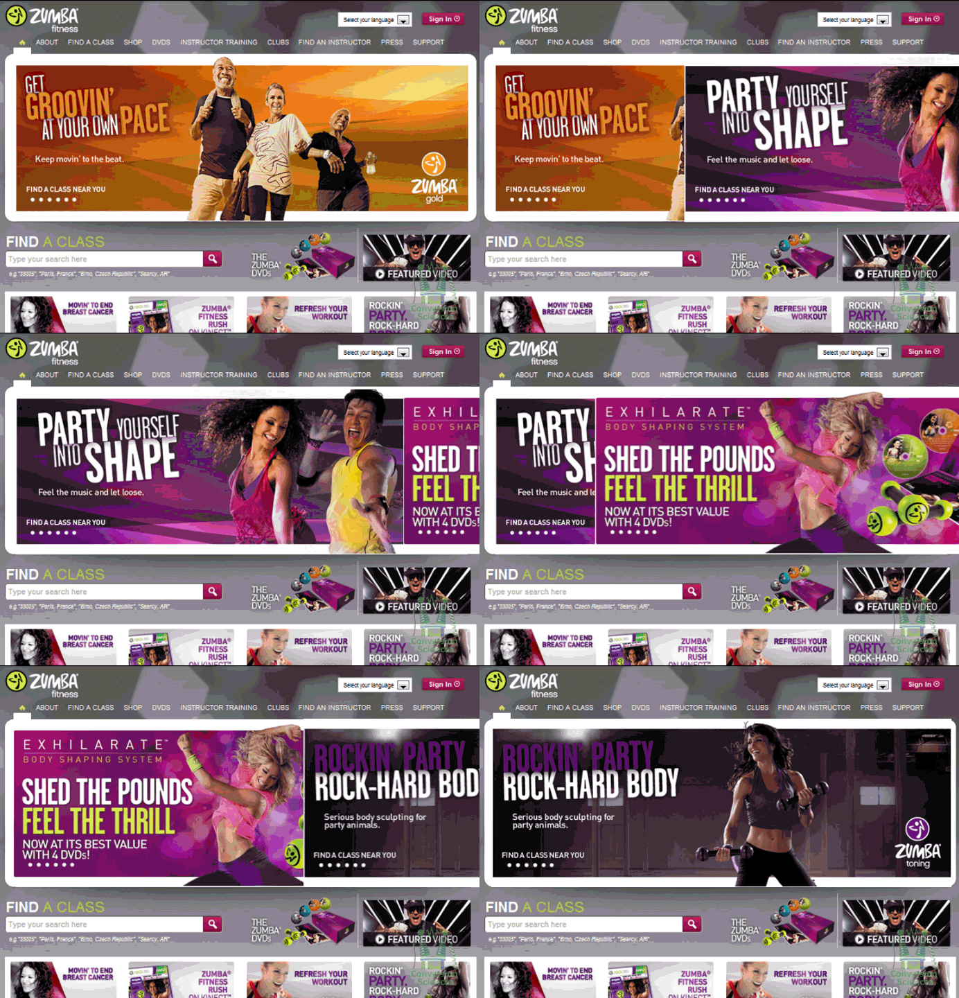
It’s like a virus on the web: Rotating Headers, also called “Carousels” or “Sliders”.

Designers recommend them.

Content Management Systems provide widgets to implement them.

And everyone is copying their competitors, which makes them spread.

Those of us that test websites know one thing: We can almost always get a higher conversion rate with a static image then with rotating header images.

Why Rotating Headers Hurt Conversion

There are two primary reasons that sliding header images hurt conversion.

1. Load Times

It takes a long time to load each image. Header images are generally large. Multiply that by three or four or five and you have a slooooow loading page.

2. Motion is Irresistible

Rotating Banner

Try to read this sentence with the  image above moving constantly.

Our brains are programmed to pay attention to things that move. When something moves, your “Lizard Brain” must ascertain if it is something we can eat, be eaten by or mate with.

Every time the header images slides or fades, we stop reading the page and look up. We can’t help it.

Why static images are scary

Static images require us to think hard about our value proposition. They require tough decisions because you must pick one image in a key location on your home page, category pages and landing pages.

Don’t try to hedge your bets with a rotating smorgasbord. Decisions are hard.

Fear not. We have been able to beat a static hero image with a rotating “slider” on more than one occasion. If you’re attached to your slider, we’re here to help you out.

Creating Rotating Headers That Work

This process only works if you know how to do A/B testing.

If you don’t, please, just use static images for your pages. Better yet, let us help you get setup for testing.

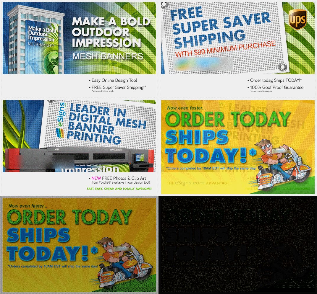
Rotating Mesh Banner-anonymized

This is a slider we optimized for custom sign maker. It started off with some advantages over most sliders we see on the Web.

First, the size of each image is relatively small, taking up one column width and measuring in at 519x 319 pixels.

Second, the rotation is a slow fade, not a sudden slide.

Third, the fade time is 10 seconds, which is quite long compared to other sliders we’ve seen.

Since we believed that a static image would perform better than the rotating images, we set out the see which of the panels would generate the most sales. We tested each image against the rotating banner as the control using Optimizely.

Here’s how they turned out. Only one panel beat the rotating image with high statistical significance.

Order Today Ships Today!

The others were inconclusive.

This was unexpected. So, we did a follow up. If we changed the order of the images, could we develop a rotating image that beat a static image?

We gave it a try, ordering the panels like this:

Panels in Order

In our test, the rotating header beat the static image by 61% with a confidence of over 99%.

What Does This Mean?

Does this mean that rotating sliders are the way to go? We have distilled the following best practices that have worked for us in other tests.

1. Make each image as small as possible so the page loads quickly.

2. Use a long interval between images.

3. Use a fade instead of a slide to minimize motion distraction.

4. Start the rotation with your highest performing images.

5. If you can’t test, go with a static image.

Don’t spread the virus. Be smart about your rotating messages.


21 Quick and Easy CRO Copywriting Hacks to Skyrocket Conversions

21 Quick and Easy CRO Copywriting Hacks

Keep these proven copywriting hacks in mind to make your copy convert.

  • 43 Pages with Examples
  • Assumptive Phrasing
  • "We" vs. "You"
  • Pattern Interrupts
  • The Power of Three

"*" indicates required fields

This field is for validation purposes and should be left unchanged.


The most important part of your website is your value proposition. Find out how to communicate it in words and images.

Too often, we confuse our tag line with our value proposition.

For a website, the value proposition is the critical message that asks a visitor to explore further and to purchase.

Famous value propositions include Zappos’ “365 day return policy and we pay shipping both ways.” Warby Parker offers “Order up to 5 of our vintage-style sunglasses. Keep the ones you like and send the others back at our expense.” These sound like expensive value propositions.

Yours doesn’t have to be.

No matter how simple or complex, your value proposition should be communicated clearly in the words and images on your website. Most value propositions can’t be communicated in a sentence or two.

Let’s see how one company communicates its value proposition in words and images.

iMagnetMount Value Proposition

I’m not going to tell you what iMagnetMount does. Let’s discover it from their home page, which acts as a landing page.

The value proposition for iMagnetMount is simple:
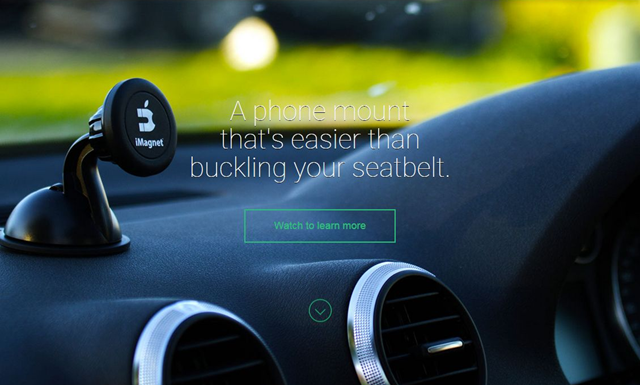
The “Hero Shot” should tell visitors that they are in the right place.

The “Hero Shot” should tell visitors that they are in the right place.

“We make a phone mount for your car.”
If I didn’t read the text, I wouldn’t really know what this is. The headline tries to be cute, but has the magic words, “Phone Mount.”
If we scroll we get the next part of the value prop pretty easily from an auto-play hero video.
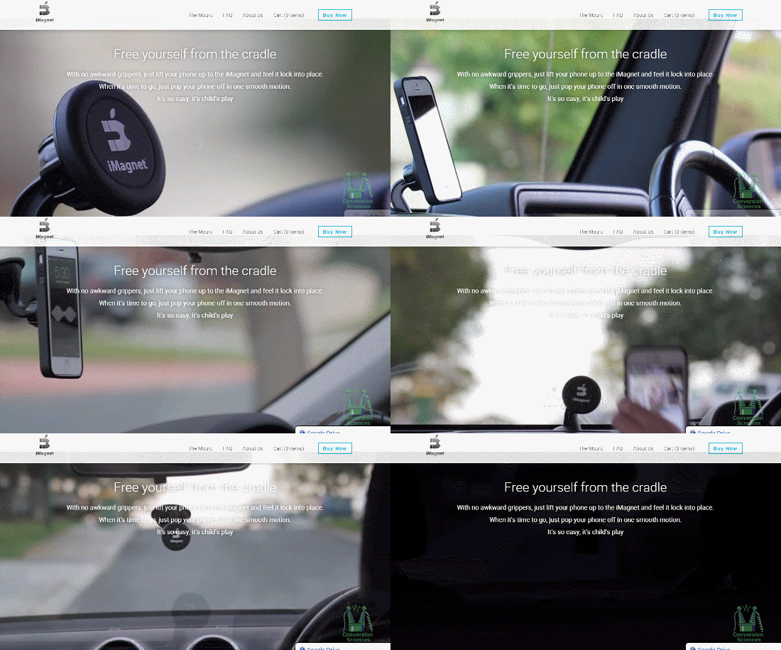
If your product is easily demonstrated, consider using video.

If your product is easily demonstrated, consider using video.

BAM! I get it. Viscerally. Nothing fancy. No catchy music. I don’t even have to read the text.

It’s solid. It’s easy. It works on the dash or on the windshield.

This is the value of having a demonstrable product. If you have a demonstrable product, use video. To demonstrate.

If anything, I would have put this at the top of the page.

Objections: What’s missing from your Value Proposition

As potential customers, what we haven’t been told will quickly gel into objections. Objection questions begin with “What if I…?” and “Will it…?” and “How can it…?”
However, these questions aren’t asked on a web page. They must be anticipated.

It’s apparent that iMagnetMount believes to be the first objection to be, “Can I trust you?” Trust symbols are seen in two places on the page.

Logos can increase "borrow" trust from better-known brands.

Logos can increase “borrow” trust from better-known brands.


Be careful introducing objections with little proof to overcome them.

Be careful introducing objections with little proof to overcome them.

Objections are funny things, though. If you address the right  concern, you move the prospect closer to buying. If you raise the wrong one, you create a new objection.

Here, iMagnetMount introduces an objection, “Magnets might hurt my phone” by stating that there is “No Magnetic Disruption To Their Phone.” The objection is addressed with some social proof, so the objection is raised and addressed.

If you raise an objection, handle it quickly.

What is the next thing we should learn about this “phone-destroying” product?

More Demonstration

Next is a video with a marquee frame showing the phone turned horizontally, like a GPS. Awesome!
The copy next to it says, “Life is too short to fumble with your phone.” iMagnetMount’s copywriter thought cute was the way to go.

The goal of this particular headline is to get the visitor to play the video. Instead, they introduce a new objection: “Will I fumble the phone? Will it fall off?”
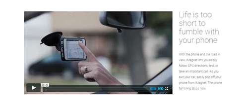
Headlines should tell the visitor what to focus on.

Headlines should tell the visitor what to focus on.

In your copy, avoid cliché phrases like “Life is too short”. Instead, be more direct.

Watch this short video to see how flexible this magnetic mount is.

Managing the Big Objections

When speaking with iMagnetMount, they confirmed that a big objection is that the magnetic mount would damage or interfere with the phone.

Will it hurt my battery?

Will it fry my electronics?

Will it burn my screen?

Will it affect reception?

iMagnetMount addresses the issue in small text under an unrelated headline.
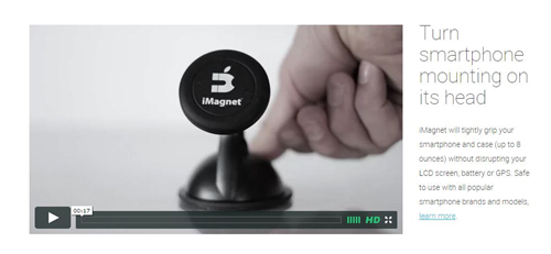
The answer to the big objection is buried in hard-to-read copy under a cutesy headline.

The answer to the big objection is buried in hard-to-read copy under a cutesy headline.

Here, the copy asks the visitor to “Turn smartphone mounting on its head.” Another throw-away headline. As above, tell them to watch the video and see the advantage.

The video demonstrates the strong suction as well as the grip of the magnet on the phone. Demonstration rocks value propositions.

These two messages – that the magnet is safe and that the suction is awesome – address two of the biggest parts of the value proposition. They should be separated and proven.

Marry Messages and Copy

Your headlines should support the image.

Your headlines should support the image.

In this part of the page, I felt that the background image used was pretty effective for making a statement about suction. It shows a suction cup sticking to a rough dashboard surface. In this case, the overlaid text supports the message of the image. Words like, “Finally” and “hassle-free” are not as powerful. Chuck these words to advance the value proposition.

Phrases like “patented” and “secure for months” are going to be more successful.

Managing Risk

Buying anything is perceived as risky, especially online. Managing the risk is a key part of the value proposition.
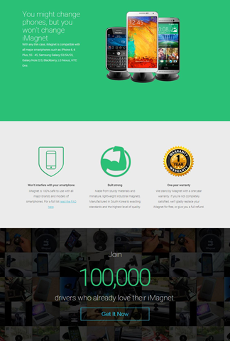
Risk management is a key part of your value proposition.

Risk management is a key part of your value proposition.

There are several messages at the bottom of the page that address risk.

  • You won’t have to buy a new mount if you think you’ll change phones.
  • Our mount is safe for your phone (with a link to a FAQ page)
  • Our product is built from strong stuff (in South Korea)
  • We offer a one-year warranty.
  • Over 100,000 drivers have bought your product.

The cornerstone of risk management is risk reversal. The use of a familiar gold seal tests well in many industries. The use of plain-English text describing the warranty and return is done well here.

A link to a FAQ page offers up many more objections, but also handles them well. Methodical buyers will appreciate the detail on this page.

Repeat the Offer at the Bottom

Anyone who has read through your page to the end is probably pretty interested. Always repeat the call to action at the bottom, as iMagnetMount does here.

Bringing it Home

Copy is more than words. Copy is words and the images that support them.

If there is one issue with the copy on this page, it is that copy is trying to be cute and isn’t supporting the very strong images and video on the page.

After our conversation, iMagnetMount modified the page to address some of these issues.
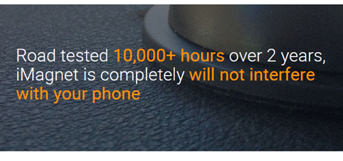
Proof is important when handling value objections.

Proof is important when handling value objections.

Here they’ve added copy to handle the objection, “Will the magnets hurt my phone?” Unfortunately, the image and copy no longer collaborate.

I don’t think they expend enough effort in managing this objection. Proof is key, and they have it. However it is buried, even in this treatment. They should state that it’s SAFE.

Safe for your phone. Safe for your battery. Safe for your screen. Proven with over 10,000 hours of road testing over 2 years.

Are we introducing some objections here? Yes, but if the proof is there, we can consider it handled.

With one change, iMagnetMount significantly improved the image-headline relationship in another part of the page.
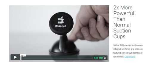
When text and image work together, value propositions get wings.

When text and image work together, value propositions get wings.

What a powerful headline that begs me to watch the video to see the proof.

The Complete Value Proposition

The keys to a communicating a strong value proposition are:

  • Demonstrate your value with images and video.
  • Support your images with headlines.
  • Provide proof whenever possible.
  • Manage risk with proof and a straight-forward return policy.
  • Repeat the offer at the bottom of the page.

There are other aspects of this page that may be hindering conversion rates, and those are discussions for another day.

However, with a well-crafted value proposition, buyers will find their way through many obstacles on their way to purchase.

What is your landing page selling?

You can answer this question in one of three ways:

  1. It’s selling what I promised in an ad or email
  2. It’s selling my company and its services
  3. All of the above

The right answer is number one.

Number two is an About Us page. Number three is a typical home page.

If this was a poll, we’d see heavy voting for two and three. Why the disconnect?

I spent some time on the phone with John Colasante of ManhattanTechSupport.com to understand why his landing pages were under-delivering. It was pretty clear that he had chosen door number two.

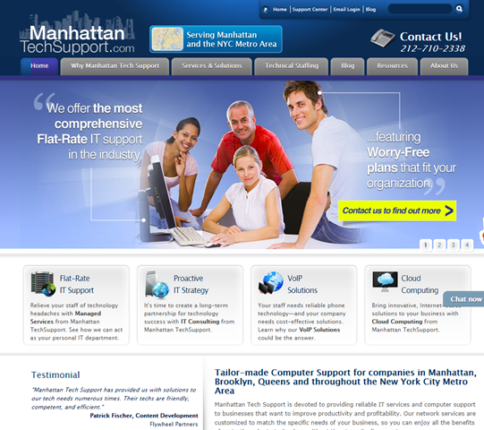
Take a look at one of their test landing pages built on the Unbounce platform.

Original Unbounce Landing Page

One ManhattanTechSupport.com Landing Page. Click for a larger image.

This page served PPC ads promising to help mid-sized businesses choose a managed IT provider. What is the promise found on the landing page?

“Transform your IT Experience!”
Few if any CTOs have woken in the middle of the night in a pool of sweat thinking, “I need to transform my IT experience!”
The sub-headline takes a bold step. “Outsource your IT Department to ManhattanTechSupport.com.”
This is the sort of suggestion you make to someone who is hypnotized, maybe.

We would expect a high bounce rate because this landing page doesn’t keep the promise of the ads, and hasn’t addressed the fundamental question of qualified visitors, “How do I choose the right managed IT provider?”
This landing page sounds like their home page.

The promise of a home page is "We'll tell you about our company." Not so for a landing page.

The promise of a home page is “We’ll tell you about our company.” Not so for a landing page.

What is this landing page really selling?

A landing page has two very focused jobs:

  1. Keep the promise made in the ad, email or link that brings visitors to the page. We call this the Offer.
  2. Get the visitor to take action on the offer.

The promise here is to help visitors choose an IT provider. The offer, however, is “Fill out this form.” Not particularly compelling.

Reading on, the offer is for ManhattanTechSupport.com to “get back to you same day during business hours.”
Is this a consultation? A sales call? A chance to hear about the CEO’s vacation?

Can filling out a form really transform my IT experience?

John clarified this for me. It is a consultation with someone who knows the space.

Now that’s an offer.

Retargeting Your Landing Pages

How would we turn this page into a true landing page?

It’s usually the job of the headline to keep the promise of the ad. This is also why landing pages are powerful: we know what the visitor is interested in, so get to design a very targeted page.

ManhattanTechSupport.com may want to change this to “Let an experienced IT consultant answer your questions on managed IT services.” Another might be “Free Managing IT Services Consultation.”
Now we need to tell them about the offer, not the company. Our sub-headline is designed to get them to read the next paragraph.

“In thirty minutes, you will discover the key to cutting the time you spend on IT by 85%.”
I gotta find out more about this!
Unfortunately, the paragraph starts we-weing all over itself: “ManhattanTechSupport.com is your premier…”.

We want to know about the offer.

How long will the consultation be? What qualifications will the consultant have? What key questions will be answered? Will I get the hard sell? Do you have a proprietary evaluation process? Will I get a freebie just for speaking with them?

When to Talk About Your Company, Products or Services

There is often another question on the visitors’ minds: “Who are you?”
It’s OK to talk about yourself to support the offer, to build trust. But you must provide proof.

Don’t tell me that you are the “leader” or the “premier” provider in your space. What awards have you won? What famous media outlets have declared you to be top of the heap? Have you been seen partying with Justin Bieber?

The ManhattanTechSupport.com page provides some trust-builders by using logos of well-known partners below the form.

There are many proof points and trust builders you can use.

  • How many years have you been in business?
  • What is your specialization? ManhattanTechSupport.com only serves business in Manhattan.
  • Are you close to me?
  • How many customers do you have?
  • Do you have testimonials from people like me? Why are others happy with your service?
  • What are your guarantees?

ManhattanTechSupport.com lists four differentiators on their page: No contracts, Everything is included, We are proactive, and We are 24/7.

Once the value of the offer is established – the value of the consultation – this is fair game to make the visitor feel comfortable taking action.

Bring it Home

The form and call to action button bring the offer home.

The form and call to action button bring the offer home.

The form and button text must bring the offer home. We really don’t need to tell anyone to fill out a form. If we had to, then how good of an IT customer would the really be?

We could start the form with a call to action like, “Request your free consultation now.”

Copyhackers Joanna Wiebe has tested button text and recommends that it match the headline. So, we might rewrite the button to say, “Have a Consultant Contact Me.”
The form fields you choose will affect the number of conversions as well as the quality of your requests.

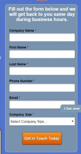
ManhattanTechSupport.com asks for “Company Size.” Why are they asking this? If it’s a qualifying question then are there some companies that won’t get called? Will I get an email that says, “Sorry, you’re too small for us”?

On the flip side, small companies may be reluctant to answer this question and may decide not to take the offer. This could mean higher quality prospects. It could also chase away visitors who aren’t really committed.

Your Landing Page in a Paragraph

The story of our landing page should be straight forward. For ManhattanTechSupport.com, it could read:

“Get a free consultation from one of our experienced IT managers. They will show you get back 85% of the time you spend on IT. The call is only 30 minutes and we promise not to give you the hard sell. We only work with companies in Manhattan. We’ve work with very discerning partners and have the experience to give you good advice. Tell us how to get in touch with you and we’ll make you an expert at choosing a managed IT service.”

That’s a pretty compelling offer, if I do say so myself.

A Few Bonus Tips

Here are a few bonus tips for this page.

I recommend that you limit the “knock-out” text, or light text on a dark background. Those of us over 40 with failing eyes will have more trouble focusing on and reading this text.

If you want people to pick up the phone and call, give them the number in the headline and at the top of the form. For ManhattanTechSupport.com, we’d use a headline like, “Call to speak to an experienced managed IT consultant. 646-762-7649.” The form headline would read, “For immediate answers, call 646-762-7649, or we’ll use this form to request a call within one business day.”

To solicit calls, don't put the number off to the side.

To solicit calls, don’t put the number off to the side.

Use steps and bullets. Don’t be afraid to let visitors know they are going to get a sales pitch.

The ManhattanTechSupport.com page may offer this guidance:

When you contact us
(1) We will ask you a few questions to assess your situation.

(2) We make recommendations and answer your questions.

(3) If appropriate, we will provide a quote for our managed IT services.

Focused Landing Pages are Easier to Write

I hope that this column has taken some of the burden out creating landing pages for you. When you focus on the promise, the page gets much easier to write. With a reasonable design and the right traffic, you should have  a high-converting landing page.

Share your landing page with us here and let us know what your questions are.

SwellNoMore is one business that changed its cart for technical reasons, and ended up changing their visitors behavior in the process.
How many steps should your checkout process have? There are conflicting theories.
Some believe that every click, every step offers visitors another chance to abandon the process. They believe that the checkout process should have as few steps as possible.
Others believe that the long forms found on single-step checkouts intimidate visitors, driving them to abandon the process.
Unfortunately, most businesses let their shopping cart software decide for them.
Abandonment rate measures percentage of visitors that begin the checkout process, but never make it through to complete the purchase. A high abandonment rate is very undesirable.
The Battle for Higher Conversion Rates

SwellNoMore.com offers a natural supplement designed to reduce swelling in the face, abdomen and feet. It’s about reducing water retention. The folks behind Swell No More contacted us because they needed to increase visitor retention, however.
They had done what many of you have done to increase sales on their site.
They had hired designers to come in and revamp their landing page. Twice. In both cases, the redesigned pages decreased the conversion rate.
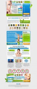
Here you can see the original, current control and the redesigned page that cut conversion rate to about 1/3. Click the images to enlarge them.

swellnomore_com-Best-performing-landing-page.png swellnmore-Landing-Page_v4-1.jpg
The redesigned landing page on the right did not generate as many sales as the original on the right.

They did the smart thing and went back to the original.
They tried an editorial approach to educate their visitors. This reaches a more methodical audience, but doesn’t perform well.

Health Medical Journal Page

Click to Enlarge: The editorial style landing page.


While they were waging this battle, they got blind-sided by a change that they had to make for technical reasons.

Having a Change of Cart?

See what I did there?
Swell No More has a traditional online store, and their landing page used the same cart as this store.
Until they changed it.
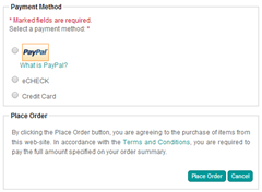
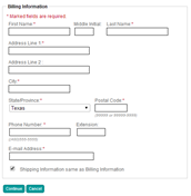
The old cart offers a two-step checkout process that hid fields until needed. For instance the fields to input shipping address were hidden unless the “Shipping information same as billing information” checkbox was unchecked. Likewise, the fields for credit card information were hidden unless the radio button for Credit Card was selected.

image image
Unnecessary fields are hidden in the original cart (right) making the process seem simpler. Click images to enlarge.

This seems to have made the checkout process seem faster and simpler.
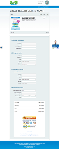
Compare this to the new cart featuring a one-step checkout process and no hidden fields.

swellnomore_com-New shopping cart step

The one-step online checkout presented an intimidating page.


This checkout page follows many of the best practices for online checkout:

  • The order is shown, including the product images.
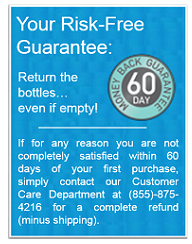
  • The “Risk-free Guarantee” at the top and “Doctor Trusted” bug on the right reinforces the purchase.
  • Trust symbols are placed near the call-to action button.
  • All costs have been addressed, including shipping and taxes.

Nonetheless, this cart had a significantly higher abandonment rate then the multi-step cart, but it is not sufficient to blame the steps alone. Fewer visitors were getting through to complete their purchase.
Things That Can Impact Checkout Abandonment

Every time we change something and collect results, we gain information we can put to use on our site. Keep in mind that we are not finding answers, only hypotheses.
Conversion Sciences will run the controlled split tests needed to turn a hypotheses into a reliable, revenue-building result. Start optimizing.
Here are some hypotheses that might explain the difference.

  1. The form on the single-step checkout was too intimidating. Hide fields or return to a two-step process. Or do both.
  2. The more explicit risk reversal message on the old cart was more trustworthy.
    "Return the bottles... even if empty!"

    A detailed return policy can increase conversion rates in your checkout process.

  3. The trust symbols placed above the fold made buyers feel more comfortable.
    Trust symbols lend your page legitimacy, increasing many buyers' comfort.

    Trust symbols lend your page legitimacy, increasing many buyers’ comfort.

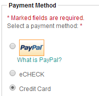
  4. The PayPal logo, missing from the new checkout page, made buyers feel more comfortable.
    PayPal

    Third-party financial logos allow your page to “borrow” trustworthiness from known brands.

  5. Placing the shipping and tax information above the fold was more clear.
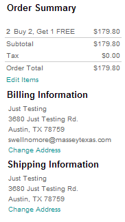
    Swell No More Order Summary

    One of the biggest reasons buyers abandon checkout is that they don’t know the final cost of their purchase.
Look Beyond the Technical Aspects of Your Cart

Too many shopping carts have been built by engineers and not by professionals experienced in human interfaces. These carts may meet the technical requirements you need, but may chase away the very customers you serve.
No checkout process fits all.
Look for flexibility in your cart vendor so that you can test and tweak to your cart’s desire. Ask them if they have tested their cart in businesses like yours. Ask them what research they have that shows their abandonment rates are low.
Take control of your abandonment rates to increase sales of your products and services.

How important are images to your landing page? The formula we use in our Chemistry of a Successful Landing Page includes the element “Image” as a necessary component. At the heart of this is the need for the visitor to imagine owning the product or service. That’s right, even services.
For some, it’s difficult to “show the product.” If you’re offering an expensive software solution or consulting service, how do you communicate what it will be like to own that? Screen shots, flow charts and explainer videos are typical go-to solutions.
Lazy designers drop happy, smiling people on the page. Avoid this business porn.
At the other end of the spectrum is the visual product or service. Photographers, artists, decorators and designers have a portfolio of past work to help visitors imagine buying from them.
Vacation Beach Portraits is such a visual business, and they have some test results that offer some insights. I love it when small businesses take up testing.
Vacation Beach Portraits takes family portraits of tourists to the Orange Beach and Gulf Shores areas of Alabama. The beautiful white beaches and sunsets over the Gulf of Mexico offer an ideal setting.
The folks at Vacation Beach Portraits tried testing a landing page against their home page, a blog filled with samples of their work.

Vacation Beach Portraits HomePage-Selections

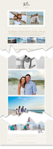
The Vacation Beach Portraits home page was full of delicious images showing off the work.


familyportraits_vacationbeachportraits_com

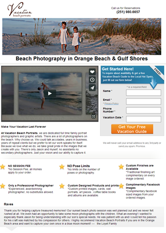
Then landing page features a prominent call to action and portfolio video.


Vacation Beach Portraits HomePage thumbThe home page was a long scrolling collection of pictures from recent shoots. Load time can significantly decrease conversion rate on pages like this. However, though lazy-loading of the images allowed me to start viewing images immediately.
The landing page, built using Unbounce, provided an explainer video with samples from their portfolio. It is shorter and features a bulleted list of benefits as part of the copy.

Serial Test

This local business will have few transactions each month. Therefore, Jason Odom of Vacation Beach Portraits did tests in series.
From May 1-15, he sent his search traffic to the landing page.
From May 16-31 he sent his search traffic to the home page.

image

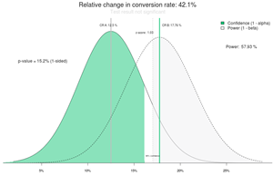
Comparison of visits to inquiries shows a 42.1% increase in conversion rate for the home page. However, this is not statistically valid. Source: ABTestGuide.com


Given the relatively low number of clicks and inquiries, the two pages converted at the same rate statistically. When testing low-traffic sites, we are looking for treatments that beat the control by large margins — 50% or 100%.
In this test, the home page generated 42% more inquiries and 105% more paying clients. Neither of these results was statistically significant, though. The sample sizes were just too low.

Why Didn’t the Landing Page Outperform the Home Page?

Anytime we hear that people are sending “store-bought” traffic to their home page, we roll our eyes. We are almost always able to improve conversions by sending visitors to a landing page.
In this case that didn’t happen. What’s the deal?
Two hypotheses emerged from this test.
1. The long page full of gorgeous pictures found on the home page is what visitors want.
2. The clear call to action found on the landing page kept it in the running.
For their next test, we recommended either adding a bunch of these big gorgeous pictures to the landing page, or adding a call to action button at intervals down the home page.
The quality of the images in the landing page video was lower than the full-width photos found on the home page.
When someone decides they want an amazing family photo like those shown, a button with “Schedule Your Photo Session” is exactly what they will be looking for.

Other Considerations

There were some additional hypotheses we felt would improve the performance of these pages.

This font is pretty, but very hard to read.


We felt that the script font used on the home page was hard to read, recommending a serif print font instead.

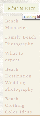
Beach Clothing Color Ideas is at the bottom.


The navigation on the site was not particularly logical. The very helpful navigation item “what to wear” seems to link to anything but topics on what to wear. Every link on a site should keep its promise.
Making the phone number more apparent my close the time it takes to book a client from the web or landing page. We find that adding the phone number to the headline (yes, the headline) will significantly increase calls without depressing form fills.

Advice for Businesses with Visual Offering

If you have a visual product, you should leverage this with high-quality, high-resolution web images. Don’t be afraid of long pages. Visual visitors know how to scroll and will appreciate the wealth of stimulation.
However, don’t forget the calls to action.
You never know when someone has seen enough to buy. Lace a buttons or links among your images. Keep in mind that the buttons or links are going to have to compete visually with the images, so make them pop.
The button or link will go to a more traditional landing page or product page that handles objections, allows selection of size, color or format, and asks them to buy.
In almost every case, use captions. These are the most read copy on most pages and are a great place to include a call to action. Tell them what they are looking at, even if it is obvious to you.

Results From the Follow-up Test

This is the busy season for Vacation Beach Rentals, and their landing pages are already converting very well for them. We won’t know the results another test for some time. Subscribe to the Conversion Scientist by email to find out the rest of this story.

People often wonder why their site isn’t more successful. They ask themselves all sorts of questions: Is it too wordy? Is my product/service stupid? Do I need more flair? Well…..
Good news everyone!** Brian teamed up with Crazy Egg to share five website formats that are proven to get results.
Brian breaks down the five basic types of sites and explains their winning features and structure.
Read the full post to find out which category your site fits in:

  • The brochure site
  • The publication site
  • The online store
  • The consultative site
  • The online service

Once you determine which site style fits your company, you can put together a foolproof plan for building the perfect site for your needs.
Click HERE to read the entire post. Thanks to our awesome partner Crazy Egg!
** I will personally high five you or send you a Conversion Sciences sticker if you can  be the first to tell me what the line that is starred above is from. Either tweet @bmassey with the answer, or leave it as a comment on the Facebook page. Good luck, and may the odds be ever in your favor!  – CB

Feb 23, 2013 11:10 pm

Comments:

  •  @neilpatel While it may sound self-serving to share with you an article on why you should spend money with a company like ours, a conversion optimization company, I think you’ll find the points made by Neil Patel are a great guide to choosing your conversion optimization strategy.
    Yes, you need a conversion optimization strategy, even if you don’t hire consultants.
    Given Neil’s background of creating companies in the online marketing optimization space (KISSmetrics and CrazyEgg), I hope we’ll see some more from him in the form of tools. – Brian Massey

 
Tags: conversion rate, optimization, neil patel

The Dollar Shave video went mega viral because it is “funny”, right?
But to understand why and how it is funny you need to break it down and analyze what motional strings it is playing. Only then will you truly understand its success.

Michael is fed up. Who isn’t?

The major emotional theme of the video is “Fed up-ness”. At the heart of this Fed up-ness lies of course Dollarshave’s value proposition to customers who are fed up with paying for overpriced razor blades. But there’s more.
The whole body language of CEO Michael Dubin says “I’m fed up”. He just can’t sit or stand still, he needs to move, he’s on a mission. He’s fed up with political correctness as he proclaims that the blades are F***ing great. He’s fed up with over-paid tennis players. I think he’s even fed up with being fed up.
This goes right into the core of the American peoples’ feelings. Not only are they fed up with the Razor blade monopoly, they’re fed up with Washington, they’re fed up with no jobs. They’re also fed up with being fed up.

Michael takes matters into his own hands

By doing so he becomes an agent for the aspirations of Gillette-enslaved Americans. When they buy blades from Dollarshave, they’re not customers, they’re proactive change agents who can create change and fortune by their own actions. Together with Michael they enact their shared American dream.
Remember the payoff in the video?
“Isn’t it about time?”
It’s not a product or service statement. Actually not even a statement. It’s just about how you feel when you’re fed up and want to take matters into your own hands. Like Michael.

Michael is one of us, not one of them

Look at Michael’s office. It’s a mess. You’ll find similar offices all over the country. Except of course at Madison Avenue. It’s as far from that as you can possibly get. In any case Michael seems to spend most of his time in the warehouse.
Michael would not pay an agency tons of cash to make this video. If you know a little bit about video production you can see it’s professionally made. Still it’s created to preserve an amateurish look and feel. That’s not by coincidence.
And Michael obviously can’t play tennis.

Michael is American

Ok, the flag at the end is obvious, but when you think of it the American theme runs right through the video.
There’s an homage to the ancestors (Grandpa with Polio). The evil villain is a foreigner (a Swiss tennis player). There’s a reference to the Vanderbilts.
It might not be as obvious to you as it is to me (I’m Swedish), but it’s there for sure.

Michael talks to….. Yeah, Michaels

Michael is a former marketing exec. Does he need to save dollars on his shaving in order to be able to keep the kids in school? I don’t think so. He just thinks it’s about time.
So when crafting the video for the launch campaign Michael needed to decide what people he should appeal to. – “What is the persona of my early adopter?”, is the question he must have been asking himself.
And I think the answer is – “People like myself!”. People who think the Swiss Army knife approach of Gillette is starting to look ridiculous. People who don’t need to save on their shaving. People who just have this feeling that something should change. Not for rational money-saving reasons, but for emotional reasons.
Others will come later. Who really need to save on their shaving. Who wants more proof of the quality of the blades. Then we’ll see other campaigns designed for them. But for now Michaels want to wake up thousand of Michaels around the country.

Michael creates an Experience

I listened to Jared Spool at Conversion Conference SF a couple of months ago. He said that every innovation goes through three phases; Technology, Features and Experience, being the final one.
Gillette is clearly about Features, with their vibrating handle, flashlight, 10 blades and backscratcher (according to Michael). They’re trying to sell us a Shaving Experience which is an Experience around the use of the product.
Michael, on the other hand, spends exactly 5 seconds to talk about the features of the products in the 94 seconds video. Dollarshave creates an Experience around how we see ourselves as individuals and how we want to live our lives. This is infinitely stronger.
We react much stronger to messages about our identity than our actions. I guess Michael knows this.
So if and when you decide to buy those blades you’re not just shaving – You’re participating in a collective experience designed to enforce your self-image as a strong and active American who thinks “It’s about time”.
John Ekman is the Chief Conversionista of Conversionista! He is regarded as a Swedish authority on Conversion Rate Optimization. According to John, a Conversionista is someone deeply and crazily passionate about improving Conversion Rates. You can find more inspiring posts on John’s blog.

Will the holiday card we chose convert “Bah Humbug” into the “Love Bug?” Follow along as we express our gratitude to you and show you why we chose the holiday card we did.

We hope we’ve been able to make 2011 a great year for you, since you’ve made it a great year for us here at Conversion Sciences.

Look for us in 2012 as we continue to educate, optimize and have fun doing it.

Brian

Tom had two sites targeting the same audience, and getting about the same traffic. Both had analytics installed. This was a rare opportunity to see how two very different approaches to website design affected online sales conversion out in the real world.

Read this before changing your website.

It’s time-consuming to offer 45 minutes of my time to anyone who wants to improve their online sales conversion rates. I just can’t think of any better way to introduce businesses to conversion concepts.

And the people I meet on the phone are priceless.

One such person is Tom Jackson of Heliski.com. His is a rare and instructive look at the power of the written word and the ineffectiveness of standard design strategies when it comes to conversion.

Tom had two sites targeting the same audience, and getting about the same traffic. Both had analytics installed.

According to him, one was “dated, awkward, wordy, but it’s working.” The other, he said, was “newer, looks better, better organized but WAY underperforming in lead gen.”

This was a rare opportunity to see how two very different approaches to website design performed out in the real world.

Which would you pick as the conversion winner?

Take a look at Tom’s two sites. Which would you pick as the hands-down winner? Which would you image would have cratered his income had he relied exclusively on it?

How analytics (and a session with the Conversion Scientist) saved one business's online sales.

How analytics (and a session with the Conversion Scientist) saved one business’s online sales.

I did a complete evaluation of these two pages in my Search Engine Land column, and you might be surprised at my conclusions: strong copy beat slick new design.

Two very different sites: one “dated, awkward, wordy;” the other “newer, looks better, better organized.” So why was the “dated, awkward, wordy” winning the conversion game so handily?

From a distance the two home pages couldn’t look more different. HeliskiingReview.com uses non-standard layout. Text is knockout white on blue, usually considered more difficult to read than Heliski.com’s black on grey.

The newer site uses a more “image- or brand-oriented play, establishing its value proposition as “the ultimate heliskiing destination.” Unfortunately, you can’t heliski on the site, so this is an empty promise.

The body copy couldn’t be more different in approach. HeliskiingReview.com uses plain language with specific, value- and benefit-oriented points in easy-to-scan bulleted format. Specifics are almost always important for conversion.

A designer might say that the big star with “send me info” was “too TV.” However, it certainly does draw the eye to an important call to action.

and the conversion champ is…

HeliskiingReview.com had a conversion rate of 2.27% vs. Heliski.com at 1.99%. That’s 14% better. However, HeliskiingReview.com delivered much more qualified prospects. Tom was able to book trips for 15.29% of the HeliskiingReview.com leads. Heliski.com had a close ratio of only 1.33%.

That’s 1146% more bookings and tens of thousands of dollars in sales.

What we can Learn from Tom (or How Analytics Saved One Business’s Online Sales)

The moral of the tale is that Tom measured his sites’ performance. He had the analytics in place, and was smart enough not to make changes to his site without being able to measure their effect. By leaving both sites up, he was able to rollback the changes.

Do you know how changes to your site affect your business? You should.

I’m offering a two hour short course on June 11 in Austin entitled Web Analytics: Tools and Best Practices. This is an Austin Entrepreneur Network short course, which means that it’s only $25. We love our entrepreneurs.

Join me and find out how you can avoid huge mistakes – mistakes that rob you of leads and steal your sales. This is the second time I’ve done this presentation.

Or you can book your own session!

Read my full report on Search Engine Land, and I hope to see you on June 11.

© Copyright 2007 - 2024 • Conversion Sciences • All Rights Reserved • Conversion Scientist® is a federally registered trademark owned by Conversion Sciences. Any unauthorized use is expressly prohibited.