I believe that copywriters suffer from a particular kind of post-traumatic stress disorder. It comes from the fact that anyone who knows the language feels qualified to edit their copy.
They deliver their best work, well researched and designed to persuade. Then their work is edited by anyone and everyone. The red marks are like wounds bleeding onto the page. Too often the metaphors, symbolism and structure are amputated out of the prose. In their place are industry jargon, superlatives, and unsubstantiated claims. What is left, I call styrofoam copy.
And when the resulting copy fails to persuade, the copywriter feels a sense of defeat. The copywriter still maintains ownership of the effort — and sometimes blame. So, they begin to deliver copy that is designed to appeal to the editors, and less to persuade the actual customer.
It’s safe, jargony, and corporate.
We’re told terrifying things; that people have the attention span of a goldfish; that Millennials don’t read; that we only have 8 seconds to make our point. No wonder we’re confused about how to communicate through copy.
Data to the rescue.
The words we use to establish our value and persuade visitors to take action can be tested, and my guest today is going to talk about this. Tested copy can be defended from revisions and build your cred as a marketing genius.
Olivia Ross is the Director of CRO at Directive Consulting. She is a designer who turned into a conversion optimizer and believes that copy is at the core of any great customer journey. We discuss how to A/B test copy for your marketing campaigns.
Go find your best performing copy. The landing page that is your workhorse, or the email that delivers ready traffic to your site. How would you improve it?
Would you try a longer version? A shorter version? Would you include an image and a compelling caption? Would you write a more compelling headline?
Write these down. You might want to put them into a spreadsheet so you can sore them and sort them. You’ve begun to create your own hypothesis list.
How could you test the most compelling idea on the list? Most of your tools have the ability to test different versions simultaneously. Your landing page software, your email service provider, and Google has a free testing tool built in.
Take your list to your team and see if they can help you design a test of one of these ideas.
If it fails, you’ve learned something about what your visitors want. If you succeed, you’ve improved the performance of a flagship campaign.
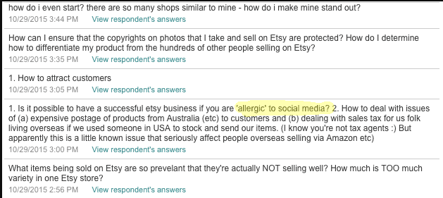
A poor conversion rate will pick your pocket day after day. That’s why you’ll love these 7 conversion copywriting hacks. They’re quick and easy. And you can start using them today.
REPEAT YOUR CUSTOMERS/PROSPECTS
You may have heard that you should write like your customers speak. It builds rapport and credibility. Readers are more likely to think to themselves, “This company gets me and my issue.”
But rather than just guess what your target audience would say, use their actual words.
That’s what Sarah Peterson did when promoting her Etsy course.
The highlighted phrase stood out among responses to a survey she sent to prospects.
A key phrase from survey response
She used that exact phrase to resonate with prospects in her sales email.
The key phrase inserted into marketing email
There are several ways you can do this same thing.
Speak with your customers and prospects. Pick up the phone and have a quick chat. Do more listening than speaking, and write down what they say. Or, if the person gives you permission, record it so you can transcribe it later.
Survey your audience. This could even be as simple as a one question survey that you put on your website. Make sure that it’s open-ended.
Search reviews and forums. See what people are saying not just about your offering, but your competitors as well. This can be a great way to uncover pain points.
SWAP YOUR HEADLINE AND SUBHEAD
It’s amazing how many times I see a landing page where the subhead is stronger than the headline. Maybe the writer is trying to be clever or creative. Perhaps they think the headline shouldn’t be more than a few words long.
Whatever the reason, it’s killing conversions. If it’s not immediately clear what you’re offering me, why should I read on?
Fortunately, the subheads usually have this information. So an easy fix is to just make the subhead your headline.
Here’s a good example:
The subheading is the value proposition
A stronger converting headline
See how much clearer this page is when the subhead and headline are switched?
CUT YOUR FIRST PARAGRAPH
This is a hack that goes back to the heyday of direct mail. It’s designed to help you get right to the point.
Getting to the point quickly sounds pretty obvious. But you’d be surprised how many marketing pieces waste words trying to introduce themselves or state the obvious.
People don’t care about that. They care about themselves. What is it your offer is going to do for them? Tell them right away why they should care.
If your first paragraph doesn’t do this, scrap it and start with the next one.
ADD ASSUMPTIVE PHRASING
Here’s a nifty little psychological hack.
Write your copy as if the conversion is a foregone conclusion.
Simply look through your copy and add phasing like this to some of your statements:
“When you start your trial…”
“You’ll love how…”
“As you’ll see…”
The power of this hack lies with the endowment effect, a phenomenon where we value what we already own more than something we never had. By writing as if your prospect already owns what you’re selling, he or she imagines that situation.
Presuppositions are another type of assumptive phrasing you can use to add persuasive power to your copy. These statements infer something else is true. For instance, if I ask, “Which of these copywriting hacks are you going to use first?” that infers that you are indeed going to use them.
You must accept the inference to be true in order to avoid incongruence within the sentence. We’re wired to avoid incongruence because it requires more brain power.
Use this to your advantage by creating presuppositions with words such as:
Finally. “You can finally get in shape without spending hours in the gym.” (Presupposes that you had to spend hours in the gym to get in shape.)
Start. “Start earning the income you deserve.” (Presupposes that you aren’t currently earning what you deserve.)
Stop. “Stop wasting time on diets that don’t work.” (Presupposes that you are wasting your time.)
Again. “This car makes driving fun again.” (Presupposes that you once enjoyed driving but now find it to be a chore.)
Anymore. “Getting your kids to do their homework won’t be a battle anymore.” (Presupposes that getting your kids to do their homework is a battle.)
How will you use assumptive language in your marketing? (See what I did there?)
USE THE WORD “BECAUSE”
We like to think that we’re rational. That’s why we like to have a reason for doing things people ask of us. But here’s the interesting part. Simply having a reason is often more important than the reason itself.
Consider this famous social experiment:
In 1978, researchers approached people in line for the copier machine and asked to cut in front. They tested the effectiveness of three different phrases.
“Excuse me, I have 5 pages. May I use the Xerox machine?” was successful 60% of the time
“Excuse me, I have 5 pages. May I use the Xerox machine, because I’m in a rush?” was successful 94% of the time
“Excuse me, I have 5 pages. May I use the Xerox machine, because I have to make copies?” was successful 93% of the time
It’s not surprising that people let the researchers cut in line more often when a reason was given. What is surprising is that whether that reason was valid or bogus had no significant impact.
Look at that third phrasing again. Of course, they had to make copies. So did everyone else in line. That’s what a copier is for.
So why did that excuse work?
Often with small requests, we take a mental shortcut. Instead of processing the actual request and reason, we recognize that a reason was given, and we comply.
It’s important to note that the reason for the request becomes more important as the request gets larger.
When the researchers repeated the experiment with 20 pages instead of 5, giving a bogus reason had the same effect as giving no reason. Both were successful only 24% of the time compared to 42% when a valid reason was given.
To use this in your marketing, look for areas where you want the reader to do something and add a “because.”
“Act now because this offer expires in 10 days.”
“Because you’re the type of person who…”
“We’re giving away free samples because we want you to see for yourself.”
USE PATTERN INTERRUPTS
Attention spans are short these days. Even if your copy is great, most readers will start to lose interest if you don’t shake things up a bit. Pattern Interrupts are a great way to do just that.
Pattern Interrupts are a neuro-linguistic programming technique designed to break the expected pattern of thoughts or behaviors. There are a couple of ways to use it in your marketing.
The first is to keep readers engaged. In a long-form piece of marketing, the reader expects paragraphs to follow paragraphs and on. This familiar pattern allows the brain to go on autopilot. You don’t want this. You want readers’ attention.
Break the pattern by adding testimonials, sidebars, callouts and other devices that temporarily interrupt the narrative of your text. Take a look at these examples.
Interrupting the pattern and flow
Interrupting the pattern and flow
You can also use a Pattern Interrupt to disarm readers or refocus their attention. People don’t like to be sold to. As a result, they reflexively put their guards up when they expect a sales pitch.
But what if your copy doesn’t start off as expected?
Use a Pattern Interrupt to disarm readers or refocus their attention.
Readers expecting a typical sales pitch will probably have a different mindset when they read something like this:
Shift the mindset
REMIND READERS OF THEIR FREE WILL
A team in France first proved how effective the “But You Are Free (BYOF)” technique is with this social experiment.
One of the experimenters would stop people in a mall and ask for change to ride the bus. In half of the instances, he or she added the phrase, “But you are free to accept or to refuse.”
Significantly more people gave money when the BYOF technique was used. Not only that, but the amount they gave was twice as much.
Follow-up studies have proved BYOF effective in requests for donations to a tsunami relief fund, participation in a survey, and many other situations.
It works by combating something called psychological reactance. Wikipedia describes it this way:
“Reactance occurs when a person feels that someone or something is taking away his or her choices or limiting the range of alternatives.
Reactances can occur when someone is heavily pressured to accept a certain view or attitude. Reactance can cause the person to adopt or strengthen a view or attitude that is contrary to what was intended, and also increases resistance to persuasion.
With this one simple phrase, you remove reactance and open your prospect’s mind to your persuasion. “
Note: The specific wording doesn’t matter as much as the sentiment. You can also use variations such as:
The choice is yours
It’s completely up to you
You may do as you wish
But obviously do not feel obliged
When you see how well these techniques work you’ll wish you started using them sooner.
Download the full ebook for all 21 copywriting hacks.
21 Quick and Easy CRO Copywriting Hacks
Keep these proven copywriting hacks in mind to make your copy convert.
How would you find a 508% increase in leads from your most important landing page? Here’s how Comnio did it.
What Makes Up Your Value Proposition
I’m often asked questions like, “What would you test first on a landing page?” and, “What do you test on landing pages that most often increases conversions?” At Conversion Sciences, we ask ourselves these questions almost every time we start designing a test. When we “place a bet” on a landing page test, we are most likely to start with the value proposition.
The catch is this.
Your “value proposition” is communicated by the offer, copy, images and proof. It’s complex.
Your “value proposition” is communicated by the offer, copy, images and proof. It’s complex. So, when we say “start with the value proposition,” we’re talking about several potential tests.
Case Study: Comnio
I first came to know Comnio shortly after they had made a change to the over-arching component of their value proposition: the brand promise.
They had originally considered ShtLst.com.
The original concept did a great job of communicating the value proposition, but in a NSFW way.
The value proposition starts with, “Keep your company off of peoples’ Sh*t List.” I loved this approach mainly because I got the value prop in a very humorous way. The company uses customer complaints to market their services to companies that need help managing complaints. It’s hard to market a product to corporations that requires (Not Safe For Work) NSFW warnings, however. Here’s the original video (NSFW).
They decided to go with a safer corporate approach, branding the product as Comnio. The more customer complaints they are trusted with, the more businesses they can approach to sell their service.
So, the home page is an important landing page.
When I spoke with Ross Clurman the site offered a straight-forward value proposition to the consumer.
The Comnio home page served as a landing page for people needing customer support.
Visually, the most important parts of this value proposition are:
The company. Note the large logo and company name top center.
The features of the service – History tracking, Rapid Response and Friendly Feedback.
A chance to offer an Email address. The white field is the most visually distinct item on this page.
The white glove treatment. See the large background image.
The Second Evolution
This value proposition didn’t work well, and this lead Ross to reach out to me for a free consultation.
My recommendations for Ross would certainly have been to focus on the company less and on what will happen more and to use a hero image that is more relevant. By September 2015, the home page was taking a different approach, focusing on the service value and defining the steps that make it work.
In September of 2015, this page had a conversion rate of 3.6%.
In this case the “proof” comes in the form of the logos of companies that Comnio has worked with. This can be a very effective way to increase conversions.
In September, the new landing page enjoyed a 3.6% conversion rate with 822 visits over 30 days.
Evolution Number Three
Updated Home Page Design Again, included full-size version so you can scale down as needed…
The revised page that ran in October 2015 had a conversion rate of 18.3%.
In October of 2015, Ross’s team launched a new version of the page with a different approach to the value proposition. With just over 1000 visits, this page delivered a mind-blowing 18.3% conversion rate. That’s a 508% increase over September’s version.
What They Changed
The Comnio team changed several things to make their value proposition more effective. In their own words, here’s what they changed.
Changed main tagline to explain what we do (as a benefit, not a feature)
Added secondary tagline to explain the pains/problems Comnio solves for users
Changed email [field] placeholder text from “Email address” to “Enter your email address” (a directive to visitors – people respond to being told what to do)
Changed CTA button from “Sign up for free” to “Try Comnio For Free” (resonates, and sounds like less of a commitment if people don’t feel like they’re “signing up” for something)
Added social sign-up options
Swapped out the position of company logos with the position of testimonials from users
Added a gradient line below hero area to separate it from the rest of the page
Which Elements Made the Difference?
Since all changes were made at once, it’s hard to know which contributed most. One of the changes may have even reduced the ultimate conversion rate. I think that, in this case, all elements work together to make one compelling value proposition. The sum is greater than the parts.
By translating the page into prose, we can see clues as to why.
Speak Your Value Proposition
If we were to write the value proposition of each page as a paragraph, you can see why the latter made more sense to visitors.
September Page
“Comnio offers on-demand customer service for any business at any time for free and it works on your smartphone. Just share your feedback. We contact the business and your issue gets resolved. Signup for free and start using Comnio now. We want your email address to sign up for free. Companies that you recognize use us, like beats by dr. dre, Lufthansa, Panasonic and more. You can trust us because @Kane007 tweeted that they are very grateful to us for helping.”
The italicized text is taken from the background image.
I think that this value proposition sounds like it focuses on the businesses, not end-users.
October Page
“Comnio deals with customer service so you don’t have to and it works on your smartphone. Submit your issue. We contact the business and your issue gets resolved. No waiting on hold. No repeating yourself. Just real, good customer service. Enter your email address to try Comnio for free. Or connect with us on Twitter or Facebook. You can trust us because we took just days to fix a problem for JASON that he’d had for years. We work with companies you recognize like beats by dr. dre, Lufthansa, Panasonic and more.”
The addition of “No waiting. No repeating yourself” really drives the point home that this page is for the consumer, and does it in a way that helps the visitor imagine what they are in store for if they do this themselves.
Overall, the new value proposition is more powerful and logical – about five times more powerful.
Our tests are showing that the contents of testimonials are very important. I believe that the message told by JASON is superior the the tweet by @Kane007, especially since JASON sounds like a person.
Finally, the company logos have been moved from the meat of the value proposition to a supporting role. This removed confusion about who this page is for, companies or consumers.
Social Signup Success
The impact of the social sign-up options in the October page is two fold. First it’s easier to do on a mobile device. Second it puts well-known brands on the page. This is a way of “borrowing” trust from Twitter and Facebook. There may be few social sign-ups, yet more form completions with this approach due to the increased trust on the page. In this case, Ross reports that about 49% of leads used the social sign-up buttons.
The magic question here is, did people who were going to sign-up use the social buttons for convenience, or did the social buttons drive visitors to sign-up who wouldn’t have otherwise done so.
Missing Ingredients
There are some specific elements we like to see in every landing page. The thing missing from this value proposition is proof. At some point they are going to be able to say something like, “15,324 issues resolved successfully.” The number doesn’t have to be that large, in my opinion.
For a potentially disruptive service like this, media mentions would be another nice addition to the page. This delivers more trust building and more proof.
To learn more about what makes landing pages convert at higher and higher rates, watch our free webinar The Science of the Landing Page.
Write Out Your Value Proposition
Whether you’re selling an application, a report or a free consultation, your value proposition should unfold in the visitors’ minds through the words, images and emphasis you place on the page. If your page is compelling written as a paragraph, you can enjoy high conversion rates like Comnio.
If not, test your way through to a value proposition that works.
Feature image by stan via Compfightcc and adapted for this post.
We’ve all seen the numbers. Visual content outperforms text-only content by a landslide.
Need a refresher?
Content generates up to 94% more views if combined with compelling visual elements and graphics. (MDG Advertising)
40% of people will respond better to visual information than to plain text. (Zabisco)
High quality infographics are 30 times more likely to be read than text articles. (Ansonalex)
While I’ve known these stats for some time, I didn’t feel like there was much I could do about it until recently. I would make sure to break my articles up with nice subheadings and insert quality stock photos or original photography when I had it, but that was about as visual as I got. “After all,” I thought, “I’m a writer—not a designer.”
How I Became More Visual
Things changed when I started writing a weekly column for a client whose company designs and builds custom homes. The column was to appear as sponsored content on a well-known luxury living blog. My goal was to conduct interviews and research on the latest trends in home design and present my findings in 500+ word articles along with some beautiful photography of the client’s work.
My logic was simple: The photography was already performing extremely well on social media. The pictures would be the hook, and people would stay for the insightful article.
The first article of the campaign. It goes on for over 600 words.
While this approach already seemed to be working on the client’s on-site blog, it didn’t have the effect I wanted it to on the sponsored column.
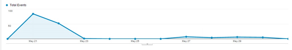
In fact, my first article performed pretty badly, despite all the effort I had put into conducting interviews, despite the great quotes and useful information I used—even despite the photos that had been shared thousands of times on social media. The first article—a piece that used anecdotes and advice from the client about finding inspiration for your home—received 84 views upon publication and continues to be one of the lowest performing posts of the campaign, with a total of 220 views.
The tiny blip made by my first article. We used tracking pixels to watch traffic on Google analytics. As you can see, traffic did not pick up after posting.
Then I started using Illustrator
I had been fumbling around with the program for several months, but never felt like I had time to use it properly. My approach had always been to write the best copy I could and to let a designer help out if they had time. But this time I was determined to do something—anything—different so that the column would prove worthwhile.
So I went ahead and designed some images for my next two posts—just some simple, vector-based elements to use as featured images and between subheadings. They weren’t great, but they were presentable, and the articles performed slightly better than the last.
I wasn’t sure if the slight increase in views warranted the extra time it took to create new visuals, but I decided to give it one more shot.
I’m glad I did.
Taking a cue from fashion magazine style collages, I cobbled together a collage using pieces of our original photography and used it as the central element of the next post. The post received 524 views on the first day of publication—over six times more views than my initial post. Even better, the post continues to rack up views, with 1,626 views to date.
My first post on the site to be primarily visual.
Since posting that article, I have continued to create similar content for this campaign (and others) that have performed just as well.
My next post also used a collage. It received 504 views on the first day of publication. Interestingly enough, this article was on the same topic as my initial failed article—how to find home design inspiration. The difference was all in how the information was presented.
Spikes in traffic from my first two collage posts done in Illustrator.
A few months later, new posts continue to create spikes in traffic, and we begin to gain a consistent viewership between postings.
While I don’t have all the answers to this change in performance, I attribute the success of the collage articles to two things: 1. their overall presentation, and 2. their particular appeal to my audience.
Overall Presentation
They stand out from surrounding posts in the blog roll.
In a sea of photographs, a small piece of graphic design can really stand out.
They look original.
Readers who are already engaged with the client’s brand may have already seen our best photography. These images made them brand new.
They look useful and cohesive.
A simple collage with numbered items promises practical, bite-sized content. Plus, people want to be shown how information relates. Sometimes, placing a great photo next to text isn’t enough.
Appeal to the Audience
They mimic the look of luxury magazine and blog articles.
In researching our audience, I checked out several sites that our demographic enjoys. (Facebook’s recent expansion of its search function is great for this task.) They gave me examples of the kind of short-form blog posts that our target audience typically reads.
They account for the audience’s browsing behavior.
If your prospective customers are visually inclined, too much text is a nuisance. By creating visual content, I was able to provide the kind of bite-sized articles that that my audience expected in that context.
Growing your capabilities will make you more perceptive.
There are probably several lessons to be learned from this incident, including one about knowing your audience. But the one I want to stress is this: learning how to design will make you a better writer.
How do I know? I’m not just basing this claim on the spike in traffic that came after I started creating visuals. I’m also basing it on the fact that now, when I set out to create content, I don’t ask myself, “How can I best express this idea through copy?” I ask, “What is the best way to express this idea? Period.”
I am also better able to take into account the browsing behavior of my audience. I wouldn’t be writing this out as a 1,000+ word article if I didn’t think that the audience of The Conversion Scientist was willing to read longer articles. Similarly, the content you create should cohere with the browsing behavior of the people you want to reach. No matter how great your writing is, you will never convince a non-reader to read—at least, not through a piece of content marketing.
Because I can now create a broader variety of content I also think much more about the behavior of my audience. That’s why learning Illustrator has not only made me more versatile—it has also made me more perceptive. If copy is only a small part of the equation, I can combine my strengths as a writer with my (developing) ability to design to create content that is cohesive, concise, and valuable. Colleen Ahern is a copywriter and content marketing strategist at Page Agency. She created the Page Agency Blog, where she writes about the rapidly evolving world of content marketing and social media. Follow her on Twitter @ColleenAhern.
Tim Ash coined the term “Big fat bouncers in your brain” during an interview on his Landing Page Optimization podcast that he and I were on.
I love the image that phrase draws to mind, because it’s true.
The bottom line is this: If you want your message to affect and influence your readers and listeners, you must get past the big fat bouncers in their brains.
[cs-tan-box]
Writing Killer Copy: Getting Past the Bouncers in Your Brian
[/cs-tan-box]
I’ve introduced you to these two bouncers and telling you how to write copy that gets past them.
Why register now? Find out how Betabrand achieved 432% growth for products nobody was looking for. Get my real definition of “copy”. See revealing brain scans. We all love brain scans. Discover my fool-proof method for great copy. Find out what business porn is and how to create compelling images. As always, we have FUN doing these.
[cs-tan-box]
Writing Killer Copy: Getting Past the Bouncers in Your Brian
The most important part of your website is your value proposition. Find out how to communicate it in words and images.
Too often, we confuse our tag line with our value proposition.
For a website, the value proposition is the critical message that asks a visitor to explore further and to purchase.
Famous value propositions include Zappos’ “365 day return policy and we pay shipping both ways.” Warby Parker offers “Order up to 5 of our vintage-style sunglasses. Keep the ones you like and send the others back at our expense.” These sound like expensive value propositions.
Yours doesn’t have to be.
No matter how simple or complex, your value proposition should be communicated clearly in the words and images on your website. Most value propositions can’t be communicated in a sentence or two.
Let’s see how one company communicates its value proposition in words and images.
iMagnetMount Value Proposition
I’m not going to tell you what iMagnetMount does. Let’s discover it from their home page, which acts as a landing page.
The value proposition for iMagnetMount is simple:
The “Hero Shot” should tell visitors that they are in the right place.
“We make a phone mount for your car.”
If I didn’t read the text, I wouldn’t really know what this is. The headline tries to be cute, but has the magic words, “Phone Mount.”
If we scroll we get the next part of the value prop pretty easily from an auto-play hero video.
If your product is easily demonstrated, consider using video.
BAM! I get it. Viscerally. Nothing fancy. No catchy music. I don’t even have to read the text.
It’s solid. It’s easy. It works on the dash or on the windshield.
This is the value of having a demonstrable product. If you have a demonstrable product, use video. To demonstrate.
If anything, I would have put this at the top of the page.
Objections: What’s missing from your Value Proposition
As potential customers, what we haven’t been told will quickly gel into objections. Objection questions begin with “What if I…?” and “Will it…?” and “How can it…?”
However, these questions aren’t asked on a web page. They must be anticipated.
It’s apparent that iMagnetMount believes to be the first objection to be, “Can I trust you?” Trust symbols are seen in two places on the page.
Logos can increase “borrow” trust from better-known brands.
Be careful introducing objections with little proof to overcome them.
Objections are funny things, though. If you address the right concern, you move the prospect closer to buying. If you raise the wrong one, you create a new objection.
Here, iMagnetMount introduces an objection, “Magnets might hurt my phone” by stating that there is “No Magnetic Disruption To Their Phone.” The objection is addressed with some social proof, so the objection is raised and addressed.
If you raise an objection, handle it quickly.
What is the next thing we should learn about this “phone-destroying” product?
More Demonstration
Next is a video with a marquee frame showing the phone turned horizontally, like a GPS. Awesome!
The copy next to it says, “Life is too short to fumble with your phone.” iMagnetMount’s copywriter thought cute was the way to go.
The goal of this particular headline is to get the visitor to play the video. Instead, they introduce a new objection: “Will I fumble the phone? Will it fall off?”
Headlines should tell the visitor what to focus on.
In your copy, avoid cliché phrases like “Life is too short”. Instead, be more direct.
Watch this short video to see how flexible this magnetic mount is.
Managing the Big Objections
When speaking with iMagnetMount, they confirmed that a big objection is that the magnetic mount would damage or interfere with the phone.
Will it hurt my battery?
Will it fry my electronics?
Will it burn my screen?
Will it affect reception?
iMagnetMount addresses the issue in small text under an unrelated headline.
The answer to the big objection is buried in hard-to-read copy under a cutesy headline.
Here, the copy asks the visitor to “Turn smartphone mounting on its head.” Another throw-away headline. As above, tell them to watch the video and see the advantage.
The video demonstrates the strong suction as well as the grip of the magnet on the phone. Demonstration rocks value propositions.
These two messages – that the magnet is safe and that the suction is awesome – address two of the biggest parts of the value proposition. They should be separated and proven.
Marry Messages and Copy
Your headlines should support the image.
In this part of the page, I felt that the background image used was pretty effective for making a statement about suction. It shows a suction cup sticking to a rough dashboard surface. In this case, the overlaid text supports the message of the image. Words like, “Finally” and “hassle-free” are not as powerful. Chuck these words to advance the value proposition.
Phrases like “patented” and “secure for months” are going to be more successful.
Managing Risk
Buying anything is perceived as risky, especially online. Managing the risk is a key part of the value proposition.
Risk management is a key part of your value proposition.
There are several messages at the bottom of the page that address risk.
You won’t have to buy a new mount if you think you’ll change phones.
Our mount is safe for your phone (with a link to a FAQ page)
Our product is built from strong stuff (in South Korea)
We offer a one-year warranty.
Over 100,000 drivers have bought your product.
The cornerstone of risk management is risk reversal. The use of a familiar gold seal tests well in many industries. The use of plain-English text describing the warranty and return is done well here.
A link to a FAQ page offers up many more objections, but also handles them well. Methodical buyers will appreciate the detail on this page.
Repeat the Offer at the Bottom
Anyone who has read through your page to the end is probably pretty interested. Always repeat the call to action at the bottom, as iMagnetMount does here.
Bringing it Home
Copy is more than words. Copy is words and the images that support them.
If there is one issue with the copy on this page, it is that copy is trying to be cute and isn’t supporting the very strong images and video on the page.
After our conversation, iMagnetMount modified the page to address some of these issues.
Proof is important when handling value objections.
Here they’ve added copy to handle the objection, “Will the magnets hurt my phone?” Unfortunately, the image and copy no longer collaborate.
I don’t think they expend enough effort in managing this objection. Proof is key, and they have it. However it is buried, even in this treatment. They should state that it’s SAFE.
Safe for your phone. Safe for your battery. Safe for your screen. Proven with over 10,000 hours of road testing over 2 years.
Are we introducing some objections here? Yes, but if the proof is there, we can consider it handled.
With one change, iMagnetMount significantly improved the image-headline relationship in another part of the page.
When text and image work together, value propositions get wings.
What a powerful headline that begs me to watch the video to see the proof.
The Complete Value Proposition
The keys to a communicating a strong value proposition are:
Demonstrate your value with images and video.
Support your images with headlines.
Provide proof whenever possible.
Manage risk with proof and a straight-forward return policy.
Repeat the offer at the bottom of the page.
There are other aspects of this page that may be hindering conversion rates, and those are discussions for another day.
However, with a well-crafted value proposition, buyers will find their way through many obstacles on their way to purchase.
I have to admit, I was a little more nervous than usual presenting in front of an audience of psychologist-marketers.
You’ll see what I mean in the video.
Why would a Conversion Scientist be invited to speak at a Psych conference? Because our testing is designed to tell us things about your visitors that they cannot even explain themselves. This is why split testing is such a valuable tool. Visitors tell us what they prefer by how they act.
One thing testing has taught us is that there are bouncers in the human brain, and these bouncers must be dealt with before our messages will be processed and acted upon.
It’s just 20 minutes or so.
Hat tip to Roy H. Williams and the Wizard Academy for introducing me to the research I present here.
I did a little experiment using images and copy in my Marketing Land column Take Control of Your Visitors’ Eyes. Instead of using my superior powers of page design to highlight an important piece of information, I used them to hide that information.
Subscribe to Podcast
I purposefully did some things you may be doing accidentally, to the detriment of your site and your visitors.
When looking at web and landing page copy, I often find the important information buried, or designed in such a way as to look unimportant.
Value propositions, phone numbers, guarantees, and special offers are some of the things that are important to visitors, but don’t look important.
Images, captions and more
Read the column or listen to the podcast to find out how I obscured an important fact, and how I highlighted another, less relevant fact using:
Part of persuasive writing is crafting killer conversion copy. On today’s interview, I ask Joanna Wiebe for her opinion on the matter. Check it out.
I’ve been putting the finishing touches on my Conversion Conference presentation entitled Creating Killer Conversion Copy: Emails, Landing Pages, PPC Ads and More.
Writing Killer Conversion Copy with Joanna Wiebe of CopyHackers.com [Audio]
I asked Joanna Wiebe of CopyHackers.com to give me her opinion on writing copy that converts. She clearly has an opinion. I thought Scott Stratten was the epitome of a Canadian Diva. Then I met Joanna. (She’ll be mortified that I wrote that.)
Does a copywriter for the Web have to understand design? How about analytics?
How can I choose a copywriter that is going to increase conversions?
What is Joanna’s process for creating copy that tests well over and over?
For more on social media strategy, sign up to get a copy of my up-coming book: The Customer Creation Equation: Unexpected Formulas of the Conversion Scientist.
After nine months of writing, fifteen chapters complete and dozens of columns supporting the effort, you’d think that the easiest thing to do would be to pick a name for my conversion marketing book.
As it turns out, this is difficult.
So why read a post about selecting a book title? Because, it’s all about conversion – not just the book, but the title is about converting book prospects into book readers.
The title of your book is key to maximizing conversions. It is like the subject line of your email, like the headline of your landing page, and like the value proposition of your home page. Get these wrong and your conversion rates will plummet. However the book title can’t be changed. Once chosen you are stuck with it until you write another.
It’s expensive to test titles, and this makes a Conversion Scientist very nervous.
I’ve considered a number of approaches. These approaches will also inform your online marketing.
Leverage something familiar
My first thought was to leverage something familiar, something that is already popular. This spawned several mockups including The Bourne Conversion, Eat, Pray, Convert, How to Win Friends and Convert People, and Conversions with God.
Unfortunately, copyright issues will prevent me from using any of these.
Ask your SEO person
The next thing I had to consider was how people might find the book on search engines. Phrases like “online sales conversion,” “analytics,” “conversion rates,” and “social media” are some of the most commonly searched phrases in the conversion marketing space. With this focus in mind, several titles were considered:
Online Sales Conversion: The Science of B2B, B2C, Online Services and Social Media Websites
The Well Managed Web Site: Conversion Strategy and Analytics in Simple Terms
Managing Websites to High Conversion Rates
Online Conversion Strategy
In my opinion, words like “conversion” and “analytics” are too clinical. Furthermore, these conversion terms don’t really get that much search traffic, so this strategy became less important to me.
Leverage your existing brand
I’ve been marketing Conversion Sciences and The Conversion Scientist pretty consistently for six years now through writing, speaking and training. The business is familiar to many online marketers and business owners, the two primary targets for my tome.
Playing on the science angle associated with the brand yielded several interesting titles, including the original working title, Get a Reaction.
Marketing + Science = Customers: Online Conversion Strategies to Transform Prospects into Buyers
Conversion Science: The Proven Formulas for Transforming Online Prospects into Customers
The Science of Reaction: Proven Conversion Formulas of Internet Based Companies
Own a word
I’ve always like one-word book titles that are provocative, like Malcolm Gladwell’s “Blink” and “Outliers.” I thought “REACTION” might be the word that sticks with people in my space.
REACTION: Getting visitors to take action on your website
Get a REACTION: Proven Strategies of the Conversion Scientist
The Science of REACTIONS: Websites that Convert Visitors to Leads and Sales
My feeling is that you have to have a large marketing budget to get a word to stick in the minds of potential readers. I didn’t get a multi-million dollar advance, unfortunately.
Surprise them
Seth Godin is great at naming books with unexpected titles, such as Purple Cow, All Marketers are Liars and Meatball Sundae. I thought the unexpected or absurd might work for my book as well.
It’s Raining Soup. Get a Bowl. How to turn Internet traffic into a delicious business.
Glad I Stopped By: Websites We Love to Do Business With
They Did What?! Unexpected Strategies of The Conversion Scientist
Marketing Backwards: Unexpected Strategies of The Conversion Scientist
The Website Genome Project: Proven Research of The Conversion Scientist
The truth is, I’m not Seth Godin. Darn it.
State your topic plainly
We often get too clever for our own good when we’re writing headlines, subject lines, and book titles. It’s a business book, after all.
Managing Your Website: Conversion Strategy and Analytics for the Managers and Business Owners
Online Conversion Strategies for Websites that Dominate Their Marketplace
The problem with these is that the reader is more likely to fall asleep before finishing the title.
Ask your personas
If you follow The Conversion Scientist, you know that I believe creating visitor personas is the best way to get high conversion rates on your website. The same applies to books, and I have developed several personas for this book.
With this guidance, I was able to choose a book title that combines the right ingredients… I hope. Here’s what I know about my personas.
Most of my personas have heard of The Conversion Scientist through my columns, blog posts and speaking. This tells me to leverage the familiar science angle.
One persona studies marketing, and they are reluctant to read a book that will give them same advice they’ve already heard. Therefore, the title should indicate that it is presenting a fresh way to look at online marketing. Use terms like “unexpected” or surprise titles like “marketing backwards.”
Finally, all of my personas are human, which means they respond to things like metaphors, rhyming and alliteration (the repeated use of a sound in a sentence or phrase). This tells me I should use these tools.
After reviewing these persona requirements, we settled on the following title:
The Customer Creation Equation: Unexpected Formulas of The Conversion Scientist™
The alliteration and rhyming nature of the main title will help people remember the name. It has the important search terms “conversion,” and “customer” in it. The terms “equation” and “formulas” evoke the science theme of my brand.
Finally, the strategies are “unexpected,” and indeed the book contains advice contrary to what you have been told. This was a tough decision for me. One of our personas is trying to solve a specific marketing problem. Calling my recommendations “unexpected” may not appeal to her. She will want to know about “proven” strategies, and I did consider the subtitle “Proven Strategies of The Conversion Scientist.” Yet, I knew she would find value in being “cutting edge,” and “unexpected strategies” should appeal to her.
Did we pick the right title? Which would you prefer to read? Let us know in the comments.
You won’t be converting much of anything if you start with the wrong kind of website. Find out which of five conversion signatures your website should be following with a free video that introduces some key concepts from The Customer Creation Equation.


 Colleen Ahern is a copywriter and content marketing strategist at Page Agency. She created the


![Writing Killer Conversion Copy with Joanna Wiebe of CopyHackers.com [Audio]](https://conversionsciences.com/wp-content/uploads/2012/02/joanna-wiebe.jpg "joanna wiebe")


