
How to Avoid Mobile-Friendly Redesign Disasters

Joel Harvey, Conversion Scientist™
This post is excerpted from Designing from the Mobile Web 2.0 by Joel Harvey. Joel discusses what he’s been learning through the tests that Conversion Sciences has done for the mobile web. You can begin to take these as new hypotheses in your business so that your mobile devices and your mobile traffic is converting at higher and higher levels.
I’m sure mobile’s on the top of your mind.
We have tested hundreds of mobile hypotheses over the last couple of years and we’ve learned a lot. There’s still a lot that we don’t know.
We’re going to share some of the key things that we’ve learned along the way with you and show you what you need to be focusing on to start driving wins in your mobile traffic.
Mobile-Friendly Redesign and Best Practices
We are not here to talk about mobile optimization best practices. No, mobile best practices don’t really exist yet. Mobile best practices are a monster that lurks in our marketing. We call it the Bestpracticlops.
The Bestpracticlops reminds us how dangerous the phrase “best practice” is, and how dangerous best practices can be. We’re going to talk a little bit about that before we really dive into the meat of mobile-friendly redesigns.

Don’t let the Bestpracticlopse devour your mobile website.
A Best Practice is a commercial or a professional procedure that is accepted or prescribed as being the most effective.
What does that really mean?
It’s something that works everywhere all the time. That’s what a true best practice would be.
Now let’s compare that with the definition of conversion optimization
Conversion Optimization is “The process of generating and using data to improve a site’s unique experience for key segments.”
In other words, conversion optimization is finding the unique things on your unique site that drive your unique visitors to do more of what you want them to do. This is fundamentally different than the definition of best practice – something that works everywhere all the time.
They don’t live together nicely.
There is an almost infinite number of things that you can consider for testing on a website. There are an infinite number of things you could test on a website. Clearly, many of them aren’t really worth testing. Just in the mobile world alone, you could ask, “What kind of device type are we talking about?”
What’s the operating system?
- Is it Android?
- Is it iOS?
- Is it Windows?
- What browser are they using?
- What’s the screen size?
- What do we think the load time is of the page?
- Is this a new visitor or a return visitor?
- Is this a regular desktop site being shown on the mobile device?
- Is this a responsive site adjusting itself to the mobile device?
- Is it a mobile dedicated site?
- What promotion brought them here?
- What’s the site speed?
- What’s the speed of the network connection?
- Is it in landscape or horizontal mode?
Those are just a few of the things that you have to consider, not to mention the most important things like:
- What is my offer?
- What is the content?
- What is the copy?
- What is the design and layout?
We don’t want to make you feel overwhelmed. We want you to avoid this misconception of best practices: Whenever you’re faced with an infinity monster of choices, what do you do? You might want to reach for something easy. You might look for a best practices unicorn riding a rainbow that you can get on and ride to higher conversion rates.

Best practices are like Unicorns. They sound great, but don’t really exist.
You might be tempted to say, “Best practices. That’s going to make this easy. We don’t have to worry about the infinity monster anymore. We’ve got something in the bag.” The truth is that 50% of your ideas, at best, are going to be wrong and I can say this from years of experience.
Our process at Conversion Sciences is to painstakingly go through the data and the site and come up with a list of hypotheses. We have a fairly sophisticated methodology for going through and ranking those hypotheses based on what we think have the best chance of winning.
Yet, on our best day, half of those hypotheses don’t result in a lift in conversion.Yet, on our best day, half of those hypotheses don’t result in a lift in conversion. That’s not because they’re ill-conceived or they’re just filler and fluff that we throw into the list. It’s because your visitors are very different from us and we really don’t understand them.
If you take that and apply it to the concept of best practices, particularly mobile best practices, you’re faced with a 50% success rate at best if you just start rolling things onto your site.
I’m going to show you some things that have worked for us. If you want to, you can just start rolling stuff out onto your site. However, I would highly encourage you to test it because what works on one site in the same industry doesn’t work on another site in that same industry.
And this is where we get the Bestpracticlops. You have a few failed tests and say, “We tried some things that those experts said worked and it didn’t for us, and therefore, optimization doesn’t work. We should focus on something else.”
Don’t fall into that trap.
Mobile Visitors Want Something, Well, Mobile
Whenever we think about mobile websites — and this is really true of all websites – we find that visitors don’t want what we’ve built for them.
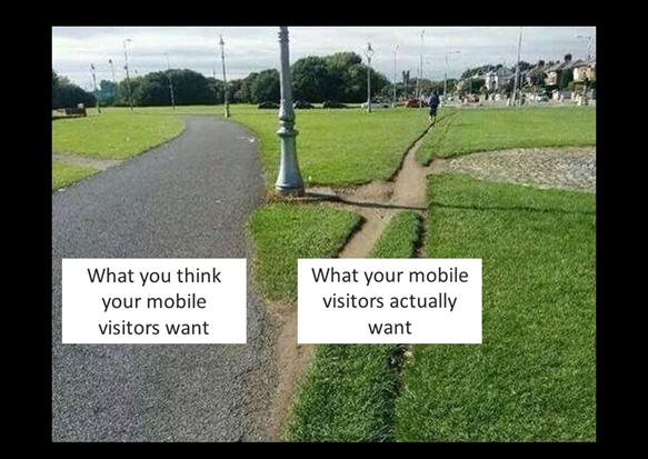
Your mobile visitors will cut their own path to a solution. Mobile-friendly redesign must take this into account.
You may be familiar with the concept of desire lines. Universities, state capitols, and other places, landscape engineers go to great pains to lay out what they think are the best routes for sidewalks, and what you inevitably find is that the visitors, the users of those sidewalks, pick their own path.
We know for a fact that this is absolutely true in mobile. The problem is it’s harder for a visitor to cut through to a desire line on mobile. You design for what you think your mobile visitors want, and this is different from what they actually want. I guarantee you these are two distinctly different things.
Furthermore, your optimized mobile experience is going to be different from everybody else’s, even more so than on the desktop. The best way to understand the desired path is through analysis and testing. The data will tell you.
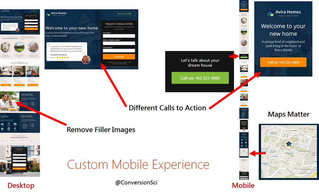
Mobile visitors want different features, faster load times and mobile calls to action.
Mobile Traffic is One of Your Fastest Growing Segments
If this sounds like a lot of work, it is most likely worth it, no matter the industry you are in. The red-dotted line shows in the graph below shows that in just 14 months the percentage of people visiting this ecommerce site on mobile has grown from 20 up to 35%.
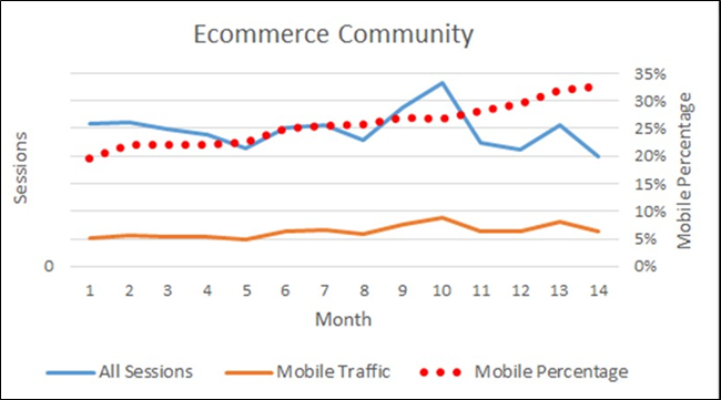
Mobile growth as a percentage of all visits for an ecommerce community.
This has real life implications on your site-wide conversion rate. For this particular audience, most people don’t buy on a mobile. So you have an ever increasing percentage of your traffic coming out on a device that, so far, doesn’t produce the same level of revenue.
The Mobile Screen is Screen One
More and more of your visitors’ first interactions with you will be on a mobile device. It’s important to understand this. In this section, we’re going to talk about dedicated mobile websites or heavily QA’d responsive websites.
Mobile is the first impression.
When someone’s decided they’re going to buy a new TV, what do they do? They pick up their mobile device whenever they’re stopped at a traffic light, whenever they’re waiting in line, whenever they’re sitting in a restaurant waiting for a friend. They start doing some simple searches.
“Best LCD TV over 52 inches”
These visitors are trying to get a sense of what their consideration set is. The consideration set is comprised of all the different specs and brands that you want to consider for the television.
The next question is, “I’ve discovered what the one or two things that I want to buy are. Now I have to figure out who I want to buy them from.”
The research that creates those two consideration sets doesn’t happen in mutually exclusive websites either. In doing these exploratory searches and they’re more likely to land on real merchant sites than on sites like Consumer Reports. They’re going to land on Best Buy. They’re going to land on Fry’s. They’re going to land on competing sites.
They’re not coming to buy right then. They’re landing to understand what they want and who might be able to provide it for them.
And this happens across any industry, whether it’s ecommerce or lead generation.
In the beginning, when people are in tire-kicking mode, at the very top of the funnel, they’re using their mobile device to figure out what they want and who might be able to provide it for them. The key is making sure that you are positioned to make a great first impression, and putting yourself in a position to be the website that they come back to whenever they’re actually ready to make a decision about who to buy from or who to submit their information to.
It’s a pretty simple concept. Give them a win.
If you forget that, you’re going to start making your mobile site work like your desktop site, and you’re going to lose when you do that.
Responsive Web Design. What Could Go Wrong?
One of the hottest topics in web design today is responsive web design (RWD). Remember the Bestpracticlops? The Bestpracticlops thrives on mobile responsive design.
Many sites have gone responsive in the last year. Many of you moved quickly, quicker than you would have liked to, in making your sites responsive thanks to Google’s Mobilegeddon update. It turned out not to be such a big deal.
I certainly know we were taking phone call after phone call saying, “We’ve got to go to responsive because of Google and can you help us do that in like six weeks?”
The truth about responsive templates is that they make decisions for you and, unfortunately, those decisions are not always good. Think about this: You have very unsophisticated technology trying to say in real time, “Based on the screen size of this device, I need to move this element, eliminate this one and to change the order of these others.” It’s not artificial intelligence here. It’s really dumb technology making decisions about how to fit stuff on a screen that’s 3 or 5 inches wide from a site designed for a 17 inch screen.
What could go wrong?
When Mobile-Friendly Redesign Becomes User-Unfriendly Redesign
The following image shows a pay-per-click landing page for Banfield Pet Hospital. They are spending pay-per-click money to get people to this page. The mobile landing page is inset over the desktop landing page.

Banfield’s responsive web design decided the company logo wasn’t important on small-screens.
Do you see what’s missing?
The most important trust-builder on the page has been removed – the logo. This initial credibility and trust builder has been amputated by the responsive design. This responsive template made a decision to simply remove the company’s logo. The headline is quite ironic in this case. We have not been properly introduced because there’s no branding.
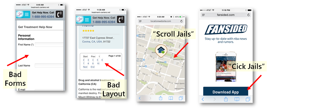
Layout issues, “scroll jails” and “click jails” are symptoms of responsive web design.
Responsive designs can make a number of poor decisions, so many in fact that we wonder, “Why not just design for mobile specifically?”Responsive designs can make a number of poor decisions, so many in fact that we wonder, “Why not just design for mobile specifically?”
What’s missing from the mobile image below?
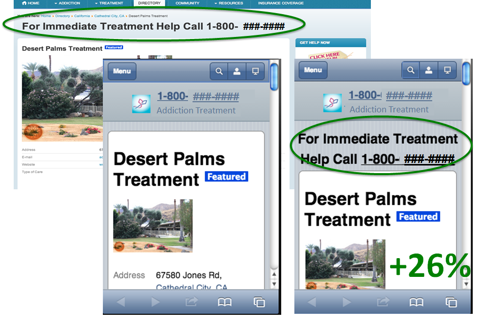
The mobile screen on the left shows that an important headline was removed by the responsive template. Adding it back increased calls by 26%.
The responsive template decided to remove the headline on small-screen devices. Since mobile visitors are different than desktop visitors, we tested what would happen if we fixed this responsive decision. We told the responsive design, “Don’t make that decision. You’re bad. You made a stupid decision. Now sit in the corner.”
We found that returning this powerful headline to mobile devices delivered 26% more mobile phone calls.
This is real. This happens. We see this happen even today.
Responsive Web Design Delivers Slower Mobile Experiences
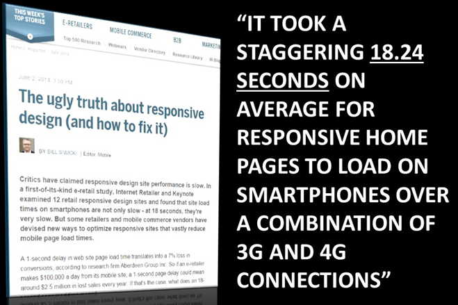
Responsive web designs don’t eliminate the fat when switching to mobile screens.
Internet Retailer did a study and found that, for large responsive ecommerce sites, the average load time just for the homepage was 18.24 seconds. We’re not talking about a category page that could have dozens of images in this case.
That is about 16 seconds too long probably, especially for mobile visitors.
Mobile visitors are really impatient. They are in the moment. We’re getting more and more impatient, and mobile visitors make desktop visitors look like the Dalai Lama when it comes to patience.
A mobile site with an 18 second load time is like shooting yourself in the foot. It’s like shooting yourself in both feet, and both knees. If you’re lucky it stops there.
Redesign Your Desktop Site to be Mobile Friendly? Really?
You don’t just get to make the mobile site responsive. The desktop site won’t remain the same.
The desktop site is probably your bread and butter for most of the people listening to this. You have to redesign your desktop site to have a responsive mobile site. Here’s what we know about redesigns: they almost always result in a decrease in conversion rate.
Sorry, we’ve seen it too many times.
In short, we recommend that you keep your high-converting desktop site as it is and optimize for that traffic. Build out your mobile-friendly site using a separate, adaptive web design. Then optimize that mobile traffic for the unique experience they want.
We’ll talk about what you should try on your mobile site.
NOTE: we find that a responsive web design works well for desktop and tablet-sized screens.
Mobile-Friendly Redesign Based on Data
Since every mobile audience is different, you’ll be well-served if you use your behavioral data to guide your mobile-friendly redesign. This includes:
- User Testing
- Surveys
- Web Analytics
- AB Testing Results
At the very least, you have the web analytics data and the recommendations here to guide you to mobile AB testing for results.
Conversion Sciences make mobile a part of every conversion optimization project. Contact us for a free consultation.

Expertise: conversion rate optimization, AB testing, marketing strategy, digital marketing, analytics, landing page design, computer programming, entrepreneurship
Speaking: IBM, Inbound, LeadsCon, Content Marketing World, Affiliate Summit, and more
Books and Training: Your Conversion Creation Equation, Video CRO, Marketing Videos that Convert, CRO Best Practices
As Seen On: ClickZ, Search Engine Land, Marketing Land, Conversion Sciences Blog, Intended Consequences podcast
Education: Texas A&M University, BS Computer Science and Management
- Your Traffic Fell 30 Percent. Your Targets Did Not. - September 3, 2026
- How to Filter Bot Traffic in Google Analytics With Ask Advisor - August 20, 2026
- Using AI to Chat with your Online Business - July 10, 2026


From layout issues, to users demand, to mobile responsiveness adaptation, to capabilities of friendly mobile design. All of this has been defined properly plus additional examples. It was a great article and worth to read.