Multivariate testing offers high-traffic websites the ability to find the right combination of features and creative ideas to maximize conversion rates. However, it is not sufficient to simply throw a bunch of ideas into a pot and start testing. This article defines what a multivariate test is, explains the advantages and pitfalls of this kind of testing, and offers some ideas for the future.
split testing
After reading our Ultimate A/B Testing Guide, we thought you might want to take advantage of a few creative approaches to landing page AB testing. They go beyond basics to improve your digital marketing ROI.
There are a surprising number of AB tests smart marketers can run on their landing pages to ensure they’re getting the highest conversion rates possible. You already know you can experiment with different landing page elements for conversion rate optimization. Headlines, subheads, calls to action, and design elements can all be considered when building your testing hypotheses’ list.
Now, let’s kick it up a notch with these nine approaches for landing page AB Testing that may inspire you to create your own unique AB tests.
1. Create Targeted Landing Pages for A B Testing
Let’s say you are launching an advertising campaign. And you want to know what page will convert best: a generic one or a highly targeted to the audience and message. For this split test you could have ad variations that would use your generic landing page and one or more targeted landing page versions.
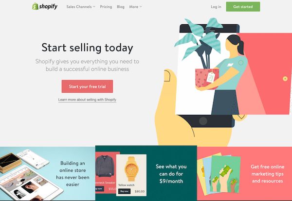
For example, if Shopify did an AB test between their generic vs. targeted landing pages in an advertising campaign, the control would apply to anyone looking for an eCommerce solution.
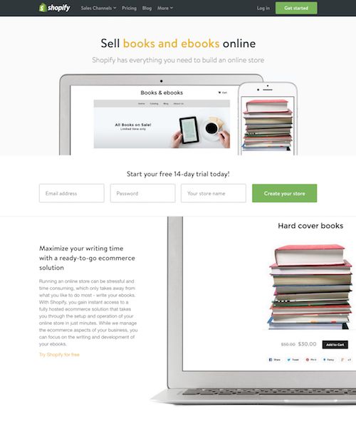
For a variation or version of a landing page, they could use their page that targets booksellers.
To maximize your conversions with this test, analyze your customer database to determine who your best customers are and create targeted landing pages focused on those specific groups of customers. If you do a quick Google search for Shopify’s landing pages you can see they have created targeted landing pages for their top customer segments.
You can use these as examples of how to create targeted landing pages for your top customer groups and demographics.
2. Landing Page AB Testing: Experiment with Animated Headlines
Headlines can make or break your landing page, as they are the first words that capture your visitor’s attention. It’s a simple AB test that can make a dramatic impact on conversions, and it can be done using most AB testing tools.
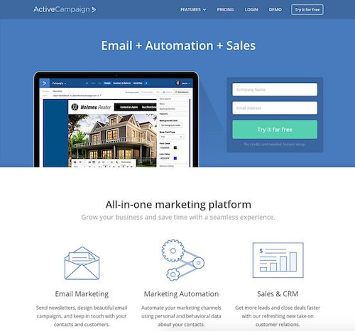
The key to the headline AB test is to change nothing but the headline. For example, you can see how ActiveCampaign changed from a simple headline about their features…
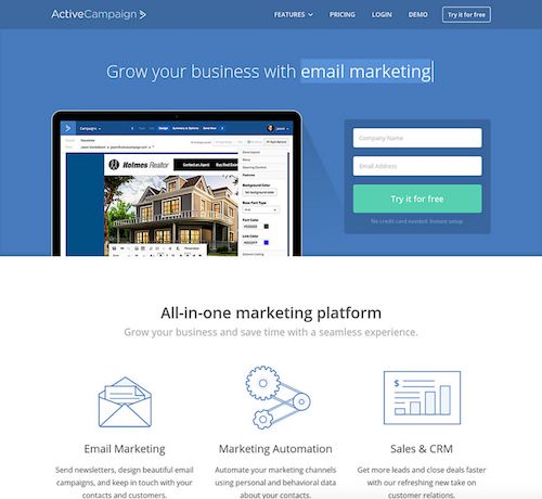
…to a better headline about the benefits their customers can expect when using their service.
This change proved to be a winner, as they have kept it since 2015 with a constantly changing message about their benefits. Therefore. test your headline.
3. Landing Page Split Test Idea: Vary Featured Homepage Products
In most cases, your homepage will be the most popular landing page on your website. Hence, it will be a page where you should do extensive AB testing.
One test you can do to see if you can increase conversions is simply changing your featured product.
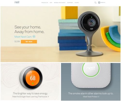
Nest does this by swapping out its popular monitoring camera (formerly Dropcam)…
…with its popular thermostat controller.
This test is currently running (as noted by the ?alt=1 at the end of their homepage URL), so we’ll have to see which one wins in the end.
In some cases, you may want to change your featured product based on the one that is currently getting featured coverage in the media. Or whether that coverage is positive or negative.
4. Creative Landing Page AB Testing Idea: Explore Different Stories
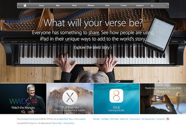
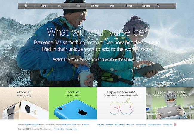
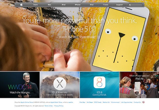
Do stories resonate with your customers and if so, which stories translate into the most sales? Find out through AB testing. Apple did this in this past by running multiple campaigns on their website, social media, and television ads featuring stories about musicians…
…explorers…
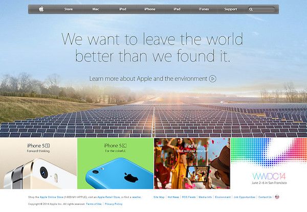
…environmentalists…
…parents…
…and many other page visitors. The goal was to show how their products could help tell everybody’s story. No matter what they did or how much of an impact they made in the world.
Apple ultimately went back to a homepage focused on its latest products, but without AB testing, Apple couldn’t just assume that approach would convert the highest.
5. AB Testing your Landing Page: Shift the Focus to One Product at a Time
Landing pages have better conversion rates when there is one, clear call-to-action; sometimes that CTA is buying a product. But when your top landing page is your homepage, you can’t focus on just one product, right?
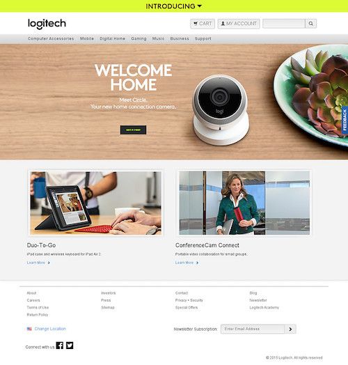
Maybe you can. In the past, Logitech had a pretty standard homepage that offered up all of its products all at once to homepage visitors.
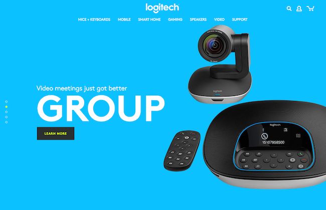
But now, Logitech gives visitors a tour through their top products, one at a time.
In a few moments, you are completely immersed in a particular product and its main benefit, thanks to this new landing page. It’s definitely a way of landing page AB testing you will want to try if you have a few products you can highlight in this fashion.
6. Transform Your Hero Image to Video
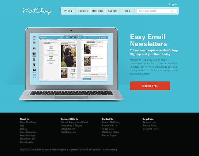
You know that great image of your product that you use to compel people to sign up or buy? Why not convert it into a video that dives even deeper into exactly what happens with that feature of your product. MailChimp made that change with their landing page, going from a screenshot of their newsletter designer…
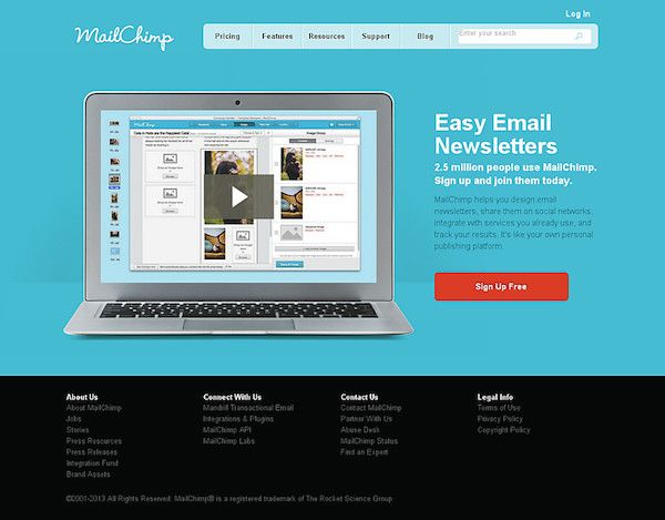
…to a video of how their newsletter designer worked.
Instead of hoping that an image would convince visitors that their newsletter designer was easy to use, as the landing page claimed, the video was right there to prove it.
While their current landing page features a different, shorter animation, it still features one that demonstrates the ease of use of their newsletter designer. Thus proving that since 2012, video and animation on the landing page beats a screenshot for conversions.
7. Try a Change of Scenery: AB Testing Landing Page Copy vs Image
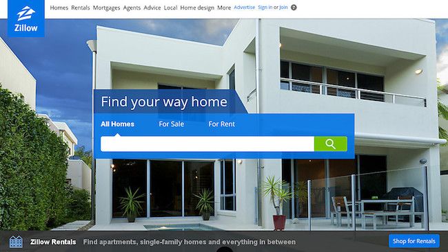
Sometimes it’s not text or functionality that will make your site convert better, it’s simply imagery that matches the story of your value proposition. Zillow experimented with this idea by changing the background of its search.
One variation was a neighborhood overview with home sale prices, which actually contradicts the line below the image about looking for rentals.

Zillow’s background showing homes with their prices isn’t relevant to people looking for rental property. Especially with a message at the bottom of the page specifically written for renters.
Another variation used an image of a specific home, which could appeal to both for sale and for rent searchers.
It seems that they have stuck with the individual home view as it works with what most searchers are looking for.
8. Landing Page A B Testing Basics: Rearrange the Elements
It may not be your product, your service, your copy, your CTA button, your colors, or other elements on your page that are lowering your conversions. It may simply be the order in which they are presented.
Just like when you rearrange all the furniture in your house because it just doesn’t quite feel right, you might want to do the same with your landing page.
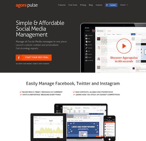
Take AgoraPulse, for example. They went from this…
…to this.
It’s easy to see why the latter layout works. It flows right into starting your free trial after a simple and convincing headline and subhead. And for visitors still not convinced they should convert, there’s simple video and bullet points to convince them to click that call to action button.
9. Copy Your Competitors
The most creative AB tests might be ones you don’t run on your own website. In addition to AB testing tools, there are tools that will alert you to when your competitors make changes to their websites. Potentially based off of their own AB Testing landing page experiments.
Rival IQ monitors your competitor’s website to see if changes have been made to it recently. The entry level plan allows you to track up to 15 companies. You’re able to track each company’s website design history along with their social media accounts, organic search rankings, and paid search traffic.
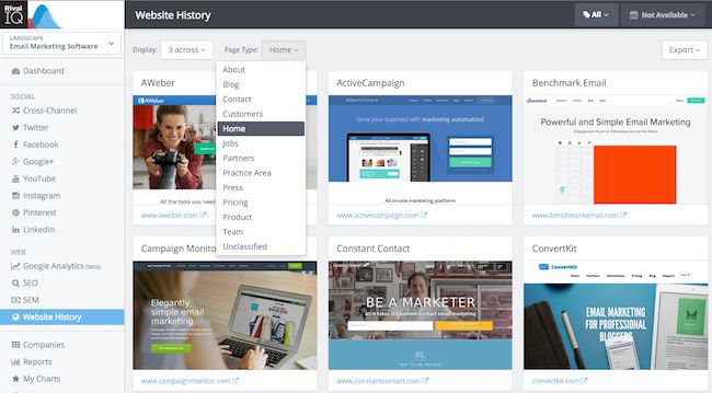
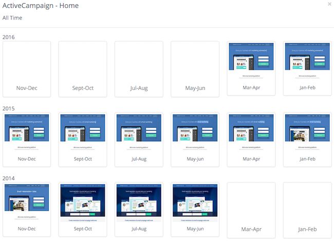
In the website history dashboard, you can view a variety of web pages from your competitor’s websites.
Depending on how long the company has been in Rival IQ’s database, you can get a couple of year’s worth of design history from each company.
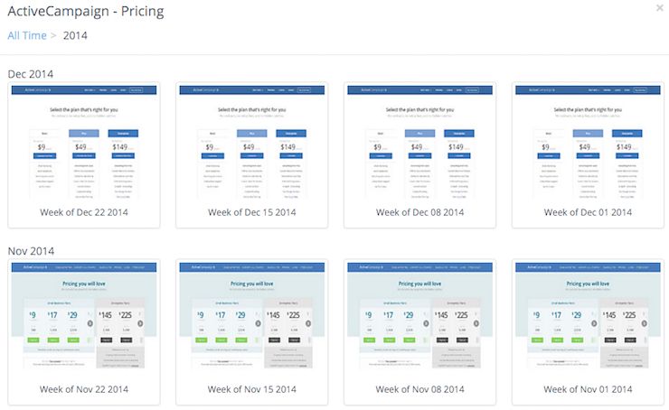
When you click on a particular month, you see the breakdown of when particular changes occurred. As well as the ability to click upon a particular design to see the full landing page.
This will give you an idea of what AB tests a competitor has run in the past. Based on the length of time a competitor has stuck with a particular design, you will know which test was the presumed winner. That is, it was statistically significant in terms of increasing their conversions. Be it for their homepage, pricing page, features page, or other significant landing pages.
In addition, you can sign up for email alerts when your competitors make major changes to their website. This will let you know when your competitors have run new tests on their website and made changes based on their results. Or you may even see the tests themselves in action as the pages change from their original to alternative versions.
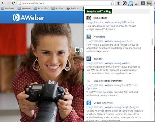
If you have a lot of competitors, and you’re not sure which to monitor, use the BuiltWith Google Chrome extension. It will help you find out if a particular competitor’s website is using AB testing software. Chances are, the ones that are will be the ones that will be making frequent changes.
What are your unique approaches to Start A B testing your landing page?
If you’ve already done the standard AB tests on your landing pages, then we hope that these additional split test ideas will further help you increase website conversions. Just like it has for the brands and online businesses mentioned here.
Have you been running or reading about some interesting AB tests? We’d love to hear about them in the comments.
The fight for online leads and sales has traditionally been fought at the search engine. That is changing.
Web analytics, bid management, competitive intelligence, ad testing and ad management tools are all common staples of any serious paid search effort. Return on ad spend (ROAS) is being tracked all the way through the sign up or purchase process and ad strategies are being adjusted accordingly.
Quietly, the battle for online leads is moving to a new front. This new front is measured by revenue per visit, and it’s kissing cousin, conversion rate. Like the tide that floats all boats, website optimization is being seen as the way to reduce all marketing costs by dropping the acquisition cost of new prospects and customers.
Why do we say this is happening quietly? That is the conclusion we came to when examining an unusual data set from SpyFu.com. We were able to determine which businesses had conversion optimization tools installed on their website. This, we reasoned, gave us a pretty good idea of which businesses would dominate in the world of online marketing — assuming they were actually using the tools.
In this month’s podcast, based on the Marketing Land column Data Exposes Scandalously Low Adoption Of Conversion Optimization Tools, Brian the Conversion Scientist explores the usage of conversion optimization tools for two industry segments: Higher Education and B2B Software.In one report, 73% of businesses are spending between $500 and $5000 per month on paid search ads. Almost a quarter are spending between $5000 and $50,000 per month. Yet, only 14% of businesses have at least one website optimization tool installed.
Who are going to be the winners in this new front? Where does your business fit in this statistic?
You’ve read the blog posts and you’ve heard from the vendors. A/B testing is a lot more difficult than you can imagine, and you can unintentionally wreak havoc on your online business if you aren’t careful.
Fortunately, you can learn how to avoid these awful A/B testing mistakes from 10 CRO experts. Here’s a quick look at some of their greatest pitfalls:
Joel Harvey, Conversion Sciences Worst A/B Testing Mistake
“Because of a QA breakdown we didn’t notice that the last 4-digits of one of the variation phone numbers displayed to visitors was 3576 when it should have been 3567. In the short time that the offending variation was live, we lost at least 100 phone calls.”
Peep Laja, ConversionXL Worst A/B Testing Mistake
“Ending tests too early is the #1 mistake I see. You can’t “spot a trend”, that’s total bullshit.”
Craig Sullivan, Optimise or Die Worst A/B Testing Mistake
“When it comes to split testing, the most dangerous mistakes are the ones you don’t realise you’re making.”
Alhan Keser, Widerfunnel.com Worst A/B Testing Mistakes
“I had been allocated a designer and developer to get the job done, with the expectation of delivering at least a 20% increase in leads. Alas, the test went terribly and I was left with few insights.”
Andre Morys, WebArts.de Worst A/B Testing Mistake
“I recommend everybody to do a cohort analysis after you test things in ecommerce with high contrast – there could be some differences…”
Ton Wesseling, Online Dialogue Worst A/B Testing Mistake
“People tend to say: I’ve tested that idea – and it had no effect. YOU CAN NOT SAY THAT! You can only say – we were not able to tell if the variation was better. BUT in reality it can still be better!”
John Ekman, Conversionista Worst A/B Testing Mistake
“AB-testing is not a game for nervous business people, (maybe that’s why so few people do it?!). You will come up with bad hypotheses that reduce conversions!! And you will mess up the testing software and tracking.”
Paul Rouke, PRWD Worst A/B Testing Mistake
“One of the biggest lessons I have learnt is making sure we fully engage, and build relationships with the people responsible for the technical delivery of a website, right from the start of any project.”
Matt Gershoff, Conductrics Worst A/B Testing Mistake
“One of the traps of testing is that if you aren’t careful, you can get hung up on just seeing what you DID in the past, but not finding out anything useful about what you can DO in the future.”
Michael Aagaard, ContentVerve.com Worst A/B Testing Mistakes
“After years of trial and error, it finally dawned on me that that the most successful tests were the ones based on data, insight and solid hypotheses – not impulse, personal preference or pure guesswork.”
Don’t start your next search marketing campaign without the guidance of our free report. Click here to download How 20 Search Experts Beat Rising Costs.
My partner Joel Harvey is fond of saying, “My favorite part of a design is the money.” He’s been part of many a web design project. His perspective comes in response to the number of times he’s heard things like:
“I want the design to pop!”
“I want my site’s design to be groundbreaking like nothing else out there!”
“Let’s turn it up a notch on the design.”
“I want the site’s design to reflect the high value of our product.”
In and of themselves, none of the above statements are unworthy pursuits. But if your goal is to increase online sales conversion and fill your coffers to the brim, you will fall woefully short if you believe that web design alone can do the heavy lifting of convincing your visitors to take action. If increasing sales is your goal, the most important person on your split testing team is the accountant.
Designers Don’t Design for the Accountant
A while back, a client sent us a couple of different mocks of some new designs they were entertaining. They ask which one I liked. The first thing I said is I like the one that makes you the most money. Up until that time their team was arguing over color palettes, white space,and rounded edges.
When I reminded them about the bigger goal, their conversation evolved. In a clock tick, we were all discussing the quality of content on the pages rather than the design elements. When their offer and call to action were right, everyone seemed to forget about the trivia of the actual design.
Designing For Your Ego
Another client brought to us a new landing page campaign they had just launched and were baffled and disappointed by the early results. They went on to explain that they thought this was the best designed landing page they had ever done. They had just hired a new graphic designer that ‘got it’, and even the CEO was impressed with his work. One problem, their paying customers didn’t seem to agree. No doubt, the design was gorgeous. Rich colors, curvy rectangles, sexy images, even the header and body fonts were crisp and clean.
So why wasn’t this campaign working? We had them show us their most recent successful campaign. The design was a tad dated, and compared to the new landing page it looked like a high school hobbyist in the company basement eating Cheetos and suckling energy drinks.
Still, by comparing we immediately saw the problem with the new landing page. The copy on the old page was much better. The headers screamed the product’s value proposition and benefits. The body copy answered relevant questions, and helped the reader imagine themselves buying the product. The call to action button was big, bold, and in your face. The new page looked stunningly attractive but said very little.
To add insult, the hot shot designer was a minimalist and had an aversion to big gawky buttons, so his primary call to action was tiny button that blended in with the hero image, and , by design, was easy to ignore. We instructed them to use the old page copy on the new design (they had to make a few adjustments to make it all fit), and we asked the designer to create a bigger and bolder call to action button. They obliged us and that new design finally beat the old landing page.
How Much Time Are You Spending With Your Designer vs. Your Banker?
So my lesson is this. Beautiful, eye-popping design and effective, profitable web design are two different things. And it always seems easier to mistake those eye-popping designs for profitable ones. Split testing will always lead you in the right direction.
Some companies spend more on design than they do on organic SEO, and almost all companies spend more on design than on Conversion Rate Optimization. Search engine spiders don’t evaluate site design, only content and links. And I have yet to see a company design their way into a better conversion rate and better RO.
Some companies spend way more time going back and forth about a design element than they do actually testing it. Makes you wonder how far ahead of your competitors you could get if you spent more time and resources on conversion optimization and testing.
So when considering a redesign of your entire site, of a successful landing page, or even a banner ad, do the following:
- List the things about the page experience (not just he design) work. Keep those in the new design.
- What about the experience doesn’t work?
- Why do we want to change this (especially if it is working)?
- Before you launch a radically new design, test what you believe is NOT working about the current design.
Above all, use web designers that deeply understand the web and principles of conversion. Otherwise they are just an artist, and the value of an artists works usually increases only after their demise. Can you wait that long?
How helpful would it be to know what prices and features your competition was thinking about using?
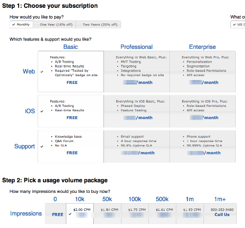
One of my readers just sent me a very revealing screenshot. It is one of the pricing pages that Optimizely is testing. It was found by “spying” on their test data.
We are able to see this because of an “exploit” that allows anyone to see what a site is testing if they are using the Optimizely testing software. Oh, the irony.
Venture Beat recently “
Try dragging the following link to your browser bookmark bar.
Optimizely Spy
Now visit Optimizely and click on the bookmark to see what they are testing.
How is this possible?
Whenever we run a split test with Optimizely, the software uploads scripts and data into all of our visitors’ browsers to change the experience and track the results. Along with this is included not just the test our visitor is being entered into, but all of our tests for that account.
So it’s relatively easy to decipher this information and see what we’re testing.
Note that the snooper can’t see any actual results, just what kinds of things you’re testing.
We like this approach because it speeds up the delivery of tests. When we use one file with everything, it changes less frequently, and the file it can be cached on a content delivery network (CDN) specifically designed to deliver files faster.
Faster tests mean more reliable tests.
Convert.com also uses this technique, though they take steps to obsure the test information.
Why Aren’t We More Concerned?
In a worst case scenario, a competitor can see what hypotheses you are testing. They can then test those same ideas and perhaps win more customers.
However, only a small percentage of sites are even testing, let alone stealing your tests. I did a quick survey of sites selling plastic surgery and cosmetic surgery who are spending at least $500 per month on search advertising.
Of 2,958 domains, only 33 had some form of split testing software installed, such as Optimizely. That’s just 1.1% of these domains. Furthermore, we know that some portion of these testing are not actually using the software they have installed.
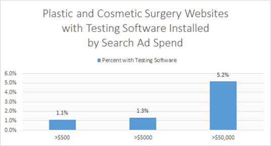
Plastic and Cosmetic Surgery websites are missing a significant opportunity to get more patients. Source: SpyFu.com
Here’s another surprise. There are ninety-seven (97) domains in this space spending over $50,000 per month on search ads. Only five of them have A/B Testing software installed, only 5%.
If you’re in the plastic surgery space and are testing, you have a major advantage over your competitors. So, the odds of someone stealing your ideas are far outweighed by the gains you will see from testing.
Our Recommendation
We recommend that you continue to test using Optimizely unless your page contains sensitive information, such as price.
If you feel uncomfortable with your test information being publicly available, move to Convert Experiments for some protection. Another popular tool, Visual Website Optimizer, does not use this technique meaning past and future tests are safe from prying eyes. There are also a variety of other highly recommended AB testing tools available.
Whatever you do, don’t let this issue take the steam out of your testing program. As you can see, testers have a significant advantage, snoopers or not.
PS: If you are in the plastic and cosmetic surgery industry, you should contact us.
We find out which half will work.
How can it be that a team with our experience, intelligence and good looks could be wrong so often? It’s a mystery to us.
The truth is, that the audience for any website is unique. Given two sites selling the exact same product, you cannot assume that what works on one will work on the other.
People are complex. Groups of people are only slightly less complex.
This is why our optimization process is so powerful. We let your visitors decide what works best, and they vote with their money or their contact information.
We call it the Conversion Catalyst.
Why We Win
We live by a few mantras at Conversion Sciences to guide our decisions.
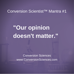
No matter how smart we think we are, the only thing that matters is what gives your visitors a better experience on your site. Don’t get caught up in the words “better experience.”
Visitors vote with their dollars. A good experience is one in which more visitors find what they need, want, or think they want. The person we are trying to impress really is the person that counts the income.
It’s not that we’re humble, but testing has a way of humbling you.
We’d like to humbly offer to optimize your website.
Let us make your accountant smile.
You can get a free strategy session with a Conversion Scientist. We’ll help you see the possibilities for your visitors.
Dennis van der Heijden is in an enviable position. He is able to see the results of hundreds of split tests through his awesome split testing service, Convert Insights at Convert.com.
He’s noticed a few things about how successful businesses are at finding winning tests.
These numbers plus his ideas on why some have tests that frequently yield conversion rate lifts while others don’t is the subject of my Instagraph. This was recorded live at Conversion Conference East 2012 in Ft. Lauderdale, Florida on October 10.
Here is a time-lapse video of the creation of the Instagraph.
Here is the final result.
[bookpromo]

