visual marketing

Oli Gardner will make you blush when he rips your landing page copy from its safe HTML home and shows you what it says as a plain text file.
I got to thinking, what if we just pulled the images from your website? Would they be able to tell the story of your value proposition?

The Role of Images on a Web Page

Too many designers see images as a way to break up the copy on a web page. They use filler images, stock photos and silly graphs that have no meaning.
Images are a powerful way to convey your value proposition – the reason that a visitor should consider your offer. This is true for landing pages as well as your home page.
The impact on a landing page can be extreme.
Images draw the eye. When your visitors first arrive, these are the elements that get seen first as they scan the page. Images can immediately ask the first question your prospects have, “Am I in the right place to get what I’m looking for?”
Images should compliment, support and enhance the copy on the page. Any image that doesn’t move the value prop forward is hindering it.
Pull the images from your page and take a look.

The Image-only Version of Your Landing Page

If you were to pull just the images from your site, would they tell your story? Here are the images from a site offering information on annuities.

What does your landing page say in pictures?

What does your landing page say in pictures?


It starts off great. The main image has a stock model representing the target audience.
Adding text to an image makes it relevant to your message.

Adding text to an image makes it relevant to your message.


Adding text to an image is a simple way to give it power.
Adding text to an image is a simple way to give it power. Furthermore, the model is looking at the information you want them to read. If a model is staring at the visitor, the visitor tends to focus more on the face, and less on the messages on the page.
This is essentially an in-image caption.

Captions Get Read

One of the most read portions of your landing pages is the caption. Unfortunately, most pages don’t use captions. Captions explain the image in more detail, moving the value proposition forward for the reader.

Captions are a great place to repeat the offer on the page.

The Caption Test

The best way to test to see if your captions are helpful is to ask a stranger to write a caption for it. How would our annuity page fare?
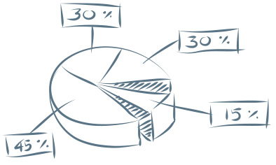
Graphics without meaningful information don't move your value proposition forward for the reader.

Graphics without meaningful information don’t move your value proposition forward for the reader.


Caption Test: “Get complex information about something.”
The heading for the copy next to this is, “What are the fees associated with an annuity?” This should be repeated as the caption.
The remaining images don’t do so well.
Is this a happy customer? An employee? We can tell the difference between a model and a real person.

Is this a happy customer? An employee? We can tell the difference between a model and a real person.


Caption Test: “I will meet attractive older men. Sooo handsome.”
The copy headline next to this image reads, “What if I need access to the principal in my annuity?” The answer may have made this handsome man smile, but the image really doesn’t support the point. This would not work as a caption.
Another lost opportunity to communicate something valuable.

Another lost opportunity to communicate something valuable.


Caption Test: “Time is running out for you and your little dog too!”
What are your images bringing to mind in your reader's mind?

What are your images bringing to mind in your reader’s mind?


The copy next to this image reads, “How long will I be able to receive income from my annuity?” This would work as a caption. But with the power that an image has for conveying a message, I think this page could do much better.

Images that Work

In general, your images should strive for the following characteristics.

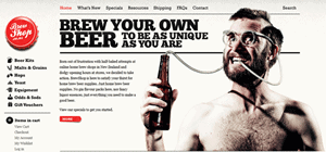
Use real people when possible: employees, clients and spokespeople are great choices.
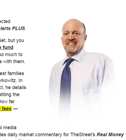
Use real employees, customers or spokespeople in your images.

Use real employees, customers or spokespeople in your images. This one needs a caption.

Use text on the image and as a caption to advance your value proposition.

Don’t be afraid to repeat offers in captions and on-image text.

This image makes great use of in-image text and an offer in the caption.

This image makes great use of in-image text and an offer in the caption.

Design images that support the copy on the page.

This image uses in-image messaging that supports the copy on the page.

This image uses in-image messaging that supports the copy on the page.

Direct the gaze of people in images to offers, forms or other important parts of the page.

This model is looking at the form, the most important part of this landing page.

This model is looking at the form, the most important part of this landing page.

For software products, choose screen shots that don’t make your product look intimidating.
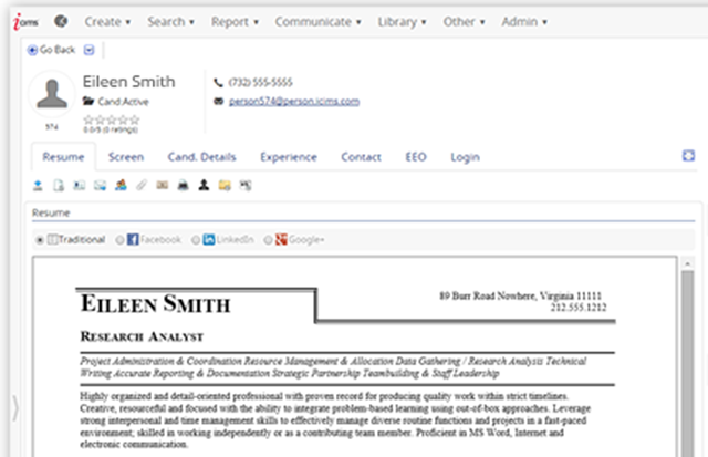
Screen shots should focus on key features of your software offering.

Screen shots should focus on key features of your software offering.

Spend as Much Time on Your Images as Your Copy

Utlimately, if you spend as much time on your images as you do your copy, you will find creative ways to power conversions on your landing pages, home pages… all pages.

Images courtesy ICIMS, Expert Market and TheStreet.com.

We’ve all seen the numbers. Visual content outperforms text-only content by a landslide.
Need a refresher?

  • Content generates up to 94% more views if combined with compelling visual elements and graphics. (MDG Advertising)
  • 40% of people will respond better to visual information than to plain text. (Zabisco)
  • High quality infographics are 30 times more likely to be read than text articles. (Ansonalex)

While I’ve known these stats for some time, I didn’t feel like there was much I could do about it until recently. I would make sure to break my articles up with nice subheadings and insert quality stock photos or original photography when I had it, but that was about as visual as I got. “After all,” I thought, “I’m a writer—not a designer.”

How I Became More Visual

Things changed when I started writing a weekly column for a client whose company designs and builds custom homes. The column was to appear as sponsored content on a well-known luxury living blog. My goal was to conduct interviews and research on the latest trends in home design and present my findings in 500+ word articles along with some beautiful photography of the client’s work.
My logic was simple: The photography was already performing extremely well on social media. The pictures would be the hook, and people would stay for the insightful article.

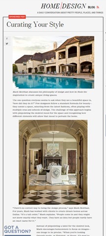
The first article of the campaign. It goes on for over 600 words.

The first article of the campaign. It goes on for over 600 words.

While this approach already seemed to be working on the client’s on-site blog, it didn’t have the effect I wanted it to on the sponsored column.
In fact, my first article performed pretty badly, despite all the effort I had put into conducting interviews, despite the great quotes and useful information I used—even despite the photos that had been shared thousands of times on social media. The first article—a piece that used anecdotes and advice from the client about finding inspiration for your home—received 84 views upon publication and continues to be one of the lowest performing posts of the campaign, with a total of 220 views.

The tiny blip made by my first article. We used tracking pixels to watch traffic on Google analytics. As you can see, traffic did not pick up after posting.

The tiny blip made by my first article. We used tracking pixels to watch traffic on Google analytics. As you can see, traffic did not pick up after posting.

Then I started using Illustrator

I had been fumbling around with the program for several months, but never felt like I had time to use it properly. My approach had always been to write the best copy I could and to let a designer help out if they had time. But this time I was determined to do something—anything—different so that the column would prove worthwhile.
So I went ahead and designed some images for my next two posts—just some simple, vector-based elements to use as featured images and between subheadings. They weren’t great, but they were presentable, and the articles performed slightly better than the last.
I wasn’t sure if the slight increase in views warranted the extra time it took to create new visuals, but I decided to give it one more shot.
I’m glad I did.
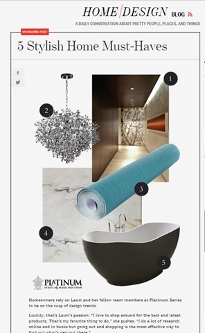
Taking a cue from fashion magazine style collages, I cobbled together a collage using pieces of our original photography and used it as the central element of the next post. The post received 524 views on the first day of publication—over six times more views than my initial post. Even better, the post continues to rack up views, with 1,626 views to date.

My first post on the site to be primarily visual.

My first post on the site to be primarily visual.

Since posting that article, I have continued to create similar content for this campaign (and others) that have performed just as well.
My next post also used a collage. It received 504 views on the first day of publication. Interestingly enough, this article was on the same topic as my initial failed article—how to find home design inspiration. The difference was all in how the information was presented.

Spikes in traffic from my first two collage posts done in Illustrator.

Spikes in traffic from my first two collage posts done in Illustrator.

A few months later, new posts continue to create spikes in traffic, and we begin to gain a consistent viewership between postings.

A few months later, new posts continue to create spikes in traffic, and we begin to gain a consistent viewership between postings.

While I don’t have all the answers to this change in performance, I attribute the success of the collage articles to two things: 1. their overall presentation, and 2. their particular appeal to my audience.

Overall Presentation

  • They stand out from surrounding posts in the blog roll.
  • In a sea of photographs, a small piece of graphic design can really stand out.
  • They look original.
  • Readers who are already engaged with the client’s brand may have already seen our best photography. These images made them brand new.
  • They look useful and cohesive.
  • A simple collage with numbered items promises practical, bite-sized content. Plus, people want to be shown how information relates. Sometimes, placing a great photo next to text isn’t enough.

Appeal to the Audience

  • They mimic the look of luxury magazine and blog articles.
  • In researching our audience, I checked out several sites that our demographic enjoys. (Facebook’s recent expansion of its search function is great for this task.) They gave me examples of the kind of short-form blog posts that our target audience typically reads.
  • They account for the audience’s browsing behavior.
  • If your prospective customers are visually inclined, too much text is a nuisance. By creating visual content, I was able to provide the kind of bite-sized articles that that my audience expected in that context.

Growing your capabilities will make you more perceptive.

There are probably several lessons to be learned from this incident, including one about knowing your audience. But the one I want to stress is this: learning how to design will make you a better writer.
How do I know? I’m not just basing this claim on the spike in traffic that came after I started creating visuals. I’m also basing it on the fact that now, when I set out to create content, I don’t ask myself, “How can I best express this idea through copy?” I ask, “What is the best way to express this idea? Period.”
I am also better able to take into account the browsing behavior of my audience. I wouldn’t be writing this out as a 1,000+ word article if I didn’t think that the audience of The Conversion Scientist was willing to read longer articles. Similarly, the content you create should cohere with the browsing behavior of the people you want to reach. No matter how great your writing is, you will never convince a non-reader to read—at least, not through a piece of content marketing.
Because I can now create a broader variety of content I also think much more about the behavior of my audience. That’s why learning Illustrator has not only made me more versatile—it has also made me more perceptive. If copy is only a small part of the equation, I can combine my strengths as a writer with my (developing) ability to design to create content that is cohesive, concise, and valuable.
Colleen Ahern, The Conversion ScientistColleen Ahern is a copywriter and content marketing strategist at Page Agency. She created the Page Agency Blog, where she writes about the rapidly evolving world of content marketing and social media. Follow her on Twitter @ColleenAhern.
Tim Ash coined the term “Big fat bouncers in your brain” during an interview on his Landing Page Optimization podcast that he and I were on.
I love the image that phrase draws to mind, because it’s true.
The bottom line is this: If you want your message to affect and influence your readers and listeners, you must get past the big fat bouncers in their brains.
[cs-tan-box]

Writing Killer Copy: Getting Past the Bouncers in Your Brian

Watch the Replay

[/cs-tan-box]
I’ve introduced you to these two bouncers and telling you how to write copy that gets past them.
Why register now?
Find out how Betabrand achieved 432% growth for products nobody was looking for.
Get my real definition of “copy”.
See revealing brain scans. We all love brain scans.
Discover my fool-proof method for great copy.
Find out what business porn is and how to create compelling images.
As always, we have FUN doing these.
[cs-tan-box]

Writing Killer Copy: Getting Past the Bouncers in Your Brian

Watch the Replay

[/cs-tan-box]

The most important part of your website is your value proposition. Find out how to communicate it in words and images.

Too often, we confuse our tag line with our value proposition.

For a website, the value proposition is the critical message that asks a visitor to explore further and to purchase.

Famous value propositions include Zappos’ “365 day return policy and we pay shipping both ways.” Warby Parker offers “Order up to 5 of our vintage-style sunglasses. Keep the ones you like and send the others back at our expense.” These sound like expensive value propositions.

Yours doesn’t have to be.

No matter how simple or complex, your value proposition should be communicated clearly in the words and images on your website. Most value propositions can’t be communicated in a sentence or two.

Let’s see how one company communicates its value proposition in words and images.

iMagnetMount Value Proposition

I’m not going to tell you what iMagnetMount does. Let’s discover it from their home page, which acts as a landing page.

The value proposition for iMagnetMount is simple:

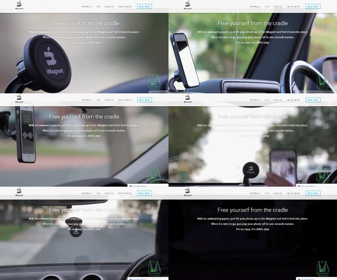
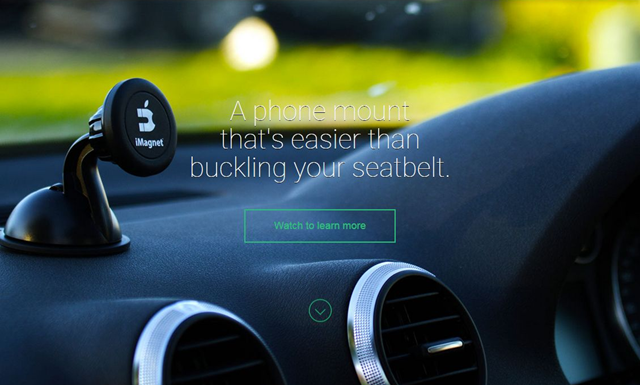
The “Hero Shot” should tell visitors that they are in the right place.

The “Hero Shot” should tell visitors that they are in the right place.

“We make a phone mount for your car.”
If I didn’t read the text, I wouldn’t really know what this is. The headline tries to be cute, but has the magic words, “Phone Mount.”
If we scroll we get the next part of the value prop pretty easily from an auto-play hero video.

If your product is easily demonstrated, consider using video.

If your product is easily demonstrated, consider using video.

BAM! I get it. Viscerally. Nothing fancy. No catchy music. I don’t even have to read the text.

It’s solid. It’s easy. It works on the dash or on the windshield.

This is the value of having a demonstrable product. If you have a demonstrable product, use video. To demonstrate.

If anything, I would have put this at the top of the page.

Objections: What’s missing from your Value Proposition

As potential customers, what we haven’t been told will quickly gel into objections. Objection questions begin with “What if I…?” and “Will it…?” and “How can it…?”
However, these questions aren’t asked on a web page. They must be anticipated.

It’s apparent that iMagnetMount believes to be the first objection to be, “Can I trust you?” Trust symbols are seen in two places on the page.

Logos can increase "borrow" trust from better-known brands.

Logos can increase “borrow” trust from better-known brands.


Be careful introducing objections with little proof to overcome them.

Be careful introducing objections with little proof to overcome them.

Objections are funny things, though. If you address the right  concern, you move the prospect closer to buying. If you raise the wrong one, you create a new objection.

Here, iMagnetMount introduces an objection, “Magnets might hurt my phone” by stating that there is “No Magnetic Disruption To Their Phone.” The objection is addressed with some social proof, so the objection is raised and addressed.

If you raise an objection, handle it quickly.

What is the next thing we should learn about this “phone-destroying” product?

More Demonstration

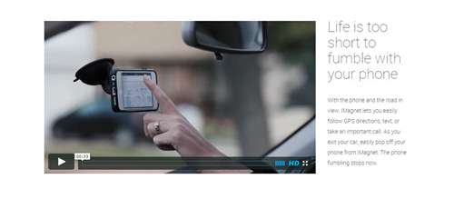
Next is a video with a marquee frame showing the phone turned horizontally, like a GPS. Awesome!
The copy next to it says, “Life is too short to fumble with your phone.” iMagnetMount’s copywriter thought cute was the way to go.

The goal of this particular headline is to get the visitor to play the video. Instead, they introduce a new objection: “Will I fumble the phone? Will it fall off?”

Headlines should tell the visitor what to focus on.

Headlines should tell the visitor what to focus on.

In your copy, avoid cliché phrases like “Life is too short”. Instead, be more direct.

Watch this short video to see how flexible this magnetic mount is.

Managing the Big Objections

When speaking with iMagnetMount, they confirmed that a big objection is that the magnetic mount would damage or interfere with the phone.

Will it hurt my battery?

Will it fry my electronics?

Will it burn my screen?

Will it affect reception?

iMagnetMount addresses the issue in small text under an unrelated headline.

The answer to the big objection is buried in hard-to-read copy under a cutesy headline.

The answer to the big objection is buried in hard-to-read copy under a cutesy headline.

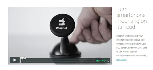
Here, the copy asks the visitor to “Turn smartphone mounting on its head.” Another throw-away headline. As above, tell them to watch the video and see the advantage.

The video demonstrates the strong suction as well as the grip of the magnet on the phone. Demonstration rocks value propositions.

These two messages – that the magnet is safe and that the suction is awesome – address two of the biggest parts of the value proposition. They should be separated and proven.

Marry Messages and Copy

Your headlines should support the image.

Your headlines should support the image.

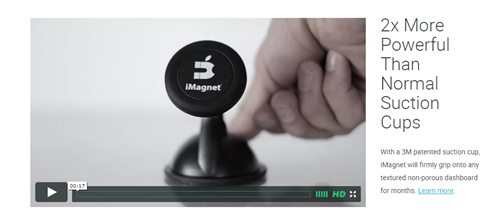
In this part of the page, I felt that the background image used was pretty effective for making a statement about suction. It shows a suction cup sticking to a rough dashboard surface. In this case, the overlaid text supports the message of the image. Words like, “Finally” and “hassle-free” are not as powerful. Chuck these words to advance the value proposition.

Phrases like “patented” and “secure for months” are going to be more successful.

Managing Risk

Buying anything is perceived as risky, especially online. Managing the risk is a key part of the value proposition.

Risk management is a key part of your value proposition.

Risk management is a key part of your value proposition.

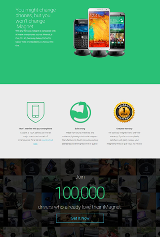
There are several messages at the bottom of the page that address risk.

  • You won’t have to buy a new mount if you think you’ll change phones.
  • Our mount is safe for your phone (with a link to a FAQ page)
  • Our product is built from strong stuff (in South Korea)
  • We offer a one-year warranty.
  • Over 100,000 drivers have bought your product.

The cornerstone of risk management is risk reversal. The use of a familiar gold seal tests well in many industries. The use of plain-English text describing the warranty and return is done well here.

A link to a FAQ page offers up many more objections, but also handles them well. Methodical buyers will appreciate the detail on this page.

Repeat the Offer at the Bottom

Anyone who has read through your page to the end is probably pretty interested. Always repeat the call to action at the bottom, as iMagnetMount does here.

Bringing it Home

Copy is more than words. Copy is words and the images that support them.

If there is one issue with the copy on this page, it is that copy is trying to be cute and isn’t supporting the very strong images and video on the page.

After our conversation, iMagnetMount modified the page to address some of these issues.

Proof is important when handling value objections.

Proof is important when handling value objections.

Here they’ve added copy to handle the objection, “Will the magnets hurt my phone?” Unfortunately, the image and copy no longer collaborate.

I don’t think they expend enough effort in managing this objection. Proof is key, and they have it. However it is buried, even in this treatment. They should state that it’s SAFE.

Safe for your phone. Safe for your battery. Safe for your screen. Proven with over 10,000 hours of road testing over 2 years.

Are we introducing some objections here? Yes, but if the proof is there, we can consider it handled.

With one change, iMagnetMount significantly improved the image-headline relationship in another part of the page.

When text and image work together, value propositions get wings.

When text and image work together, value propositions get wings.

What a powerful headline that begs me to watch the video to see the proof.

The Complete Value Proposition

The keys to a communicating a strong value proposition are:

  • Demonstrate your value with images and video.
  • Support your images with headlines.
  • Provide proof whenever possible.
  • Manage risk with proof and a straight-forward return policy.
  • Repeat the offer at the bottom of the page.

There are other aspects of this page that may be hindering conversion rates, and those are discussions for another day.

However, with a well-crafted value proposition, buyers will find their way through many obstacles on their way to purchase.

How important are images to your landing page? The formula we use in our Chemistry of a Successful Landing Page includes the element “Image” as a necessary component. At the heart of this is the need for the visitor to imagine owning the product or service. That’s right, even services.
For some, it’s difficult to “show the product.” If you’re offering an expensive software solution or consulting service, how do you communicate what it will be like to own that? Screen shots, flow charts and explainer videos are typical go-to solutions.
Lazy designers drop happy, smiling people on the page. Avoid this business porn.
At the other end of the spectrum is the visual product or service. Photographers, artists, decorators and designers have a portfolio of past work to help visitors imagine buying from them.
Vacation Beach Portraits is such a visual business, and they have some test results that offer some insights. I love it when small businesses take up testing.
Vacation Beach Portraits takes family portraits of tourists to the Orange Beach and Gulf Shores areas of Alabama. The beautiful white beaches and sunsets over the Gulf of Mexico offer an ideal setting.
The folks at Vacation Beach Portraits tried testing a landing page against their home page, a blog filled with samples of their work.

Vacation Beach Portraits HomePage-Selections

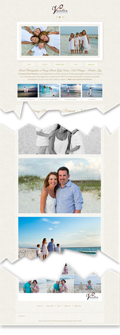
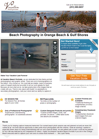
The Vacation Beach Portraits home page was full of delicious images showing off the work.


familyportraits_vacationbeachportraits_com

Then landing page features a prominent call to action and portfolio video.


Vacation Beach Portraits HomePage thumbThe home page was a long scrolling collection of pictures from recent shoots. Load time can significantly decrease conversion rate on pages like this. However, though lazy-loading of the images allowed me to start viewing images immediately.
The landing page, built using Unbounce, provided an explainer video with samples from their portfolio. It is shorter and features a bulleted list of benefits as part of the copy.

Serial Test

This local business will have few transactions each month. Therefore, Jason Odom of Vacation Beach Portraits did tests in series.
From May 1-15, he sent his search traffic to the landing page.
From May 16-31 he sent his search traffic to the home page.

image

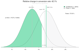
Comparison of visits to inquiries shows a 42.1% increase in conversion rate for the home page. However, this is not statistically valid. Source: ABTestGuide.com


Given the relatively low number of clicks and inquiries, the two pages converted at the same rate statistically. When testing low-traffic sites, we are looking for treatments that beat the control by large margins — 50% or 100%.
In this test, the home page generated 42% more inquiries and 105% more paying clients. Neither of these results was statistically significant, though. The sample sizes were just too low.

Why Didn’t the Landing Page Outperform the Home Page?

Anytime we hear that people are sending “store-bought” traffic to their home page, we roll our eyes. We are almost always able to improve conversions by sending visitors to a landing page.
In this case that didn’t happen. What’s the deal?
Two hypotheses emerged from this test.
1. The long page full of gorgeous pictures found on the home page is what visitors want.
2. The clear call to action found on the landing page kept it in the running.
For their next test, we recommended either adding a bunch of these big gorgeous pictures to the landing page, or adding a call to action button at intervals down the home page.
The quality of the images in the landing page video was lower than the full-width photos found on the home page.
When someone decides they want an amazing family photo like those shown, a button with “Schedule Your Photo Session” is exactly what they will be looking for.

Other Considerations

There were some additional hypotheses we felt would improve the performance of these pages.

This font is pretty, but very hard to read.


We felt that the script font used on the home page was hard to read, recommending a serif print font instead.

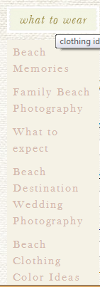
Beach Clothing Color Ideas is at the bottom.


The navigation on the site was not particularly logical. The very helpful navigation item “what to wear” seems to link to anything but topics on what to wear. Every link on a site should keep its promise.
Making the phone number more apparent my close the time it takes to book a client from the web or landing page. We find that adding the phone number to the headline (yes, the headline) will significantly increase calls without depressing form fills.

Advice for Businesses with Visual Offering

If you have a visual product, you should leverage this with high-quality, high-resolution web images. Don’t be afraid of long pages. Visual visitors know how to scroll and will appreciate the wealth of stimulation.
However, don’t forget the calls to action.
You never know when someone has seen enough to buy. Lace a buttons or links among your images. Keep in mind that the buttons or links are going to have to compete visually with the images, so make them pop.
The button or link will go to a more traditional landing page or product page that handles objections, allows selection of size, color or format, and asks them to buy.
In almost every case, use captions. These are the most read copy on most pages and are a great place to include a call to action. Tell them what they are looking at, even if it is obvious to you.

Results From the Follow-up Test

This is the busy season for Vacation Beach Rentals, and their landing pages are already converting very well for them. We won’t know the results another test for some time. Subscribe to the Conversion Scientist by email to find out the rest of this story.

For The Conversion Scientist, Visual Marketing is very simple: Create a hook and use it everywhere.

Speaking engagements, your website, your social media profiles, webinars, podcasts, the movies, grocery shopping.

Well, maybe not everywhere.
Speaking in lab coat

Brian Massey devised an inventive way to exaggerate the serious nature of his business without compromising its integrity. With science on the brain, naturally, he put on a lab coat. “Every headshot I have includes the guy coat,” says Brian.

“Every business needs a mental ‘hook’ that prospects can hang mental impressions on. I like to joke that my audiences will forget what I teach, but they never forget the lab coat.”

Brian Massey on the importance of Visual Marketing The Importance of Visual Marketing

Brian also likes to hand out lab coats to his customers, making them “Honorary Conversion Scientists”. This unique gift turns clients into walking billboards for Conversion Sciences.

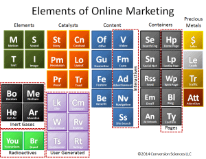
The Conversion Scientist doesn’t stop at just the lab coat. His website, blog site, office, and social media pages are adorned with a science related theme: beakers, Bunsen burners, and yes, a custom created Periodic Table of Elements for Online Marketing.

The periodic table of marketing elements.

The periodic table of marketing elements.

In fact, the inventive and humorous folks at Grasshopper penned an entire article on the importance and effectiveness of integrating humor into your marketing and branding strategies.

So, What is Visual Marketing?

Visual Marketing is the discipline of studying the relationship between an object, the context it is placed in, and its relevant image. A great brand is more than a tagline or a popping logo. It’s the purpose behind your business and how your potential clients perceive that purpose. It’s the story that makes you great. Hence the reason the lab coat works.

Lab coat + Conversion Science = The Conversion Scientist

Visual gimmick and imagery is an important part of the marketing world. Remember to throw this into your branding toolkit.

Brian Massey


21 Quick and Easy CRO Copywriting Hacks to Skyrocket Conversions

21 Quick and Easy CRO Copywriting Hacks

Keep these proven copywriting hacks in mind to make your copy convert.

  • 43 Pages with Examples
  • Assumptive Phrasing
  • "We" vs. "You"
  • Pattern Interrupts
  • The Power of Three

"*" indicates required fields

This field is for validation purposes and should be left unchanged.


I did a little experiment using images and copy in my Marketing Land column Take Control of Your Visitors’ Eyes. Instead of using my superior powers of page design to highlight an important piece of information, I used them to hide that information.

Conversion-Scientist-Podcast-Logo-1400x1400


Subscribe to Podcast


I purposefully did some things you may be doing accidentally, to the detriment of your site and your visitors.

When looking at web and landing page copy, I often find the important information buried, or designed in such a way as to look unimportant.

Value propositions, phone numbers, guarantees, and special offers are some of the things that are important to visitors, but don’t look important.

Images, captions and more

Read the column or listen to the podcast to find out how I obscured an important fact, and how I highlighted another, less relevant fact using:

  • Images
  • Captions
  • Copy
  • Headlines
  • Bulleted Lists
  • Links
  • Pull Quotes

It’s a show and tell column, .


21 Quick and Easy CRO Copywriting Hacks to Skyrocket Conversions

21 Quick and Easy CRO Copywriting Hacks

Keep these proven copywriting hacks in mind to make your copy convert.

  • 43 Pages with Examples
  • Assumptive Phrasing
  • "We" vs. "You"
  • Pattern Interrupts
  • The Power of Three

"*" indicates required fields

This field is for validation purposes and should be left unchanged.


Mar 21, 2013 09:38 am

Comments:

  •  @smexaminer While images are important for social media to help break through the noise, they are also very important on our landing pages, home pages and other web pages.
    Unfortunately, we often resort to what I call “business porn” in my book. Business porn includes stock photos of multi-racial smiling people, of graphs going up and to the right, and of cheerful women with headsets.
    So if you are struggling with what to use for visuals on your site or in your emails, here are 26 excellent ideas.  – Brian Massey

Tags: images, visuals, business porn

imageThese are the stories that caught my eye last week. If you are a curious marketer looking to learn more about conversion, please subscribe my weekly recommended reading list, For Further Study.

The Product Page 2012: 7 Must-Test Elements

Feb 27, 2012 08:22 am

@TheGrok  says “Test your product headline to be benefit oriented as opposed to just product name.” I hadn’t considered that. Good lists always tell you something you hadn’t thought of and Bryan has such a list for Online Stores and Publication sites who feature their offerings on Product Pages. Product pages are the money pages on your site, and are one of the first places to look for optimization opportunities.

read more

The Shocking Truth About How Web Graphics Affect Conversions

Feb 27, 2012 01:14 am

@KISSMetrics – David Ogilvy is experiencing something of a renaissance these days as his experience and research in offline marketing are proving true in online marketing. And we need him. Images are an abused medium on the Web, and this article points out mistakes that you are probably making.

There are some real nuggets here, such as “Captions under images are read on average 300% more than the body copy itself” Ask your designer what research he has for his decisions.

This is an important article, and you should read it before you blindly follow the advice of lazy designers.

read more

The Caption Test

Most of the images used on a webpage do not have a caption. This is unfortunate, because readers who are scanning your page will read these, often more than will read your headline and certainly more than will read your copy.

Many web images don’t have captions because there is no intelligent caption that could be written. If you tried to write a caption for many of the images on your site, you would be at a loss.

This is a sign of irrelevance.

Your images leave me baffled at best, distracted at worst.

Left on their own, what would these images tell you about the site they were found on?

iStock_000012057784XSmalliStock_000000481451XSmallPortrait of a female executive

Not much.

If you’re selling question-mark-shaped doll houses, orange couches or business apparel, these will work. The sites I found these images on are selling financial services, insurance and IT training, in that order.

You’ve seen these or something like them many many times. Your brain filters out images like this on a Web page.

In Identifying Images that don’t Convert: The Caption Test, I propose a simple test that will help you weed out images that are irrelevant to your visitors, and thus are less likely to help your conversion rates.

If you find this educational, you really should subscribe to The Conversion Scientist by email. There is much more coming.

© Copyright 2007 - 2024 • Conversion Sciences • All Rights Reserved