shopping carts

Shopping cart abandonment is the most heartbreaking of conversion killers. it is also a fertile place to increase the performance of your website.

Shopping cart abandonment is like cholesterol: There is a good kind and a bad kind. For each there is a strategy for reducing the impact of abandonment on your business.

Good abandoners leave because they aren’t done with their shopping process.

Bad abandoners leave because you surprised them or didn’t provide the information they were looking for.

But it’s 2020, and the number of smartphone dependent shoppers has grown considerably. Thus, we will add one more layer of complexity to the shopping cart abandonment recovery strategy: desktop vs mobile visitors. Why it happens and what to do about it.

Cart Abandonment Rate Formula

The shopping cart abandonment rate formula is quite an easy Key Performance Indicator (KPI) to calculate. Divide the total number of completed purchases by the number of shopping carts created within the same period. Subtract the resulting number from one and multiply by 100 to get the abandonment rate percentage.

Abandonment Rate Calculation Example

  • Total number of completed purchases: 335
  • Total number of shopping carts created: 500
  • Cart abandonment rate: ((500-335) / 500) * 100 = 33%

Definitely not a bad shopping cart abandonment rate. Only 33 out of 100 customers are leaving their carts behind. Do you experience high add to cart but low conversion rates? Keep reading.

Top 7 Cart Conversion Optimization Solutions: How to Eliminate the Causes of Cart Abandonment Consider the following tactics to optimize your online shop cart conversion rate. They may help you reduce or eliminate the causes of shopping cart abandonment.

Top 7 Cart Conversion Optimization Solutions to Eliminate the Causes of Cart Abandonment.

The difference between mobile and desktop visitors

“A growing share of Americans now use smartphones as their primary means of online access at home. Today roughly one-in-five American adults are “smartphone-only” internet users – meaning they own a smartphone, but do not have traditional home broadband service.”

Source: Surveys conducted 2013-2019. Data for each year based on a pooled analysis of all surveys containing broadband and smartphone questions fielded during that year.

Traditionally, the desktop computer is a research tool and the smartphone is a dopamine delivery system.

These are two very different uses of internet attached computers.

For someone on a desktop, adding your product to their cart is the end of a journey. For the mobile user, the add to cart is to see how it will feel.

For a growing segment of our population, this is changing. For more and more people, the smartphone is their only source for communication, research, and dopamine. Reliance on smartphones for online access is especially common among younger adults, non-whites and lower-income Americans.

For this reason, we are not going to assume that most mobile visitors are “just shopping.” We are going to look at the causes of checkout abandonment and provide a playbook for eliminating them.

There are also consumers who only buy your products on desktop computers. They would not even think to pick up their phone and buy what you sell.

Let’s dive into how to reduce shopping cart abandonment and improve conversions.

Why do Shoppers Abandon the Checkout Process?

Just as science has identified “good cholesterol” and “bad cholesterol,” there are “good” and “bad” abandoners among your website’s visitors.

The Good Abandoners

Good abandoners leave you as part of their process. They are walking all the way to the edge of buying, even though they are not ready to buy. They are imagining purchasing from you. Yet, they fully intend to continue comparing your offering to alternatives when they start the checkout process.

And they may be hoping you’ll hang on to their selections for when they return. Wish lists and persistent shopping carts are a big help to these abandoners. More on that later.

The challenge is to get them to come back and buy when they are done. We cover some of the strategies for retargeting this visitor later on this article.

The Bad Abandoners

Bad abandoners leave you because they didn’t like what they saw after they got started. These abandoners are bad for you because they are lost opportunities. They were going to buy, but you chased them away with your checkout process.

Your purchase process confounded them, introduced new fears, or asked them to do something they weren’t ready to do, like create an account. Many of these abandoners started the process simply because they didn’t have all the information they needed to make their decision.

This kind of abandonment can be treated by improving the checkout process and by using pricing and shipping strategies.

The five primary “drivers” of Desktop cart abandonment

According to Forrester Research’s report “Understanding Shopping Cart Abandonment,” the five primary “drivers” of cart abandonment are:

  1. Shipping and handling costs were too high. (Bad abandoners)
  2. The shopper wasn’t ready to purchase the product. (Good abandoners)
  3. The shopper wanted to compare prices on other sites. (Good abandoners)
  4. Product price was higher than the shopper was willing to pay. (Bad abandoners)
  5. The shopper wanted to save products in his cart for later consideration. (Good abandoners).

Let’s look at what causes bad abandons and then talk about encouraging actual purchases.
High shopping cart abandonment rates are conversion killers. But they are also a fertile place to increase your shop's performance. Read on!

High shopping cart abandonment rates are conversion killers. But they are also a fertile place to increase your shop’s performance.

Understanding Mobile Abandonment

There are two kinds of abandoners: Those who were never going to buy and those who would have bought if only…

  • If only they could be sure their discount was applied.
  • If only they hadn’t been surprised by shipping.
  • If only the final price hadn’t been too high.
  • If only the form had been easier to enter their discount code.
  • If only there was somebody to talk to.

And there are some things that aren’t under your control, but are a particular problem for smartphone users…

  • If only my table hadn’t become available.
  • If only the movie hadn’t started.
  • If only my lunch hour had been longer.

The Impact of Distractions on Mobile Checkout

We have dedicated a whole article to maximizing mobile ecommerce checkout conversions. Take a look.

Top 7 Cart Conversion Optimization Solutions: How to Eliminate the Causes of Cart Abandonment

Consider the following tactics to optimize your online shop cart conversion rate. They may help you reduce or eliminate the causes of shopping cart abandonment.

1. Free Shipping/Free Return Shipping

When a visitor is ready to take action, they instantly begin doubting the sanity of their decision. This is the time to reassure them. Your return policy and shipping offers are great ways to remove their doubts. Getting stuck with a product you don’t want is a real fear, no matter how inexpensive the purchase.

Shipping costs are not usually refunded. Even if you have a generous return policy, buyers can see this as a risk. If your profit margins allow for free shipping both ways, great. Otherwise, adjust your pricing strategy.

In a few words, you should tell them that buying from you is  safe if this does not turn out to be a good purchase.

2. Lack of follow up actions after add-to-cart

What do you do when someone adds a product to the cart?

The typical ecommerce site takes the visitor to the Cart page. The problem with this approach is that it takes the visitor out of their shopping experience, maybe before they’ve finished buying.

The answer is typically a “Continue Shopping” button, that takes them to some part of the online retailer site.

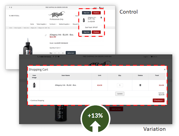
By making the cart popup overlay larger, we increased conversions by 13% for TATSoul.

By making the cart popup overlay larger, we increased conversions by 13% for TATSoul.

But, when a visitor has reached a product page, they are at the bottom of a rabbit hole. It may have involved a search, several category pages, and several product pages. They don’t want to start over.

To solve this problem, ecommerce sites have begun keeping them on the product page after they click Add to Cart, keeping their rabbit hole intact. However, if no visible acknowledgement is given, the visitor loses some of the satisfaction of their action. Or they may think the site is broken. Or they did something wrong.

Make sure that you give your potential buyers a clear signal that they’ve done something amazing. BJ Fogg recommends that you celebrate their action in some way. This should increase the likelihood that they will complete the purchase. These are two examples that signal to the visitor that they have done something amazing.

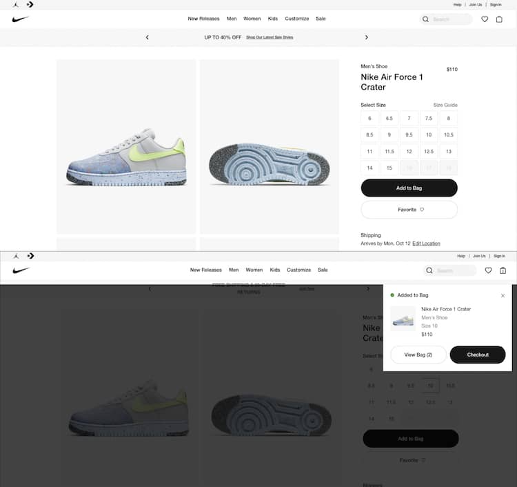
After the click to buy, Nike adds an overlay to the product page and shows a timed checkout link.

After the click to buy, Nike adds an overlay to the product page and shows a timed checkout link.

Nike hovers a Checkout overlay for a few seconds leaving the shopper in the same product page unless they click the “View Bag” or the “Checkout” button.

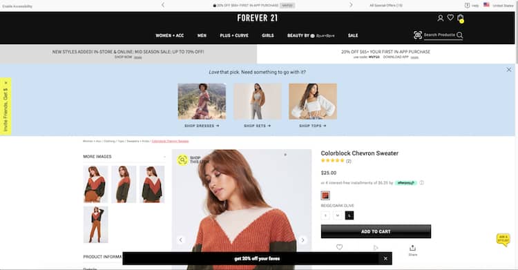
Or this one from Forever21 that tells their potential buyers they have done something amazing. Complimenting their taste, reiterating their offer to increase cart size (coupon code) and showing them product suggestions.

Forever21 does not lack on follow up actions after add to cart: promo codes and related products.

After showing the same overlay to the potential buyer, Forever 21 goes one step further.

3. Unsaved Carts

If I come back to the site, I expect my cart to still be there. Saving the visitor’s cart is an important part of abandoned cart remarketing strategies, in which an email or an ad brings them back to their selections.

Save the cart – by implementing a perpetual shopping cart – and find ways to encourage visitors to return.

4. Offer Live Support, Loyalty Programs

Your visitors will buy from you if you treat them well. They will buy again and again. Your willingness to be there for them both before and after the sale will determine their long-term value and your success.

The cart is a great place to show them you care. Have someone available on the phone or in a chat to answer their last minute questions. Let them know that this purchase is part of a reward program that shows you appreciate them.

There is an entire segment of your visitors that care about their relationship with you. Be a good relationship partner.

5. Exit Intent Offers

Remind them about the promotion you are currently offering just before they leave. Stop abandonment on its tracks. On Exit intent pop ups could help you with abandoned shopping bag recovery. Check out these 7 Best Practices for Using Exit-Intent Popovers.

6. Enable Guest Checkout

Maybe your customer doesn’t want to commit to you, yet. Offering guest checkout could make a difference in your cart optimization efforts. Instead of asking them to create an account, test and implement these Guest Checkout Tactics to Grow Ecommerce Sales (with Examples and Ideas) 

7. Ask your customers why they are leaving their cart behind

There are many tools to choose from that enable you to set up a short visitor survey to simply ask why they are leaving without checking out. This is a great use of exit-intent overlays. These can be delivered using Justuno, OptinMonster, Optimonk and other tools.

Cart Abandonment Solutions

Ok. We eliminated the causes but that doesn’t completely get rid of the problem. There will still be abandoners.

The most popular cart abandonment solution is the abandoned cart email or email recovery campaign. A great way to re-engage if you were able to get your prospective customer to give you their email. We promise to bring you a new article with the best abandoned cart emails cart and abandonment email examples soon.
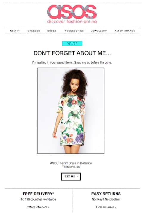
ASOS example of abandoned cart email for their email recovery campaign, the most popular cart abandonment solution.

ASOS example of abandoned cart email for their email recovery campaign, the most popular cart abandonment solution.

To help you on your quest to lower your shop’s abandonment rate, we will also include examples of abandoned cart text messages, subject lines and email sequence.

If they don’t respond to your emails, not everything is lost. You can always implement an ad retargeting campaign. There are tools that even offer cross-device and cross-platform compatibility and mobile retargeting.

What is a Good Abandonment Recovery Rate?

According to the Baymard Institute, the average abandonment rate on online shoppers is 69.57%. In plain terms, 695 people out of 1,000 are abandoning their carts. A good abandonment recovery rate will be between 10% and 30% of revenue.

If you’d like to boost your website’s bottom line and gently nudge your customers through the checkout process, book a free site review with us.

We’ll take a look at your site free of charge.

Test and implement these guest checkout tactics to reduce cart abandonment, grow ecommerce sales and conversion rates, and have your customers complete the purchase.

As a customer, do you really want to create an account for every single website you interact with? Absolutely not. On the other hand, if you are a customer, you want these online retailers to know who you are. This is why a website without a guest checkout is regarded as a “conversion killer”.

Having a guest checkout is one way to keep people from leaving your ecommerce site before they buy.

You may be worried about losing that connection with the customer. But don’t fear. If you implement some of these guest checkout ideas, you will be able to continue the conversation – even if they say they can’t stay for long as of now.

Let’s review these guest checkout tactics to help us grow sales and improve the user experience. It’s jam-packed with examples and ideas from a group of top US ecommerce sites we evaluated to illustrate this article.

Guest Checkout Tactics: What can I do to increase my ecommerce conversion rates?

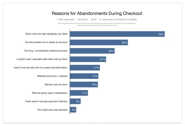
34% of the users in a Baymard Institute study abandoned an order because they were not offered an ecommerce guest checkout option.

Guest checkouts are an increasingly standard feature of most ecommerce sites today. But what sets the real winners apart is the checkout experience or the finesse with which they give the customer a choice between registering and proceeding as a guest.

If we ignore the segment of visitors that are “just browsing”, and look at the remaining reasons for abandonments, we get the above distribution. Source: Baymard Institute cart abandonment rate statistics.

Baymard Institute cart abandonment rate statistics.

If we ignore the segment of visitors that are “just browsing”, and look at the remaining reasons for abandoned carts, we get the above distribution. Source: Baymard Institute cart abandonment rate statistics.

1. Create account after purchase

Ironically, the only bit of additional information an ecommerce site needs is a password to create an account. Anyone paying with a credit card is providing their name, and it is standard practice to provide an email address for receipts and order updates.

Allow guest shoppers to create an account after the purchase is complete. Most of the information will have been filled in, and it would probably be a matter of adding a couple of fields. This will certainly help raise conversion rates, and may have only a small impact on the number of accounts your customers create.

Did you know that your customers are more likely to create an account after they purchase? This may seem counter-intuitive, the best time to ask someone to do something for you is right after they’ve purchased. They like you more because they chose you.

If you want to take it a step further, offer a guest checkout only and tell them they can create an account later, if they so desire.

Victoria’s Secret secret (and subtle) approach to account creation. Guest checkout tactics to grow ecommerce sales.

Victoria’s Secret secret (and subtle) approach to account creation.

2. Express payment options or social signups

A good way to complement a guest checkout, which will also save time filling out forms, is to offer a social signup or PayPal as the payment method. Notice how your customers can then go through the checkout without having to enter lots of details.

Not only will these options make for a smooth checkout UX, they will have a big impact on mobile checkout rates. No matter how short you make your forms, nothing beats a pre-filled option, especially when you are doing it on your phone.

Be careful, though. Not everyone trusts ecommerce websites with their social data. Thanks, Cambridge Analytica. Instead of “Login with LinkedIn”, try language like “Auto-fill from LinkedIn.”

Add this AB test to your mobile conversion optimization list, and see if you can grow the number of completed orders with express sign-ups.

3. Save your details for the next time

The smartest ecommerce sites give visitors clear reasons for creating an account at the time of purchase. They know repeat customers spend 67% more than new customers.

Of all the guest checkout tactics, this is the one I favor the most. Nothing pushy about signing up for an account or registering for future savings. Just a plain “would you like to save your details for the next time?” Why not? If I enjoy your products, I will definitely be coming back to your shop.

Do you offer a customer loyalty program? Well, there’s no better time to promote the incredible benefits of your program than right after a purchase.

Conversion Sciences Pro Tip: Craft a special exit-intent pop-up on your thank-you page that invites your new customer to enjoy the benefits of having an account. An exit-intent popup appears when the visitor is about to leave your site. This is a good time to offer something like, “Let us save your details and earn loyalty points.”

Discover how top retailers hit 10% conversion rates by using these eCommerce optimization tips that increase trust and interest from customers.

The global average conversion rate for eCommerce stores is 2.32%. Some online stores, however, manage to get rates as high as 10%. Just how do they do it?

Some may attribute it to the quality of their products. Others might point to the quality of their traffic. But if you dig deeper, you’ll find that the world’s top retailers invest in creating an optimized experience for their customers.

For a store struggling to convert browsers into customers, there’s a lot to be learned from these eCommerce retailers. So in this post, I’ll show you how some of the world’s best performing stores use conversion rate optimization to get more customers.

1. Retail Conversion Tips: Reassure eCommerce Customers of their Financial Safety

Curious to find out how the world’s top retailers grow their conversion rates? A third of your customers hesitate to punch in their credit card details because of recent data breaches at major retailers. Reassuring customers that that their credit card information is safe at all times is a proven way to improve conversion rates.

For example, when you try to checkout on Alibaba.com, you see a bunch of badges assuring the buyer of the store’s security credentials:

Alibaba's security credentials

Alibaba’s security credentials

On NewEgg.com, you’ll see similar badges on the site’s footer:

New Egg's credentials

New Egg’s credentials

On ThinkGeek.com, there’s a separate section on its website detailing the site’s payment security protocols:

Think Geek's payment security protocols

Think Geek’s payment security protocols

WalMart.com has a separate section on its website to educate customers about its privacy and security policies.

Walmart's page devoted to online security

Walmart’s page devoted to online security

2. eCommerce Optimization Tips: Offer Multiple Payment Options

Some of your customers prefer to use their credit cards, some others like to use their existing Paypal balance. By limiting available payment options, you make it harder for customers to finish their purchase. In fact, one survey found that 56% of customers expect multiple payment options at checkout.

Take a look at the number of payment options Alibaba offers through Alipay:

Alibaba payment options

Alibaba payment options

Note that Alipay also localizes the payment form. If you’re accessing the site from China, you’ll see methods that American customers don’t.

Note that Alipay also localizes the payment form. If you’re accessing the site from China, you’ll see different methods available to you than a US-based customer

Note that Alipay also localizes the payment form. If you’re accessing the site from China, you’ll see different methods available to you than a US-based customer

Amazon isn’t far behind either. It also offers multiple payment options on its checkout page:

Amazon's payment options

Amazon’s payment options

Most payment processors will let you accept payments via credit cards, debit cards and even bank transfers. You can also integrate Paypal on the checkout page to give customers another option to buy your products.

3. Great eCommerce Optimization Tips: Make Cart Contents Visible at all Times

“What items are in my cart right now?” This is a question your customers have likely asked themselves as they browse through your products.

To get an answer, they have to click on the ‘Cart’ icon and navigate away to another page. This halts the customer momentum and creates friction in the purchase process.

Remove this friction by making the contents of your visible at all times.

For example, once you add a product to your cart on Quiksilver.com, you can see the cart contents by simply moving your mouse over the cart button.

Hover view of shopping cart on Quicksilver

Hover view of shopping cart on Quicksilver

Macy’s does the same. After adding a product to the cart, the cart contents are shown by hovering the mouse over the shopping bag icon.

Hover view of Macy's shopping cart

Hover view of Macy’s shopping cart

Customers easily see what all they’ve already added to their cart without navigating away from the page.

4. Enhance Trust by Emphasizing Awards, Testimonials and Certifications

With revenues of $2.6B, NewEgg is one of the largest private companies in America. Yet, NewEgg uses several trust markers on its site to assure customers of its legitimacy.

Scroll to the site’s footer and you’ll see a link to its awards and rankings. On this page, NewEgg offers a comprehensive list of all the recognition it has received:

New Egg's many awards and certifications

NewEgg’s many awards and certifications

In an industry (computer parts sales) where authenticity is crucial, such external validation helps assure that customers of the retailer’s trust worthiness.

NorthernTool.com takes a different approach – it highlights how the business has been “family owned and operated” for 30 years in its footer:

Northern Tool offers assurance by stating how long it has been operating

Northern Tool offers assurance by stating how long it has been operating

Try creating a similar page on your site listing any public recognition you might have received. This can be a blurb from a prominent publisher, an award, or a testimonial.

5. Retail Conversion Tips: Use HTTPS/SSL to Enhance eCommerce Security

After the recent string of data breaches at major retailers, your customers are obviously nervous about data security.
Adding a SSL certificate to your site – particularly the checkout pages – can help restore some of their confidence.

This is particularly true for users on modern browsers like Chrome or Firefox which highlight SSL certificates in the address bar.
Take a look at the SSL certificate visible on NewEgg after you add a product to your cart:

New Egg's SSL certificate

New Egg’s SSL certificate

This is a quick, cheap way to give your store a much needed security boost.

6. Humanize your Company to Increase Trust

If you scroll down to the footer at Overstock.com, you’ll see something unique: a link to the CEO’s Twitter feed.

Overstock gives you an easy way to access its CEO

Overstock gives you an easy way to access its CEO

Remember: people like buying from other people, not faceless corporations. For large businesses like Overstock, this is a particularly big problem. Adding the CEO’s Twitter feed on the homepage shows that there are real people with real values behind the business.

That’s just one way to humanize your store. Another way is to tell customers your origin story, your mission and your key people on your About page.

Here’s how Zappos does it:

Zappos humanizes itself by proving it has a sense of humor

Zappos humanizes itself by proving it has a sense of humor

By calling its CEO/COO/VPs “monkeys”, Zappos tells the customer that it doesn’t take itself too seriously.

Zappos takes this far beyond the About page. It also offers customers and other business owners tours of its offices, conducts Q&A sessions to help them understand Zappos’ culture, and shares its reading lists and core values with site visitors.

Sharing information about your company's culture has a humanizing effect

Sharing information about your company’s culture has a humanizing effect

You don’t have to go that far, of course. Even something simple as a company blog can go a long way in creating more trust.
For example, take a look at Patagonia’s employee blog: The Cleanest Line.

Patagonia's employee blog shares their outdoor adventure experiences and insights, it doesn't directly sell any Patagonia products

Patagonia’s employee blog shares their outdoor adventure experiences and insights; it doesn’t directly sell any Patagonia products

7. eCommerce Optimization Tips: Offer Unique Methods to Visualize or Test Products

Putting up high resolution imagery is old hat in conversion optimized design. To stand out from the competition, you have to find more compelling ways to help customers test or visualize your products.

MyHabit’s (an Amazon deals site) 360-degree videos are a great example of this. The video plays seamlessly when a customer hovers over the video button, showing off the product in rich detail.

360 degree views on My Habits

360 degree views on My Habits

Not all products require a video or 360-degree images though. For stores with limited items, creating dedicated landing pages is a great idea as well.

See how Apple does it for all its products:

Apple uses clean and unusual shots to display their products

Apple uses clean and unusual shots to display its products

Of course, not all product presentations have to be visual in the traditional sense. Costco sells printers by mailing prospective customers a sample page from the printer.

A mailed test page is a clever way to show customers how the product performs without setting up a physical store

A mailed test page is a clever way to show customers how the product performs without setting up a physical store

This is a clever way to show the customer how the product actually performs without actually setting up a physical store.

8. Assure Customers of Free Shipping at a Single Glance

In a survey of holiday shoppers, 93% of respondents said that free shipping drove them to take action. Free shipping also ranked as the second biggest factor in eCommerce purchases.

Telling customers front and center about your shipping policies is a good way retain visitors. Place this declaration in a highly visible area above the fold, preferably before customers have even had a chance to browse through your products.

For example, ASOS shows its shipping policies right below the navigation menu:

ASOS's prominent shipping policies

ASOS’s prominent shipping policies

This tells both local and international customers whether it’s actually worth spending time on your store.
JCPenney does something similar – you can see exactly how much you need to spend to get free shipping.

JCPenney's shipping policy

JCPenney’s shipping policy

This acts as an incentive as well. Customers who are unwilling to pay for shipping might bump up their order value to avail free shipping benefits.

Stores with physical locations can go a step beyond free shipping and highlight in-store pickup on their homepages as well.
For example, on Macy’s, you’ll see a big banner advertising its order-online, pickup in-store policy:

Macy's shipping policy is unique so is very easy to find

Macy has a unique return policy, so they’ve made it very easy to find.

It’s also a good idea to highlight your return policy if you’re selling products customers are anxious buying online. For example, AutoZone gives customers assures customers that they can return their purchases in any store, no questions asked.

Auto Zone's shipping polices

AutoZone’s shipping polices

9. Create Product Pages that Fit your Customer Personas

Your customers will use your store in different ways. Some will dig through technical specs, while others will browse through dozens of reviews before pulling the trigger.

Creating product pages that fit each of your customer personas is crucial for a high-converting eCommerce experience.
For example, NorthernTool.com gives visitors an option to print out reviews for the product:

Being able to print easily is important for Northern Tool's personas

Being able to print easily is important for Northern Tool’s personas

This is necessary since a lot of NorthernTool’s customers are older people who prefer to read on paper instead of a computer/smartphone screen.

In contrast, NewEgg’s customers are very tech savvy. To appeal to these users, NewEgg gives a detailed rundown of each product’s technical specifications:

Technical depth might overwhelm users on another site, but New Egg's personas demand it in order to make a purchasing decision

Technical depth might overwhelm users on another site, but New Egg’s personas demand it in order to make a purchasing decision

Such technical depth might overwhelm users on another store, but for NewEgg’s savvy customers, this is a necessity for making a purchase decision.

10. eCommerce Optimization Tips: Help Customers Buy with Guides, Ideas and How-Tos

Creating content that helps customers choose products offers three benefits:

  • Helps your store get social shares and traffic.
  • Increases eCommerce conversion rates by helping customers choose a product that fits their requirements.
  • Increases average order value by recommending higher priced products to customers.

This strategy is particularly effective for stores that sell difficult-to-buy products such as DIY supplies, computer components, etc.

For example, Lowe’s creates a ton of content aimed at helping DIY enthusiasts. This content is displayed prominently on the nav bar under “Ideas & How-Tos”.

Lowe's free how-to guides

Lowe’s free how-to guides

eBay takes things one step further by letting users create guides of their own. Such user-generated content (UGC) helps eBay attract a massive amount of targeted search traffic.

User generated content UGC helps eBay attract a massive amount of targeted search traffic

User generated content UGC helps eBay attract a massive amount of targeted search traffic

Kate Spade ditches the buying guide in favor of a Tumblr blog. This blog curates styles, pictures and even quotes that help customers choose while also propagating the Kate Spade brand.

Kate Spade Tumblr

Kate Spade Tumblr

For a number of upcoming retailers, content is the foundation of their entire store. For example, men’s fashion retailer MrPorter was originally a blog that turned into a store. Even today, its online magazine is the central focus of the store.

MrPorter's online magazine

MrPorter’s online magazine

Creating such helpful content can be a potent strategy for getting more traffic, more conversions and bigger orders.

10 eCommerce Conversion Optimization Tips from the World’s Top Retailers Summary

Globally, conversion rates for eCommerce stores vary considerably. While a few stores struggle to get 2-3% conversion rates, top retailers convert as many as 10 out of every 100 visitors.

To get such high conversion rates, top retailers use a number of tactics. These range from mitigating customer risk to creating quality content that helps people choose the right products. By using similar tactics on your store, you can radically increase conversion rates and boost your revenue without a change in your traffic or product-line.

Key Takeaways

  • Use security badges, multiple payment options and third-party rankings, awards and certifications to underscore your store’s safety and trustworthiness.
  • Reduce friction in the buying process by making your cart visible at all times.
  • Tell customers about your shipping and return policies as soon as they land on your site.
  • Create product pages that address FUDs specific to your customer personas.
  • Create content that helps customers buy in order to get higher conversion rates and more traffic.
© Copyright 2007 - 2024 • Conversion Sciences • All Rights Reserved • Conversion Scientist® is a federally registered trademark owned by Conversion Sciences. Any unauthorized use is expressly prohibited.