
Fitt’s Law Says Button Design is Like Shooting Pool
Fitt’s Law states that the time it takes to move a mouse to a CTA button is a function of the distance to the button and its size. Just like shooting pool.
According to Fitt’s Law, clicking a button on your site can be modeled like a pool shot. It’s a fun way of saying that you should make buttons big and put them where the visitor expects them to be. If you’re looking for good ideas for testing button design, consider the game of pool.
Most of us have at one time or another found ourselves at the end of a pool cue with “a lot of green” between us and the ball we want to sink. There is a lot of table between the cue ball and the ball we want to hit just right.
Thanks to an excellent article on Entrepreneur.com, I’ve discovered that visitors to our website may be experiencing the same thing. Author Nate Desmond introduced Fitt’s Law, which he states this way:
Fitt’s Law proposes that time required to move your mouse to a target area (like a sign-up button) is a function of (1) distance to the target and (2) size of the target.
In a game of pool, the distance to the target changes constantly. This is equivalent to the distance from where a visitor’s mouse is and where your call to action button is.
In general, the rules of a pool shot are pretty simple.
Fitt’s Law Corollary: The Closer the Cue Ball to the Target Ball, the Easier the Shot
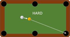
It’s easier to accurately hit a target ball that is close to the cue ball.
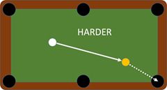
It’s counter-intuituve that the distance to the hole doesn’t matter as much as the distance from the cue ball.
If you strike the cue ball hard enough, it doesn’t really matter how far the target ball is from the pocket. What does matter is how far the target ball is from the cue ball. The shot is easier to line up and there is less distance for the cue ball to bend if you add a little accidental spin. When you put spin on the ball, it’s called “English”. Accidental spin is generally called “cussing”.
The Cue Ball is Where the Mouse Is — or Wants — to Be
To continue stretching our metaphor beyond recognition, we can liken the white cue ball to where the mouse is on a web page.
Part of the problem with this approach is that we really don’t know where the visitor’s mouse is on the page when it loads. We might assume it’s in the upper-left corner, where the website address is entered. This is true for only a small percentage of your visitors who enter your site by typing your domain. Others will come from internal links, ads and search results.
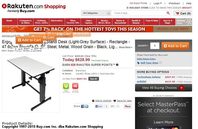
You can’t just cram your click target into the upper left corner of your pages.
It’s probably not helpful to put your call to action buttons in the upper left corner of your pages.
For some, it will be where the visitor is looking on the page. For some percentage of our visitors, the location of their mouse predicts where they look on the screen. This would tell you that the most visually interesting items on your page will be magnets for visitor eyes and for the visitor’s mouse.
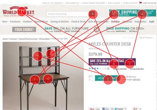
What are the most visually interesting points on your page? You can determine this by using several eye-tracking predictors like AttentionWizard and Feng-GUI. In the following example, the red circles indicate the most visually attractive aspects of the page, and predict how the visitors’ eyes will explore the page.

The visitors’ eyes don’t come close the the click target “Add to Cart” button.
The Add to Cart button – our target ball – really isn’t close to most of the high-contrast items on the page. The distance from the “mouse” to the button is long. Plus, the button is relatively small and doesn’t stand out from other elements on the page.
Compare that to the following competitor.
The click target is “closer” to where the eyes — and mouse — are likely to be on this page.
In this case, the Add to Cart button is one of the most visually interesting things on the page. Furthermore, it is near other highly-visible elements. The effective “distance” is much smaller and the visual “size” is larger.
This gives us two very helpful rules of thumb:
- Make your click targets visually interesting.
- Place your click targets close to things that are visually interesting.
We recommend that the click-targets on landing pages and product pages bet the most visually prominent items on the page.
Place Buttons Where They are Expected to Be
Probably a more effective way to reduce the distance between the mouse and a click target is to put your buttons where they are expected to be. We have been trained that the “end” of a page is the lower-right corner. This is where it has made sense to put buttons since the days of Web 1.0. As a result, we expect the lower-right to take us to the next step.
This concept is lost on the following page.
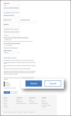
The “Cancel” button is in a disastrous place. Visitors expect the lower-right button to be the next step.
Here, the right-most button – the one most likely to be targeted — is “Cancel”. This button clears out all of the form information. Is there really ever a good reason to clear out a form? No. So don’t make it the lower-right click target.
This is close:
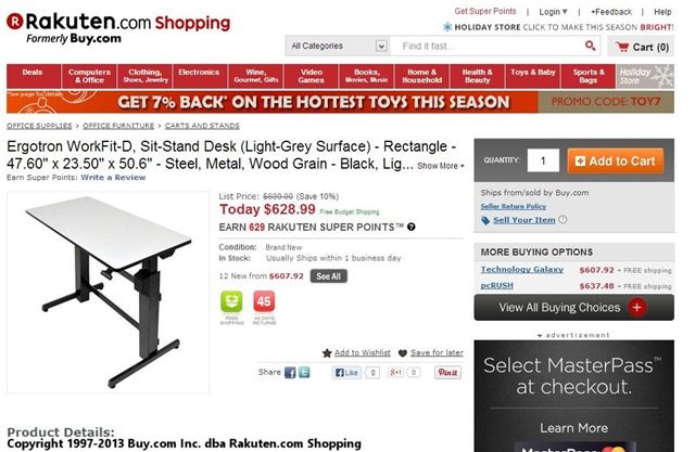
The Add to Cart button is not in the expected place on this ecommerce product page.
This is closer:
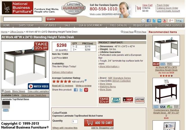
The add to cart button here is closer to the desired place. The box around it will deflect visitors’ gazes.
This is closest:

The add to cart button here is the last thing in the lower right part of the page. Perfect next step.
If Something’s In the Way, the Shot is Harder (and so is the click)
One of the major challenges in pool is, of course, other balls. This is also the problem on webpages (not the balls).
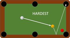
The hardest shot is when things are in the way, for pool and webpages.
Designers (should) know how to remove things that make click targets disappear. White space is one technique that removes blocks.
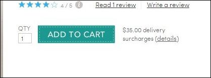
Lot’s of white space around this click target make it easier to see and click.
Solid lines form barriers to the eye’s movement.

Elements crowd out this Add to Cart button, making it almost invisible.
Major and Minor Choices for Button Design
One technique that we use that takes advantage of Fitt’s Law is major and minor choices. We make the choice that we desire less smaller and harder to click. We make the choice we want the visitor to choose big and bright.
Here we see that the designer made the “Learn More” button more visually prominent – making it closer – while making the “Watch video” link more distant – less visually prominent.

Which of these two click targets is “closer” due to the visual attractiveness? The order should probably have been reversed.
Language Makes the Hole Bigger
While there really is no way to get bigger pocket holes on a pool table, there is a way to do so with click targets. The language you use on buttons and in links will make it easier for visitors to take action.

Make your visitors excellent pool players by giving them easy shots.
“Submit” does not generate a large pocket to aim at. The language should tell the visitor what will happen if they click, and what they will get.
- Download the eBook
- Get Your Free Report
- Get Instant Access
- Add to Cart
- Checkout
- Request a Call
These make the visitor a better shot by offering them something of value as a part of the click target.
Some popovers have begun using the inverse of this technique to discourage visitors from abandoning.

Popover.
Give Your Visitors a Better Shot with Better Button Design
If a webpage is indeed like a pool table, it makes sense to give your visitors the best shot at clicking on the right button or link.
- Anticipate where your visitors eyes and mouse cursor will be on the page.
- Place click targets physically close to these places.
- Make click targets visually significant and place them near other visually significant items.
- Remove blocks that make click targets disappear. Use white space and eliminate competing elements on the page.

Expertise: conversion rate optimization, AB testing, marketing strategy, digital marketing, analytics, landing page design, computer programming, entrepreneurship
Speaking: IBM, Inbound, LeadsCon, Content Marketing World, Affiliate Summit, and more
Books and Training: Your Conversion Creation Equation, Video CRO, Marketing Videos that Convert, CRO Best Practices
As Seen On: ClickZ, Search Engine Land, Marketing Land, Conversion Sciences Blog, Intended Consequences podcast
Education: Texas A&M University, BS Computer Science and Management
- Your Traffic Fell 30 Percent. Your Targets Did Not. - September 3, 2026
- How to Filter Bot Traffic in Google Analytics With Ask Advisor - August 20, 2026
- Using AI to Chat with your Online Business - July 10, 2026


Buttons are the most important type of Call to Action.To generate leads from the web page placement of buttons and text on them play a very important role.
Agreed.
Great article guys!
What I am curios about is whether to use all capitals for the CTA button or only the first letters, any suggestions guys?
All caps can be harder to read for longer calls to action, like “Download Your Report” or “Get Instant Access”. Capitals can lend urgency, though. I say pick the one that draws the eye most.
Great thanks!
Love this analogy! Makes perfect sense – bigger buttons & clear placement = easier to “pocket” those clicks.