Here’s a common question: “How do you increase conversions when you only get a small amount of traffic?”
The first answer is, go get more traffic.
The closer your conversions are to zero, the closer your conversion optimization efforts will be to guessing.
You can do statistical optimization using split testing if you have enough conversions, but this usually comes with more traffic.
The second answer is to get more conversions so you can do conversion optimization to get more conversions. Which came first, the conversion or the optimizer?
This last point is, of course, the proverbial “rub.”
Here’s how to get started if you are running low-traffic websites.
Get Accurate Data
Be sure your analytics is setup properly. I offer an analytics setup checklist to help with Google Analytics. You’ll want to avoid blind spots such as overlay windows, tabbed content, and subdomains on separate analytics accounts.
You’re going to need a good source of data when you start picking things to test.
Compare your analytics data to a secondary dataset. Compare lead conversions to your CRM. Compare transactions reported to your accounting system. Your analytics should be within 15% of reality. Don’t be afraid to install a secondary analytics package to verify your main analytics setup.

21 Quick and Easy CRO Copywriting Hacks
Keep these proven copywriting hacks in mind to make your copy convert.
- 43 Pages with Examples
- Assumptive Phrasing
- "We" vs. "You"
- Pattern Interrupts
- The Power of Three
"*" indicates required fields
Get Some Qualitative Data
Low-traffic websites need to get more qualitative data. Right now, the one-stop-shop for qualitative data is HotJar. It offers click-tracking, session recording and feedback surveys. For alternatives, check out the ConversionDashboard.com.
Low-traffic Websites Use Serial Tests
If you don’t have the conversions to do split testing, you’ll want to do serial testing. This simply means making a single small change to your site and letting it run for at least two weeks. Since you have solid analytics (see above), you can see if there is an improvement in performance.
Measure More Than Conversions
There are some predictive metrics that you can use to gauge the performance of your serial tests.
- Bounce rate on landing pages
- Click-through-rate on key internal pages
- Add-to-cart for ecommerce sites
- Form completion percent
- Abandonment rate (basically the opposite of the last two)
Time on page, time on site, and pages per visit are to be taken with a grain of salt. Increasing these may correlate with lower conversion rates.
Start with the Message
Nothing works until your value proposition is strong. I recommend testing changes to your value proposition.
Nothing works until your value proposition is strong. I recommend testing changes to your value proposition. I’ve done hundreds of free strategy consultations over the years. Most of the time, I ask the consultee to tell me about their business. Typically, I get a concise, clear statement of the offering and value.
Rarely does this clarity appear on the website.
Sit with a copywriter and tell your story. Then, don’t edit them. Whatever they come up with, try it.
You should also test:
- Headline
- Call-to-action button text
- Pictures. If you can’t write a meaningful caption for an image, change it.
- Add sub-headlines
- Add bulleted lists
Don’t bury the lead. A great headline — called the “lead” — is the core of a strong value proposition. Often the headline that would best “grab” a reader is buried somewhere in the copy.
Find the headline that gets visitors to read your value proposition, and you’ll have the cornerstone of conversion in place.
Look for Big Wins
You’re going to have to find what we call “big wins.” This means that your change increased conversions by more than 50%. Rich Page wrote on low-traffic testing. My comment on his post was as follows:
You can also split testing with less than 100 conversions. You just need really big wins. If you have a treatment with 20 conversions and another with 40 conversions, a 100% difference is something you can probably bank on, even with such small numbers. However, if one treatment got 20 conversions and the other got 30, that 50% increase is too close to the margin of error and shouldn’t be considered an improvement (even though it feels like a win).
Technically, it’s OK to make a treatment with, say, a 30% increase the new control. Just know that you’re not likely to continue to see such an increase with small transaction amounts.
Ditch Your Outliers
You’re going to have to eliminate “outliers” in your data. Outliers include extreme orders in ecommerce sites and rushes of leads from activities such as email blasts and bursts of word of mouth.
For an ecommerce site, you should look at orders that are one or two standard deviations away from the mean.
So, what does that “mean?”
Here is two weeks of daily sales data for a site that gets about one sale per day.
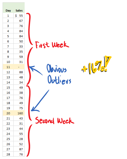
There are two obvious outliers: One day with no sales in the first week, and one with $160 in sales the second week. Statistically, a 16% increase is irrelevant, but the point is driven home when you calculate the standard deviation range.
For this data, an outlier will be lower than $27.90 or higher than $86.89.
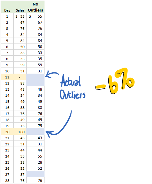
When we remove outliers we see a drop in sales of six percent. This is statistically uninteresting as well, but illustrates how outliers can affect results.
If you’d like to see how I calculated the min and max, download Example of Outliers-Conversion Scientist-low-traffic post.
Don’t Let it Run
Split testing can be done on low-transaction sites. However, don’t let the test run for more than, say, six weeks. The results just aren’t reliable. There are too many other variables mucking with your data over such long timeframes.
Always Be Testing
Just because you have few transactions per month doesn’t mean you can’t be learning. In fact, not learning may well be the reason you have few transactions per month. Never stop trying things, and use good data to decide what you keep and what you throw away.
Feature image by Shaun Garrity via Compfight cc and adapted for this post.