A website redesign is like a Hollywood movie reboot. It really is.
There have been two attempts to reboot the cultural phenomenon that is Star Wars. George Lucas gave us three prequels that, while generating some $2.5 billion in box office worldwide, were largely reviled for their lack of magic and stunted acting. Now JJ Abrams is rebooting with a sequel to the series called Star Wars: The Force Awakens.
Redesigning your website should be seen as a reboot of your online properties as well. Watch The JJ Abrams School of Website Redesign, and learn how to avoid creating a Phantom Menace when the Force Awakens for your website.
This is not the first reboot that JJ Abrams has helmed as visionary and director. We’ve got his incredibly successful treatments of the Star Trek franchise to consider as well.
Don’t Just Blow Things Up
The problem we have with the popular Responsive Web Design strategies is that you must change everything in order to create a “mobile-friendly” website. Responsive designs are programmed to make decisions about page content when smaller screens are encountered.
Many of these decisions are wrong, and we’ll cover them in our webinar.
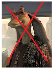
Your responsive design may be creating the equivalent of Jar-Jar Binks, a figure hated perhaps more than Darth Vader himself. In the webinar, we’ll show you how what happens when redesigns go bad.
Bring Back Beloved Characters
Your website redesign isn’t about changing things. It’s about building on what currently works, adding to the experience.
George Lucas managed to work merchandisable characters R2-D2 and C-3PO into the prequels, as well as beloved Obi-Wan Kenobi. But these characters didn’t create the esprit décor that the original ensemble did. In Star Trek, Abrams brought back young versions of the entire ensemble: Kirk, Bones, Scotty, and even two Spocks. Chekov, Sulu and Uhura were thrown in for good measure.
Your website is an ensemble cast of pages and experiences. Your landing pages need to prime buyers to get through the subscription process. Your category pages have to drive visits to product pages that entice visitors to add to cart.
Huge amounts of data is available very cheaply. Use it to know what to keep or suffer the consequences.
Don’t Create Any Jar-Jars
You don’t want to create any Jar-Jar Binks features during your redesign.
I’m sure George Lucas was certain that the Jar-Jar Binks character introduced in the Phantom Menace would be a beloved, merchandisable character. He was wrong. Abrams introduced Keenser, a (thankfully) silent alien who was Scotty’s sidekick in the first Star Trek reboot. However, he didn’t rely on this character for comedic relief nearly as much as Lucas did with Jar-Jar.
The cost to create the all-CGI Jar-Jar was huge, and probably took resources that could have been used elsewhere in the movie.
Unless you’re testing your way into your redesign, you are going to create some Jar-Jars in your redesign. These are features that you believe in, but that are rejected by your visitors. Don’t over-invest in these new experiences without testing them first.
Every website has return visitors. Your website, no matter how ugly you believe it to be, has visitors who feel at home there, enjoying a comfortable familiarity. They’ve invested the time to understand your site, to make it theirs. When you change it, they’ll be pissed.
These visitors need some rationale for your removal of familiar features and the addition of new ones. Avoid the pro-innovation bias, which is a tendency to change things because they are cool. Your returning visitors won’t think they are cool.
Even simple parallax animations are dangerous. It’s a technical error waiting for the wrong browser.
Don’t let your design firm add any “alien” features to your site. For example, parallax design causes animates to occur as your visitors scroll through the site. It’s the web equivalent of Jar-Jar.
Parallax design elements are like the blinking text of 1990s era websites. Or the Jar-Jar Binks of the Web.
In the Webinar, we’ll show you how to find out what is and isn’t necessary in your particular redesign.
Add Segments
This ain’t your father’s Star Trek.
JJ Abrams brought whole new segments into the Star Trek and Star Wars franchises. For Star Trek, he cast young heartthrobs Zak Quinto, Chris Pine, and Zoe Saldana in key roles. This brought a younger, hipper audience to the Star Trek universe. Star Wars: The Force Awakens features females in key hero and villain roles.
Your website redesign should be about two things:
1. Keeping your existing visitor segments happy.
2. Engaging new segments that need what you offer.
There is no such thing as an “average visitor” to your site. Design should specifically target key segments. These segments should not just be demographic as much as needs based. Segment by device type, by geography, by whether they are at work or play, or by the kinds of search terms they are using. Target segments at different stages of your funnel.
The death of a redesign is guaranteed if you design for the “average” visitor or design for yourself. See below.
Avoid Executive Influence
After several significant successes, J.J. Abrams has considerable freedom to do what he wants. He ignored all of George Lucas’s ideas for the new Star Wars movie and took it in his own direction.
The executives that you report to will want to have a say in the redesign. Statements like, “I would never respond to that!” are poisonous to the process, unless you site is targeted at them.
Abrams didn’t get such freedom until he had a win under his belt. Your ace in the whole is research and data. If your redesign is questioned, you better have the studies, heatmaps, split test, and analytics you need to make your case.
If you don’t have this information, you’re not likely to have a success anyway. You may want your executives to attend our webinar.
Lens Flair Comes Last
Only after you’ve considered all of these key issues can you put your own unique stamp on the site design. Abrams has a thing for lens flair in his movies.
But none of this means anything unless you have beloved features in your new site, avoid adding Jar-Jar Binks experiences and address your visitors segment by segment.
Toddlers have tablets built just for them, and elementary school kids have iPads and phones. Being connected is a way of life now, and that connectedness is starting at earlier and earlier ages.
Where did it begin? With the Millennials – that 18-34 age group that, now in adulthood, is the first generation to have had some type of device in its hands from a very young age. And for each new device and technology, they adapt almost seamlessly. Within the Millennial generation, we find “Generation C”, so called becuse of its impact on consumer culture. It consumes very differently. Anyone who has been involved in CRO already knows this, if only by experience.
What Do We Already Know About Generation C?
New research on the Millennial Generation
The research has been done, and the results are in. Sociologists, psychologists, and anthropologists have done the work for content marketers who are attempting to learn about this generation. Here are 15 critical pieces of information:
Millennials can do virtually anything with their phones other than eat, sleep and have sex. PCs are dinosaurs, but tablets and laptops are okay for certain purposes (coursework research and assignments, some product and service researching, preparing reports, graphics, and slide shares, etc.).
They do not use email or IM much.
Their preferred social media is still Facebook (62%) and YouTube. Twitter is becoming a bit more popular, but Pinterest is a big “no”.
The preferred method of communication is texting.
In 2014, they were responsible for $500 billion in Internet sales.
By 2025, they will be 75% of the workforce in the U.S.
They will not do business with anyone they do not fully trust or who is not recommended by others in their “communities”.
They covet mobility – they are marrying later, deferring starting families, renting rather than owning, and think nothing about changing jobs every year and a half.
They will not be “pushed” into conversions by “hard sells”.
Social life, family and time to enjoy both is just as important as their work, and they will sacrifice high income for quality leisure time.
They demand social responsibility on the part of companies with which they do business.
They want to be evaluated on the quality of work they produce not on the number of hours they are physically present in an office.
Trust and relationships are most highly valued in their personal, professional, and their purchasing lives.
They want to be engaged, entertained and feel a part of any business with whom they do business.
They are savvy consumers who recognize sales pitches and disingenuous, unauthentic tactics.
What This Means for CRO
There are great opportunities here. If marketing is done right, a business can have the loyalty of a customer and that customer’s entire community
There are also great risks. If marketing is done wrong, a business has lost a customer and his/her community forever. It’s hard to recoup from these mistakes.
The Four Cs
You’ve probably heard about The Four Cs of Marketing. There may be slight variations on each of the four, but the message is still consistent. Just as a reminder:
You have to create content specifically for Millennials that will be shared and, ideally go viral.
You have to connect on an emotional level. Knowing that Millennials value relationships and have strong demand for trust, your campaigns must honor these two things.
You must communicate regularly where they are online.
You must convert very carefully and gradually. Relationships and trust take time, but the payoff is big in the long run.
Millennials may be a new type of consumer, but The Four Cs still apply. Keeping them in mind, here are five practical applications based upon what we know about Generation C and the fact that you want conversions.
1. Millennials thrive when engaged with online communities.
They want to be engaged and you want to be a part of their communities. To Do:
Be where they are – Facebook and YouTube
Have conversations with them often and regularly
Comment on their comments
Invite them to participate in your business.
Example:
One of the best examples of a business that does all of this really well is ModCloth. Of course, it doesn’t hurt that it was founded by a husband and wife team who are themselves Millennials. ModCloth is a women’s fashion retailer that has this whole “engagement” thing down.
They went and still do go where Millennial women hang out – Facebook and YouTube.
They got their potential customers engaged right away, asking them to “vote” on clothing items they were considering carrying.
They established a “style gallery” on their site and their Facebook page that features actual customers “modeling” their clothing. The photos are all submitted by happy purchasers, and others are encouraged to comment on the clothing items and to engage in conversations with each other. Look at their Facebook page:
If you visit ModCloths’ Facebook page, you will see all kinds of comments, suggestions, and conversations about this clothing and how great everyone looks!
ModCloth must be doing something right – its sales topped $100 million last year.
2. Millennials want to be entertained, shocked, and schooled in unique ways.
They will share content with their communities that meets these criteria. They want to generate comments and conversations about what they share. To Do:
Give them plenty to share on a regular basis – stories, contests, photos/videos
Give them offers to redeem on your site or at your brick and mortar establishment
Invite comments, conversations and submissions
Example:
Jack Daniel’s has been around for a long time and has found ways to market to every generation, Millennials included. Understanding the need for Millennials to be involved and engaged and to share great stuff, they regularly launch new ways for them to participate and share those participations.
There is an ongoing microsite to which users can submit really weird and strange bar stories, read others’ submissions, comment, engage in conversations, and, of course share.
BarStories.JackDaniels.com features real-life bar stories that are worth sharing
Another more recent addition is “The Few and Far Between” contest for users to submit pictures of really weird bars. The winning entry will have that bar featured in a Jack Daniel’s commercial.
Still another recent participative activity is the “Crack the Jack Daniel’s Safe” lottery. Scratch-offs are delivered to bars along with bottles of Jack. A customer may order a drink made with JD whiskey and then ask the bartender for a ticket. Prizes include posters, hats, and other branded swag.
Jack Daniel’s fully intends to be a popular whiskey with the Millennials and will engage in those content marketing strategies that do just that.
3. They don’t want to spend a lot of time doing research.
They want to go quickly to a business with a lot of positive “buzz” around it and/or that has been recommended within their communities. To Do:
Share who you are; tell your story. The founders of ModCloth spent a lot of time doing this and it paid off soundly.
Become a member of their communities by being an “expert” who can give advice and recommendations through social media and through blog posts. Put teasers to those posts on Facebook with a link back to your blog when you have good, new content to share about something they have been discussing.
Don’t push them into your sales funnel with offers like email subscriptions – they could not care less. And use CTA buttons sparingly on your blog. They are a big turnoff. Do put share buttons on all of your posts. Just coming to your blog and sharing is a great initial “conversion”. Patience with Millennials.
Example:
Millennials do not remember Steve Jobs’ early years at Apple or his disagreements with the Board of Directors that caused him to leave. The company was almost run into the ground until he came back. Millennials knew him as the “face” of Apple, a brand they could trust. And he knew how important his persona was as well. For this reason, he personally launched every new product – he was trusted. Even though Jobs is gone, the Apple brand is trusted, so long as the new “faces” do not act stupidly.
Steve Jobs acting as the face of Apple made it a company that Millennials can trust.
4. Millennials will do business with companies that are genuinely relevant to their needs.
They look for companies that communicate in an honest way and that offer a consistent experience on their devices.
Recently LinkedIn published a list of the favorite websites of Millennials throughout all of their communities. The common thread among these favorites were that they had a good reputation, were easy to access on their phones, had high-speed loading on their mobile devices, and provided them with relevant products and services. To Do:
Responsive design has been a good way to provide excellent UX on mobile devices, but most of the “big boys” are now developing a mobile first strategy as they design and re-design. This is only smart considering the trends of device use for research and purchases.
Give users as few tasks as possible on their devices. Companies that do this really well are car rentals, airlines, hotels and restaurants. Amazon does a good job too.
Ensure that the site loads quickly and that navigation is really seamless. This keeps Millennials coming back which leads to conversions.
Examples
When LinkedIn published it list of Millennials’ most favored sites, Amazon of course was one. Two others were Spotify and BuzzFeed.
Here’s what Millennials said about these two sites:
Spotify: It loads quickly; the audio is terrific on their phones; it has the music they want; they can curate playlists; they can hear new artists; and they can share with their friends. Plus, their experience is consistently good. Given that 85% of Millennials listen to music on their devices, Spotify has a solid position in this market.
Spotify’s app has easy-to-use navigation, gives access to your own music, helps you discover new music, and works on multiple devices.
BuzzFeed: The whole structure of the site is easy to use on a mobile device – no swiping and a fast load and navigation. One of the biggest draws they stated were the listicles – numbered lists of everything that are quickly scannable and help with real problems in their lives.
BuzzFeed’s articles are easily digested with so many of them written in the form of a list.
5. Millennials are loyal to businesses that are principled, bear social responsibility and give back in some way.
To Do:
Get a cause of some kind.
Invite customers and potential customers to participate. For every purchase, you donate a part of the payment to a charity.
If you have a small team, take on local activities, such as Habitat for Humanity or a walk for a cure. Publicize your participation on Facebook and on your site.
Examples:
Headbands for Hope: When Jessica Eckstrom founded this company, she was a junior in college. While the idea came from a program she watched about the “Make a Wish” foundation, she knew she wanted a for-profit business that could still “do good”. By the time she graduated from college, she had sold 10,000 headbands, donated 10,000 headbands to children with cancer, and had given $10,000 to cancer research. Within one year after graduation, she had tripled her sales and donations.
Headbands for Hope engages and gives back.
TOMS Shoes: Most people already know this story. TOMS was a moderately successful shoe retailer, albeit a bit conservative in styles, when the owner decided to alter his image to appeal to Millennials. He expanded his product line and took on a pretty major undertaking. For every shoe purchase, he committed to donating a pair of shoes to a child in need. Publicizing all of this on Facebook began to really move the business. Gross sales reached $250 million, and the company has since taken on projects related to clean water and farming. TOMS has an extremely loyal customer-base among Millennials.
TOMS has boosted sales because it has made its giving very public.
Converting Millennials requires patience and a real understanding of their values and lifestyles. While analytics can provide a lot of good information about where and when they shop, devices used, where they bounce and why, there is also something to be said about knowing your audience well enough to know where to start your testing.
About the Author
Julie Ellis is an experienced marketer and freelance blogger. Her wide experience in the field of education, self-improvement and psychology gives her the opportunity to help all people that are willing to make the world better. For more, follow Julie’s Twitter and LinkedIn.
The increasing popularity of a variety of devices to access the internet—ranging from small handheld phones to tablets and laptops—have led web designers and marketers to work on approaches to make the devices more compatible with Internet usage. They are studying ease of scrolling and navigation, visual appeal, support of different screen sizes, richer experiences and faster page loads.
Adaptive Web Design (AWD) and Responsive Web Design (RWD) are different methods that arrive at the same solution. RWD is the hotter and more popular approach now, but before you decide to jump on the bandwagon, take a look at AWD. It may prove to be a better and more far-sighted approach for mobile web design.
At the heart of it, both AWD and RWD are two different ways of approaching the same goal: to create effective and impactful, functional and customized web design which can be easily visualized on any device. But as you read on, you will find that it may be the more complex and resource intensive AWD which may be a better option for designers in the long run.
The Difference Between RWD and AWD
Responsive Web Design
RWD is the popular design choice right now. It is a dynamic rendering of a web page based on fluid changes in layout according to the screen size and resolution. Thus, the design is responds to the screen size dynamically and instantly.
The images are flexible in size and the use of fluid grids is necessary. There are changes in the width of the elements in response to changing window sizes. This kind of web design makes use of queries to detect devices, so it is useful for advanced phones with certain operating systems versions. Ethan Marcotte introduced this strategy. The basis behind it was the permanent state of impermanence in the web design world —the web design has to keep evolving and shaping itself in response to changes. Thus, the advantage of this design is this: the same design can be used for viewing the website on different devices. This change in design is made possible by changes in the width and number of columns for storing text (container fields) in the code for the web page. RWD is a real-time, dynamic, changing web design.
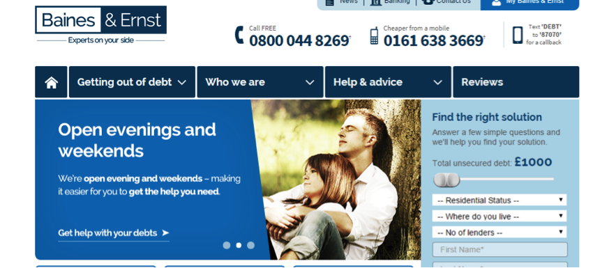
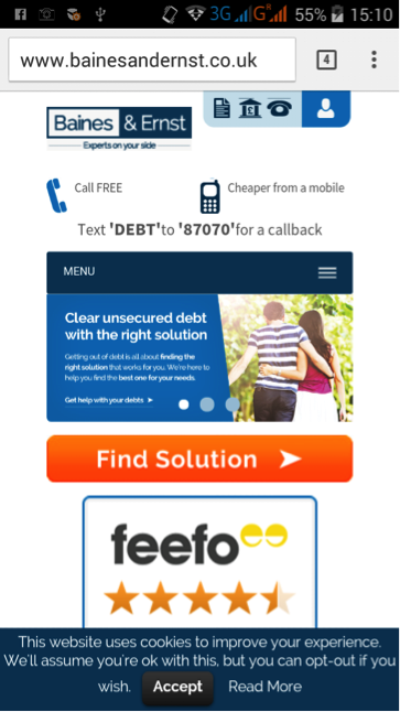
An example of RWD is that used by Barnes and Ernst, debt management experts in the UK. As you can see [need figure reference, or move images closer], the content is configured keeping in mind the interests of desktop and mobile users. Because of the increase in mobile users who were accessing their website through their smart phones, the company introduced mobile-specific search advertising and subsequently mobile-optimized websites.
Their aim was to deliver the required information to customers in a speedy way, without pushing down too much information. Based on their long-term goals and requirements, they went with the RWD one-size-fits-all approach: a single platform for all devices. Through this approach, they were able to optimize their site experience without the hassle of creating multiple websites. The site makes use of the smart-phone technology (touch/swipe), JavaScript, fluid queries, and flexible queries.
Baines and Ernst responsive web design on a desktop
Baines and Ernst responsive web design on mobile
Adaptive Web Design
AWD requires several different formats of the website — often different templates — to be made and kept ready for different devices, unlike RWD. The version of the website displayed to the viewer is based on several factors such as the location, kind of device and OS. AWD requires more up-front effort and development, but it offers a customized experience for mobile audiences. AWD is the better option for marketers who are into content-rich marketing and who need to deliver content of all kinds to their audience.
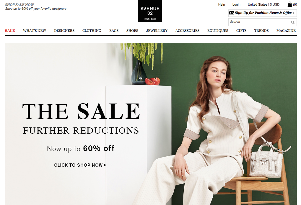
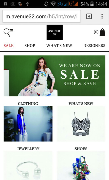
Avenue 32’s adaptive web design on a desktop
Avenue 32, a top-notch luxury retail brand, has made use of AWD to design its websites suitable for smart phone and tablet. The use of AWD has helped the brand create a visually and functionally engaging and rich experience, which matches its desktop website, which is content-rich and engaging.
This creates an equally rich mobile experience, in which customers experience content from wherever they may be. When you compare the desktop and mobile versions of the website, you can see that the content is more or less the same, but has been arranged in a way best seen on a desktop or mobile screen.
Avenue 32’s adaptive web design on mobile
The URLs for both websites can be the same (dynamic serving) or through use of different URLs (mobile specific and desktop specific, for instance), so the website visitors see is determined by the kind of device and operating system being used. Use of predesigned and customized landing pages may save time and glitches, which may otherwise happen in a dynamic RWD system.
Why is AWD the Design Choice with the Advantage?
Use of AWD makes accessing Internet pages more efficient. Pages load much more quickly with AWD, which improves the user experience and has been proven to increase conversion rates. This is because only those files which are required are transferred from server to mobile device. Optimum media files can be chosen that are suitable for the device and browser. This is how AWD delivers specific user experiences. Unlike AWD, RWD is more limited in generating optimized user experiences. Adaptive web design can be used for older mobile phones unlike responsive web design which needs the latest technology and recent phones plus use of CSS queries. The reason AWD doesn’t need the latest technology is because it makes use of client or server side code to detect the devices. This is good for the lower-end phones and older generation mobile phones which are not CSS optimized and thus do not have the ability to understand media queries and translate them.
Why is it important for a website to be accessible on many generations of mobile technology? Even if a company is located in an affluent part of the world where there is a rapid turnover in technology, huge parts of the global population – in Africa and Asia, for instance – do not have the financial means to have the newest smart phone. You would be putting your company at risk of missing out on new markets that may want what you’re selling but can’t access it easily.
You can easily deliver content to low-end mobile phone users in these countries who have much lesser bandwidth, poorer batteries and possess less power by using AWD. Adaptive means your marketing efforts lead to maximum inclusiveness.
Another advantage of AWD over RWD is that responsive web design may not be able to integrate all advertisements into every possible screen resolution as it dynamically adjusts itself. This problem is less of an issue with AWD since advertisements of all kinds can be tailored into it.
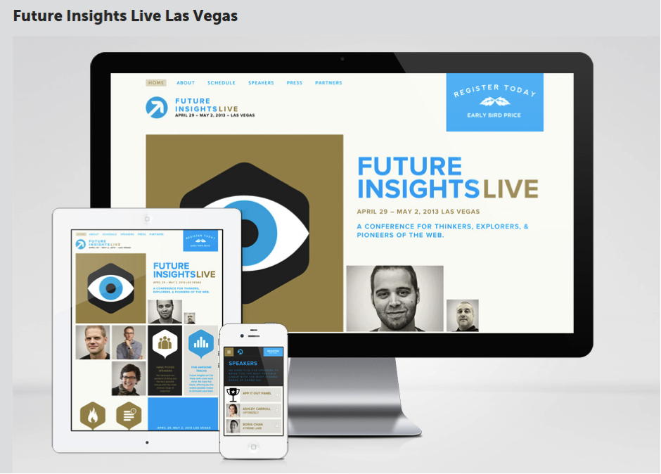
One example of the power of AWD is in the way Future Insights website generates pages. As you can see, the best customized webpage shows up for each device.
Future Insights’ set of webpages
All you need to do is to make one master version of the website, which can be tailored to make many minor versions of it. Thus, AWD offers many advantages without the drawbacks of RWD. AWD’s emphasis is on the overall functionality of the device rather than just the design. Sites using AWD can be more user-focused for mobile devices.
If you dream of achieving wider mobile Internet reach, don’t jump on the responsive bandwagon with out taking a hard look at adaptive mobile design.
About the Author
Jacey Johnson has been an administrator in higher education for over 10 years and currently works with http://aussieessays.com/essay-writers/ as a academic counselor guiding students. Most of her experiences have been in the online teaching, curriculum development and academic counseling.
The BestPracticlopse may be eating your mobile conversion rates.
Brian Massey and Joel Harvey have been making waves at conferences from Portland to Boston. Their presentations have been killing some of the sacred cows of mobile website design.
Joel will be at it again this week in Las Vegas at Conversion Conference.
Joel’s presentation on Mobile Design Essentials is going to be controversial, and how you treat mobile visitors is going to change as a result of what he has to say.
The data is there to support some of their controversial positions.
Responsive design, as we know it today is toxic to mobile conversion rates
Responsive design, as we know it today is toxic to mobile conversion rates.
High-performing mobile websites will look more like mobile apps.
Maximizing screen real estate on small screens isn’t as important as we thought.
Android and iPhone visitors act differently.
You don’t really have just one mobile website. You have ten or twenty or thirty. Each operating system, browser and screen size generates a different interpretation of your site.
Joel Harvey makes the point that if your site is broken, your visitors’ phone is broken.
Joel was rated a top speaker at Conversion Conference in 2014. Join his session on Thursday May 14 at 10:30am and for a fun and enlightening presentation.
I love the bubbles, but I doubt they are helping conversion rates. I haven’t seen animations like this since the 1990s. The background image slows load time and confuses the eye. The graduated fill on the buttons makes them all but unreadable.
Don’t laugh at my friends design. Here is a WordPress theme I recently reviewed. Check out the stars.
These stars don’t move the value proposition forward. Maybe it works for NASA.
Then there’s this:
Animation for animations sake is not helpful for scanners. Note the slow loading of the background image.
My friend needed a new theme for his WordPress site.
Fortunately, I had been asked to be a judge in the ThemeForest PageWiz template contest. More specifically, my task was to pick the themes that would make the best landing page templates.
I’ll tell you how I ranked these themes based on my experience, based on tests we’ve conducted here at Conversion Sciences, and based on my work as an online marketer who uses WordPress in my business.
47 Landing Page Templates, One Winner
The typical “Banded Sales Page” delivers the value proposition for a page in separate sections, or bands.
I reviewed 47 different PageWiz landing page templates created by designers. I was tasked with picking one I felt embodied the best practices in conversion-centric landing page design.
The goal of a landing page is to:
1) Keep the promise of an ad, email or link.
2) Get the visitor to take some action, to convert.
Most of the themes I reviewed followed a common pattern, one I call a “banded sales page.”
These are designed to unfold like a sales letter: Big promise at the top, and an unfolding story, or value proposition, as you scroll. Key parts of the story are separated into sections, often with bands of color or images to identify them.
The support for the value proposition is like that found in an old-style sales letter: claims, features and proof. Trust builders, such as testimonials and client logos are also an important part of the this style.
Most themes chose big images for background filler. This is an unfortunate choice, because slow load times mean lower conversion rates. It looks cool, but you know what’s cooler? More sales.
This style of page templates doesn’t provide a significant amount of space for copy, and this may be to their detriment. Instead, they provide bite-sized information to build the value proposition, perfect for scanning the page. These bite-sized sections are most commonly presented in bands of different background colors.
For example, the Landing Page Elements Theme wastes a lot of valuable space for a rather irrelevant image.
Large images take a long time to load and often don’t move the value proposition forward.
Some of the themes used parallax scrolling features, which we have not tested, but which may actually add friction to the experience, reducing conversions.
The Theme Should Serve Your Market
The landing page really needs to serve it’s audience. I found the highest scoring templates to be those that were for specific kinds of businesses: fitness, real estate, conferences, travel.
My pick is the Avira Homes template because of its creative calls to action and excellent mobile experience. It suffers from big images and almost fell out of the running.
Mobile Friendly is a Must
I’ll get this out of the way now. No responsive design made my list of top templates. I know it’s an easy way to get a mobile site, but mobile is different than desktop. Design a separate template for mobile.
Look for a landing page template that supports a separate mobile experience.
The Knights Theme offers a mobile theme separate from their desktop implementation.
Mobile Visitors Want Different Content
I made mobile support an important part of the criteria, because it is a growing traffic source for almost any industry. Most themes relied on responsive designs. Others had dedicated mobile templates. Many themes actually break when displayed on phone-sized screens.
We favor designs with dedicated mobile designs, as responsive designs have myriad problems for landing pages. Responsive designs often don’t make sense as desktop content is stacked in non-intuitive ways. These mobile sites also tend to load slower than their dedicated mobile cousins.
Most desktop themes won’t offer a map on their home page or landing pages. For mobile visitors, where we are is important. Maps are a great addition to your mobile experience.
Mobile-oriented content like maps are often lost in responsive designs.
Mobile visitors also want bigger buttons, click-to-call functionality and mobile-focused calls to action. Notice how the Avira site (my winner) offers click to call as the first-screen call to action in their mobile theme. Their desktop site offers a form and the “Contact Me” button.
Avira’s separate mobile app is designed for a uniquely mobile experience.
The Avira Real Estate Theme was my choice for overall winner.
The Page Should Load Fast
I was happy to see that none of these pages had scrolling hero images, called sliders. These slow load times and can distract readers from the information on the page.
The slow load time of the VPropos theme left us with nothing to watch.
The slow load time of this theme left us with nothing to watch.
The Theme Should Make Good Use of the First Screen
It is important that a landing page communicate that the visitor can take action on the page. It should be done early. There is a segment of your visitors that are looking to take action. They don’t want to read, they want to put things in motion.
The FlatVault theme makes good use of the top of the page using calls to action.
In contrast to the landing page templates with large images, I felt that FlatVaulth did a good job of utilizing the top portion of the page, with not one but two calls to action.
The Copy Should Be Easy to Read
I favor designs with dark text on light backgrounds for readability. Knockout text is hard for eyes over 40 to read. Pages that are mostly dark cause our pupils to widen. This larger aperture makes focusing more difficult. That’s why we squint when we are trying to read small text. It makes our aperture smaller.
Light text on a dark background is more difficult for older eyes that have trouble focusing.
The App Cast Theme may be best for young eyes.
A good designer uses color to guide the eye. The use of the same color makes it harder to locate the information that is important. For example, pricing tables job is to help us choose. In this pricing table, it’s clear that the center offering is more important, but the color choices make it hard to compare across offerings.
The poor color choices make it hard to compare options.
The Landing Elements Vol 2 Theme make poor color choices.
Contrast is your friend, especially when your presenting headlines and calls to action.
The headline and call to action are difficult to read here because of a low contrast between background and text.
The green and red backgrounds offer a low contrast background for the headline and form’s call to action in the Brom theme.
Make Good Use of Images and Video
If a theme didn’t explicitly support video, I didn’t hold it against theme. Several did. Video is all over the map in terms of whether it works or not. It is a powerful medium that can work for you or against you.
Images are powerful ways to move the value proposition of the site forward. Unfortunately, designers often punt, using filler stock images instead of well-thought out pictures. Unfortunately, theme builders really can’t offer one image that communicates well for all of the possible sites their theme may ride on.
The Cube Consulting Theme makes good use of image placement here.
This image is in the right place, but is clearly a stock image. The human eye knows when it sees what we call business porn.
The man in this theme is what we call “business porn.” It is a stock image, not someone who works at the company or is a customer. The placement of this image is smart. It anchors the call to action form visually which partly covers the image.
A better image would have been looking down at the form, or to the value proposition at the left. We tend to linger on faces, especially when they are looking right at us. If we’re looking at a face, we’re not reading the offer text or the calls to action.
Be careful of images that work against you.
The dot-matrix background and gratuitous keyboard image only work to make the text hard to read in this image.
The Expo Theme uses a dot-matrix background that messes with the eyes and makes the text harder to read. Why is there a keyboard in the background?
This background image conflicts with the call to action, confusing the eye.
One problem of our winning theme, Avira, is the poor choice of a background image. This image conflicts with the call to action form.
Shapes
The shape of your images can have impact as well. After viewing over 40 different themes with the banded designs, I found these curved images refreshing.
The shape of your images can draw the eye to important page components.
The Dyxalot Theme curved hero image draws the eye to the center where the key messages are.
Avoid Useless Images
If I have to find a large, high-resloution image that’s relevant to my visitor and figure out how to not screen it back, that’s a theme that is too much work.
This design is typical of the designs that waste precious real estate at the top of the page with nothing relevant.
A lot of space was dedicated to red buildings in this theme. What’s the message?
The Mobis Theme wastes a lot of space with a background picture of buildings. Unecessarily large images push your value proposition and calls to action down on the page, where they are less likely to be seen.
Make Images Clickable
Make images clickable, even if there’s a button below. These are not.
Clicking on the buttons works, but the images are not clickable. Don’t get in your visitors’ way.
The MyCourse Theme should make their images clickable.
Calls to Action
Calls to action should be the most visually prominent items on the page.
The use of arrows and button colors that clash with the other colors on the page signal that the call to action should be addressed by the visitor.
High contrast buttons and arrows signal to the visitor that they should address the call to action.
The My Earth Non-profit Theme enhances the visibility of the call to action.
More Calls to Action
For long banded pages, they should be frequent. You never know when your visitor is seeing the content that pushes them to take action in a long-scrolling landing page.
Our winning theme, Avira, offered a variety of calls to action, from the ability to inquire about specific properties to general inquiries. It invited visitors to call and offered lead generation forms at the top and bottom of the page.
You never know when copy or an image is going to incite a visitor to act. Use frequent calls to action.
Your Forms Should Behave
Form behavior should make completion intuitive and natural. When someone hits tab in your form, they should be taken to the next field, not another part of the page.
The form for the Urane Theme looks like this:
Be careful if you use the tab button here (and most of us do).
When I type my name and click Tab, it jumps to a random part of the page.
Surprise behaviors will kill your conversion rates.
Use a Dripping Pan
If someone reads your page to the bottom, this is a pretty good sign that they are interested. Themes should repeate the call to action at the bottom of the page. We call this a dripping pan because it catches the juices to make gravy.
This form appears at the bottom of the page. It’s a dripping pan.
The dripping pan for the MyPro Affiliate Theme offers a complete form and call to action.
App Store Buttons
If you’re doing a theme for an app download, the call to action is to visit an app store. I recommend that you not redesign these buttons. They should be recognizable as clicks to the Google Play store and iTunes app store.
The most recognizable app store button designs are used across the Web.
The Dyxalot Theme makes this call to action almost invisible.
These download calls to action are almost invisible
The App Cast Mobile Theme offers company logos, not app store logos.
Are these company logos or app store download buttons?
The Volax Theme offers more clues that this is an app download, but this is not a fimiliar image for the app stores.
The addition of download counts adds social proof, but what am I downloading exactly?
Plan for Proof and Trust
Presenting proof is very important, and several themes offered interesting ways to present proof. Claims made in your copy must be supported by a benefit and proof.
The Expo theme presents a place for proof points
The Expo theme presents a place for proof points.
Websites can “borrow” trust from other brands by showing logos, seals and badges. Client logos, partner logos, and even the logos of credit cards all conspire to build trust with visitors. Themes that support this were ranked higher in my judging.
Websites can “borrow” trust from clients, partners and media outlets by displaying their logos
Unfortunately, the MyPro Theme made a poor choice for the background of these trust building logos.
Induce Scrolling
One of the concerns with banded pages like those in this competition is that every scroll can look like the bottom of the page. Visitors may never scroll further to see the persuasive content lower on the page.
Themes that induced scrolling were ranked higher on my list.
The Upfold Theme provides several scrolling queues. The v-shaped header image invites visitors to scroll down.
A simple arrow-shaped image can induce scrolling, making your copy more effective.
Connective lines between sections signal visitors that there is more to see. This keeps people scrolling.
Subtle connective lines signal that there is more information to follow as the visitor scrolls.
Consider Introducing Scarcity
If your offer has a deadline, you can use countdown timers to introduce “scarcity.” This communicates that an offer is about to expire and that the visitor should take action immediately.
Countdown timers are effective, and several themes incorporated them into their pages.
Count down timers can introduce scarcity into the visitor’s decision making process.
The Pagewiz Event Conference Meetup Theme places a countdown timer in the body of the page.
Scarcity is a natural fit for events.
Elect! Political Charity Conference Theme places a countdown timer right below the hero image.
Social Distraction
The most common distraction I see on landing pages is social media icons. Traffic is never free. Even search traffic requires you to optimize and develop content. If you’ve paid for a visitor to come to your site, why send them off to Mark Zuckerberg? He’s god enough traffic.
The social icons are muted, but shouldn’t be at the top of the page competing with the call to action.
The social icons are muted here, but save them for the thank you page.
The social icons on the FlatBox Theme are the most visible (and thus the most important) items above the fold.
The social media icons really pop on this dark background. The message is that these are the most important things on the page.
Only use if social media is a great source of visitors for your site. Instead of a dripping pan at the bottom of the page, FlatBox offers a smorgasbord of distractions.
Most businesses aren’t good at turning likes and follows into business. Save these buttons for the thank you page.
The best use of social media I saw was the RealGym Theme, my runner up. This use of social media turns gym trainers into social sales people
Here the social icons support the business model directly by turning trainers into social salespeople.
Help Me Choose a Plan
If you offer multiple levels of service or product tiers, the job of your pricing matrix is to, Help Me Choose. Your landing page template should highlight one price package to help my visitors choose.
The Mobis Multipurpose Landing Page Theme offers three colors, none of which is more prominent than any other.
Which of these is most popular? Which should I choose? It’s hard to tell.
The Urane Theme offers a highlighted choice.
This design says,”I should pay attention to the middle one, and not just choose the cheapest.”
Pricing tables that make it easy to compare features will improve conversion rates.
The Landing Elements Vol 1 Theme offers banding to help guide the eye across features.
Alternating colors help guide the eye and aid in comparing features.
Pricing tables should not attempt to sell features. You should only select a few criteria–three or four–to be placed in the pricing table. Let the copy do the rest of the selling.
Use helpful names as well.
Choose the descriptive names for your feature levels.
The Flat Vault Theme suggests “Basic”, “Pro” and “Elite” levels. These generic names are translated as “Cheap”, “Expensive” and “Only for big companies”. Be more clear in your naming. Choose names that convey relevant value.
No Template is Going to Have It All
This is a lot to consider when picking a theme. None of the landing page templates I reviewed scored perfect on all counts.
Your business may have special needs. If building trust is important, focus on themes that support trust and proof. If you serve mobile visitors, be sure to use a separate theme for your mobile site.
For almost any site, Readability, Calls to action, and Load Time are going to be critical.
Any theme you produce will need to be optimized for your unique visitors. Contact Conversion Sciences for a free consultation on your site.
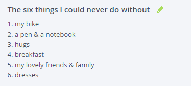
Now I can ride my new bike and know that I selected the best template for my carpet-cleaning friend.
Here’s the dripping pan.
21 Quick and Easy CRO Copywriting Hacks
Keep these proven copywriting hacks in mind to make your copy convert.
You can’t get into website optimization without it leaking into the rest of your life. You see the world differently. At Conversion Sciences, we obsess about optimization and the affect on our lives is interesting.
We tally the coffee orders of those in line ahead of us to help with your decision.
We leave the house at the EXACT same time each day when trying alternative commutes. Of course we use the stopwatch for accuracy.
We do a quick evaluation of the speed of the grocery store checkout people before choosing a line.
And we optimize our dating lives.
We see this as an opportunity to introduce landing page concepts to a broader audience. Lots of people get excited about optimizing their dating profile. Landing page optimization makes the accountant smile. Dating profile optimization makes the heart smile.
Basically, we are appealing to your base nature to help you make more money in your business.
Basically, we are appealing to your base nature to help you make more money in your business.
I would like to invite you into the world of optimization obsession by introducing you to a new series of blog posts coming your way: Optimize My Dating Life.
[dating-series]
We asked Megan – one of our Conversion Scientists – to document an optimization project in which she applies everything she knows about increasing conversion rates to her online dating profile. Ultimately, a dating profile is nothing more than a lead-generating landing page, so it’s just waiting to be optimized.
How is an Online Dating Profile a Lead-Generating Landing Page?
A dating profile certainly serves a specific purpose. You know what that purpose is, but do the people who visit your profile? You’ve undoubtedly heard horror stories at happy hours from your single friends, or maybe you have a few stories of your own. Misunderstandings occurring as a result of a miscommunication on a dating profile.
For a time, my profile listed my favorite book as Batman: the Dark Knight Returns. I came to understand this was an error in judgment on my part. I went on dates with four different people who assumed I would be able to keep up in a conversation discussing the history of the Marvel (or is it DC?) universe. Just to clarify: I couldn’t keep up.
Maybe you’ve created a landing page for an expensive giveaway only to receive a bafflingly low quality and quantity of leads. Were you really communicating what you thought you were?
Previous research has determined that it all comes down to the picture. These studies were only measuring inquiries, the number of people who try to connect. We want to go deeper. We want to judge the quality of the connections.
Look at her, she’s adorbs. Who wouldn’t want to date that face?
Looks aren’t everything, right? Well, the right images are important — on your dating profile and on your landing pages.
We’ll be testing other important components of dating landing pages: trust builders, proof points and offers.
Yes, I said, “offers”. Will the right offer on a dating landing page make the difference? We can’t wait to find out.
Finally, we want to measure the quality of our “leads”. You’ve probably been on dates with people you chose because of their level of attractiveness only to find out they’re as interesting as elevator music. You’ve probably been approached by someone who saw your lovely little mug and that person wanted to ask you on a date without knowing anything about how smart and cool and interesting you are.
And you’ve probably visited a landing page with a design that was absolutely beautiful. A work of art. But for the life of you, couldn’t figure out what you were being asked to do.
[dating-series]
What Are We Studying?
We will be attempting to make our little project as scientific as possible so that you will be better able to incorporate our successes (and avoid our failures) in your own landing pages.
Megan will be creating a few different dating profiles, and we will attempt to isolate the actual written content of her profile and her user pictures.
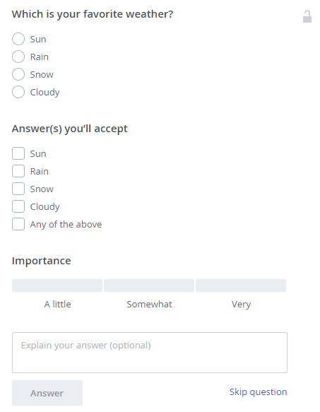
Example of a free-form question where answers could change across profiles and over the course of the project
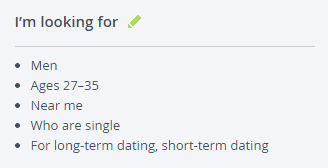
okcupid tries to match people based on a series of questions, what each person is seeking by using the service, and location, and we will be keeping all of this information the same across all of the profiles so that she has a greater chance of showing up in the same searches for the same people.
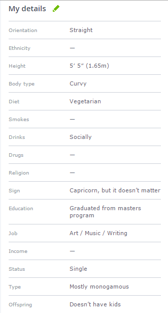
Example of information that will be a control across all profiles
Example of information that will be a control across all profiles
Example of a potential okcupid question that will be a control across all profiles
Because lead-generation is the end goal, we will be measuring the quality and quantity of leads received on each of her profiles. Megan’s first task will be to create a quality matrix that will allow her to rate each of her leads and avoid relying on how physically attractive they are. So we’ll be looking at Megan’s own profile and making changes to increase the number of quality leads she receives, but we’ll also be looking at the potential leads’ profiles and rating them.
What’s a lead? Men who message her are her leads; conversions will be securing dates with said leads.
Will Megan rate leads higher when they mention their families? How will musicians fare? Are vegetarians a hard-pass? Be sure to read her next post to find out!
Use Our Love Lessons Learned to Build the Landing Page of Your Dreams
We’ll be writing posts as the project progresses. We really have no idea how things are going to turn out: will Megan find Mr. Right? Who knows, but we might as well make the search interesting.
As for your landing pages, generating leads is a bit more of a science than finding the love of your life, and for that reason, there’s a lot you can learn from dating profiles to help improve your landing page.
So here we go…we’ll keep you posted.
If Austin is the conversion capital of the world, it was a supernova of conversion optimization brilliance this past week when the Conversion XL Live conference was held here. Luminaries from around the globe converged here for a program that covered topics from landing page design to “bandit” algorithms.
I learned a lot.
Here were some of the highlights for me.
The Dame, The Detective and the Double-cross
I used Humphrey Bogart detective movies to illustrate that conversion optimizers use a variety of data sources to determine what to test and what not to test. The femme fatale will appear in the detective’s office and pose a problem. The salty detective will investigate, looking for clues. If he’s not careful, he can be double-crossed by the data.
For a data detective, the initial hypothesis is the “dame’s” story. Of course, she is hiding something. He must find clues to tease out the truth using alternative data sources. He can use post-test analysis techniques to make sure he wasn’t double-crossed by his data.
Some of the alternative sources I discussed were:
Aggregated Behavioral data like Google Analytics and AB Testing Tools.
Aggregated User Interaction data like click tracking tools and form-tracking tools.
Individual User Interaction data, like session recordings, ratings and reviews data and live chat transcripts.
Self-reported data, such as surveys and online feedback.
Customer knowledge, often found by interviewing sales and customer support people.
When you prioritize hypotheses that have lots of support in data, you keep yourself from being double-crossed by unexpected results.
Mobile Website Design
We believe that the mobile Web is like the desktop Web in the 1990s: we will look back and laugh at the choices we are making today.
Amy Africa has done a lot of testing on mobile websites, and gave us a flood of Mobile Web 2.0 tips. My notes were extensive, but some of the her revelations were surprising.
Don’t think in terms of pages. Think in terms of screens and scrolls.
Make your “action directives” (action buttons, search options, etc.) big and bold.
80% of mobile success is having the right navigation.
One third to one half of mobile visitors will use search. Design search results pages as if only three items will be seen.
Mobile forms are abandoned more often on mobile.
Email is of even bigger importance with mobile users than desktop users.
Social logins can reduce abandonment if done right.
“Oversell the phone number” in the purchase process.
Responsive design comes with a mobile performance hit.
Transfer mobile visitors to the desktop by sending email or text.
Email will make up for deficiencies in the mobile experience.
She introduced me to some new terms, including “donuts”, “spreaders” and “cart hoppers.”
It’s clearly an exciting time in the mobile world.
Predictive Analytics and Machine Learning
Matthew Gershoff introduced us to the world of predictive analytics and machine learning.
Optimization = Learning efficiency + Applying the “best” learnings
New tools, such as his company Conductrics provides tools that use the key ingredients of optimization.
Setting goals
Sensing the environment, usually through analytics.
Having the ability to act and execute on learnings.
Observing outcomes.
Learning the decision logic of visitors.
These ingredients are the basis for machine learning.
He recommended courses on VideoLectures.com to get up to speed on machine learning and artificial intelligence.
Conversion Maturity Model
Brooks Bell was interviewed by conference host Peep Laja about the Conversion Maturity Model that defines how advanced an organization is with respect to optimization.
Her namesake company surveyed 300 companies, rating them on six criteria.
Culture
Team
Tools and Systems
Process
Strategy
Performance
The executive sponsor at a company is key to the success of the optimization effort, she pointed out. Very true.
Conversion Optimizers from Everywhere
Austin truly was the Conversion Supernova of the World.
In from Vancouver, Oli Gardner of Unbouce took us through the rules of good landing page design. He provided us all with some free tools to help us evaluate our landing pages and forms.
André Morys runs one of the largest conversion optimization companies in the world. He’s both hugely entertaining and German.
Michael Aagard flew in from Denmark to share some of his most embarrassing testing mistakes and his triumphs.
Yehoshua Coren is a cross-cultural phenomenon as the Analytics Ninja from Israel.
When we stand up a website, perhaps the most valuable question we can ask about our visitors is, “What triggered them come to our website? What problem are they trying to solve?”
The question is different when someone comes on their smartphone.
The question is, “What triggered them to come to our website from where they are? What problem are they trying to solve right now?”
When you add the “where” and “right now” components, it is clear that your mobile site has to answer a very different question.
I was inspired to talk about this when I was looking for a Chinese Restaurant near my office.
How to define a Mobile User
How do you define a mobile user?
Is it the operating system they use (Android or iOS)?
Is it the size of their screen?
Is it the device they visit with?
I would argue that the best definition of a mobile user is if they need an answer where they are or right now.
When I was looking for a Chinese Restaurant near my office, I picked up my smartphone even though I had a full-powered PC right in front of me.
Why did I do this?
Because my phone is my “where” device. It can tell Google exactly where I am as a reference.
It is also my “right now” device. When someone asks a question that I don’t know the answer to, I Google it on my phone. Not my laptop.
Old habits die hard.
So, what did I get from my where and now search?
A mobile site that doesn’t quite get me
For the person who is searching for a Chinese Restaurant from their mobile device, there are a few predictable questions. Your business has a similar set of predictable questions as well.
Here are the key questions for desktop and mobile devices:
Desktop/Tablet Questions
Mobile Questions
Where are you?
How far are you from where I am now?
What are your business hours?
Are you open now?
Do you deliver?
Do you deliver to where I am now?
What is on your menu?
Does your menu meet the requirements of the people with me now?
Do you have a nice environment?
Will I be embarrassed when we all show up?
What is your phone number?
What do I do if I don’t find an answer to my above questions?
So, how does the Chinese Restaurant Shu Shu’s mobile website fare in meeting my needs?
Shu Shu’s wins with a nice big click to call button. I may not need this now, but this is the way to display a phone number for a device that is a phone. Dialing is so last decade.
The two other big buttons on the first screen are both helpful and baffling. The map icon shows a map of the store location. “Where” is a natural mobile question. But, “Where is your Google Plus profile” is not a natural first question. So why is that the second most important item on the top screen?
The value proposition, “Fresh Ingredients, Clean Environment, Healthy Eating!” is not a common mobile question. In fact, this value prop introduces the concept of a not-clean restaurant. If it wasn’t a problem, why bring up “clean?”
The menu button answers an important question and one of the early ones. But why send people off to Yelp!? It seems that this would encourage comparison shopping.
And then came the text. Do I need to know that “Shu Shu’s Asian Cuisine offers the mouth-watering tastes you’re craving at our Chinese restaurant in Austin, TX?”
No, I don’t. This is SEO copy, and it has no place in a mobile experience. This is a downside of the responsive design.
Unfortunately, it just keeps going.
Finally, I get to something that speaks in the language of smartphones: images.
Well, one image.
Let’s have some more pictures, please.
And we finally get to the map, with a link to “View on Google Maps.” This is how we can answer the question, “How far are you from where I am now?”
Adding a coupon-like sweetener is smart. However, the responsive design changed the aspect ratio of the image, making the site look cheap.
Next are the facts about address and hours of operation, complete with a link to “Website.” I thought we were already there?
Design for the Bottom Bounce
Finally, we hit bottom. Smartphone users have busy thumbs that generate lots of scrolling. Scroll tracking shows that many mobile visitors will “hit bottom.” This part of the page can be as critical as the first screen.
Choose wisely what you put at the bottom. I wouldn’t recommend sending bouncers off to social media. In fact, I would repeat the click-to-call phone number, place a clickable address, and maybe a way to take action here. A “Place an Takeout Order” button or “Email this to Friends” button would be good considerations.
I would also consider placing ratings and reviews here if possible.
All in all, this mobile site eventually delivers answers to most of the mobile user’s questions. The effectiveness is hampered by the responsive design that
In this case, a responsive design is probably not the right choice from a purely functional standpoint. However, it is easy to maintain, and restaurants don’t usually have the staff to manage multiple sites.
You don’t have to run a restaurant
The questions are the same, even if you don’t run a restaurant. However, there are differences for sites that have “considered” purchases, such as high-ticket products or business services.
What can you teach the mobile designer right now, where they are? Are they in a meeting being asked about solutions like the ones you provide?
We think that cross-device calls to action can be a big help.


 Jacey Johnson has been an administrator in higher education for over 10 years and currently works with


.")


