If you are anything like me, you’ve made your fair share impulsive purchases online.
Unlike trekking into brick-and-mortar, I never get on the Internet with the intent of pulling out my credit card. Yet, inevitably, I’ve got two food delivery subscriptions and a blouse from the JCrew factory store shipping out tomorrow.
Are your visitors like me? How much of your business comes from impulsive behavior? Most importantly, are you converting your impulse visitors before their craving to buy passes?
In this post, I will show you how to quantify the number of impulse buyers on your site using Google Analytics, and I will also share strategies on how to get them to convert.
The Impulsive Buyer
We define an impulsive buyer as someone who is poised to take action. These are our spontaneous buyers, more likely to be relational than transactional. They may not be impulsive in life, but are behaving in their spontaneous mode on your site right now.
What makes an impulsive buyer impulsive?
- They perceive the risk of taking action as low.
- They perceive the value of taking action as high.
- They perceive the cost of shopping as high.
- FOMO: Fear of missing out may drive their behavior.
- Familiarity with your products makes a purchase decision easy.
- Repeat buyers simply restocking will act as if they are impulsive.
For these visitors, leaving a browsing session without having pulled the financial trigger is like leaving the confessional before they’ve received their prescription of penitential prayers. It’s a complete waste of time and fundamentally misses the point of the exercise.
For these buyers, you should dedicate a portion of your site to mitigating risk, building value, pointing the way to purchase, creating scarcity, and spelling out the facts.
Impulse buyers aren’t the crazed shoppers that can be found assaulting each other in the Walmart on Black Friday.Impulse buyers aren’t the crazed shoppers that can be found assaulting each other in the Walmart on Black Friday. These buyers may be thoughtful and methodical in their approach. However, they will buy from someone today, unless no alternatives present themselves.
If they don’t buy from you now, they will most likely not return.
Finding Impulse Buyers in the Data
Impulse buyers don’t announce themselves upon arrival at your website, but they leave footprints in your digital sand. To start, we’re looking for those one-hit wonders, the drive-by shoppers. Google Analytics tracks this behavior for us with the “Time to Purchase” report.

Where to find time to purchase in Google Analytics
Impluse buyers are, by definition, those visitors who purchase within their first visit. Thus, we want to know which transactions are completed on our site within a single session.
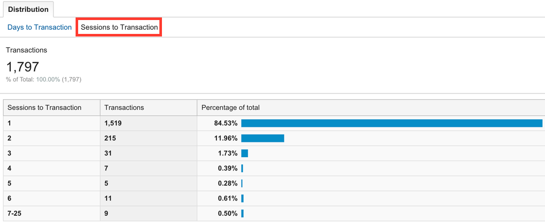
The number of sessions it takes to convert
For an ecommerce website, a single-session percentage of more than 80% indicates that quick buying behavior is contributing to your overall conversion rate. You’re probably serving your impulse buyers well.
If single-session conversions make up less than 60% of your total transactions, one of two things is happening.
- You are selling something that methodical customers are going to purchase, such as appliances or a college education.
OR
- You are not satisfying the impulse-buyers’ craving before it passes.
Google Analytics makes it easy to track impulse buyers on your site. Create an advanced segment for those visitors who purchase in one session.
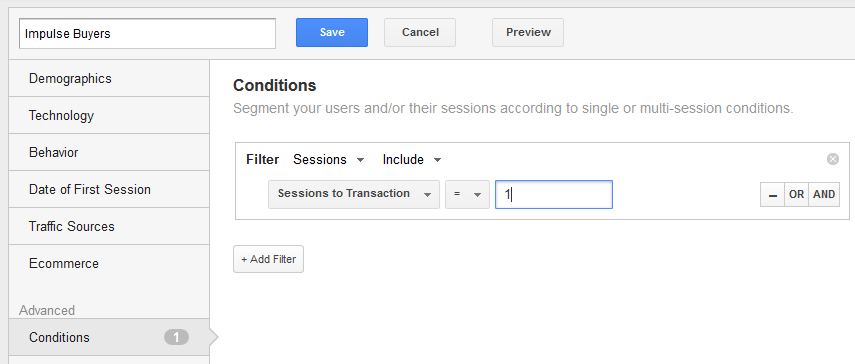
When you look at your Google Analytics reports through the lens of this segment you will see how impulse buyers are impacting your business.
 are a significant portion of all revenue (orange line) for this ecommerce business.")
Impulse Buyers (blue line) are a significant portion of all revenue (orange line) for this ecommerce business.
Use this segment to answer other questions as well. In the graph below, it is clear how an email promotion to existing buyers affects the impulse buyer segment.

Email campaigns appeal to return and repeat buyers (orange line) and less so to first-time impulse buyers (blue line).
How did these visitors get to your site? Where did they land? Did they use site search or navigation to get to a product page? What items did these quick buyers purchase?

Sessions with Searches: Search is clearly not important to most impulse buyers for this site.
Answering these questions will help to develop a map of impulse behavior on your site.
With this blueprint, you’ll be able to pinpoint the areas of your site that attract impulse buyers and begin to test conversion optimization efforts that focus on them.
Reducing Risk
When customers are poised to buy, they do a risk assessment. Impulse buyers love low-risk transactions. This is the job of what we call risk reversal tactics.
A risk reversal tactic is anything that takes the risk out of a transaction. Risk reversal comes in many forms.
- Money-back guarantees
- Warranties
- Trust symbols, such as the BBB logo
- Ratings and reviews
- Free shipping offers
- Low-price guaratees
Often sites signal that they can’t be trusted without even realizing it. They hide their return policies, or make them so complex that they become meaningless. They don’t display free shipping offers in a prominent place.
Impulse buyers have a quiet voice in their head asking “Is this a good idea?”. What can you do to make sure the answer to that question is always “Yes”?
Case Study: JetPens
The vaguest, most theoretical thing you should be doing is making people feel good about giving you their personal information. Trust symbols must be obvious but subtle enough to avoid that “Trust me! Trust me! Trust me!” vibe that we get from used car salesmen, so incorporate them as naturally as possible.
Take Jetpens.com, an online store selling Japanese pens and stationery.

JetPens naturally decreases risk reversal with the trust symbols on their checkout screen.
This store is somewhat specialized, so it doesn’t have the same degree of trusted name recognition as an office supplies store like Staples or Office Depot. One way it resolves the issue is having the Google Trusted Store symbol in the lower right corner. It sticks to every page, not just the checkout screen.
This is called “borrowing trust.” Sites can borrow trust from current clients, credit card companies, and certification organizations like Google and Buyer Safe.
Increasing Order Size
While you may see free shipping as a pricing issue, it really acts to reduce risk. It reduces anxiety about spending money on a website. It is can also increase the average order of impulse buyers.
JetPens offers free shipping for orders over $25, and they make it really easy for you to hit that mark.
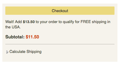
You know exactly how much you need to spend to get free shipping.
There’s no need for their impulse buyers to do any math.
In lieu of free shipping, it pays for your site to be up-front about what shipping will cost. This takes the surprise out of the transaction, reducing cart abandonment.
JetPens uses a Calculate Shipping button for just this purpose.
You don’t even have to leave the checkout page to fill your cart to hit the $25 mark.
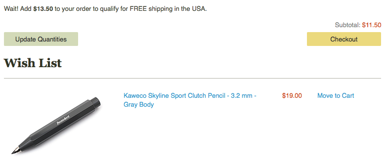
Getting to the $25 mark that signals free shipping is pretty good motivation for most people to spend more money, but once someone is in the checkout screen, do you really want them to leave it? By placing a few items from account holders’ wish list at the bottom of the page, JetPens makes it easy for impulse buyers to double-down. Customers see how much more they need to spend and a great suggestion for how to get there.
If the visitor hasn’t added anything to their wish list, why not add a few inexpensive suggestions of your own?
Case Study: ModCloth
With online retail, shipping information needs to be easy to find. Free shipping isn’t the only reason people convert: they’ll also be more likely to buy if they think it will be easy to return what they bought. Someone doing lots of research on a product may be willing to hunt around for money-back guarantees, but impulse buyers need trust symbols to be much more in-their-face.
ModCloth, an online women’s clothing store, uses the top of its website to embed lots of different trust symbols.
The top of ModCloth’s website covers lots of trust-building bases.
Customer care and shipping information is at the top of every page, and when you visit the page on returns and exchanges, it’s also pretty easy to understand.
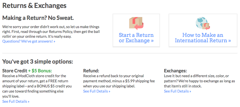
ModCloth’s return policy
Someone in a hurry to spend money may not make it all the way to this page, but she’ll know it’s there, and she’ll know that exchanges are free without even clicking. Why wouldn’t she spend her money if it’s that easy to get rid of something that didn’t work out?
Introducing Scarcity
Scarcity is a term that includes limitied supplies, limited-time engagements, exclusivity and qualifications to buy. It imparts a sense of urgency to a shopping session, and impulse buyers are just looking for excuses to act. Give your impulse buyers excuses to act by making it clear that she will be missing out if she doesn’t buy right now. Remember, impulse buyers see the shopping process as expensive and don’t want to waste their time.
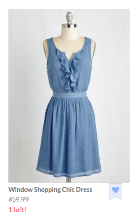
Dwindling stock makes this item much more attractive.
Only one Window Shopping Chic Dress left?! What am I going to wear when I go window shopping this weekend if that dress doesn’t end up in my closet!
Many impulse buyers like feeling like they’re part of an exclusive group. It feeds their egos and justifies the elitist tone they use when they brag about how the rest of us weren’t able to wear the right window shopping dress.
Increasing the Perceived Value of an Impulse Purchase
Free gifts and bonuses add value to a perceived purchase. The gift doesn’t have to be an extraordinary offer. It provides another excuse to act, often increasing urgency.
SheIn hits that impulse buying nail on the head not once, but twice. First, a popover tells you that there’s an opportunity for a free gift.
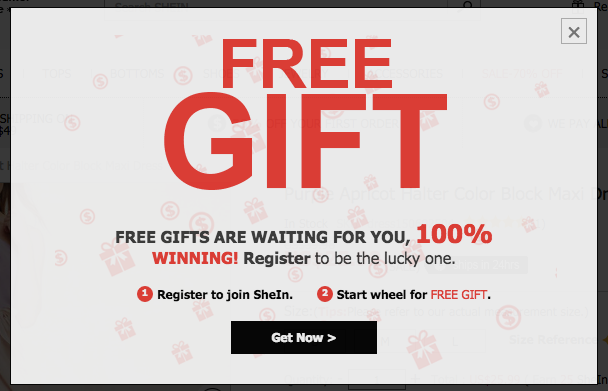
Free gift offer from SheIn
But here’s the fun part. You have to start a wheel for a free gift. So it’s a game!

Shoppers play a game to get a free gift.
This strategy works for pretty much any kind of business, not just retail. SheIn asks you to join a mailing list order to have the chance at spinning the wheel to get a free gift, so it’s a lead-generating strategy.
The Gift of Game
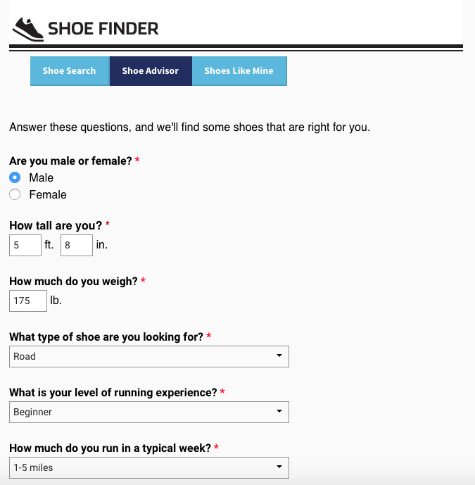
Gamification is much beloved by millennials, a group renowned for their impulsive buying behavior. Quizzes and games make even the most mundane tasks so much more interesting. Let’s say I’m looking for new running shoes, so I search “What kind of shoes should I buy?”
One result is from the American Orthopaedic Foot and Ankle Society. The name alone seems pretty trustworthy. What do they have to say about what shoes I should buy?
Running shoe buying guide
Yikes. This isn’t even half of the article! Luckily, I have another option to help me find the answer to my question.
Runner’s World shoe quiz
Runner’s World magazine makes things so much easier! First I take a short quiz, then it spits out a shoe suggestion for me.
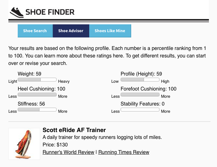
Running shoe suggestion
Runner’s World doesn’t want to sell me a shoe, but if I were on a retail site selling running shoes, how awesome would it be to be able to click “Add to Cart” from this page?
Go Mobile or Go Home
This weekend I had a movie night with some friends at my house because we urgently needed to watch the first Magic Mike movie. We didn’t want to miss any major plot points when we watched the soon-to-be-released sequel.
I rented the movie on my phone using the Google Play Movies & TV app. I tapped the purchase button, and openly lamented to my friends how easy it was to throw my money away. I mean disgustingly easy. Three taps and four bucks of my hard-earned money was gone, replaced by the privilege of having two days of access to a movie I hope my mom never finds out I watched.
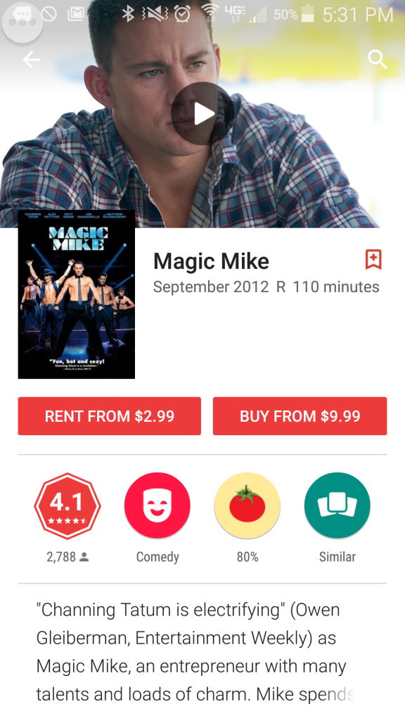
First tap
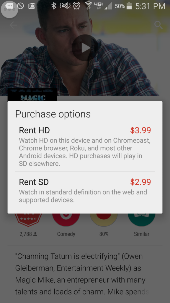
2nd tap…and 3rd tap my money is gone
Voila, I made a purchase I kind-of-but-not-really regret. Your website could have that purchase!
On mobile, fewer people are doing research. They’re either buying, or they’re leaving. I wanted that Magic Mike movie, and I wanted it right then. More obstacles would have meant using a different app or just watching a different movie I already own.
Buying something from you should be as easy as renting a movie on my phone.
Park the things you know about your desktop users. Think about the needs of your mobile visitors as if they were a different animal. They’re not unicorns or dragons or anything, but you wouldn’t put a leash on a cat. They just won’t stand for it.
As an example, Victoria’s Secret realized that promo codes are to mobile users what pull cords are to blow dryers. They’re not the right tool for the job.
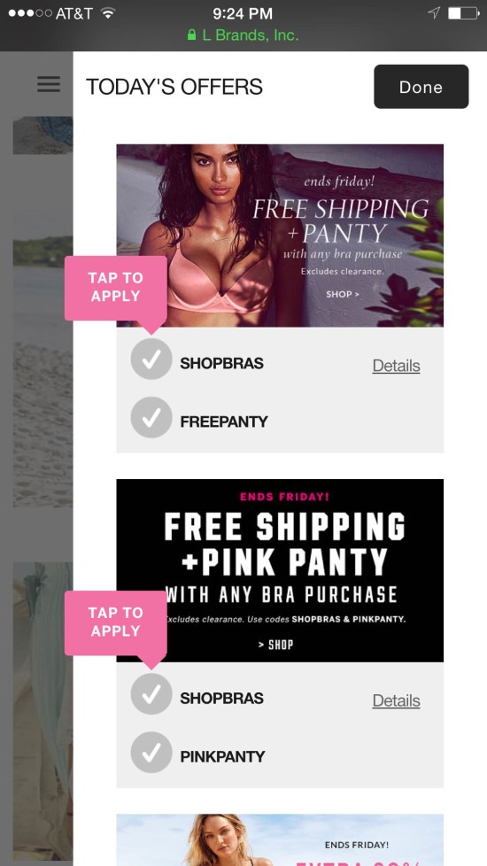
Victoria’s Secret doesn’t ask mobile visitors to enter a promo code.
Impulse Abandoners
Impulse buyers become impulse abandoners when your site doesn’t serve their need to take action. The moment they perceive that a transaction is low value, that the effort is too high, that a purchase is risky or that there is no urgency to take action, they become less impulsive.
It is not manipulative to feed their need for speed. Giving impulse buyers the rationale to act is exactly what they want from you. Why deny them?
Feature image licensed under Creative Commons and adapted for this post.


.")