Web design is about communicating with people who have problems that your offering solves. Science is about making sure you’re not designing just for yourself. If you do web design for conversion, science will guarantee that your new design will perform better. Here’s how.
This is Alice. She’s a web designer. Alice is doing a website redesign. The design she completes is based on research and her extensive experience. She is confident that this new design will make more visitors choose her company.
Alice the Web Designer
Alice works with Bob, the web developer and Cindy, the marketing manager to finalize her design, copy and images.
Alice the web designer, Bob the web developer and Cindy the marketing manager.
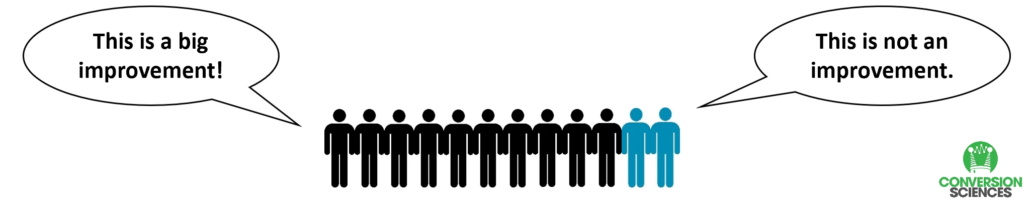
Their boss, Doug, has faith in the team and thus the design. He loops in Emily from Sales. She thinks it is a big improvement.
Yet, we haven’t asked any customers yet. So they invited some prospective customers in to weigh in on the new design.
Most of them thought the new design was a definite improvement.
The focus group was mostly in favor of the new design.
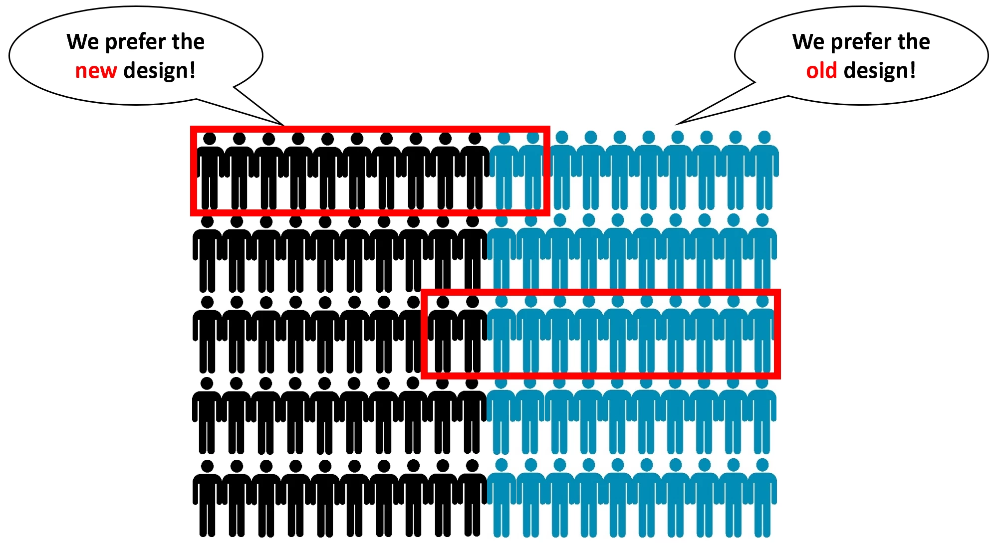
Frank, who worked in reception was concerned. He loved to shop online, and knew that if a product had a 5-star review but had only 12 reviews, he wouldn’t believe that rating.
So, why was 12 opinions enough to believe that this design is actually an improvement? Five of them were company employees, after all!
How 12 people can get it wrong.
Fortunately, Georgia, the company scientist was also concerned. She knew that the internal group was going to love the new design because they had designed it. And he knew that members of focus groups want to like the new design, because they are eager to please.
They’re human.
Instead of replacing the old design with the new design, Georgia setup an experiment. Half of the visitors to the website saw the old design and half saw the new design. Which one would generate the most revenue? What she found was that there was no difference. As far as the company’s prospective customers were concerned, there was no difference.
How did a talented bunch of people, with the help of real customers come to such an erroneous conclusion?
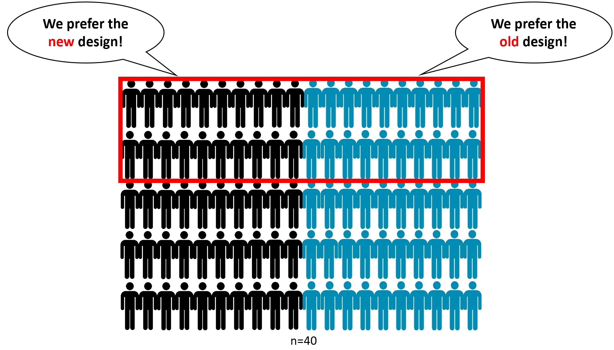
Let’s assume we have 100 people visiting a website. Half of them are more likely to buy with the old design and half of more likely to buy with the new design. You can see that it’s pretty easy to collect a sample of opinions that don’t tell you what is really going on. Pick the wrong 12 people, and you can either bet on a poor design, or throw out a pretty good design.
Most design teams are biased in favor of a design because they created it with no other opinions involved.
Bigger sample sizes mean fewer design mistakes.
We can never ask EVERYONE if they prefer to see the old design or the new one. We have to ask a subset of the population of visitors. Scientists use the variable “n” for the size of the sample we are going to “ask”.
Here’s the problem from a Design Scientist’s point of view.
One designer? n=1
One designer, one developer, one marketing persion? n=3
Add in an executive and a focus group? n=12
At n=12, we are till making mistakes in our design decisions. How big does n need to be?
In our example, a sample size of n=40 gives us more confidence that we are seeing reality.
It’s harder to make bad decisions with larger sample sizes.
Where do we find these bigger sample sizes?
A design scientist has two tasks:
Increase the sample of people opining on her designs.
Increase the quality of the sample of people opining on her designs.
There are three broad ways of getting more n’s to look at your design options:
AB Testing
Trial and Error
Usability Studies
Usability Testing
A usability test is essentially a giant focus group. Thanks to services like UsabilityHub, you can bring 25, 50, or more people to look at your new designs and tell you which communicates better.
Cons: These panels of people are NOT necessarily customers of your product, so their input is less reliable than trial and error or an AB test.
Trial and Error using analytics
To get the “input” of your actual prospects, it makes sense to launch something. Then you use analytics to see if the change made things worse or better. However, you must be willing to roll your new design back if you find that conversions drop with the new design.
We recommend using an AB testing tool to make changes to the page and then use analytics to determine if the change was an improvement. If it was, make the change permanent. If it wasn’t, try something else.
Cons: If there is a shift in traffic, pricing, promotions, competitors, or anything else, your results can be skewed. For example, if your competition launches a sales at the same time that you launch a new design, it can look like the new design is decreasing your sales.
AB Testing
The AB test is designed to overcome the limitations of the other two approaches. It takes it’s sample from your actual web visitors and it controls for changes in the marketplace. For an explanation of how this works see our intro to AB Testing.
Cons: AB testing is limited by the amount of traffic you are getting and requires some developer support.
Guaranteeing your design will outperform the old design.
If you are able to improve the number of brains involved in your web design for conversion, and can bring the brains of actual prospects, there is no reason you should make small sample size mistakes with your website redesigns.
You can guarantee your new design will improve conversions. If your samples say they’re not better, you don’t use them and try something else.
What is the job of an optimizer? Is it just improving conversion rates? If not, what is the goal of a CRO professional and what are the steps of conversion optimization?
Brian Massey, the Conversion Scientist, shares the steps of conversion optimization. He is the founder of Conversion Sciences, and author of the book “Your Customer Creation Equation”.
If you are new to conversion optimization or if you need to take your website conversion to the next level, Brian’s book is a fantastic foundation. It will help you understand the way an optimizer looks at the world and looks at a website.
What is the Goal of Conversion Optimization or CRO?
Let’s start off by talking about what conversion optimization means to me. I don’t see my job as just improving conversion rates, but getting the most value out of every visitor to your website.
In a lot of situations that might mean a conversion to a sale. But even on an e-commerce site, we might want to connect with visitors who aren’t yet ready to buy, so we try to get them to join an email list. We can get value from them by asking them for their name and email address in exchange for fantastic information, a discount, or something else of value.
In the mobile world, a conversion may look like a phone call. Click-to-call is a powerful way for prospects to take action when away from their phone.
There are a number of things we can do to get value from our visitors, and for us, everything is on the table.
The reason I want to lead the life of a conversion optimizer is because we do wonderful things for online businesses. This is probably why we’re so well-liked.
Benefits of conversion optimization.
Benefits of Being or Having a Conversion Optimizer
First of all, we do increase the revenue from the traffic that you’re getting. The net result of that is that it decreases your acquisition costs, your advertising spend.
If more of those clicks that you’re paying for turn into customers, then you get a positive return on your ad spend.
Having a site with high conversion rates often means people are staying on your site longer. They are buying more often. They are typically visiting more pages. Google understands this and rewards you with higher rankings. If people are staying on your site and not “pogo sticking” back to the search results page, well, your organic ranking will likely go up.
We, of course, increase your growth because we don’t just test what goes on your pages. We can test pricing, we can test bundling, we can test new features — we can test the things that are core to your business.
We’ll know which channels are converting best, which things you’re doing well and which you are not. And you can adjust your marketing spend accordingly.
So, conversion optimizers really are wonderful for a business.
Do you know which path your users are taking?
Logically, we might think that a path through our website should look a certain way, but in truth, the visitors want something different.
It’s our job to understand what that desire path is. For instance, in a park like this, people may be avoiding the paved path because it’s concrete which is harder on your knees when you’re running than dirt. It may not just be because it’s the shortest distance.
We want to understand the visitors’ motivations. That is what I spend my days doing. My whole job is to make sure that I’m not using mental shortcuts to make decisions.
Cognitive bias codex.
The 3 lbs. of gray matter between our ears is just packed full of biases, shortcuts, and stereotypes. These biases, stereotypes and shortcuts, cause us to think we’re doing the right things when we’re making decisions about design, or about our products, or about our pricing.
But in truth, we’re doing it wrong for our users. We take shortcuts. We’re not really connecting with what our users want. This whole method, the steps to conversion optimization, is designed to keep us from relying on our biases to make decisions.
The Importance of the Optimizer
When you’re optimizing, you play a really important role in the design process and in your company. You are the one who is double checking the assumptions that are being made. You are the one making sure that those assumptions are what our visitors and our customers want.
The optimizer plays a key role in the design process and in their company.
The Benefits of Conversion Optimization
An optimizer has many benefits. They save time. There’s nothing that wastes more time than launching a campaign, spending your marketing budget on that campaign and then not having it work. So, by doing a little extra work on the front end, collecting some data, you can make sure that your campaigns are going to be more successful so you don’t have to start over and relaunch them.
The Value of Data (and its many uses)
Data is a great way to deal with what we call helicopter executives, executives who feel that maybe the team isn’t making the right decisions. They feel that they have to come in and review your creative and your campaigns, making changes to what you’re doing. Of course, their assumptions are based on the same biases that anyone’s are.
If you are able to say, “Well, we have some data that says this is the best thing,” then they’re more likely to think, “OK, this makes sense. Go ahead.”
You’ve just removed one cook from the kitchen.
How a conversion optimizer should handle agencies and teams.
Oftentimes you’ll get creative from your agency and think, “Is this really effective creative?” Your agency may present you with options and ask you to choose. As an marketer, your answer should always be “I don’t know, go collect some data to find out which one of these ideas is most likely to be the best choice”. This should be the job of your agency’s experimenter. This is a powerful way to manage teams effectively.
Steps to Conversion Optimization: Gathering Good Competitor Ideas
We like to take ideas from our competitors and from other websites that we like, but we often steal bad ideas. Just because our competitors are using them doesn’t mean they’re working.
An optimizer wants to take ideas and test them before stealing them. At Conversion Sciences, we say, “Steal like a scientist.”
Digital Marketing Careers Require Experimentation
If I haven’t made the point abundantly clear, people with the skills of an optimizer are very valuable. And right now these skills are hard to find and expensive. In a few years, these skills are going to be absolutely required. So, if you don’t have these skills, you’re not going to be able to work in premiere digital marketing roles, in digital product management, or run a business that requires the web to succeed.
Experimenters Can Take More Chances
As a conversion optimizer, you can take more chances because you know how to create experiments that allow you to be more creative.
Experimenters take these really creative ideas that would otherwise sound risky, find a way to collect some data, and then understand whether or not that idea is actually going to improve things. You also avoid implementing a bad idea. We call this a “design insurance”.
You don’t have to always play it safe with your campaigns. You can come up with crazy ideas and experiment before you actually launch and take all of the risk.
Being able to take more risks, a CRO expert can get more leads, more sales, and lower acquisition costs.
And, of course, you get more leads, you get more sales, you lower your acquisition costs, you grow your business.
That’s what most people want from their conversion optimizer. But conversion optimizers are so much more valuable.
My day deals almost exclusively with ideas. Ideas for how to improve a website, ideas for how to improve a customer’s journey, ideas for what kind of content we should be putting on the page, ideas for how we should discount, ideas for how we should lay out a page. Ideas for what we should be doing and advertising. For almost anything that’s going to be seen or experienced by the user, there are ideas for improving it.
How to Find the Right Ideas: good reasons to kill ideas
I’m going to walk you through the process of figuring out which ideas are the right ideas.
When we first start with a client, we go through their website and perform an analysis. This includes an analysis of their existing data. We come up with a very long list of what looks like really good ideas for improving the conversion rate.
Our job is to kill some of those ideas and get them off the list so that we can move on to the ones that are good ideas. In fact, the scientific method that I use on a daily basis is designed around this.
The job of an experimenter is to come up with ideas and then find out why that idea is wrong. When you test a hypothesis, you are actually testing against the null hypothesis trying to prove that idea won’t improve things. If you can’t, despite trying everything, then you’ve got a winner.
So, what are the good reasons to kill ideas? We evaluate ideas based on these criteria. Is there a reason that we should keep this idea on the list?
Reasons to Kill an Idea
1. That’s a lot of work
Some ideas require too much work to test and implement. We might say the website needs to be redesigned. That’s very risky because it changes everything. And so we’ll often just pull that idea out right away.
Ironically, this is the way most website redesign is done. 90% of the market is still redesigning websites this way.
They start by hiring a creative agency or bringing in a creative team. That team does a little research at the beginning of the process, and then they make all sorts of design changes based on that research. Then, they push it all out and hope that they made the right choices.
That’s very risky, and so full-scale redesigns don’t stay on our list very long.
2. It’s too small of an idea
Some ideas just aren’t that impactful. For instance, if we had an idea to change something in the footer of a page, we can tell from our heatmap reports that few visitors are seeing the footer area. We would say that’s too small of an idea. It doesn’t have enough of an impact and we’ll drop it from the list.
Likewise, changing the color of a button or changing the font of our headings are low-impact changes. We tend to just get rid of these ideas.
3. No one is seeing it
There are pages on your site that are important to the customer’s journey, but not a lot of visitors are visiting it.
For example, sometimes FAQ pages can be really important to our visitor’s journey. If we had a hypothesis that said we’re going to change the order of FAQ questions, but we looked in analytics and saw that few visitors were actually visiting the FAQ page, we would say it’s probably not a good thing to test.
On the other hand, few people are seeing the checkout process on an ecommerce website, but those visitors are in the process of buying. In this case, we want to keep checkout ideas at the top of our list.
4. I don’t have any data on it
For each idea on my list, I have to ask myself, “Can I find some data on this idea.” This is the question we ask ourselves over and over and over. If I can’t find data on an idea, or I can’t generate data on that idea, then it’s not a testable idea.
A good example might be things on a website that encourage people to visit a physical store. There are technologies to track this cross-channel behavior, but it’s very expensive technology. Even if we have really good ideas about how to drive more people to the brick and mortar store, we really don’t have a way of collecting success data related to that idea. So, that would be something that we would eliminate because we don’t have the data.
Steps of Conversion Optimization: Gather Existing Data
Let’s talk about sources of data. Once we’ve gone through our list, we’ve got things on it which we think are good ideas. We think they are easy to implement or can be implemented in a reasonable amount of time. We think people are visiting those pages, and we think we can find some data on them.
One of the first places I like to look when I’m building a landing page are the client’s paid search ads.
Steps of Conversion Optimization: Gather Existing Data.
Using this made-up example for the U.S. Mint — that’s the part of the US government that prints money — let’s pretend that they’re offering 50% off dollar bills.
Now, you might think this is a crazy offer, better than anything you have. But the truth is that we all have an amazing offer: a great product or service that’s priced right. It saves time. It saves money. It solves a problem. Yet, you still have trouble converting people. Well, don’t be too discouraged, because the U.S. Mint would have trouble giving a dollar bill away for 50 cents.
Go to your paid search team or your advertising team and ask them for a spreadsheet with the last six months or a year’s history of ads.
How many impressions they generated
How many interactions they generated
How many conversions they generated
Go through the data and look for those ads that had a lot of impressions or more importantly, had a lot of impressions AND conversions.
If we look at the third one in our example above, we see it has an interaction rate of 2.8%. That seems like the highest rate, but it was only 37 interactions. This sample size is a little bit too small for us to have confidence in. I’m more interested in those that have 612 or 943 conversions.
It seems that “50% off dollars for a limited time” has a better conversion rate than “Dollar Bills: Buy one, get one.” When I write copy for my landing page, I’m going to favor language that includes “50% off”.
I would not be as excited about “Discounted Dollar Bills” because it had a 0.3% conversion rate and a high enough number of interactions that we can believe that this data is probably accurate.
You see how I can use our ads to understand which words, which headlines, I should be using in my landing pages and in my copy. It’s on my list.
Social media Ad Performance and Conversion Data
We can do this with social media as well. For instance, if we want to put a video on the landing page or video on our homepage, video ads can help us understand what people are interested in.
Use a tool like Ahrefs or SEMrush to look at our competitors’ ads. Find out what words they’re using and if they have a lot of keywords that they’re using.
Previous Email Campaigns Data
Email campaigns are another great source of data. I looked at the subject lines for emails that Conversion Sciences sends. We send emails for new blog posts all the time. I wanted to know which subjects — which titles of our blog posts — were getting the most clicks. I took six months of data and I ranked it based on their click through rate.
Looking at the top ten, we see “writing”, “copywriting”, “persuasion”, “value proposition”, “persuade people”, and “business taglines”. My audience is interested in the words that influence conversions.
I was a little surprised, but we were able to use this data to produce a free copywriting report on how to write copy for conversion writing, and this converts very well for us.
Download these 21 quick and easy CRO copywriting hacks.
In this case, the data really did point us in the right direction. The data created a hypothesis, an idea, and then gave us the data that said you should launch this. Then we used the conversion data, the number of leads that we’re generating on our website, as the final proof that this was a good idea.
Steps of Conversion Optimization: User Testing
Another step in conversion optimization is user testing. Everybody thinks that a conversion optimizer spends most of their time split testing. This is the best data we can generate, the best tools that we can use. But in truth, I want to gather data faster and doesn’t require me to use precious visitor traffic.
We only want the most important and best ideas to go to AB testing while using user testing to figure out which of my creative ideas is best.
Our user testing includes things like a 5-second study. A 5-second study works great when I have three or four different headlines and three or four different images that I want to consider for a landing page.
We’ll use a service like UsabilityHub or Helio and we’ll ask for 25 people to come and look at each of our mockups. The 5-second test works like this: test subjects get to see the mockup for five seconds and then it disappears.
But five seconds in the human brain is quite a long time. After the five seconds is up, we’ll ask questions like,
Does this business seem credible?
What do you think this business does?
Do you know what we were asking you to do?
Where would you click if you were going to take action?
Can you remember any of the bullets or any specific information on the page?
We can score these twenty five people in each of these areas. The image and headline combination that scored the best tells us that it’s probably the best idea.
We now have some data from real world people that is telling us which idea to take to an AB test. There might be a couple of these that score well. So, we want to take the two best ideas to an AB test, but it also means we don’t have to test the others and waste traffic on those.
There are a number of tests that you can use for user testing. Usability hub or Helio, offer a question test where the visitor gets to look at the page as long as they want and answer questions.
A first click test measures how quickly someone can find where they’re supposed to click based on the prompt that you give them. How many of them get it right in test layout or how clear the call to action is on your page.
User testing tools like UserZoom or UserTesting.com allow us to set up a scenario and ask the visitor, for instance, to go through and purchase on a website. We watch them as they try to complete the task. We see where they get confused, where they get tripped up. They’re talking out loud as they’re going through it.
You’re going to see issues in these user tests that you wouldn’t catch otherwise. It can be very enlightening. We can really learn quite a bit from that user testing videos.
More Data Sources: User Intelligence Tools & Reports
Another step of conversion optimization is to look through user intelligence reports. User intelligence is different from user testing.
User testing uses strangers and pretenders. These are people who aren’t actually trying to solve a problem, but we’re using them as a focus group to play with our creative and see how effective it is at communicating with human beings.
User intelligence tools are actually watching your visitors as they interact with your website.
Analytics has the most obvious user intelligence data. Google Analytics is a great behavioral database. It’s all the people who are coming to your website to try to solve a problem. It shows you where they landed, what channel brought them, what pages they visited, how long they were there, where they left, if they bought, how many of them bought, what their computer setup was, what browser they’re on — all of this information is in Google Analytics.
It’s a great database for asking questions. I probably spend at least 10 to 20 percent of every day in analytics, and if I’m working on an analysis, I’ll spend the entire day in analytics, it’s such a rich source of data.
The other thing we use is what are called heatmap reports. They tell us how far the visitors are scrolling when they visit a page, where their mouse is moving on a page, and where they’re clicking. These are great tools for answering specific questions about a page.
You don’t have to be a Ph.D. in science to understand them. If you can read a weather radar map, you can read a heat map.
Here is an example.
Heatmaps of a website page for golf resort in Hawaii.
This is a resort in Hawaii, a golf resort. They assumed that since it’s a golf resort, people who are considering booking a room are going to be interested in golf.
On this page, which lists all their specials, they listed the golf specials at the top. When we went in and looked at where people were clicking on this page, we found out that “Free Breakfast” was most clicked item, even though free breakfast is down near the bottom of the page.
People don’t behave the way you think. What is the cost of breakfast? At this resort, it might be 40 or 50 bucks. If you’re going to save a couple of hundred dollars on golf, it would seem to be a better value, right? Not according to the visitors.
These are the sorts of insights that conversion optimizers love to find.
I also spend time watching session recordings. With session recordings you get to watch visitors as they’re working through your site. You see where their mouse is moving and what they’re clicking on. It takes a while, but you find things that you wouldn’t otherwise discover.
Session recording of golf rates page.
If you watch a bunch of these, you begin to understand what’s bothering your visitors. If I’ve got a specific idea that I’m trying to remove from the list, I’ll spend some time watching session recordings.
Sticky heatmap.
A more advanced conversion optimization strategy is running an eye tracking study. Now, this doesn’t work directly with your website, but you can bring people from your website if they’re willing to take a look. And it’s just amazing that this technology exists because eye-tracking studies used to be so hard.
Submit a mockup to a company called Tobii, and they’ll bring 25, 50, 100 people to look at it. They’ll record what the visitors see on the page using laptop cameras. Laptop cameras have such high resolution that we can tell where people’s eyes are looking on the screen.
We can see what people linger on, what ideas they like, what offers they like, and where there are images that stop them on the page. This information is really valuable if you’re trying to critique your page layout.
Gamification: AB Testing
The last thing that I spend time on is AB testing. Because if we’re going to take something to an AB test, as it’s the best data we can collect, we only want to take the best ideas. And it takes quite a bit of work to get AB test results.
Here is an example of one that we did. We worked with a company called Automatic and they had a plug that plugs into your car and connects your phone to your car’s computer. They came out with this new Pro version, but everybody was buying the Lite version.
Why wouldn’t people buy the Pro version? Sure, it’s more expensive, but it’s so much better. Maybe we’re not communicating how much better it is effectively.
We did a “Thank you” page popup survey asking, “What made you choose Lite instead of Pro?” We found out that people didn’t understand the value of the Pro features.
We created a version of the product page was simpler. It was a shorter list of features, and we only highlighted the things that were most different. This is something you should consider any time you’re offering multiple plans or products on a pricing page.
We designed an AB test. One half of the visitors saw the original page, which we call the Control. The other half saw our variation. The result was a 13% increase in conversion rate for our variation. We also saw an increase in revenue per visit because more people were buying the Pro version.
A/B Testing: automatic pro vs lite.
This achieved exactly what we wanted. The data we collected during the AB test was very reliable, because these tests are designed to eliminate as much randomness as possible.
What are the Steps of Conversion Optimization Summary
If you are going to be a successful digital marketer, you are going to be an experimenter. Your ability to use the tools and data of the trade will determine your future in a data-driven marketing economy.
All you need to know about mobile call-to-action buttons to increase conversions. Don’t miss out on these call-to-action (CTA) button design guidelines.
The world is mobile. Some users may not even own a desktop and, with the probable exception of work, they prefer mobile. And we say “probable” because nowadays some workplaces offer tablets. So, let’s not forget about tablets.
You want every visitor to count towards your conversion goals, and this includes your mobile conversion goals.
Mobile best practices don’t really exist. Every audience is different, and we have the tests to prove it. What works for one business doesn’t always work for others.
There is an almost infinite number of things that you can consider for testing on a website. And many of them aren’t worth testing.
We are going to share some design ideas for your website’s mobile call-to-action buttons, so you can test them and discover what works for yours.
Conversion Sciences’ Guidelines for Mobile Call-to-Action Buttons
We’ll split these ideas into three major categories: placement, copy, and design. You can elaborate your own list of ideas — we call them hypotheses — based on what you know about your visitors and your website that could result in a lift in conversions.
Remember, there are no best practice unicorns hidden in this article.
Before delving into CTA button placement, copy, and design, let’s review some mobile conversion testing concepts.
Mobile visitors are in a fundamentally different context than their desktop counterparts
Most mobile websites are responsive designs, designed first for the desktop. This only gets you 50% of the way to a high-converting mobile website. Why? Because a mobile visitor is immersed in a context that is essentially different than the one for desktop visitors. They are waiting for a table, standing in line at the bank, or relaxing on their couch. Often, they are better positioned to start a conversation than to finish a transaction.
This is one reason we often see mobile conversion rates that are a half or a quarter of desktop conversion rates.
As we test for conversions the mobile version will evolve and differentiate itself from the desktop version. We have to make different decisions on which calls to action to use, which calls to action to prioritize, where to place them, whether to use text or icons, and so on.
It is not obvious how to design your mobile call-to-action buttons to maximize conversions.
Consider the symbol for infinity. The infinity symbol represents to us the fact that there is an almost infinite number of things that you can consider for testing on a website. From the operating system to the type of visitor and everything in between.
The number of tests we could elaborate could really reach infinity.
Placement, size, call to action text, stickiness, and frequency all combine to increase the number of possibilities. And don’t forget to consider interactions with other elements. Is that chat icon covering up your mobile call to action button?
Note: In the following sections, we run the design tips, ideas and guidelines from the top organically ranking articles on mobile call-to-action button by the conversion scientist himself: Brian Massey, who’s been a conversion optimization expert since 2007.
Discover what he has to say on mobile call-to-action button placement, copy and design. You’ll be surprised and learn a ton from his answers.
How to Identify the Optimal Placement for your Mobile CTA Buttons
Your visitors’ thumbs are spending too much time on your screens and your mobile conversion rate is suffering. – Brian Massey, Conversion Scientist®.
Conversion Sciences Team: mobile call-to-action button placement best practices
We found articles on this topic that recommended organizing mobile CTAs according to their priority. For example, on an ecommerce site, you should order these calls to action: “Continue shopping”, “View your cart” and finally, “Check out”. The literature said they should be ordered to follow eye movement, from top to bottom,
Is this correct and what guidelines would you give somebody regarding mobile call-to-action button placement?
Brian Massey: What you mention isn’t wrong on desktop screens, but on mobile it’s very different.
For mobile websites, the first question we ask is, which call to action do we optimize for.
How hard is it to take action on a mobile device? It’s pretty hard, even for digital “natives”. Forms are just more difficult to fill out on a mobile device than using a keyboard.
This is one reason for lower mobile conversion rates. In general, the longer your forms, the lower your conversion rates. This problem is amplified by small digital keyboards.
On one particular ecommerce website that was researched, visitors have to go through a four step registration process to buy from this e-retailer on desktop.
If your signup process requires them to find a piece of information, such as a password or account number, your mobile conversion rates will drop.
On mobile, it may make sense to prioritize for something easier to complete. We have to find out which call to action to optimize for. For example, we may find that the best option is optimizing for collecting emails.
Sales funnel or full funnel conversion optimization? Which should you use and when? It all depends on what you want to understand.
Full funnel conversion optimization – or the Conversion Sciences Profit Funnel™ – provides the analysis and insights needed to help positively impact your business bottom line. Analyzing a sales funnel helps improve those issues found in a specific buying process.
There is nothing wrong about analyzing a sales funnel conversion rate or a sales funnel model for a specific segment of a customer journey. But your online business will definitively benefit from performing a Profit Funnel™ or full-funnel conversion optimization as well.
A highly experienced team of conversion experts can leverage both models when optimizing, instead of narrowing the view and hurting profits. An inexperienced conversion consultant will only see a siloed series of sales funnels, evaluate them independently and make decisions based on their own unique ROAS instead of their interactions.
Let’s review the key differences between sales funnel and full funnel conversion optimization or Profit Funnel™. We’ll begin with a great example of both models, a definition of a full marketing funnel. Finally, we’ll cover their differences in scope and the metrics used by each funnel.
Happy customers means returning customers. The starting point for full funnel conversion optimization is the customer blueprint and guess whose CRO audit services include a map of the customer journey for your online shop?
Example of Sales Funnel vs Full Funnel Conversion Optimization
Imagine an addiction treatment center that offers both low-cost at-home testing kits and treatment programs. Their at-home drug testing kit sells for $10, and it costs $5 to manufacture and ship. Their treatment programs start at $15,000.
They have an effective social media presence, paid campaigns to engage and attract their target market. And they also provide valuable resources for people with addiction problems and for their loved on their website. These range from informational articles to online quizzes to help find out whether or not one is suffering from an addiction and what is the best course of action.
Ok. Time to tackle sales funnel optimization. If they analyze their PPC sales funnel they will realize that it is costing them $20 in ad spend to convert each home testing kit sale. This added to the manufacturing and shipping costs may lead them to determine that this $10 sale is costing the company $25. But they are not looking at their profit margins, they are simply calculating Return on Ad Spend or ROAS.
Thus, they may decide to turn off the ad spend and stop this failing campaign because they “lose” $15 per sale. Or they may attempt to improve a Google Ads campaign that is already performing quite well.
But what if this addiction treatment center looks at the full-marketing funnel or Profit Funnel™ instead?
They would find that 20% of their customers have repeated their kit purchase every 3 months.
By the same token, they have not estimated the impact that their content development and social media efforts have on those conversions. And they were attributing the sale to the last touch-point.
As the buyer journey is not limited to a single channel, analyzing a single sales funnel could narrow your business focus and marketing assessment scope.
Moreover, this treatment center finds that 2% of the people who purchase their $10 test later sends a loved one to their center for a $15k treatment program. Those $20 in ad spend for each testing kit sale got the family to notice their services and inquire about their drug-rehab program. Therefore, for every 100 tests they sell, an average of 2 patients will join their treatment program generating a minimum of $30,000 in revenue.
Before I became the CMO, I was more focused on how we were spending our marketing budget than on how marketing could help drive long-term business objectives.But thinking like this holds businesses back. Marketing should be valued for its long-term potential, rather than its short-term efficiencies.
So, What is Full Funnel Conversion Optimization or Profit Funnel™ Optimization?
As we have noticed, a full funnel evaluates the 360 degree customer journey with a company or brand. Its goal is not only to acquire a customer but also to understand, nurture and improve their relationship and experience with the brand.
It focuses on not only pre but post-transaction because it takes into account how this will affect the probability of increased number of subscription renewals or sales, lower customer rotation, lower customer acquisition costs, and increased profit margins.
As we can clearly see, even though it’s called a funnel, this model looks more like an infinite loop with many potential touch-points throughout the buyers journey, over time and across a multitude of devices and online/offline experiences.
Have you even thought of people interacting with your site or buying from you via Alexa? Photo: Grant Ritchie via Unsplash.
1. Sales Funnel vs Profit Funnel™ or Full Funnel Optimization: Differences in Scope
One of the main differences between sales funnel and a full funnel conversion optimization is its scope. The oftentimes narrow span of a sales funnel is overshadowed by the number of elements or touch-points that a Profit Funnel™ considers.
Let’s check them out.
Single Path vs Infinite Loop: Are you optimizing for Omni channel yet?
The most evident difference between the sales and the Profit Funnel™ models lies in their reach. Highly restricted to a specific conversion path for the sales funnel versus a very broad view of the customer journey for the latter.
While most sales funnels are focused on a single transaction (such as a lead, sale or subscription) the full funnel or Profit Funnel™ acknowledges the entire lifetime of a potential customer or client. Its purpose is to allow us to take a step back and look at the entire customer journey or full marketing funnel and help optimize by what is most profitable without discarding the customer experience.
One Decision Maker vs Multiple Stakeholders
Have you been optimizing for a single decision-maker? Maybe you were leaving some marketing personas out of the equation. The higher the ticket price, especially for B2Bs, the higher the likelihood of having more than a single decision-maker involved in the purchasing process. Most companies will include different stakeholders’ input through the funnel and each one of them may further or delay that coveted B2B sale.
Sales funnel conversion optimization targets one person. Profit funnels recognize there is often more than one decision-maker.
Conversion Sciences Profit Funnel™ recognizes and accounts for this fact. Trying to optimize a single funnel to convert this lead is short-sighted, when understanding the 360 degree customer journey and optimizing for it, will significantly increase conversions and boost profit margins.
We often find – when auditing a client’s conversion efforts – that their sales funnels don’t include mobile customers. Addressing this gap via mobile conversion optimization efforts has increased their profits manyfold.
The Profit Funnel™ recognizes the value of determining which of those platforms holds the highest potential for each particular conversion and finding a way to best optimize each path.
Sales funnels often focus on increasing conversions on a certain page on either mobile, tablet, or desktop. Thus, leaving out the reality that customers will interact with your brand, product or service in multiple ways and through as many devices as exist.
Have you even thought of people interacting with your site or buying from you via Alexa?
Full Funnel Conversion Optimization Enables a More Personalized Online Experience
The data-driven strategy of optimizing the full marketing funnel helps you identify consumer segments. Behavioral information can be collected in-store, online, and post-visit. The insights derived from this analysis helps you craft and deliver online personalized experiences to boost conversions and increase their contribution to your bottom line. All the while deriving insights to improving your marketing strategy.
“You are engaging with the consumer on an intimate level — they are telling you what products are interesting. That customer data is one of the most important things to grow your brand.” – Kate Kibler, Timberland’s VP of direct-to-consumer.
For high-traffic sites, Conversion Sciences offers the latest martech stacks – ML and AI-powered – via the Conversion Catalyst AI™. Our Conversion Catalyst AI™ builds a predictive model that identifies which visitors are ready to buy, and delivers the perfect experience so that they are more likely to buy from you. So you can deliver the most optimized experience be it on your website, on wearable devices, voice search, augmented-reality or any of the myriad of experiences the IoT brings us.
Full funnel analysis and optimization will deliver a more cohesive personalized experience to your online customer segments.
2. Sales Funnel vs Full Funnel Conversion Optimization Metrics
It’s hard to take a look at your full marketing funnel and try to gauge how well it’s working besides ROI and profit margins. But following those metrics without fully understanding which effort or efforts made the difference, is no way to run a business either. But lucky you. Full funnel is optimized with your bottom line in mind and a bespoke full funnel attribution will help you identify what’s helping and what’s hindering your conversions.
Therefore, the difference between sales funnel and full funnel conversion optimization is that you will end up concentrating your marketing spend on those efforts who bring in profitable returns. Much better than looking at a measly conversion rate. right? ;)
Sales funnel conversion optimization targets one person while Profit funnels recognize there is often more than one decision-maker.
ROAS vs ROI
Are you narrowing your business focus down to sales funnels and conversion rates? Are you making decisions that affect your whole business by a simple ROAS? Or are you leveraging a 360 degree customer blueprint to improve your company’s profit margins?
In the addiction treatment center example, when the sales funnel was not profitable (its ROAS was negative), they could have shut down the ad campaign. But when they looked at the full funnel (in-patient treatment registrations), the ad investment was profitable and it justified the initial losses in the funnel. It had a positive ROI.
Thus, by using both metrics, you can isolate those efforts whose ROAS may be positive but not their ROI, which takes into consideration not a single digitally advertised campaign but how each contributes to the business profit margins. And you can spare from killing efforts with negative ROAS because, in the end, their revenue-generating power is much larger than the one calculated from the revenue from ad campaign/cost of ad campaign.
By doing so, you change the focus to driving business performance, not just advertising performance.
Single Attribution vs Custom Attribution
Going back to the addiction treatment center example. There are things they do that contribute to their bottom line – such as informational blog posts, quizzes, etc. But their attribution model assigned the conversion value to a single Google Ads campaign.
People have several contacts with a brand before they even consider converting on that landing page, clicking on that PPC ad or that Instagram shoppable image. Which means that any and all contributions along the 360 degree funnel, or full funnel or Profit Funnel™ must be taken into account and their value toward each of the conversions (testing kit purchase, treatment) attributed properly to measure its impact on revenues and on profit margins.
While a single touch attribution model is a fast and simple way to allocate credit to a campaign, full funnel must use a bespoke or custom attribution model to understand what is working and what is not.
It’s common yet dangerous and naive to make assumptions about which touchpoint to attribute credit for a conversion. Oftentimes these assumptions are created from unrecognized personal bias and proven false through data analysis. This is one of the biggest reasons that analyzing all metrics is vital to a company’s long-term success.
How do you bring a data-driven approach to your website redesign? BigCommerce hired Chris Nolan to do just that. Here’s how he used data to drive a Market-first redesign.
When we lose an employee to another company, I feel a mix of pride and saltiness. I’m proud that working here turns otherwise ordinary men and women into highly valuable data-driven performance marketers.
But I hate getting my employees poached.
In 2018, it was time for one of our employees to step into a bigger role. After working with us for years, Chris Nolan (not the Batman director) stepped into a big role in a company with Big in its name.
Chris was tapped to be the cornerstone hire for the growth team at BigCommerce. We miss him, but have enjoyed seeing how a Conversion Scientist takes on a big organization like BigCommerce.
His challenge is the same challenge that “woke” marketers are facing in every industry. How do I get an entrenched culture to adopt data and testing.
You might say that Chris jumped out of his lab coat and into the fire with BigCommerce, as they recently redesigned their entire site. There is no bigger challenge to a growth marketer than an “all in” redesign.
BigCommerce homepage before the website redesign.
BigCommerce homepage after the website redesign
I invited Chris to come onto the podcast to share the challenges and triumphs of a new hire nudging a culture from the bottom during a website relaunch.
Buckle up.
Chris is the Senior Growth Strategy Manager at BigCommerce. Businesses build their e-commerce websites on BigCommerce technology. They recently completed a website redesign.
Chris started his marketing journey because he had a passion for human behavior. This episode is jam-packed as he walks us through agency relationships, differentiating mobile from desktop sites and how to think ‘market-first’ to get the right site experience for your next redesign.
Self Care Tip
Championing change in an organization is a long journey, but the victories come all along the way. So, when you get back to the office, do something to take care of yourself. Book a massage. Put a meditation session on your calendar. Invite a close friend to your favorite restaurant. Get a jog or workout in.
These are scientifically proven ways we make ourselves better marketers, too.
How is conversion optimization ensuring that website redesigns always deliver an improvement in performance? Brian Massey and Joel Harvey can tell you. And they do.
Poker is one of those games that, like digital marketing, requires a left-brain/right-brain approach. To begin with, good poker players know the percentages. They know that the two four’s in their hand gives them a 12% chance of winning in a typical game. That’s their left-brain, data-driven knowledge.
Then you add in all of the right-brain stuff. Emotion. Reading the other players’ faces. Controlling your own face. Tells. And past behaviors.
Yep, that’s digital marketing. But there’s one move that throws all of that out the window.
You may have seen it in the World Series of Poker on TV, or in a James Bond movie. One player pushes his entire stack of chips into the center of the table and says, “All in”. What he’s saying is, if he loses this hand, he loses everything. All of the other players have to ask themselves, “WIll I match his entire stack?” or should I get out now.
Going all in smashes everything. It may mean that you’re ignoring the data in one big high-stakes bluff. Or it may mean that you’re trying to ratchet up the emotion, scaring the rest of the table into making a bad decision.
There is an equivalent to “going all in” in digital marketing as well. It’s called a website redesign.
This is one of the biggest budgeted projects a company will do. When someone throws a lot of money at the marketing department, it can be hard to resist.
Sure, it could have a huge impact on the financial prospects of the firm. It can also cause you to lose everything.
Poker players have one advantage over digital marketers when going all in: They can see their cards. They know their percentage. Digital marketers? Well, they have past performance from the current site..
Joel and I are talking website redesigns today. And we’re going to tell you something that may blow your mind. Website redesigns don’t have to be an all or nothing hand. You don’t have to push all of your budget in and wait 3, or 6 or even 12 months later.
Listen to find out how we stack the odds in our favor, guaranteeing a winning hand.
The website redesign needs to be profitable – not pretty.
Users tell you what they think you want to hear.
Slow and steady wins the [website redesign] race.
Demand data.
When an agency comes to you and asks you to pick something, that’s an opportunity for you to say, “Wait a minute! You guys go off and collect some data and tell me which one of these is going to be victorious.” You shouldn’t be guessing. They shouldn’t be guessing.
Website Redesign Tip
The all-in approach isn’t just limited to website redesigns. Individual campaigns are usually all-in affairs as well.
When you get back to the office, open a spreadsheet and start writing out the assumptions that you’re making when designing that email, social media ad, or landing page.
You should quickly have a few dozen.
“We need to be clever in our headline”
“We need to have a picture on the page”
“We need icons on our website.”
“Video is required.”
Many of these may be well supported by past experience or best practices.
For each, you should ask, “Do I have a way of finding out if this assumption is a good one.”
You may be able to look at the performance of past pages. You may be able to see which email subject lines worked best in the past. You may create different versions of ads and see which delivers the best result.
Now you’re looking at your cards, and you’ll rarely win a hand if you don’t.
When considering investing in a web business, consider the following.
Traffic source: Is it dependent on free search?
Proft
On-going development: Does it require additional investment?
Dependence on Third-party API’s: Facebook, Twitter and others can change access to data at any time.
There are other considerations for website due diligence as well.
Calculate Revenue per Visit
The Revenue per Visit (RPV) is the revenue generated by a site divided by the number of visitors. If this number is small, you may have trouble building traffic, because the cost of the traffic is higher than the revenue.
For a better analysis, consider measuring Profit per Visit.
Avoid Traffic Arbitrage
If the site is not something you would use, you might have a business built on traffic arbitrage. Arbitrage is acquiring traffic, and then sending it advertisers or affiliates for more than you paid.
This is not a web business.
Does the Website have a Future?
Sites with a limited future are not a good long-term investment. When performing website due diligence, be careful of sites that are at the mercy of time or other businesses.
Websites that focus on a single event have a built in expiration date.
Sites that fix something in someone else’s product can be eliminated by upgrades to that product.
Sites tat provide a product that is simply “better” than the competition can be marketed out of existence
Websites that depend on loopholes should be avoided, as loopholes can be closed.
Avoid trying to figure things out after you buy.
— Bryan O’neil, Flippa.com
Website Due Diligence: 7 Business Buying Myths
O’Neil offer seven myths about buying a business that you should avoid.
Myth #1: The site’s backlink profile is important
Dependence on organic traffic is dangerous.
Myth #2: Financial verification is most important
Businesses with good financial verification can fail if they don’t have a future.
Myth #3: Escrow can save you from a bad decision.
Escrow is where you give money to a third party during a period of inspection and verification.
Do your due diligence before you enter escrow. Don’t make yourself a target for scammers.
Entering escrow also tie up your capital, limiting your options.
Myth #4: Website due diligence is just too expensive.
Due diligence is expensive, especially if done by a third party.
But, when you compare it to the purchase price, it can be quite affordable.
Calculate your Website Due Diligence Percent:
DDP = Cost of Due Diligence / Purchase Price of Website.
Myth #5: Screen shots are viable proof of financial performance.
Business owners can forge screen shots showing success. This is a sign of a scammer.
Make the seller jump through hoops.
— Bryan O’neil, Flippa.com
Myth #6: Your broker can do due diligence.
Avoid any broker that claims they have done due diligence for you.
Brokers work for the SELLER.
Myth #7: You can rely on apps to do your website due diligence.
Nope. You need the human element in the process.
Due Diligence when Buying Websites by Bryan O’neil of Flippa.com
Here is my instagraph infographic of his presentation on due diligence mistakes when buying Websites.
Due Diligence when Buying Websites by Bryan O’Niel
21 Quick and Easy CRO Copywriting Hacks
Keep these proven copywriting hacks in mind to make your copy convert.
Running a business website is no different from a Monopoly game. You have scarce resources to spend building the site and attracting traffic. Find out how to optimize for scarcity and win the game!
Monopoly is the quintessential game of American capitalism. For better or worse, it focuses the player on one goal: maximizing the number of dollars in your pile. Everyone has their own strategy and their preferred properties to own and build. Your little sister may only buy properties if she likes the color.
Excellent monopoly players learn their opponents’ strategy and then adapt to respond to the environment they are in.
If you look beyond the “greed is good” focus on money, you will realize that playing the game teaches the principles of scarcity and optimization.
The number dollars you start with is scarce. You must make the most of your limited resources.
You want to be ready when lady luck glances your way. When a dog, a car, or a hat finally lands your property, you better be ready.
Running a business website is no different. You inevitably have scarce resources to spend building the site and attracting traffic.
And when those visitors finally land on your site, you better be ready. This is the job of optimization.
If you viewed your web page as a Monopoly board, would it change your priorities and behavior?
Like houses and hotels, would the right elements be on your page be there?
Too often, we don’t think about our web pages as scarce resources that have to be optimized. Too often, we use our little sister’s “pretty property” strategy. Trust me. She still hates to lose.
Discover how to optimize for scarcity and grow your business.
What is Scarcity
Scarcity means having less resources than needed to achieve a goal. In Monopoly, we can’t own all the properties and have hotels on all properties. We have to deal with scarcity. Our money supply is limited, as is our opportunity to buy properties. The desire to compete brings out our analytical nature and we scheme to make the most of the resources we have as opposed to the resources we want. We do this because we know we have an opponent that is actively working to undo us. Again, do we think about our web page the same way?
Examples of Scarcity on our Web Pages
In reality, we do have opponents in our web strategy. Not just one, but many. In fact, we usually have more opponents than competitors. Some of these opponents include:
Limited attention span
Lack of common reference and knowledge base
Low-resolution computer monitors
Negative emotional association with specific words or images
Slow connection speeds
As you think about the opponents listed above, you will recognize scarcity working against your ultimate goal. Vigorously compete against these opponents on your site with the same vigor you compete in Monopoly, and you’ll be more likely to “pass GO and collect $200.”
How to Optimize for Scarcity
Something amazing happens on the Monopoly board that doesn’t naturally happen on our web page.
In Monopoly, we quit caring about how glamorous a property is and instead focus on how much money it will make for us.
In contrast, it is the very rare individual who walks into a web planning meeting without being focused on making the most beautiful page possible. If we played Monopoly the same way, we would focus on acquiring and building hotels on Boardwalk and Park Place and be done. If you try this approach, either in Monopoly or on your website, you lose.
If you don’t pull your weight, you’re gone!
Without emotion, we require properties to pay their way. They have a job to do and we expect them to do it well. The properties’ job is generating revenue.
Is there an element on your web page that isn’t pulling its weight? As optimizers, our job is to identify the converting elements on a page and remove the non-converting elements.
How to Optimize for Scarcity: Testing to see which properties are performing
Such was the case for one client’s site, when we set out to improve the home page. We followed this process to find out which elements led to conversions:
We set up Google to score on bounce rate while watching conversions.
We used click-tracking software heat mapping to identify content that was not getting clicked. This website has 4 clickable icons that take the user to additional content. We found that the 2 outer icons had low activity and decided to test them against alternate icons.
The experiment executed quickly with the following results:
10% improvement in bounce rate
56% improvement in conversions
Fig 1. Small changes have a big impact on conversions.
That felt good – let’s do it again
After experiencing success, it seemed like a good idea to try again. This time we identified one icon that was under-performing, so we replaced it with another one that led to a converting page. The result here is interesting. Looking at the heat map alone indicates the replaced icon is more desirable. But looking at the numbers reveals it was not the right choice.
Fig 2. More clicks do not necessarily mean more conversions.
As shown on the heat map above, replacing the 3rd icon attracted many more clicks on the “B” version of the page. However, both the bounce rate and the conversion rate took a hit.
Bounce rate degraded 4%
Conversion rate decreased 56%
This experiment shows why it is essential to test and scrutinize the results. Two nearly identical hypotheses with two nearly identical changes led to opposite results. My initial inclination was to ignore the results and push the change through. But I put on my Monopoly head and determined the measurable results of the change should trump how I felt about the change.
No Experiment is a Failure
It would be easy to walk away from the second experiment and view it as a total loss. In the same way that losses are our teachers in Monopoly, losses should be our teachers in web optimization experiments. Just as every Monopoly opponent is unique, our clients and website visitors are unique.
To better understand the behavior we observed, we sought to learn more by asking some basic questions:
Why did higher clicks on the replaced icon also correspond to a higher bounce rate? (Hint: something else didn’t get clicked as much!)
What was appealing about the new icon?
Why did the site conversion rate drop?
What was the net gain/loss of each individual conversion metric?
Did the new copy corresponding to the new icon have a negative impact?
Would alternate copy change the site performance?
Did the new icon and copy add clarity and relevance?
Did the new icon and copy add anxiety or distraction?
It is important to learn from each experiment regardless of the results. Applying this discipline is critical in understanding the unique functionality of your website and what increases or decreases conversions.
Failing to learn from a “failed” experiment is like failing to learn the tactics of your Monopoly opponent. You will face them again, and you want to be prepared when you do.
So What Should You Do?
Like many 12-step programs, the first step is to acknowledge you have a problem. Say out loud, “I care more about how pretty my web page is than how much money it makes.” Let that sink in and prepare to change. Make a personal commitment to website profitability based on hard data. Then approach your web pages with the kind of profit-focused attention to scarcity and optimization that wins Monopoly games.
Make a list of the individual components on your web page – especially above the fold.
Write the purpose of each component next to it.
Ask yourself if each component contributes to profit – and eliminate those that don’t.
Ask yourself if there is anything that could replace the existing components that would drive more profit.
Test, test, test.
Nobody is immune to personal biases and individual favorites. If you want to maximize the functionality of your website, you need to put a structure in place that always tests and always trusts data over opinion. When you earn how to optimize for scarcity, you win. When you make a habit of doing that, you will be the same formidable opponent that you are in Monopoly.
21 Quick and Easy CRO Copywriting Hacks
Keep these proven copywriting hacks in mind to make your copy convert.
Fitt’s Law states that the time it takes to move a mouse to a CTA button is a function of the distance to the button and its size. Just like shooting pool.
According to Fitt’s Law, clicking a button on your site can be modeled like a pool shot. It’s a fun way of saying that you should make buttons big and put them where the visitor expects them to be. If you’re looking for good ideas for testing button design, consider the game of pool.
Most of us have at one time or another found ourselves at the end of a pool cue with “a lot of green” between us and the ball we want to sink. There is a lot of table between the cue ball and the ball we want to hit just right.
Thanks to an excellent article on Entrepreneur.com, I’ve discovered that visitors to our website may be experiencing the same thing. Author Nate Desmond introduced Fitt’s Law, which he states this way:
Fitt’s Law proposes that time required to move your mouse to a target area (like a sign-up button) is a function of (1) distance to the target and (2) size of the target.
In a game of pool, the distance to the target changes constantly. This is equivalent to the distance from where a visitor’s mouse is and where your call to action button is.
In general, the rules of a pool shot are pretty simple.
Fitt’s Law Corollary: The Closer the Cue Ball to the Target Ball, the Easier the Shot
It’s easier to accurately hit a target ball that is close to the cue ball.
It’s counter-intuituve that the distance to the hole doesn’t matter as much as the distance from the cue ball.
If you strike the cue ball hard enough, it doesn’t really matter how far the target ball is from the pocket. What does matter is how far the target ball is from the cue ball. The shot is easier to line up and there is less distance for the cue ball to bend if you add a little accidental spin. When you put spin on the ball, it’s called “English”. Accidental spin is generally called “cussing”.
The Cue Ball is Where the Mouse Is — or Wants — to Be
To continue stretching our metaphor beyond recognition, we can liken the white cue ball to where the mouse is on a web page.
Part of the problem with this approach is that we really don’t know where the visitor’s mouse is on the page when it loads. We might assume it’s in the upper-left corner, where the website address is entered. This is true for only a small percentage of your visitors who enter your site by typing your domain. Others will come from internal links, ads and search results.
You can’t just cram your click target into the upper left corner of your pages.
It’s probably not helpful to put your call to action buttons in the upper left corner of your pages.
For some, it will be where the visitor is looking on the page. For some percentage of our visitors, the location of their mouse predicts where they look on the screen. This would tell you that the most visually interesting items on your page will be magnets for visitor eyes and for the visitor’s mouse.
What are the most visually interesting points on your page? You can determine this by using several eye-tracking predictors like AttentionWizard and Feng-GUI. In the following example, the red circles indicate the most visually attractive aspects of the page, and predict how the visitors’ eyes will explore the page.
The visitors’ eyes don’t come close the the click target “Add to Cart” button.
The Add to Cart button – our target ball – really isn’t close to most of the high-contrast items on the page. The distance from the “mouse” to the button is long. Plus, the button is relatively small and doesn’t stand out from other elements on the page.
Compare that to the following competitor.
The click target is “closer” to where the eyes — and mouse — are likely to be on this page.
In this case, the Add to Cart button is one of the most visually interesting things on the page. Furthermore, it is near other highly-visible elements. The effective “distance” is much smaller and the visual “size” is larger.
This gives us two very helpful rules of thumb:
Make your click targets visually interesting.
Place your click targets close to things that are visually interesting.
We recommend that the click-targets on landing pages and product pages bet the most visually prominent items on the page.
Place Buttons Where They are Expected to Be
Probably a more effective way to reduce the distance between the mouse and a click target is to put your buttons where they are expected to be. We have been trained that the “end” of a page is the lower-right corner. This is where it has made sense to put buttons since the days of Web 1.0. As a result, we expect the lower-right to take us to the next step.
This concept is lost on the following page.
The “Cancel” button is in a disastrous place. Visitors expect the lower-right button to be the next step.
Here, the right-most button – the one most likely to be targeted — is “Cancel”. This button clears out all of the form information. Is there really ever a good reason to clear out a form? No. So don’t make it the lower-right click target.
This is close:
The Add to Cart button is not in the expected place on this ecommerce product page.
This is closer:
The add to cart button here is closer to the desired place. The box around it will deflect visitors’ gazes.
This is closest:
The add to cart button here is the last thing in the lower right part of the page. Perfect next step.
If Something’s In the Way, the Shot is Harder (and so is the click)
One of the major challenges in pool is, of course, other balls. This is also the problem on webpages (not the balls).
The hardest shot is when things are in the way, for pool and webpages.
Designers (should) know how to remove things that make click targets disappear. White space is one technique that removes blocks.
Lot’s of white space around this click target make it easier to see and click.
Solid lines form barriers to the eye’s movement.
Elements crowd out this Add to Cart button, making it almost invisible.
Major and Minor Choices for Button Design
One technique that we use that takes advantage of Fitt’s Law is major and minor choices. We make the choice that we desire less smaller and harder to click. We make the choice we want the visitor to choose big and bright.
Here we see that the designer made the “Learn More” button more visually prominent – making it closer – while making the “Watch video” link more distant – less visually prominent.
Which of these two click targets is “closer” due to the visual attractiveness? The order should probably have been reversed.
Language Makes the Hole Bigger
While there really is no way to get bigger pocket holes on a pool table, there is a way to do so with click targets. The language you use on buttons and in links will make it easier for visitors to take action.
Make your visitors excellent pool players by giving them easy shots.
“Submit” does not generate a large pocket to aim at. The language should tell the visitor what will happen if they click, and what they will get.
Download the eBook
Get Your Free Report
Get Instant Access
Add to Cart
Checkout
Request a Call
These make the visitor a better shot by offering them something of value as a part of the click target.
Some popovers have begun using the inverse of this technique to discourage visitors from abandoning.
Popover.
Give Your Visitors a Better Shot with Better Button Design
If a webpage is indeed like a pool table, it makes sense to give your visitors the best shot at clicking on the right button or link.
Anticipate where your visitors eyes and mouse cursor will be on the page.
Place click targets physically close to these places.
Make click targets visually significant and place them near other visually significant items.
Remove blocks that make click targets disappear. Use white space and eliminate competing elements on the page.
Have you ever found yourself in the middle of a conversation or argument and it suddenly hits you that the two of you aren’t talking about the same thing? Then you have that brilliant “aha” moment where you can actually start making some progress.
One workplace conversation that can be particularly tricky is whether your company should redesign its website. It’s important to make sure everyone is talking about the same thing when you talk about redesign because it’s costly, risky, and emotionally charged.
There are a few common reasons companies choose to redesign their websites:
The site performs poorly
The desire to be “mobile-friendly”
The site is “dated”
The desire to be “unique”
These reasons have a common denominator: you’re not happy with a very particular aspect of your site. There are many ways you can approach finding a solution to the problem, and we – the universal We – attach the word “redesign” to those solutions even though it means one of many methods are used to get the result we want.
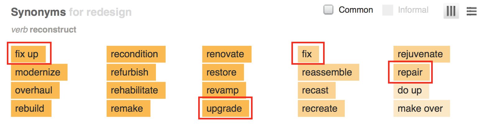
Synonyms for redesign from dictionary.com
According to Dictionary.com, the above are some of the more common synonyms for “redesign”. The way Conversion Sciences uses this term is very industry-specific, so it has a certain jargon-y quality. Someone working in marketing at a tech or ecommerce company probably understands our jargon more than their colleagues in other departments.
If you’re that marketing person and you’re trying to convince your boss and other departments that you need conversion optimization, it’s really important that you’re all speaking the same language. You might be experiencing some miscommunication and not even realize it.
What are the different ways each of you might be using the word “redesign”?
Before you dismiss it as juvenile to keep returning to basic, dictionary definitions of “redesign”, make a mental tally of important people who don’t work in marketing, conversion optimization, or graphic design.
Your CEO and CFO, maybe your boss
Your customer service representatives answering chat, phone calls, and emails
Your customers
All of us feel great satisfaction in knowing the real definition, but ultimately being right isn’t helpful if no one understands each other.
A Full Redesign: Starting Over From Scratch
When we say “redesign” in its purest sense, we mean a brand spanking new website. You hired a designer, you have a new color palette and CSS, you completely threw out the old. Every page is new, the entire structure is different.
“Redesign” can be used to mean a brand spanking new experience
When Conversion Sciences cautions against redesigns, this is the definition we’re using. We say there are only two good reasons to undertake a website redesign:
You are re-branding or
Your CMS (content management system) is too limiting
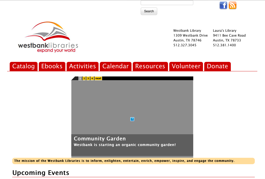
When I worked at Westbank Library our website used a proprietary CMS built by the company that built our ILS (integrated library system). An ILS is used to search for books or connect to an online resource or check to see when books are due back. In other words, an ILS isn’t meant to be the platform for a very specific kind of online application.
Westbank’s homepage in 2008, built with a CMS that was only intended to be used for online library catalogs (screenshot via the Way Back Machine)
The ILS wouldn’t support some very important non-book-related features:
We couldn’t optimize the site for the search engines
We couldn’t embed a calendar
We couldn’t choose which photos appeared where on the page
We couldn’t create customized landing pages for special events
We couldn’t make the site ADA compliant
We couldn’t add widgets other libraries were using
We needed a new site built on a new CMS, one that met our present-day needs. The only way to do that was to dump the old one. The new website was built using Drupal, and it meant everything was new. The change was necessary and long overdue.
Westbank’s new homepage after the from-scratch redesign (screenshot via the Way Back Machine, which is why the images aren’t loading)
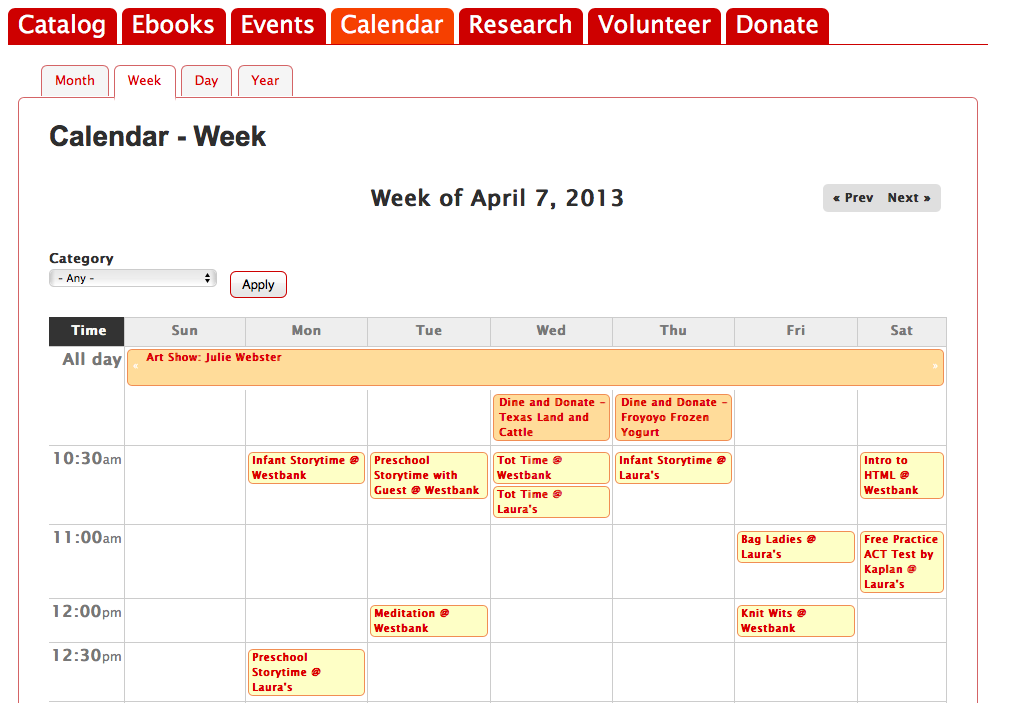
We were excited that on smartphones, the phone number was tel-linked and that the site was now searchable without going back to Google. Best of all, we had an actual, legitimate calendar. Before the redesign, the best we could do was make a list of what was going on.
Calendar of events on old site
After the redesign, people could see an actual calendar with clickable events where they could go find more information.
Calendar of events on new site
Without a doubt, the new site was an immense improvement. The lack of functionality on the old site was crippling us.
In this case, a full redesign was justified, but the results weren’t what we had hoped.
21 Quick and Easy CRO Copywriting Hacks
Keep these proven copywriting hacks in mind to make your copy convert.
43 Pages with Examples
Assumptive Phrasing
"We" vs. "You"
Pattern Interrupts
The Power of Three
"*" indicates required fields
Conversion Optimization as Redesign: Making Incremental Changes
When the new site launched, our traffic went through the roof – hundreds of times more people were visiting our website. But since the change was long overdue, people who used the old site for a decade were totally lost.
Dozens of people called us saying “I can’t find anything on this new website, you need to redesign it!” and dozens more sent us angry emails saying the same. With the amount of time we spent working on the new website, it was disheartening to hear. Small public libraries don’t have the resources to do projects like this often – and in some cases, they can’t do projects like it at all. We knew we’d been fortunate, and we were suddenly terrified we had blown our only chance to fix our site. There were very serious discussions of applying for grants, then hiring a new design team to start over.
But after spending time talking to our patrons, we’d find out what they actually meant by “redesign”.
In one case, a gentlemen received an email reminding him to renew his books and included a link for him to do it online. Before our redesign, that link took him to his library account where he was automatically logged in on his home computer. All he had to do was click “renew”. After the redesign, this link took him to our homepage, so he had no idea where to go. When we say that your landing pages need to fulfill the promises you’ve made in your ad, this is a great example of what we’re talking about. Instead of changing the design of anything, we needed to fix that link.
Another way we knew people were lost is by analyzing how they used the site.
One problem in particular was how people used our site’s search box. All of the searches were for titles of popular books and movies, but the search box wasn’t connected to the online catalog. Our old site had one search box, and its only use was to look for books and movies. Everyone assumed the new search box had the same function, but it didn’t.
Search options on the new website
We used the data from our search box the same way you can use heat maps. You can accommodate how your visitors are already using your site with the data you gather. Instead of forcing them to use our search box the way we wanted, we changed it to do what they wanted.
But that change meant our visitors, once again, didn’t have a site search option.
We changed the site search bar to be a catalog search, but it still wasn’t perfect
From this point, we found a widget that gave us a more dynamic search bar. Then we replaced images at the bottom of the page that linked to adult, teen, and children’s programs with widgets featuring new books and the library’s Instagram account. And we featured upcoming events more prominently, moved the contact information into the footer, added navigational links along the top of the page, and worked to make the site ADA compliant. The current homepage design is very different compared to what it was when we first rolled out the new website.
The homepage as it is now
These changes were slow-going, careful, and made one at a time. The redesign 1.0 and current iteration look similar because of branding and tabbed browsing, but for library patrons, these are two very disparate experiences. It is safe to say the new homepage underwent another redesign, but you might hesitate to use that word because the changes didn’t happen all at once.
“Redesign” can be used to describe incremental changes
The website wasn’t perfect, but there was a lot to work with. We couldn’t start over every time we realized the site could be doing better.
Big Swings as Redesign: Changing Several Variables at Once
We use the term “big swing” to talk about sweeping changes we make on a page. Often these changes are on a page that’s particularly important or special, like a homepage or landing page.
It means we’ve changed several features all at once instead of testing one thing at a time. The downside of this strategy is that no matter how the page performs after the test goes live, we don’t really know why. If the page continues to perform with the exact same conversion rate, we don’t really know why: our changes may have offset each other.
Big, sweeping changes are exciting when they are successful, and people love to share these kinds of successes. They make great headlines and engaging stories. They give us hope that our big change will work out the way we want, or perhaps even better than we imagine. The problem is that there are usually third variables at play in these stories.
Think about the diet book industry. Every book boasts of its followers’ drastic life improvements due entirely to the diet. But when someone starts to pay attention to what she eats, she may also make other changes like exercising more, quitting smoking, and getting more frequent checkups with her doctor. Was her success really due to the diet book? Or was it purely chance since she made so many other changes? There’s no way to know.
Michael Scott’s Big Swing
Humans have the potential to be rational, logical creatures, but we often fall prey to our emotions when we make decisions, dole out praise, or attach blame. In an episode of The Office, Office Manager Michael Scott has the brilliant, big idea to send out paper shipments with five golden tickets tucked into the boxes at random. Each ticket awarded a 10% discount to its recipient.
The promotion quickly goes south when Dunder Mifflin’s largest client receives all five tickets, and there are no disclaimers or expiration dates. Michael arranges for a fall guy who will be fired for the idea, but then finds out this client has decided to send Dunder Mifflin even more business because of the discount. Naturally Michael wants the credit but doesn’t want to be reprimanded for almost bankrupting the company.
Michael Scott dressed as Willy Wonka, presenting his Golden Ticket idea
The Golden Ticket promotion was a big swing because Dunder Mifflin didn’t isolate the variable Michael was hoping to test: will current clients be more loyal to Dunder Mifflin because of a special, one-time-only, 10% discount?
The consequences of the Golden Ticket run the gamut of possible results of big swings:
Positive Result: When it seemed like the promotion would put Dunder Mifflin out of business, the responsible party was fired
Negative Result: When it became apparent the promotion would solidify a relationship with an important client, the responsible party was publicly commended
Neutral Result: Dunder Mifflin lost a huge amount of revenue due to the promotion, then gained more revenue, also due to the promotion
Big Swings at Conversion Sciences
In a staff meeting last week, Conversion Scientist Megan Hoover told us, “We completely redesigned this landing page for our client, and it was a big improvement”. In a different staff meeting, fellow Conversion Scientist Chris Nolan told us, “Our first test was to redesign our client’s homepage, and it was a huge success”.
Conversion Sciences doesn’t do website redesigns, we do conversion optimization. So what did Megan and Chris mean?
We switched from two columns to three
We wrote a new headline
We changed the copy
We changed the wording on the call to action
These changes mean they were speaking accurately when they described their big swings as “redesigns”.
“Redesign” describes what we do when we make big swings
We didn’t change the functionality of the page, the page’s purpose, or the CMS. We definitely made some big changes, but we certainly didn’t start from scratch, and all of the changes were very localized to a landing page and a homepage.
It’s worth noting that even though it’s tough to measure results when you make a big swing type of redesign, we still take the risk sometimes because Conversion Sciences has run so many successful tests. We are very good at making educated hypotheses about what kinds of changes will work well together, but we don’t attempt these big changes often. There is a lot of room for error in the big swing.
What is Your Desired End Result?
We covered three approaches to redesign in this post:
Throw-out the old, start from scratch
Incremental changes
Big swings
Let’s return to the most common reasons a company chooses to redesign:
The site performs poorly
The desire to be “mobile-friendly”
The site is “dated”
The desire to be “unique”
When you have the conversation at work about redesigning your site, try starting with the end goal.
If you work backwards, the conversation has a good chance of staying on track because it’s likely that everyone wants the same thing, even if it comes out of their mouths sounding very different. I’m willing to bet that everyone wants a home page with lower bounce rates. Everyone wants to reduce cart abandonment rates. Everyone wants more downloads of your industry reports. Everyone wants to sell more merchandise.
Redesigns are seductive. They come with big budgets and a chance to make a visible impact. The question at the heart of my arguments is this: do you need a website redesign, or do you need a website optimization program?
An optimization program can begin delivering results within weeks. Full redesigns take months and months to develop. An optimization program tells you which of your assumptions are good ones. Full redesigns are big gambles.
With a short Conversion Strategy Session, you will be able to make the case for a full redesign or optimization program for your growing online business. Request your free session.
We may request cookies to be set on your device. We use cookies to let us know when you visit our websites, how you interact with us, to enrich your user experience, and to customize your relationship with our website.
Click on the different category headings to find out more. You can also change some of your preferences. Note that blocking some types of cookies may impact your experience on our websites and the services we are able to offer.
Essential Website Cookies
These cookies are strictly necessary to provide you with services available through our website and to use some of its features.
Because these cookies are strictly necessary to deliver the website, refusing them will have impact how our site functions. You always can block or delete cookies by changing your browser settings and force blocking all cookies on this website. But this will always prompt you to accept/refuse cookies when revisiting our site.
We fully respect if you want to refuse cookies but to avoid asking you again and again kindly allow us to store a cookie for that. You are free to opt out any time or opt in for other cookies to get a better experience. If you refuse cookies we will remove all set cookies in our domain.
We provide you with a list of stored cookies on your computer in our domain so you can check what we stored. Due to security reasons we are not able to show or modify cookies from other domains. You can check these in your browser security settings.
Other external services
We also use different external services like Google Webfonts, Google Maps, and external Video providers. Since these providers may collect personal data like your IP address we allow you to block them here. Please be aware that this might heavily reduce the functionality and appearance of our site. Changes will take effect once you reload the page.
Google Webfont Settings:
Google Map Settings:
Google reCaptcha Settings:
Vimeo and Youtube video embeds:
Privacy Policy
You can read about our cookies and privacy settings in detail on our Privacy Policy Page.