unbounce

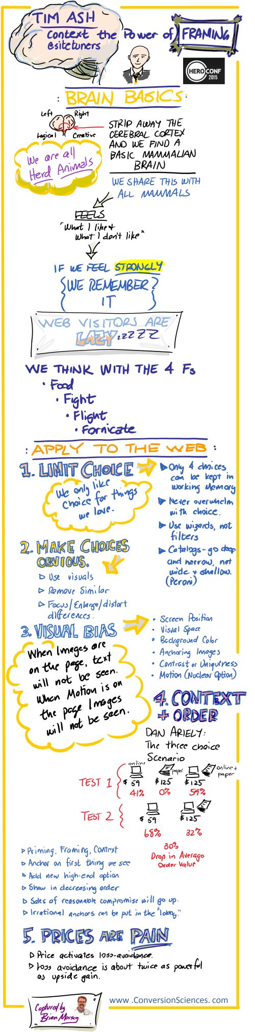
If you’ve ever read the book The Design of Everyday Things you may recall one of the stories. It tells of a typist asked to evaluate the design of a new keyboard. She reported back to the keyboard designer that she liked the new design and didn’t find any faults with it. The designer asked if they could watch her use it. What they observed was that she kept making a particular typing error over and over again.
The new design had moved some keys around, so the typist kept hitting the wrong key. She was used to the old layout. When they asked her about it, she blamed herself and not the design because the key was clearly labeled.

I Blame Myself

A couple of weeks ago, my favorite artist released a new album. It’s always a long time in coming, so album release day felt like Christmas morning to me. I even woke up early, ready to download it and spend my whole morning listening to it.
After about a decade of not spending money on music, I decided 2015 is the year I wanted to start doing it again. This year I also bought Taylor Swift’s newest album and the soundtrack for a deeply cool movie, A Girl Walks Home Alone at Night. I bought both on Google Play, and as we mentioned in a different post, spending money on Google Play is distressingly easy.
When I went to work buying Joanna Newsom’s latest, I expected a similarly unremarkable experience. I thought two taps to purchase and one tap to play would get the job done. But her album wasn’t for sale on Google Play, so I decided to buy it directly from her record label, Drag City.

Joanna Newsom's artist page was my first touchpoint with Drag City

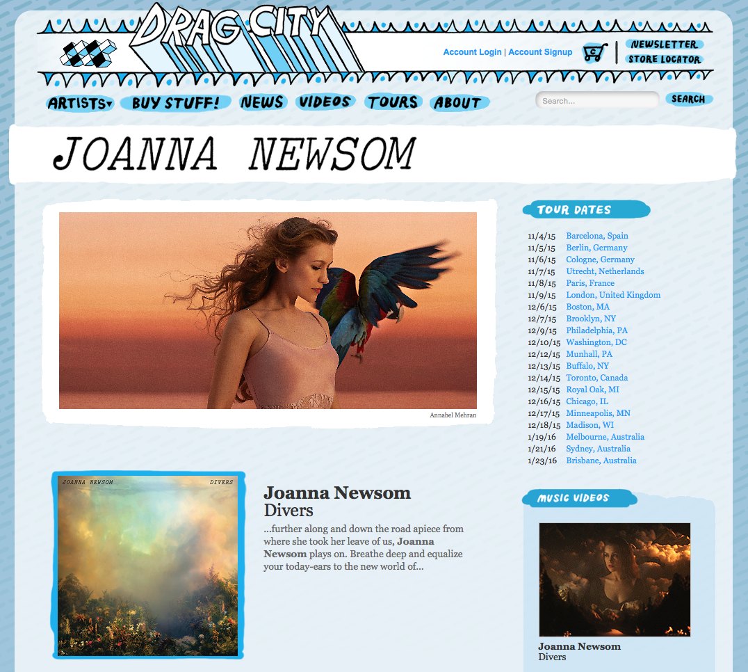
Joanna Newsom’s artist page was my first touchpoint with Drag City


I couldn’t actually remember the name of her record label, so I got there by a search, and I bypassed the homepage entirely. My first impression of the page was positive but ultimately irrelevant since I knew that I would definitely be spending my money on this website regardless of my experience because I really wanted this album, and it wasn’t readily available everywhere.

Strategic Use of Invisibility

After a moment I saw that there isn’t a buy button anywhere on this page, nor are there any prices. Apparently, I needed to find a product page to get to that information. Like most people comfortable with technology, I scan and click links quickly and with little thought.
I ended up in a loop where I clicked “Joanna Newsom” two or three times before my brain caught up with my finger. I was just taking myself back to the same page over and over again.

I needed to find my way to the product page, but I kept ending up back on the artist page.

I needed to find my way to the product page, but I kept ending up back on the artist page.


The page I wanted was strategically hidden behind the album image and the name of the album. Despite the page’s every attempt, I made my way to the product page. This wasn’t to be the last time I felt sheepish.
Which download do I want?

Which download do I want?

This Product Page is FLACed Up

I already disclosed that I don’t buy music often (I’m more of a book and movie person), so maybe it’s unsurprising that I was caught off-guard by one of my purchase options: the FLAC Download. Is that a normal thing now? It better be because 1) I had to do a Google search to figure out whether I needed to adopt FLAC instead of MP3 and 2) I was irritated that I had to leave the website to find answers instead of Drag City just telling me on this screen.
Not everyone is going to find their way back like I did.
My search told me that I don’t care enough to know more about FLAC downloads to spend an extra dollar, so I selected MP3 and moved on to the next step.

The Payment Method Shell Game

Technical errors are always a problem. In this case, the inconsistency happened in the all-important cart. Sometimes when I visited my cart, I was given the option to purchase with Paypal. Sometimes it wasn’t.

Option 1: No PayPal

Option 1: No PayPal


Option 2: Checkout with PayPal

Option 2: Checkout with PayPal


I saw both of these screens in the process of writing this article. If I didn’t feel like I absolutely needed this album right this instant, I would have just bailed without a PayPal option. For some people it’s the borrowed trust that the PayPal logo provides that would cause them to stay. If I have to get off my couch and find my credit card to buy something, I can probably live without it.
Since I was borderline desperate, I journeyed onward regardless, perhaps even going so far as to walk across the room to fetch my purse.

How to Treat Your Repeat Buyers Like Dirt

I had high hopes that I was almost done using this website when I got to this page.

I had high hopes that I was almost done using this website when I got to this page.


The first time I went through this process my purchase was a cinch. Replicating it for this post didn’t go the same way, however. The first time around I created a new account and moved on. I assumed it would be even more straightforward after I had my own account.
When I logged in with my new account, however, I wasn’t taken to the next step in the purchase process. I was taken to Drag City’s homepage.
So here is how they treat return buyers: Find music. Add music to cart. Click checkout. Login. Get sent back to the beginning.
I thought it was because I typed my password incorrectly. It felt like I had done something wrong. I felt bad. Being a returning customer is not nearly as easy as being a new one, apparently. I persevered.

Here’s Your Order. Not.

When I finally made it to the through to a screen thanking me for my purchase, I didn’t know what do from there. Where was my download? How was I going to be able to listen to my album? Had I just sent my ten bucks into cyberspace never to be seen again?
I searched through Drag City’s FAQs and even tried to find a customer forum where I could find the answer to those questions, but I came up with nothing. My emailed receipt also got me nowhere. I returned to the browser where I ended my purchase to see if I’d missed a message telling me what to do next, but that also left me empty-handed.
Me dumb. That is the message.
I ended up emailing their customer service to ask what was up, but I felt incredibly stupid about it. I felt self-conscious, like I’m sure my dad feels when he calls me for the seventh time to ask how to use his TV remote, but it seemed like the only option. And dang, after all it took to get there, I couldn’t just give up.
My story ends rather anticlimactically because about an hour later, I got an email back letting me know that I would receive my download via email, and I should please let them know if I didn’t receive it. I had indeed received it – but about ten minutes before customer service got back to me. It was weird.
It was great customer service with a quick response, but I prefer not to feel like an idiot, even if it results in a kind email from a stranger.
You may think it’s not fair to compare a small business website to an e-tail juggernaut like Amazon, but it is. If I had decided I didn’t want to support Drag City, using Amazon would have been so much easier. Amazon loves taking people’s money, and Drag City makes it feel like a burden.

My Amazon search result for the same album

My Amazon search result for the same album


Just my search result on Amazon gave me more information than Drag City’s entire Joanna Newsom page. And notice the “Available for download now” message. The last time I spent money on a digital download from Amazon was probably about five years ago when I purchased an episode of Vampire Diaries, and even that long ago, the whole process went very smoothly. I definitely didn’t have to wait an hour for an email.

Who is to blame for negative shopping experiences?

Re-living my buying experience in excruciating detail began to make me think “I don’t know why this bothered me at the time. It seems pretty obvious in hindsight.”
Some websites have very poor design, and users will openly criticize it, but others have design flaws that are subtle. After spending a few minutes using the navigation and thinking about the purpose of the page, a visitor will figure it out, but they may blame their own alleged stupidity for being slow on the uptake.
It’s one reason that self-reporting is so notoriously inaccurate: the reasons we think we behave a certain way aren’t always clear. It’s also why tools like heat maps are so eye-opening. It’s also why I was mad that I got up early on Nerdy-Christmas Morning only to have this experience be the thing that woke me up.

Feature image by greg westfall. via Compfight cc and adapted for this post.

Are your PPC ads plaid and your landing pages polka dots? That is, are your PPC ads and landing pages in alignment? Check out these great tips and maximize conversions.

Pay-per-click (PPC) advertising can be a highly effective way to get your products in front of new prospective customers and drive sales, but only when campaigns are set up with the right touch. Depending on what keywords you want to target with your bids, search ads are generally not prohibitively expensive, but it’s easy to fall into the trap of blowing through your budget on PPC without justifying your media spend with enough sales.

The PPC management mistakes that most commonly ruin advertisers’ chances of respectable ROI involve text mismatches. All too often, an ad’s keyword settings do not match the language used in the ad’s creative, or the landing page content does not match the language used in the ad’s creative.

Search marketing spending in the US from 2014 to 2019.

Search marketing spending in the US from 2014 to 2019.

Why Matching Terminology Matters

If you’re not matching terminology on your landing page to your PPC ads, you’re wasting money and losing clients.

Successful PPC marketing hinges on continuity across all touch points. Web searchers enter search terms into Google based on a need they are trying to fulfill. By the time users have formulated their queries as lines of text, they have already been forced to think about what they’re looking for as being specific to certain terminology. Thus, if your message is going to resonate with them, it has to use the very same terminology.

Google users naturally gravitate towards organic search results. To catch people’s eyes, your ad needs to convey that it addresses the exact issue that the searcher is trying to solve. What’s more, search terms that appear within ad copy appear in bold letters, adding to their visibility and click-throughs.

When people click on the ad, they are expecting to find a matching solution on the other end. You know that dirty feeling you get when you click on a content headline that over-promises and the article ultimately under-delivers? That’s a similar feeling to what happens when there’s a disconnect between search ad copy and landing page copy.

When you get that feeling, you’re unlikely to do business with whoever gave it to you. And that’s why it’s so important that the landing page refer to the exact need at hand and offer an appropriate solution, all using the same terminology. This is one of those landing page best practices that tends to be right every single time.

PPC Ads and Landing Pages in Alignment: The Power of Maximized Continuity

Lack of continuity will result in customers leaving your conversion funnel before opting in to your lead capture offer or purchasing your products.

Google Ads not Converting? Try These 4 Optimization Tricks

If a customer searches for “cyan polo shirt summer sale” and you show him an ad for “men’s clothing,” he is not likely to click on it, even though your online store might very well offer cyan polo shirts in the men’s section. Even ad creative touting a “blue polo shirt” product won’t perform as well as the phrase “cyan polo shirt” would – the closer to an exact match you can get, the more effective your ads will be.

PPC ads and landing pages in alignment: Use the word

Use the word “cyan” to describe the color of this shirt, not just “blue”.

The same principle applies to matching ad copy with landing page copy. If your ad promises a “cyan polo shirt summer sale” but you send people to your homepage, where there are 25 different apparel products being showcased and no trace of any type of sale, the visitor is likely to bounce out extremely quickly.

Customized Ecommerce Text Variations

Using standardized language across your website is necessary to maintain an atmosphere of professional polish and so that your internal search engine will work well. On the other hand, when you set up your search ad campaigns, you should be performing some extensive keyword research to reveal all of the alternate wording that people use for the same thing.

Going back to the same example, you may learn that people often search for polo shirts that are “sapphire,” “teal,” or “turquoise,” which are all reasonably close matches to the “cyan” that appears on your product pages. It totally makes sense to bid on ads to appear on search results for “sapphire polo shirt,” but in cases like these, you may want to create alternate versions of your product pages that only visitors referred by this specific ad will see.

Just make sure to keep these variations out of sight of the search engines, so you won’t get penalized for duplicate content – and out of sight in the website navigation, so visitors do not get confused. Apply a meta “No Index” tag to the head of the landing page to make sure that variations don’t get indexed. Better yet, make sure all your PPC ad campaign landing pages are noindex, follow. Until you have chosen the one you would like to drive organic traffic to.

Dynamic Keyword Insertion

A helpful tool in this process is a Google Adwords feature called Dynamic Keyword Insertion (DKI). This tool will adjust your ad text to reflect keywords in the user’s search, potentially accomplishing the same goals we just discussed.

Wordstream ran a case study testing the effectiveness of DKI with a client, and found that using this strategy had the following results:

  • Impressions dropped 6%
  • Click-through-rate (CTR) increased by 55%
  • Conversions increased by an incredible 228%
DKI more than tripled conversions.

DKI more than tripled conversions.

The results speak for themselves.

In the context of continuity, the key is to have a very small number of keywords in your ad groups. For top performers, you may even want to use Single Keyword Ad Groups (SKAGS).

Customized Lead Capture Page Variations

If your offer is for a service, a B2B product or something otherwise relatively expensive, then you don’t need to send visitors to ecommerce-integrated product pages at all. In these cases, a sparser landing page is likely to perform better, and it’s easy and inexpensive to create new versions of your landing pages for each keyword combination that you bid for.

Landing pages like these are generally aimed at capturing leads rather than driving sales, since major purchases require more pre-sale relationship building to establish trust and to educate prospects. Many of the better marketing platforms available in the open market offer modules for both landing page creation and autoresponder marketing emails.

If lead capture is your goal, focus your Adwords strategy on your prospects’ pain points rather than your offer’s specifications. For instance, a financial consulting firm could run PPC ads for the search term “family budgeting help” or “debt advice.” These ads could lead to landing page variations for each search term, with each one offering visitors the option to download an eBook that provides practical tips on family budgeting and saving money on household bills.

A campaign of this type takes into account that the prospect is having trouble balancing his or her household budget, and it offers a quick and easy solution that also positions the advertiser as a trustworthy expert in the field of family finance. This paves the way for follow-up messaging.

Another benefit of this type of hyper-specific targeting is that it allows marketers to segment the entire customer journey and serve up nurturing emails that match the subscriber’s specific interests. A post-campaign analysis of the relevant conversion data can reveal which segments represent the advertiser’s most valuable customers, thereby informing subsequent marketing strategies.

Doesn’t Have to Be a Bottomless Pit

You do need a landing page for every important ad, but that doesn’t necessarily mean you should set up hundreds of landing pages. Instead, focus your campaign on a select number of lead nurture audience personas (three or four) and create an ad that’s optimized to speak to each one of them. Create a unique landing page for each of these ads and set up an autoresponder to send follow-up emails with relevant content to each persona.

If you’re marketing an ecommerce property with a diverse product line and a shopping cart system, start by trying these tactics for just a few products. If it serves you well, then you can focus on making your work flow scalable down the road.

PPC campaigns that are set up for maximum terminology variations are likely to enjoy boosted conversion rates and revenues, so that ad dollars are less likely to go to waste.

Keep improving your paid ads: Google Ad Extensions to Improve your Customer Acquisition Efforts

Graph image by Statista (via Skitch)

One of my most requested and highest rated presentations for online sales is The Chemistry of the Landing Page. It’s part of our Conversion Course.
The elements combine to make an effective landing page. Here’s the equation for a successful landing page:

Our tried and true formula for a landing page uses several elements from our periodic table of conversion optimization.

Our tried and true formula for a landing page uses several elements from our periodic table of conversion optimization.


This formula tells us that an effective landing page takes a Web Page (Wp), adds an Offer (Of), a Form (Fm), an Image (I) of the product plus Proof (Pr) and Trust (Tr) to get the visitor to take action. You may ask, “Where did these elements come from?”
We have a palette of things to work with that help us when we’re developing marketing campaigns that deliver sales, leads and subscribers. For us, it’s like a game.
This chart provides a vocabulary and methodology to work through ideas for higher and higher converting online properties. You’ll find it in our Landing Page ROI Checklist, which you can download for free.
Now you can play.
Download the Elements of Conversion Optimization PDF, cut out the elements, and start having some fun.
Choose from a colorful palette of elements when writing, designing and strategizing for conversions.

Click to Download a colorful palette of elements for writing, designing and strategizing for conversions.


We want to create a reaction with our visitors. See what I did there? When optimizing for conversions, we don’t want visitors to interact, we want them to react.

Start with the Basic Elements

These core elements are found in every reaction.

These core elements are found in every reaction.


If we cut out Motion (M) and Image (I) to create a powerful kind of content.
It's simple to combine elements to make new elements. Adding Motion (M) to Images (I) gives us Video (V).

It’s simple to combine elements to make new elements. Adding Motion (M) to Images (I) gives us Video (V).


Video (V) is found in the table under Content. Not all video is created equal.

Fun with Content

The set of elements in the Content section are powerful resources for getting visitors to take action.

Content comes in many forms, including the more interactive type.

Content comes in many forms, including the more interactive type.


The bottom row of Content is interactive. It engages the visitor in unique ways.
If we combine all of the basic elements plus a very special kind of content called Music (Mu), we get the recipe for an explainer video for our business. Explainer videos include the features and benefits of our product or service.
An explainer video requires a variety of content to be successful.

An explainer video requires a variety of content to be successful.

Pick a Container or Two

Where does this explainer video live? We can place it onto a web page or a Social Network (Sn) like YouTube.

Containers are the places where we mix our elements to spark reactions that generate new elements.

Containers are the places where we mix our elements to spark reactions that generate new elements.


We can load our video onto YouTube, which is a social network.
As a Social Network (Sn), YouTube can turn Video content into  Attention (Att) a semi-precious metal.

As a Social Network (Sn), YouTube can turn Video content into Attention (Att) a semi-precious metal.


We’ve generated some precious attention as well as two kinds of User Generated Content, Comments and Likes. User-generated Comments (Cm) amplify the amount of Attention (Att) your business gets from a social posting.
This doesn’t get us much in the way of conversion. We may get some social content and some awareness, some Attention. For the sake of conversion, we need visits to our website. We need Traffic.

Dealing with the Precious Metals

Our main goal when combining elements is a bit of alchemy. We want to generate precious metals, Sales ($) and Leads (Pb). Those of you familiar with the periodic table of elements should get why I chose “Pb” for Leads.

Online sales is only one precious metal that can be generated.

The Metals represent our most valuable elements.


The precious metals represent some sort of conversion: a suspect to a prospect, a prospect to a lead, a lead to a sale. We’ll be doing more with the precious metals in future articles.

The Offer Leads the Conversion

The content that invites visitors to take action is an Offer of some kind. We can add the offer to the video or to the page. In a social network like YouTube, we don’t have much control over how offers are displayed on the page. Adding the offer to the video is considered a best practice in all situations.
The offer magically turns attention into traffic.

Putting an Offer in front of our attentive viewers can generate traffic for us.

Putting an Offer in front of our attentive viewers can generate traffic for us.


I told you this was going to be fun. However, when we start asking visitors to do something, we introduce some contamination into our reaction.
The Traffic has to have someplace to go. So we can use our handy equation, shown above, to create a landing page.
When we combine our traffic with an effective landing page, sales and leads are created.

When we combine our traffic with an effective landing page, sales and leads are created.


When playing the conversion game, we want Leads and online Sales as our reward. Qualified traffic plus an efficient landing page can deliver that for us.

The Inert Gases Get in the Way

If our video is longer than it is entertaining, we may generate a contaminant called Bordom (Bo). If we spend more time talking about our business and products than solutions for our viewers, we are generating Melium (Me). If we go on and on, we’re generating Hot Air (He).
All of these can generate the most disappointing contaminants, called Abandon (Ar). We give it the same symbol as the element Argon (Ar), because when someone abandons your content, they “Are gone.”

The Inert Gases just get in the way of our reactions and our conversions.

The Inert Gases just get in the way of our reactions and our conversions.


We can see these contaminants in our analytics. Here’s the attention graph for one of our explainer videos. This graph tells us what percentage of visitors are watching at any given time (blue line). The red line indicates replays of portions of the video.
Here is evidence of Inert Gases in the data from our explainer video.

Here is evidence of Inert Gases in the data from our explainer video. You be the judge.


At the beginning, we lose those viewers who are just in the wrong place, though viewers abandon the video throughout. There’s a place where we spend too much time drawing because we like to draw. This is producing Hot Air (He). Toward the end of this four-minute video we see evidence of Bordom (Bo). We should shorten things up.
Then, at the end, when we make the Offer (Of), we see some abandonment due to Melium (Me). We’re talking about ourselves at this point.

Adding Some Catalysts

Catalysts don’t actually react with anything, they help the other elements react faster, hotter or more efficiently. You shouldn’t buy our product just because others have, but social proof is a key motivator in many reactions. It’s a catalyst in our message. Search Engine Optimization (Seo) is invisible to the reader for the most part, but it can catalyze a page to create more Traffic (Tf).

Catalysts make reactions faster, hotter and more efficient.

Catalysts make reactions faster, hotter and more efficient.


Videos are great for Storytelling (St), so this might be a great catalyst for our explainer video. We know from our landing page formula above that Proof (Pr) and Trust (Tr) are important and should be included in our landing pages.
On our blog, we’ve used Gamification (Gm). Using a badges as a reward, we encourage visitors to come back and read more. This addition that has accelerated the growth of our subscriber list and traffic.

Our Explainer Video

We chose to put our explainer video on a landing page with an offer and a form. There is also an offer in the video. We transcribed the soundtrack to provide text for the page.
The formula is this:

explainer video formulas

The formulas for our explainer video Not how elements from one reaction feed another. See the landing page.


The traffic comes from this page and our weekly educational email, which you should subscribe to.

A Checklist for Effective Online Sales

These equations are your checklist for producing effective marketing. It also allows you to have some fun mixing and matching elements that may not seem to go together.
Download the PDF, cut out the elements, and get creative about how you make your online properties more profitable.

Oli Gardner will make you blush when he rips your landing page copy from its safe HTML home and shows you what it says as a plain text file.
I got to thinking, what if we just pulled the images from your website? Would they be able to tell the story of your value proposition?

The Role of Images on a Web Page

Too many designers see images as a way to break up the copy on a web page. They use filler images, stock photos and silly graphs that have no meaning.
Images are a powerful way to convey your value proposition – the reason that a visitor should consider your offer. This is true for landing pages as well as your home page.
The impact on a landing page can be extreme.
Images draw the eye. When your visitors first arrive, these are the elements that get seen first as they scan the page. Images can immediately ask the first question your prospects have, “Am I in the right place to get what I’m looking for?”
Images should compliment, support and enhance the copy on the page. Any image that doesn’t move the value prop forward is hindering it.
Pull the images from your page and take a look.

The Image-only Version of Your Landing Page

If you were to pull just the images from your site, would they tell your story? Here are the images from a site offering information on annuities.

What does your landing page say in pictures?

What does your landing page say in pictures?


It starts off great. The main image has a stock model representing the target audience.
Adding text to an image makes it relevant to your message.

Adding text to an image makes it relevant to your message.


Adding text to an image is a simple way to give it power.
Adding text to an image is a simple way to give it power. Furthermore, the model is looking at the information you want them to read. If a model is staring at the visitor, the visitor tends to focus more on the face, and less on the messages on the page.
This is essentially an in-image caption.

Captions Get Read

One of the most read portions of your landing pages is the caption. Unfortunately, most pages don’t use captions. Captions explain the image in more detail, moving the value proposition forward for the reader.

Captions are a great place to repeat the offer on the page.

The Caption Test

The best way to test to see if your captions are helpful is to ask a stranger to write a caption for it. How would our annuity page fare?

Graphics without meaningful information don't move your value proposition forward for the reader.

Graphics without meaningful information don’t move your value proposition forward for the reader.


Caption Test: “Get complex information about something.”
The heading for the copy next to this is, “What are the fees associated with an annuity?” This should be repeated as the caption.
The remaining images don’t do so well.
Is this a happy customer? An employee? We can tell the difference between a model and a real person.

Is this a happy customer? An employee? We can tell the difference between a model and a real person.


Caption Test: “I will meet attractive older men. Sooo handsome.”
The copy headline next to this image reads, “What if I need access to the principal in my annuity?” The answer may have made this handsome man smile, but the image really doesn’t support the point. This would not work as a caption.
Another lost opportunity to communicate something valuable.

Another lost opportunity to communicate something valuable.


Caption Test: “Time is running out for you and your little dog too!”
What are your images bringing to mind in your reader's mind?

What are your images bringing to mind in your reader’s mind?


The copy next to this image reads, “How long will I be able to receive income from my annuity?” This would work as a caption. But with the power that an image has for conveying a message, I think this page could do much better.

Images that Work

In general, your images should strive for the following characteristics.

Use real people when possible: employees, clients and spokespeople are great choices.

Use real employees, customers or spokespeople in your images.

Use real employees, customers or spokespeople in your images. This one needs a caption.

Use text on the image and as a caption to advance your value proposition.

Don’t be afraid to repeat offers in captions and on-image text.

This image makes great use of in-image text and an offer in the caption.

This image makes great use of in-image text and an offer in the caption.

Design images that support the copy on the page.

This image uses in-image messaging that supports the copy on the page.

This image uses in-image messaging that supports the copy on the page.

Direct the gaze of people in images to offers, forms or other important parts of the page.

This model is looking at the form, the most important part of this landing page.

This model is looking at the form, the most important part of this landing page.

For software products, choose screen shots that don’t make your product look intimidating.

Screen shots should focus on key features of your software offering.

Screen shots should focus on key features of your software offering.

Spend as Much Time on Your Images as Your Copy

Utlimately, if you spend as much time on your images as you do your copy, you will find creative ways to power conversions on your landing pages, home pages… all pages.

Images courtesy ICIMS, Expert Market and TheStreet.com.

One of the great benefits of speaking at great conferences is getting to learn from your peers in the industry. Joel Harvey and I did our first LIVE tag-team presentation called “The Chemistry of the Landing Page.”
Tim Ash gave an insightful and “inciteful” keynote presentation at the PPC Hero Conference here in Portland Oregon. Here are my instagraph notes taken live as he spoke.

Tim Ash Hero Conf 2015 Context Power of Framing

Click to Enlarge


If you live in Chicago, we’re bringing one of our most important presentations right to you.
If you don’t live in Chicago, may I suggest you get that Ford Fairlane lubed and tuned up for a road trip. You’ll want to be there on June 2.
We’re going mobile to spread the results of our testing on the mobile web. It’s one of the most important presentations we’ve done because the mobile web is changing fast.

CRO-1 with Labels ghostbusters ambulance

Conversion Sciences is Road Tripping to Chicago June 2.


We know a thing or two about your mobile marketing. Your Mobile traffic is probably one of your fastest growing segments. It converts at depressingly low rates. You have probably decided to focus your efforts on the desktop for now.
We were there once, too.
Come see the most interesting and lucrative things we’ve learned about mobile conversions from tests across industries. You’ll learn you how to avoid common conversion-killing “mobile best practices”, write CTAs that get mobile visitors to take action and employ simple UX tricks that will keep those CTAs constant without distracting or irritating visitors.
You’ll also get tips for bridging the 1st screen to 2nd screen gap, maximizing phone leads from mobile visitors and building forms that mobile visitors will actually complete.
You’ll leave this sessions equipped to make smarter decisions about your mobile experience.

We Get a Special Discount

We get a special discount since we’ve got the awesome wheels. Don’t tell our hosts at Unbounce that we’re sharing this code with you.

conversionsciencessentme

You better sign up before they get wise. This code lets you in the door for $149.50. That’s 50% off the already ridiculous price. You can use it here. Yes, it’s a damn long discount code. Copy it to your clipboard.

Did I Mention the Other Seven Awesome Speakers?

No? Well you can’t beat them. You should check them out after you’ve registered to see us.
Speaker Image

We’re worth the $149.50 admission, but you also get these bright people.

Come see us in Chicago, or wait to see these great speakers at one of the overblown and expensive conferences in some far away city. Your choice.

Last year, Austin, Texas declared itself the Conversion Capital of the World with some stiff competition.
It turns out that, this year there is even more reason to support this very scientific and not-at-all-biased claim. We’ll be sharing our updated list of Austintatious website optimization pros on CRO Day, April 9.

Clearly, the quality of breakfast tacos and microbrews are determining factors for how optimizers choose their city of residence.
Website optimizers aren’t your typical marketer. In our roundup, each one will tell the story of how they were drawn, pulled or tricked into conversion optimization.
Subscribe to The Conversion Scientist. Don’t miss this Ausome list.

[subscribe-by-email]

Ironically, CRO Day was declared by the crew at Unbounce, a respected but decidedly “ain’t in Austin” company. Despite that, we think that you should be online for this event. We will participate.
Two days until International Conversion Rate Optimization Day

breakfast tacos by goodiesfirst via Compfight cc and adapted for this post

As content writers, we’re trying to persuade others to see our point of view – to agree with us. Regardless of whether it’s to click on a link or to purchase a product, we want our writing to influence others in a positive manner.

To write in an engaging and persuasive way is an art form – it’s elegant, refined and exercises discernment. And it’s worlds apart from the distasteful, strong-arm tactics employed by spam marketers.

Crafting content that influences isn’t necessarily hard, but it does take a bit of practice. So, without further ado, let’s have a look at five key elements that contribute to successful and persuasive content writing.

1: Be an Expert

Few things are more influential than the opinion of an expert. Why? Because true experts know what they’re talking about. It’s clear in their authenticity and transparency. Experts don’t use fluffy filler material in their persuasive writing, and they don’t try to distract the reader with gimmicks.

If you want to establish yourself as an influencer in your niche, you need to be the premier expert in your field. You don’t need a degree or years of related experience, but you need to demonstrate that you’re a specialist. You want to be so knowledgeable in your particular market that your content is oozing with confidence and certainty.

Note the word specialist.

Experts don’t try to cover all the bases, and they don’t pretend to know everything remotely related to their topic.

They specialize in one particular aspect or angle, and by sharing their knowledge they become an authority. And authority bestows persuasion.

La Carmina, a very successful travel blogger self-describing her approach as “spooky-cute”, embodies this idea to perfection because her success is not the result of trying to be all things to all travelers. Her advice? “Be niche. Don’t be afraid to focus on a specific topic or audience…” Read more of her suggestions for being a specialist on the Huffington Post.

La Carmina.

La Carmina Travel Blog specializes in “spooky-cute” travel.

2: List the Most Important Information First

Writing persuasive copy for web pages is similar to that of writing news articles. That is, the most important information comes first – which is quite different from writing an essay or a short story. Journalists refer to this method as writing in an inverted pyramid, and it starts with the most relevant points which are then followed by related details and background information.

In this manner, you have the opportunity right at the start of your post to motivate your readers to continue on to your benefits, features and call to action.

By highlighting the outcomes that you or your products can provide at the beginning, you’ll give them a clear understanding of the big picture. Don’t wait for the conclusion of your piece to deliver the vision they want, because they’ll be long gone.

Gregory Ciotti at Unbounce gives a great example of this idea in his post on how research can affect the way we write copy. He captures the essence of his entire topic in the second sentence, leaving no doubt in the readers’ mind about whether reading the post will be beneficial or not.


21 Quick and Easy CRO Copywriting Hacks to Skyrocket Conversions

21 Quick and Easy CRO Copywriting Hacks

Keep these proven copywriting hacks in mind to make your copy convert.

  • 43 Pages with Examples
  • Assumptive Phrasing
  • "We" vs. "You"
  • Pattern Interrupts
  • The Power of Three

"*" indicates required fields

This field is for validation purposes and should be left unchanged.


3: Give Your Readers Reasons Why

Written or spoken, few words are more persuasive than the word because.

In her book Mindfulness, social psychologist Ellen Langer clearly demonstrated that people are more likely to comply to a request if they’re given a reason via the word because. Even if the reason is redundant or doesn’t make sense!

Another persuasive word to work into your copy is imagine – asking your readers to imagine their desired outcome is a safe alternative to asking them to take action. It’s make-believe, so their inner gatekeeper (the voice in our head suspicious of others’ motives) won’t be inclined to object. And getting your prospects to imagine themselves in happy situations is a powerful influencer.

At Enchanting Marketing, Henneke shows us how to master this element with the words ‘because’ and ‘picture’ right in the introduction of her post (picture being a synonym of imagine). She first suggests we may be making a mistake in our web writing, then gets us to picture a client clicking where we want them to and finally shows us ‘why’ we’re making the mistake – with the word because.

You can’t help but continue reading, and for web content, that’s a big deal because, as Henneke says, you are writing for people who probably aren’t going to read what you write.  People don’t read articles all the way through online like they do in print.

Picture your customers as wild animals when you write copy suggests Henneke Enchanged Marketing

Picture your customers as wild animals when you write copy suggests Henneke Enchanged Marketing

4: Benefits First, Then Features

This point may seem a bit counterintuitive, but only because you know your products or services so well – still, you need to remember that your prospects don’t. Keep in mind that they’re looking for specific outcomes.

It might help to think of the benefits as the outcome they desire, while the features are part of the solution to their problem. For example, “You can look like a supermodel in two weeks with our Magic Pills – no need for diets or exercise!” The benefit is looking like a supermodel in two weeks. The features are no dieting or exercising.

By succinctly outlining the benefits first, then the features, you’ll generate greater interest in your clients’ minds.

Brian Clark shows us how to successfully highlight benefits, and to differentiate between benefits and features, with the ‘forehead slap test’ in this great post on Copyblogger.

5: Write for Scanners

It’s important to remember that most online consumers are scanners first and readers second. To persuade your prospects actually to read your content, use some of these eye candy elements to draw them into your article:

  • Headings and subheads, relevant and on topic
  • Bullet lists to highlight benefits and features
  • Font variations, bold, italics, and colored links
  • Short sentences and short paragraphs, each with one idea only
  • Images and infographics
  • Memorable captions

Case Study

Alex Turnbull at Bufferapp expertly includes all five of these elements in his post on research-backed content.  You’ll notice that:

  1. He establishes himself as an expert on writing persuasive content with solid research, and results, to establish his status.
  2. The most important information is listed first. The graph shows us that a headline that includes research received a +40% increase in click throughs.
  3. He gives us the reason ‘why’ in a big way – right there in the first sub-header: “why you should write research-backed content”.
  4. The benefit is shown in a graph demonstrating the increase in click through rates.
  5. The post is easily scanable. Lots of relevant subheads, graphs, images, bold and colored fonts. And the sentences and paragraphs are short and concise, with a memorable caption: “ROI is about the MECHANIC using the tool.”

With a bit of practice in applying these key elements, you’ll be successful at writing persuasive content that your readers will understand and appreciate – and that’s a winning situation for everyone.

In 2014, we declared Austin, Texas the Conversion Optimization Capital of the World. We will be updating our yearly list of Austin’s greatest conversion minds on CRO Day, April 9. Subscribe and see if you agree.

If Austin is the conversion capital of the world, it was a supernova of conversion optimization brilliance this past week when the Conversion XL Live conference was held here. Luminaries from around the globe converged here for a program that covered topics from landing page design to “bandit” algorithms.

I learned a lot.

Here were some of the highlights for me.

The Dame, The Detective and the Double-cross

The Detective BogartI used Humphrey Bogart detective movies to illustrate that conversion optimizers use a variety of data sources to determine what to test and what not to test.  The femme fatale will appear in the detective’s office and pose a problem. The salty detective will investigate, looking for clues. If he’s not careful, he can be double-crossed by the data.

For a data detective, the initial hypothesis is the “dame’s” story. Of course, she is hiding something. He must find clues to tease out the truth using alternative data sources. He can use post-test analysis techniques to make sure he wasn’t double-crossed by his data.

Some of the alternative sources I discussed were:

Aggregated Behavioral data like Google Analytics and AB Testing Tools.

Aggregated User Interaction data like click tracking tools and form-tracking tools.

Individual User Interaction data, like session recordings, ratings and reviews data and live chat transcripts.

Self-reported data, such as surveys and online feedback.

Customer knowledge, often found by interviewing sales and customer support people.

When you prioritize hypotheses that have lots of support in data, you keep yourself from being double-crossed by unexpected results.

Mobile Website Design

We believe that the mobile Web is like the desktop Web in the 1990s: we will look back and laugh at the choices we are making today.

Amy Africa has done a lot of testing on mobile websites, and gave us a flood of Mobile Web 2.0 tips. My notes were extensive, but some of the her revelations were surprising.

  • Don’t think in terms of pages. Think in terms of screens and scrolls.
  • Make your “action directives” (action buttons, search options, etc.) big and bold.
  • 80% of mobile success is having the right navigation.
  • One third to one half of mobile visitors will use search. Design search results pages as if only three items will be seen.
  • Mobile forms are abandoned more often on mobile.
  • Email is of even bigger importance with mobile users than desktop users.
  • Social logins can reduce abandonment if done right.
  • “Oversell the phone number” in the purchase process.
  • Responsive design comes with a mobile performance hit.
  • Transfer mobile visitors to the desktop by sending email or text.
  • Email will make up for deficiencies in the mobile experience.

She introduced me to some new terms, including “donuts”, “spreaders” and “cart hoppers.”

It’s clearly an exciting time in the mobile world.

Predictive Analytics and Machine Learning

Matthew Gershoff introduced us to the world of predictive analytics and machine learning.

Optimization = Learning efficiency + Applying the “best” learnings

New tools, such as his company Conductrics provides tools that use the key ingredients of optimization.

  1. Setting goals
  2. Sensing the environment, usually through analytics.
  3. Having the ability to act and execute on learnings.
  4. Observing outcomes.
  5. Learning the decision logic of visitors.

These ingredients are the basis for machine learning.

He recommended courses on VideoLectures.com to get up to speed on machine learning and artificial intelligence.

Conversion Maturity Model

Brooks Bell was interviewed by conference host Peep Laja about the Conversion Maturity Model that defines how advanced an organization is with respect to optimization.

Her namesake company surveyed 300 companies, rating them on six criteria.

  1. Culture
  2. Team
  3. Tools and Systems
  4. Process
  5. Strategy
  6. Performance

The executive sponsor at a company is key to the success of the optimization effort, she pointed out. Very true.

Conversion Optimizers from Everywhere

Austin truly was the Conversion Supernova of the World.

In from Vancouver, Oli Gardner of Unbouce took us through the rules of good landing page design. He provided us all with some free tools to help us evaluate our landing pages and forms.

André Morys runs one of the largest conversion optimization companies in the world. He’s both hugely entertaining and German.

Michael Aagard flew in from Denmark to share some of his most embarrassing testing mistakes and his triumphs.

Yehoshua Coren is a cross-cultural phenomenon as the Analytics Ninja from Israel.

Lukas Vermeer traveled from The Netherlands to share his conversion challenge game, So You Think You Can Test?

Michael Summers of Rockville, MD showed us the powerful insights to be gained from eye-tracking studies.

Anita Andrews showed us how using the wrong goal will result in poor testing decisions.

You should be at ConversionXL Live next year.

Exit-intent overlays are effective tactics for building subscriber lists. Incentivize signups, capture addresses, and target specific users.

The other day we gathered for an email brainstorming session.  What followed was the usual list of half-baked metaphors:

“Email is like fine wine, it gets better with age.”

“Email is like styrofoam, it’ll take 10,000 years to break down.”

“Email is like a cockroach, you can’t kill it.”

We were repeating ourselves, but the point was clear: despite being 350 Internet years old, email has never been more important to ecommerce.  How did this happen? Weren’t we all giving email the last rites in 2009 as ‘social’ stormed The Internets?

Instead, something peculiar happened: email grew some grey hair and stopped wearing cheap suits. It became a place for business, something we now use mostly for work, shopping, and all kinds of other grown-up stuff.  Think about it: what did you do online in 1998 that you still do today? You don’t go on Yahoo Chat, and you don’t Ask Jeeves. But you still use email every day.

Image of 1990's desktop: What the f*** was “Network Neighborhood” for?

What the f*** was “Network Neighborhood” for?

And since Clooney got married, John Stamos stands as the last breathing representation of email: a relic from the ’90s that we still appreciate—and that still looks pretty damn good.

Email is like John Stamos. A relic from the '90s that we still appreciate—and that still looks pretty damn good.

Email is like John Stamos. A relic from the ’90s that we still appreciate—and that still looks pretty damn good.

Email By the numbers

To illustrate just how valuable email has become to ecommerce, we need only look at a few telling statistics:

  • Over 77% of online customers prefer receiving marketing messages via email. (MarketingLand)
  • Email marketing produces a $44.25 return for every $1 spent.
  • Companies see, on average, a 4300% return on their investments in email marketing. (Digital.com)
  • 79% of leads don’t convert to sales, and lack of nurturing is the main reason. (Unbounce)
  • Prospects who receive email marketing messages order 28% more often. (iContact)
  • Email is projected to grow from roughly 4.1 billion accounts (2014) to 5.2 billion accounts in 2018. (Radicati Group)

So why is it so much more valuable than social media?

The reason is that email addresses are much different than fans or followers. Gaining direct access to someone’s inbox is the ultimate sign of trust from an online customer.

“Without a doubt our email list is the best investment we’ve ever made.”
Douglas Karr, MarketingTechBlog

And if you build a list of subscribers who know and respect your brand, it’s likely to become your most powerful revenue channel.

The list-building conundrum: how exit-intent overlays can help

The sheer value of email subscribers creates a natural conundrum. How can marketers reach beyond signup widgets and accelerate list growth?

Sure your signup widgets and call-outs help. But they won’t build you a hugely valuable email list by themselves.  And I’m not talking the dead-end ‘get one or two leads’ or ‘half the emails get returned’ kind of list.

I’m talking lists full of warm email leads that are familiar with your products, have read your content, and recently interacted with your brand.

The tool I’m going to discuss today is building some seriously kickass email lists for marketers across the web; Neil Patel has used it to double his email his email opt-in rate.

The tool is an exit-intent overlay, i.e. a modal lightbox that activates when a user is about to abandon your site.

An exit-intent overlay on Gr8fires.co.uk, activated when a user is about to abandon the site.

An exit-intent overlay on Gr8fires.co.uk, activated when a user is about to abandon the site.

The juice that drives exit overlays is called “exit-intent technology,” which is designed to detect abandoning visitors based on user behaviour. Exit-intent technology identifies abandoning users by measuring the path a user follows through a site, sensing resting moments when users are idle, and detecting cursor movements the break the browser plane towards the ‘Back’ button.

When abandoning visitors are detected, the exit overlay activates and attempts to capture a signup by offering something of value to the user.

And when done right, exit overlays will build you a kickass email list in a relatively short period of time.

4 Reasons exit-intent overlays are the best list-building tool on the web

1.   You can incentivize the signup

Customers need a good reason to sign up for your email list, and exit-intent overlays are fertile ground for providing this incentive.
Busted Tees uses an immediate discount as incentive in the example below.

Image of BustedTees exit overlay.
The incentive you offer can take many forms. Here’s another example from CopyHackers, which incentivizes the email signup with the promise of valuable, free information that marketers can use to improve their business.

Image of Copy Hackers exit overlay
Offering a course has the extra advantage of guaranteeing multiple interactions with the prospect, as the offer can be served piece-by-piece.

2.   Exit-intent overlays are big and bold—but not intrusive

Exit overlays have much better visibility than traditional signup widgets.

When an exit overlay activates, it dims out the rest of the window to maximize contrast and visibility, as per the example from The Chive below.

Image of The Chive exit-intent overlays

That said, exit overlays are not intrusive in the way old school pop-ups were:

  • They don’t disable or inhibit the functionality of the navigation bar
  • They don’t slow or prevent users from leaving the site
  • Since they’re served only to abandoning users, they don’t interrupt active browsing sessions

Essentially, an exit overlay acts as a second page view that’s only seen by segments of abandoning users you choose to target

3.   Exit overlays can be targeted at specific users and pages

Abandoning users are not all the same; they leave your site for all different reasons.  To accommodate differing motivations, exit-intent technology allows you to target specific user groups such as first-time or repeat visitors, cart abandoners, referral traffic, and paid traffic.

Targeting rules can also be applied to pages. You can target (or exclude) any page on your site—which comes in handy for appealing to different users who are at various stages of your conversion funnel.

For example, targeting first-time visitors from low-converting segments like social media traffic can be a very lucrative tactic for building email lists. Traffic from social media usually hasn’t established a relationship with your brand, so grabbing an email address from these users can be a valuable tactic for starting this relationship.

4.   Exit-intent overlays capture signups from “hedonic” cart abandoners

If you’re like me, you believe the idea that abandoned shopping carts are costing etailers trillion of dollars per year is utter hogwash.

Yes, most virtual carts are ‘abandoned’. But by attaching a dollar figure to the “cost” of cart abandonment, we’re presupposing that everyone who adds items to a virtual cart does so with intent to buy.

The truth is, a good portion of cart abandoners add items out of interest, not commitment. They’re simply browsing, often using the cart as a bookmarking tool to save items for later.

And a group called hedonic shoppers makes up a large percentage of these ‘casual’ cart abandoners.

According to research, people have two primary shopping motivations: hedonic and utilitarian.

Utilitarian shopping is driven by our need for necessities like housing, food and clothing. For utilitarian shoppers, purchasing is a problem-solving activity.

Hedonic shopping, however, is driven by our desire for fun and entertaining shopping experiences.

To illustrate, here’s Shopify’s data on cart abandonment:

Shopify's cart abandonment rates. Note that hedonic motivations show up in two of the top five reasons for abandoning a cart.  Hedonic shoppers don’t need to buy to get satisfaction; they need only browse. And we see these motivations manifest themselves most noticeably in cart abandonment.

So the question now is obvious: how do we engage hedonic shoppers beyond that first interaction with your cart?

How to Growth-Hack Your Email List Using Exit-Intent Overlays: Image of BabyAge exit-intent overlay

Email is the obvious answer, yet according to BizReport, 80% of marketers aren’t sending triggered emails after cart abandonment.

Exit-intent overlays can rapidly build subscriber lists from abandoning cart traffic – especially when they promise more of the rich, engaging experiences the hedonic shopper desires.

Case Study: How Xero Shoes used exit overlays to grab 3,000 new email subscribers

Xero Shoes manufactures and markets “barefootwear,” a brand of light, low-profile footwear that feels like you’re wearing nothing at all.

In the words of founder Steven Sashen, Xero Shoes allows customers to Feel The World™.

Xero Shoes website

Like all etailers, Xero’s fortunes rest on the performance of paid and organic traffic sources. And of course, email marketing is a key tactic for monetizing this traffic.

Challenge and Strategy

Barefootwear is a complicated product that takes time to explain properly, and educating prospects on its benefits posed a big challenge for Xero.

Further, Xero’s email sidebar widget had a low signup rate—a common problem amongst etailers today.

But rather than see this as a barrier to sale, Xero hypothesized that they could kill two birds with one stone using an exit overlay campaign.

Bird 1: Accelerate growth of the company’s subscriber list.

Bird 2: Use the email content to explain thoroughly Xero’s product offering and overcome customer pain points/objections.

Xero’s email sidebar widget had a low signup rate — a common problem amongst online retailers today. But rather than see this as a barrier to sale, Xero hypothesized that they could kill two birds with one stone using an exit overlay campaign.

The creative was designed to position Xero Shoes as an alternative to what “shoe companies” offer and to drive curiosity around founder and owner Steven Sashen.

Xero decided to place their exit overlay on the company homepage—the highest-traffic page on the domain—with the intent of grabbing new signups from low-converting segments such as social media traffic.

Finally, returning visitors were excluded from viewing the exit overlay—ensuring the messaging wouldn’t irritate blog readers or existing customers.

Results

Over a six-month period, Xero’s exit overlay campaign averaged between 15 and 20 signups per day, resulting in a list of over 3,000 new subscribers.

Over a six-month period, Xero’s exit overlay campaign averaged between 15 and 20 signups per day, resulting in a list of over 3,000 new subscribers.

This represented a 412% increase in email signups and drove a 9.81% boost in overall company order volume.

Takeaways

Gaining access to a prospect’s inbox is the ultimate sign of trust which is why email marketing has become so valuable to ecommerce.

Exit overlays – modal lightboxes that activate before users abandon your site – are one of the most effective tactics for building subscriber lists.  With exit overlays, marketers can incentivize signups, capture addresses from uncommitted prospects, and target specific users and pages.

Angus Lynch is a conversion copywriter at Crowdvert, a Vancouver-based conversion rate optimization agency, and the Director of Marketing for Crowdvert’s proprietary user engagement tool, Rooster.

© Copyright 2007 - 2024 • Conversion Sciences • All Rights Reserved