Updated April 5, 2015
What could keep a highly motivated potential buyer from completing a transaction on your website? What could make a highly educated visitor feel like a bumbling child? Here’s one way.
I am a fan of the blubrry podcasting service. Founder Todd Cochrane hosted one of my favorite podcasts way back after the turn of the century. They do a good job of hosting The Conversion Sciences Podcast and offer good analytics on listeners.
So, when my account was cancelled due to a change in our PayPal account, I was keenly interested in restoring the account and my data. I mean, we’re talking about $12 a month here. No big deal.
What could possibly keep me from completing such a transaction? Well, I didn’t complete the resubscription process without leaving the site in confusion first. Wait until you find out why.

Early Optimization Success Comes From Embarrassing Places

It can be really hard to fend off a determined buyer. It can be really easy to confound a less-committed buyer.
Conversion optimization services promise sophisticated analysis and testing to make websites more effective. At Conversion Sciences, our Conversion Catalyst process is built on one simple assumption: We don’t know what will make an online business more money. We don’t know what changes will release hidden money.
We just have to be really good at finding out.
Our first discoveries inevitably come from two sources:

1. Technical problems on an untested device.

You don’t have just one website. You have 20 or 30 or more. Every device serves up a slightly different website. Every browser interprets your site in its own way.
The most reliable way to see how well your many websites are performing is with the actual systems. Our QAtion Station consists of computers, tablets and phones of varying vintages, from Windows XP computers running IE 6 to the latest iPhones.
We are in a unique position to see all of your websites. You’ll be surprised at some of the twisted “interpretations” these devices make of your site. We only check devices that make up a good-sized portion of your visitors. So, when we find an obscure bug, our clients make more money.

2. Things only a newbie to the site would find.

This is where our ignorance comes into play. We don’t need to be up on the best practices for conversion optimization, though we are. We just need to be human. It is one of our more charming characteristics.
You can’t see the problems you create for your visitors because you are too close to your business. Your website is a familiar place that is comfortable to you and to few others. We are thorough and know how to document problems so that they can be fixed or tested.
My blubrry experience is a case study in this last category.
Schedule a call with us and we’ll tell you what we can do for your online business. If you have five-hundred transactions or more a month, we can find the sales, leads and subscribers you’re missing every day.

How blubrry Made a Scientist Want to Cry

It took me a while to find the right place on the blubrry site to re-order service. The navigation menus weren’t labeled in the way I would label them. And I’m an experienced podcaster. I finally stumbled upon a link buried on a page that would allow me to repurchase my service.

Here's the link in my blubrry account I was looking for.

Here’s the link in my blubrry account I was looking for.


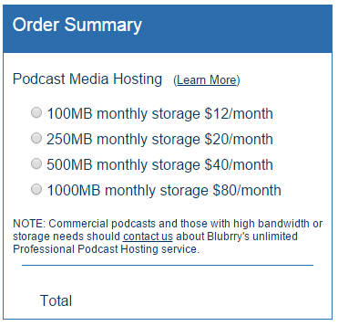
Triumphantly, I clicked this link. This is what I got:
Blubrry checkout page doesn't lend confidence.

The blubrry checkout page doesn’t offer any help.


I was offered a choice of four amounts to pay, with no other information to guide my choice. All confidence drained from my body. Clearly I missed something.
I’m a college graduate! I’m a trained web expert! And I cannot buy a subscription for a podcast hosting service?
I’m a college graduate! I’m a trained web expert! And I cannot buy a subscription for a podcast hosting service? Self-loathing quickly followed.
Which would you choose. Is the cheapest enough?

Which would you choose. Is the cheapest enough?


Any bright individual would choose the cheapest. But then, I didn’t want to risk my content by being a cheapskate.
Ultimately, I left and went back to the emails informing me that my account had been cancelled. There were no links to this page nor any page offering solice.
I came back and, acting on a sliver of memory, chose the $12/month option because that was what I thought I was paying.
It was only when putting this column together that I found the page with the details I was missing. By clicking from my blubrry account page on “blubrry home” and then “blubrry store” I found this.
No matter which "Order Now" button you click, you are taken to the same confusing page.

No matter which “Order Now” button you click, you are taken to the same confusing page.


Guess where “Order Now” takes you? Yep. The same obscure page listing four undefined prices.
The page of frustration cannot be defeated.

The page of frustration cannot be defeated.


Of course, this could be fixed with a little logic that selected the proper level for the visitor and listed the name of the service level.
The point of this case study is this: conversion optimization gold may not be as far away as you think.

Blubrry is a Good Service, But…

I have already invested the time to make this service work for me. I’ve been a client for a couple of years. I’m committed. I did, however, check out competitor Libsyn to see if I should just jump ship. I didn’t.
Those less committed prospects who might be making a similar decision won’t be so forgiving.
The site is a user experience disaster, one of the hardest to use I’ve encountered. My account is not setup properly, but I’ve been able to make it work. I just found out that blubrry has options for advanced analytics. What a shame that I didn’t have this data sooner.
I suspect I am not the only one who has trouble with blubrry.com.
The site doesn’t need a redesign, but it needs some guiding elements on key pages. Only then can we begin to optimize for those subtle changes that make a site really convert.
Todd, please contact us and let us help you. It may be the most profitable call you make all year.
Any sites you think need a re-read? Let us know in the comments.
 

Update

The folks at Blubrry read our post. See comment below from Todd Cochrane. A simple change to the order page may decrease their abandonment rates.

I hope we’ll hear from them if their fortunes improve.

Video helps your marketing. It’s not a very controversial statement, but for years now YouTube has been hovering around the number two spot of the most-used search engines, yet somehow video in online marketing still has a feeling of just emerging from its infancy.
Despite that, marketers feel very comfortable using video for their own projects, with close to 80% of marketers polled by eMarketer claiming they’ve leveraged video for their own brand’s marketing. Marketers are starting to see that they can benefit greatly from leveraging video in channels like email marketing.

Email and Video: An Unlikely Marriage?

Email marketers are among many starting to see the benefit of video in their campaigns. Jon Spenceley of Vidyard.com reported that the brand Clear Fit saw a 53% higher click-to-open rate on emails that featured a video call-to-action over their non-video counterparts.
Even mentioning the word “video” can increase open rates by 20% as reported by the Daily Egg blog. In fact, it’s preferred over even more precise terms like “webinar” and “conference”.
A white paper released by The Relevancy Group LLC showed an increase in customer engagement across the board when videos were used in email campaigns. This includes conversions, click-through, social sharing and even average order size!

What are the benefits of using video in your email marketing messages? Source: The Relevancy Group, LLC Executive Survey, n=66 2/13, United States Only

What are the benefits of using video in your email marketing messages? Source: The Relevancy Group, LLC Executive Survey, n=66 2/13, United States Only

Video also has the added benefit of being mobile friendly and this is especially good news since last year mobile finally overtook desktop-fixed internet-access hubs.

Number of global users on desktop versus mobile from Smart Insights

Number of global users on desktop versus mobile from Smart Insights

These numbers are no doubt impressive and there is some psychology behind why video is so effective.

Why Do Customers Prefer Video?

While numbers are definitely indicating a preference for video, we’re interested in exploring why? Let’s start with a simple video-email analogy.
The process of checking email is largely a passive activity. You have information sent directly to you and you review it. Checking your email is a simple process, and it’s precisely the reason marketers find video such an attractive transition within the user’s experience.
Videos can engage customers without requiring them to change their current state which is important because your customers don’t have to do work in order to do business with you.

Video content allows customers to enter into your sales funnel without feeling like they’ve abruptly left another activity behind.
Video content allows customers to enter into your sales funnel without feeling like they’ve abruptly left another activity behind. That’s a hugely beneficial psychological component supporting why video seems to increase the effectiveness of marketing activities.

Carefully Weighing Video in Email Marketing

Videos are great for the user but how much should they be used and where? What should your marketing campaigns look like? A lot of the focus on video and improved conversions in the research cited above touts the benefits of video specifically in email marketing campaigns. But don’t go and blindly add video to every email and marketing document you send out!
Embedding video is great for the user and engaging them with your brand in their current state of mind, but there are also drawbacks. Even well-rounded and optimized email campaigns need to consider what can go wrong before including video.

Thumbnails

Thumbnails, perhaps the most overlooked aspect of video, can actually create several unintended problems for your campaigns. YouTubers have long known that thumbnails matter and email marketers inexperienced with video should take some notes. A good thumbnail needs to be good-quality with a central focus and also be adaptable to changes in sizes. A thumbnail may have to scale from as small as a couple of hundred pixels to over a thousand.  Size considerations also apply to text included in the thumbnail, since it can quickly become unreadable.
The best thumbnails:

  • Evoke emotion
  • Leverage controversy
  • Focus on a human face with an engaging expression
  • Accurately represent the content

These need to be used carefully and in accordance with the brand’s overall messaging and feel.

Embedding

While thumbnails are important, email marketers need also to consider whether to leverage the new video embedding feature that many email clients now support. There’s more support now for this feature than ever, but its current ubiquitousness might have you question whether all your customers are receiving your marketing messages. Since approximately 58% of email users (via Social Mouths) cannot view video embedded in their emails, marketers should be careful about placing all their eggs in that basket.
Even if a customer can open the content, the ability for your customers to engage with your brand in an individual email is limited. Ideally you want your customer to engage with your site more directly.

Leveraging Landing Pages Can be Confusing

Landing pages can support email marketing and help take visitors from the email to the website or to an important conversion in between. You may have a landing page AND an email sporting an embedded video, but that creates a bit of confusion for your customers on how they should share this information. Do they forward the email with the video? Do they email a link to the landing page? If the customer forwards the email, will it create formatting issues with the video?
If you prefer to use a landing page to support your email marketing, you should embed the video in the landing page and use a call-to-action that mimics the look and feel of a video player. The slight disruption is outweighed by side-stepping user confusion of where to share and of course by drastically improving the user’s ability to actually access the video content.

Final Thoughts

There is a lot to consider when working with video in email marketing. It may not be the right move to include video in your email marketing efforts. If it is the right move, you may have a separate set of considerations when it comes to landing pages. Pascale Guay, CEO of Dialog Insight, responds to the limitation of video content in email marketing on her company blog saying the most important strategy for email marketers is to make use of the channels used by their target audience above all else. If your target audience responds to email marketing – use this channel! If your open-rates soar because of video content – use this channel…carefully.
Are you using video in your email campaigns? If not, how come? If so, how is it working for you? Leave a comment below!

About the Author

Jenix Hastings
Jenix is a journalist who specializes in discovering and documenting digital media. She makes a living as a copy writer specializing in web content and recently began writing for her personal blog: www.jenixwrites.com. Jenix is also a proud new mother and when she isn’t writing she’s sharing in the daily discovery of her beautiful daughter. Reach out @JenixHastings.

It’s February and we’re just now publishing our “Most Popular Posts of 2014” post.

We were in a bit of a quandary on how to go about this. Even though we are the masters of metrics, the mullahs of measurement, and mightier than mayhem, we weren’t sure how to measure “popular.”

Wipe that quizzical look off of your face.

Effective content marketing is one reason we have enjoyed so much success, and our blog is the heart of our content marketing efforts. We take it very seriously.

We want posts that are popular to our target audience, marketers struggling to use data and testing wisely in their online efforts. We also want content that grows our subscriber lists. This is how we begin a relationship with you, our readers.

While we want to give you a list of great content to read, we are more focused on learning something from 2014 so we can give you more of what you love in 2015.

Before we reveal our top ten, we invite you to follow us on our journey through the data.

What Tells Us That a Post is Effective Content Marketing?

Which metrics tell us that a post is popular with our target market? We considered several. Our final top ten list was a blend of all of these.

Here’s our thought process.

Visits, or Sessions

It seems to make sense that the most visited posts would be the most popular. We pulled our visit statistics from Google Analytics on a post-by-post basis.

Our most visited post by far is entitled 63 Great Email Subject Lines from the SXSW Catalog. Google has fallen in love with this post. It was published in 2011 and is perennially our most visited post. This year, it has three times the visits of the next competitor.

image

This post is our most popular by visits, but it really isn’t as relevant as some other posts.

We had fun writing this post, but it isn’t particularly relevant to our business. It has a low conversion rate, low engagement and generated few shares relative to the traffic.

Once we weighted some of the other factors found in this story, this post fell out of the top 10. In our final selection, only four posts were in among the ten most-visited. No, visits are not a good proxy for popularity.

Bounce Rate

If people are visiting our site, but not sticking around, we say they bounce. We measure a bounce as a visit lasting less than 15 seconds. Pages with a low bounce rate would be considered more popular than those with an above-average bounce rate.

The standout post with regard to bounce rate was Rotating Headers Don’t have to Kill Your Conversion Rate.

Most people spent more than 15 seconds reading this post based on it's low bounce rate (4.86%)

Most people spent more than 15 seconds reading this post based on it’s low bounce rate (4.86%)

Overall, seven of the posts in our final top ten also had top-ten bounce rates.

Engagement: Time and Pages

If visitors are spending more time on our site, we could assume that they found the content relevant.

Of our top picks for 2014, Pages per Visit and Average Session Duration were highly correlated. Posts with high engagement also enjoyed high conversion rates and low bounce rates.

Our most engaging post was What are You Really Selling on Your Landing Page? [CASE STUDY]. This is what I call a highly efficient post.

Our most engaging post was taken from a free consultation. It did not require a great deal of research.

Our most engaging post was taken from a free consultation. It did not require a great deal of research.


It took very little research to write. I took information from a free consultation for the example, and simply wrote up my conclusions.

This post brought a lot of return visitors, probably regular readers. It had the highest conversion rate and also generated the most comments.

Other high-efficiency posts included How to Present a High-Converting Value Proposition [CASE STUDY] and  How Many Steps Should Your Online Checkout Have? [CASE STUDY].

Number of Leads Generated

The post that generated the most subscribers for our conversion course was a case study from a prospect.

The post that generated the most subscribers for our conversion course was a case study from a prospect.

When we’re not sharing our expertise with you fine folks, we spend our days finding out what our clients’ visitors want from their sites. We don’t bother asking them. We let them vote with their wallets and their contact information.

The same is true in our consulting business. If our guests truly enjoy our posts, they should naturally subscribe to our content or sign up for our free course. Growing our subscriber list is critical to our business. This is how we begin a conversation with potential clients. This is pretty important.

For each of our most-visited posts, we calculated the conversion rate. A conversion for our blog is a subscriber to our list or a conversion course student.

So what kind of content has the highest conversion rates? Oddly enough, our “highly efficient” content also enjoys high conversion rates. Three of the highest converting were created from free consultations. One was a client case study. One was an infodoodle captured live at the Business of Software conference.

All-in-all, seven of the top-converting posts made our final ten.

Social Shares

If someone is sharing our content on social media and by email, we can assume they found the content, well, shareable.

Our most shared post was an infographic submitted by another company.

Our most shared post was an infographic submitted by another company.

To size up social shares, I calculated the shares per visit, or SPV. The post with our highest SPV was New Ideas for the New Year: Online Marketing in 2015 [INFOGRAPHIC] at 48.9%. This means that for every two visitors, one of them shared on social media – 221 on Twitter, 33 on LinkedIn, 24 on Facebook, and two on Google Plus.

This story was NOT in our final top ten list. It was hurt by a low conversion rate and short average session duration. Clearly, people came, scanned and shared. This post was an infographic, and of the posts with the highest SPV five were infographics.

Of our top-ten posts, six had strong shares to visit ratios.

Other Influences

The major point of doing this kind of analysis is to provide more of what visitors are looking for in 2015. Feeding the content machine required original content as well as curated content and guest writers. Our analysis teased out the value of these strategies.

Guest Posts

Two guests posts made our top ten list.

Two guests posts made our top ten list.

We had a lot of guest contributors – eleven of the top-twenty most visited posts. So, we were surprised that only two of our final top-ten were contributed by guest writers. Curiously, these were both infographics.

If we just look at the ten most visited posts, six were guest posts and five were among the most shared. Four had high conversion rates.

In general, most guest posts fell out on engagement metrics. For some reason, readers of guest posts visited few other pages, and didn’t stay long.

Infographics

I’ve always been somewhat cool to infographics. They generate a lot of traffic, but didn’t seem to deliver the goods when it comes to engaged and converting visitors.

Boy was I wrong in 2014.

Of our top ten posts, four were infographics. Two of them were among the highest converting posts of 2014.

Two of the four were infodoodles, hand-drawn during live presentations. This is highly efficient content for us.

Doing infodoodles allows us to leverage “celebrities” – Rand Fishkin and Bryan Eisenberg in this case – who may be more likely to share our infodoodles with their audiences. Sometimes it works. Over 81% of visitors to Rand Fishkin’s infodoodle were new top our blog, the highest in our top-ten. Thanks, Rand.

Infodoodles are unique to The Conversion Scientist. It leverages industry celebrities.

Infodoodles are unique to The Conversion Scientist. It leverages industry celebrities.

Maybe more celebrities would share if we didn’t include caricatures.

Angie Schottmuller

Angie Schottmuller

Oli Gardner and Joanna Wiebe

Oli Gardner and Joanna Wiebe

Case Studies

Humans love stories, and that is what a case study really is. We relate to the trials and tribulations of others in a way that “How to” posts can never enjoy. Our top ten list bear this out, with four of the final ten being case studies.

We’ll definitely give you more of this in 2015.

Headlines

Contrary to popular belief, typical headline strategies didn’t seem to apply to us.

None of the headlines started with a number. You don’t have to troll Twitter for long before you see the proliferation of headlines beginning like “# Ways to…”. Only three of the top 20 most visited posts used headlines in this format.

Questions should never invoke a "yes" or "no" answer.

Questions should never invoke a “yes” or “no” answer.

Three headlines were stated as a question. Questions are dangerous. If the answer to your headline question is “Yes” or “No” then visitors don’t tend to read on. An example would be “Are you Struggling with Your Landing Pages?” Question headlines should cause the visitor to ask, “What is the answer,” or “How will you do that?”

We don’t use question headlines on our sites much. Maybe we should do it more.

Other Insights

By creating a weighted score for our posts, we were able to select a list of the most engaging, educational and efficient posts for 2014. There were some surprises in this list.

  • Only four from the list were found among the ten most visited posts.
  • Nine of them scored well for engagement (pages per visit and session duration).
  • Seven where high-converters.
  • Six were among the most shared.
  • Two featured “celebrities” Rand Fishkin and Bryan Eisenberg.
  • One featured a brand (Amazon) and one featured places (Austin and Vancouver).
  • Four were case studies.
  • Only one post containing video made the list.
  • None of my podcast posts made the list.

The Final Top-ten List

Our scoring system combined entrances (visits in which the post was the first page), bounce rate, pages per visit, average session duration, conversion rate, and shares per visit into a single score.

Here are the top scoring posts from 2014. Check them out.

Score Post Title
3.35 What are You Really Selling on Your Landing Page? [CASE STUDY]
2.87 Rotating Headers Don’t have to Kill Your Conversion Rate [CASE STUDY]
2.85 The Science of Pricing [INFOGRAPHIC]
2.81 How to Present a High-Converting Value Proposition [CASE STUDY]
2.79 Your Landing Page Questions Answered: Unbounce Webinar Extended Edition
2.75 Is Austin Really The Conversion Capital of the World? Vancouver says “No Way, eh.”
2.74 Rand Fishkin Cracks the SEO Code in 2015 [INFODOODLE]
2.74 What Makes Shoppers Click? A Lesson in E-Commerce Consumer Psychology (INFOGRAPHIC)
2.71 How Many Steps Should Your Online Checkout Have? [CASE STUDY]
2.67 Bryan Eisenberg Explains Amazon’s Relentless Customer-Focused Optimization [INFODOODLE]

We’ll bring you more of what you want, dear reader, in 2015.

small business report 2015 3d coverA new survey of 1,000 business owners and executives of small businesses has revealed their attitudes as we go into 2015.
Dallas-based Wasp Barcode is a small business and took it upon themselves to survey their colleagues, finding out how small businesses felt about the coming year.
As a small business, we took an interest in the findings of this report. Here is what we divined from the numbers.

They are Optimistic

Overall, 57% of businesses are expecting revenue growth in 2015. Only 9% expect their revenue to be lower in 2015.
This is a rosy outlook, considering that the Small Business Administration’s Office of Advocacy says that some 20% of businesses with employees will close shop within 5 years of starting. Optimism is a part of the job description for entrepreneurs, who create far more jobs than big companies in America.

They are Hiring, Or Trying

Of the biggest challenges facing small businesses, 42% cited hiring new employees. This was second only to growing revenue, and the two are intertwined for most businesses.
For companies above 51 employees, hiring was the most acute problem for 2015.
Government regulation and employee healthcare took the fourth and fifth slots on the list of challenges. Clearly, the changes in the national healthcare policies is on the mind of small businesses.

They are Local

It was somewhat surprising to find that 82% of small businesses had no plans to expand globally. In our experience, it is common to work with businesses who are utilizing highly-trained workers from outside of the US.
This statistic draws a bright circle around the fact that small business is local business.

They are Working to Keep You Happy

Of the small businesses surveyed, 56% said that they were focused on improving customer experience and retention. Small business has clearly gotten the message that it’s cheaper to keep a customer than to gain a new one.
This doesn’t mean that they’re not working to get new customers. The next most cited strategy was investing in new customer acquisition.
In 2015, we can expect to courted by small business.

Read the Full Report

You can read the entire small business report from Wasp Barcode and draw your own conclusions.
Disclosure: Wasp Barcode is a client of Conversion Sciences.

It’s unfortunate that I have to fly to Las Vegas to catch fellow Austinite Noah Kagan. However, I was glad to have caught his keynote at Affiliate Summit West 2015.
Mainly because he gave everyone in the audience $10. Real money.
Is he so desperate for attention that he has to buy an audience with cash? Maybe. But his little stunt was really to make a point. His question is, “Are your relationships in black and white, or full color?”
I captured the highlights of his presentation in this instagraph infographic drawn in real time. Share it with someone.

Affiliate marketers get conversion optimization.

I was gratified at how sophisticated the folks at Affiliate Summit were. Affiliate marketers understand that conversion optimization is a big lever that increases CPA payouts, makes advertisers happy and sets OPMs apart from the competition.
And it’s all we do at Conversion Sciences.

noah kagan infodoodle


The year 2015 will be full of surprises, but not everything needs to be a total shocker. We can start planning now for some of what 2015 will bring.
So, what should we be focusing on?
I am privileged to know some smart entrepreneurs and marketers, the kind of people who would have an informed opinion about 2015.
Give it a read and know that these bright folks (and me) aren’t guessing. Take these online marketing tips and do your own research.
For me, Peep Laja summed it up best:

“Be your own benchmark. Aim to do better than you did last month.”

A few good friends of ours are quoted in this image – if you’d like to see them in person, consider coming to ConversionXL Live in April.
2015 Marketing Tips
Hat tip to tribes.no

Online retailer iNature Skincare® sponsored a video that turned into a phenomenon.

Released on October 29, 2014, the Comfortable: 50 People 1 Question video had garnered over 4 million views within two weeks.

iNature Skincare had sponsored a viral hit.

Unfortunately, sales did not rise as much as one would think. Why not? It is not uncommon for viral videos to fail as buy-ral videos.

We took a look at their site and felt that they hadn’t mapped the visitors journey appropriately.

The Visitor’s Journey

In this case the visitor’s journey starts with being moved by the video. It should then move to becoming aware of the brand, to understanding why the brand sponsored this video, to considering their products, and then to purchase.

I feel good. I want to feel good some more.

After viewing the video, we feel pretty good. Or sad. Or nostalgic. These feelings aren’t typical when considering skin care products.

As viewers, our first response is to get more of this feeling. The most common way to extend the feeling is to share with others. This is clearly happening.

However, iNature Skincare should be enabling this next step. I would have liked to know why iNature sponsored this video.

How does my feeling relate to the sponsor?

iNature Skincare’s viral video is benefiting other brands, brands not nearly as closely aligned with it.

For me, PS Print is getting the love from this video because they are advertising here. This is most likely a retargeted ad. I think iNature Skincare should be here.

Other advertisers are getting the benefit of this viral video through advertising.

Other advertisers are getting the benefit of this viral video through advertising.

My recommendation was that iNature Skincare should ask the producer to add an overlay or advertise on the video with a message that says, “Why did iNature Skincare asked 50 people this question? Our story.” This would run before the filmmaker, Jubilee Project had a chance to make their pitch at the end.

This ad would allow visitors to take the next step in the journey. If you were producing such a video, you would want to use the end of the video to bring the viewers to the next step.

The sponsor shares my values.

The ad would need to bring the visitor to a page that answered the question posed.

Every ad should bring the visitor to a page that continues the journey. Home pages are notoriously bad at that.

The page should communicate that there was a reason for the effort, and tie the message to it’s products. We really don’t have to work too hard to do this. The message, in words and pictures would be:

We chose to sponsor this video because one of the people interviewed was clearly impacted as a child by acne and eczema. Our products could have helped. We’re still working on the Mermaid Tail.

If I have skin problems, my next question should be, “Really? How?”

The sponsor can solve a problem I have.

iNature Skincare has strong proof of the effectiveness of its products. It has an award-winning package design that lends it credibility. But we must honor the visitor’s journey.

Now is the time to begin building out the company’s value proposition in words and images.

I felt that the compelling proof found in a study was their most powerful statement of the power of the product. This study was small. Eight babies were treated with their product and the results measured on two scales. The before and after pictures are available on the site.

This page offers compelling evidence of the safety and effectiveness of the products. Click for full image.

This page offers compelling evidence of the safety and effectiveness of the products. Click for full image.

The results on this page are unclear, but the pictures are powerful. The product is effective and save enough for babies.

What product did this? Unfortunately, iNature Skincare leaves the visitor hanging on this page. This is an ideal time to introduce the product that had such an impact and offer more information. This could be done in the right sidebar area of the page.

A mockup of the Consumer Study page with a next step for the visitor.

A mockup of the Consumer Study page with a next step for the visitor.

I would also add products at the bottom of this page.

I can afford the product that solves my problem.

The visitor now needs to do a cost/benefit calculation. It’s time to introduce the product and complete the value building process. For iNature Skincare, the product page does a good job.

I recommended putting a picture of the product used and a link to learn more about the product. The page that featured the product was imperfect, but provided a good deal of information.

The iNature Skincare product page.

The iNature Skincare product page.

This was a good next step because after providing the product information and the price, the presented the next step in the visitor’s journey.

Should I buy now? Can I delay?

The next step in the journey is the choice. So far, the question in the visitor’s mind – “Should I go on?” – has been an easy one to answer. Each click offered more relevant information in the journey.

Visitors that don’t have skin problems have fallen away. Now we are talking to those who need our product.

It’s time to bring them to choice.

This is the job of the call-to-action button. For most ecommerce sites, “Add to Cart” tests well as the call to action. It is presented here in bold read.

This is the traditional next step in the buyer's journey for ecommerce sites.

This is the traditional next step in the buyer’s journey for ecommerce sites.

The button is very wide, and almost doesn’t look like a clickable button. It also lies well down the page. It could be missed. Nonetheless, it offers a natural next step in the visitor’s journey, an important final step.

If, at this point, the visitor does not purchase, then we can assume that

a) they just weren’t ready

b) we didn’t do a good enough job of building value

Price is rarely the issue. When I tell you that your product is too expensive, they mean that you didn’t do a good enough job explaining the value to me.

Could iNature Skincare entice more of these lost visitors to buy?

The Complete Journey

We’ve mapped out a journey from first exposure through to purchase.

  1. A good feeling from branded content
  2. Discovering a brand that shares my values
  3. The realization that the brand solves a problem I have
  4. Understanding the product’s value proposition
  5. The decision to buy
  6. Finalizing the transaction

Each point along the way holds an opportunity for optimization. Here are some opportunities for iNature Skincare to improve these waypoints.

Let Your Visitors Find Their Own Journey

For many visitors, we will not know where their journey started. So, we have to make it easy for them to create their own journey.

iNature Skincare as a non-standard design. The navigation bar is in a sticky band along the bottom, instead of along the top as is expected by most visitors.

This cuts 110 pixels off of the page height, space which could be used to further the value proposition.

The floating navigation bar at the bottom of the takes up precious space.

The floating navigation bar at the bottom of the takes up precious space.

Every page on the site needs to offer a next step toward evaluating the products. There are no next steps on the Our Story, About, Dry Skin or Before and After pages.

Every page should answer a question and continue the journey.

If you are stuck on designing your buyer journey, I recommend you buy Buyer Legends from Bryan and Jeffrey Eisenberg. They outline a process for laying out powerful stories that marketers can actually implement.


21 Quick and Easy CRO Copywriting Hacks to Skyrocket Conversions

21 Quick and Easy CRO Copywriting Hacks

Keep these proven copywriting hacks in mind to make your copy convert.

  • 43 Pages with Examples
  • Assumptive Phrasing
  • "We" vs. "You"
  • Pattern Interrupts
  • The Power of Three

"*" indicates required fields

This field is for validation purposes and should be left unchanged.


People sometimes confuse us with robot-like scientists, being lead by data and caring little for the creative side of marketing.

Nothing could be further from the truth.

Conversion-Scientist-Podcast-Logo-1400x1400


Subscribe to Podcast

I like to think that we can be more creative because we add a rigor to our creativity that allows us to try riskier things. If we have some data that says risky might work, we have a methodology through which we can confirm it’s effectiveness with a high level of confidence.

We backstop our creative with data, and this gives us a freedom that few designers and writers have.

In my new column Enhance Your Creativity Through Analytics I show you how we find data to backup or disavow our creative efforts.

Listen here or read it online.


21 Quick and Easy CRO Copywriting Hacks to Skyrocket Conversions

21 Quick and Easy CRO Copywriting Hacks

Keep these proven copywriting hacks in mind to make your copy convert.

  • 43 Pages with Examples
  • Assumptive Phrasing
  • "We" vs. "You"
  • Pattern Interrupts
  • The Power of Three

"*" indicates required fields

This field is for validation purposes and should be left unchanged.


When we stand up a website, perhaps the most valuable question we can ask about our visitors is, “What triggered them come to our website? What problem are they trying to solve?”
The question is different when someone comes on their smartphone.

The question is, “What triggered them to come to our website from where they are? What problem are they trying to solve right now?”
When you add the “where” and “right now” components, it is clear that your mobile site has to answer a very different question.

I was inspired to talk about this when I was looking for a Chinese Restaurant near my office.

How to define a Mobile User

How do you define a mobile user?

Is it the operating system they use (Android or iOS)?
Is it the size of their screen?
Is it the device they visit with?

I would argue that the best definition of a mobile user is if they need an answer where they are or right now.

When I was looking for a Chinese Restaurant near my office, I picked up my smartphone even though I had a full-powered PC right in front of me.

Why did I do this?

Because my phone is my “where” device. It can tell Google exactly where I am as a reference.

It is also my “right now” device. When someone asks a question that I don’t know the answer to, I Google it on my phone. Not my laptop.

Old habits die hard.

So, what did I get from my where and now search?

A mobile site that doesn’t quite get me

For the person who is searching for a Chinese Restaurant from their mobile device, there are a few predictable questions. Your business has a similar set of predictable questions as well.

Here are the key questions for desktop and mobile devices:

Desktop/Tablet Questions

Mobile Questions

Where are you? How far are you from where I am now?
What are your business hours? Are you open now?
Do you deliver? Do you deliver to where I am now?
What is on your menu? Does your menu meet the requirements of the people with me now?
Do you have a nice environment? Will I be embarrassed when we all show up?
What is your phone number? What do I do if I don’t find an answer to my above questions?

So, how does the Chinese Restaurant Shu Shu’s mobile website fare in meeting my needs?
Mobile Website First screen
Shu Shu’s wins with a nice big click to call button. I may not need this now, but this is the way to display a phone number for a device that is a phone. Dialing is so last decade.

The two other big buttons on the first screen are both helpful and baffling. The map icon shows a map of the store location. “Where” is a natural mobile question. But, “Where is your Google Plus profile” is not a natural first question. So why is that the second most important item on the top screen?
Mobile website for a restaurant
The value proposition, “Fresh Ingredients, Clean Environment, Healthy Eating!” is not a common mobile question. In fact, this value prop introduces the concept of a not-clean restaurant. If it wasn’t a problem, why bring up “clean?”

The menu button answers an important question and one of the early ones. But why send people off to Yelp!? It seems that this would encourage comparison shopping.

Optimizing a Mobile website

And then came the text. Do I need to know that “Shu Shu’s Asian Cuisine offers the mouth-watering tastes you’re craving at  our Chinese restaurant in Austin, TX?”
No, I don’t. This is SEO copy, and it has no place in a mobile experience. This is a downside of the responsive design.

Unfortunately, it just keeps going.

Optimizing a Mobile website
Finally, I get to something that speaks in the language of smartphones: images.

Well, one image.

Optimizing a mobile website maps and pictures
Let’s have some more pictures, please.

And we finally get to the map, with a link to “View on Google Maps.” This is how we can answer the question, “How far are you from where I am now?”
Responsive design changes image
Adding a coupon-like sweetener is smart. However, the responsive design changed the aspect ratio of the image, making the site look cheap.

Next are the facts about address and hours of operation, complete with a link to “Website.” I thought we were already there?
Mobile website has basic information.

Design for the Bottom Bounce

Finally, we hit bottom. Smartphone users have busy thumbs that generate lots of scrolling. Scroll tracking shows that many mobile visitors will “hit bottom.” This part of the page can be as critical as the first screen.

Put calls to action at the bottom of your mobile website.
Choose wisely what you put at the bottom. I wouldn’t recommend sending bouncers off to social media. In fact, I would repeat the click-to-call phone number, place a clickable address, and maybe a way to take action here. A “Place an Takeout Order” button or “Email this to Friends” button would be good considerations.

I would also consider placing ratings and reviews here if possible.

All in all, this mobile site eventually delivers answers to most of the mobile user’s questions. The effectiveness is hampered by the responsive design that

  • Inserts unnecessary elements.
  • Slows the load time significantly.
  • Mutilates some images.

In this case, a responsive design is probably not the right choice from a purely functional standpoint. However, it is easy to maintain, and restaurants don’t usually have the staff to manage multiple sites.

You don’t have to run a restaurant

The questions are the same, even if you don’t run a restaurant. However, there are differences for sites that have “considered” purchases, such as high-ticket products or business services.

What can you teach the mobile designer right now, where they are? Are they in a meeting being asked about solutions like the ones you provide?
We think that cross-device calls to action can be a big help.

In this presentation, I talk about predicting the future.
The problem with predicting the future, even using CRO, is that our visitors are very unpredictable. Here are some of the assumptions we use to predict the future that just don’t work.
Because, really, all of us are predicting the future. When we’re building our sites and we’re putting our ads out, we’re trying to predict what that ad or that site is going to do for our business.
We’re all trying to predict the future and we’re not very good at it.
The Conversion Scientist Podcast


Subscribe

© Copyright 2007 - 2024 • Conversion Sciences • All Rights Reserved • Conversion Scientist® is a federally registered trademark owned by Conversion Sciences. Any unauthorized use is expressly prohibited.