In this episode of Intended Consequences, we discover how to implement website surveys without affecting conversions and we evaluate some great tools to measure and analyze the gathered data.
Implementing website surveys is always a great idea. Unfortunately, if wrongly implemented, they may lower conversions. Our visitors may decide to respond to the survey and forget what they added to the shopping cart. Today, we’ll analyze the importance of well crafted website exit survey questions that will shield results. We will also share with you some AI-powered tools that can help you find out how to diagnose your webpages and get visitors past the obstacles that most of us unintentionally create.
Intended Consequences: Interview with Curtis Morris of Qualaroo
Resources and Links Discussed
- Follow Curtis on Twitter – @curtis_morris
- Follow Brian on Twitter – @bmassey
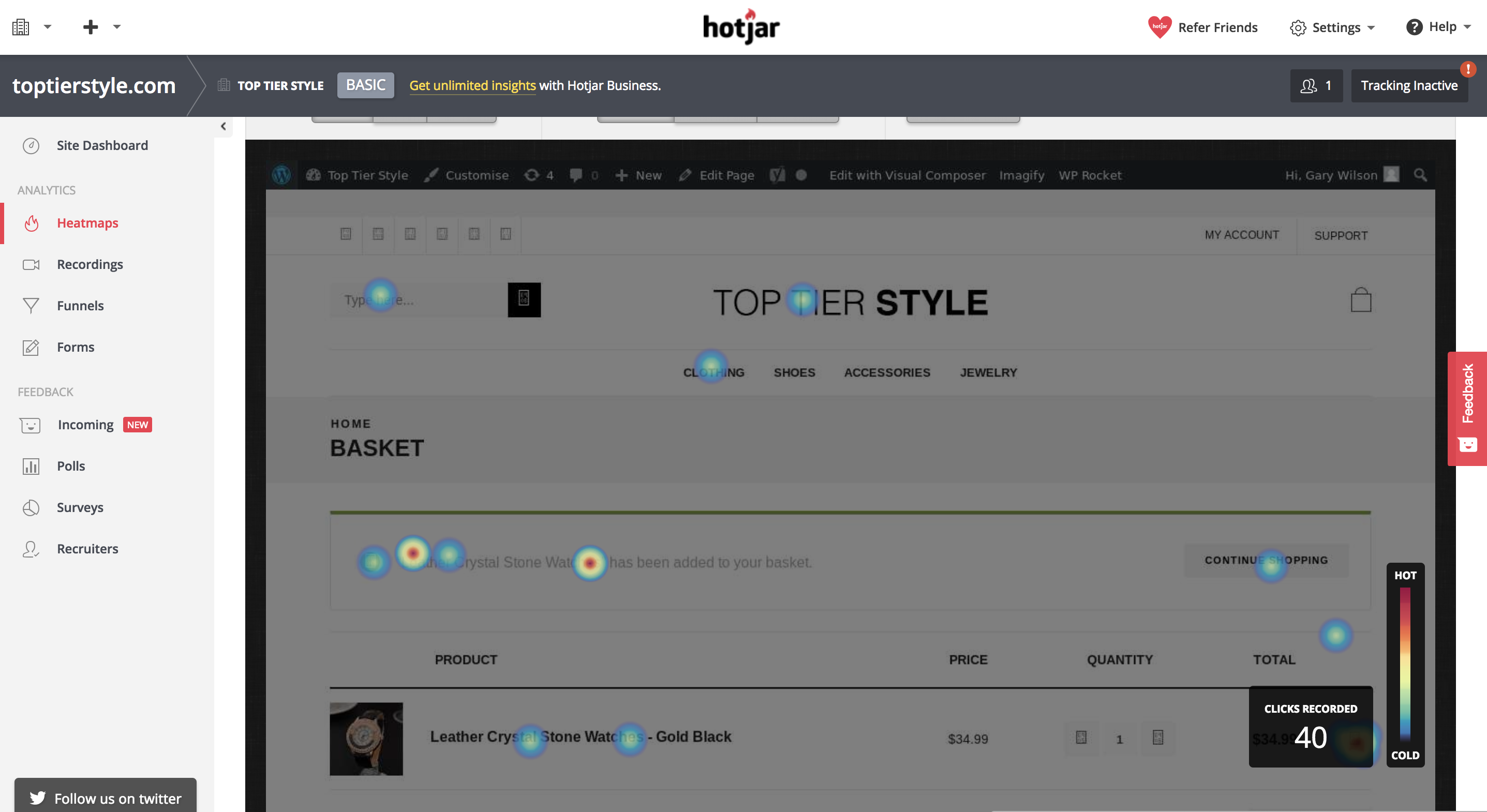
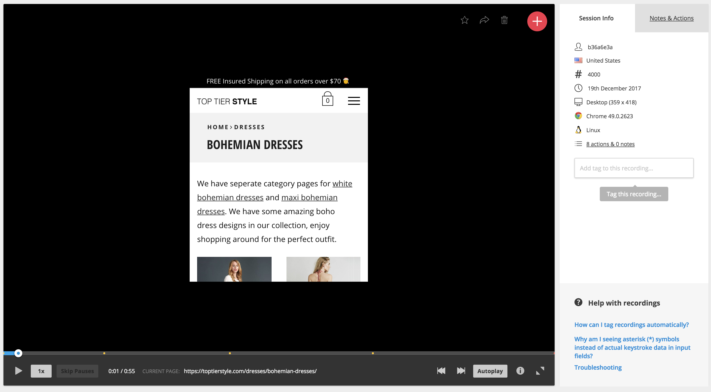
- Learn more about the tools mentioned – Qualaroo, Zapier, Salesforce, IBM Watson, HotJar, and SessionCam.
How to Implement Website Surveys without Affecting Conversions Key Takeaways
- Thank you page survey: Find out why this should be a part of every website that processes sales, subscriptions or registrations of any kind.
- What almost kept you from buying today?: In this episode, learn what’s more effective than Net Promoter scores or pre-sale feedback queries.
- “Liking” In Action: Curtis shows us when is the best time to ask someone to take desired action.
- Data Tools: Find out which tools to use that allow you to be more creative, all while gathering data to be effective.
An Interview with Curtis Morris of Qualaroo

Curtis Morris formerly with Qualaroo
Qualaroo let’s you discover issues — good and bad — that are affecting your prospects and customers. It provides a business with the ability to ask website visitors questions, collect answers, and process high quantities of input. The tools uses sentiment analysis and AI-driven text recognition to summarize inputs from hundreds or thousands of participants.
There is no better focus group than your prospects and customers. Qualaroo keeps you in touch with them.
How Automatic Solved Their Sales Problem with a Website Exit Survey
The people at a company called Automatic had an idea. What if we created a device that would connect your smartphone to your car’s computer. The idea was great, but then they ran into a problem.
How do you get people to buy the more profitable version of your product? How do you get people to click on the things you want them to click on? How do you get them to
When you take any car built since 1996 to a mechanic, one of the first things they will do is plug your car into a computer. The mechanics computer will essentially ask your car what’s been going on.
This makes me think of Star Wars, when Han Solo tells C-3PO that he needs him to talk to the Millennium Falcon.
It turns out that there’s a lot that your car can tell the mechanic, most of it uninteresting to the mechanic.
When one of the many sensors around your car detects a problem — your oil is low, or your engine temperature is getting high — your car shows you a “check engine” light, as if you couldn’t handle the details.
But your car knows more. Much more.
You car knows how fast you’re accelerating. It nows how fast you’re slowing down. It knows if your airbags have been deployed. It knows the levels of all of the fluids, the pressure in the tires, even the quality of the emissions coming out the tailpipe.
For your mechanic, all of this information becomes available through a special port in your car, called the OBD-II port. They get an engine code from your car’s computer and can lookup the problem, probably online.
The people at a company called Automatic had a idea. What if we created a device that would plug into the port on your car, and connect your smartphone to your car’s computer. Then your pocket C-3PO could talk to your four wheeled Millennium Falcon, translating engine codes and much more.
It turns out that Automatic was on to something. Their device connected your car’s computer to your phone, and then their app tracked your trips, monitored your acceleration and deceleration — to help you save gas — and even connected to a variety of apps so you could expense travel miles and turn on your Nest thermostat when you pulled into the driveway.
How Implementing Website Exit Surveys Increased Conversions
In 2016 the company released a more advanced version of the product. Automatic Pro had its own always-on 3G connection. This meant that it didn’t need your smartphone to communicate with the internet. This opened up new opportunities.
Automatic Pro could alert someone if your airbags deployed, even if your phone was broken in an accident. If your car was stolen, you would know exactly where it is. The site touted “event-based apps” and “streaming apps” and “parking tracking.”
The old device was recast as Automatic Lite and sold online for $80 beside the Automatic Pro at $130.
And most people bought the Lite version.
This was a bit of a problem as the Lite version was a lower margin product. Why weren’t people buying the clearly superior Pro version of the product? Should Automatic just accept that car owners are cheap and adjust their expectations?
Fortunately, Conversion Sciences was working with them, and tackled this problem for them. Using our sophisticated scientific minds, we devised a strategy for finding out why buyers weren’t jumping on the Pro product. We asked them.
Whenever someone bought an Automatic Lite, we served up one question in a popup box: “Why didn’t you choose the Automatic Pro?”
Within two weeks, we had over 150 responses. And these responses were from people who had already been all the way through the purchase process. The popup had no negative effect on conversion, because it appeared AFTER THE SALE.
And it told us what was wrong.
After analyzing the responses, one comment really summed things up.
“I don’t think I need crash alert. I have apps that track where I park just fine, nor have I ever needed it. I don’t know what Live vehicle tracking means. I don’t know what event-based apps means. I don’t know what streaming apps mean, either.”
In short, the site wasn’t doing a good job of helping them choose the right solution for them. So they defaulted to the cheapest option. This is the classic problem of the Pricing Page. The job of the pricing page is not to show off all of the features. It’s to help the buyer choose the right plan, the right level or the right feature set.
By modifying the way the features were presented on Automatic’s pricing page, we were able to significantly increase the number of units sold overall, and increase sales of the profitable Automatic Pro as a percentage. This was proven with an AB split test.
Things were going well enough that Automatic was acquired by SiriusXM, the satellite radio people, for 100 million dollars.
This is the power of qualitative data. Qualitative data is that delicious, juicy input that comes directly from buyers, prospects and pretenders. It’s typically gathered in surveys, focus groups and polls. These can deliver quantitative data, but qualitative data is prized for its messiness. It helps us understand how people think about products, how they talk about their problems, and what really is important to them.
The downside of this kind of data is that it is harder to process. We had 150 responses to analyze for Automatic. Imagine if you got thousands a day. Every day.
These are the problems that Curtis Hill thinks about. He is CEO of Qualaroo, and believes, as I do, that quantitative data means nothing if it’s not supplemented with qualitative data. So, listen to the Podcast for all the juicy details on how to implement website surveys without affecting conversions.