I’ve seen plenty of websites that are beautifully designed and portray a strong sense of professionalism.
And that’s great. But it’s not enough.
Many businesses are missing out on a crucial opportunity to get their visitors to actually engage with their website. Think about it. If you can get your visitors to actually do something while on your site and engage them, there’s a greater chance that you’re going to push them through the funnel.
Case Study: Increasing Homepage Engagement
Here’s a brilliant example. Take a look at the Super Fast Funding website.
This is their original page. There was not a lot of opportunity for visitors to engage upon landing on the home page.
Super Fast Funding’s original website didn’t offer many ways to engage.
The picture on the right hand side doesn’t tell us much. It’s nearly impossible to decipher or read the text on documents at which our friendly smiley faced cartoon is pointing.
There are also several other things going wrong here.
The main headline asks “Are you fundable?” There are two possible answers to that question: yes or no.
Don’t ever ask your visitors a question that could be answered negatively with a “No” response.
Don’t ever ask your visitors a question that could be answered negatively with a “No” response. It creates doubt and in their minds, could immediately disqualify them from further engagement with your site.
Instead, give them hope like in this new version of their home page. Kudos to this new design. Super Fast Funding has added several elements to dramatically increase visitor engagement.
The slider bar invites the visitor to start interacting with the page and this can increase conversion rates.
They’ve preceded their phone number with the verbage “Questions?”. They’ve added a video rather than just an “Our Video” link in the main menu bar since many people opt out of watching a video if there isn’t a propelling thumbnail to get them interested.
A Live Chat link has been added at the very top of the page. A blog has been added. And they’ve also added a “Get Started” button.
Now that’s engagement.
But what I really liked about this page is the slider bar that they’ve added that allows visitors to choose the amount of funding that they’d like to receive.
Not only did they eliminate the possibility of a “No” answer, but they’ve made the experience very interactive for their visitors (while also giving them a sense of control), and by doing so, they’ve dramatically increased visitor engagement.
Do you see now why amping up the opportunities for visitor engagement is important to increasing sales, revenue, customer acquisition and a larger portion of the market share? A website provides far greater opportunity for engagement over other marketing collateral mediums. It’s a shame if you don’t take advantage of that.
Case Study: Screen Sharing for Easier Engagement
LiveLOOK – which was acquired by Oracle last year – has added a bit of brilliance in how they’re tackling online customer service issues: their solution makes it possible for merchants to assist their online shoppers through screen sharing.
Have you ever been in a brick and mortar store where a clerk has had to help you step by step with a transaction? I experienced it recently when a clerk had to help me through a scanning system that I had no clue how to operate. Had he not been there to help me, there would have been no transaction.
Screen sharing, in essence, does the same thing. When your visitors are completely stumped, merchants can get onto the shoppers’ screen and take actions for the visitor to assist them in the transaction.
One of the nation’s leading health insurance organizations utilized LiveLOOK’s co-browse solution to improve upon customer service issues, and it helped guide visitors through a variety of online processes including registering, paying bills online and finding more information. The most immediate result was the drastic reduction in call handling times. Calls that previously took up to an hour were reduced to 7-10 minutes on average.
That 85% reduction in call times created a savings in resources and compensation for those resources. Call center agents have also reported less visitor frustration which helps them to generate loyalty and customer satisfaction.
Tools to Increase User Engagement
Don’t forget, there are other ways to engage visitors and – just as importantly – ways to track that engagement. HotJar is a company that has made it really easy to track engagement by offering multiple tools in one bundled solution. Not only do they offer the engagement tools, but the solution also offers tools to track visitor engagement.
In a brick and mortar store, clerks are face to face with shoppers, so if they’re smart, they can communicate directly with those shoppers to help them through the buying process.
It’s vital that you do the same with your online store. The HotJar bundled solution includes:
Surveys
Exit Polls
Heat Mapping
Visitor Playback Sessions
User Tester Recruitment
Form & Funnel Analysis
There are other options for click tracking, session recordings, and heat maps that you can read about at MyConversionLab.com.
Surveys
In an effort to find out how knowledgeable users were on tech terms, a survey conducted by Vouchercloud.net revealed that 27% thought a “gigabyte” was an insect found in South America, 23% believed that an “MP3” was a Star Wars robot and 18% thought that a “Blu-ray” was a marine animal. According to the Harvard University’s 2014 Senior Survey, 13.17% of Harvard seniors admitted to cheating during their tenure at the school.
Who would have known unless the questions were asked?
Surveys are another way to obtain valuable feedback from your visitors. You can ask your visitors all of the questions you’d like to ask if you were face to face. When you’re putting together a survey, be sure to ask open ended questions that will provide you with more information rather than yes/no questions.
For example, rather than just ask “Did you find it difficult to shop on our website?” ask “If you found it difficult to shop on our website, what were the 3 biggest issues you experienced?”
And then there’s the tracking and analysis part. If you can’t analyze visitor engagement – how will you know how to improve it?
Exit Polls
Exit polls are boxes that pop up, but this time while your visitors are leaving. They typically ask visitors what issues they experienced that kept them from making a purchase, so it’s a quick and easy way to find out what’s keeping a website’s visitors from converting.
Heat Mapping
If you’re not familiar with the technology, heat mapping is where a small piece of code is inserted into your web page so that a visual representation can be created showing where visitors are clicking. And just as importantly, where they are not.
As you can see from the graph bar in the heat map image below, colors show just how many clicks are being made in a particular area. The color coding gives a visual representation with the color red representing the most clicks.
An incredible number of people click on the About link in the upper right corner. What does this mean?
We know that a percentage of visitors want to learn more about the people behind a company website before they feel comfortable moving forward through the funnel, but as you can see from click-tracking, it’s a little surprising just how many people are actually clicking on the second “About” button. Using this kind of technology may yield some interesting and unexpected results.
Visitor Playback Sessions
Visitor playback sessions take this type of tracking to another level. With visitor playback sessions you can actually watch a recorded video of visitors as they move around your site. You can see where they stop, where they scroll and where they click which means you can see where they get stumped and what might keep them from spending money on your site.
User Tester Recruitment
I’ve had some strong debates with companies in regards to my website audit recommendations – that is until the user tests come in and back up my findings. I wait to view user tests last to see if the users agree with what I’ve recommended.
User Testing allows you to look over the shoulders of people while they browse your site. You get a first hand glance as to where they are getting stuck or having issues.
Form and Funnel Analysis
Funnel and form analysis gives you data on where visitors are dropping out of your forms and funnels and lets you fix those issues.
Conclusion
Without tracking and analyzing your visitors engagement, it’s going to be very difficult to figure out how to improve their experiences. You could have a site complete with copywriting, images, and design that are absolutely spectacular, but it’s that interaction and engagement that’s going to provide you with the valuable feedback you need in order to be aware of issues that are frustrating and confusing your visitors, and it’s also going to give you the opportunity to assist them in getting past those frustrations.
About the Author
Marie Dean is the Innovation Director at CoversionLifters and has been an expert in the field of conversion optimization for 12 years. She helps clients improve their website conversions, increase revenue, lower acquisition costs and capture more of the market share through in-depth website analysis.
Feature Image Photo Credit: KayeNicole via Compfightcc and adapted for this post
I love the bubbles, but I doubt they are helping conversion rates. I haven’t seen animations like this since the 1990s. The background image slows load time and confuses the eye. The graduated fill on the buttons makes them all but unreadable.
Don’t laugh at my friends design. Here is a WordPress theme I recently reviewed. Check out the stars.
These stars don’t move the value proposition forward. Maybe it works for NASA.
Then there’s this:
Animation for animations sake is not helpful for scanners. Note the slow loading of the background image.
My friend needed a new theme for his WordPress site.
Fortunately, I had been asked to be a judge in the ThemeForest PageWiz template contest. More specifically, my task was to pick the themes that would make the best landing page templates.
I’ll tell you how I ranked these themes based on my experience, based on tests we’ve conducted here at Conversion Sciences, and based on my work as an online marketer who uses WordPress in my business.
47 Landing Page Templates, One Winner
The typical “Banded Sales Page” delivers the value proposition for a page in separate sections, or bands.
I reviewed 47 different PageWiz landing page templates created by designers. I was tasked with picking one I felt embodied the best practices in conversion-centric landing page design.
The goal of a landing page is to:
1) Keep the promise of an ad, email or link.
2) Get the visitor to take some action, to convert.
Most of the themes I reviewed followed a common pattern, one I call a “banded sales page.”
These are designed to unfold like a sales letter: Big promise at the top, and an unfolding story, or value proposition, as you scroll. Key parts of the story are separated into sections, often with bands of color or images to identify them.
The support for the value proposition is like that found in an old-style sales letter: claims, features and proof. Trust builders, such as testimonials and client logos are also an important part of the this style.
Most themes chose big images for background filler. This is an unfortunate choice, because slow load times mean lower conversion rates. It looks cool, but you know what’s cooler? More sales.
This style of page templates doesn’t provide a significant amount of space for copy, and this may be to their detriment. Instead, they provide bite-sized information to build the value proposition, perfect for scanning the page. These bite-sized sections are most commonly presented in bands of different background colors.
For example, the Landing Page Elements Theme wastes a lot of valuable space for a rather irrelevant image.
Large images take a long time to load and often don’t move the value proposition forward.
Some of the themes used parallax scrolling features, which we have not tested, but which may actually add friction to the experience, reducing conversions.
The Theme Should Serve Your Market
The landing page really needs to serve it’s audience. I found the highest scoring templates to be those that were for specific kinds of businesses: fitness, real estate, conferences, travel.
My pick is the Avira Homes template because of its creative calls to action and excellent mobile experience. It suffers from big images and almost fell out of the running.
Mobile Friendly is a Must
I’ll get this out of the way now. No responsive design made my list of top templates. I know it’s an easy way to get a mobile site, but mobile is different than desktop. Design a separate template for mobile.
Look for a landing page template that supports a separate mobile experience.
The Knights Theme offers a mobile theme separate from their desktop implementation.
Mobile Visitors Want Different Content
I made mobile support an important part of the criteria, because it is a growing traffic source for almost any industry. Most themes relied on responsive designs. Others had dedicated mobile templates. Many themes actually break when displayed on phone-sized screens.
We favor designs with dedicated mobile designs, as responsive designs have myriad problems for landing pages. Responsive designs often don’t make sense as desktop content is stacked in non-intuitive ways. These mobile sites also tend to load slower than their dedicated mobile cousins.
Most desktop themes won’t offer a map on their home page or landing pages. For mobile visitors, where we are is important. Maps are a great addition to your mobile experience.
Mobile-oriented content like maps are often lost in responsive designs.
Mobile visitors also want bigger buttons, click-to-call functionality and mobile-focused calls to action. Notice how the Avira site (my winner) offers click to call as the first-screen call to action in their mobile theme. Their desktop site offers a form and the “Contact Me” button.
Avira’s separate mobile app is designed for a uniquely mobile experience.
The Avira Real Estate Theme was my choice for overall winner.
The Page Should Load Fast
I was happy to see that none of these pages had scrolling hero images, called sliders. These slow load times and can distract readers from the information on the page.
The slow load time of the VPropos theme left us with nothing to watch.
The slow load time of this theme left us with nothing to watch.
The Theme Should Make Good Use of the First Screen
It is important that a landing page communicate that the visitor can take action on the page. It should be done early. There is a segment of your visitors that are looking to take action. They don’t want to read, they want to put things in motion.
The FlatVault theme makes good use of the top of the page using calls to action.
In contrast to the landing page templates with large images, I felt that FlatVaulth did a good job of utilizing the top portion of the page, with not one but two calls to action.
The Copy Should Be Easy to Read
I favor designs with dark text on light backgrounds for readability. Knockout text is hard for eyes over 40 to read. Pages that are mostly dark cause our pupils to widen. This larger aperture makes focusing more difficult. That’s why we squint when we are trying to read small text. It makes our aperture smaller.
Light text on a dark background is more difficult for older eyes that have trouble focusing.
The App Cast Theme may be best for young eyes.
A good designer uses color to guide the eye. The use of the same color makes it harder to locate the information that is important. For example, pricing tables job is to help us choose. In this pricing table, it’s clear that the center offering is more important, but the color choices make it hard to compare across offerings.
The poor color choices make it hard to compare options.
The Landing Elements Vol 2 Theme make poor color choices.
Contrast is your friend, especially when your presenting headlines and calls to action.
The headline and call to action are difficult to read here because of a low contrast between background and text.
The green and red backgrounds offer a low contrast background for the headline and form’s call to action in the Brom theme.
Make Good Use of Images and Video
If a theme didn’t explicitly support video, I didn’t hold it against theme. Several did. Video is all over the map in terms of whether it works or not. It is a powerful medium that can work for you or against you.
Images are powerful ways to move the value proposition of the site forward. Unfortunately, designers often punt, using filler stock images instead of well-thought out pictures. Unfortunately, theme builders really can’t offer one image that communicates well for all of the possible sites their theme may ride on.
The Cube Consulting Theme makes good use of image placement here.
This image is in the right place, but is clearly a stock image. The human eye knows when it sees what we call business porn.
The man in this theme is what we call “business porn.” It is a stock image, not someone who works at the company or is a customer. The placement of this image is smart. It anchors the call to action form visually which partly covers the image.
A better image would have been looking down at the form, or to the value proposition at the left. We tend to linger on faces, especially when they are looking right at us. If we’re looking at a face, we’re not reading the offer text or the calls to action.
Be careful of images that work against you.
The dot-matrix background and gratuitous keyboard image only work to make the text hard to read in this image.
The Expo Theme uses a dot-matrix background that messes with the eyes and makes the text harder to read. Why is there a keyboard in the background?
This background image conflicts with the call to action, confusing the eye.
One problem of our winning theme, Avira, is the poor choice of a background image. This image conflicts with the call to action form.
Shapes
The shape of your images can have impact as well. After viewing over 40 different themes with the banded designs, I found these curved images refreshing.
The shape of your images can draw the eye to important page components.
The Dyxalot Theme curved hero image draws the eye to the center where the key messages are.
Avoid Useless Images
If I have to find a large, high-resloution image that’s relevant to my visitor and figure out how to not screen it back, that’s a theme that is too much work.
This design is typical of the designs that waste precious real estate at the top of the page with nothing relevant.
A lot of space was dedicated to red buildings in this theme. What’s the message?
The Mobis Theme wastes a lot of space with a background picture of buildings. Unecessarily large images push your value proposition and calls to action down on the page, where they are less likely to be seen.
Make Images Clickable
Make images clickable, even if there’s a button below. These are not.
Clicking on the buttons works, but the images are not clickable. Don’t get in your visitors’ way.
The MyCourse Theme should make their images clickable.
Calls to Action
Calls to action should be the most visually prominent items on the page.
The use of arrows and button colors that clash with the other colors on the page signal that the call to action should be addressed by the visitor.
High contrast buttons and arrows signal to the visitor that they should address the call to action.
The My Earth Non-profit Theme enhances the visibility of the call to action.
More Calls to Action
For long banded pages, they should be frequent. You never know when your visitor is seeing the content that pushes them to take action in a long-scrolling landing page.
Our winning theme, Avira, offered a variety of calls to action, from the ability to inquire about specific properties to general inquiries. It invited visitors to call and offered lead generation forms at the top and bottom of the page.
You never know when copy or an image is going to incite a visitor to act. Use frequent calls to action.
Your Forms Should Behave
Form behavior should make completion intuitive and natural. When someone hits tab in your form, they should be taken to the next field, not another part of the page.
The form for the Urane Theme looks like this:
Be careful if you use the tab button here (and most of us do).
When I type my name and click Tab, it jumps to a random part of the page.
Surprise behaviors will kill your conversion rates.
Use a Dripping Pan
If someone reads your page to the bottom, this is a pretty good sign that they are interested. Themes should repeate the call to action at the bottom of the page. We call this a dripping pan because it catches the juices to make gravy.
This form appears at the bottom of the page. It’s a dripping pan.
The dripping pan for the MyPro Affiliate Theme offers a complete form and call to action.
App Store Buttons
If you’re doing a theme for an app download, the call to action is to visit an app store. I recommend that you not redesign these buttons. They should be recognizable as clicks to the Google Play store and iTunes app store.
The most recognizable app store button designs are used across the Web.
The Dyxalot Theme makes this call to action almost invisible.
These download calls to action are almost invisible
The App Cast Mobile Theme offers company logos, not app store logos.
Are these company logos or app store download buttons?
The Volax Theme offers more clues that this is an app download, but this is not a fimiliar image for the app stores.
The addition of download counts adds social proof, but what am I downloading exactly?
Plan for Proof and Trust
Presenting proof is very important, and several themes offered interesting ways to present proof. Claims made in your copy must be supported by a benefit and proof.
The Expo theme presents a place for proof points
The Expo theme presents a place for proof points.
Websites can “borrow” trust from other brands by showing logos, seals and badges. Client logos, partner logos, and even the logos of credit cards all conspire to build trust with visitors. Themes that support this were ranked higher in my judging.
Websites can “borrow” trust from clients, partners and media outlets by displaying their logos
Unfortunately, the MyPro Theme made a poor choice for the background of these trust building logos.
Induce Scrolling
One of the concerns with banded pages like those in this competition is that every scroll can look like the bottom of the page. Visitors may never scroll further to see the persuasive content lower on the page.
Themes that induced scrolling were ranked higher on my list.
The Upfold Theme provides several scrolling queues. The v-shaped header image invites visitors to scroll down.
A simple arrow-shaped image can induce scrolling, making your copy more effective.
Connective lines between sections signal visitors that there is more to see. This keeps people scrolling.
Subtle connective lines signal that there is more information to follow as the visitor scrolls.
Consider Introducing Scarcity
If your offer has a deadline, you can use countdown timers to introduce “scarcity.” This communicates that an offer is about to expire and that the visitor should take action immediately.
Countdown timers are effective, and several themes incorporated them into their pages.
Count down timers can introduce scarcity into the visitor’s decision making process.
The Pagewiz Event Conference Meetup Theme places a countdown timer in the body of the page.
Scarcity is a natural fit for events.
Elect! Political Charity Conference Theme places a countdown timer right below the hero image.
Social Distraction
The most common distraction I see on landing pages is social media icons. Traffic is never free. Even search traffic requires you to optimize and develop content. If you’ve paid for a visitor to come to your site, why send them off to Mark Zuckerberg? He’s god enough traffic.
The social icons are muted, but shouldn’t be at the top of the page competing with the call to action.
The social icons are muted here, but save them for the thank you page.
The social icons on the FlatBox Theme are the most visible (and thus the most important) items above the fold.
The social media icons really pop on this dark background. The message is that these are the most important things on the page.
Only use if social media is a great source of visitors for your site. Instead of a dripping pan at the bottom of the page, FlatBox offers a smorgasbord of distractions.
Most businesses aren’t good at turning likes and follows into business. Save these buttons for the thank you page.
The best use of social media I saw was the RealGym Theme, my runner up. This use of social media turns gym trainers into social sales people
Here the social icons support the business model directly by turning trainers into social salespeople.
Help Me Choose a Plan
If you offer multiple levels of service or product tiers, the job of your pricing matrix is to, Help Me Choose. Your landing page template should highlight one price package to help my visitors choose.
The Mobis Multipurpose Landing Page Theme offers three colors, none of which is more prominent than any other.
Which of these is most popular? Which should I choose? It’s hard to tell.
The Urane Theme offers a highlighted choice.
This design says,”I should pay attention to the middle one, and not just choose the cheapest.”
Pricing tables that make it easy to compare features will improve conversion rates.
The Landing Elements Vol 1 Theme offers banding to help guide the eye across features.
Alternating colors help guide the eye and aid in comparing features.
Pricing tables should not attempt to sell features. You should only select a few criteria–three or four–to be placed in the pricing table. Let the copy do the rest of the selling.
Use helpful names as well.
Choose the descriptive names for your feature levels.
The Flat Vault Theme suggests “Basic”, “Pro” and “Elite” levels. These generic names are translated as “Cheap”, “Expensive” and “Only for big companies”. Be more clear in your naming. Choose names that convey relevant value.
No Template is Going to Have It All
This is a lot to consider when picking a theme. None of the landing page templates I reviewed scored perfect on all counts.
Your business may have special needs. If building trust is important, focus on themes that support trust and proof. If you serve mobile visitors, be sure to use a separate theme for your mobile site.
For almost any site, Readability, Calls to action, and Load Time are going to be critical.
Any theme you produce will need to be optimized for your unique visitors. Contact Conversion Sciences for a free consultation on your site.
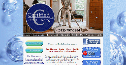
Now I can ride my new bike and know that I selected the best template for my carpet-cleaning friend.
Here’s the dripping pan.
21 Quick and Easy CRO Copywriting Hacks
Keep these proven copywriting hacks in mind to make your copy convert.
We’ve come a long way, baby. This is one of my first web pages, from 1998.
Soft Reality Home Page from 1998. It was Web 1.0.
This was Web 1.0. Looking back, we have to cringe. But guess what: we’re in Mobile Web 1.0 and it feels like 1998 all over again.
In 1998, Web 1.0 was on the verge of becoming Web 2.0, which fueled a bubble that would bring stock markets down and rearrange the tech landscape.
Is Mobile Web 1.0 Like Web 1.0?
Mobile Web 1.0 may not have such a violent transition, but what we’re learning from testing mobile optimized websites is that we will look back at Mobile Web 1.0 and cringe, just like when we look at Web 1.0 sites.
What are we doing with the mobile web that are the equivalents of blinking text, myriad fonts and crazy background patterns?
Conversion Scientist Joel Harvey will attempt to answer some of those questions in his Conversion Conference presentation Mobile Optimization Essentials.
He’s going to reviewing several of the tests we’ve performed here at Conversion Sciences and let you in on how Mobile Web 2.0 is shaping up.
This won’t be some humdrum presentation either. Joel is one of the highest rated speakers at Conversion Conference, and he has the badge to prove it.
43 Reasons to Attend Conversion Conference
If Joel’s presentation wasn’t enough, you’ll learn from and meet speakers doing 43 sessions covering all aspects of online conversion.
The psychology for persuading people to take action
Conversion copywriting
UX design
Testing techniques
Analytics
Social CRO
Email Testing
CRO Tools
Optimizing ads
And the list goes on and on. It’s a complete dose of getting more revenue from the audience you already have.
Save $100 with Code JOEL100
Because we have sway with the organizers of Conversion Conference, we can get you a sweet deal on the price of a ticket: $100 off.
Conversion Conference is just around the corner – only a month away. By mid-May, you’ll have a new perspective on how to make online marketing hum for your business. And it’s in Las Vegas.
Tickets are going fast. Grab your ticket soon before they sell out. Don’t forget to use your discount code: JOEL100.
As content writers, we’re trying to persuade others to see our point of view – to agree with us. Regardless of whether it’s to click on a link or to purchase a product, we want our writing to influence others in a positive manner.
To write in an engaging and persuasive way is an art form – it’s elegant, refined and exercises discernment. And it’s worlds apart from the distasteful, strong-arm tactics employed by spam marketers.
Crafting content that influences isn’t necessarily hard, but it does take a bit of practice. So, without further ado, let’s have a look at five key elements that contribute to successful and persuasive content writing.
1: Be an Expert
Few things are more influential than the opinion of an expert. Why? Because true experts know what they’re talking about. It’s clear in their authenticity and transparency. Experts don’t use fluffy filler material in their persuasive writing, and they don’t try to distract the reader with gimmicks.
If you want to establish yourself as an influencer in your niche, you need to be the premier expert in your field. You don’t need a degree or years of related experience, but you need to demonstrate that you’re a specialist. You want to be so knowledgeable in your particular market that your content is oozing with confidence and certainty.
Note the word specialist.
Experts don’t try to cover all the bases, and they don’t pretend to know everything remotely related to their topic.
They specialize in one particular aspect or angle, and by sharing their knowledge they become an authority. And authority bestows persuasion.
La Carmina, a very successful travel blogger self-describing her approach as “spooky-cute”, embodies this idea to perfection because her success is not the result of trying to be all things to all travelers. Her advice? “Be niche. Don’t be afraid to focus on a specific topic or audience…” Read more of her suggestions for being a specialist on the Huffington Post.
La Carmina Travel Blog specializes in “spooky-cute” travel.
2: List the Most Important Information First
Writing persuasive copy for web pages is similar to that of writing news articles. That is, the most important information comes first – which is quite different from writing an essay or a short story. Journalists refer to this method as writing in an inverted pyramid, and it starts with the most relevant points which are then followed by related details and background information.
In this manner, you have the opportunity right at the start of your post to motivate your readers to continue on to your benefits, features and call to action.
By highlighting the outcomes that you or your products can provide at the beginning, you’ll give them a clear understanding of the big picture. Don’t wait for the conclusion of your piece to deliver the vision they want, because they’ll be long gone.
Gregory Ciotti at Unbounce gives a great example of this idea in his post on how research can affect the way we write copy. He captures the essence of his entire topic in the second sentence, leaving no doubt in the readers’ mind about whether reading the post will be beneficial or not.
21 Quick and Easy CRO Copywriting Hacks
Keep these proven copywriting hacks in mind to make your copy convert.
43 Pages with Examples
Assumptive Phrasing
"We" vs. "You"
Pattern Interrupts
The Power of Three
"*" indicates required fields
3: Give Your Readers Reasons Why
Written or spoken, few words are more persuasive than the word because.
In her book Mindfulness, social psychologist Ellen Langer clearly demonstrated that people are more likely to comply to a request if they’re given a reason via the word because. Even if the reason is redundant or doesn’t make sense!
Another persuasive word to work into your copy is imagine – asking your readers to imagine their desired outcome is a safe alternative to asking them to take action. It’s make-believe, so their inner gatekeeper (the voice in our head suspicious of others’ motives) won’t be inclined to object. And getting your prospects to imagine themselves in happy situations is a powerful influencer.
At Enchanting Marketing, Henneke shows us how to master this element with the words ‘because’ and ‘picture’ right in the introduction of her post (picture being a synonym of imagine). She first suggests we may be making a mistake in our web writing, then gets us to picture a client clicking where we want them to and finally shows us ‘why’ we’re making the mistake – with the word because.
You can’t help but continue reading, and for web content, that’s a big deal because, as Henneke says, you are writing for people who probably aren’t going to read what you write. People don’t read articles all the way through online like they do in print.
Picture your customers as wild animals when you write copy suggests Henneke Enchanged Marketing
4: Benefits First, Then Features
This point may seem a bit counterintuitive, but only because you know your products or services so well – still, you need to remember that your prospects don’t. Keep in mind that they’re looking for specific outcomes.
It might help to think of the benefits as the outcome they desire, while the features are part of the solution to their problem. For example, “You can look like a supermodel in two weeks with our Magic Pills – no need for diets or exercise!” The benefit is looking like a supermodel in two weeks. The features are no dieting or exercising.
Brian Clark shows us how to successfully highlight benefits, and to differentiate between benefits and features, with the ‘forehead slap test’ in this great post on Copyblogger.
5: Write for Scanners
It’s important to remember that most online consumers are scanners first and readers second. To persuade your prospects actually to read your content, use some of these eye candy elements to draw them into your article:
Headings and subheads, relevant and on topic
Bullet lists to highlight benefits and features
Font variations, bold, italics, and colored links
Short sentences and short paragraphs, each with one idea only
He establishes himself as an expert on writing persuasive content with solid research, and results, to establish his status.
The most important information is listed first. The graph shows us that a headline that includes research received a +40% increase in click throughs.
He gives us the reason ‘why’ in a big way – right there in the first sub-header: “why you should write research-backed content”.
The benefit is shown in a graph demonstrating the increase in click through rates.
The post is easily scanable. Lots of relevant subheads, graphs, images, bold and colored fonts. And the sentences and paragraphs are short and concise, with a memorable caption: “ROI is about the MECHANIC using the tool.”
With a bit of practice in applying these key elements, you’ll be successful at writing persuasive content that your readers will understand and appreciate – and that’s a winning situation for everyone.
If the Zombie Apocalypse struck tomorrow, and the only way not to become the walking dead was to throw away your mobile device, who would be the winners and losers?
According to an intriguing infographic, you’d be more likely to be file-swapping on Dropbox than binge-watching on Netflix. You’d be more likely to get your news the same way your grandparents do. You’d be back to reading the New York Times online instead of Buzzfeed, which now interprets world events by comparing them to your favorite episodes of Friends.
Would you have predicted that Sears would suddenly be more popular than Pandora. I guess we’ll be needing somewhere to buy a new Walkman to take to the gym.
Somehow Google would still manage to rule the Internet world which is hardly surprising since
“Encarta it” just doesn’t have the same ring as “Google it.”
In case you’re wondering where Encarta falls into the mix, I had to Google it to read a Wikipedia article about it.
This little thought exercise underscores the winners and losers in the mobile game. Many businesses claim that mobile isn’t important enough yet, or that their offering doesn’t lend itself to mobile. Netflix and Buzzfeed dominate their marketplace in part because they embraced mobile early and often.
If you believe your visitors are hunched over a desktop when they visit your site, you are setting yourself up to be the mobile-unfriendly loser in your marketplace. Are you creating your own Zombie Apocalypse?
And let’s all breathe a collective sigh of relief that Craigslist would still be a solid option for finding your next creepy roommate since its popularity doesn’t take quite the hit of more fashion-forward websites in this mobile-devoid alternate universe.
Raise your hand if you’re considering a website redesign. Pretty much everyone, yeah? Well, before you undertake such a massive project, there’s a lot you should consider first…namely the effects such huge changes can have on your conversion rates.
Some businesses will pour millions of dollars into a fancy and beautiful website redesign only to discover that their customers no longer know how to interact with (ahem, buy things on) the site. In other words, a double loss. If you think the design of your site is keeping visitors from spending money, consider an approach that’s a bit more slow-and-steady.
Brian suggests taking a scientific approach: he’s a scientist, after all. It has probably been some time since you’ve had to think much about the scientific method, so here’s a recap:
Research
Form a hypothesis
Create an experiment design
Run tests
Tabulate results
Analyze results
Do some research then come up with some small changes you can make and measure the effects of.
It’s a cycle that often ends with a surprise. Our visitors just don’t behave the way we think they should. There are great resources out there to help understand these people we call visitors, like Crazy Egg and Google Analytics.Don’t fret: there are absolutely resources out there to help you get the job done.
Here’s where I could say “You know your customers best,” so you should be able to come up with a solid list of hypotheses with which you could experiment, but I won’t. You should still come up with a list of ideas based on research, but you should be prepared for surprises.
And remember, I’m serious when he says to keep it scientific. Isolate a single variable as much as possible so that you know for sure what is driving changes in your site visitors’ behaviors.
We’ve all seen the numbers. Visual content outperforms text-only content by a landslide.
Need a refresher?
Content generates up to 94% more views if combined with compelling visual elements and graphics. (MDG Advertising)
40% of people will respond better to visual information than to plain text. (Zabisco)
High quality infographics are 30 times more likely to be read than text articles. (Ansonalex)
While I’ve known these stats for some time, I didn’t feel like there was much I could do about it until recently. I would make sure to break my articles up with nice subheadings and insert quality stock photos or original photography when I had it, but that was about as visual as I got. “After all,” I thought, “I’m a writer—not a designer.”
How I Became More Visual
Things changed when I started writing a weekly column for a client whose company designs and builds custom homes. The column was to appear as sponsored content on a well-known luxury living blog. My goal was to conduct interviews and research on the latest trends in home design and present my findings in 500+ word articles along with some beautiful photography of the client’s work.
My logic was simple: The photography was already performing extremely well on social media. The pictures would be the hook, and people would stay for the insightful article.
The first article of the campaign. It goes on for over 600 words.
While this approach already seemed to be working on the client’s on-site blog, it didn’t have the effect I wanted it to on the sponsored column.
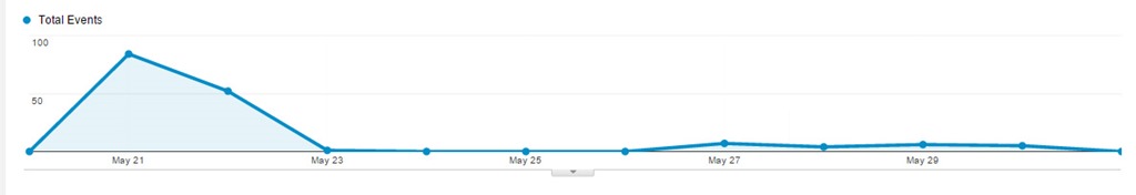
In fact, my first article performed pretty badly, despite all the effort I had put into conducting interviews, despite the great quotes and useful information I used—even despite the photos that had been shared thousands of times on social media. The first article—a piece that used anecdotes and advice from the client about finding inspiration for your home—received 84 views upon publication and continues to be one of the lowest performing posts of the campaign, with a total of 220 views.
The tiny blip made by my first article. We used tracking pixels to watch traffic on Google analytics. As you can see, traffic did not pick up after posting.
Then I started using Illustrator
I had been fumbling around with the program for several months, but never felt like I had time to use it properly. My approach had always been to write the best copy I could and to let a designer help out if they had time. But this time I was determined to do something—anything—different so that the column would prove worthwhile.
So I went ahead and designed some images for my next two posts—just some simple, vector-based elements to use as featured images and between subheadings. They weren’t great, but they were presentable, and the articles performed slightly better than the last.
I wasn’t sure if the slight increase in views warranted the extra time it took to create new visuals, but I decided to give it one more shot.
I’m glad I did.
Taking a cue from fashion magazine style collages, I cobbled together a collage using pieces of our original photography and used it as the central element of the next post. The post received 524 views on the first day of publication—over six times more views than my initial post. Even better, the post continues to rack up views, with 1,626 views to date.
My first post on the site to be primarily visual.
Since posting that article, I have continued to create similar content for this campaign (and others) that have performed just as well.
My next post also used a collage. It received 504 views on the first day of publication. Interestingly enough, this article was on the same topic as my initial failed article—how to find home design inspiration. The difference was all in how the information was presented.
Spikes in traffic from my first two collage posts done in Illustrator.
A few months later, new posts continue to create spikes in traffic, and we begin to gain a consistent viewership between postings.
While I don’t have all the answers to this change in performance, I attribute the success of the collage articles to two things: 1. their overall presentation, and 2. their particular appeal to my audience.
Overall Presentation
They stand out from surrounding posts in the blog roll.
In a sea of photographs, a small piece of graphic design can really stand out.
They look original.
Readers who are already engaged with the client’s brand may have already seen our best photography. These images made them brand new.
They look useful and cohesive.
A simple collage with numbered items promises practical, bite-sized content. Plus, people want to be shown how information relates. Sometimes, placing a great photo next to text isn’t enough.
Appeal to the Audience
They mimic the look of luxury magazine and blog articles.
In researching our audience, I checked out several sites that our demographic enjoys. (Facebook’s recent expansion of its search function is great for this task.) They gave me examples of the kind of short-form blog posts that our target audience typically reads.
They account for the audience’s browsing behavior.
If your prospective customers are visually inclined, too much text is a nuisance. By creating visual content, I was able to provide the kind of bite-sized articles that that my audience expected in that context.
Growing your capabilities will make you more perceptive.
There are probably several lessons to be learned from this incident, including one about knowing your audience. But the one I want to stress is this: learning how to design will make you a better writer.
How do I know? I’m not just basing this claim on the spike in traffic that came after I started creating visuals. I’m also basing it on the fact that now, when I set out to create content, I don’t ask myself, “How can I best express this idea through copy?” I ask, “What is the best way to express this idea? Period.”
I am also better able to take into account the browsing behavior of my audience. I wouldn’t be writing this out as a 1,000+ word article if I didn’t think that the audience of The Conversion Scientist was willing to read longer articles. Similarly, the content you create should cohere with the browsing behavior of the people you want to reach. No matter how great your writing is, you will never convince a non-reader to read—at least, not through a piece of content marketing.
Because I can now create a broader variety of content I also think much more about the behavior of my audience. That’s why learning Illustrator has not only made me more versatile—it has also made me more perceptive. If copy is only a small part of the equation, I can combine my strengths as a writer with my (developing) ability to design to create content that is cohesive, concise, and valuable. Colleen Ahern is a copywriter and content marketing strategist at Page Agency. She created the Page Agency Blog, where she writes about the rapidly evolving world of content marketing and social media. Follow her on Twitter @ColleenAhern.
Get out your number 2 pencils and practice your small circles. We fill in some bubbles for you to help you redesign your home page.
What if I told you that, when a visitor reaches your homepage, to them it’s just like taking a multiple-choice test? They have a question and you offer choices.
Does your homepage design punish visitors if they make the wrong choice? This is the purpose of those standardized multiple choice tests we’ve been taking since high school: if you guess, you are likely to get it wrong.
We don’t want to punish our visitors for guessing. We can attempt to eliminate the guessing, though.
In 8 Ways Your Home Page Is Like A Multiple Choice Test we explore the rules for designing multiple choice questions provided by the Scholastic website, and then see how these apply to our home page question: “Why did you visit our website today?”
21 Quick and Easy CRO Copywriting Hacks
Keep these proven copywriting hacks in mind to make your copy convert.
It was a book by Jeffrey and Bryan Eisenberg that helped launch Conversion Sciences as a business way back in 2006, Waiting for Your Cat to Bark?
These brothers and Austin residents have together and individually produced a number of eye-opening and ground breaking volumes, such as Call to Action and AB Testing.
These books have changed the fortunes of many an online business.
So I was naturally pleased and excited to hear from Jeffrey that they’ve released a new book, with the promising title, Buyer Legends: The Executive Storyteller’s Guide.
Get the Kindle Edition of Bryan and Jeffrey Eisenberg’s new book on Amazon.
Leave it to the Eisenbergs to turn up the volume on existing concepts. While the rest of us are working on Buyer Peronas and Buyer Journeys, the Eisenbergs have moved along to “Buyer Legends.”
It sounds almost heroic, like Joseph Cambell crossed with Jeff Bezos.
The introduction defines a “Buyer Legend:”
Buyer Legends is the process of using narratives and storytelling in your marketing and selling efforts.
They are not just talking about storytelling as compelling marketing. They see narratives and storytelling as a key way for organizations to understand their data internally.
It’s not surprising to hear them talk about narratives and storytelling as a way to make sense of “big data.” Bryan has been working with companies with names such as “Narrative Sciences.”
Read the full review on Inc.com.
In the mean time, go get your copy.
It’s like a virus on the web: Rotating Headers, also called “Carousels” or “Sliders”.
Designers recommend them.
Content Management Systems provide widgets to implement them.
And everyone is copying their competitors, which makes them spread.
Those of us that test websites know one thing: We can almost always get a higher conversion rate with a static image then with rotating header images.
Why Rotating Headers Hurt Conversion
There are two primary reasons that sliding header images hurt conversion.
1. Load Times
It takes a long time to load each image. Header images are generally large. Multiply that by three or four or five and you have a slooooow loading page.
2. Motion is Irresistible
Try to read this sentence with the image above moving constantly.
Our brains are programmed to pay attention to things that move. When something moves, your “Lizard Brain” must ascertain if it is something we can eat, be eaten by or mate with.
Every time the header images slides or fades, we stop reading the page and look up. We can’t help it.
Why static images are scary
Static images require us to think hard about our value proposition. They require tough decisions because you must pick one image in a key location on your home page, category pages and landing pages.
Don’t try to hedge your bets with a rotating smorgasbord. Decisions are hard.
Fear not. We have been able to beat a static hero image with a rotating “slider” on more than one occasion. If you’re attached to your slider, we’re here to help you out.
Creating Rotating Headers That Work
This process only works if you know how to do A/B testing.
If you don’t, please, just use static images for your pages. Better yet, let us help you get setup for testing.
This is a slider we optimized for custom sign maker. It started off with some advantages over most sliders we see on the Web.
First, the size of each image is relatively small, taking up one column width and measuring in at 519x 319 pixels.
Second, the rotation is a slow fade, not a sudden slide.
Third, the fade time is 10 seconds, which is quite long compared to other sliders we’ve seen.
Since we believed that a static image would perform better than the rotating images, we set out the see which of the panels would generate the most sales. We tested each image against the rotating banner as the control using Optimizely.
Here’s how they turned out. Only one panel beat the rotating image with high statistical significance.
The others were inconclusive.
This was unexpected. So, we did a follow up. If we changed the order of the images, could we develop a rotating image that beat a static image?
We gave it a try, ordering the panels like this:
In our test, the rotating header beat the static image by 61% with a confidence of over 99%.
What Does This Mean?
Does this mean that rotating sliders are the way to go? We have distilled the following best practices that have worked for us in other tests.
1. Make each image as small as possible so the page loads quickly.
2. Use a long interval between images.
3. Use a fade instead of a slide to minimize motion distraction.
4. Start the rotation with your highest performing images.
5. If you can’t test, go with a static image.
Don’t spread the virus. Be smart about your rotating messages.
21 Quick and Easy CRO Copywriting Hacks
Keep these proven copywriting hacks in mind to make your copy convert.
We may request cookies to be set on your device. We use cookies to let us know when you visit our websites, how you interact with us, to enrich your user experience, and to customize your relationship with our website.
Click on the different category headings to find out more. You can also change some of your preferences. Note that blocking some types of cookies may impact your experience on our websites and the services we are able to offer.
Essential Website Cookies
These cookies are strictly necessary to provide you with services available through our website and to use some of its features.
Because these cookies are strictly necessary to deliver the website, refusing them will have impact how our site functions. You always can block or delete cookies by changing your browser settings and force blocking all cookies on this website. But this will always prompt you to accept/refuse cookies when revisiting our site.
We fully respect if you want to refuse cookies but to avoid asking you again and again kindly allow us to store a cookie for that. You are free to opt out any time or opt in for other cookies to get a better experience. If you refuse cookies we will remove all set cookies in our domain.
We provide you with a list of stored cookies on your computer in our domain so you can check what we stored. Due to security reasons we are not able to show or modify cookies from other domains. You can check these in your browser security settings.
Other external services
We also use different external services like Google Webfonts, Google Maps, and external Video providers. Since these providers may collect personal data like your IP address we allow you to block them here. Please be aware that this might heavily reduce the functionality and appearance of our site. Changes will take effect once you reload the page.
Google Webfont Settings:
Google Map Settings:
Google reCaptcha Settings:
Vimeo and Youtube video embeds:
Privacy Policy
You can read about our cookies and privacy settings in detail on our Privacy Policy Page.


.")


 Colleen Ahern is a copywriter and content marketing strategist at Page Agency. She created the