Sales and marketing have changed dramatically over the last few decades. Gone are the days when you need to go door to door to sell your products or services. Most startups these days don’t even have a phone sales team. With the Internet, it has all moved online.
However, just because the methods have changed, it doesn’t mean the underlying principles have. Penned in 1884, Influence: The Psychology of Persuasion by Robert Cialdini talks about persuasion as related to face-to-face sales.
The book has stood the test of time and is still one of the most accepted marketing documents ever produced. Even if you aren’t familiar with the book as a whole, you’ve likely seen or tested one or more Cialdini’s six principles in the past: scarcity, reciprocity, liking, authority, social proof, and commitment and consistency.
While I fully recommend reading the book in its entirety, this post will serve as a brief update on how each of these principles are used now and what you can expect from trying one yourself.
1. Scarcity
We always want what we can’t have.
Scarcity is the idea that there is a limited number of items left to buy or time left in which to complete the conversion. When something is scarce, we tend to want it more, if only just to possess something that’s not readily available.
Scarcity works best on customers who already have a need for your product or service as opposed to those just browsing. If you find that customers are sitting on the fence and not converting, a little indication that your product is scarce might get them to buy sooner rather than later.
There are multiple ways to create scarcity on a site. Let’s take a look at three.
Stock Scarcity
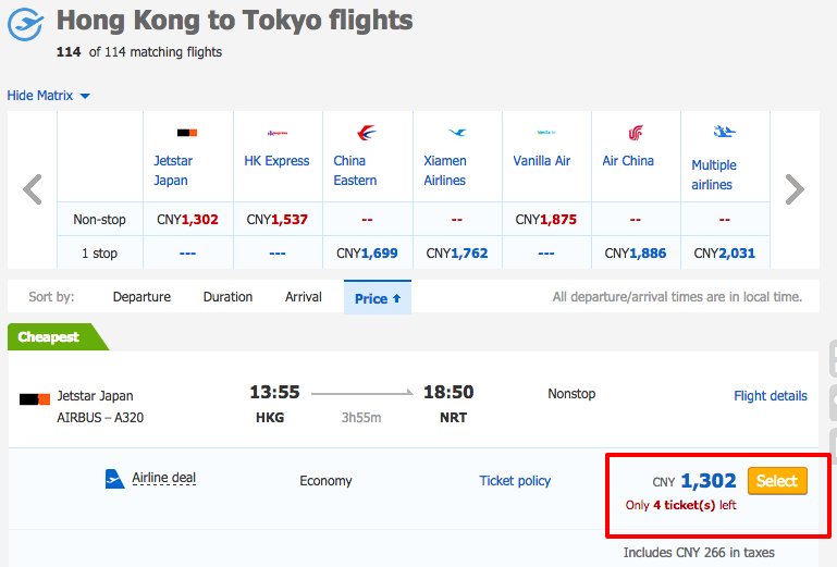
With a bit of red text, Ctrip calls out the number of remaining tickets right next to the CTA.
The Chinese travel site
Ctrip is constantly updating the number of tickets they have at a specific price point. Apart from making the text stand out against the blue and white theme, it also implies a sense of urgency.
As customers look at flights, the text immediately captures their attention, letting them know that if they don’t purchase it now they won’t get that flight at all.
It works great for booking sites like flights and hotels, and it can be used to good effect on regular commerce sites, too. By letting customers know that a certain product is low in stock without mentioning when you’ll restock, you can get them off the fence.
Monsoon, an online clothing and accessories retailer, used to have a regular product page that didn’t indicate if stocks for a product were low. They hypothesized that adding a message when stocks were low might urge their customers to buy faster.
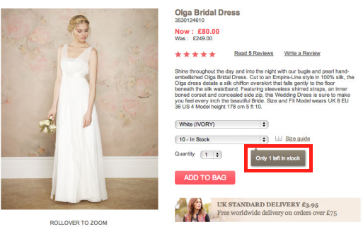
Knowing that there’s only one dress left increases our sense of urgency.
By adding a pointer if a certain item had 5 or fewer units left in stock, they were able to increase conversion rates by 10%!
Shipping Scarcity
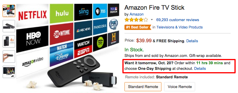
Amazon’s shipping countdown clock
Oh
Amazon, is there any conversion tactic you don’t use on your site? We’ve all seen the little shipping countdown they have for next-day delivery. It looks like a bit of innocent text, but to shoppers it means the difference between getting their product as soon as possible, versus waiting a few days. In this age of instant gratification, it’s enough to convince some people to buy right away.
Running a shipping countdown is a great idea for targeting impatient shoppers, and Which Test Won showed a
9% increase in conversions thanks to the introduction of a similar timer. Even if your shoppers aren’t impatient in general, you can take advantage of holiday shopping to offer priority shipping so they get their gifts in time.
Sale/Discount Scarcity

It’s hard to miss this weekend sale on Threadless
Urban clothing retailer
Threadless is always putting their sales front and center on their homepage. Doing so not only increases visibility, but also plays on the concept of Fear Of Missing Out where shoppers can’t stand to miss a deal since the sales are short-lived.
Again, we see red text playing a part as Threadless brings attention to their limited time sale. By saying it runs “this weekend only” it implies that customers will never see this kind of deal again. Deep down, we know that there will be more deals like this later, but the uncertainty coupled with the immediacy of this deal make us buy.
Be sure to mention the discount even on your product page. Corkscrew Wine had discounted one of their wines but initially they didn’t highlight that on the product page.
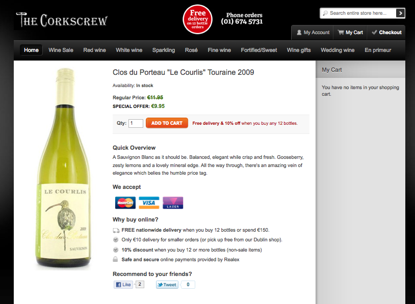
It’s easy to miss that this wine is discounted.
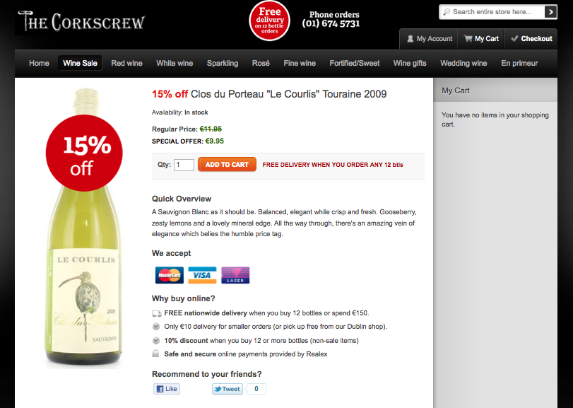
To emphasize the discount, they added a big 15% off sticker and mentioned the discount in the title too.
Calling attention to the fact that the wine was on sale, even though the price was the same in both cases, gave them a massive 150% increase in conversion rates!
2. Reciprocity
You scratch my back and I’ll scratch yours.
The idea plays on the notion that humans are naturally inclined to pay back a favor, typically manifested on a website in two ways.
Free Offers
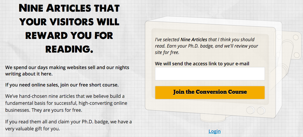
Conversion Sciences offers a free short course in exchange for your email address.
You’ve probably already got pop-ups and email subscription forms offering your visitors a free resource in exchange for their email address. This is content marketing 101 and draws in leads that may later convert to customers.
But those email addresses would be useless if it weren’t for the principle of reciprocity. By getting something for free your visitors are now inclined to pay you back in some way, by either buying your product or telling their friends about you.
The more valuable the free offer, the stronger this effect is. In the example above, Conversion Sciences offers nine free articles on increasing website sales. On its own, it’s a pretty valuable offer.
But they take it a step further and offer a website review on top of that! Getting an expert to point out where you’re going wrong on your site is the kind of immense value that makes visitors want to pay for more.
If you think your one page report is enough to bring in sales, think again. While it may get you email addresses, it’s probably not valuable enough to get you more. Go big with your free offer and watch sales roll in.
Loyalty Programs
Gamification is a new term in the conversion world and a concept that I find really cool. Completing actions like purchases or filling out a form allows you to earn points that can be redeemed later for discounts and other perks.
Credit card companies have been doing this for a while, but other industries are just catching on that it’s a great way to promote loyalty and engagement.
The concept is simple. You reward your customers for actions that they take. The rewards reinforce repeated behavior and entice them to take more actions. The result is a cycle of loyal, repeat customers doing things you want them to do because they know they’ll be rewarded for it.
Starbucks is a great example of this. They
boosted revenue by 11% by implementing a reward points program. For every dollar spent using a Starbucks Card, you get rewards. In fact, new card activations and reloads went up by 32% just because of that!
Gamifying your site doesn’t have to be as complicated as the Starbucks system. Even simple action-reward sequences, like getting a 10% discount for tweeting a product, work.
3. Liking
Users are more inclined to buy if they like the person selling or marketing the product.
Have you ever wondered why advertisements always have movie actors or sports stars in them? It’s because they are playing on the popularity and likeability of the celebrity.
It goes beyond just sticking a smiling face on every page of your site. You need to take both your ideal customer and product into consideration.
Testimonials
Testimonials can help your site create the trust you need to win over new visitors. Everything from the written praise on your homepage to the retweets by industry influencers can help you stand out to users who might be on the fence about converting.
In the example above from Buzzsumo, a content marketing tool, we see three testimonials from popular marketers. You probably recognize these faces yourself and you may have come across Noah’s blog or Rand’s whiteboard videos. Those testimonials are perfectly targeted at the software’s customer base, and their likeability plays a huge part in conversions.
In fact, testimonials are so powerful that they can increase conversions even without the name-dropping. WikiJobs, a graduate jobs website in the UK, wanted more people to sign up for their practice tests. Initially, their page had no testimonials.
For the test, all they did was add three testimonials in, without names or faces.
Boom! Those three lines, which could very well have been made up, increased their conversions by a whopping 34%!
4. Authority
Just like with using celebrities, many advertisers also use authority figures like doctors. This is especially common when it comes to health and hygiene products like toothpaste or soap. The doctors are probably just actors, but the fact that they are wearing a white lab coat is enough to influence many people.
Introducing the principle of authority into your site means coming across as an industry expert and therefore increasing the trust a user has for your brand.
For example, Kaya Skin Clinic, a retailer of complex skin products, wanted to increase the consultations made through their site. Their initial page mentioned their expert dermatologists, but the call to action was booking a consultation.
To further emphasize their authority and expertise, they tested asking visitors to sign up for an expert opinion instead.
That small change outperformed the control by 138% and increased sales by 22%! By simply implying authority their visitors were more likely to convert.
I personally think there is a bit of overlap when it comes to authority, liking, and social proof, but here are a few examples of sites taking their authority to the next level:
It doesn’t get much more obvious than this. This legal site did almost the same thing as Kaya and added the word ‘expert’ wherever it fit. For businesses in industries like Law, Medicine, Healthcare and so on, it’s important to establish expertise even if it means adding the word ‘expert’ to your site.
Of course, there are more ways to display authority and expertise on your site. USAA does a great job of using images to convey a sense of professionalism and knowledge regarding investments. Both the stock ticker and app screenshots imply that they know what they are doing when it comes to managing your money, especially if you don’t know the first thing about it.
When it comes to your site, a combination of professional design, authoritative copy and images of experts can go a long way in building trust and increasing conversions.
5. Social Proof
Monkey see, monkey do.
If there was any doubt that we evolved from apes, this principle should clear it.
Social proof is all about leveraging the fact that we are more comfortable performing a certain action, like buying your product, if we see that others have done it before. It’s a great way to reassure nervous users that your company is legitimate and others have purchased your product or service.
Most people know the impact that adding reviews can have on your conversion rate, but there are a few other ways to leverage social proof.
Social Stats
Got a big following on social media? Try including it in your header like Sneakerwatch to increase your credibility. They have almost a million followers if you add all those numbers up. That’s like saying there are a million people who love the company so much they want to stay connected on social media.
Going back to the Kaya case study, they tried to go one step further with their CTA and added their Facebook follower count.
Again, the act of adding social proof helped even more and increased conversion rates by a further 70%.
Beware though, if you have really low social media numbers, this might backfire on you. Taloon.com, an ecommerce store that sells plumbing, electrical and gardening suppliers, used to have social media buttons on every product page. However, their share numbers weren’t very flattering and it actually lead to negative social proof that lowered their conversions by 12%.
Show Off Your Accomplishments
Have you won an award or been recognized somewhere? Sing it from the (figurative) rafters by putting it on your homepage to help reinforce your offers in the eyes of your users.
This example from World Nomads combines social proof, authority and liking by adding logos of well-liked and trustworthy brands that use their insurance. The implied question is, if these brands can trust World Nomads, why shouldn’t you?
6. Commitment and Consistency
When I started playing poker, I’d make a very common mistake. If I had bet money pre-flop, I’d continue to bet even if the flop was terrible. After all, I’d already made a commitment, so I might as well continue staying in the hand. Needless to say, I lost a lot of money!
You see, people like to stay consistent. If they make a commitment, they try to keep it. So instead of going for the big sale right away, try starting with a smaller commitment and then increasing the ask later.
For example, if you’ve ever applied for a loan, financed a car, or mortgaged a home, you know that the process of actually getting approved can be daunting. You are often faced with pages of forms that seem to drag on forever. In order to make this easier to manage, sites like to begin with a small commitment that is followed by small and consistent steps.
Take this booking form for an airport parking service in Edinburgh. Just looking at the page makes me want to run away. There are so many form fields!
Thankfully they realized this and split it into a multi-step form. Sure, it’s the same number of fields eventually, but by breaking it up, it doesn’t look so daunting.
This resulted in a 35% increase in form completions. By making the user enters some personal information, they are ensuring the user is committed to the process of providing more information and completing the application. These initial steps help weed out users who aren’t serious and provide higher quality leads.
When customers hit the ‘Continue’ button, they are taken to the next step. Since they’ve already made a bit of a time commitment, they’re more likely to stay consistent and continue filling the form.
Many software companies use this concept when they offer free trials. By entering an email address, you can get started using the product immediately, and each step in the onboarding sequence builds your commitment.
Ecommerce companies, on the other hand, tap into this concept when they up-sell customers. They start off with an expensive base product, like a phone or computer, and then upsell customers on accessories. Having already paid a big sum for the main product, customers are likely to pay a comparatively insignificant amount to further enhance it.
Finally, info-marketers flip the script and sell customers cheap products first before upselling to higher priced courses. Again, the commitment principle is at work here, taking advantage of people’s tendency to stay consistent.
Harness the Power of Persuasion
With the exception of adding social stats to your home page, all of these tips are going to be more complicated than changing the color or copy of your CTA. Consequently, make sure you take the time to plan out each change while considering your audience and goals.
Be warned, though! It would be easy to misuse one of these tactics and do more harm than good. If you go back to the WikiJob case study, you’ll see that the testimonials were just plain-text quotes with no attribution. Of course, those were real quotes, but it’s not hard to ‘cheat’ a bit and make up your own.
Similarly, it’s easy to fake social proof numbers or mislead customers into thinking that your stock is running out. The problem with this is, apart from being entirely unethical if you get caught it could be disastrous for your business.
Recently, JC Penney had to settle a class-action lawsuit for creating fake sales and discounts. In many cases they would double a product’s price and then put it on ‘sale’ for 50% for a limited time. As we’ve already seen, a discount scarcity tactic like this can increase sales, as it did for JC Penney, but when the truth came out it hurt them financially and eroded customer trust.
So if you’re going to try any of this out, make sure you do it the right way. Don’t create scarcity if there isn’t any, don’t manufacture testimonials, and don’t artificially inflate your social proof. Harness the power of persuasion while maintaining your customers’ trust.


