10 successful value proposition examples proven by AB testing.
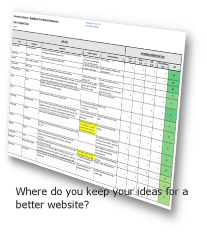
Conversion Sciences has completed thousands of tests on websites of all kinds for businesses of all sizes. At times, we’ve been under pressure to show results quickly. When we want to place a bet on what to test, where do we turn?
Copy and images. These are the primary components of a website’s value proposition.
It’s the #1 factor determining your conversion rate. If you deliver a poor value proposition, there is little we can do to optimize. If you nail it, we can optimize a site to new heights.
So, I have to ask: have you ever taken the time to split test your value proposition?
This article shows you how to identify a poor value proposition, hypothesize a series of better alternatives, and split test them to identify the wining combination of copy, video and images.
Essential Qualities Of A Worthwhile Value Proposition
Your value proposition is the promise you make to prospective customers about the unique value your business will deliver to them.
Your value proposition is a statement, which can be made up of the following elements:
- Headline
- Subheadline
- Copy
- Bullet points
- Images or Graphics
- Video
Words carry tremendous power, but they aren’t the only element you can employ in promising defined value to potential customers. A value proposition can be made up of any of the above elements, as well as others I’ve no doubt failed to mention.
To be effective, your value proposition should include the following characteristics:
- Conveys a clear, easily understood message
- Speaks to the unique value your business provides
- Explicitly targets a specific audience segment
- Makes a clear promise regarding the benefits being delivered
Hopefully, these criteria are making you aware of what your value proposition is not. It is not a slogan, creative phrase, or teaser.
The best way to demonstrate this is to show you some real examples of businesses that improved their conversion rates by upgrading their value propositions.
Let’s get started.
Example #1: Groove Increases Conversions By 104%
Groove is simple help desk software. It’s a streamlined product designed to help smaller teams provide personalized customer support without learning and configuring something more complicated like Zendesk.
Groove’s original homepage was converting at only 2.3%.
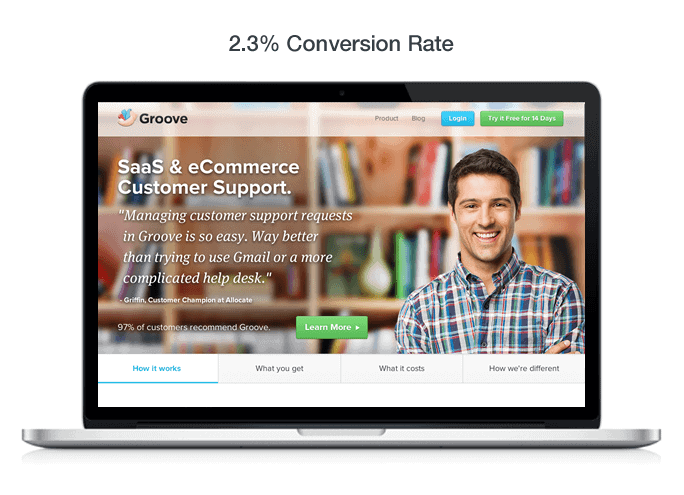
Groove SaaS and eCommerce Customer Support Value Proposition
After reaching out to several experts for help, they received the following advice:
“You’re talking to your customers the way you think marketers are supposed to talk. It’s marketing-speak, and people hate that… you should talk like your customers do”
With this in mind, the Groove team spent some time talking to various customers over the phone in order to get a feel for how those customers were talking about Groove and the actual words they were using.
They also changed their opening autoresponder email to the following, which ended up generating an astounding 41% response rate and becoming a prime, continuous source of qualitative data for the business:
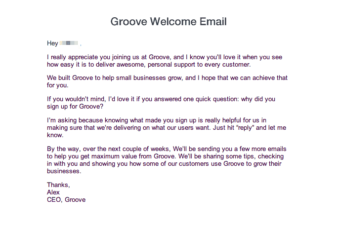
Groove welcome email established their value proposition.
As a result of this feedback, they created a new “copy first” landing page, with a completely revamped value proposition.
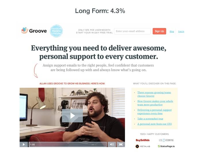
Groove created a ‘copy first’ landing page based on feedback from customers
After testing the new page against the original, Groove found that it converted at 4.3% for an 87% improvement. After running additional tests with more minor tweaks over the next two weeks, the conversion rate ultimately settled at 4.7%, bringing the total improvement to 104%.
Key Takeaways
So what can we learn from Groove’s big win?
- Benefit-driven headlines perform better than headlines simply stating the product category.
- The subheading is not a good place for a testimonial. You need to explain your value before you bring in proof to verify your claims.
- Notice how the new headline explains a bit of the “how and what” while still keeping the customer in focus.
- While Groove doesn’t explicitly define the target audience within the headine and subheading, they do accomplish this via the above-the-fold bullet point and video testimonial.
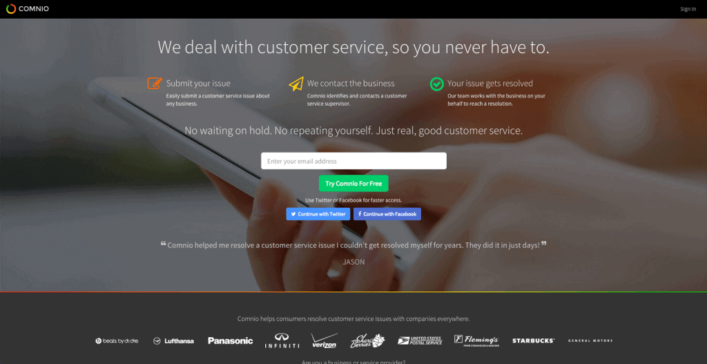
Example #2: Comnio Increases Signups By 408%
Comnio is a reputation management company that helps both consumers and businesses resolve customer service issues.
After transitioning away from a moderately NSFW branding strategy, the company needed a new way to communicate it’s value and attract users. After the page below failed to convert, they contacted Conversion Sciences’ Brian Massey for a CRO strategy consultation.
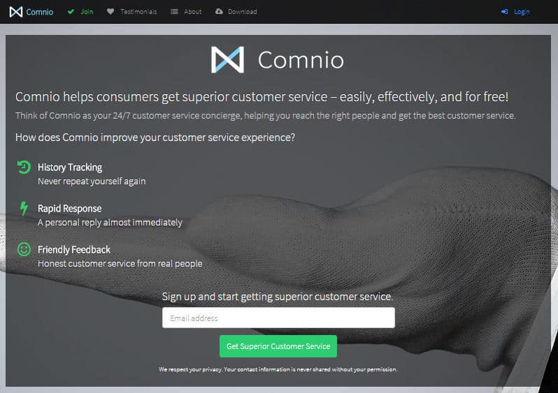
Comnio’s landing page failed to convert well
Brian helped the team come up with a new version:
“My recommendations were to focus on the company less and on what will happen more and to use a hero image that is more relevant. By September 2015, the homepage was taking a different approach, focusing on the service value and defining the steps that make it work.”

Comnio’s new landing page performed at a high rate
This new page was a definite improvement over the previous version, and over the next 30 days, it converted a respectable 3.6% of site visits.
That said, there were still some clear problems, the most obvious being that the opening headline and subheadline were failing to make a clear promise. In order to optimize this page, Comnio implemented the following changes:
- Changed the headline to explain what they do (as a benefit, not a feature)
- Changed the subheadline to explain the pains/problems Comnio solves for users
- Changed the email field placeholder text from “Email address” to “Enter your email address”
- Changed the CTA button from “Sign up for free” to “Try Comnio For Free”
- Added social sign-up options
- Swapped out the position of company logos with the position of user testimonials
- Added a gradient line below the hero shot to separate it from the rest of the page
The new page looked like this:
Comnio further refined the landing page with a significantly higher conversion rate
Thanks in large part to a strong headline, this new page converted at an incredible 18.3% over its 30-day test, a 408% increase over the previous version.
It’s also worth noting that 49% of new signups used one the social signup options available on the new page.
Key Takeaways
So what can we learn from Comnio’s huge conversion spike? Whenever this many changes are implemented in one test, it hurts our ability to make specific conclusions, but here’s what I’m seeing:
- The new headline isn’t cute, catchy, or cool. It’s a simple, definitive statement, and that’s exactly why it works so well.
- Directly addressing emotional customer pain points (no waiting, no repeating yourself) within your value proposition can have a MASSIVE impact on your conversion rate.
- Signup friction can significantly decrease your conversion rate. Considering half signups on the new page occurred via the social buttons, it would make sense to assume this feature was a big part of the conversion boost.
- Brian also noted that the social signup buttons themselves could have served as social proof, borrowing trust from Facebook and Twitter.
Example #3: Udemy Increases Clicks By 246%
Udemy is a massive marketplace for online courses on everything you can imagine.
And while the company’s meteoric growth is certainly a testament to their product-market fit and understanding of their own value proposition, until somewhat recently, the individual course pages were very poorly optimized.
Until this last year, Udemy course pages looked like this:
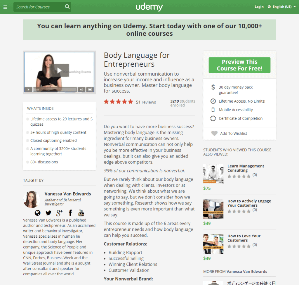
Udemy landing page that needed higher conversion rates
If I’m trying to sell my course via this page, there are a number of major problems diminishing my conversion rate.
- Udemy is essentially stealing the headline of the page with it’s bold “You can learn anything…” banner. If I’m on this page, I either clicked here through a direct-link or through Udemy’s browser, and in neither case, does it make sense to tell me about Udemy’s 10,000 courses.
- With 3 columns, I have no clue where to look first. Where is the value proposition?
- I can barely even tell the green rectangle on the right is supposed to be a CTA button.
While Vanessa’s course does have a value proposition, it certainly isn’t laid out in a way that makes it defined or obvious.
Eventually, Udemy caught-on to this a tested a special layout:
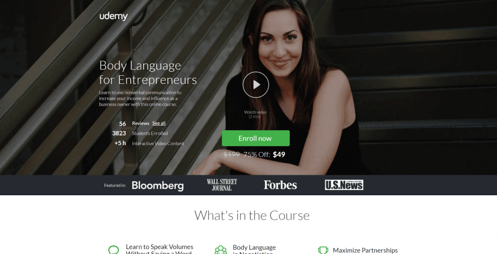
Udemny redesigned landing page employing user testing
Unlike the old page, this version has a very clear value proposition, with the headline, subheadline, video and CTA all clearly displayed without distraction.
Brian Massey talks a bit about what makes this page work:
Most importantly, this new landing page receives 246% more click-throughs than the old course landing page.
Udemy also altered their normal course landing pages to incorporate some of these elements, putting the headline, subheadline and promo video front and center, with a much more obvious CTA button and all additional information below the fold.

Udemy used the same techniques to update their course page.
Key Takeaways
So what can we learn from Udemy’s landing page improvements?
- Layout is extremely important.
- Limiting your hero shot to only the core elements of your value proposition will virtually always serve you better than throwing up a bunch of info and letting the reader decide what to read first.
- Unless you are working with some sort of advanced interactive technology, it’s important that you take visitors through a linear journey, where you control the narrative they follow through your page.
Example #4: 160 Driving Academy Increases Leads By 161%
160 Driving Academy is an Illinois based firm that offers truck-driving classes and guarantees a job upon graduation.
In order to improve the conversion rate on their truck-driving classes page, the company reached out to Spectrum, a lead-generation marketing company. Spectrum’s team quickly noted that the page’s stock photo was sub-optimal.

160 Driving Academy original landing page with stock photo.
The team had a real image of an actual student available to test, but almost didn’t test it out.
“… in this case we had a branded photo of an actual 160 Driving Academy student standing in front of a truck available, but we originally opted not to use it for the page out of concern that the student’s ‘University of Florida’ sweatshirt would send the wrong message to consumers trying to obtain an Illinois, Missouri, or Iowa license. (These states are about 2,000 kilometers from the University of Florida).”
Ultimately, they decided to go ahead and test the real student photo anyway and simply photoshopped the logo off the sweatshirt:

Revised landing page with picture of actual student.
The primary goal of this test was to increase the number of visitors who converted into leads via the contact form to the right of the page, and this simple change resulted in an incredible 161% conversion lift with 98% confidence.
The change also resulted in a 38.4% increase (also 98% confidence) in actual class registrations via this page!
Not bad for a simple photo change.
Key Takeaways
So what can we learn from this case study? Yes, stock photos tend to be poor performers, but why?
The answer lies in how our brains respond to images. Essentially, our brains are far more likely to notice and remember images versus words, but these advantages tend not to apply to stock photos, as our brains have learned to automatically ignore them.
For a more in-depth breakdown of this subject, check out this writeup from VWO.
We’ve covered 28 different takeaways in this article, and for you convenience, I’ve gone ahead and put them into an easy cheat sheet you can download via the form below.
18-28 Value Proposition Takeaways

Example #5: The HOTH Increases Leads By 844%
The HOTH is a white label SEO service company, providing link building services to agencies and SEO resellers.
Despite having what most would consider a solid homepage, their conversion rate was sitting at a very poor 1.34%. It started with the following value proposition and then followed a fairly standard landing page flow:

The Hoth homepage had a low conversion rate.
While their landing page wasn’t bad as a whole, you may be noticing that their value proposition was a bit vague and hinged primarily on the assumption that incoming users would click and watch the video.
The HOTH team decided to make a big changeup, and completely scrapped the entire landing page, replacing it with a new headline, subheadline and…. that’s it.

The Hoth made a big change to their landing page.
Behold, the brilliant new landing page!
And while you might be tempted to laugh, this new variation converted at 13.13%, an incredible 844% increase from the original!
Key Takeaways
So what can we learn from this?
- Your headline can be more important than the rest of your landing page combined
- For certain audiences, saying less and creating a curiosity gap might encourage them to give you their contact info
- Adding social proof elements to your subheading is something worth testing
Example #6: Conversioner Client Increases Revenue By 65%
So yes, I know that 65% is not quite the 100% I promised you in the headline, but let’s be honest, you aren’t scoffing at a 65% increase in actual revenue.
This case study comes from Conversioner and features an unnamed client whose product enables customers to design & personalize their own invitations, greeting cards, slideshows, etc.
The client’s original homepage looked like this:

The original homepage an invitation service
At first glance, this value proposition really isn’t that bad.
Sure, they are focused primarily with themselves in the headline, but they sort of make up for it in the subheadline by discussing the direct customer benefits, right?
“Delight guests with a unique invite they won’t forget.”
There’s just one really big problem here. These customer benefits have nothing to do with the customer or the benefits.
Stop and think about it.
“Delight your guests”… who talks like that? Nobody. Nobody talks like that. When you are thinking about sending out invites, you aren’t thinking, “Hmmm how can I delight my guests?”
But we aren’t done: “… a unique invite they won’t forget.”
This copy is completely disconnected from the target consumer. Why do people send invites? Is it so their guests will never forget the invites?
No. The best possible invite is one that gets people to your event. That’s it. Your goal is a great party. Your goal is a bunch of fun people at your great party. That’s the primary metric, and it isn’t even addressed in this value proposition.
Which is why the Conversioner team made a change:

The revised homepage of the invitations service
Notice that this new variation doesn’t completely abandon the “what we do” portion of the value proposition. It is still communicating exactly what is being offered from the get-go.
“Create Free Invitations”
But then it speaks to the benefits. It’s free AND it is the start of a great party.
The proof is in the pudding, and this change resulted in a 65% increase in total revenue.
Key Takeaways
So what can we learn from Conversioner’s successful experiment?
- Don’t let “benefits” become another buzzword. Focusing on benefits only matters if those benefits are relevant and important to the target audience.
- Think through what is motivating your customers outside of the immediate conversion funnel. They aren’t just signing up for your email builder. They are planning an event. Speak to that.
Example #7: The Sims 3 Increases Game Registrations By 128%
I’m guessing you’ve heard of The Sims franchise, but in case you haven’t, it’s one of the best selling computer game franchises in history.
While the third installment was sold as a standalone game, the business model relied heavily on in-game micro-transactions. But in order to begin making these in-game purchases, users needed to first register the game.
The Sims’ marketing team found that once players had registered, they were significantly easier to convert into repeat buyers. Registrations were primarily solicited via the game’s launch screen, but the conversion rate was unsatisfactory.

The launch screen of the Sims 3 game.
As you can see, it’s fairly obvious why nobody was registering.
Why would they? How could they?
“Join the fun!” … what does that mean? If I’m a gamer pulling up the launch screen, I already know how to join the fun. I just click the giant Play button on the left side of the screen. And there is nothing on this screen that would cause me to pause that line of action and consider registering.
Unsurprisingly, this is exactly what WiderFunnel thought when they were hired to improve this page. They quickly realized the need to incentivize users to register and make it very clear what was being requested of them.
The team came up with 6 different variations to test. Here’s their direct commentary:
- Variations A1 & A2: ‘simple’: These two test Variations emphasized the overall benefits of game registration and online play. Much of the control page’s content was removed in order to improve eyeflow, a new headline with a game tips & content offer was added, a credibility indicator was included and the call-to-action was made clear and prominent. Both A1 and A2 Variations were identical except for background color which was white on one Variation and blue on the other.
- Variation B: ‘shop’: This Variation was similar to Variations A1 and A2 in that it was focused on the overall benefits of registering and emphasized free content in its offer. In addition, this Variation included links to The Sims 3 Store where players can buy game content and to the Exchange where players can download free content.
- Variation C: ‘free stuff’: In this Variation, the headline was changed to emphasize a free content offer and the subhead highlighted a more specific offer to receive free points and a free town upon registering. Links to The Sims 3 Store and the Exchange were also included in this variation but benefit-oriented bullet points were removed to keep copy to a minimum.
- Variation D: ‘free town’: This test Variation was focused on a specific offer to receive a free Sims town upon registering. The offer was prominent in the headline and echoed in the background image. General benefits of game registration were listed in the form of bullet points.
- Variation E: ‘free points’: As with Variation D, this Variation put the emphasis on a specific offer for 1,000 free SimPoints and the imagery depicted content that could be downloaded by redeeming points.
#4 converted best, bringing in 128% more registrations than the original.

This version of the Sims 3 launch page performed best.
While this isn’t surprising, it serves to illustrate how simple conversion optimization can be. It’s really just a matter of giving people what they want. Sometimes, identifying what that is will be challenging. And sometimes, it will take a bit of digging.
Key Takeaways
So what should we learn from this?
- Give the people what they want! What do your users want and how can you give it to them?
- Be specific with the benefits you are promising. “Join the fun” is not anything. “Get Riverview FREE” is specific.
- Make your CTA obvious. If your #1 goal is to make someone take _______ action, everything about your landing page should make that obvious.
Example #8: Alpha Increases Trial Downloads By 98%
Alpha Software is a software company with a number of product offerings, the most recent of which deals with mobile app development.
The company wanted to improve results for one of it’s product landing pages, pictured below:

The Alpha landing page for mobile app development.
They tested it against the following simplified page:

An alternate design for the Alpha landing page.
This new streamlined version resulted in 98% more trial signups than the original. That’s a pretty drastic improvement considering the changes can be summed up in two bullet points:
- Navigation removed
- Bullets expanded and tidied up
And this isn’t the only case study where the removal of navigation resulted in an uptick in conversions. It’s actually pretty common.
In a similar test by Infusionsoft, a page with secondary navigation between the headline and the rest of the value proposition…

This InfusionSoft landing page has menus under the headline.
… was tested against the same page, minus the nav bar, with different CTA text:

This version of the Infusionsoft page has no menu below the headline
The simplified page with no extra navigation bar had 40.6% more conversions at a 99.3% confidence level.
While I think the CTA change definitely played a role in these results, it’s very important for marketers to streamline the navigation of their landing pages (and their websites as a whole).
Key Takeaways
So why did I include this in our list?
- Distraction is a big deal when it comes to framing your value proposition. Remove distractions, even if that means eliminating basic site navigation options.
- Don’t be afraid of bullet points. They tend to be used in hero shots nowadays, but they can be a great option when you can’t get fit everything you need in the headline and subheadline.
Example #9: HubSpot Client Improves Conversions By 106%
For our next to last example, I want to look at a client case study released by HubSpot awhile back. This unnamed client had a homepage converting poorly at less than 2% and had decided it was time to take optimization seriously.
The client looked through several landing page best practices and decided to make some critical adjustments to their page.
The 1st change was to replace the original vague headline with a clear new headline and benefit-driven subheadline:

Two versions of a landing page with different headline designs.
The 2nd change was to add a single, obvious CTA instead of offering a buffet of product options for visitors to select from.

Two versions of a landing page with the call to action higher on the page.
The 3rd change was to move individual product selections down below the hero shot. The new page started with a single value proposition and then allowed users to navigate to specific products.
The result of these three changes was a 106% lift in page conversions.

The results of this landing page AB test.
The main issue I want to address this with study is the question of “Should we try to convert first or segment first?”
In my professional experience, combined with the many studies I’ve reviewed, it’s usually better for every page to have a clear, singular direction to begin with and then go into multiple navigation or segmentation options.
Another test that speaks to this comes from Behave.com (formerly WhichTestWon). The marketing team from fashion retailer Express had an exciting idea to test a new homepage that immediately segmented users based on whether they were looking for women’s clothing or men’s clothing.

This Express homepage tries to segment men and women right away.
They tested this against their original page that pitched the current discount in circulation and offered a singular value proposition:

This Express homepage converted better than the segmented one.
The segmented test page converted poorly compared to the original, with the following results at a 98% confidence level:
- 2.01% decline in product views, per visit
- 4.43% drop in cart additions, per visit
- 10.59% plummet in overall orders, per visit
Key Takeaways
So what can we learn from these two case studies?
- Give people a reason to stay before you give them multiple navigation options to select from.
- In a similar vein, the less options you give people, the more likely they are to convert in the way you are looking for. Offering a single CTA is always worth testing.
- The more of the Who, What, Where and Why you can explain in your value proposition, the better chance you have of resonating with new visitors.
Example #10: TruckersReport Increases Leads By 79.3%
TruckersReport is a network of professional truck drivers, connected by a trucking industry forum that brings in over 1 million visitors per month.
One of the services they provide is assistance in helping truck drivers find better jobs. The conversion funnel for this service began with a simple online form that was followed by a 4-step resume submission process.
The initial landing page was converting at 12.1%:

Truckers report landing page.
ConversionXL was brought in to optimize this funnel, and after analyzing site data and running several qualitative tests with a few of the most recommended AB testing tools, they came up with the following insights:
- Mobile visits (smartphones + tablets) formed about 50% of the total traffic. Truck drivers were using the site while on the road! –> Need responsive design
- Weak headline, no benefit –> Need a better headline that includes a benefit, addresses main pain-points or wants
- Cheesy stock photo, the good old handshake –> Need a better photo that people would relate to
- Simple, but boring design that might just look too basic and amateur –> Improve the design to create better first impressions
- Lack of proof, credibility –> Add some
- Drivers wanted 3 things the most: better pay, more benefits and more home time. Other things in the list were better working hours, well-maintained equipment, respect from the employer. Many were jaded by empty promises and had negative associations with recruiters.
Using these insights, they created and tested 6 different variations, ultimately landing on the following page:

Three views of the redesigned Truckers Report homepage.
This new page saw a conversion lift of 79.3% (yes, I know I fudged on the 100% think again… sorry not sorry). Instead of trying to explain why, I’ll simply quote Peep Laja:
- Prominent headline that would be #1 in visual hierarchy
- Explanatory paragraph right underneath to explain what the page is about
- Large background images tend to work well as attention-grabbers
- Warm, smiling people that look you in the eye also help with attention
- Left side of the screen gets more attention, so we kept copy on the left
- As per Gutenberg diagram, bottom right is the terminal area, so that explains the form and call to action placement.
The team also optimized the entire funnel, but since our focus is on value propositions today, I’ll simply direct you to Peep’s writeup for the full story.
Key Takeaways
So what are our value proposition takeaways?
- Start with the benefits. I can’t say this enough. What does your target audience want most? Tell them about that right off the bat.
- Eliminate uncertainty. When you tell people exactly what to expect, it builds trust. Notice the “1. 2. 3.” on the new page. If you are going to require something from the user, tell them exactly what to expect from the beginning.
- If you aren’t mindful of how your value proposition is displaying to mobile users, change that now. You can’t afford to ignore mobile traffic, and you should be split testing mobile users separately from desktop users.
10 Value Proposition Examples With 28 Takeaways
Optimizing your value proposition is a low hanging fruit that can have a tremendous impact on your website. It’s also a core consideration in a good AB testing framework.
Hopefully these 10+ value proposition examples will help you along your journey to funnel optimization.
We’ve covered 28 different takeaways in this article, and for you convenience, I’ve gone ahead and put them into an easy cheat sheet you can download via the form below.
18-28 Value Proposition Takeaways


 with a video (right) on one site increased revenue per visit.")