If you’ve ever heard me speak at a conference, you know I like to wear a white lab coat.

that coat tho…
It’s not a gimmick, and I certainly don’t wear it because of its slimming properties.
No, I wear it because of science.
There is an area of research called Enclothed Cognition. It is the study of the systematic influence that clothes have on the wearer and those around him.
Scientists have studied the lab coat. When someone puts on a lab coat, they score higher on cognitive tests. So, when I put on a lab coat, I will actually make fewer errors than if I was wearing my street clothes.
When I’m wearing a lab coat, I think I’m smarter than I really am.
Scientists have also studied the effect of uniforms and authority. When I wear the lab coat, what I say will carry more weight with you.
Not only do I think I’m smarter than I am, you will think I’m smarter than I really am.
In other words, I am gaining an unfair advantage based on behavioral science. Today, I’m going to show you how your business can gain an unfair advantage in the marketplace using behavioral science.
Why “Creative” Marketing Is A Cover-Up
We tend to have some preconceived notions about what is creative and what is “mathy.”
Beginning in the 1960s, Madison Avenue agencies led companies to believe that the team with the most creative minds would win in the marketplace. Even after these same agencies began installing mainframe computers and monitoring TV viewing habits, they still led companies to believe that it was the creativity – the novelty of the campaigns – that brought success.
No, they didn’t have Google Analytics. Or Omniture. Or brain scans. Or any of the numerous tools that even the smallest business has access to today, but better believe they were using research to make creative decisions.
Yet, when the web became a thing, we continued to embrace this belief that advertising and marketing was a purely creative endeavor.
We do the market studies. We run the focus groups. We send the surveys.
But, ultimately, it is still up to the designers and developers to make the final choices.
Here’s how the typical web design process works.
- A company hires an agency.
- The agency does a market research study with lots of insights about who would buy the company’s products.
- The agency delivers a beautiful report for the executives to ponder.
- The agency then creates three design options, and it asks the company executives — the least qualified people to make design decisions — to pick the best design.
- Finally, they eagerly jot down the executives’ changes and publish the new site.
Everyone is getting their “creative” on.
Meanwhile, someone else is tasked with writing the content, and the content is just pored into spaces in the design.
This is not creative. It’s chaos. And worse, it’s waste.
The problem is that, even when we do research, designers don’t really know which design is going to be the best. There are no longer any boundaries on what we can do digitally. I can create anything, any color, any text, any images. I can add video. I can add live chat.
How can anyone decide with so many choices?
The answer is behavioral data.
It’s not about guessing or being creative. It’s about analyzing how visitors are engaging with a site and then turning that data into testable hypotheses that can be measured against the existing site via a statistically valid testing process.
For a long time, collecting and analyzing data was too costly for small or even mid-sized businesses to consider. But today, it is essentially cheaper to collect and use behavioral data than it is not to.
Let me say that again: It is now cheaper to collect and use behavioral data than it is not to.
While most businesses continue doing launch and see design, the marketplace will reward you from taking a data-first approach.
In many ways, it’s an unfair advantage.
The Two Brains That Drive Behavior
Our brains have two very different personalities, these two personalities are said to live in the two halves of our brains. It’s almost like we have two distinct brains.
The right side of our brain is believed to be the home of the painter in us, the musician, the dancer, the writer, the child. Unrestrained by time or place or social norms, our right brain is capable of creating entire worlds from thin air while chasing butterflies and writing symphonies.
This is all very frustrating to the left side of our brain, which revels in process. It values time and order and systems. It delights in giving thoughts expression as it is where speech is processed and created. It catalogs our past and projects our future. It worries about our businesses and our careers. It balances our checkbooks and then worries about what will happen next month.
Together, the two halves of our brains are crayons and calendars, elephants and emails, moonbeams and money…
For the purposes of business, your right brain is the idea generator. It comes up with way more stuff than we could ever process and execute on. And that’s why the left brain excels at throwing stuff away. When the right brain says “butterflies and symphonies”, the left brain has trouble making sense of it and discards it without further evaluation.
This is why we struggle.
Too often, we let our left brain run our business and this creates an imbalance. Behavioral Science will restore that balance.
You might be thinking that anything called “behavioral science” is something that only the left-brain could love.
This is only somewhat true. Behavioral science is like raw meat to a ravenous left brain. It is a way to tell the future, solving one of our left brain’s biggest problem.
But it’s ALSO a way for the left brain to deal with the right brain.
When the right brain says “butterflies and symphonies”, the left brain will now say, “I don’t know what it means, but I know how to test it.”
This is a fundamental shift in the relationship. Marketing, advertising, or any kind of communication is a dance between the creative right brain and the expressive left brain.
When I started Conversion Sciences in 2007, I didn’t have clients with budgets for high-dollar testing tools. My primary service was to facilitate the understanding of the people coming to my clients’ websites. I spent several weeks with their site and their analytics. I interviewed the employees that knew the clients. I scoured their sites for poor practices and itemized them all.
Then I composed empathetic personas, highlighting the struggles of their prospects, spinning the story of their journey to the site and offering solutions that could be implemented on the website. It awakened their right brains and we had meaningful, connected meetings about these people they called customers!
And then…
… nothing changed.
They dried their eyes, shoved my personas into a drawer and dealt with the fire of the day. I had awakened their right brain, but ultimately the left brain won them over. It didn’t know how to use this information to predict the future.
And then AB testing tools became cheap. I still reviewed our clients’ sites, interviewed their employees and composed my brilliant personas.
But then we tested our ideas.
As it turns out, most of the ideas that came from this in-depth work were wrong. The tests revealed that many, if not most of my ideas did not result in an increase in conversions and revenue. It was a very humbling experience.
But more importantly, it allowed us to start getting predictable results for our clients. Nowadays, we never know which change will improve a client’s conversion rate, but we have framework in place that helps us identify the right tests to run and virtually guarantees we get results in the end.
We can consider bigger and more creative ideas. We have the ability to test almost anything our right brains can come up with. Testing has turned out to be the best way to determine which of our amazing ideas work and which don’t.
At Conversion Sciences, we call this rigorous creativity, and it’s the reason our clients see a 20% average conversion lift.
It’s also the reason anyone, including you, can harness your creativity for the purpose of data-driven optimization. But before you can score, you need to first understand the rules.
The 6 Rules of Behavioral Data
We all make decisions every day based on what other people are doing. You are wired to navigate the world using behavioral data.
When you check Facebook to see how many people like and comment on your most recent post, you’re using your built-in behavioral know-how. When you select a movie based on the Rotten Tomatoes Freshness Score, you are getting your behavioral science on. The New York Times Best Seller list, the Billboard Charts, and the laugh track on The Big Bang Theory are all sources of behavioral data that we use to make decisions every day.
If you don’t believe me, let’s use an example. When my son was 14, he built his own gaming computer. He had meticulously researched every component, from the high-frequency monitor to the mouse pad. His last decision was the motherboard, the foundation of the computer that every element plugs into.
He had narrowed it down to two alternatives. They had the same features and were priced within pennies of each other. Reviewers of the motherboards had given one a four-star rating, and the other a five-star rating.
If we didn’t understand the first rule of behavioral data, we would have simply chosen the five-star motherboard. Five stars is better than four, right? But even at the tender age of 14, Sean was smart enough to see how many reviews had fed those ratings.
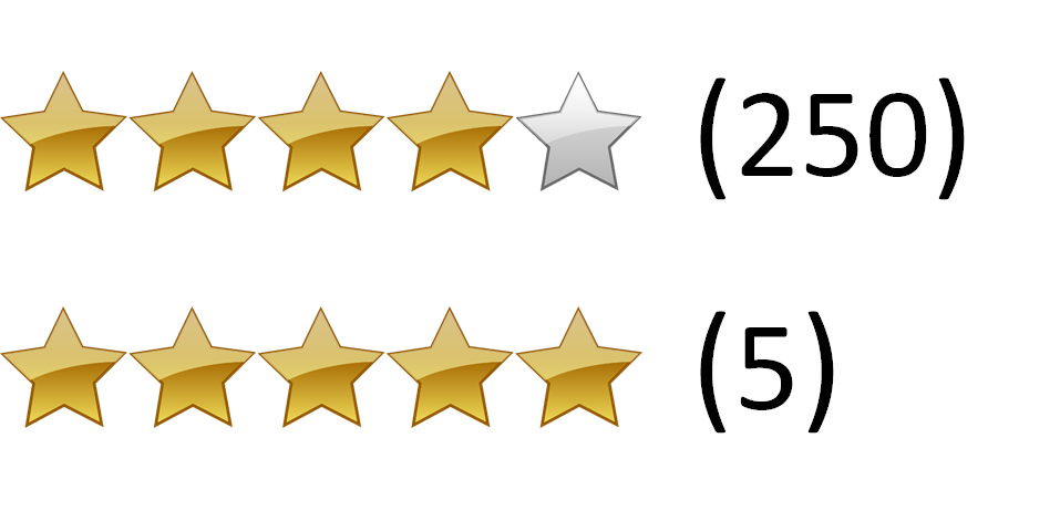
hmmm which one is legit?
The five-star motherboard had five reviews, while the lower-rated four-star motherboard had 250 reviews. You have no doubt about which rating is most reliable. Your little brain, like my son’s, is doing the math. We know that the five-star rating is just as likely to be a three- or two-star rating.
The data isn’t in.
You are intuitively calculating what statisticians call n: The Sample Size of the data collected (the reviews). And you know the first rule of behavioral data.
- Larger Sample Sizes Are Better Than Smaller Sample Sizes
- Data Over Time Is Better Than Data At One Point In Time
- More-Recent Data Is Better Than Less-Recent Data
- Observational Data Is Better Than Self-Reported Data
- Customers & Prospects Are More Believable Than Pretenders
- Quantitative Data predicts the Future Better than Qualitative Data
Well designed A/B tests are created to follow all of the rules of behavioral data. They are designed to deliver observational, recent data, taken over time from a statistically significant sample of prospects that can be quantitatively analyzed.
As a marketer, you can tap into this innate scientific know-how, using it to predict the performance of your campaigns and make them better.
For a deeper look at these rules with accompanying examples and case studies, read: The 6 Rules of Behavioral Data Built Into All of Us.
Research vs. Intuition
In 2014, Marks & Spencer redesigned their apparel website. Marks & Spencer is a £10 billion company running food and apparel stores in the UK and Europe. In 2013 13% of their sales went through the web. That’s about $1.5 billion. With a B.
In 2014, they launched a website redesign. The effort cost £150 million. Today that would be about $180 million.

Even the largest brands can stumble.
The UX community–and their designers–thought the redesign was “positive.”
More research would be needed for us to give a thorough UX opinion but our first thoughts are that it’s a positive redesign.
— ExperienceSolutions
The customers didn’t agree. Upon launch, the site saw an immediate 8% drop in sales. That’s about $10 million per month in lost sales. This number doesn’t take into account the loss of brand trust.
The best way to build brand online is to deliver what your visitors want.
For $180 million, we expect that they did a great deal of research into their customers and visitors. So what went wrong.
This is the battle being waged in your businesses. Intuition vs. research. Best practices vs. behavioral science. Left brain vs. right brain. Both are necessary. But if you continue to find yourself struggling to get value from the visitors that you pay to bring to your site, there is an imbalance.
Intuition is our ability to apply our experience to new situations. We admire those who can discern the important aspects of something without study.
When behavioral data was expensive to acquire, campaign planning and development was dominated by intuition. If we invested in research, it was done at the beginning. This was primarily qualitative data based on surveys and focus groups.
Then the designers and developers would apply the data to the best of their ability, but relied on their intuition to make the thousands of little decisions necessary to complete a project.

When collecting data is expensive, we rely more on the intuition of experts during development.
It is at the end of this process that true behavioral data is collected. It’s called results. If the results were positive, then the campaign can be replicated and continued. If the results were disappointing, then the campaign would be scratched, and the process would start over.
This is the classic launch and see approach.
What does a campaign development process look like in an era of cheap behavioral data. For most businesses, it looks the same. But for industry leaders, it looks like this:

When data is abundant and inexpensive, we can optimize before launch.
Qualitative data is collected at the beginning. But now we can go back and test components of the campaign again and again. And we collect inexpensive quantitative behavioral data.
Intuition has its place and always will. But now we have balance. At several points along the development path, we can answer specific questions about our campaign.
Obviously, it’s important to get this offer right, it makes sense to do a study. I’m going to use this word “study” a lot because it means, “Stop and look for some data.” A study can mean evaluating existing data or collecting new data. It may take months, but can also be done in a few hours.
Offer Selection & Continuity
I’m going to use the term “studies” frequently. A study describes our process of collecting and evaluating behavioral data. Studies are often short processes, but don’t have to be.
We do a study when we ask the question, “Do I have some data to support a decision, or could I collect some data to help me make a decision.”
We do a study when we ask the question, “Do I have some data to support a decision, or could I collect some data to help me make a decision.”
If we decided to do a little study of offer language, where could we look for some behavioral data? Well, any place we make offers.
If you’ve been running ads on Google or Bing, you have a sample of offers. You can compare the click rates and their conversion rates of these ads to learn which offers appealed most to prospects.
For one of our clients, we looked at their Adwords ads and saw that the best performing offered either 20% off or $100 off.

Adwords Ad
These are what we call “Transactional” prospects. Their greatest fear is paying a dollar too much for something. The landing page used for these ads didn’t lead with the discounts, however.
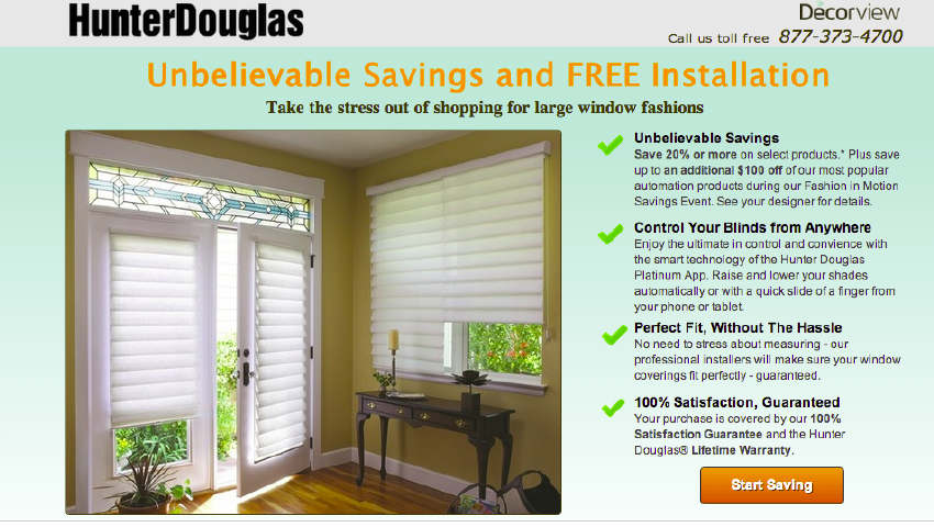
Before
We focused on the $100 off offer and this became part of the primary offer. This page increased leads by 40% after we made this simple change.

After
Other sources of behavioral data? How about a study of emails with high click-through rates? What offers get the most clicks in your email? This data is kept in any email service for easy evaluation. Pull them into a spreadsheet and see what offers appealed to prospects.
Your ad and email teams should be thrilled to hear from you. At some point, they may come to you to learn what landing page copy is delivering the best conversion rates. They can do a behavioral study of your landing pages.
Why is this data valuable?
- First it is behavioral, not self-reported.
- Second, it is a sample taken from prospects and customers.
- Third, it’s a big sample. It will typically include a sample sizes of thousands of impressions or recipients, and hundreds of clicks.
- Fourth, the data spans months or years. If seasonality is an issue, you will want to zero in on a timeframe of data that matches the timeframe that your landing page will launch.
You’re not guessing. And you’re getting value from the ad spend and email outreach you’ve already invested in.
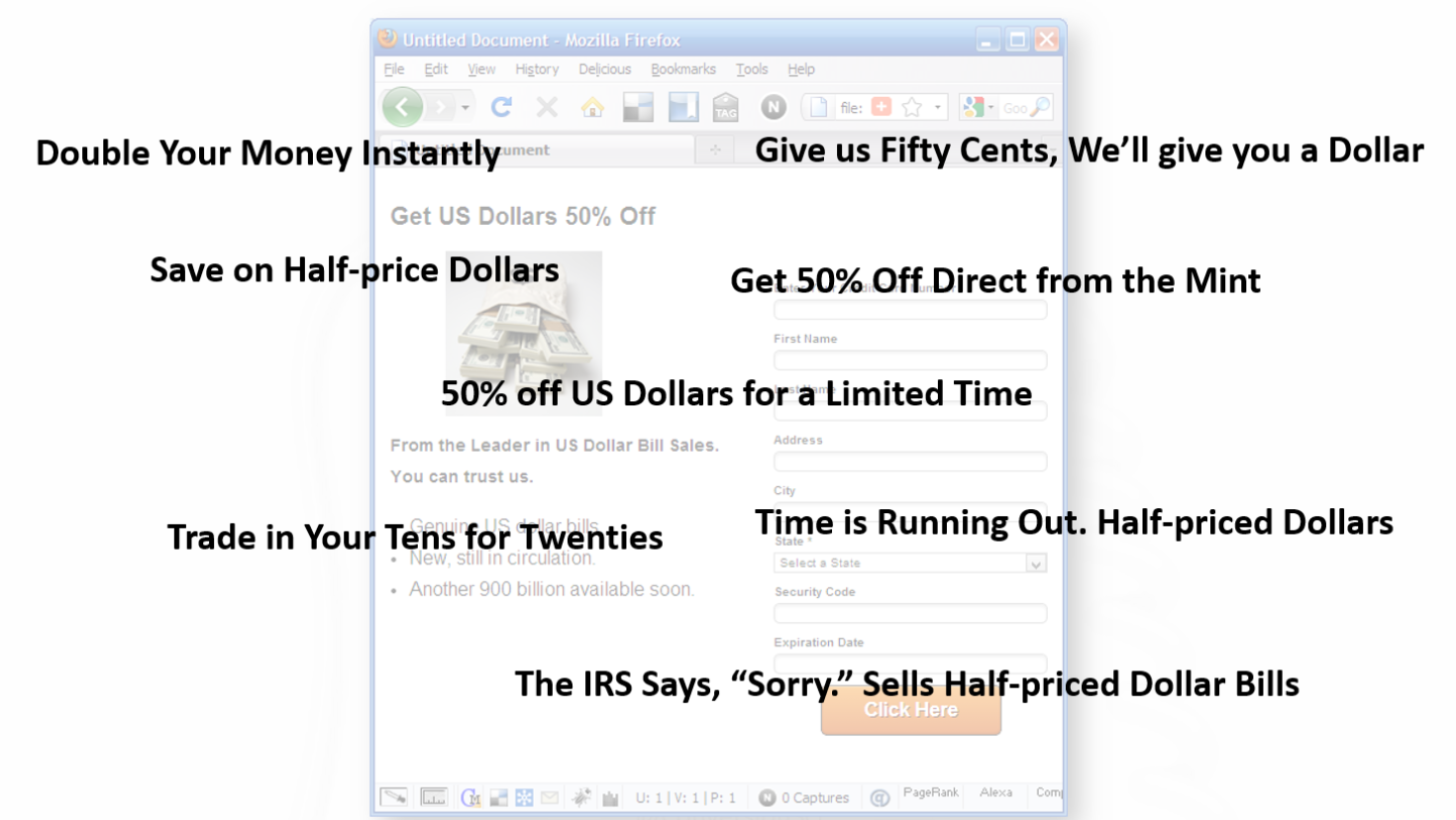
If these sources don’t exist for you — if this is a new offer or product, then your study may include launching several ads to see what works. The copywriter may recommend some images to support the copy. If you leave the images to the designer, they will scurry over to iStockPhoto and populate your page with ineffective stock photography.
Image and Headline Selection

Wow, great effort on the photos…
We call this business porn. You can tell business porn is on your site using the caption test. If you can’t write a caption for a picture that makes sense, then it’s probably business porn.
The caption for shaking hands might be, “We want to shake your hand, so we can start sending you invoices.” Headset hotties are all the rage. The caption might read, “I don’t work here, but you should call anyway.” And the caption for a random graph might read, “We don’t know what this measures, but it’s going up and to the right.”
Your visitors know the difference between a studio picture and a picture of your customers or employees. This is a waste of valuable space on our landing pages.
Marketing 101 says, “Show the product.” This is because no one is going to take action on your landing page until they’ve imagined what it will be like to take action. Spend as much time on the images as you do on the copy. Images are a powerful way to advance the value proposition.
You may have several images to choose from. We’ll do a study to help you pick images that work for your copy.
Unfortunately, we rarely know if we’ve chosen the right copy and image.
So many choices, so little time
More likely, we’re struggling with a number of options.
All of these satisfy the offer, but can be expected to perform very differently.
Let’s do a study!
Finding the Right Headline and Hero Image
Why not give ourselves some creative latitude. We could probably come up with some different headlines and images. Why not collect some data on this to narrow down our choices?
We can pretty easily narrow down our choices using a five-second test. This test can be done very inexpensively at UsabiltyHub.com or Verifyapp.com.
The five-second test flashes your page in front of test subjects for five seconds. The subject is then asked questions about what they saw. It’s a good measure of the immediate impact of the copy and images, revealing how well they communicate the offer.
This is a great way to gauge the effectiveness of headlines and images.
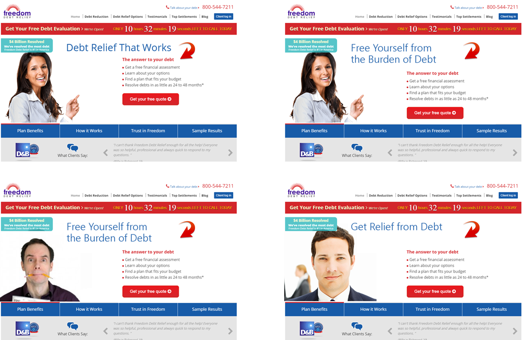
Finding the right hero image and headline
Here’s what we learned about a homepage we tested with the five-second test. This is a typical scenario for this company’s products. We then asked them if this company would solve their problem.
User survey
It is clear that visitors aren’t getting a clear understanding from the home page. This test took two days and cost about $2.50 for each of the 25 respondents.
We can put several versions of our landing page through the test, different headlines, images and copy. Our landing page doesn’t even need to be functional for this kind of test.
Let’s evaluate this data. Sample size? Small. Little n=25. Strangers or customers? This is a sample of people who aren’t necessarily customers, so their input must be taken with a grain of salt. Qualitative or quantitative? This is clearly qualitative, and we were able to ask several more questions to understand their impressions of the page.
For our landing page, we can use this test to narrow down the best two headlines and best two images. Then we can do a more quantitative, behavioral study with a larger sample size to get our best offer and image. Before we dive into that, there are a couple of other elements we’ll want to include in our landing page before we test.
Understanding our Visitors’ Preferences
What could we add to a page that would enhance our visitors’ perception of our credibility? The folks at Stack asked this question using a Question Test from UsabilityHub.com. They wanted to know what kind of social proof would enhance the perception of credibility for their home page: a testimonial or customer logos.
They created three versions of their home page, one without social proof, one with a testimonial and one listing the logos of their well-known clients. Then they asked the question:
Does this company seem credible to you?
The results favored the logos somewhat.

Expedited vs Testimonial vs Social Proof
This information is directional in nature, but it narrowed the choices that could be used in a more rigorous AB test.
This is a great example of using panels to inform decisions. It can be applied to a variety of components of a page.
- Copy length
- Page Layout
- Navigation
- Image choice, size and placement
- Trust symbols
- Proof points
- Headlines
This allows designers to be more creative, since their choices can be easily reduced with a question test.
Helping Visitors Solve Problems
Are visitors finding the information they are looking for on our pages? This was a question that insurance provider RACV wanted to know. It was important that their customers be able to find their roadside assistance number in an emergency.
To gather some data, they did a Click Test from UsabilityHub.com. The click test measures how long it takes a participant to click on the page. In this case, they asked participants to click on the roadside assistance number of their current page. The results showed it took 20 seconds on average for these participants to find and click on the right place.

#buried
The click location is shown by the heatmap in the lower right corner of the page.
Clearly, they needed a redsign. Their new design put the roadside assistance number in a band closer to the top of the screen. They ran another click test and reduced the time it took to find the link to 5 seconds on average.

#lessburied
This was a significant win for RACV.
You will use a test like this to determine how your page is functioning holistically.
- What calls to action are most clickable?
- Are visitors able to find the next step in the process?
- Do you have too many calls to action on a page?
- How is your home page helping visitors choose a path?
Answer these questions and you will deliver a better experience.
Studying Page Layout
Notice that we haven’t yet gotten a designer involved yet. There’s a reason for that. Designers tend to add things to a page that satisfy their ego, or that they believe will satisfy you. They want carousels, animated video backgrounds, sliding logos and such. These are all bad ideas, unless you have some data that suggests otherwise.
A professional design is important to credibility, but the primary job of the layout design is to get our visitors eyes to the important information on the page. In this way, we want our designer to be more of a draftsman, using their knowledge of font, color, white space, positioning, negative space, grids, and visual cues to direct our visitors experience. We don’t need designers to be persuasive or manipulative.
Before we call the designers, let’s find out what is wrong with the layout. The more specific instructions we can give our designer, the more likely we are to keep them from going crazy.
Thanks to the amazing increase in webcam resolution and the steep drop in price, we can track where a persons eyes fall on a monitor with surprising accuracy. This means we can do inexpensive eye-tracking studies.
We did an eye-tracking study in 2012. Back then, we needed a special infrared camera and expensive software. We recruited 23 people from around Austin and brought them into a room one at a time. We calibrated the camera to track their eyes and asked them to watch one of three videos while we tracked, and to then fill out a survey.
This took weeks to setup and days to execute. The camera and special software were not cheap, at $7500. All in the study cost $15,000 to $20,000 in time and materials.
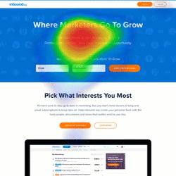
The World’s Least Inexpensive User Test
In 2016 the I was asked to give my opinion on a landing page for inbound.org. They didn’t have any data on the page, so I asked my friends at Tobii (formerly Sticky.ai) to do an eye-tracking study of the mockup. Their technology used everyday webcams to track the viewer’s eyes. These studies cost around $500.
Here’s an example of what they delivered in about a week.
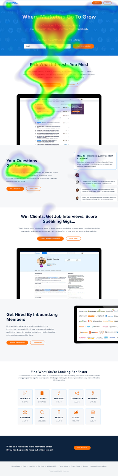
#heatmapsaregreat
This view is called a heatmap view. Like rain in a weather report, this tells us where the eyes of 50 test subjects fell most. Red means that many saw that part of page and lingered. Yellow, less so. Green even less. Clear means that these parts of the page got very little or no attention.
This is helpful information when considering layout. From the data, we speculated that the second section was more interesting to the visitors than the hero offer. Few people were being enticed to scroll down the page. And the big screenshot in the middle was acting as a stop.
Watching these interactions in motion can deliver insights as well. Such videos are automatically generated. I wish we had these back in the day.
“You’re waiting for a train…”
We may choose to iterate our campaign elements now using usability tests and eye-tracking studies, but at some point we are going to declare a version of this page the control and launch it.
Our behavioral science doesn’t stop there.
After Launch
We are going to use a few tools to give us some very helpful data about how this page is performing with real prospects.
- Analytics database
- Click tracking software
- Session recording software
And if we really want to take this decision to the supreme court, some AB testing software.
Analytics is a large database of behavioral information. It sits behind our website collecting the behaviors and details of our visitors — anonymously. It is the best source of quick studies. This is a topic for another post.
Heatmaps
To increase the size of our samples, we can turn to click-tracking software. Instead of tracking where visitors’ eyes go on the page, this tracks their mouse movements and where they click. We get similar information with a much larger samples size.
Is our copy too long? Is key information being missed? This can be answered easily with a scroll tracking report.
Scroll tracking
What elements on a page are getting visitors’ attention? Which are being ignored? With click tracking, we can see the interactions of thousands of visitors in a single heat map. Here’s an example of a pricing page.
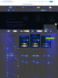
Click tracking
These are tools that cost a few hundred dollars a month to have running on your site.
Here’s a heatmap we saw on a college website. Why is this one part of the form red hot?
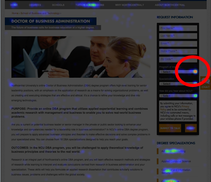
Heatmap
This field is “Program of Interest.”
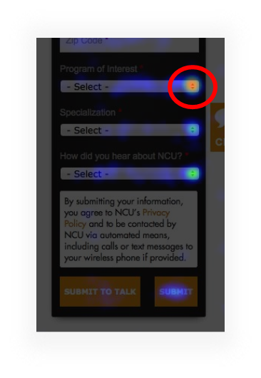
Follow the colors
It seems that the site didn’t do a good job of communicating what programs were available. When we added “Program of Interest” to the body of the pages and took the potential students to the right part of the site, information requests went up by 20%. That’s a big deal when you’re selling something that costs hundreds of thousands of dollars.
The Supreme Court of Data
We have a page that we expect to convert well out of the gate. Our big decisions have been supported by research–an offer study, a copy study, a 5-second test and an eye-tracking study– and have been colored by our intuitive abilities as communicators.
With sufficient traffic, there is another kind of study that we consider the Supreme Court of studies. It’s called an AB test or a split test.
Like our other tools, AB testing tools cost $500 a month or less, and our old data friend, Google, has released a free AB testing tool called Google Optimize.
AB testing tools give us the ability to change just about anything we want on a web page without messing with the backend of our website. In other words, we don’t need the developers’ help. These tools manage everything for you.
They split your traffic equally among two or more variations of your page.
They keep track of which variation generates leads or sales.
They do the statistical calculations for you so you know when your sample size is big enough.
And this data follows all of the rules of behavioral data. It is customers and prospects. The tests are done simultaneously, so the history effect is minimized. The samples sizes are large. The data collected is behavioral, not self-reported.
The only thing we don’t get from AB test results is the deep qualitative insights. That is why we continue to do other studies like site feedback like site surveys.
One of our favorites It involves a single-question popover survey on the thank you page, or the receipt page of the site. A typical survey question is:
“What almost kept you from buying today?” or “What almost kept you from signing up?”
The input is free-form text.
In this example, we asked customers why they chose the Lite version of a product over the Pro version.
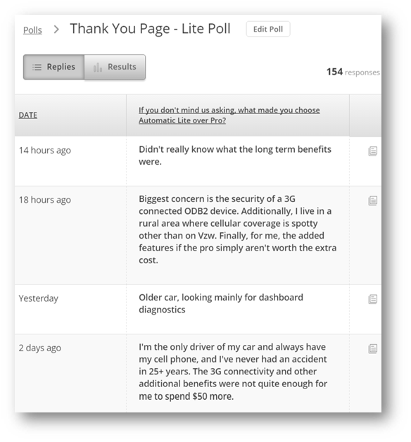
Why did you give us less money?
The results of this can be very enlightening when asked like this giving us new ideas about what to test.
Designing AB tests is an intensely creative process.
Conclusion: The Gold is in the Data
This is data gold. But it costs like copper.
When you ask every day what data is available to help me make creative decisions, you can be more creative. You can do more with less because you’re not spinning your wheels.
Investing in behavioral data is now cheaper than not investing in behavioral data. Are you excited about behavioral data now?
Many of the results I’ve shown you are from our clients. A Conversion Scientist named Ruth Mayer created them. A year ago, she was working in a flower shop. Today she is is finding revenue at some busy websites.
Do you really thing behavioral data isn’t within your reach?
When it is expensive to do research, we can’t afford to invest very often, but digital data gathering has become very inexpensive, and it allows us to capture what is happening on our websites, advertising networks and mobile apps in real time.
How would a store owner know that people who looked at a pair of shoes also tend to look at a pair of capri pants? They’d have to follow their visitors around with a clipboard. That’s not practical in the real world. It’s common online.
“Market research is for researchers. Behavioral science is for doers.” –BAM
I’m not going to stop until everyone comes to love behavioral data. Like throwing raw meat to your left hemisphere to free up your creative right hemisphere.
Imagine how you would approach the world if you knew you were creating what your audience really wanted.
How will I know if you love data? Let’s do a study…

 Chris Cooper is a conversion copywriter and content strategist based in Denver, CO. He owns Real Good Writing where he helps tech and SaaS companies write B2B copy that people actually want to read. When he’s not getting more customers for his clients, he’s fighting a tireless battle for proper use of the oxford comma. Visit www.rgwriting.com or connect on Twitter @ElCoopacabra.